Official account: Special House
Author: Peter
Editor: Peter
Hello, I'm Peter~
Many readers have asked me: are there any good cases of data analysis and data mining? The answer is, of course, it's all on Kaggle.
It's just that you have to spend time studying and even playing games. Peter has no competition experience, but he often goes to Kaggle to learn the problem-solving ideas and methods of the big guys in the competition.
In order to record the good methods of the big guys and improve himself, Peter decided to open a column: Kaggle case sharing.
The case analysis will be updated from time to time later. The ideas come from the big guys on the Internet, especially the sharing of Top1. Peter is mainly responsible for sorting out ideas and learning technology.
Today, I decided to share a case about clustering, using the supermarket user segmentation data set. Please move to the official website address: supermarket
To facilitate your practice, the official account can be returned to the supermarket to receive this dataset.
The following is the Notebook source code ranking top 1. Welcome to learn from it~
Import library
# data processing
import numpy as np
import pandas as pd
# KMeans clustering
from sklearn.cluster import KMeans

# Drawing library
import matplotlib.pyplot as plt
import seaborn as sns
import plotly as py
import plotly.express as px
import plotly.graph_objects as go
py.offline.init_notebook_mode(connected = True)
Data EDA
Import data
First we import the dataset:
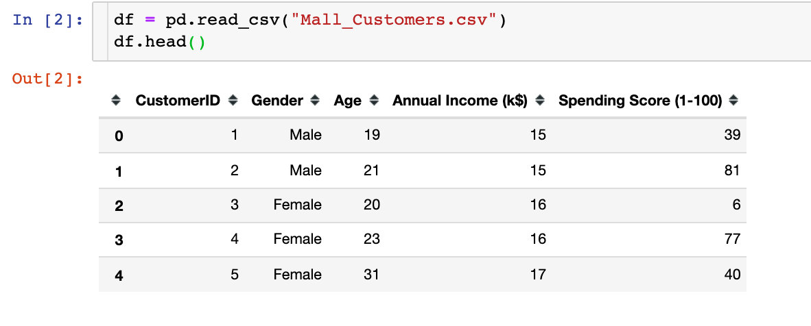
We found that there are five attribute fields in the data, namely customer ID, gender, age, average income and consumption grade
Data exploration
1. Data shape
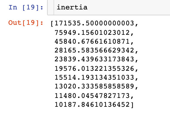
df.shape

# result
(200,5)
A total of 200 rows and 5 columns of data
2. Missing values
df.isnull().sum()

# result
CustomerID                0
Gender                    0
Age                       0
Annual Income (k$)        0
Spending Score (1-100)    0
dtype: int64
You can see that all fields are complete without missing values
3. Data type
df.dtypes

# result
CustomerID                 int64
Gender                    object
Age                        int64
Annual Income (k$)         int64
Spending Score (1-100)     int64
dtype: object
In the field types, except that Gender gender is a string, others are int64 numeric types
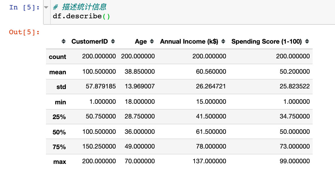
4. Description statistics
Description statistical information is mainly used to view the values of relevant statistical parameters of numerical data, such as number, median, variance, maximum value, quartile, etc
For the convenience of subsequent data processing and display, two points are handled:
# 1. Set drawing style
plt.style.use("fivethirtyeight")

# 2. Take out the three key analysis fields
cols = df.columns[2:].tolist()
cols
# result
['Age', 'Annual Income (k$)', 'Spending Score (1-100)']
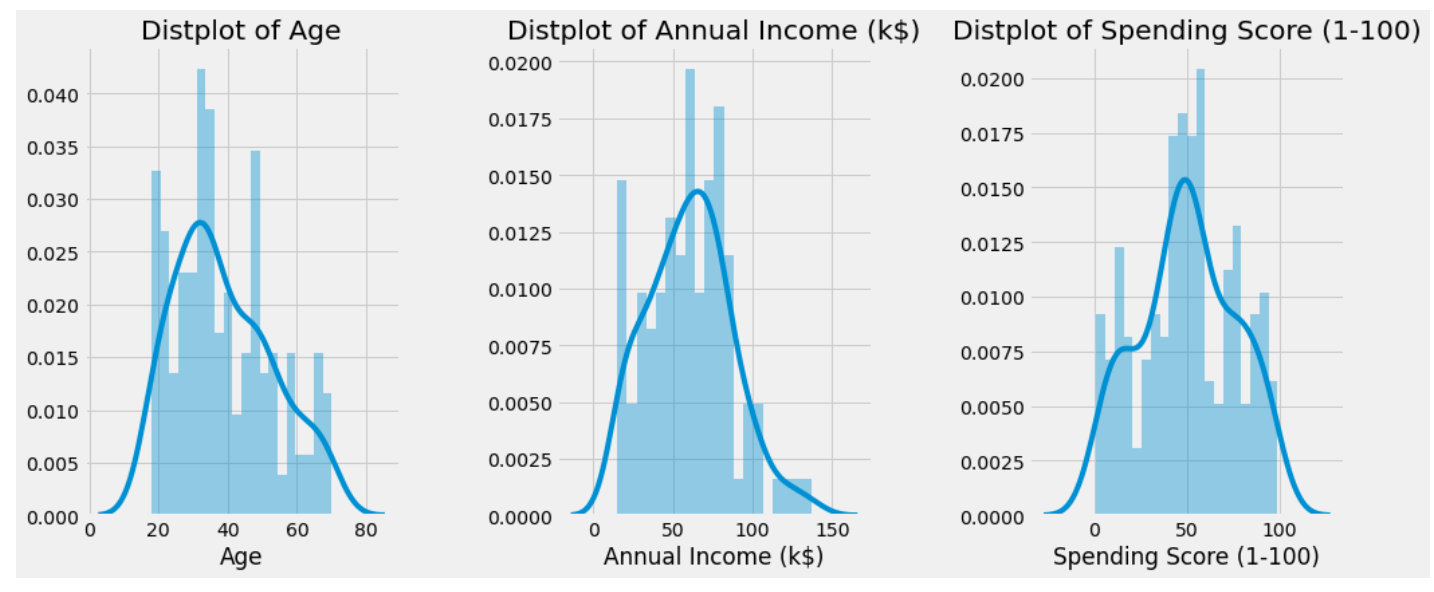
3 attribute histograms
Check the histograms of 'Age', 'Annual Income (k $)' and 'Spending Score (1-100)' and observe the overall distribution:
# mapping
plt.figure(1,figsize=(15,6))  # canvas size
n = 0

for col in cols:
    n += 1 # Subgraph location
    plt.subplot(1,3,n)  # Subgraph
    plt.subplots_adjust(hspace=0.5,wspace=0.5)  # Adjust width and height
    sns.distplot(df[col],bins=20)  # Draw histogram
    plt.title(f'Distplot of {col}')  # title
plt.show()  # display graphics
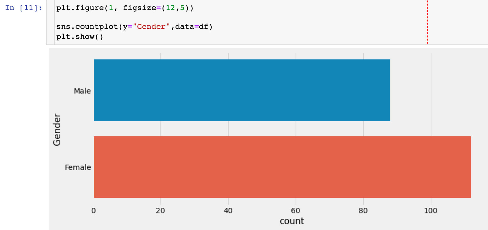
Gender factor
Gender Statistics
Check the number of men and women in this dataset. Whether gender has an impact on the overall analysis will be considered in the follow-up.
Data distribution by gender
sns.pairplot(df.drop(["CustomerID"],axis=1),
             hue="Gender",  # Grouping field
             aspect=1.5)
plt.show()
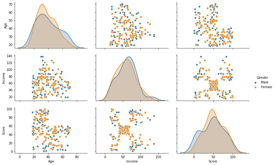
Through the above bivariate distribution map, we observed that gender has little effect on the other three fields
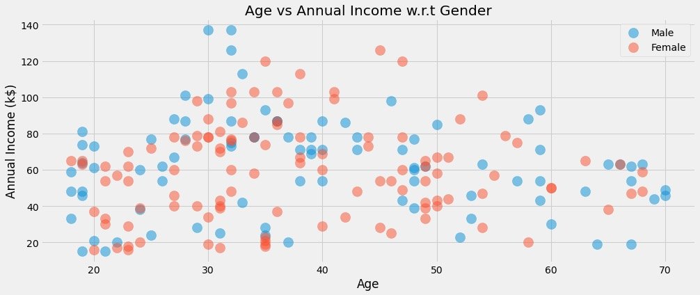
Relationship between age and average income under different gender
plt.figure(1,figsize=(15,6))  # Drawing size

for gender in ["Male", "Female"]:
    plt.scatter(x="Age", y="Annual Income (k$)", # Specify the fields for both analyses
                data=df[df["Gender"] == gender],  # Data to be analyzed under a gender
                s=200,alpha=0.5,label=gender  # Scatter size, transparency, label classification
               )

# Horizontal and vertical axis, title setting
plt.xlabel("Age")
plt.ylabel("Annual Income (k$)")
plt.title("Age vs Annual Income w.r.t Gender")
# display graphics
plt.show()
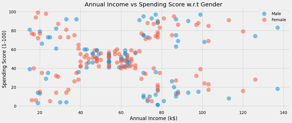
Relationship between average income and consumption score under different gender
plt.figure(1,figsize=(15,6))

for gender in ["Male", "Female"]:  # Refer to the above for explanation
    plt.scatter(x = 'Annual Income (k$)',y = 'Spending Score (1-100)',
                data=df[df["Gender"] == gender],
                s=200,alpha=0.5,label=gender)

plt.xlabel('Annual Income (k$)')
plt.ylabel('Spending Score (1-100)')
plt.title("Annual Income vs Spending Score w.r.t Gender")
plt.show()
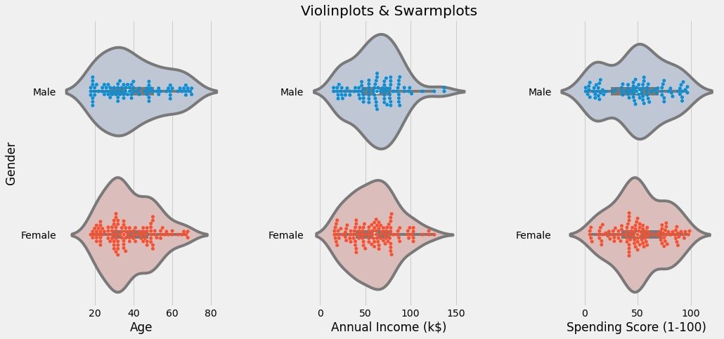
Data distribution by gender
Observe the data distribution through violin diagram and cluster scatter diagram:
# Clustering scatter diagram: swarm plots
# Violin picture: violinplot

plt.figure(1,figsize=(15,7))
n = 0

for col in cols:
    n += 1  # Subgraph order
    plt.subplot(1,3,n)  # Nth subgraph
    plt.subplots_adjust(hspace=0.5,wspace=0.5)  # Adjust width and height
    # Draw two graphics under a col and display them in groups through Gender
    sns.violinplot(x=col,y="Gender",data=df,palette = "vlag")
    sns.swarmplot(x=col, y="Gender",data=df)
    # Axis and title settings
    plt.ylabel("Gender" if n == 1 else '')
    plt.title("Violinplots & Swarmplots" if n == 2 else '')

plt.show()
The results are as follows:
- View the distribution of different fields under different genders
- Observe whether there are outliers, outliers, etc
Attribute correlation analysis
It mainly observes the regression between two attributes:
cols = ['Age', 'Annual Income (k$)', 'Spending Score (1-100)'] # Correlation analysis of these three attributes
plt.figure(1,figsize=(15,6))
n = 0

for x in cols:
    for y in cols:
        n += 1  # Every cycle, n increases and the subgraph moves once
        plt.subplot(3,3,n)  # 3 * 3 matrix, Nth figure
        plt.subplots_adjust(hspace=0.5, wspace=0.5)  # Width and height parameters between subgraphs
        sns.regplot(x=x,y=y,data=df,color="#AE213D")  # Drawing data and colors
        plt.ylabel(y.split()[0] + " " + y.split()[1] if len(y.split()) > 1 else y)

plt.show()
Specific figures are:
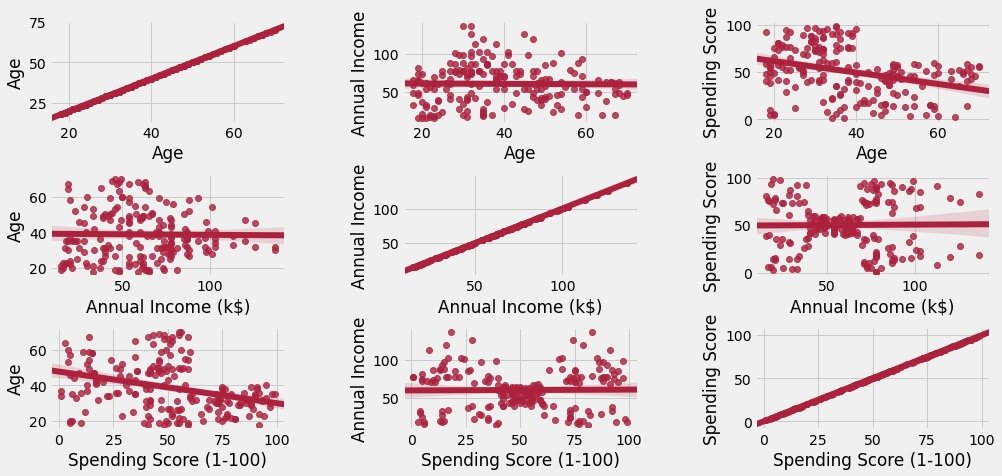
The figure above shows two points:
- The main diagonal is the relationship between itself and itself, which is in direct proportion
- Other graphs are between attributes, including scattered distribution of data and relevant trend charts of simulation
Clustering between two attributes
The principle and process of clustering algorithm are not explained in detail here. It is based by default
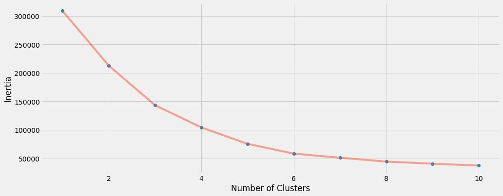
K value selection
We determine the k value by drawing the ELBOW diagram of the data. Data broadcasting:
1. Parameter interpretation from the official website: https://scikit-learn.org/stable/modules/generated/sklearn.cluster.KMeans.html
2. Chinese interpretation reference: https://blog.csdn.net/qq_34104548/article/details/79336584
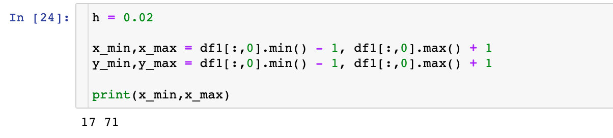
df1 = df[['Age' , 'Spending Score (1-100)']].iloc[:,:].values  # Data to be fitted
inertia = []   # An empty list to store the sum of distances to the centroid

for k in range(1,11):  # The default value of k is 1-10, and the empirical value is 5 or 10
    algorithm = (KMeans(n_clusters=k,  # k value
                       init="k-means++",  # Initial algorithm selection
                       n_init=10,  # Random run times
                       max_iter=300,  # Maximum number of iterations
                       tol=0.0001,  # Tolerance minimum error
                       random_state=111,  # Random seed
                       algorithm="full"))  # Select auto, full and elkan for the algorithm
    algorithm.fit(df1)  # Fitting data
    inertia.append(algorithm.inertia_)  # Sum of centroids
Draw the relationship between the change of K value and the sum of centroid distance:
plt.figure(1,figsize=(15,6))
plt.plot(np.arange(1,11), inertia, 'o')  # The data is drawn twice, and the marks are different
plt.plot(np.arange(1,11), inertia, '-', alpha=0.5)

plt.xlabel("Choose of K")
plt.ylabel("Interia")
plt.show()
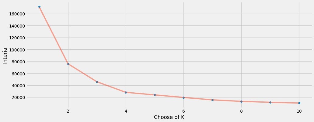
Finally, we find that k=4 is more appropriate. Therefore, k=4 is used for the real fitting process of data
Cluster modeling
algorithm = (KMeans(n_clusters=4,  # k=4
                       init="k-means++",
                       n_init=10,
                       max_iter=300,
                       tol=0.0001,
                       random_state=111,
                       algorithm="elkan"))
algorithm.fit(df1)  # Analog data
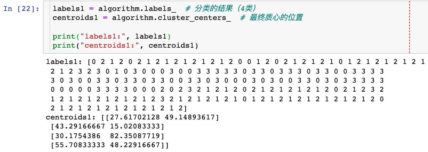
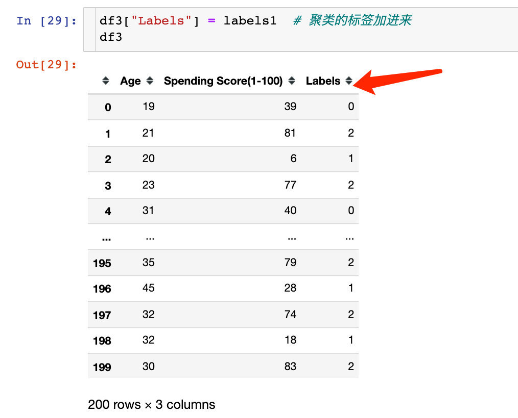
After the fit operation of the data, we get the label label and four centroids:
labels1 = algorithm.labels_  # Results of classification (4 categories)
centroids1 = algorithm.cluster_centers_  # Position of final centroid

print("labels1:", labels1)
print("centroids1:", centroids1)
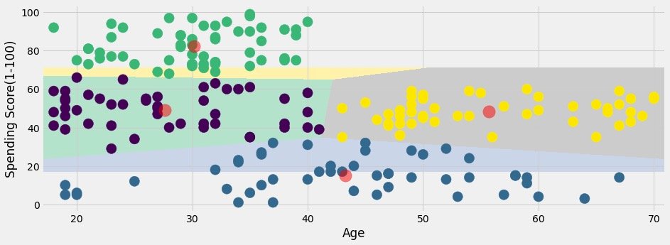
In order to show the classification effect of the original data, the case on the official website is the following operation, which I personally think is a little cumbersome:
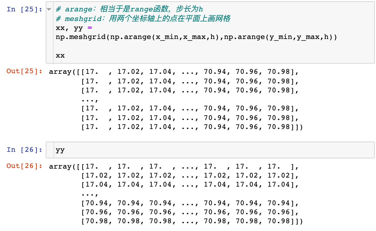
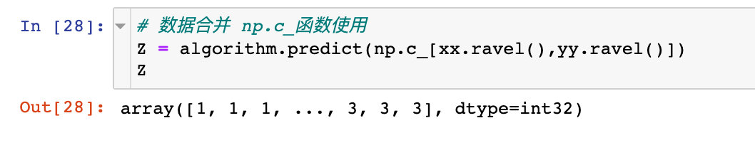
Data consolidation:
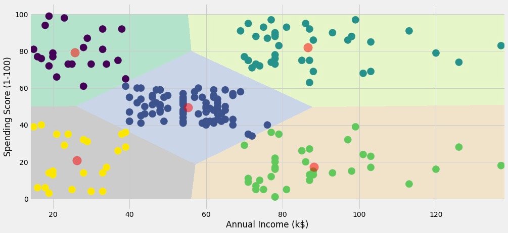
Show classification effect:
plt.figure(1,figsize=(14,5))
plt.clf()

Z = Z.reshape(xx.shape)

plt.imshow(Z,interpolation="nearest",
           extent=(xx.min(),xx.max(),yy.min(),yy.max()),
           cmap = plt.cm.Pastel2,
           aspect = 'auto',
           origin='lower')

plt.scatter(x="Age",
            y='Spending Score (1-100)',
            data = df ,
            c = labels1 ,
            s = 200)

plt.scatter(x = centroids1[:,0],
            y =  centroids1[:,1],
            s = 300 ,
            c = 'red',
            alpha = 0.5)

plt.xlabel("Age")
plt.ylabel("Spending Score(1-100)")

plt.show()
If it was me, what would I do? Of course, Pandas+Plolty is used to solve the problem perfectly:
See the results of classification visualization:
px.scatter(df3,x="Age",y="Spending Score(1-100)",color="Labels",color_continuous_scale="rainbow")
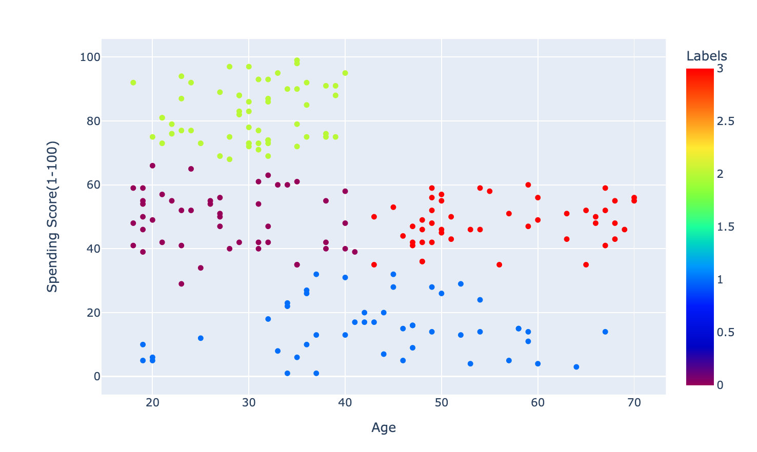
The above process is clustering according to Age and Spending Score(1-100). Clustering of Annual Income (k $) and Spending Score(1-100) fields was also carried out on the official website based on the same method.
The effects are as follows, which are divided into five categories:
Clustering of three attributes
Cluster according to Age, Annual Income and Spending Score, and finally draw a three-dimensional graph.
K value selection
The methods are the same, except that three fields (two above) are selected
X3 = df[['Age' , 'Annual Income (k$)' ,'Spending Score (1-100)']].iloc[: , :].values  # Select data for 3 fields
inertia = []
for n in range(1 , 11):
    algorithm = (KMeans(n_clusters = n,
                        init='k-means++',
                        n_init = 10 ,
                        max_iter=300,
                        tol=0.0001,
                        random_state= 111  ,
                        algorithm='elkan') )
    algorithm.fit(X3)   # Fitting data
    inertia.append(algorithm.inertia_)
Draw elbow diagram to determine k:
plt.figure(1 , figsize = (15 ,6))
plt.plot(np.arange(1 , 11) , inertia , 'o')
plt.plot(np.arange(1 , 11) , inertia , '-' , alpha = 0.5)
plt.xlabel('Number of Clusters') , plt.ylabel('Inertia')
plt.show()
We finally choose k=6 to cluster
Modeling fitting
algorithm = (KMeans(n_clusters=6,  # Determined k value
                    init="k-means++",
                    n_init=10,
                    max_iter=300,
                    tol=0.0001,
                    random_state=111,
                    algorithm="elkan"))
algorithm.fit(df2)

labels2 = algorithm.labels_
centroids2 = algorithm.cluster_centers_

print(labels2)
print(centroids2)
Get labels and centroids:
labels2 = algorithm.labels_
centroids2 = algorithm.cluster_centers_
mapping
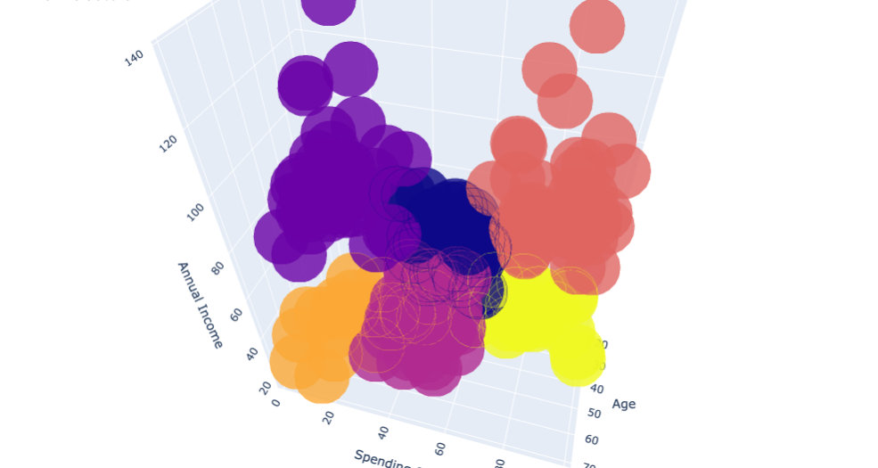
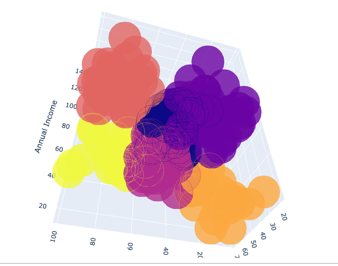
For 3D clustering, we finally choose plot to show:
df["labels2"] = labels2

trace = go.Scatter3d(
    x=df["Age"],
    y= df['Spending Score (1-100)'],
    z= df['Annual Income (k$)'],
    mode='markers',

    marker = dict(
        color=df["labels2"],
        size=20,
        line=dict(color=df["labels2"],width=12),
        opacity=0.8
    )
)

data = [trace]
layout = go.Layout(
    margin=dict(l=0,r=0,b=0,t=0),
    title="six Clusters",
    scene=dict(
        xaxis=dict(title="Age"),
        yaxis = dict(title  = 'Spending Score'),
        zaxis = dict(title  = 'Annual Income')
    )
)

fig = go.Figure(data=data,layout=layout)

fig.show()
The following is the final clustering effect: