Author: Peter Editor: Peter
Hello, I'm Peter~
Airbnb is the abbreviation of AirBed and Breakfast ("Air-b-n-b"), and its Chinese name is: air accommodation. It is a service-oriented website for contacting tourists and renting vacant houses. It can provide users with a variety of accommodation information.
This paper explores and analyzes a data about aibiying in Singapore on kaggle. Original notebook learning address: https://www.kaggle.com/bavalpreet26/singapore-airbnb/notebook

<!--MORE-->
Aibiying collected the global rental data and put it on its official website for reference. The official data address is: http://insideairbnb.com/get-the-data.html
The data of many cities above, including Beijing and Shanghai, are free to download. Interested friends can play with these data.
This article chooses the garden city - Lion City Singapore, which is a good place to travel abroad!

Import library
Import libraries required for data analysis:
import pandas as pd
import numpy as np

# 2D graphics
import matplotlib
import matplotlib.pyplot as plt
import seaborn as sns
import geopandas as gpd
plt.style.use('fivethirtyeight')
%matplotlib inline

# Dynamic graph
import plotly as plotly
import plotly.express as px
import plotly.graph_objects as go
from plotly.offline import init_notebook_mode, iplot, plot
init_notebook_mode(connected=True)

# Map making
import folium
import folium.plugins

# NLP: word cloud
import wordcloud
from wordcloud import WordCloud, STOPWORDS, ImageColorGenerator


# Machine learning modeling related
import sklearn
from sklearn import preprocessing
from sklearn import metrics
from sklearn.metrics import r2_score, mean_absolute_error
from sklearn.preprocessing import LabelEncoder,OneHotEncoder
from sklearn.model_selection import train_test_split
from sklearn.linear_model import LinearRegression,LogisticRegression
from sklearn.ensemble import RandomForestRegressor,  GradientBoostingRegressor

# Ignore alarm
import warnings
warnings.filterwarnings("ignore")
Basic data information
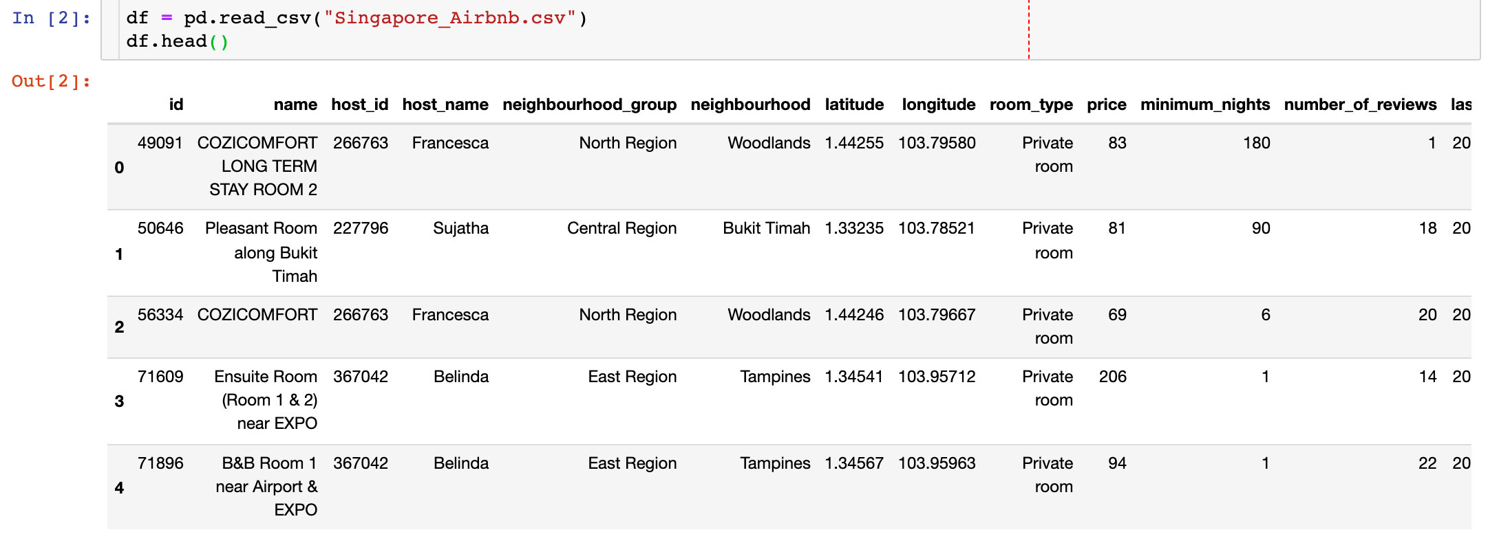
Import the data we obtained:
View the basic information of data: shape, field, missing value, etc
# Data shape
df.shape
(7907, 16)
# Field information
columns = df.columns
columns
Index(['id', 'name', 'host_id', 'host_name', 'neighbourhood_group',
'neighbourhood', 'latitude', 'longitude', 'room_type', 'price',
'minimum_nights', 'number_of_reviews', 'last_review',
'reviews_per_month', 'calculated_host_listings_count',
'availability_365'],
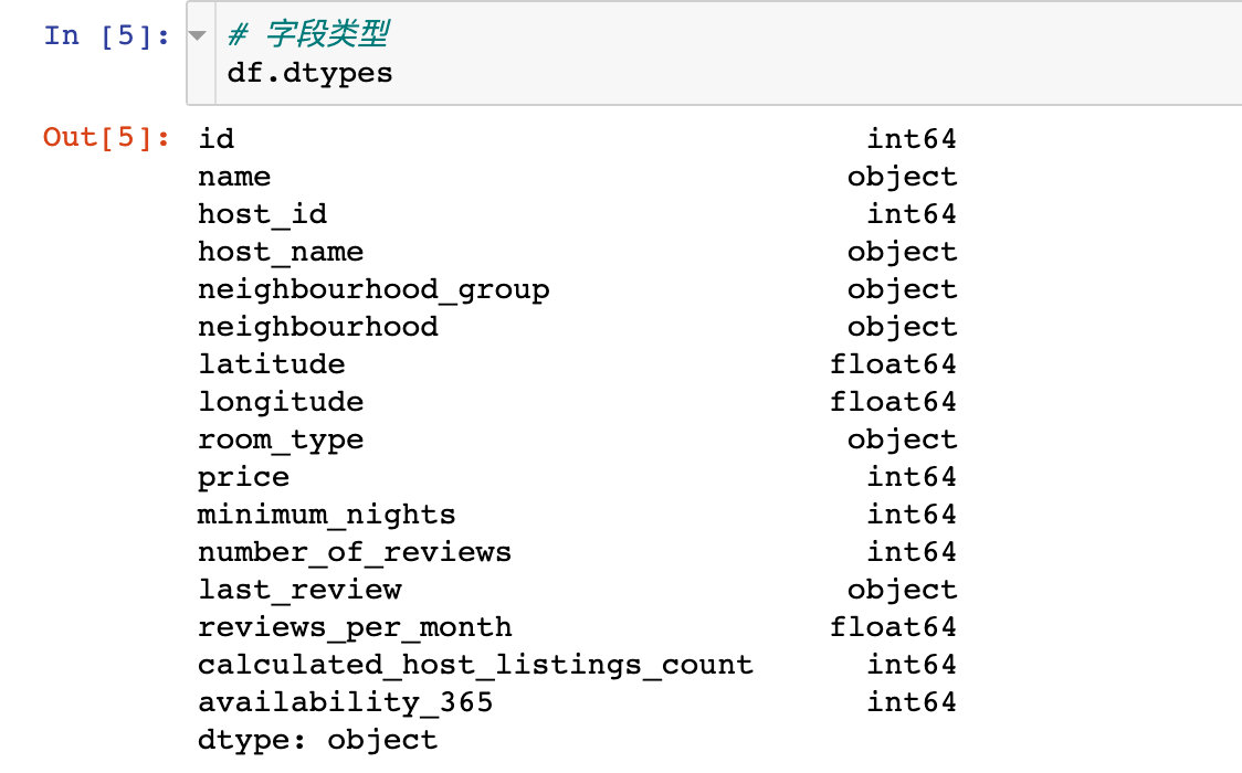
dtype='object')Specifically, the Chinese meaning of each field is:
- ID: record ID
- Name: house name
- host_id: landlord id
- host_name: landlord's name
- Neighborhood: Area
- Latitude: latitude
- Longitude: longitude
- room_type: room type
- Price: price
- minimum_nights: minimum booking days
- number_of_reviews: number of comments
- last_reviews: last comment time
- reviews_per_month: number of comments / month
- calculated_host_listings_count: the number of rentable houses owned by the landlord
- availability_365: rentable days of the house in a year
Through the info property of DataFrame, we can view multiple information of data:
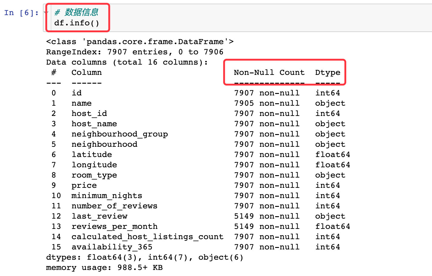
Specific missing values:
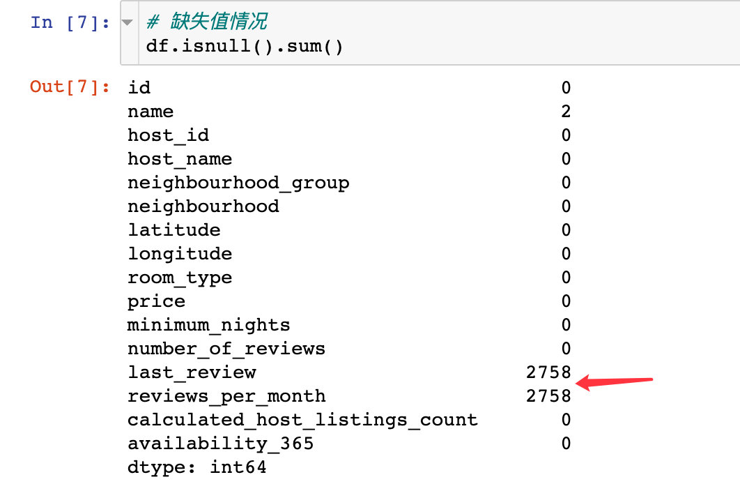
Missing value processing
1. First check the distribution of missing values in the field: it can be seen from the following figure that it is also last_ Reviews and reviews_ per_ Missing value in month field
sns.set(rc={'figure.figsize':(19.7, 8.27)})
sns.heatmap(
  df.isnull(),
  yticklabels=False,
  cbar=False,
  cmap='viridis'
)

plt.show()
2. The two rows of records of the missing value field (the above two) and the name field are deleted directly
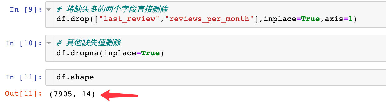
The final data becomes 7905 rows and 14 fields. The original data is 7907 rows with 16 field attributes
Data EDA
The full name of EDA is Exploratory Data Analysis, which is mainly used to explore the distribution of data
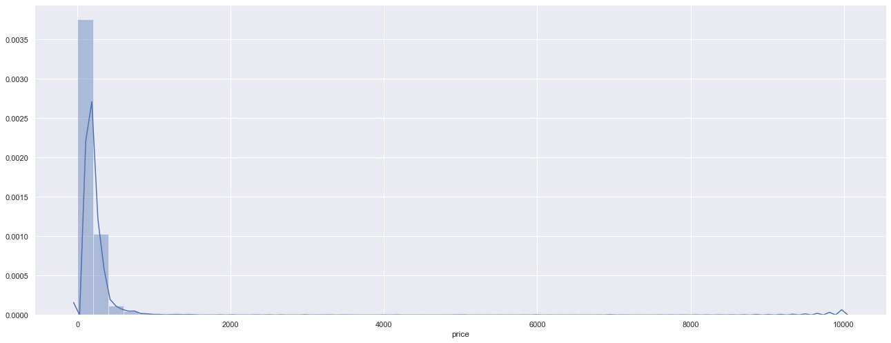
price
Overall, the price is still below 1000
sns.distplot(df["price"])  # histogram
plt.show()
Let's look at the relationship between the price and the minimum reservation days:
sns.scatterplot(
    x="price",
    y="minimum_nights",  # Minimum per night
    data=df)

plt.show()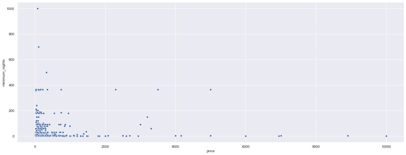
Through the price scatter chart, it can also be observed that the main prices are still distributed in the houses with the minimum reservation days of less than 200
region
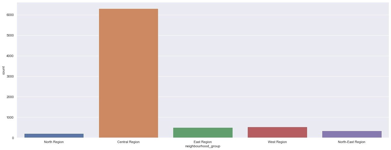
View the regional (geographical) distribution of houses: more houses are located in the Central Region.
sns.countplot(df["neighbourhood_group"])
plt.show()
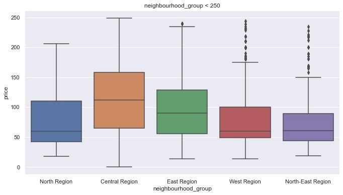
The above is the comparison of each area from the number of houses, and the following is the comparison of different areas
df1 = df[df.price < 250]   # More houses less than 250
plt.figure(figsize=(10,6))

sns.boxplot(x = 'neighbourhood_group',
            y = 'price',
            data=df1
           )

plt.title("neighbourhood_group < 250")

plt.show()
From the box diagram, you can see: houses in the Central Region
- House prices are more widely distributed
- The average of house prices is also higher than other places
- The price distribution is not compared with other values, which is more reasonable
The above is a comparison from the area of the house, and the following can find their specific longitude and latitude:
plt.figure(figsize=(12,8))

sns.scatterplot(df.longitude,
               df.latitude,
               hue=df.neighbourhood_group)

plt.show()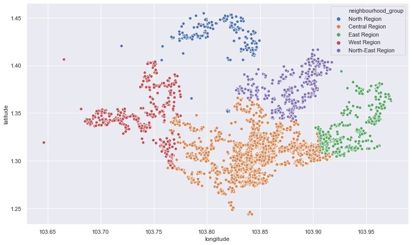
Heat map of house source distribution
In order to draw the thermal map of geographical location, you can learn this library: folium
import folium
from folium.plugins import HeatMap

m = folium.Map([1.44255,103.79580],zoom_start=11)

HeatMap(df[['latitude','longitude']].dropna(),
        radius=10,
        gradient={0.2:'blue',
                  0.4:'purple',
                  0.6:'orange',
                  1.0:'red'}).add_to(m)
display(m)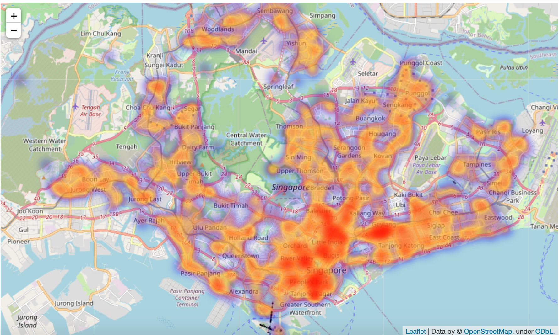
Room type room_type
Proportion of different room types
Count the total number and corresponding percentage of three different room types:
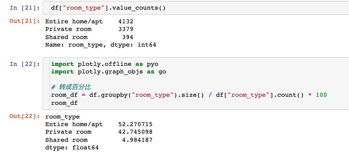
Visually compare the proportions of these three types:
labels = room_df.index
values = room_df.values

fig = go.Figure(data=[go.Pie(labels=labels,
                             values=values,
                             hole=0.5
                            )])

fig.show()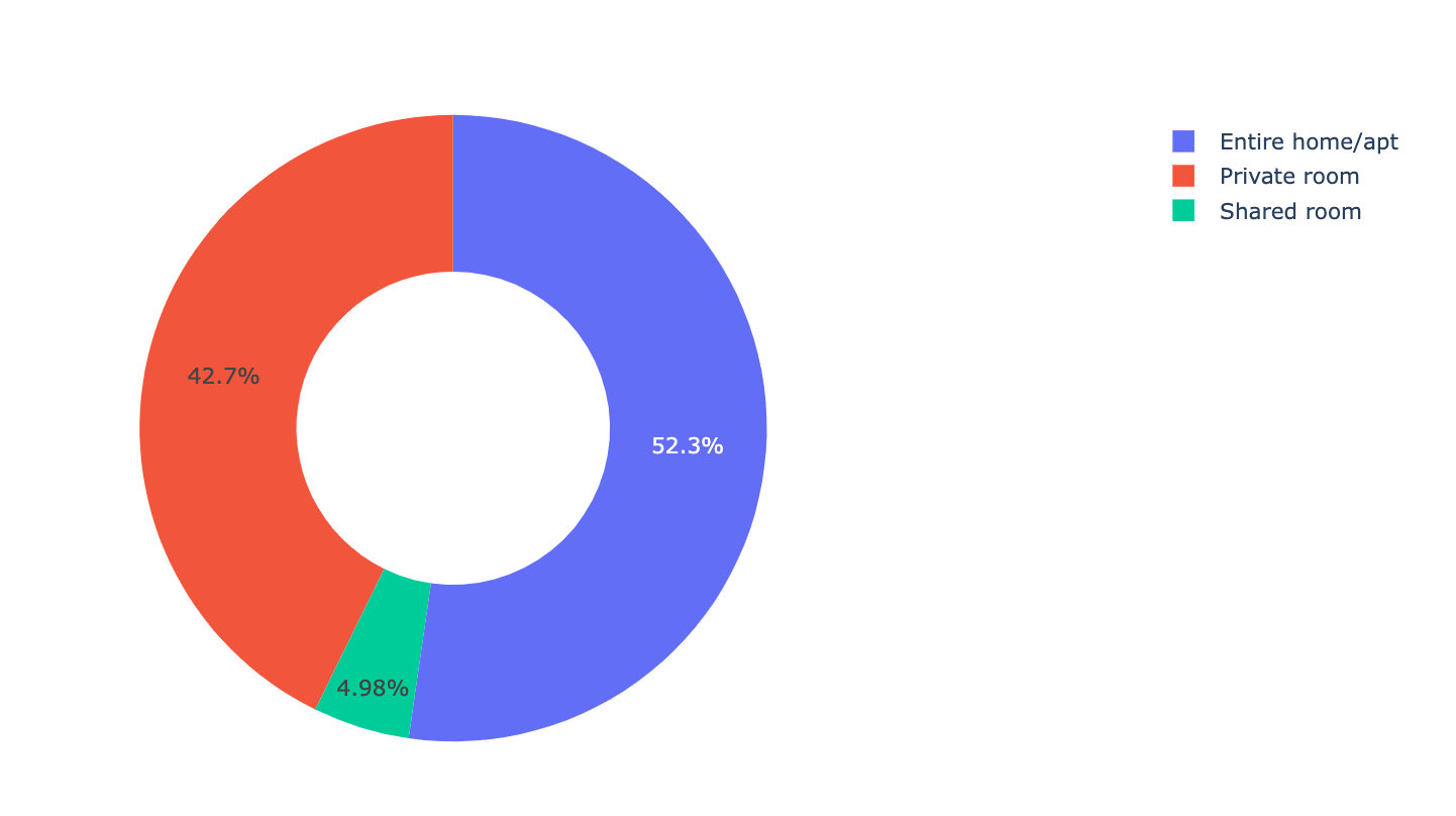
Conclusion: the whole rent or apartment accounts for the largest proportion of houses, which may be more popular.
Room types in different areas
plt.figure(figsize=(12,6))

sns.countplot(
    data = df,
    x="room_type",
    hue="neighbourhood_group"
)

plt.title("room types occupied by the neighbourhood_group")
plt.show()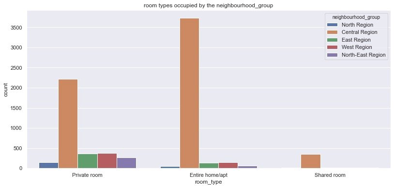
Comparing different types of rooms in different areas, we get the same conclusion: in different rooms_ Type, the Central Region has the most rooms
Personal addition: how to use plot to draw the above grouping chart?
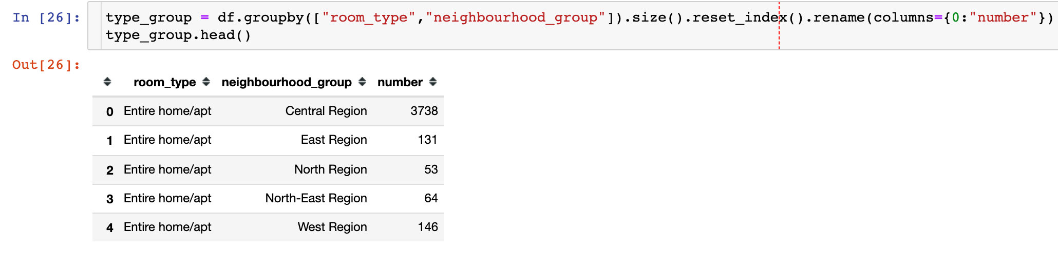
px.bar(type_group,
       x="room_type",
       y="number",
       color="neighbourhood_group",
       barmode="group")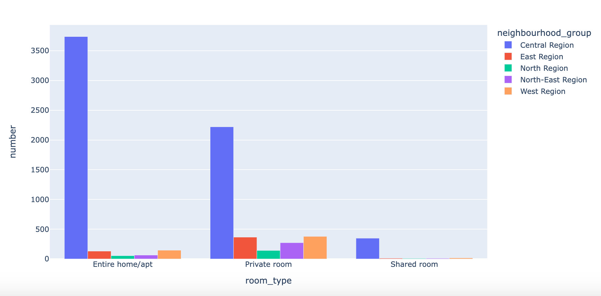
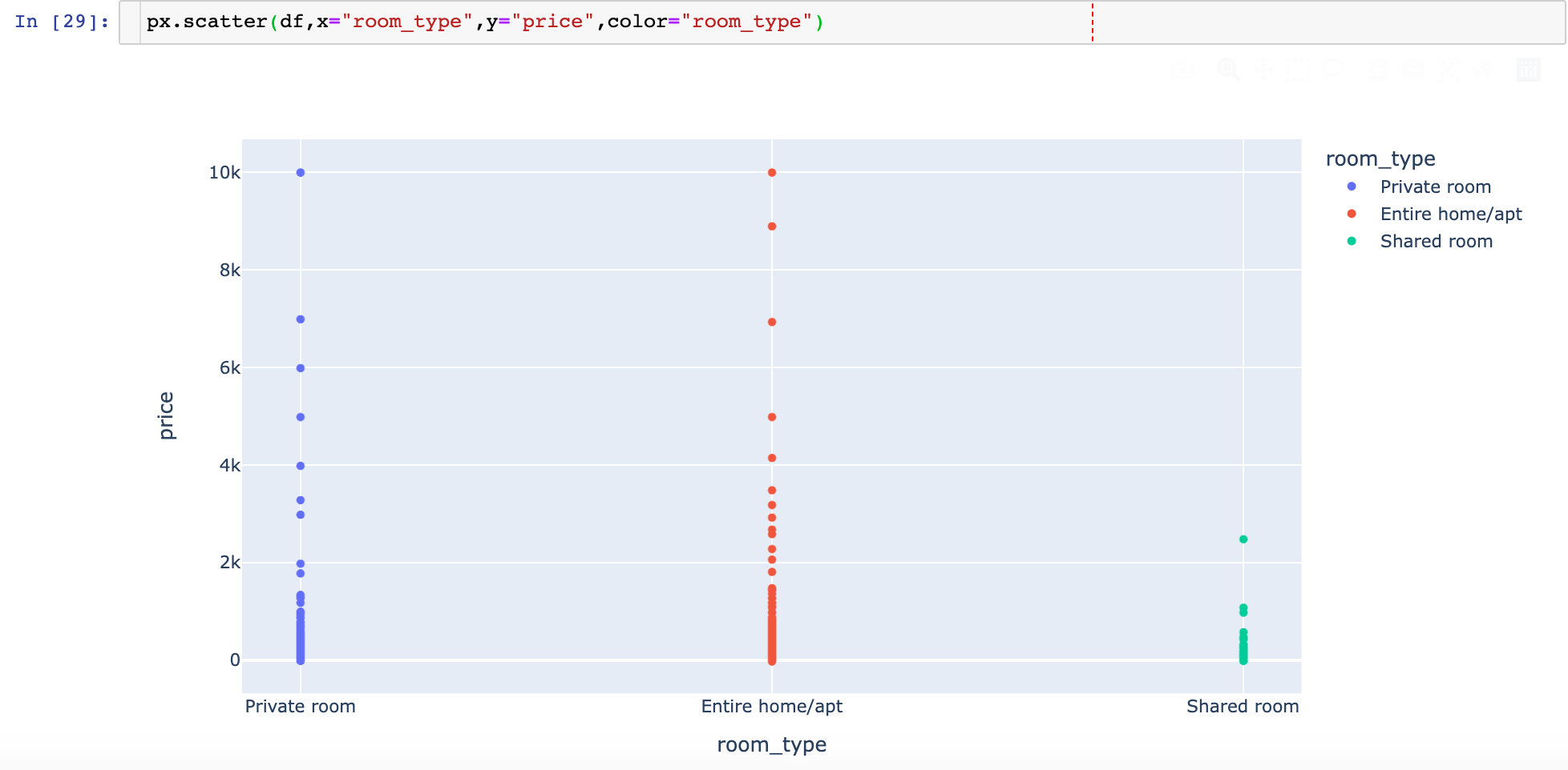
Room type and price relationship
plt.figure(figsize=(12,6))

sns.catplot(data=df,x="room_type",y="price")

plt.show()
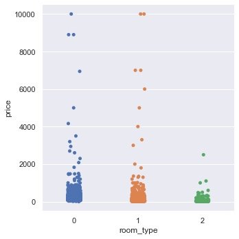
Personal addition: use Plotly to draw the version
Room name
Overall word cloud
Draw a word cloud based on the room name name:
from wordcloud import WordCloud, ImageColorGenerator
text = " ".join(str(each) for each in df.name)

wordcloud = WordCloud(
    max_words=200,
    background_color="white").generate(text)

plt.figure(figsize=(10,6))
plt.figure(figsize=(15,10))
plt.imshow(wordcloud, interpolation="Bilinear")

plt.axis("off")
plt.show()
- 2BR: 2 Bedroom Apartments
- MRT: Mass Rapid Transit, Metro in Singapore; Maybe there are more houses near the subway
Key in name
Keywords after cutting the name:
# Put all the data names in the list names
names = []
for name in df.name:
    names.append(name)

def split_name(name):
    """Function: cut each name"""
    spl = str(name).split()
    return spl


names_count = []
for each in names:  # Loop list names
    for word in split_name(each): # Cut each name
        word = word.lower()  # Unified to lowercase
        names_count.append(word)  # The results of each cut are placed in the list

# Counting Library
from collections import Counter
result = Counter(names_count).most_common()
result[:5]
top_20 = result[0:20]  # Top 20 high frequency words

top_20_words = pd.DataFrame(top_20, columns=["words","count"])
top_20_words
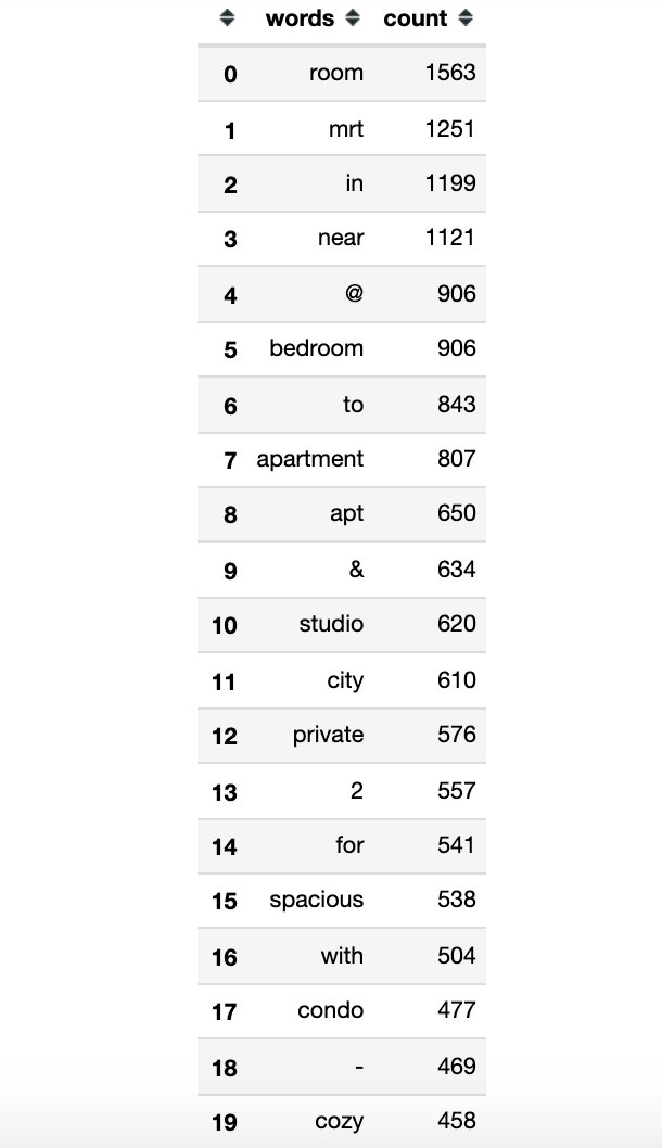
plt.figure(figsize=(10,6))

fig = sns.barplot(data=top_20_words,x="words",y="count")
fig.set_title("Counts of the top 20 used words for listing names")
fig.set_ylabel("Count of words")
fig.set_xlabel("Words")
fig.set_xticklabels(fig.get_xticklabels(), rotation=80)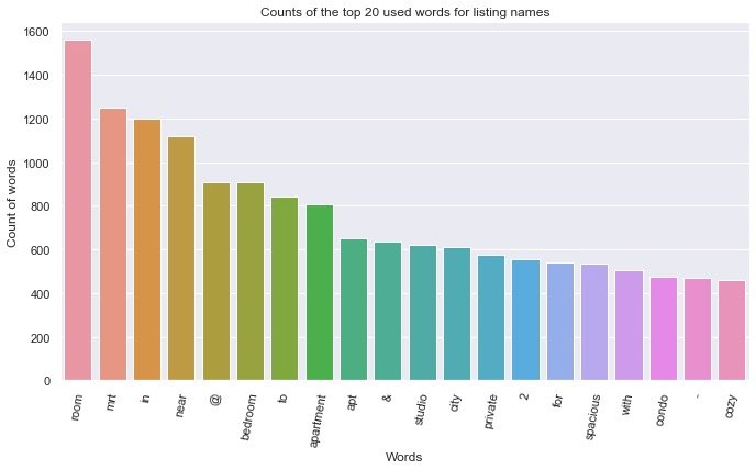
Return visit statistics
See which rooms have a high number of follow-up visits:
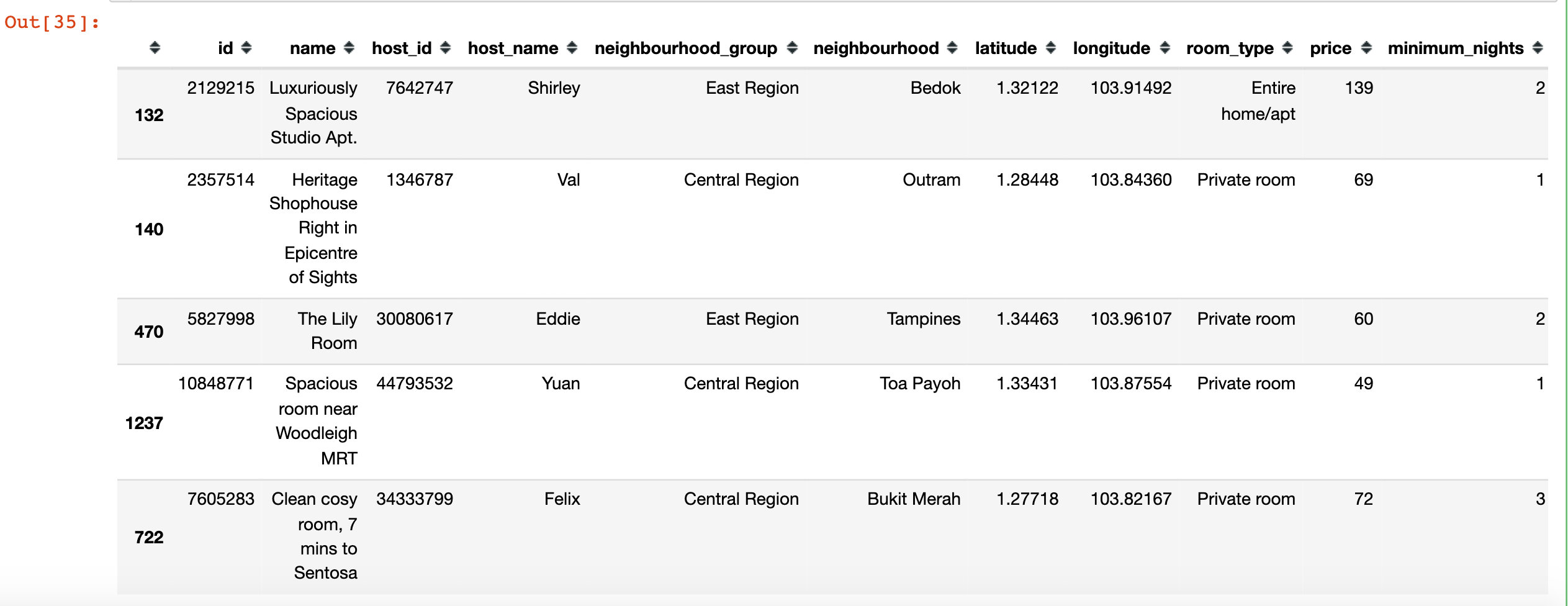
df1 = df.sort_values(by="number_of_reviews",ascending=False).head(1000)

df1.head()
import folium
from folium.plugins import MarkerCluster
from folium import plugins

print("Rooms with the most number of reviews")

Long=103.91492
Lat=1.32122

mapdf1 = folium.Map([Lat, Long], zoom_start=10)

mapdf1_rooms_map = plugins.MarkerCluster().add_to(mapdf1)

for lat, lon, label in zip(df1.latitude,df1.longitude,df1.name):
    folium.Marker(location=[lat, lon],icon=folium.Icon(icon="home"),
                 popup=label).add_to(mapdf1_rooms_map)

mapdf1.add_child(mapdf1_rooms_map)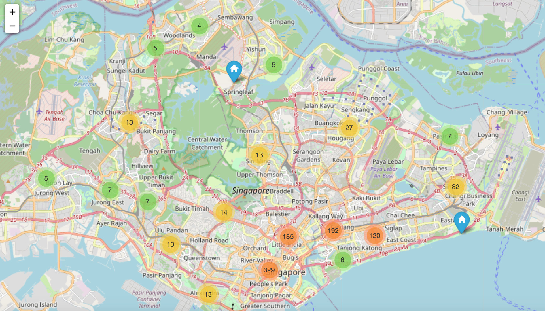
Rentable days
Comparison of rentable days of the house in a year under different longitude and latitude conditions:
plt.figure(figsize=(10,6))

plt.scatter(df.longitude,
            df.latitude,
            c=df.availability_365,
            cmap="spring",
            edgecolors="black",
            linewidths=1,
            alpha=1
           )

cbar=plt.colorbar()
cbar.set_label("availability_365")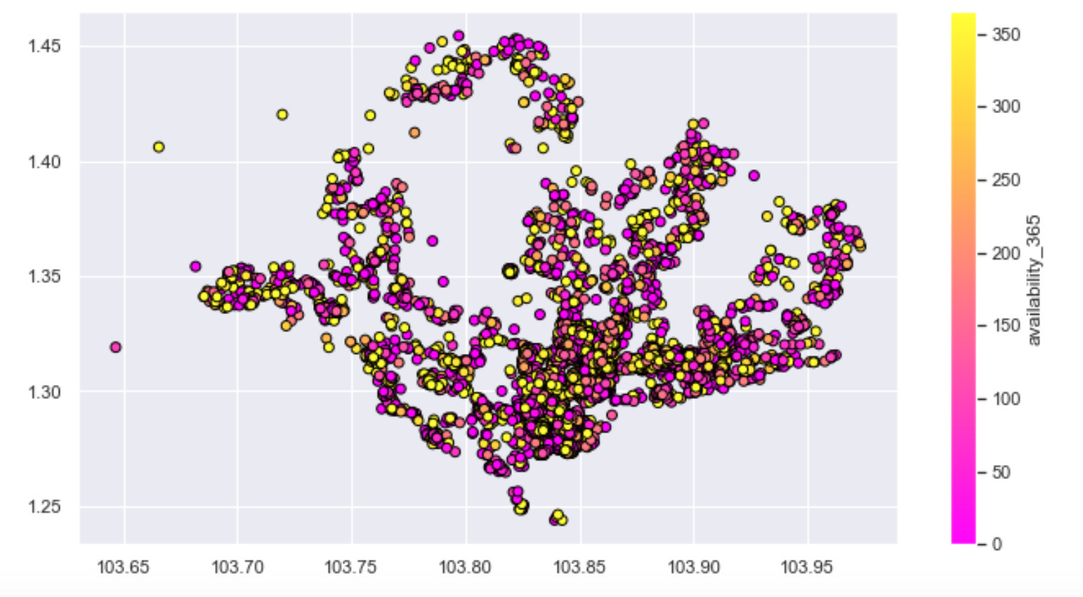
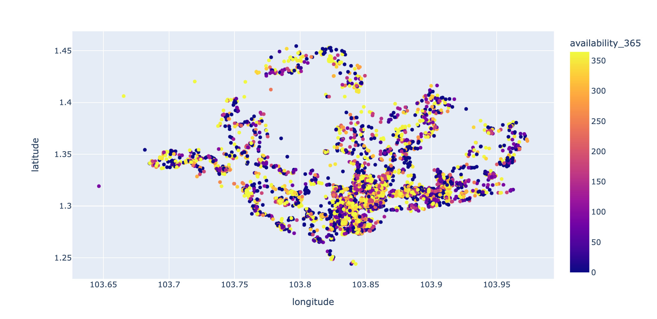
Personal addition: how to draw with plot?
# Plot version
px.scatter(df,x="longitude",y="latitude",color="availability_365")
Distribution of houses with price less than 500:
# Data with price less than 500

plt.figure(figsize=(10,6))
low_500 = df[df.price < 500]

viz1 = low_500.plot(
  kind="scatter",
  x='longitude',
  y='latitude',
  label='availability_365',
  c='price',
  cmap=plt.get_cmap('jet'),
  colorbar=True,
  alpha=0.4)
viz1.legend()
plt.show()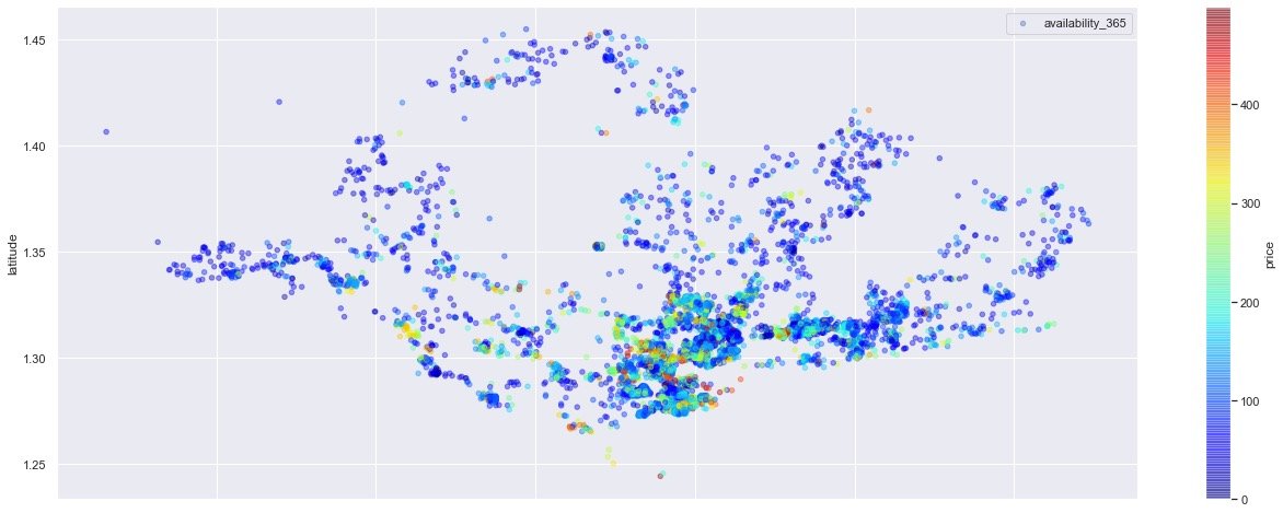
Added part: more concise version of Plotl8y
# Plot version
px.scatter(low_500,
           x='longitude',
           y='latitude',
           color='price'
          )
Linear regression modeling
Pretreatment
For the modeling scheme based on linear regression, delete the invalid fields first:
df.drop(["name","id","host_name"],inplace=True,axis=1)
Code type conversion:
cols = ["neighbourhood_group","neighbourhood","room_type"]

for col in cols:
    le = preprocessing.LabelEncoder()
    le.fit(df[col])
    df[col] = le.transform(df[col])

df.head()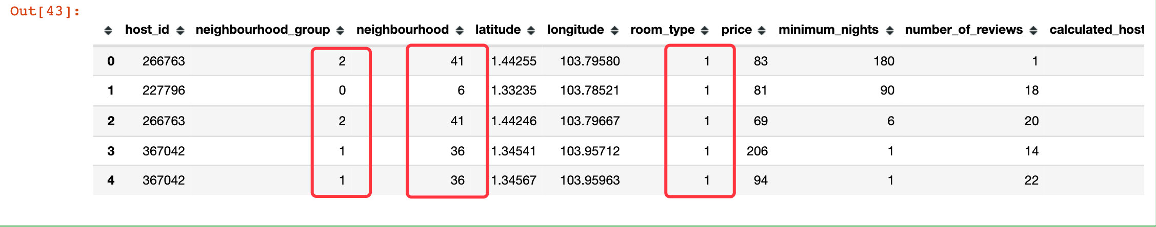
modeling
# Model instantiation
lm = LinearRegression()

# data set
X = df.drop("price",axis=1)
y = df["price"]

# Training set and test set
X_train, X_test, y_train, y_test = train_test_split(X, y, test_size=0.2, random_state=101)

lm.fit(X_train, y_train)
Test set validation
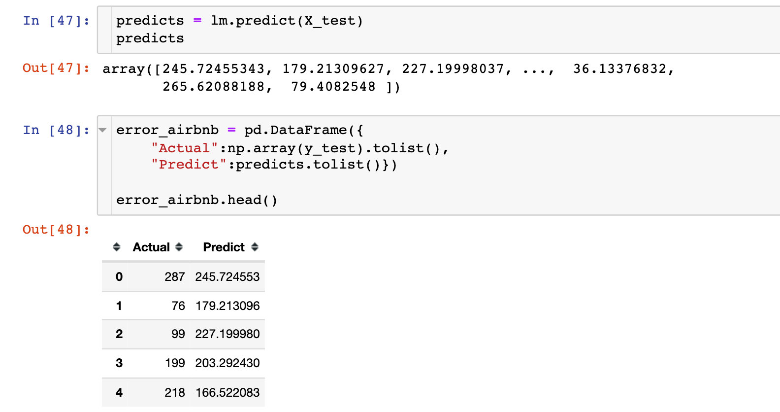
title=['Pred vs Actual']

fig = go.Figure(data=[
    go.Bar(name='Predicted',
           x=error_airbnb.index,
           y=error_airbnb['Predict']),

    go.Bar(name='Actual',
           x=error_airbnb.index,
           y=error_airbnb['Actual'])
])

fig.update_layout(barmode='group')
fig.show()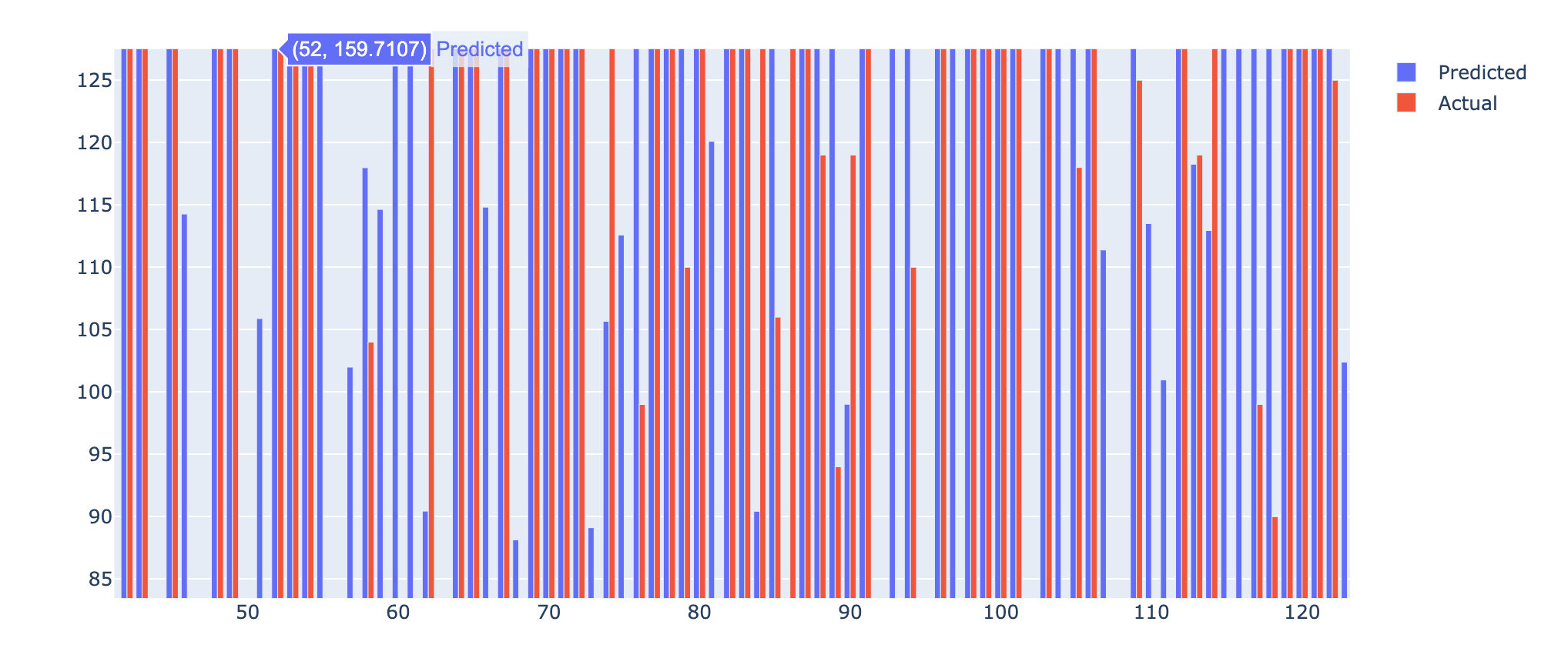
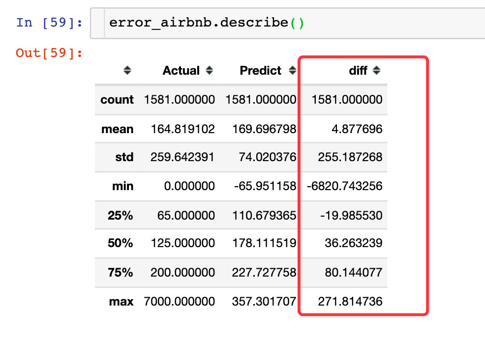
Personal addition: we compare the predicted value with the real value and make the difference diff (added field)
error_airbnb["diff"] = error_airbnb["Predict"] - error_airbnb["Actual"]
px.box(error_airbnb,y="diff")
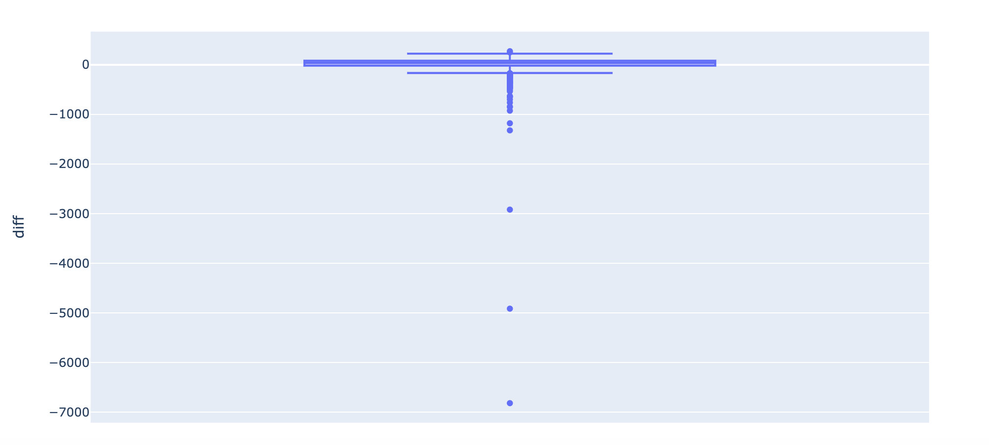
Through the box diagram of the difference value diff, we find that the real value and the predicted value are very different in some data.
It can also be seen from the descride attribute below: some cases have a difference of 6820 (absolute value), which is an abnormal value; The median of one quarter is - 19 and the difference is 19. On the whole, the two are still close