Pygal for Python data analysis: plotting stacked histogram, stacked line chart, pie chart and point chart
Posted by dunhamcd on Mon, 28 Oct 2019 21:18:41 +0100
2. Pygal draws stacked histogram, stacked line chart, point chart and pie chart
1) overlay
- The second group of data in the stack chart will be superimposed on the first group of data, and the accumulation effect of the two groups of data can be seen. The same can be seen for other groups of data.
(1) stacked histogram: Pygal.StackedBar()
import pygal
import random
year_data = [str(i) for i in range(2011, 2020)]
banana_data = [random.randint(20,40)*1000 for i in range(1, 10)]
apple_data = [random.randint(35,60)*1000 for i in range(1, 10)]
garph = pygal.StackedBar()
garph.add('Annual sales of bananas', banana_data)
garph.add('Apple's annual sales', apple_data)
garph.x_labels = year_data
garph.y_label_rotation = 45
garph.title = 'Sales analysis of banana and apple over the years'
garph.x_title = 'Particular year'
garph.y_title = 'Sales volume (ton)'
garph.legend_at_bottom = True
garph.margin = 35
garph.show_x_guides = True
garph.show_y_guides = True
garph.render_to_file('fruit.svg')

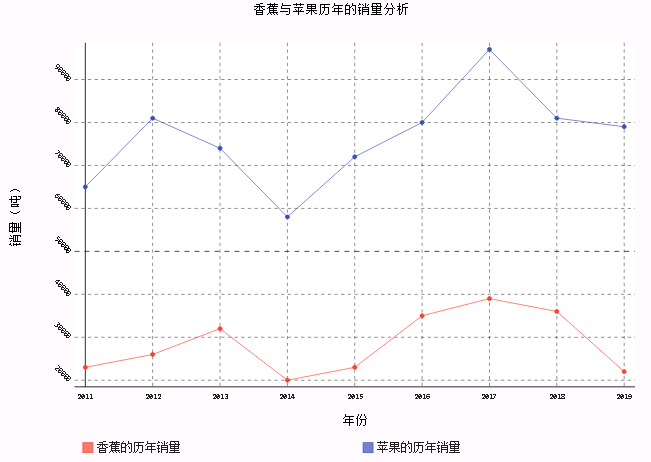
(2) stacked line chart: pygal. Stackeline()
garph = pygal.StackedLine()
garph.add('Annual sales of bananas', banana_data)
garph.add('Apple's annual sales', apple_data)
garph.x_labels = year_data
garph.y_label_rotation = 45
garph.title = 'Sales analysis of banana and apple over the years'
garph.x_title = 'Particular year'
garph.y_title = 'Sales volume (ton)'
garph.legend_at_bottom = True
garph.margin = 35
garph.show_x_guides = True
garph.show_y_guides = True
garph.render_to_file('fruit.svg')
(3) horizontal overlay
- HorizontalStackedBar(): horizontal stacked histogram
- Horizontalstackeline(): horizontal stacked line chart
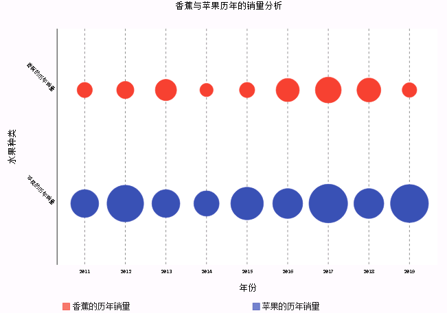
2) point graph: pygal.Dot ()
- Point graphs use the size of points (circles) to represent the size of values
garph = pygal.Dot()
garph.add('Annual sales of bananas', banana_data)
garph.add('Apple's annual sales', apple_data)
garph.x_labels = year_data
garph.title = 'Sales analysis of banana and apple over the years'
garph.x_title = 'Particular year'
garph.y_title = 'Fruit types'
garph.y_label_rotation = 45
garph.legend_at_bottom = True
garph.margin = 35
garph.show_x_guides = True
garph.show_y_guides = False
garph.render_to_file('fruit.svg')
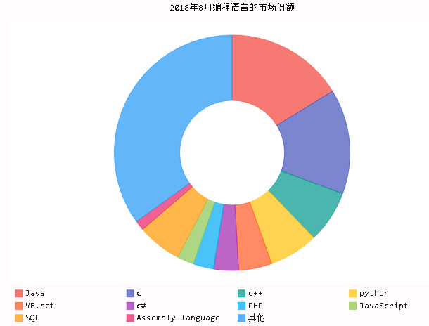
3) pie chart
(1) traditional pie chart: pygal.Pie()
import pygal
data = {'Java':0.16881, 'c':0.14996, 'c++':0.07471, 'python':0.06992, 'VB.net':0.04762, 'c#':0.03541, 'PHP':0.02925, 'JavaScript':0.02411, 'SQL':0.06316, 'Assembly language':0.01409, 'Other':0.36326}
graph = pygal.Pie()
for k in data.keys():
graph.add(k, data[k])
graph.title = '2018 Market share of programming languages in August'
graph.legend_at_bottom = True
graph.render_to_file('language.svg')

(2) hollow pie chart
- Inner radius: set the inner radius of pie chart
graph = pygal.Pie()
for k in data.keys():
graph.add(k, data[k])
graph.title = '2018 Market share of programming languages in August'
graph.legend_at_bottom = True
graph.inner_radius = 0.5
graph.render_to_file('language.svg')
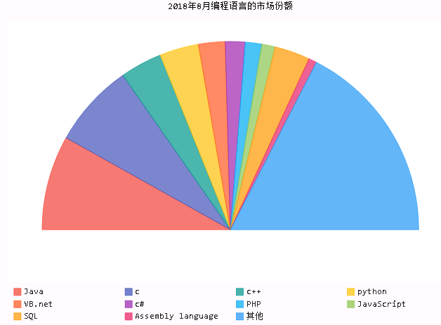
(3) semicircle pie
graph = pygal.Pie()
for k in data.keys():
graph.add(k, data[k])
graph.title = '2018 Market share of programming languages in August'
graph.legend_at_bottom = True
graph.half_pie = True
graph.render_to_file('language.svg')
Topics:
Programming
Java
Python
PHP