definition
The position attribute is used to specify the position of an element on the web page. It is mainly described through three dimensions: benchmark, whether to take off the mark and occupy the position, and whether to set the margin. There are five positioning methods: static, relative, absolute, fixed and sticky. Before talking about positioning, let's talk about several concepts: normal mode and off standard:
Normal mode:
The so-called normal mode, that is, the normal position, does not affect the layout of the next element, that is, it does not float. Common are block level elements and inline elements:
- Block level elements (typically such as DIV) are arranged vertically in the browser window (view point) - each will be displayed on a new line below the previous element, and their outer margins will separate them. Common examples are multiple div:
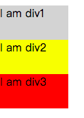
// html
<body>
    <div>I am div1</div>
    <div>I am div2</div>
    <div>I am div3</div>
</body>

// css
div {
	background-color: lightgrey;
	width: 100px;
	height: 50px;
}
div:nth-child(2) {
	background-color: yellow;
	width: 100px;
	height: 50px;
}
div:last-child {
	background-color: red;
	width: 100px;
	height: 50px;
}
- Inline elements behave differently -- they don't appear on new lines; Instead, they are on the same line with each other and any adjacent (or wrapped) text content, as long as there is space within the width of the parent block level element. If there is no space, the overflowing text or element moves down to a new line.
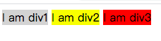
// html
<body>
    <span>I am span1</span>
    <span>I am span2</span>
    <span>I am span3</span>
</body>
// css
span {
	background-color: lightgrey;
	width: 100px;
	height: 50px;
}
span:nth-child(2) {
	background-color: yellow;
	width: 100px;
	height: 50px;
}
span:last-child {
	background-color: red;
	width: 100px;
	height: 50px;
}
Off label
The so-called de labeling is to break away from the "standard flow" (some are called "normal flow", English is "normal flow"). The original position will no longer be occupied, and the next element will occupy its position. At this time, the elements will overlap. Set the z-index size to display the overlapping order of elements.
static positioning
Static is the default positioning method of the browser. If position is not added to the element style, it is static positioning. The positioning features are:
- Benchmark: determine the layout of elements according to the order of codes. The normal display mode is the so-called "standard flow".
- Edge offset: invalid by setting top right bottom left.
- Off label: without off label, it normally occupies the proper position and does not affect the layout of the next element.
- Usage scenario: clear the location, that is, for a box with non static location, if you don't want to locate it, use static to clear it. It is very important in the browser debugging process. For example, you can use static to see where the original location should be.

// html
<body>
    <div>test static position</div>
</body>

// css
div {
  background-color: pink;
  top: 100px;
}
relative positioning
Relative relative positioning mode, which is characterized by:
- Benchmark: its position in static positioning mode is used as the benchmark, commonly known as the default position of the element.
- Edge offset: it must be accurately positioned by setting top / right / bottom / left.
- Off label: without off label, it normally occupies the proper position, does not affect the layout of the next element, and the next element still views it as "standard flow".
- Usage scenario: a commonly used formula "the child must be the parent". If the child element needs to set absolute positioning, the parent element can set relative. Of course, there are other scenarios, which are not listed here.
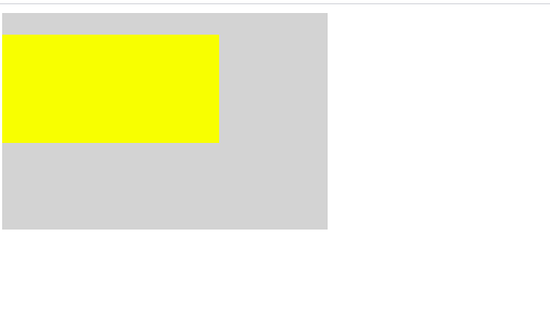
<body>
    <div class="father">
        <div class="son"></div>
    </div>
</body>

// css
.father {
	background-color: lightgrey;
	width: 300px;
	height: 200px;
}
.son {
	background-color: yellow;
	position: relative;
	top: 20px;
	width: 200px;
	height: 100px;
}
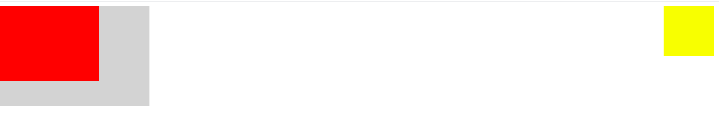
absolute positioning
Absolute absolute positioning mode, which is characterized by:
- Benchmark: it is usually the parent element, but the premise is that the parent element sets a non static positioning. If the parent element does not set positioning, the browser window will be used as the base point.
- Edge offset: it must be accurately positioned by setting top / right / bottom / left.
- Off label: completely off label, not occupying the proper position, affecting the layout of the next element. The next element is deemed to be non-existent.
- Usage scenario: if an element needs to be aligned with the (0, 0) coordinate point of the parent element, you can immediately think of absolute. You can also use absolute if you need to convert it to inline block mode.
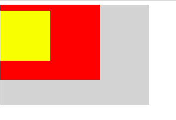
//html
<body>
    <div class="father">
        <div class="son"></div>
        <div class="son2"></div>
    </div>
</body>
// css
.father {
	background-color: lightgrey;
	width: 300px;
	height: 200px;
}
.son {
	background-color: yellow;
	position: absolute;
	top: 20px;
	width: 100px;
	height: 100px;
}
.son2 {
	background-color: red;
	top: 20px;
	width: 200px;
	height: 150px;
}
fixed positioning
Fixed fixed positioning mode, which is characterized by:
- Base point: the browser window is the base point. No matter how the page is laid out and scrolled, the position will be fixed.
- Edge offset: it must be accurately positioned by setting top / right / bottom / left.
- Off label: completely off label, not occupying the proper position, affecting the layout of the next element. The next element is deemed to be non-existent.
- Usage scenario: for example, the abominable advertisement on the page will stop there no matter how you slide.
// html
<body>
    <div class="father">
        <div class="son"></div>
        <div class="son2"></div>
    </div>
</body>

// css
.father {
	background-color: lightgrey;
	width: 300px;
	height: 200px;
}
.son {
	background-color: yellow;
	position: fixed;
	right: 10px;
	width: 100px;
	height: 100px;
}
.son2 {
	background-color: red;
	top: 20px;
	width: 200px;
	height: 150px;
}
sticky positioning
Sticky sticky positioning mode, which actually includes two positioning modes: relative and fixed, but does not exist at the same time. A trigger condition is required, that is, the fixed mode will be switched after the value of edge offset top / right / bottom / left is reached. Different positioning modes show the positioning characteristics of this mode respectively.
- Datum point: in relative mode, its own position is taken as the datum point; The fixed mode is based on the browser window.
- Edge offset: if you set top / right / bottom / left, you will have both relative and fixed positioning modes. If not set, it defaults to relative,
- Off standard: relative non off standard, fixed off standard
- Usage scenario: for example, the abominable advertisement on the page will stop there no matter how you slide.
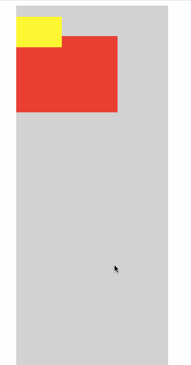
// html
<body>
    <div class="father">
        <div class="son"></div>
        <div class="son2"></div>
    </div>
</body>

// css
.father {
	background-color: lightgrey;
	position: relative;
	left: 200px;
	width: 300px;
	height: 1000px;
}
.son {
	background-color: yellow;
	position: sticky;
	top: 30px;
	width: 90px;
	height: 60px;
}
.son2 {
	background-color: red;
	top: 20px;
	width: 200px;
	height: 150px;
}
epilogue
The above is the explanation of various positioning. It may be very complicated in practical work, but it is basically the ingenious use of these positioning. If there is any error in the description, please leave a message and comment. The code sub code diagram is not easy, and the code gif diagram is even more difficult. Please indicate the source for reprint. Thank you.