Recently, I saw a literature that used the data in GBD database to predict the development trend of disease burden. I found it very interesting, so I took the time to repeat the key methods in R language.
reference:
Changing trends in the disease burden of esophageal cancer in China from 1990 to 2017 and its predicted level in 25 years
DOI: 10.1002/cam4.3775
1. Installation of relevant R package
Three R packages are mainly used, one by one:
1.1 Nordpred package
Used for nordpred age period cohort (APC) analysis
Note that this package is not on r-cran. You need to use the remotes package to download it from github
install.packages("remotes")
library(remotes)
remotes::install_github("haraldwf/nordpred")
library(nordpred)
If the download is slow, you can download the package I saved on Baidu cloud disk
Link: https://pan.baidu.com/s/1DmooS88GtWVRflcelJ71sQ
Extraction code: jm4q
Then install it locally
install.packages("F:/R_packages/haraldwf-nordpred-ef83b2c.tar.gz", repos = NULL, type = "source")
1.2 INLA package
To take advantage of the integrated needed Laplace approximation (INLA) approach
install.packages("INLA", repos = "https://inla.r-inla-download.org/R/stable", dependencies = TRUE)
It's troublesome to go directly. I've tried several times and failed to drop the line halfway. Use the package I shared
#A package foreach needs to be pre installed before installing INLA
install.packages('foreach')
install.packages("F:/R_packages/INLA_21.02.23.zip", repos = NULL, type = "source")
1.3 BAPC package
In order to use Bayesian age period cohort models, age specific and age standardized projected rates can be generated
#Some packages need to be pre installed before installing BAPC
install.packages("cmprsk")
install.packages("fanplot")
install.packages("Epi")
#Then download and install BAPC package
install.packages("BAPC", repos = "http://R-Forge.R-project.org")
library(BAPC)
Reminder: common errors include low rlang package version, which can be unloaded and reinstalled:
remove.packages('rlang')
install.packages('rlang')
Similarly, if the BAPC package is not downloaded smoothly, you can use the package stored on my cloud disk for local installation:
install.packages("F:/R_packages/BAPC_0.0.34.tar.gz", repos = NULL, type = "source")
2. Data preparation
(1) GBD data download: http://ghdx.healthdata.org/gbdresults-tool
The case here is the Chinese esophageal cancer article published on cancer medicine, using the data of GBD 2017; Currently updated to GBD 2019; Select the required conditions on the official website, and then download csv;
(2) Population forecast data: https://population.un.org/wpp/Download/Standard/CSV/
(3) Standardization of population structure, who 2000-2025 standard: https://seer.cancer.gov/stdpopulations/world.who.html
3. Model explanation (can be omitted)
The following is my personal understanding. Because I am only a clinical doctor, my understanding of the model may not be accurate enough, so this paragraph can be omitted.
The model bases of nordpred packages and BAPC packages are all **Age-Period-Cohort (APC) * models, which are based on the correlation between incidence rate or mortality rate, age structure and population size. The basis of mining this association is also generalized linear model (GLM). There are two GLMs in the nordpred package:
- power model is the index model. At that time, when this model was applied to cancer prediction (Moller et al.), it was considered that it was best to use when the index was 5, and the fixed index model with index 5 was also used in nordpred package;
- Poisson log link model, which is also a classic one, satisfies Poisson distribution after log transformation;
Based on the above, APC model can be built under the framework of traditional probability theory or Bayesian framework, which is Bayesian age period cohort models (BAPC).
Some literatures mentioned an APC model with random exponential model as link function under the Bayesian framework. It was explained very carefully. There are specific equations and evaluation methods. It is suggested to refer to:
Verena Jürgens et al. A Bayesian generalized age–period–cohort power model for cancer projections;
DOI: 10.1002/sim.6248
INLA: integrated nested Laplace approximation (INLA) approach
There is a famous method in Bayesian inference: Markov chain, but this method is inefficient and slow. ILNA method, as an alternative to the low computational density of Markov chain, is used for approximate Bayesian inference in hidden Gaussian model. The APC model built under the INLA framework is provided in the bapc package. Description on the official website: package implementing Bayesian age period cohort models with the focus on projects BAPC uses integrated nested Laplace approximations (INLA) for full Bayesian inference. BAPC generates age-specific and age-standardized projected rates. When interest lies in the predictive distribution, Poisson noise is automatically added.
4. Model establishment and operation
4.1 building APC model with nordpred
For details of nordpred package, see: https://rdrr.io/github/haraldwf/nordpred/man/nordpred.html
It also comes with an example, which can be pasted and run directly
4.1.1 data sorting
(1) data of esophageal cancer, age, 1990-2017 years, China (male incidence rate).
be careful:
- nordpred has 18 age groups by default. If it does not meet the requirements, an error will be reported. Because there is no data or 0 for esophageal cancer under the age of 15, it is a group.
- The nordpred package model can predict up to five values. If you enter the annual data from 1990 to 2017, you can predict the value from 2018 to 2022; Therefore, in order to predict the incidence in 2042, the data from 1990 to 2017 are calculated as a group of five years (1990-1992 is a group of three years);
esoph <-  fread('F:/nordpred/esoph.csv')
unique(esoph$age_name)
ages <- c("15 to 19", "20 to 24", "25 to 29",
          "30 to 34", "35 to 39", "40 to 44", "45 to 49", "50 to 54", "55 to 59",
          "60 to 64", "65 to 69", "70 to 74", "75 to 79", "80 to 84", "85 to 89",
          "90 to 94", "95 plus")
### for incidence for male
esoph_ages <- esoph[age_name %in% ages &
                      sex_name == 'Male' &
                      metric_name == 'Number' &
                      measure_name == 'Incidence',
                    .(age_id, age_name, year, val)]
#esoph_ages <- esoph_ages[order(age_id),]
esoph_ages_n <- dcast(data = esoph_ages, age_id + age_name ~ year)
rownames(esoph_ages_n) <- c("15-19", "20-24", "25-29", "30-34",
                            "35-39", "40-44", "45-49", "50-54",
                            "55-59", "60-64", "65-69", "70-74",
                            "75-79", "80-84", "85-89", "90-94","95+")
esoph_ages_n["0-14",] <- 0
esoph_ages_n <- esoph_ages_n[order(esoph_ages_n$age_id),]

#Here we need to set the number of haircut diseases in a group of 5 years, and I took the average; Because there is a lot of repetitive work, I wrote a function to complete it. The function code is shown at the end of the article
#The parameters are the name of the table to be sorted, the start year, the end year, and the year as the end of the observation data
esoph_ages_g <- function_year5(esoph_ages_n , 1990, 2017, 2017)
Effect after finishing:
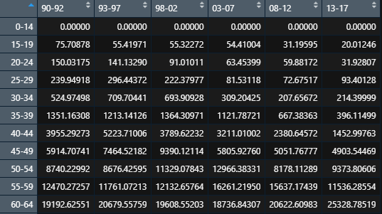
(2) Population structure arrangement of China from 1990 to 2042
be careful:
- The data from 1990 to 2042 are averaged according to a group of five years (1990-1992 is a group of three years);
- The unit of source data is every 1000 people, so it is * 1000 when extracting
population <- fread('F:/nordpred/WPP2019_PopulationByAgeSex_Medium.csv')
china_population <- population[Location == 'China',]
unique(china_population$AgeGrp)
china_population_1990_2017 <- china_population[Time %in% 1990:2042,
                                               .(Age_id = 1:21, AgeGrp, Time, PopMale = PopMale*1000)]
china_population_1990_2017_n <- dcast(data = china_population_1990_2017, Age_id +  AgeGrp ~ Time)
#calculation of 95+
china_population_1990_2017_n[22, 3:55] <- china_population_1990_2017_n[20, 3:48] + china_population_1990_2017_n[21, 3:55]
china_population_1990_2017_n[1, 3:55] <- china_population_1990_2017_n[1, 3:48] + china_population_1990_2017_n[2, 3:55] + china_population_1990_2017_n[3, 3:55]
china_population_1990_2017_n <- china_population_1990_2017_n[-c(2,3,20,21),]
rownames(china_population_1990_2017_n) <- c("0-14", "15-19", "20-24", "25-29", "30-34",
                                            "35-39", "40-44", "45-49", "50-54",
                                            "55-59", "60-64", "65-69", "70-74",
                                            "75-79", "80-84", "85-89", "90-94","95+")

china_population_1990_2017_g <- function_year5(china_population_1990_2017_n, 1990, 2042, 2017)
Effect after finishing:

(3) World standardized population
## data for age-standardization
age_stand <- read_file('F:/nordpred/AS.txt')
age_stand <- gsub(pattern = '\n', replacement = '\t', x = age_stand)
age_stand <- gsub(pattern = '\r', replacement = '', x = age_stand)
age_stand <- strsplit(x = age_stand, split = '\t')
age_stand <- matrix(data = unlist(age_stand), ncol = 5, byrow = T) %>% as.data.table()
colnames(age_stand) <- age_stand[1,] %>% as.character()
age_stand <- age_stand[-1,]
write.csv(age_stand, 'F:/nordpred/age_stand.csv')
#The previous steps can be omitted. I have sorted them and uploaded them to Baidu cloud together with R package

wstand <- c(age_stand$`WHO World Standard (%)`[1:3] %>% as.numeric() %>% sum(),
            age_stand$`WHO World Standard (%)`[4:19] %>% as.numeric(),
            age_stand$`WHO World Standard (%)`[20:21] %>% as.numeric() %>% sum() - 0.035)/100
#sum of wstand must be 1
sum(wstand)
4.1.2 APC model and reprint paper FIgure 6 A
The parameters are not detailed. You can see them in R. as long as the data is sorted out, there is basically no problem.
The link function is a fixed exponential model: linkfunc = 'power5';
The starting age is the second group: startestage = 2, startuseage = 2;
Everything else is the default
## nordpred and plot
res <- nordpred(esoph_ages_g, china_population_1990_2017_g,
                noperiods = 4, startestage = 2, startuseage = 2,
                cuttrend = c(0, .25, .5, .75, .75), linkfunc = "power5", recent = FALSE)
plot(res, standpop = wstand, new = TRUE)
I added a mortality calculation, and the results are shown in the figure below (the unit of ordinate is morbidity / mortality per 100000 people);
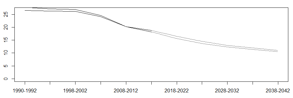
Original drawing in the paper:

4.1.3 reprint paper Figure 6 B-C
B is similar to C. here, take the male mortality in C as an example. According to the description of the paper, each group of lines can be composed of three parts:
(1) The number of deaths observed between 1990 and 2017, in dots, is relatively simple
esoph_all <- esoph[age_name == 'All Ages' &
                      sex_name == 'Male' &
                      metric_name == 'Number' &
                      measure_name == 'Deaths',
                    .(year, val)]
ggplot(data = esoph_all,aes(x = year, y = val)) + geom_point()
(2) if the incidence rate is the same as in 2017, or increase by 1% annually on the basis of the 2018-2042 year, or decrease by 1% on the basis of this year, the shadow line will be added to the shadow line.
- Incidence rate of age groups in 2017
rate_2017 <- esoph[age_name %in% ages &
                     sex_name == 'Male' &
                     metric_name == 'Number' &
                     measure_name == 'Deaths' &
                     year == 2017,
                   .(age_id, age_name, val)]

 temp <-  data.frame(age_id = 0, age_name = '0-14', val = 0)
 rate_2017 <- rbind(rate_2017, temp)
rate_2017 <- rate_2017[order(rate_2017$age_id),]

pop_2017 <- china_population_1990_2017_n %>% as.data.table()
pop_2017 <-  pop_2017[, .(age_name = c("0-14", "15-19", "20-24", "25-29", "30-34",
                       "35-39", "40-44", "45-49", "50-54",
                        "55-59", "60-64", "65-69", "70-74",
                        "75-79", "80-84", "85-89", "90-94","95+"),
                         val = pop_2017$'2017')]

rate_2017$val <- 100000 * rate_2017$val/pop_2017$val
- If 2018 and beyond, the incidence rate will be maintained in 2017.
new_years <- seq(2018, 2042, 1) %>% as.character()
china_all_3 <- data.frame(year = rep(0, 25), number = rep(0, 25), se = seq(29:53))
for (i in 1:25) {
  china_all_3$year[i] <- new_years[i]
  china_all_3$number[i] <- sum(china_pop[, new_years[i]] * rate_2017[, val]) / 100000
}
- 1% per year
 #1% up
rate_2017_u <- rate_2017 %>% as.data.frame()

new_years <- seq(2018, 2042, 1) %>% as.character()
for (i in 1:25){
  rate_2017_u[, new_years[i]] <- rate_2017_u$val * (1.01 ^ (i - 1))
}

china_all_4 <- data.frame(year = rep(0, 25), number = rep(0, 25), se = seq(29:53))
for (i in 1:25) {
  china_all_4$year[i] <- new_years[i]
  china_all_4$number[i] <- sum(china_pop[, new_years[i]] * rate_2017_u[, new_years[i]]) / 100000
}
- 1% per year
rate_2017_u <- rate_2017 %>% as.data.frame()

new_years <- seq(2018, 2042, 1) %>% as.character()
for (i in 1:25){
  rate_2017_u[, new_years[i]] <- rate_2017_u$val * (0.99 ^ (i - 1))
}

china_all_5 <- data.frame(year = rep(0, 25), number = rep(0, 25), se = seq(29:53))
for (i in 1:25) {
  china_all_5$year[i] <- new_years[i]
  china_all_5$number[i] <- sum(china_pop[, new_years[i]] * rate_2017_u[, new_years[i]]) / 100000
}
- Mapping
china_all_4$number_up <- china_all_4$number
china_all_4_5 <- cbind(china_all_5, china_all_4[4])
ggplot() +
  geom_line(data = china_all_3, aes(x = as.numeric(year), y = number), linetype = 'dashed') +
  geom_ribbon(data = china_all_4_5, aes(x = as.numeric(year), ymin = number, ymax = number_up), alpha = 0.4)
(3) APC forecast from 2018 to 2042
- Method 1: the incidence of the group was calculated based on the predicted incidence rate of each 5 year group and the average population size of the 5 year group.
result <- round(nordpred.getpred(res, incidence = TRUE, standpop = NULL), 2)
rownames(result) <- c("0-14", "15-19", "20-24", "25-29", "30-34",
                      "35-39", "40-44", "45-49", "50-54",
                      "55-59", "60-64", "65-69", "70-74",
                      "75-79", "80-84", "85-89", "90-94","95+")
china_annual <- china_population_1990_2017_g
china_annual$age_names <- rownames(china_annual)

years <- colnames(china_annual)
china_all <- data.frame(year = rep(0, 11), number = rep(0, 11), se = seq(1:11))

for (i in 1:11) {
  china_all$year[i] <- years[i]
  china_all$number[i] <- sum(china_annual[, years[i]] * result[, years[i]]) / 100000
}
china_all$new_year <- c(1991, 1995, 2000, 2005, 2010, 2015, 2020, 2025, 2030, 2035, 2040)
ggplot(data = china_all, aes(x = new_year, y = number)) + geom_line()

#The effect is equivalent to:
plot(res, incidence = F, standpop = NULL, new = TRUE)
- Method 2: the incidence of the group was calculated based on the predicted incidence rate of each 5 year group and the average population size of the 5 year group.
china_all_years <- NULL
for(i in 1:11){
  if(china_all$year[i] == '1990-1992'){
    china_all_years <- append(china_all_years, rep(china_all$number[i], 3))
  }
  else{
    china_all_years <- append(china_all_years, rep(china_all$number[i], 5))
  }
}

china_all_years <- data.frame(year = seq(1990, 2042, 1), number = china_all_years)
ggplot(data = china_all_years, aes(x = year, y = number)) + geom_line()
- Method 3: calculate the incidence of the disease in each 5 year group based on the predicted incidence rate and the annual population situation.
result2 <- round(nordpred.getpred(res, incidence = TRUE, standpop = NULL), 2)
years <- colnames(result2)

temp <- NULL
for (i in 1:11) {
  if(years[i] == '1990-1992'){
    temp <- append(temp, rep(years[i], 3))
  }
  else{
    temp <- append(temp, rep(years[i], 5))
  }
}

result2 <- result2[, temp]
colnames(result2) <- seq(1990, 2042, 1) %>% as.character()


new_years <- colnames(result2)

china_pop <- china_population_1990_2017_n[,3:55]
china_all_2 <- data.frame(year = rep(0, 53), number = rep(0, 53), se = seq(1:53))
for (i in 1:53) {
  china_all_2$year[i] <- new_years[i]
  china_all_2$number[i] <- sum(china_pop[, new_years[i]] * result2[, new_years[i]]) / 100000
}
china_all_2$new_year <- seq(1990, 2042, 1)
ggplot(data = china_all_2, aes(x = new_year, y = number)) + geom_point()
- Drawing summary
ggplot() +
  geom_line(data = china_all_3, aes(x = as.numeric(year), y = number), linetype = 'dashed') +
  geom_ribbon(data = china_all_4_5, aes(x = as.numeric(year), ymin = number, ymax = number_up), alpha = 0.4) +
  geom_point(data = esoph_all, aes(x = year, y = val)) +
  geom_line(data = china_all_2[29:53,], aes(x = as.numeric(new_year), y = number), color = 'green') +
  geom_line(data = china_all[7:11,], aes(x = as.numeric(new_year), y = number), color = 'red') +
  geom_line(data = china_all_years[29:53,], aes(x = year, y = number), color = 'blue')
effect:
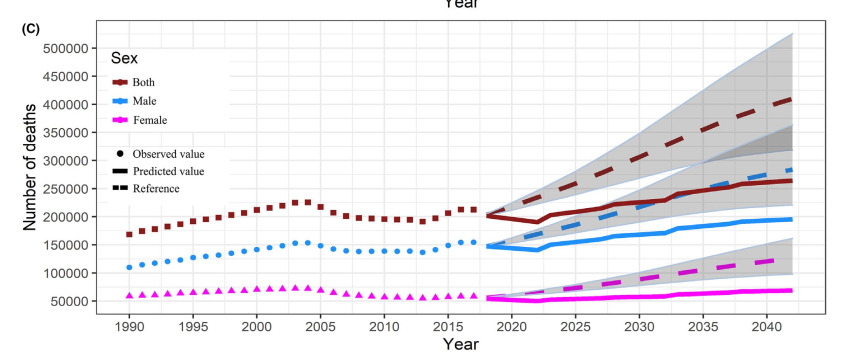
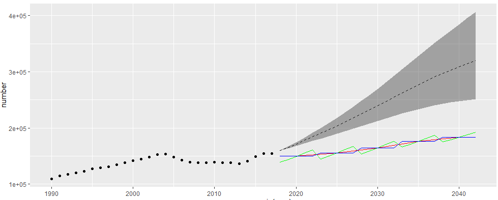 I tested the possible methods in 3 because I was not sure how the original figure was calculated. Among them, the result of method 1 is a red line, method 2 is a blue line, and method 3 is a green line;
There is a certain deviation from the original drawing (as follows); Moreover, when the original picture was in 2018, the lines converged to one point, which is obviously better than my picture. But the description in the original text is not very detailed, and I didn't think of a better method;
4.2 BAPC package model
4.2.1 reprint paper Figure e3
Note: for the principle of ILNA package, please refer to a blog: https://www.paulamoraga.com/book-geospatial/sec-inla.html ; This article does not cover the use of a separate INLA, but the INLA method will be used in BAPC, so you need to install the INLA package
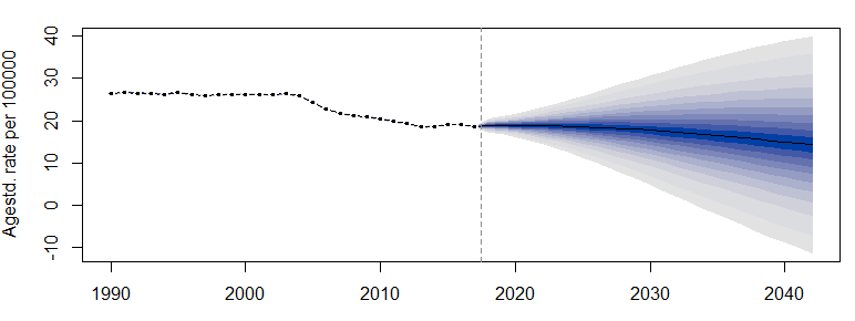
Taking Figure e3C as an example, the original figure is as follows:

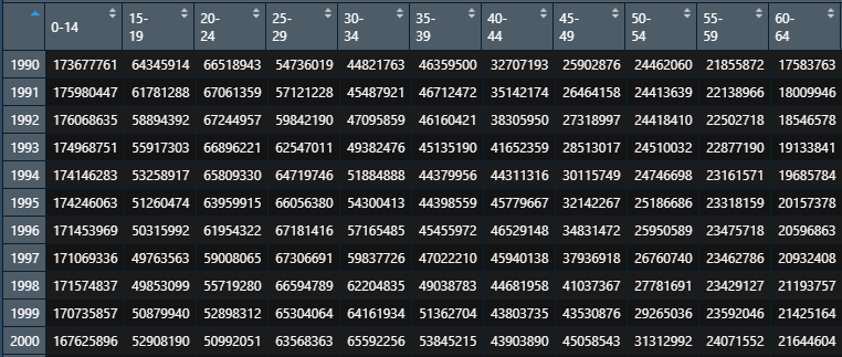
When using BAPC package, there are several points to pay attention to:
- Population data and death data need to be integers (because Poisson distribution is to be satisfied)
- The horizontal table of incidence rate and demographic statistics is age, and the vertical is the year.
- The incidence rate is 17 years later, and the data is NA.
The sorted data are as follows:
Death table:
Population table:
The code is divided into two steps:
(1) Organize data
#population
china_ay <- t(china_population_1990_2017_n) %>% as.data.frame()
china_ay <- china_ay[-c(1,2),]
china_ay <- apply(china_ay, c(1,2), as.integer) %>% as.data.frame()

#death
esoph_ay <- t(esoph_ages_n) %>% as.data.frame()
esoph_ay <- esoph_ay[-c(1,2),]
esoph_ay <- apply(esoph_ay, c(1,2), as.numeric) %>% as.data.frame()
esoph_ay <- apply(esoph_ay, c(1,2), round) %>% as.data.frame()

#Supplement years without death data
esoph_pro <- matrix(data = NA, nrow = 25, ncol = 18) %>% as.data.frame()
rownames(esoph_pro) <- seq(2018,2042,1)
colnames(esoph_pro) <-  c("0-14", "15-19", "20-24", "25-29", "30-34",
                          "35-39", "40-44", "45-49", "50-54",
                          "55-59", "60-64", "65-69", "70-74",
                          "75-79", "80-84", "85-89", "90-94","95+")
esoph_ay <- rbind(esoph_ay, esoph_pro)
(2) Modeling and drawing
lc_esoph <- APCList(esoph_ay, china_ay, gf = 5)
require(INLA)
bapc_result <- BAPC(lc_esoph, predict = list(npredict = 25, retro = T),
               secondDiff = FALSE, stdweight = wstand, verbose = TRUE)

plotBAPC(bapc_result, scale=10^5, type = 'ageStdRate', showdata = TRUE)
The effect is as follows:
4.2.2 reproduction of paper Figure e4
Take figure B as an example, in which the diamond is the prediction result of BAPC model, and further take the blue line as an example
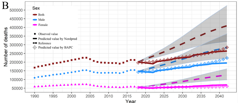
The code is divided into three steps
(1) get the predicted incidence rate and collate data.
#Predict data
age_rate <- agespec.rate(x = bapc_result) %>% as.data.frame()

#age_proj <- agespec.proj(x = bapc_result) %>% as.data.frame()
age_rate_mean <- age_rate[,colnames(age_rate) %like% 'mean']
colnames(age_rate_mean) <- c("0-14", "15-19", "20-24", "25-29", "30-34",
                              "35-39", "40-44", "45-49", "50-54",
                              "55-59", "60-64", "65-69", "70-74",
                              "75-79", "80-84", "85-89", "90-94","95+")
age_rate_mean <- t(age_rate_mean) %>% as.data.frame()
(2) Calculate the number of patients
new_years <- seq(1990, 2042, 1) %>% as.character()
china_all_6 <- data.frame(year = rep(0, 53), number = rep(0, 53), se = seq(1:53))
for (i in 1:53) {
  china_all_6$year[i] <- new_years[i]
  china_all_6$number[i] <- sum(china_pop[, new_years[i]] * age_rate_mean[, new_years[i]])
}
(3) Mapping: let's make a big summary
ggplot() +
  geom_line(data = china_all_3, aes(x = as.numeric(year), y = number), linetype = 'dashed') +
  geom_ribbon(data = china_all_4_5, aes(x = as.numeric(year), ymin = number, ymax = number_up), alpha = 0.4) +
  geom_point(data = esoph_all, aes(x = year, y = val)) +
  geom_line(data = china_all_2[29:53,], aes(x = as.numeric(new_year), y = number), color = 'green') +
  geom_line(data = china_all[7:11,], aes(x = as.numeric(new_year), y = number), color = 'red') +
  geom_line(data = china_all_years[29:53,], aes(x = as.numeric(year), y = number), color = 'blue') +
  geom_point(data = china_all_6[29:53,], aes(x = as.numeric(year), y = number), shape = 3)
Final effect:
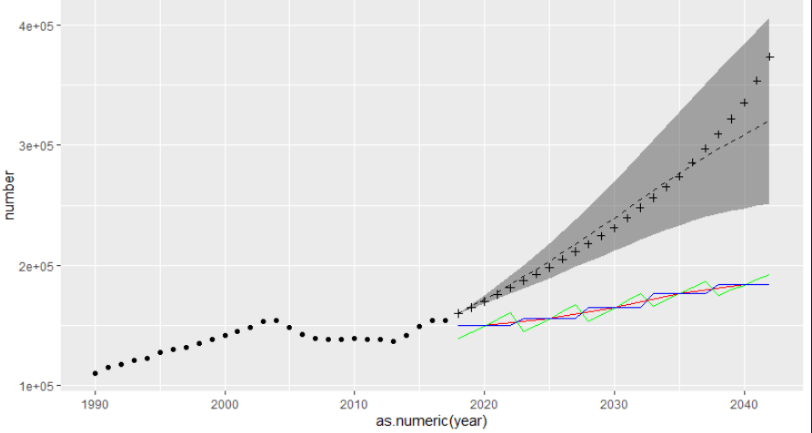
The cross in the figure represents the predicted value of BAPC model
Step 4.2.2 can also be completed by another simple method; Suddenly, it is found that the projection provided in the model is the predicted value of the number of deaths:
#Get data and organize
age_proj <- agespec.proj(x = bapc_result) %>% as.data.frame()
age_proj_mean <- age_proj[,colnames(age_proj) %like% 'mean']
colnames(age_proj_mean) <- c("0-14", "15-19", "20-24", "25-29", "30-34",
                             "35-39", "40-44", "45-49", "50-54",
                             "55-59", "60-64", "65-69", "70-74",
                             "75-79", "80-84", "85-89", "90-94","95+")

#Calculate the number of deaths
sum_year <- apply(age_proj_mean, 1, sum) %>% as.data.frame()
colnames(sum_year) <- 'number'
sum_year$year <- rownames(sum_year)

#Drawing
ggplot() +
  geom_line(data = china_all_3, aes(x = as.numeric(year), y = number), linetype = 'dashed') +
  geom_ribbon(data = china_all_4_5, aes(x = as.numeric(year), ymin = number, ymax = number_up), alpha = 0.4) +
  geom_point(data = esoph_all, aes(x = year, y = val)) +
  geom_line(data = china_all_2[29:53,], aes(x = as.numeric(new_year), y = number), color = 'green') +
  geom_line(data = china_all[7:11,], aes(x = as.numeric(new_year), y = number), color = 'red') +
  geom_line(data = china_all_years[29:53,], aes(x = as.numeric(year), y = number), color = 'blue') +
  geom_point(data = china_all_6[29:53,], aes(x = as.numeric(year), y = number), shape = 3) +
  geom_point(data = sum_year[29:53,], aes(x = as.numeric(year), y = number), shape = 2)
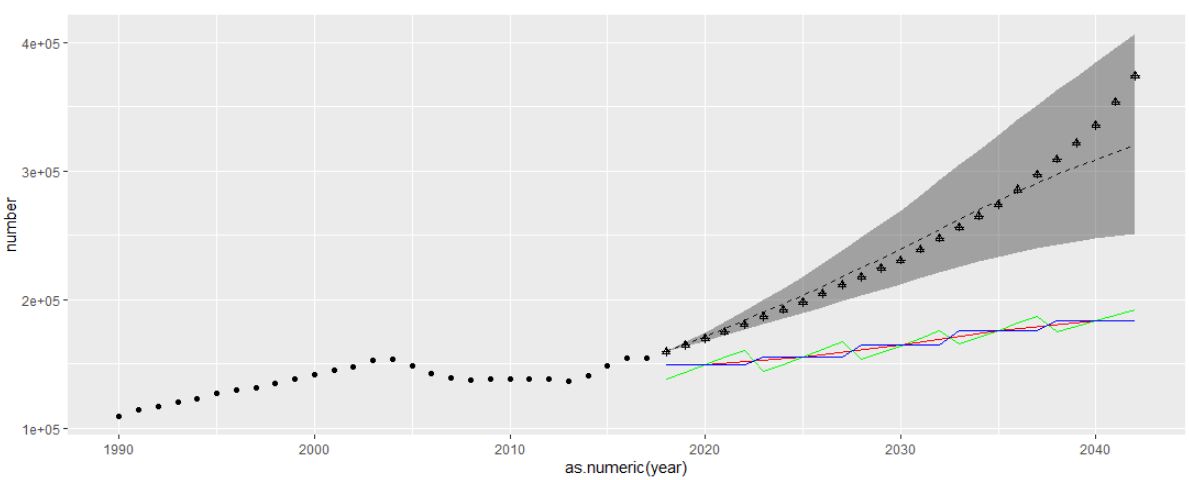 The triangle mark is used. Because it is the same as the previous result, the triangle and the cross coincide
In a word, it is quite different from the original picture. After all, the big framework of the two models is different, and the prediction method is also different;
I don't know how to make them fit so well. If there is a better way, I hope I won't hesitate to give you advice.
5. Postscript
5.1 model evaluation and my doubts
Author's original text:

As for the evaluation of the model, the author said that because the prediction lines made by the two models are relatively consistent, the model is OK
This made me very confused. I felt that this statement was a little hasty, so I checked some data.
When Verena J ü rgens and others talked about the Bayesian formula of the Poisson power link APC model, they mentioned the model evaluation:
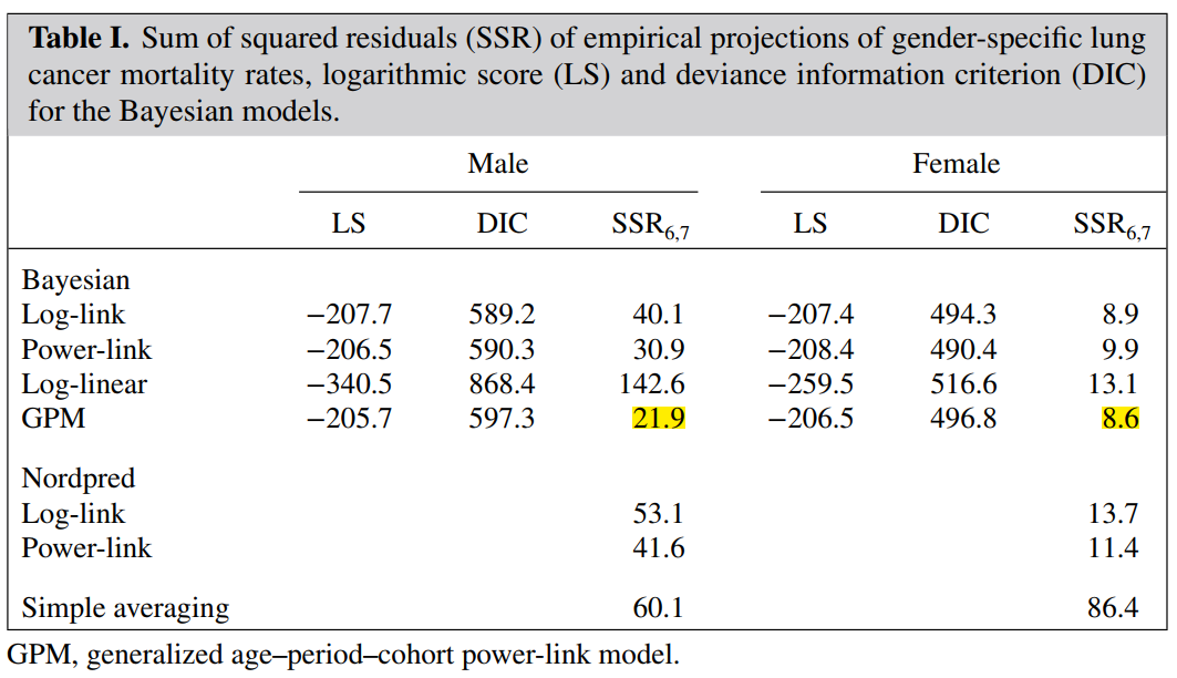
Unfortunately, limited by my knowledge level, I don't know how to calculate these values for model evaluation. Welcome and look forward to comments and additions from netizens!
A user-defined function used in 5.2
In the above code, in order to facilitate data sorting, I used a user-defined function function_year5():
function_year5 <- function(table_name, start_year, end_year, current_year){

  remain <- current_year - round((current_year - start_year)/5) * 5
  year_names <- NULL
  for (i in start_year:end_year) {
    if((i - current_year)/5 - round((i - current_year)/5) == 0){
      if(i == remain){
        temp <- paste(start_year, i, sep = '-')
        year_names <- append(year_names, temp)
      }
      else{
        temp <- paste(i-4, i, sep = '-')
        year_names <- append(year_names, temp)
      }
    }
  }

  table_name <- table_name %>% as.data.frame()
  new_years <- seq(start_year,end_year,1)
  new_table <- matrix(data = rep(0, length(year_names)*18), ncol = length(year_names), nrow = 18) %>% as.data.frame()
  colnames(new_table) <- year_names

  j = 1
  for (i in 1:(end_year - start_year + 1)) {
    if((new_years[i] - 2017)/5 - round((new_years[i] - 2017)/5) != 0){
      new_table[, year_names[j]] <- new_table[,year_names[j]] + table_name[,as.character(new_years[i])]
    }
    else{
      if(j == 1){
        new_table[,year_names[j]] <- (new_table[,year_names[j]] + table_name[,as.character(new_years[i])]) / (remain - start_year + 1)
      }
      else{
        new_table[,year_names[j]] <- (new_table[,year_names[j]] + table_name[,as.character(new_years[i])]) / 5
      }
      j = j + 1
    }
  }
  return(new_table)
}