Recently, writing PPT needs the whole summary diagram. It's easier to find it in python. Don't talk more nonsense. Record your experience.
1, Initial simple picture
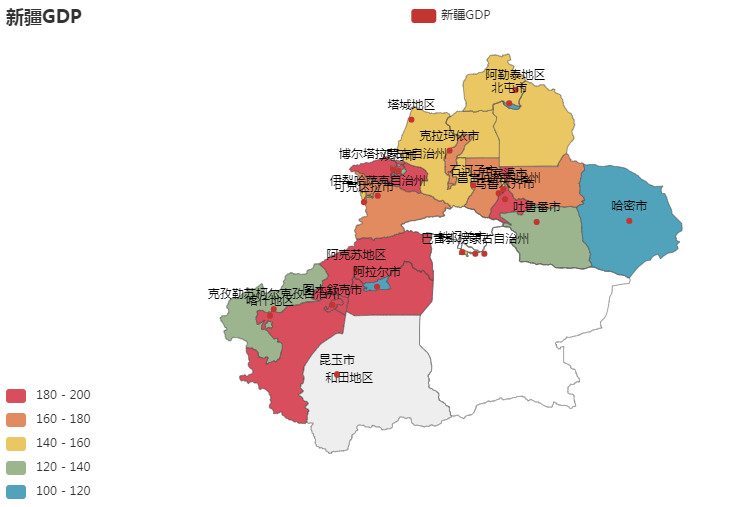
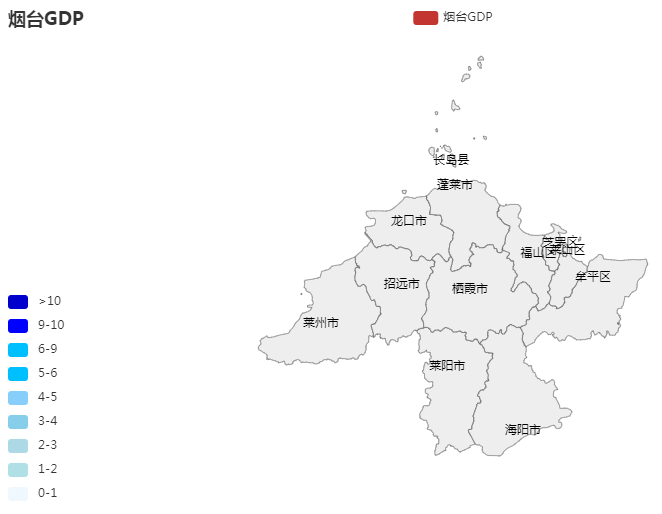
Take Xinjiang as an example, because the plot map of Xinjiang is relatively irregular (is the name too long, the point too close, and I'm confused? The article will say how to adjust it better later)
Attached code:
from pyecharts.charts import Map  # Note the difference between this and the old version of pyecharts call
from pyecharts import options as opts
import random

titlename = "Xinjiang GDP"
city = ['Urumqi','Kunyu City','Hami City','Bayingolin Mongolian Autonomous Prefecture','Turpan City','Altay Region','Beitun City','Tacheng area','Karamay City','Shuanghe City','Bortala Mongolian Autonomous Prefecture','Kekedala City','Ili Kazakh Autonomous Prefecture','Changji Hui Autonomous Prefecture','Shihezi City','Aksu Region','Alar City','Bayingolin Mongolian Autonomous Prefecture','Kashgar region','Kizilsu Kirgiz Autonomous Prefecture','Tumushuk City','Tiemenguan City','Wujiaqu City']

#This value is attached to the corresponding city
data_city = [(i, random.randint(100, 200)) for i in city]

#Of course, data_city can also set its own values, as shown below
#[('urumqi city ', 170), ('kunyu city', 171), ('hami city ', 106), ('bayingolin Mongolian Autonomous Prefecture', 140), ('turpan city ', 127), ('altay region', 109), ('beitun city ', 119), ('tacheng region', 115), ('karamay city ', 195), ('shuanghe city', 148), ('bortala Mongolian Autonomous Prefecture ', 171), ('kekekedala city', 120), ('ili Kazak Autonomous Prefecture ', 127), ('changji Hui Autonomous Prefecture ', 176), ('shihezi city', 157), ('aksu region ', 134), ('alar city', 145), ('bayingolin Mongolian Autonomous Prefecture ', 138), ('kashi region', 200), ('kizilsu Kirgiz Autonomous Prefecture ', 193), ('tumushuke City', 143), ('tiemenguan city ', 183), ('wujiaqu city', 127)]


china_city = (
    Map()
    .add(
        series_name=titlename,
        data_pair=data_city,
        maptype="Xinjiang",
        is_map_symbol_show=True,                    #This controls whether red dots are displayed on the map. Only some city names in data_city will display red dots in the map
        label_opts=opts.LabelOpts(is_show=True),    #This controls whether names are displayed on the map
    )
    .set_global_opts(
        title_opts=opts.TitleOpts(title=titlename),
        visualmap_opts=opts.VisualMapOpts(
            min_=0,
            max_=15,
            is_piecewise=True                        #Define the legend in the lower left corner as segmented, and the default is continuous legend
        ),
    )
    .render(titlename+".html")
)

#After execution, the peer will generate a "Xinjiang GDP.html" file, which will be used later
2, Name optimization
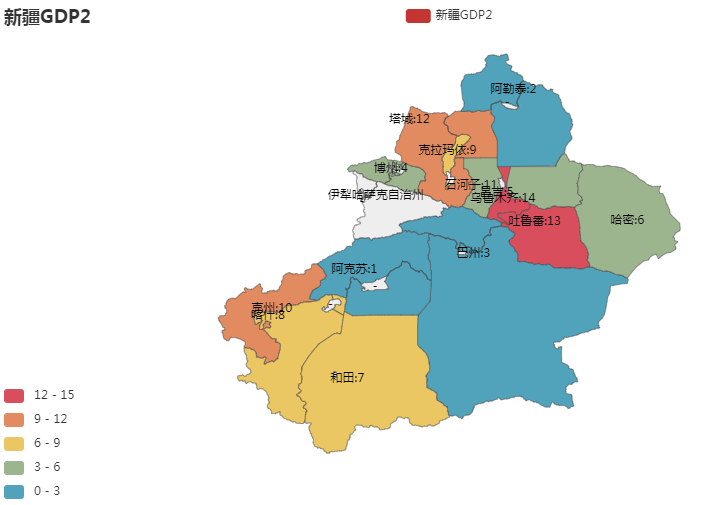
For cities whose names are too long, you can add the name_map attribute in add to adjust them. However, it should be noted that after modifying the alias, the city name in the corresponding data_pair also needs to be consistent with the alias. My alias here carries the corresponding value, so the data_city parameter should also be consistent with the alias
from pyecharts.charts import Map # Note the difference between this and the old version of pyecharts call
from pyecharts import options as opts
import random
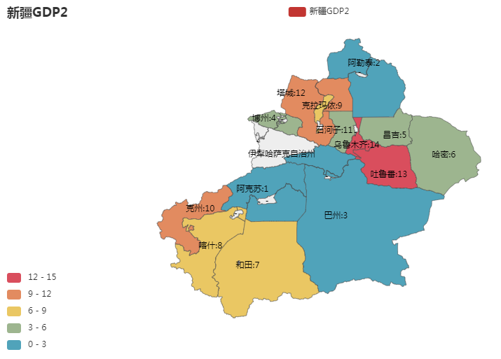
titlename = "Xinjiang GDP2"
# This value is attached to the corresponding city
data_city = [('Aksu:1',1),('Altay:2',2),('Bazhou:3',3),('Bozhou:4',4),('Changji:5',5),('Hami:6',6),('Hotan:7',7),('Kashgar:8',8),('Karamay:9',9),('Tomsk :10',10),('Shihezi:11',11),('Tuscaloosa :12',12),('Turpan:13',13),('Urumqi:14',14),]
name_map = {
'Aksu Region':'Aksu:1','Altay Region':'Altay:2','Bayingolin Mongolian Autonomous Prefecture':'Bazhou:3','Bortala Mongolian Autonomous Prefecture':'Bozhou:4','Changji Hui Autonomous Prefecture':'Changji:5','Hami City':'Hami:6','Hotan Area':'Hotan:7','Kashgar region':'Kashgar:8','Karamay City':'Karamay:9','Kizilsu Kirgiz Autonomous Prefecture':'Tomsk :10','Shihezi City':'Shihezi:11','Tacheng area':'Tuscaloosa :12','Turpan City':'Turpan:13','Urumqi':'Urumqi:14',
'Tiemenguan City':'-','Alar City':'-','Tumushuk City':'-','Kekedala City':'-','Beitun City':'-','Shuanghe City':'-','Kunyu City':'-','Wujiaqu City':'-'
}
china_city = (
Map()
.add(
series_name=titlename,
data_pair=data_city,
maptype="Xinjiang",
is_map_symbol_show=False,
label_opts=opts.LabelOpts(is_show=True),
name_map=name_map
)
.set_global_opts(
title_opts=opts.TitleOpts(title=titlename),
visualmap_opts=opts.VisualMapOpts(
min_=0,
max_=15,
is_piecewise=True
),
)
.render(titlename+".html")
)Is it cool? Go on
3, Red dot and name position adjustment:
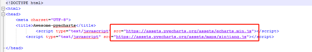
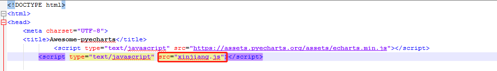
When we select the document opening method to open the html file, we will find that ecarts.min.js and xinjiang.js use online documents, so we cannot change the coordinate information of online documents to change the red dot and name position.
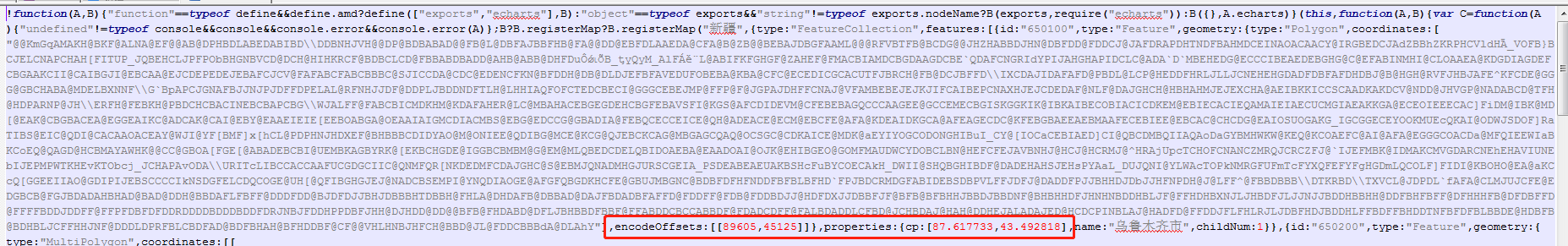
The coordinate position of Xinjiang is saved in xinjiang.js file. You can find the local xinjiang.js file through everything. After opening, you will find that there will be a longitude and latitude coordinate in front of each city. You can control the display of names in the map by adjusting this coordinate.
Put xinjiang.js and html files together, and change xinjiang.js in html to the local JS file path. I set the same level directory here:
Is it better to show the graph after modifying the coordinates
4, Color customization
If you feel the color is not satisfactory, you can also set it yourself
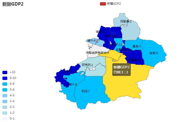
.set_global_opts(
    title_opts=opts.TitleOpts(title=titlename),
    visualmap_opts=opts.VisualMapOpts(
        pieces=[
            {"max": 20, "min": 10, "label": ">10", "color": "#0000CD"},
            {"max": 9.99, "min": 9, "label": "9-10", "color": "#0000FF"},
            {"max": 8.99, "min": 6, "label": "6-9", "color": "#00BFFF"},
            {"max": 5.99, "min": 5, "label": "5-6", "color": "#00BFFF"},
            {"max": 4.99, "min": 4, "label": "4-5", "color": "#87CEFA"},
            {"max": 3.99, "min": 3, "label": "3-4", "color": "#87CEEB"},
            {"max": 2.99, "min": 2, "label": "2-3", "color": "#ADD8E6"},
            {"max": 1.99, "min": 1, "label": "1-2", "color": "#B0E0E6"},
            {"max": 0.99, "min": 0, "label": "0-1", "color": "#F0F8FF"},
        ],
        is_piecewise=True    #Don't write False here, otherwise it's not segmented
    ),
)
5, Splicing
Maybe if you want to splice two provinces, you can add one more add. However, the generated graphics need to be moved and spliced by yourself. I haven't found a good way to automatically produce ╮ (╯) ╭. Some big guys know and ask for information
Here you can drag and drop
.add(
        series_name=titlename,
        data_pair=data_city,
        maptype="Xinjiang",
        is_map_symbol_show=False,
        label_opts=opts.LabelOpts(is_show=True),
        name_map=name_map
    )
    .add(
        series_name=titlename,
        data_pair=data_city,
        maptype="Tibet",
        is_map_symbol_show=False,
        label_opts=opts.LabelOpts(is_show=True),
        name_map=name_map
    )
6, Other
maptype can be defined in a variety of ways. At present, several commonly used are:
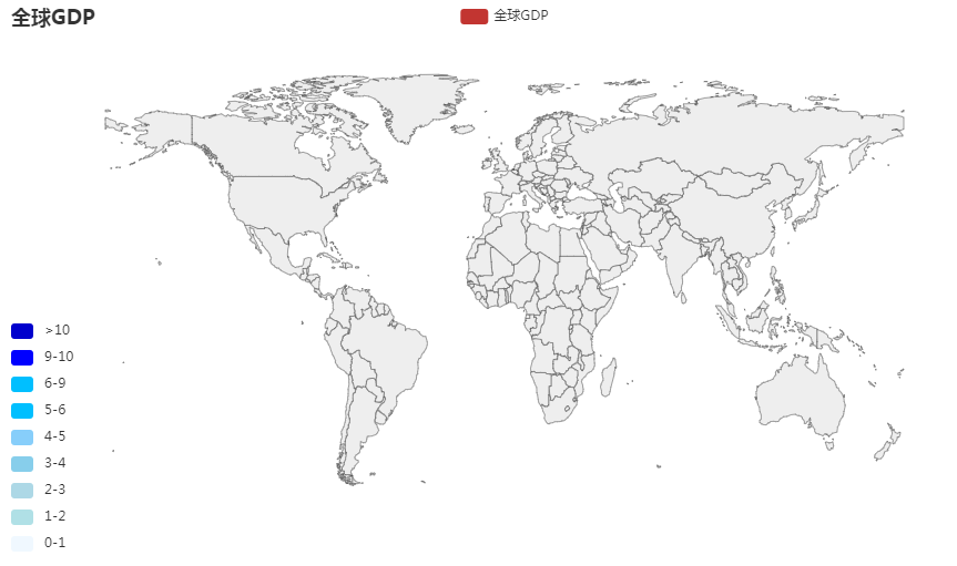
1. Global - all countries: world
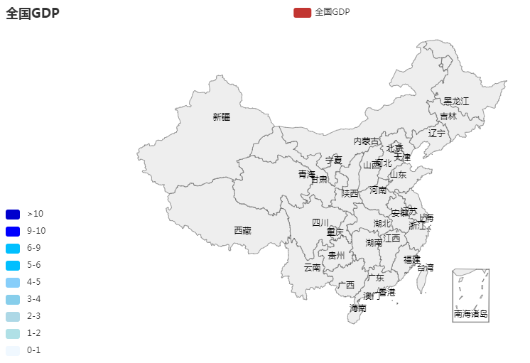
2. china - all provinces: china
3. China - all cities HOHO, what a mess

4. Province / City: name of province / City
I hope that the summary can make everyone take fewer detours and go farther and farther on the sunny road together