Welcome to focus on Python, data analysis, data mining and fun tools!
If you want to ask: what visual tool libraries are available in Python? I think many people can remember matplotlib, which is a library that beginners can't get around, but with the higher and higher requirements for data visualization, matplotlib can't meet it.
Today, I will explain pyecharts module in detail. When it comes to it, we have to mention Echarts. It is an open-source data visualization by Baidu, combined with ingenious interactivity and exquisite chart design, which has been recognized by developers. Python is an expressive language, which is very suitable for data processing. When analysis meets data visualization, pyecharts is born. Welcome to collect and learn, like praise and support. A technical exchange group is provided at the end of the paper.
Pyecharts has the following characteristics:
- Simple API design, use silky photos, and support chain calls
- Includes 30 + common charts, everything
- Support the mainstream Notebook environment, Jupyter Notebook and jupyterab
- It can be easily integrated into mainstream Web frameworks such as Flask and Django
- Highly intelligent configuration items can easily match beautiful charts
- Detailed documents and examples to help developers get started quickly
- Up to 400 + map files and their own Baidu maps provide user support for geographic data expansion
Official Github link: https://github.com/pyecharts/pyecharts/
Let's explain it in detail
01 installing and importing modules
When it comes to installing modules, we can do this,
The basic steps to create a drawing using Pyecharts are
1. Prepare data
2. Design graphic style and background color
3. Pyecharts drawing
4. Attributes such as title or legend of design chart
5. Export to html
from pyecharts import options as opts
from pyecharts.charts import Bar
from pyecharts.faker import Faker
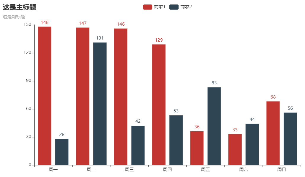
c = (
Bar()
.add_xaxis(Faker.choose())
.add_yaxis("Merchant 1", Faker.values())
.add_yaxis("Merchant 2", Faker.values())
.set_global_opts(title_opts=opts.TitleOpts(title="This is the main title", subtitle="This is the subtitle"))
.render("bar_base.html")
)
The result is
02 data preparation
import pandas as pd
import numpy as np

data = pd.DataFrame({'x':np.arange(1,101),'y':["Randomly generated number"]})
df = pd.read_excel("Path to your file")
03 Pycharts also provides built-in data sets
Pyechards also provides some data sets, mainly including category data, time data, color data, geographic data, world population data, etc. which one to use is randomly selected through the choose() method
def choose(self) -> list:
    return random.choice(
        [
            self.clothes,
            self.drinks,
            self.phones,
            self.fruits,
            self.animal,
            self.dogs,
            self.week,
        ]
    )
04 style of drawing
When it comes to graphic styles, there are probably so many
class _ThemeType:
    BUILTIN_THEMES = ["light", "dark", "white"]
    LIGHT = "light"
    DARK = "dark"
    WHITE = "white"
    CHALK: str = "chalk"
    ESSOS: str = "essos"
    INFOGRAPHIC: str = "infographic"
    MACARONS: str = "macarons"
    PURPLE_PASSION: str = "purple-passion"
    ROMA: str = "roma"
    ROMANTIC: str = "romantic"
    SHINE: str = "shine"
    VINTAGE: str = "vintage"
    WALDEN: str = "walden"
    WESTEROS: str = "westeros"
    WONDERLAND: str = "wonderland"
    HALLOWEEN: str = "halloween"
06 set title and subtitle
The code for setting the title and subtitle is as follows
set_global_opts(title_opts=opts.TitleOpts(title="This is the main title",subtitle="This is the subtitle"))
07 setting legend and location
legend_opts=opts.LegendOpts(type_="scroll", orient="vertical",pos_top="15%",pos_left="7%")) # Figure location of cracks
label_opts=opts.LabelOpts(formatter="{b}: {c}") # Presentation form of results
08 export results
render("test.html")

# If it's in the Jupiter notebook
render_notebook()
09 Pyecharts drawing
Histogram
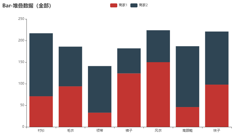
The columns of different categories in the same category can be stacked, that is, the stacked histogram
c = (
    Bar()
    .add_xaxis(Faker.choose())
    .add_yaxis("Merchant 1", Faker.values(), stack="stack1")
    .add_yaxis("Merchant 2", Faker.values(), stack="stack1")
    .set_series_opts(label_opts=opts.LabelOpts(is_show=False))
    .set_global_opts(title_opts=opts.TitleOpts(title="Bar-Stack data (all)"))
    .render("bar_stack_1212.html")
)
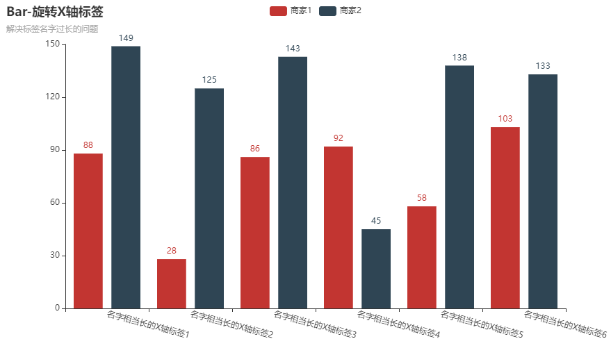
Sometimes the abscissa has a large number of logo words, and the X-axis displays the full text. We can tilt the logo font slightly
c = (
    Bar()
    .add_xaxis(
        [
            "The name is quite long X Shaft label 1",
            "The name is quite long X Shaft label 2",
            "The name is quite long X Shaft label 3",
            "The name is quite long X Shaft label 4",
            "The name is quite long X Shaft label 5",
            "The name is quite long X Shaft label 6",
        ]
    )
    .add_yaxis("Merchant 1", Faker.values())
    .add_yaxis("Merchant 2", Faker.values())
    .set_global_opts(
        xaxis_opts=opts.AxisOpts(axislabel_opts=opts.LabelOpts(rotate=15)),
        title_opts=opts.TitleOpts(title="Bar-rotate X Axis label", subtitle="Subtitle"),
    )
    .render("test.html")
)
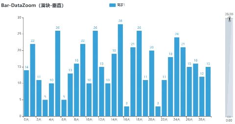
We can also put the column chart like this
c = (
    Bar(init_opts=opts.InitOpts(theme=ThemeType.LIGHT))
    .add_xaxis(Faker.days_attrs)
    .add_yaxis("Merchant 1", Faker.days_values, color=Faker.rand_color())
    .set_global_opts(
        title_opts=opts.TitleOpts(title="Bar-DataZoom(slider-(vertical)"),
        datazoom_opts=opts.DataZoomOpts(orient="vertical"),
    )
    .render("bar_datazoom_slider_vertical.html")
)
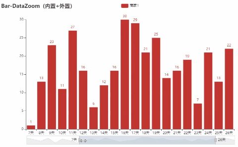
We can also drag the columns inside to achieve data scaling and range change
c = (
    Bar()
    .add_xaxis(Faker.days_attrs)
    .add_yaxis("Merchant 1", Faker.days_values)
    .set_global_opts(
        title_opts=opts.TitleOpts(title="Bar-DataZoom(built-in+(external)"),
        datazoom_opts=[opts.DataZoomOpts(), opts.DataZoomOpts(type_="inside")],
    )
    .render("bar_datazoom_both.html")
)
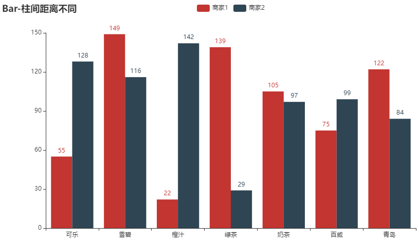
In the histogram, the distance between different columns can also be different
c = (
    Bar(init_opts=opts.InitOpts(theme=ThemeType.WHITE))
    .add_xaxis(Faker.choose())
    .add_yaxis("Merchant 1", Faker.values(), gap="0%")
    .add_yaxis("Merchant 2", Faker.values(), gap="0%")
    .set_global_opts(title_opts=opts.TitleOpts(title="Bar-Different distance between columns"))
    .render("bar_different_series_gap.html")
)
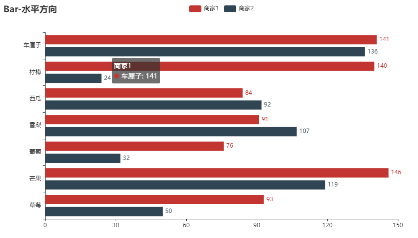
Histogram horizontal state
And a horizontal histogram
c = (
    Bar()
    .add_xaxis(Faker.choose())
    .add_yaxis("Merchant 1", Faker.values())
    .add_yaxis("Merchant 2", Faker.values())
    .reversal_axis()
    .set_series_opts(label_opts=opts.LabelOpts(position="right"))
    .set_global_opts(title_opts=opts.TitleOpts(title="Bar-horizontal direction"))
    .render("bar_reversal_axis.html")
)
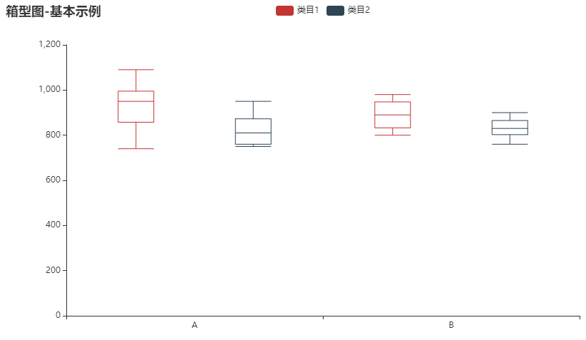
Box diagram
Box chart is more convenient for us to observe the internal distribution of data
from pyecharts.charts import Boxplot

v1 = [
    [850, 740, 950, 1090, 930, 850, 950, 980, 1000, 880, 1000, 980],
    [980, 940, 960, 940, 900, 800, 850, 880, 950, 840, 830, 800],
]
v2 = [
    [890, 820, 820, 820, 800, 770, 760, 760, 750, 760, 950, 920],
    [900, 840, 800, 810, 760, 810, 790, 850, 820, 850, 870, 880],
]
c = Boxplot()
c.add_xaxis(["A", "B"])
c.add_yaxis("Category 1", c.prepare_data(v1))
c.add_yaxis("Category 2", c.prepare_data(v2))
c.set_global_opts(title_opts=opts.TitleOpts(title="Box diagram-Basic example"))
c.render("boxplot_test.html")
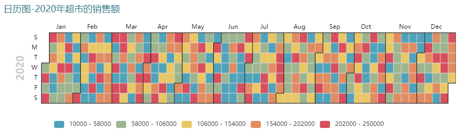
Calendar chart
Calendar chart specifically refers to displaying the data of each day in color according to the layout of the calendar, so as to intuitively see the data of the whole year. For example, it shows the annual sales of the supermarket, so as to see that the sales of a specific month or week are relatively low
c = (
    Calendar(init_opts=opts.InitOpts(theme=ThemeType.INFOGRAPHIC))
    .add("", data, calendar_opts=opts.CalendarOpts(range_="2020"))
    .set_global_opts(
        title_opts=opts.TitleOpts(title="Calendar chart-2020 Supermarket sales in"),
        visualmap_opts=opts.VisualMapOpts(
            max_=250000,
            min_=10000,
            orient="horizontal",
            is_piecewise=True,
            pos_top="230px",
            pos_left="100px",
        ),
    )
    .render("calendar_test.html")
)
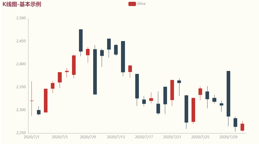
K-line diagram
c = (
    Kline(init_opts=opts.InitOpts(theme=ThemeType.ESSOS))
    .add_xaxis(["2020/7/{}".format(i + 1) for i in range(31)])
    .add_yaxis("kline", data)
    .set_global_opts(
        yaxis_opts=opts.AxisOpts(is_scale=True),
        xaxis_opts=opts.AxisOpts(is_scale=True),
        title_opts=opts.TitleOpts(title="K Line diagram-Basic example"),
    )
    .render("kline_test.html")
)
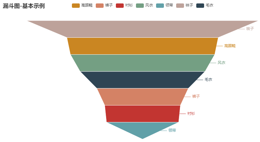
Funnel diagram
from pyecharts.charts import Funnel

c = (
    Funnel()
    .add("Category", [list(z) for z in zip(Faker.choose(), Faker.values())])
    .set_global_opts(title_opts=opts.TitleOpts(title="Funnel diagram-Basic example"))
    .render("funnel_test.html")
)
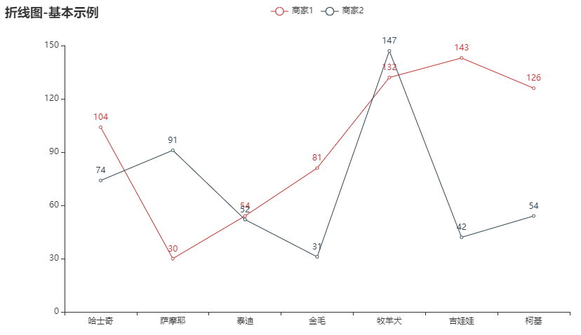
Line chart
c = (
    Line()
    .add_xaxis(Faker.choose())
    .add_yaxis("Merchant 1", Faker.values())
    .add_yaxis("Merchant 2", Faker.values())
    .set_global_opts(title_opts=opts.TitleOpts(title="Line chart-Basic example"))
    .render("line_test.html")
)
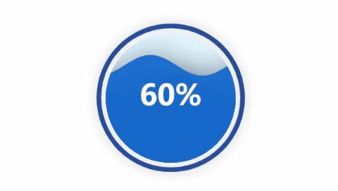
Water polo diagram
Water polo chart is usually used to show the completion degree of indicators
from pyecharts.charts import Liquid

c = (
    Liquid()
    .add("lq", [0.55, 0.75])
    .set_global_opts(title_opts=opts.TitleOpts(title="Liquid-Basic example"))
    .render("liquid_test.html")
)
Word cloud picture
c = (
    WordCloud()
    .add(series_name="Example of word cloud picture", data_pair=data, word_size_range=[5, 100])
    .set_global_opts(
        title_opts=opts.TitleOpts(
            title="Example of word cloud picture", title_textstyle_opts=opts.TextStyleOpts(font_size=23)
        ),
        tooltip_opts=opts.TooltipOpts(is_show=True),
    )
    .render("basic_wordcloud.html")
)

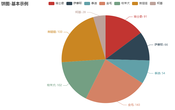
Pie chart
c = (
    Pie()
    .add("Category", [list(z) for z in zip(Faker.choose(), Faker.values())])
    .set_global_opts(title_opts=opts.TitleOpts(title="Pie chart-Basic example"))
    .set_series_opts(label_opts=opts.LabelOpts(formatter="{b}: {c}"))
    .render("pie_test.html")
)
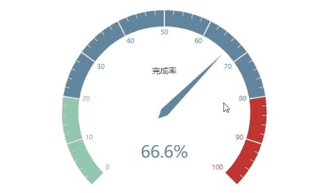
Instrument cluster diagram
The drawing of dashboard can also be used to show the completion degree of indicators
from pyecharts.charts import Gauge

c = (
    Gauge()
    .add("", [("Completion rate", 70)])
    .set_global_opts(title_opts=opts.TitleOpts(title="Dashboard-Basic example"))
    .render("gauge_test.html")
)
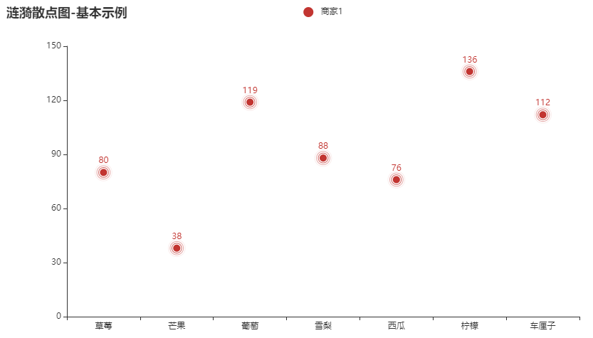
Ripple scatter
c = (
    EffectScatter()
    .add_xaxis(Faker.choose())
    .add_yaxis("Merchant 1", Faker.values())
    .set_global_opts(title_opts=opts.TitleOpts(title="Ripple scatter-Basic example"))
    .render("effectscatter_test.html")
)
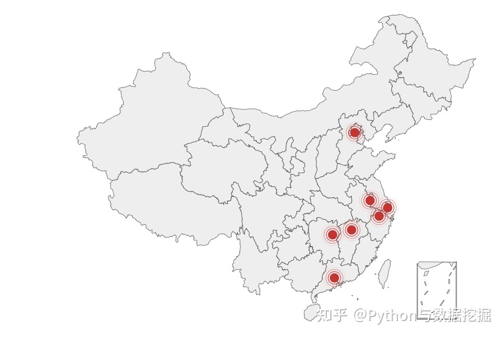
Map
from pyecharts import options as opts
from pyecharts.charts import Geo
from pyecharts.faker import Faker
from pyecharts.globals import ChartType

c = (
    Geo()
    .add_schema(maptype="china")
    .add(
        "geo",
        [list(z) for z in zip(Faker.provinces, Faker.values())],
        type_=ChartType.EFFECT_SCATTER,
    )
    .set_series_opts(label_opts=opts.LabelOpts(is_show=False))
    .set_global_opts(title_opts=opts.TitleOpts(title="Geo-EffectScatter"))
    .render("geo_effectscatter.html")
)
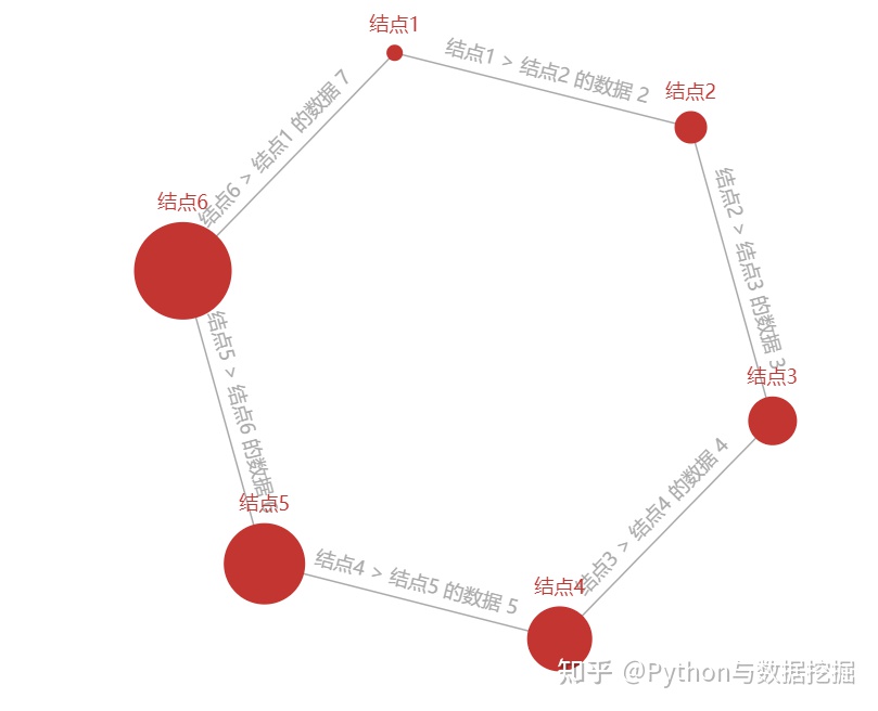
Diagram
from pyecharts import options as opts
from pyecharts.charts import Graph

nodes_data = [
    opts.GraphNode(name="Node 1", symbol_size=10),
    opts.GraphNode(name="Node 2", symbol_size=20),
    opts.GraphNode(name="Node 3", symbol_size=30),
    opts.GraphNode(name="Node 4", symbol_size=40),
    opts.GraphNode(name="Node 5", symbol_size=50),
    opts.GraphNode(name="Node 6", symbol_size=60),
]
links_data = [
    opts.GraphLink(source="Node 1", target="Node 2", value=2),
    opts.GraphLink(source="Node 2", target="Node 3", value=3),
    opts.GraphLink(source="Node 3", target="Node 4", value=4),
    opts.GraphLink(source="Node 4", target="Node 5", value=5),
    opts.GraphLink(source="Node 5", target="Node 6", value=6),
    opts.GraphLink(source="Node 6", target="Node 1", value=7),
]
c = (
    Graph()
    .add(
        "",
        nodes_data,
        links_data,
        repulsion=4000,
        edge_label=opts.LabelOpts(
            is_show=True, position="middle", formatter="{b} Data {c}"
        ),
    )
    .set_global_opts(
        title_opts=opts.TitleOpts(title="Graph-GraphNode-GraphLink-WithEdgeLabel")
    )
    .render("graph_with_edge_options.html")
)
Technical exchange
Welcome to reprint, collect, gain, praise and support!

At present, a technical exchange group has been opened, with more than 2000 group friends. The best way to add notes is: source + Interest direction, which is convenient to find like-minded friends
- Method ① send the following pictures to wechat, long press identification, and the background replies: add group;
- Mode ②. Add micro signal: dkl88191, remarks: from CSDN
- WeChat search official account: Python learning and data mining, background reply: add group