QSS Base of PyQt5 Full 95 Window
CSS Tutorial:https://www.w3school.com.cn/css/index.asp
Check the links for details, but there is no problem reading the following article.
QSS Concepts
The whole process of QSS is Qt Style Sheets, as the name implies, a Qt stylesheet. Qt stylesheets are a powerful mechanism that allows you to customize the appearance of widgets in addition to the functionality already available through subclassing QStyle. The concept, terminology, and syntax of Qt stylesheets are inspired by HTML Cascading Stylesheets (CSS), but apply to the widget world.
Stylesheets are text specifications and can be used with QApplication.setStyleSheet() is set on the entire application, or you can use QWidget.setStyleSheet() is set on a particular widget (and its child windows). If multiple style sheets are set at different levels, Qt will get a valid style sheet from all the set style sheets. This is called cascading.
For example, the following stylesheet specifies that all QLineEdits should use yellow as their background color, and all QCheckBox es should use red as their text color:
QLineEdit { background: yellow }
QCheckBox { color: red }
QSS Syntax
Qt stylesheet terminology and syntax rules are almost identical to HTML CSS and less functional.
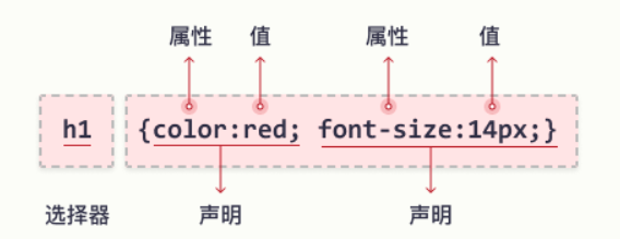
The CSS rule-set consists of a selector and a declaration block:

QSS color
Most Used RGB Color Formats
In CSS, you can use the following formula to specify a color as an RGB value:
rgb(red, green, blue)
Each parameter (red, green, and blue) defines a color intensity between 0 and 255.
For example (255, 0, 0) is red and (0, 255, 0) is green and (0, 0, 0) is black.
QPushButton{background-color:rgb(100, 100, 100)}

Of course you can use black, yellow, and other color settings
QPushButton{background-color:red}

In addition, you can use the HEX color format to specify colors using hexadecimal values. Or you can use hue, saturation, and lightness (HSL) to specify colors
QPushButton{background-color:#ff0000}
QPushButton{background-color:hsl(0, 100%, 50%)}

QSS Background
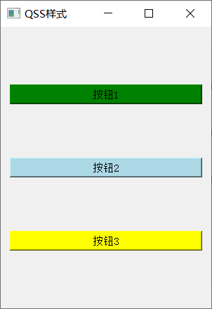
The background-color attribute specifies the background color of the element.
		btn1 = QPushButton(self)
        btn1.setText('Button 1')
        btn1.setStyleSheet('background-color: green')
        btn2 = QPushButton(self)
        btn2.setText('Button 2')
        btn2.setStyleSheet('background-color: lightblue')
        btn3 = QPushButton(self)
        btn3.setText('Button 3')
        btn3.setStyleSheet('background-color: yellow')

        vbox = QVBoxLayout()
        vbox.addWidget(btn1)
        vbox.addWidget(btn2)
        vbox.addWidget(btn3)
        self.setLayout(vbox)
Result

QSS Background Image
background-image: Attribute specifies the image to be used as the element's background.
QPushButton {
  background-image: url("bgdesert.jpg");
}
QSS Border
The border property allows you to specify the style, width, and color of an element's border
(1) Border type border-style property specifies the type of border to display
dotted - Define Point Line Border
dashed - Define dashed border
solid - Define solid border
double - Define a Double Border
groove - Definition 3 D Slope border. The effect depends on border-color value
ridge - Definition 3 D Ridge border. The effect depends on border-color value
inset - Definition 3 D inset Frame. The effect depends on border-color value
outset - Definition 3 D outset Frame. The effect depends on border-color value
none - Define Borderless
hidden - Define hidden borders
For example:
QPushButton{border-style: dotted;}
(2) The border-width property specifies the width of the four borders
Width can be set to a specific size (px, pt, cm, em)
QPushButton{border-style: solid;
  border-width: 5px;
  border-width: 5px 20px; # The top and bottom borders are 5px and the rest are 20px
  border-width: 25px 10px 4px 35px; # Top Border 25px, Right Border 10px, Bottom Border 4px, Left Border 35px
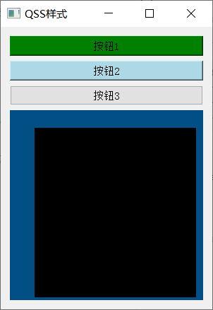
label = QLabel('Cows and cattle', self)
label.setStyleSheet("QLabel{background-color: black;border:20px solid #014F84;"
                    "border-style: solid;border-width: 5px;border-width: 5px 20px;" # The top and bottom borders are 5px and the rest are 20px
                    "border-width: 25px 10px 4px 35px;}") # Top Border 25px, Right Border 10px, Bottom Border 4px, Left Border 35px

(3) Rounded border-radius attributes are used to add rounded borders to elements
border-radius: 5px;
QSS Text
(1) Text color and background color: background-color attribute and color attribute
Front
(2) Text alignment text-align property is used to set horizontal alignment of text
Text can be left-aligned, right-aligned, or center-aligned. Corresponding to left right center
text-align: center;
This property does not work for self-testing pyqt, please point out if you have other comments
label.setAlignment(Qt.AlignRight)
But that works.
(3) Vertical alignment The vertical-align attribute sets the vertical alignment of elements
{
  vertical-align: top;

  vertical-align: middle;

  vertical-align: bottom;
}
This property is also useless, but it can be used as follows: Add a V for vertical
label.setAlignment(Qt.AlignRight | Qt.AlignVCenter)
QSS Font
(1) The font-family property of the text specifies the font of the text.
Serif - There is a small stroke at the edge of each letter. They create a sense of form and elegance.
Sans-serif - Font lines are simple (without small strokes). They create a modern and simple look.
Monospace - All letters here have the same fixed width. They create a mechanical look.
Cursive - Imitates human handwriting.
Fantasy - is a decorative/playful font.
The font-family attribute should contain multiple font names as a backup system to ensure maximum compatibility between browsers and operating systems. Start with the font you want and end with a generic series (if no other fonts are available, let the browser select similar fonts in the generic series). Font names should be comma-separated.
Note: If the font name is more than one word, it must be quoted, for example, "Times New Roman".
 {
  font-family: "Times New Roman", Times, serif;

  font-family: Arial, Helvetica, sans-serif;

  font-family: "Lucida Console", "Courier New", monospace;
}
(2) The font-style attribute of italic text is mainly used to specify Italic text.
This property can be set to three values:
Normal - normal text display
Italic - Text in italic
oblique - Text is "skewed" (skewed is very similar to italic, but less supported)
label.setStyleSheet("QLabel{font-family: Times New Roman, Times, serif;"
                            "font-style: italic;}")
(3) Font size font-size property sets the size of the text
label.setStyleSheet("QLabel{font-size: 40px;}")
QSS Button
Button has a series of settings, paste a style in my code here
        button_font = ("QPushButton {border-radius: 5px;padding: 15px;color: rgb(0, 0, 100);"
                       "font-size: 22px;background-color: rgb(220, 220, 220);color: rgb(10, 10, 10)}"

                       "QPushButton:hover {background-color: rgb(180, 180, 180);}"
                       "QPushButton:pressed {background-color: rgb(150, 150, 150);border: 2px solid rgb(130, 141, 199);"
                       "color: rgb(35, 35, 35);}")
Finally, in order to facilitate test learning, the complete code above is attached.
from PyQt5.QtCore import *
from PyQt5.QtGui import *
from PyQt5.QtWidgets import *
import sys


class BasicQSS(QWidget):
    """
    QSS Basics
    QSS(Qt Style Sheets)
    Qt style sheet
    Style for setting controls

    Similar to for Web Of CSS,Similar functionality
    """

    def __init__(self):
        super(BasicQSS, self).__init__()
        self.resize(300, 600)
        self.setWindowTitle('QSS style')
        btn1 = QPushButton(self)
        btn1.setText('Button 1')
        btn1.setStyleSheet('background-color: green')
        btn2 = QPushButton(self)
        btn2.setText('Button 2')
        btn2.setStyleSheet('background-color: lightblue')
        btn3 = QPushButton(self)
        btn3.setText('Button 3')
        label = QLabel('Niu Niu 12', self)
        label.setMinimumSize(200, 200)
        label.setStyleSheet("QLabel{background-color: black;border:20px solid #014F84;"
                            "border-style: solid;border-width: 5px;border-width: 5px 20px;"  # The top and bottom borders are 5px and the rest are 20px
                            "border-width: 25px 10px 4px 35px;"  # Top Border 25px, Right Border 10px, Bottom Border 4px, Left Border 35px
                            "color: red;"
                            "font-family: Times New Roman, Times, serif;"
                            "font-style: italic;"
                            "font-size: 40px;}")
        label.setAlignment(Qt.AlignRight | Qt.AlignVCenter)

        vbox = QVBoxLayout()
        vbox.addWidget(btn1)
        vbox.addWidget(btn2)
        vbox.addWidget(btn3)
        vbox.addWidget(label)

        self.setLayout(vbox)


if __name__ == '__main__':
    app = QApplication(sys.argv)
    form = BasicQSS()
    print(form.__doc__)
    # Three quotes for multiple lines and one pair of braces
    # selector
    qssStyle = '''
    QPushButton{
    background-color:hsl(0, 100%, 50%)
    background-color:hsl(0, 100%, 50%)
    background-color:hsl(0, 100%, 50%)
    }'''
    form.setStyleSheet(qssStyle)
    form.show()
    sys.exit(app.exec_())
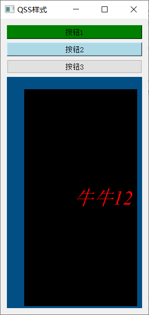
Result

Finally, let's have a little compliment! It took more than two hours to do this, and I hope it will be helpful to you. A complete UI design (Pedestrian Detection and Identity System Design) will be updated if you have the opportunity in the future. Just pay attention to it.