catalogue
1, Introduction to iris dataset
2, One dimensional data visualization
3, 2D data visualization
4, Multidimensional data visualization
5, References
1, Introduction to iris dataset
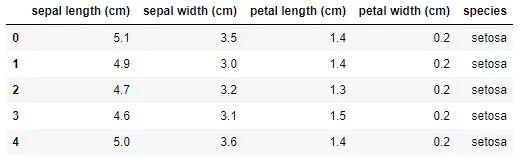
iris dataset has 150 observation values and 5 variables, namely, sepal length, sepal width, petal length, petal width and varieties. Among them, there are 3 values of varieties: setosa, virginica and versicolor. Anyway, there are 3 different varieties of Luan tail flower, with 50 observation values each. See the table below for details.
import numpy as np
import pandas as pd
import matplotlib.pyplot as plt
import seaborn as sns

%matplotlib inline
sns.set(style="white", color_codes=True)

#Load iris dataset
from sklearn.datasets import load_iris
iris_data = load_iris()
iris = pd.DataFrame(iris_data['data'], columns=iris_data['feature_names'])
iris = pd.merge(iris, pd.DataFrame(iris_data['target'], columns=['species']), left_index=True, right_index=True)
labels = dict(zip([0,1,2], iris_data['target_names']))
iris['species'] = iris['species'].apply(lambda x: labels[x])
iris.head()
Taking iris dataset as an example, we demonstrate how to use matplotlib, seaborn, pandas and sklearn for one-dimensional, two-dimensional and multi-dimensional data visualization and exploratory data analysis, so as to provide some ideas for later modeling.
2, One dimensional data visualization
Seaborn is Python's data visualization tool based on matplotlib. It provides many high-level encapsulated functions to help data analysts quickly draw beautiful data graphics and avoid many additional parameter configuration problems.
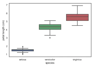
- Using boxplot to draw the relationship between individual features and varieties, we can see that different varieties of Luan tail flowers can be well divided in a single dimension of petal length. In particular, the petal length of setosa is not too different from that of the other two varieties. OK, I'll recognize you at a glance.
# look at an individual feature in Seaborn through a boxplot

sns.boxplot(x='species', y='petal length (cm)', data=iris)
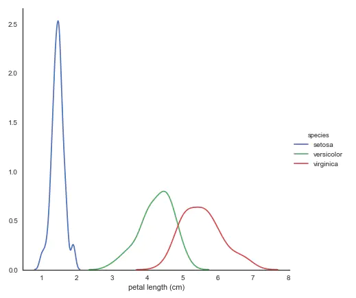
- kdeplot nuclear density map
# kdeplot looking at univariate relations
# creates and visualizes a kernel density estimate of the underlying feature

sns.FacetGrid(iris, hue='species',size=6) \
   .map(sns.kdeplot, 'petal length (cm)') \
    .add_legend()
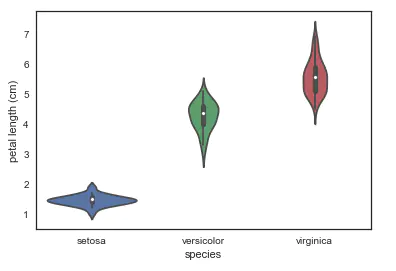
- violinplot harp chart: it combines the characteristics of box chart and kernel density estimation chart. It represents and compares the distribution of continuous variable data in the case of one or more classified variables. It is an effective method to observe the distribution of multiple data.
# A violin plot combines the benefits of the boxplot and kdeplot
# Denser regions of the data are fatter, and sparser thiner in a violin plot

sns.violinplot(x='species', y='petal length (cm)', data=iris, size=6)
3, 2D data visualization
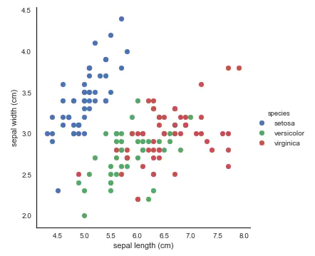
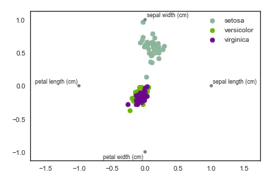
- Scatter diagram: use FacetGrid to identify the color according to the variety, which is convenient for us to find the relationship between the data. Here, two features are used for visualization. setosa is still easy to recognize as always, and virginica and versicolor are still a little inseparable.
# use seaborn's FacetGrid to color the scatterplot by species

sns.FacetGrid(iris, hue="species", size=5) \
    .map(plt.scatter, "sepal length (cm)", "sepal width (cm)") \
    .add_legend()
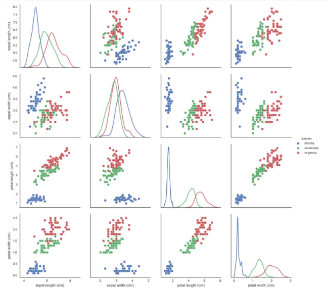
- pairplot: it's great to show the pairwise relationship of features, okay!
# pairplot shows the bivariate relation between each pair of features
# From the pairplot, we'll see that the Iris-setosa species is separataed from the other two across all feature combinations
# The diagonal elements in a pairplot show the histogram by default
# We can update these elements to show other things, such as a kde

sns.pairplot(iris, hue='species', size=3, diag_kind='kde')
4, Multidimensional data visualization
seaborn is not used for multidimensional data visualization here. pandas, matplotlib and sklearn are mainly used.
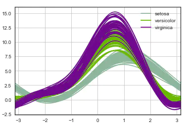
1. Andrews curve
The Andrews curve converts the attribute value of each sample into the coefficients of the Fourier sequence to create the curve. The clustering data can be visualized by marking each type of curve into different colors. The curves of samples belonging to the same category are usually closer and form a larger structure.
# Andrews Curves involve using attributes of samples as coefficients for Fourier series and then plotting these

pd.plotting.andrews_curves(iris, 'species')
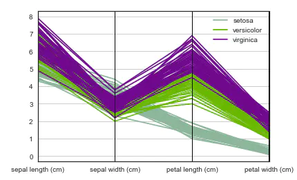
2. Parallel coordinates
Parallel coordinates are also a multi-dimensional visualization technology. It can see the categories in the data and visually estimate other statistics. When parallel coordinates are used, each point is connected with a segment. Each vertical line represents an attribute. A set of connected segments represents a data point. It may be a kind of data point that will be closer.
# Parallel coordinates plots each feature on a separate column & then draws lines connecting the features for each data sample

pd.plotting.parallel_coordinates(iris, 'species')
3. Radar map of radviz
RadViz is a way to visualize multidimensional data. It is based on the basic spring pressure minimization algorithm (which is often used in complex network analysis). Simply put, put a group of points on a plane, and each point represents an attribute. In our case, there are four points, which are placed on a unit circle. Next, you can imagine that each data set is connected to each point through a spring, and the elastic force is positively proportional to their attribute value (the attribute value has been standardized). The position of the data set on the plane is the equilibrium position of the spring. Samples of different classes are represented by different colors.
# radviz  puts each feature as a point on a 2D plane, and then simulates
# having each sample attached to those points through a spring weighted by the relative value for that feature

pd.plotting.radviz(iris, 'species')
4. Factor analysis
Factor analysis refers to the statistical technology of extracting common factors from variable groups. It was first proposed by British psychologist C.E. Spearman. He found that there is a certain correlation between students' grades in various subjects. Students with good grades in one subject often have better grades in other subjects, so he speculated whether there are some potential common factors or some general intellectual conditions that affect students' academic performance. Factor analysis can find out the hidden representative factors in many variables. Classifying the variables with the same essence into one factor can reduce the number of variables and test the hypothesis of the relationship between variables.
Based on a simple linear model of Gaussian potential variables, it is assumed that each observation is composed of low dimensional potential variables and normal noise.
from sklearn import decomposition

fa = decomposition.FactorAnalysis(n_components=2)

X = fa.fit_transform(iris.iloc[:,:-1].values)

pos=pd.DataFrame()
pos['X'] =X[:, 0]
pos['Y'] =X[:, 1]
pos['species'] = iris['species']

ax = pos[pos['species']=='virginica'].plot(kind='scatter', x='X', y='Y', color='blue', label='virginica')
pos[pos['species']=='setosa'].plot(kind='scatter', x='X', y='Y', color='green', label='setosa', ax=ax)
pos[pos['species']=='versicolor'].plot(kind='scatter', x='X', y='Y', color='red', label='versicolor', ax=ax)
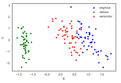
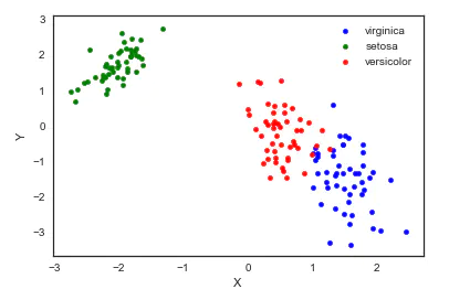
5. Principal component analysis (PCA)
Principal component analysis is a dimension reduction method evolved from factor analysis. The original features are transformed into linear independent features through orthogonal transformation. The transformed features are called principal components. Principal component analysis can reduce the original dimension to n dimensions. One special case is to reduce the dimension to 2 dimensions through principal component analysis. In this way, multidimensional data can be transformed into points in the plane to achieve the purpose of multidimensional data visualization.
from sklearn import decomposition

pca = decomposition.PCA(n_components=2)

X = pca.fit_transform(iris.iloc[:,:-1].values)

pos=pd.DataFrame()
pos['X'] =X[:, 0]
pos['Y'] =X[:, 1]
pos['species'] = iris['species']

ax = pos[pos['species']=='virginica'].plot(kind='scatter', x='X', y='Y', color='blue', label='virginica')
pos[pos['species']=='setosa'].plot(kind='scatter', x='X', y='Y', color='green', label='setosa', ax=ax)
pos[pos['species']=='versicolor'].plot(kind='scatter', x='X', y='Y', color='red', label='versicolor', ax=ax)
It should be noted that dimensionality reduction through PCA actually loses some information. We can also see how much the retained two principal components can explain the original data.
pca.fit(iris.iloc[:,:-1].values).explained_variance_ratio_
output: array([0.92461621, 0.05301557])
We can see the two principal components retained. The first principal component can explain 92.5% of the original variation, and the second principal component can explain 5.3% of the original variation. In other words, 97.8% of the original information is still retained after being reduced to two dimensions.
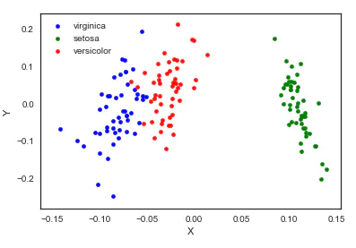
6. Independent component analysis (ICA)
Independent component analysis splits multi-source signals into sub components with the greatest possible independence. It is not used to reduce dimension at first, but to split overlapping signals.
from sklearn import decomposition

fica = decomposition.FastICA(n_components=2)

X = fica.fit_transform(iris.iloc[:,:-1].values)

pos=pd.DataFrame()
pos['X'] =X[:, 0]
pos['Y'] =X[:, 1]
pos['species'] = iris['species']

ax = pos[pos['species']=='virginica'].plot(kind='scatter', x='X', y='Y', color='blue', label='virginica')
pos[pos['species']=='setosa'].plot(kind='scatter', x='X', y='Y', color='green', label='setosa', ax=ax)
pos[pos['species']=='versicolor'].plot(kind='scatter', x='X', y='Y', color='red', label='versicolor', ax=ax)
7. Multi dimensional scaling (MDS)
The multidimensional scale attempts to find a good low dimensional representation of the distance of the original high-dimensional spatial data. In short, the multi-dimensional ruler is used for the similarity of data. It attempts to use the distance in geometric space to model the similarity of data. To put it bluntly, it is to use the distance in two-dimensional space to represent the relationship of high-dimensional space. The similarity between objects or the exchange frequency between countries can be the data of molecules. This is different from the previous method. The input of the previous method is the original data, while in the example of multidimensional ruler, the input is the distance matrix based on Euclidean distance. The multi-dimensional ruler algorithm is a continuous iterative process, so it needs to use max_iter to specify the maximum number of iterations, and the calculation time is also the largest of the above algorithms.
from sklearn import manifold

from sklearn.metrics import euclidean_distances

similarities = euclidean_distances(iris.iloc[:,:-1].values)
mds = manifold.MDS(n_components=2, max_iter=3000, eps=1e-9, dissimilarity="precomputed", n_jobs=1)
X = mds.fit(similarities).embedding_

pos=pd.DataFrame(X, columns=['X', 'Y'])
pos['species'] = iris['species']

ax = pos[pos['species']=='virginica'].plot(kind='scatter', x='X', y='Y', color='blue', label='virginica')
pos[pos['species']=='setosa'].plot(kind='scatter', x='X', y='Y', color='green', label='setosa', ax=ax)
pos[pos['species']=='versicolor'].plot(kind='scatter', x='X', y='Y', color='red', label='versicolor', ax=ax)
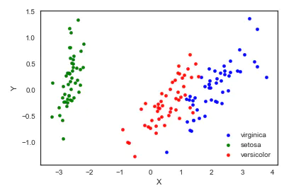
8. TSNE(t-distributed Stochastic Neighbor Embedding)
t-SNE(t-distributed random neighborhood embedding) is a nonlinear dimensionality reduction algorithm for exploring high-dimensional data. The observed clusters are identified based on the similarity of data points with multiple features to find patterns in the data, and the multidimensional data is mapped to two or more dimensions suitable for human observation. It is essentially a dimensionality reduction and visualization technology. The best way to use this algorithm is to use it for exploratory data analysis.
from sklearn.manifold import TSNE

iris_embedded = TSNE(n_components=2).fit_transform(iris.iloc[:,:-1])

pos = pd.DataFrame(iris_embedded, columns=['X','Y'])
pos['species'] = iris['species']

ax = pos[pos['species']=='virginica'].plot(kind='scatter', x='X', y='Y', color='blue', label='virgnica')
pos[pos['species']=='setosa'].plot(kind='scatter', x='X', y='Y', color='green', label='setosa', ax=ax)
pos[pos['species']=='versicolor'].plot(kind='scatter', x='X', y='Y', color='red', label='versicolor', ax=ax)
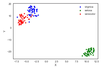
Well, I think the result of TSNE is the most lovely ⁄ (⁄ • ⁄) ω⁄•⁄ ⁄)⁄
5, References
- Python Data Visualizations
- Multidimensional data visualization
- More advanced than PCA dimensionality reduction -- (R/Python) t-SNE clustering algorithm practice guide
Link: https://www.jianshu.com/p/3bb2cc453df1