1. pygal (chart type Bar)
The Python visualization package Pygal will be used to generate scalable vector graphics files
Official pygal document: [www.pygal.org/en/stable/]( http://www.pygal.org/en/stable/)
1. Install pygal
pip install pygal -i https://pypi.tuna.tsinghua.edu.cn/simple
2. Simple python charts
import pygal
pygal.Bar()(1, 3, 3, 7)(1, 6, 6, 4).render()
Generate svg charts
pygal.Bar()(1, 3, 3, 7)(1, 6, 6, 4).render_to_file("simple.svg")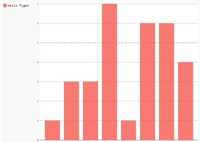
You need to view its source file to display the picture.
3. Make multi-series icons (Bar)
import pygal

# pygal.Bar()(1, 3, 3, 7)(1, 6, 6, 4)(5,7,8,13)(5,7,4,9).render_to_file("xgp.svg")

py_bar = pygal.Bar()
py_bar.add("Headline",[1, 3, 3, 7])
py_bar.add("Subtitle",[1, 6, 6, 4])
py_bar.render_to_file("wsd.svg")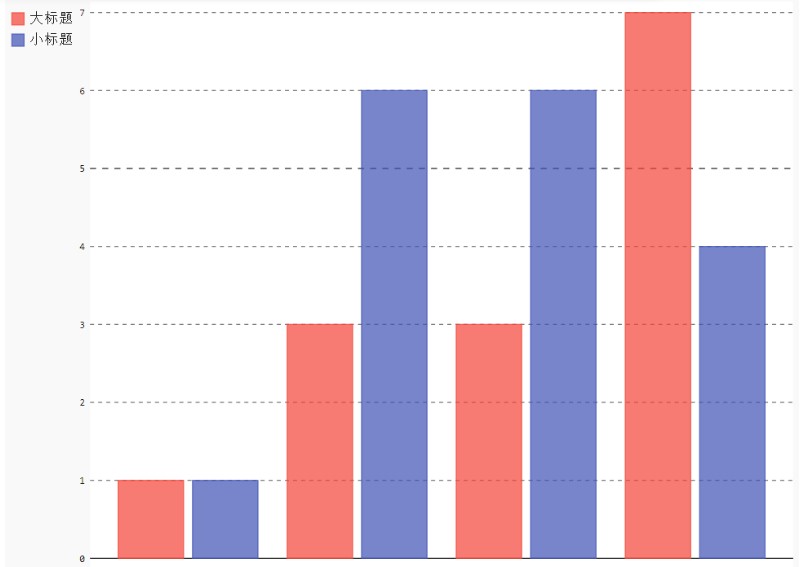
4. StackedBar
import pygal

# pygal.Bar()(1, 3, 3, 7)(1, 6, 6, 4)(5,7,8,13)(5,7,4,9).render_to_file("xgp.svg")

py_bar = pygal.StackedBar()
py_bar.add("Headline",[1, 3, 3, 7])
py_bar.add("Subtitle",[1, 6, 6, 4])
py_bar.render_to_file("wsd.svg")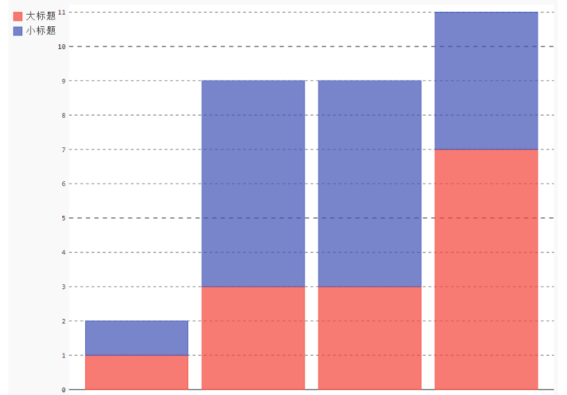
5. HorizontalStackedBar
import pygal

# pygal.Bar()(1, 3, 3, 7)(1, 6, 6, 4)(5,7,8,13)(5,7,4,9).render_to_file("xgp.svg")

py_bar = pygal.HorizontalStackedBar()
py_bar.add("Headline",[1, 3, 3, 7])
py_bar.add("Subtitle",[1, 6, 6, 4])
py_bar.render_to_file("wsd.svg")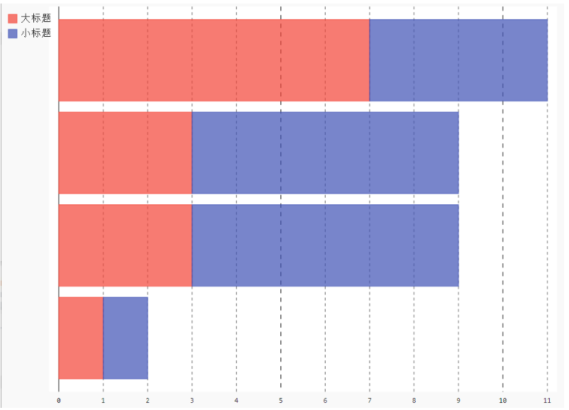
2. pygal (various chart types)
1. Basic Line
import pygal

# pygal.Bar()(1, 3, 3, 7)(1, 6, 6, 4)(5,7,8,13)(5,7,4,9).render_to_file("xgp.svg")

py_bar = pygal.Line()
py_bar.add("Headline",[1, 3, 3, 7])
py_bar.add("Subtitle",[1, 6, 6, 4])
py_bar.render_to_file("wsd.svg")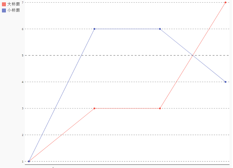
2,Horizontal Line
Same graphic but horizontal, ranging from 0-100.
import pygal

# pygal.Bar()(1, 3, 3, 7)(1, 6, 6, 4)(5,7,8,13)(5,7,4,9).render_to_file("xgp.svg")

py_bar = pygal.HorizontalLine()
py_bar.add("Headline",[1, 3, 3, 7])
py_bar.add("Subtitle",[1, 6, 6, 4])
py_bar.range = [0, 10]
py_bar.render_to_file("wsd.svg")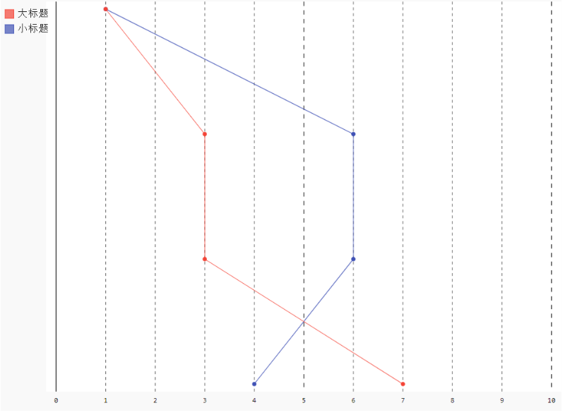
3,Stacked
Same graphics but with stacked values and fill rendering
import pygal

# pygal.Bar()(1, 3, 3, 7)(1, 6, 6, 4)(5,7,8,13)(5,7,4,9).render_to_file("xgp.svg")

py_bar = pygal.StackedLine(fill=True)
py_bar.add("Headline",[1, 3, 3, 7])
py_bar.add("Subtitle",[1, 6, 6, 4])
py_bar.range = [0, 10]
py_bar.render_to_file("wsd.svg")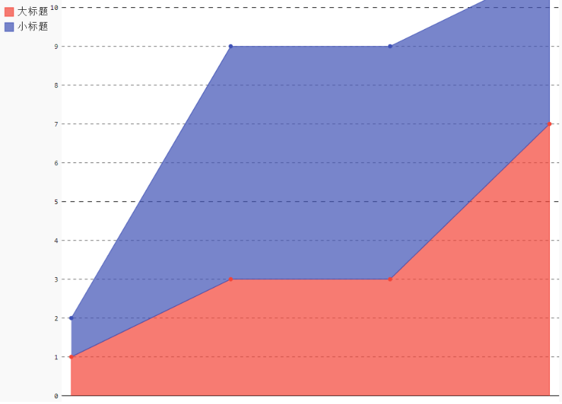
4,Time
For time-dependent graphs, you only need to format the label or use a variant of the xy chart
import pygal
from datetime import datetime

# x_label_rotation=20 means that the x-axis label rotates 20 degrees to the right, negative numbers to the left
date_chart = pygal.Line(x_label_rotation=-20)
date_chart.x_labels = map(lambda d: d.strftime('%Y-%m-%d'), [
 datetime(2013, 1, 2),
 datetime(2013, 1, 12),
 datetime(2013, 2, 2),
 datetime(2013, 2, 22)])
date_chart.add("Visits", [300, 412, 823, 672])
date_chart.render_to_file("line-time.svg")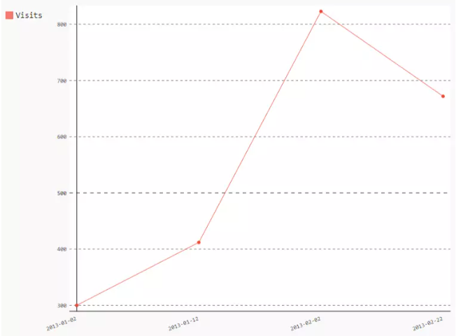
Lambda is an expression or an anonymous function
def sum(x, y):
    return x + y
This can be written in Lambda
p = lambda x, y: x + y
5,Histogram
Basic
A histogram is a special bar. It takes three values for a bar: the height of the ordinate coordinate, the beginning of the horizontal coordinate, and the end of the horizontal coordinate.
import pygal

hist = pygal.Histogram()
hist.add('Wide bars', [(5, 0, 10), (4, 5, 13), (2, 0, 15)])
hist.add('Narrow bars',  [(10, 1, 2), (12, 4, 4.5), (8, 11, 13)])
hist.render_to_file("histogram-basic.svg")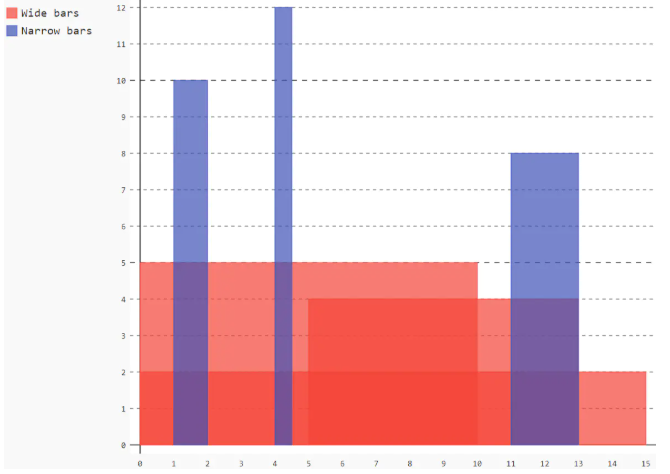
6,Scatter Plot
Disabling lines between points and points to obtain scatterplots
import pygal
from math import cos

xy_chart = pygal.XY()
xy_chart.title = 'XY Cosinus'
xy_chart.add('x = cos(y)', [(cos(x / 10.), x / 10.) for x in range(-50, 50, 5)])
xy_chart.add('y = cos(x)', [(x / 10., cos(x / 10.)) for x in range(-50, 50, 5)])
xy_chart.add('x = 1',  [(1, -5), (1, 5)])
xy_chart.add('x = -1', [(-1, -5), (-1, 5)])
xy_chart.add('y = 1',  [(-5, 1), (5, 1)])
xy_chart.add('y = -1', [(-5, -1), (5, -1)])
xy_chart.render_to_file("xy-basic.svg")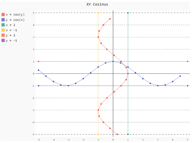
7,Pie
A simple pie chart
import pygal

pie_chart = pygal.Pie()
pie_chart.title = 'Browser usage in February 2012 (in %)'
pie_chart.add('IE', 19.5)
pie_chart.add('Firefox', 36.6)
pie_chart.add('Chrome', 36.3)
pie_chart.add('Safari', 4.5)
pie_chart.add('Opera', 2.3)
pie_chart.render_to_file("pie-basic.svg")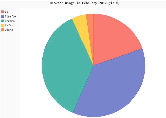
8,Multi-series pie
Same pie chart, but divided into subcategories
import pygal

pie_chart = pygal.Pie()
pie_chart.title = 'Browser usage by version in February 2012 (in %)'
pie_chart.add('IE', [5.7, 10.2, 2.6, 1])
pie_chart.add('Firefox', [.6, 16.8, 7.4, 2.2, 1.2, 1, 1, 1.1, 4.3, 1])
pie_chart.add('Chrome', [.3, .9, 17.1, 15.3, .6, .5, 1.6])
pie_chart.add('Safari', [4.4, .1])
pie_chart.add('Opera', [.1, 1.6, .1, .5])
pie_chart.render_to_file("pie-multi-series.svg")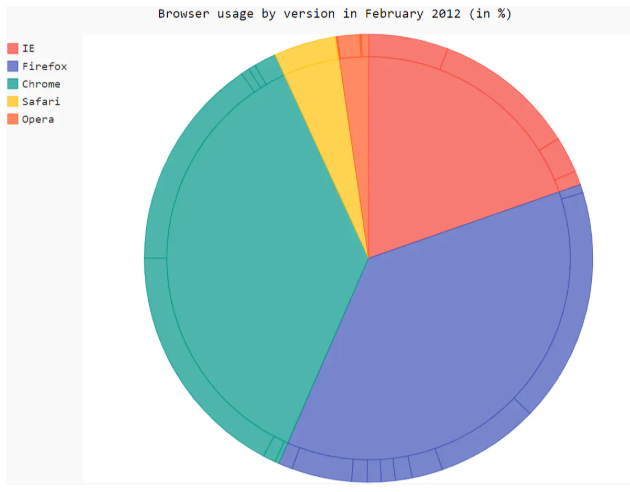
9,Radar
Simple Kiviat Diagram
import pygal

# pygal.Bar()(1, 3, 3, 7)(1, 6, 6, 4)(5,7,8,13)(5,7,4,9).render_to_file("xgp.svg")

py_bar = pygal.Radar()
py_bar.add("Headline",[1, 3, 3, 7])
py_bar.add("Subtitle",[1, 6, 6, 4])
py_bar.range = [0, 10]
py_bar.render_to_file("wsd.svg")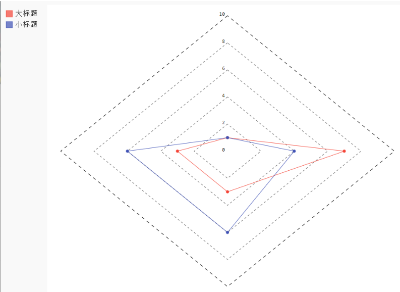
10,Box
Extremes (default)
import pygal

box_plot = pygal.Box()
box_plot.title = 'V8 benchmark results'
box_plot.add('Chrome', [6395, 8212, 7520, 7218, 12464, 1660, 2123, 8607])
box_plot.add('Firefox', [7473, 8099, 11700, 2651, 6361, 1044, 3797, 9450])
box_plot.add('Opera', [3472, 2933, 4203, 5229, 5810, 1828, 9013, 4669])
box_plot.add('IE', [43, 41, 59, 79, 144, 136, 34, 102])
box_plot.render_to_file("box-extremes.svg")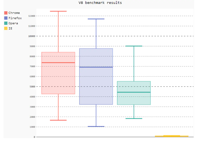
11,Dot
import pygal

# pygal.Bar()(1, 3, 3, 7)(1, 6, 6, 4)(5,7,8,13)(5,7,4,9).render_to_file("xgp.svg")

py_bar = pygal.Dot(x_label_rotation=30)
py_bar.add("Headline",[1, 3, 3, 7])
py_bar.add("Subtitle",[1, 6, 6, 4])
py_bar.range = [0, 10]
py_bar.render_to_file("wsd.svg")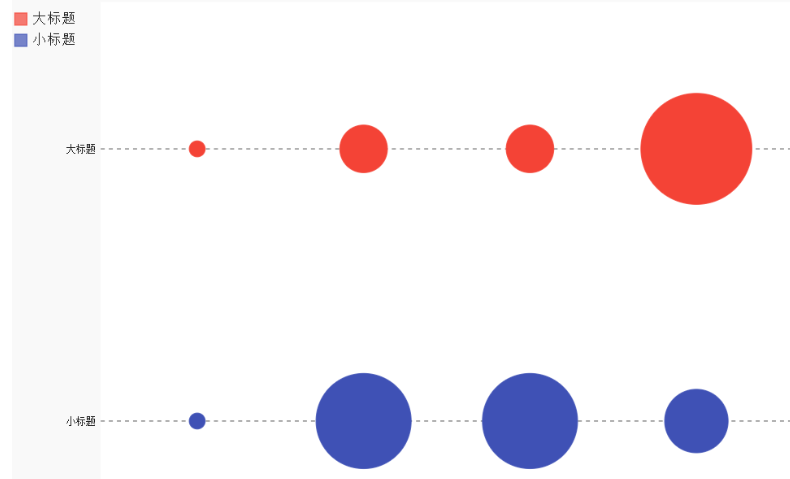
12,Funnel
funnel plot
import pygal

funnel_chart = pygal.Funnel()
funnel_chart.title = 'V8 benchmark results'
funnel_chart.x_labels = ['Richards', 'DeltaBlue', 'Crypto', 'RayTrace', 'EarleyBoyer', 'RegExp', 'Splay', 'NavierStokes']
funnel_chart.add('Opera', [3472, 2933, 4203, 5229, 5810, 1828, 9013, 4669])
funnel_chart.add('Firefox', [7473, 8099, 11700, 2651, 6361, 1044, 3797, 9450])
funnel_chart.add('Chrome', [6395, 8212, 7520, 7218, 12464, 1660, 2123, 8607])
funnel_chart.render_to_file('funnel-basic.svg')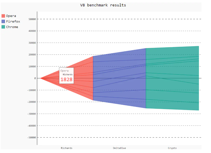
13,SolidGauge
import pygal

gauge = pygal.SolidGauge(inner_radius=0.70)
# Percentage Format
percent_formatter = lambda x: '{:.10g}%'.format(x)
# Dollar format
dollar_formatter = lambda x: '{:.10g}$'.format(x)
gauge.value_formatter = percent_formatter

gauge.add('Series 1', [{'value': 225000, 'max_value': 1275000}],
          formatter=dollar_formatter)
gauge.add('Series 2', [{'value': 110, 'max_value': 100}])
gauge.add('Series 3', [{'value': 3}])
gauge.add(
    'Series 4', [
        {'value': 51, 'max_value': 100},
        {'value': 12, 'max_value': 100}])
gauge.add('Series 5', [{'value': 79, 'max_value': 100}])
gauge.add('Series 6', 99)
gauge.add('Series 7', [{'value': 100, 'max_value': 100}])
gauge.render_to_file('solidgauge-normal.svg')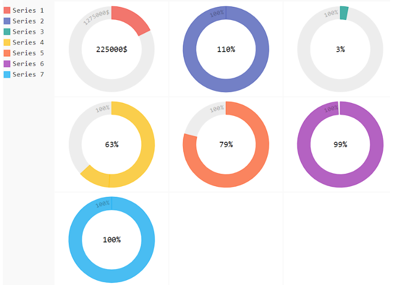
14,Gauge
Instrument Diagram
import pygal

gauge_chart = pygal.Gauge(human_readable=True)
gauge_chart.title = 'DeltaBlue V8 benchmark results'
gauge_chart.range = [0, 10000]
gauge_chart.add('Chrome', 8212)
gauge_chart.add('Firefox', 8099)
gauge_chart.add('Opera', 2933)
gauge_chart.add('IE', 41)
gauge_chart.render_to_file('gauge-basic.svg')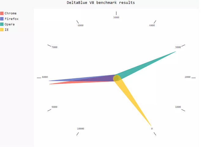
15,Maps
World map
install
pip install pygal_maps_world
Countries
import pygal

worldmap_chart = pygal.maps.world.World()
worldmap_chart.title = 'Some countries'
worldmap_chart.add('C countries', ['cn', 'ca', 'ch', 'cg'])
worldmap_chart.add('F countries', ['fr', 'fi'])
worldmap_chart.add('M countries', ['ma', 'mc', 'md', 'me', 'mg',
                                   'mk', 'ml', 'mm', 'mn', 'mo',
                                   'mr', 'mt', 'mu', 'mv', 'mw',
                                   'mx', 'my', 'mz'])
worldmap_chart.add('U countries', ['ua', 'ug', 'us', 'uy', 'uz'])
worldmap_chart.render_to_file('world-map-countries.svg')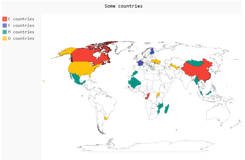
16,Continents
Visit continents
import pygal

supra = pygal.maps.world.SupranationalWorld()
supra.add('Asia', [('asia', 1)])
supra.add('Europe', [('europe', 1)])
supra.add('Africa', [('africa', 1)])
supra.add('North america', [('north_america', 1)])
supra.add('South america', [('south_america', 1)])
supra.add('Oceania', [('oceania', 1)])
supra.add('Antartica', [('antartica', 1)])
supra.render_to_file('world-map-continents.svg')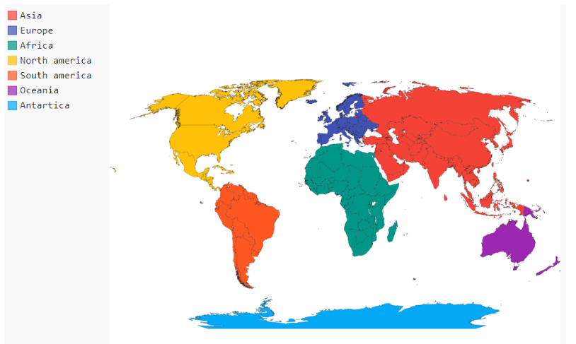
3. Throwing Colors
Analyze point probability and plot histogram
1. Create source files (references required)
from random import randint

class Die():
    """Class representing a chromaton"""
    def __init__(self,num_sides=6):
        """Colors default to 6 sides"""
        self.num_sides=num_sides

    def roll(self):
        """Returns a random value between 1 and the number of chromatic faces"""
        return randint(1, self.num_sides)
2. Create a color
from Pygal.Example.die import Die
import pygal
# Create a color
die = Die()
# Throw a few colors and store the results in a list
results = []
for roll in range(1000):
r = die.roll()
results.append(r)
print(results)
# Analysis results
frequencies = []
for value in range(1, die.num_sides+1):
frequency = results.count(value)
frequencies.append(frequency)
print(frequencies)
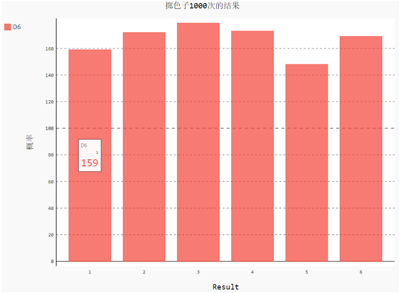
# Visualize results
hist = pygal.Bar()
hist.title='Results of 1000 chromaton throws'
hist.x_labels = ['1','2','3','4','5','6']
hist.x_title='Result'
hist.y_title='probability'
hist.add('D6',frequencies)
hist.render_to_file('die_visual.svg')Open the file with your browser and point your mouse at the data to see the title "D6", the coordinates for the x-axis, and the coordinates for the y-axis.
It can be found that the frequency of the six numbers is similar (theoretically, the probability is 1/6, and the trend becomes more and more obvious as the number of experiments increases).
3. Roll two dices at the same time
Just change the code a little and instantiate a dice
from Pygal.Example.die import Die
import pygal
# Create two colors
die_1 = Die()
die_2 = Die()
# Throw a few colors and store the results in a list
results = []
for roll in range(1000):
r = die_1.roll() + die_2.roll()
results.append(r)
print(results)
# Analysis results
frequencies = []
max_result= die_1.num_sides + die_2.num_sides
for value in range(2, max_result + 1):
frequency = results.count(value)
frequencies.append(frequency)
print(frequencies)
# Visualize results
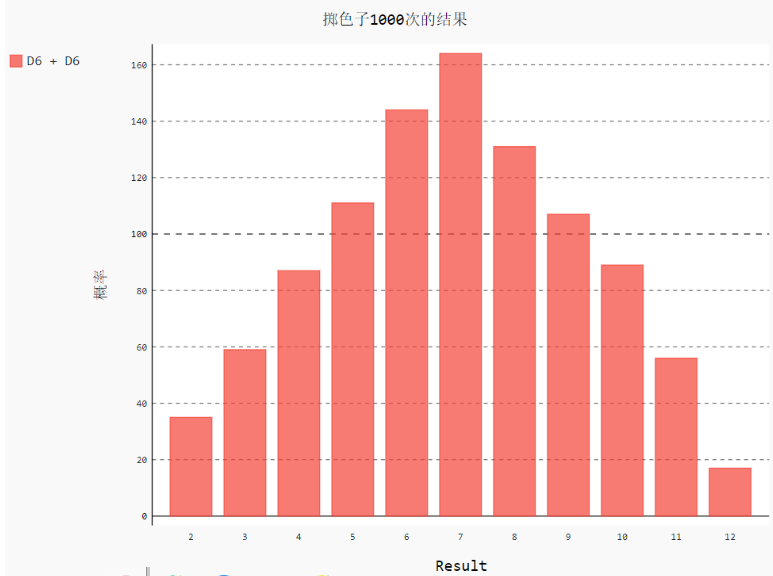
hist = pygal.Bar()
hist.title='Results of 1000 chromaton throws'
hist.x_labels = ['2','3','4','5','6','7','8','9','10','11','12']
hist.x_title='Result'
hist.y_title='probability'
hist.add('D6 + D6',frequencies)
hist.render_to_file('die_visualc.svg')****As you can see from the graph, the sum of the two dices is 7 times the most and 2 times the least.Since there is only one case where 2 can be thrown - > (1, 1); whereas there are six cases where 7 can be thrown (1, 6), (2, 5), (3, 4), (4, 3), (5, 2), (6, 1), there are no more than 7 cases in which the probability of 7 being thrown is the highest.
4. Roll two dices at the same time (six and ten)
from Pygal.Example.die import Die
import pygal
# Create two colors
die_1 = Die()
die_2 = Die(10)

# Throw a few colors and store the results in a list
results = []
for roll in range(50000):
    r = die_1.roll() + die_2.roll()
    results.append(r)
print(results)

# Analysis results
frequencies = []
max_result= die_1.num_sides + die_2.num_sides
for value in range(2, max_result + 1):
    frequency = results.count(value)
    frequencies.append(frequency)

print(frequencies)

# Visualize results
hist = pygal.Bar()
hist.title='Results of 1000 chromaton throws'
# hist.x_labels = ['2','3','4','5','6','7','8','9','10','11','12','13','14','15','16']
hist.x_labels = [i for i in range(2,max_result+1)]
hist.x_title='Result'
hist.y_title='probability'
hist.add('D6 + D6',frequencies)
hist.render_to_file('die_visualcc.svg')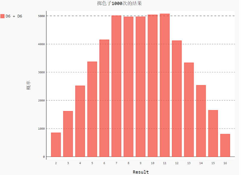
4. Python Processing csv Files
CSV(Comma-Separated Values), or comma-separated values, can be opened for viewing in Excel.Since it is plain text, any editor can also be opened.Unlike Excel files, CSV files:
- Value has no type, all values are strings
- Styles such as font color cannot be specified
- Cannot specify cell width and height, cannot merge cells
- No more than one worksheet
- Image charts cannot be embedded
In a CSV file, two cells are separated by, as a separator.Like a, c means that there is a blank cell between cell a and cell c.And so on.
Not every comma represents a cell boundary.So even if the CSV is a plain text file, it still insists on using specialized modules for processing.Python has a built-in CSV module.Let's start with a simple example.
1. Read data from CSV files
import csv

filename = 'F:/Jupyter Notebook/matplotlib_pygal_csv_json/sitka_weather_2014.csv'
with open(filename) as f:
    reader = csv.reader(f)
    print(list(reader))
**Data can't be printed directly. The outermost layer of list(data) is a list, and each row of data in the inner layer is in a list, a bit like this**
[['name', 'age'], ['Bob', '14'], ['Tom', '23'], ...]
So we can access Bob's age reader[1][1], traversing through the for loop as follows
import csv

filename = 'F:/Jupyter Notebook/matplotlib_pygal_csv_json/sitka_weather_2014.csv'
with open(filename) as f:
    reader = csv.reader(f)
    for row in reader:
        # Line number starts from 1
        print(reader.line_num, row)
Intercept part of output
1 ['AKST', 'Max TemperatureF]
2 ['2014-1-1', '46', '42', '37', '40', '38', '36', '97', 138']
...
The preceding number is the line number, which you can get from reader.line_num starting with 1.
Note that the reader can only be traversed once.Since reader is an iterative object, you can use the next method to get one row at a time.
import csv

filename = 'F:/Jupyter Notebook/matplotlib_pygal_csv_json/sitka_weather_2014.csv'
with open(filename) as f:
    reader = csv.reader(f)
    # Read a line that is no longer available in the reader below
    head_row = next(reader)
    for row in reader:
        # Line number starts at 2
        print(reader.line_num, row)
2. Write data to csv file
There are reader s to read and, of course, writer s to write to.Write one line at a time, multiple lines at a time.
import csv

# Numbers with numbers and strings are fine
datas = [['name', 'age'],
         ['Bob', 14],
         ['Tom', 23],
        ['Jerry', '18']]

with open('example.csv', 'w', newline='') as f:
    writer = csv.writer(f)
    for row in datas:
        writer.writerow(row)

    # You can also write multiple lines
    writer.writerows(datas)
If newline=''is not specified, an empty line will be written for each written line.The above code generates the following.
name,age
Bob,14
Tom,23
Jerry,18
name,age
Bob,14
Tom,23
Jerry,18
3. DictReader and DictWriter objects
Using DictReader, you can get data like a dictionary, using the first row of the table (typically the header) as the key.You can access the data corresponding to that key in each row.
import csv

filename = 'F:/Jupyter Notebook/matplotlib_pygal_csv_json/sitka_weather_2014.csv'
with open(filename) as f:
    reader = csv.DictReader(f)
    for row in reader:
        # Max TemperatureF is a data in the first row of the table as a key
        max_temp = row['Max TemperatureF']
        print(max_temp)
Using the DictWriter class, you can write data as a dictionary, with the same key as the header (the first row of the table).
import csv

headers = ['name', 'age']

datas = [{'name':'Bob', 'age':23},
        {'name':'Jerry', 'age':44},
        {'name':'Tom', 'age':15}
        ]

with open('example.csv', 'w', newline='') as f:
    # The header is passed in here as the first row of data
    writer = csv.DictWriter(f, headers)
    writer.writeheader()
    for row in datas:
        writer.writerow(row)

    # You can also write multiple lines
    writer.writerows(datas)
4. Statistical monthly maximum temperature
import csv
from matplotlib import pyplot as plt
from datetime import datetime

plt.rcParams['font.sans-serif']=['SimHei'] #Used for normal display of Chinese labels
plt.rcParams['axes.unicode_minus']=False #Used for normal negative sign display

filename = 'Python-sitka_weather_2014.csv'
with open(filename) as f:
    # Calling the reader() function passes the f object as a parameter to it to create a reader object associated with the file
    reader = csv.reader(f)
    # Returns the next line in the file
    header_row = next(reader)
    # print(header_row)

    # for index, column_header in enumerate(header_row):
    #     print(index, column_header)

    highs = []
    for row in reader:
        # Convert strings to numbers using int() so that matplotlib can read them
        high = int(row[1])
        highs.append(high)

    print(highs)

    # Draw graphics from data
    fig = plt.figure(dpi=128, figsize=(16, 9))
    plt.plot(highs, c='red')

    # Format Graphics
    plt.title('2014 Annual Maximum Temperature', fontsize=24)
    plt.xlabel('', fontsize=16)
    plt.ylabel('Maximum Temperature', fontsize=16)
    plt.tick_params(axis='both', which='major', labelsize=16)

    plt.show()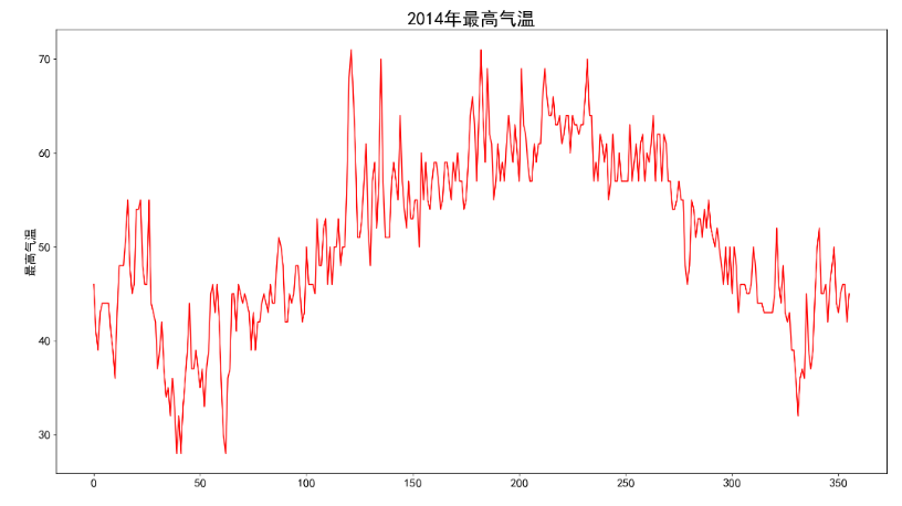
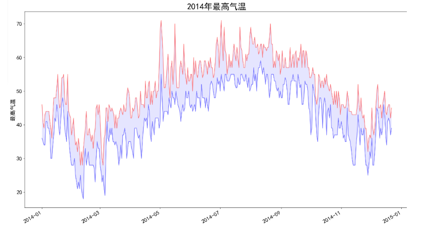
5. Statistical monthly maximum and minimum temperatures
import csv
from matplotlib import pyplot as plt
from datetime import datetime

plt.rcParams['font.sans-serif'] = ['SimHei']  # Used for normal display of Chinese labels
plt.rcParams['axes.unicode_minus'] = False  # Used for normal negative sign display

filename = 'Python-sitka_weather_2014.csv'
with open(filename) as f:
    # Calling the reader() function passes the f object as a parameter to it to create a reader object associated with the file
    reader = csv.reader(f)
    # Returns the next line in the file
    header_row = next(reader)
    # print(header_row)

    dates, highs, lows = [], [], []
    for row in reader:
        current_date = datetime.strptime(row[0], "%Y/%m/%d")
        dates.append(current_date)
        # print(current_date)

        # Convert strings to numbers using int() so that matplotlib can read them
        high = int(row[1])
        highs.append(high)

        low = int(row[3])
        lows.append(low)

    # print(highs)

    # Draw graphics from data
    fig = plt.figure(dpi=128, figsize=(16, 9))
    plt.plot(dates, highs, c='red', alpha=0.5)
    plt.plot(dates, lows, c='blue', alpha=0.5)
    plt.fill_between(dates, highs, lows, facecolor='blue', alpha=0.1)

    # Format Graphics
    plt.title('2014 Annual Maximum Temperature', fontsize=24)
    plt.xlabel('', fontsize=16)
    # Draw slash labels
    fig.autofmt_xdate()
    plt.ylabel('Maximum Temperature', fontsize=16)
    plt.tick_params(axis='both', which='major', labelsize=16)

    plt.show()
    # plt.savefig('hish.png')