pyecharts Is a for generating Echarts Class library of charts. In fact, it is the docking between echarts and Python. Echarts is a data visualization JS library open source by Baidu. It is mainly used for data visualization.
install
Pyecarts is compatible with Python 2 and python 3. The current version is 0.1.6
pip install pyecharts
introduction
Start by drawing your first chart
from pyecharts import Bar

bar = Bar("My first chart", "Here is the subtitle")
bar.add("clothing", ["shirt", "cardigan", "Chiffon shirt", "trousers", "high-heeled shoes", "Socks"], [5, 20, 36, 10, 75, 90])
bar.show_config()
bar.render()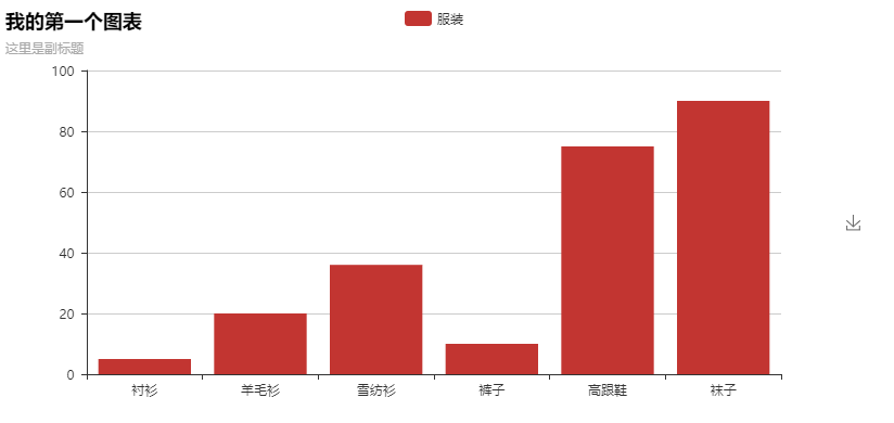
Tip: you can press the download button on the right to download the picture to the local
- add()
The main method is used to add chart data and set various configuration items - show_config()
Print out all configuration items of the chart - render()
By default, a render will be generated in the root directory HTML file, support path parameter, set file saving location, such as render(r"e:\my_first_chart.html"), and open the file with browser.
The default encoding type is UTF-8. There is no problem in Python 3. Python 3 supports Chinese much better. However, in Python 2, the coding processing is a headache. For the time being, no perfect solution can be found. At present, I can only conduct secondary coding through the text editor. I use Visual Studio Code. I first open it through Gbk coding, and then save it again in UTF-8. In this way, if I open it with the browser, there will be no Chinese garbled code problem.
Basically, all chart types are drawn in this way:
- chart_name = Type() initializes the specific type chart.
- add() adds data and configuration items.
- render() generates html file
Chart type
Due to space reasons, only examples of each chart type (code + generated chart) are given here in order to arouse the interest of readers. Please refer to the project for detailed parameter introduction README.md Documentation
Bar (bar chart / bar chart)
from pyecharts import Bar

attr = ["shirt", "cardigan", "Chiffon shirt", "trousers", "high-heeled shoes", "Socks"]
v1 = [5, 20, 36, 10, 75, 90]
v2 = [10, 25, 8, 60, 20, 80]
bar = Bar("Histogram data stacking example")
bar.add("business A", attr, v1, is_stack=True)
bar.add("business B", attr, v2, is_stack=True)
bar.render()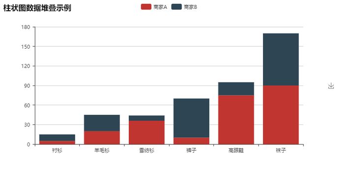
from pyecharts import Bar

bar = Bar("Example of marker line and marker point")
bar.add("business A", attr, v1, mark_point=["average"])
bar.add("business B", attr, v2, mark_line=["min", "max"])
bar.render()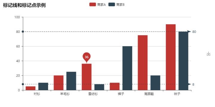
from pyecharts import Bar

bar = Bar("x Shaft and y Axis exchange")
bar.add("business A", attr, v1)
bar.add("business B", attr, v2, is_convert=True)
bar.render()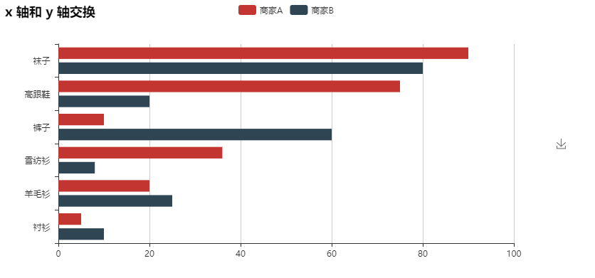
Effectscutter (scatter chart with ripple effect animation)
from pyecharts import EffectScatter

v1 = [10, 20, 30, 40, 50, 60]
v2 = [25, 20, 15, 10, 60, 33]
es = EffectScatter("Dynamic scatter diagram example")
es.add("effectScatter", v1, v2)
es.render()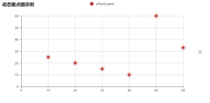
es = EffectScatter("Various graphic examples of dynamic scatter diagram")
es.add("", [10], [10], symbol_size=20, effect_scale=3.5, effect_period=3, symbol="pin")
es.add("", [20], [20], symbol_size=12, effect_scale=4.5, effect_period=4,symbol="rect")
es.add("", [30], [30], symbol_size=30, effect_scale=5.5, effect_period=5,symbol="roundRect")
es.add("", [40], [40], symbol_size=10, effect_scale=6.5, effect_brushtype='fill',symbol="diamond")
es.add("", [50], [50], symbol_size=16, effect_scale=5.5, effect_period=3,symbol="arrow")
es.add("", [60], [60], symbol_size=6, effect_scale=2.5, effect_period=3,symbol="triangle")
es.render()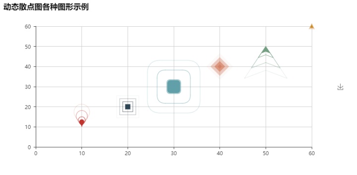
Funnel diagram
from pyecharts import Funnel

attr = ["shirt", "cardigan", "Chiffon shirt", "trousers", "high-heeled shoes", "Socks"]
value = [20, 40, 60, 80, 100, 120]
funnel = Funnel("Funnel diagram example")
funnel.add("commodity", attr, value, is_label_show=True, label_pos="inside", label_text_color="#fff")
funnel.render()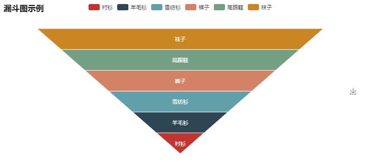
Gauge (instrument cluster)
from pyecharts import Gauge

gauge = Gauge("Dashboard example")
gauge.add("Business indicators", "Completion rate", 66.66)
gauge.show_config()
gauge.render()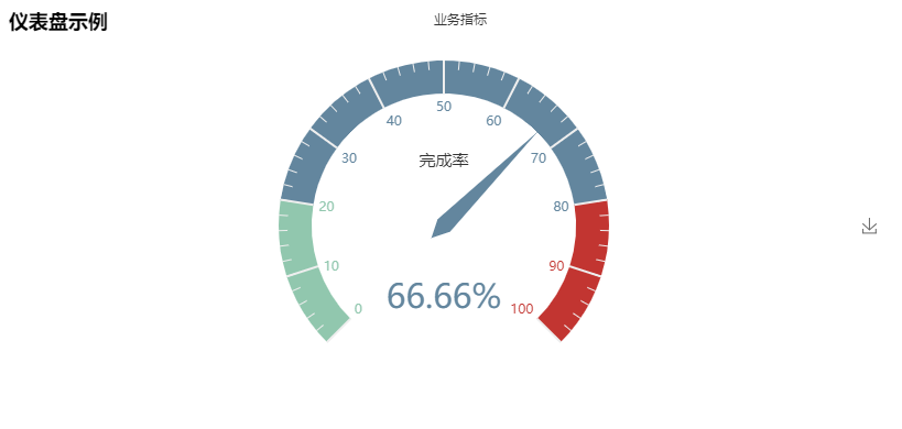
Geo (geographic coordinate system)
Scatter type
from pyecharts import Geo

data = [
    ("Haimen", 9),("erdos", 12),("Zhaoyuan", 12),("Zhoushan", 12),("Qiqihar", 14),("ynz ", 15),
    ("Chifeng", 16),("Qingdao", 18),("Rushan", 18),("Jinchang", 19),("Quanzhou", 21),("Lacey", 21),
    ("sunshine", 21),("Jiaonan", 22),("Nantong", 23),("Lhasa", 24),("Yunfu", 24),("Meizhou", 25)...]
geo = Geo("Air quality of major cities in China", "data from pm2.5", title_color="#fff", title_pos="center",
width=1200, height=600, background_color='#404a59')
attr, value = geo.cast(data)
geo.add("", attr, value, visual_range=[0, 200], visual_text_color="#fff", symbol_size=15, is_visualmap=True)
geo.show_config()
geo.render()
HeatMap type
geo = Geo("Air quality of major cities in China", "data from pm2.5", title_color="#fff", title_pos="center", width=1200, height=600,
background_color='#404a59')
attr, value = geo.cast(data)
geo.add("", attr, value, type="heatmap", is_visualmap=True, visual_range=[0, 300], visual_text_color='#fff')
geo.show_config()
geo.render()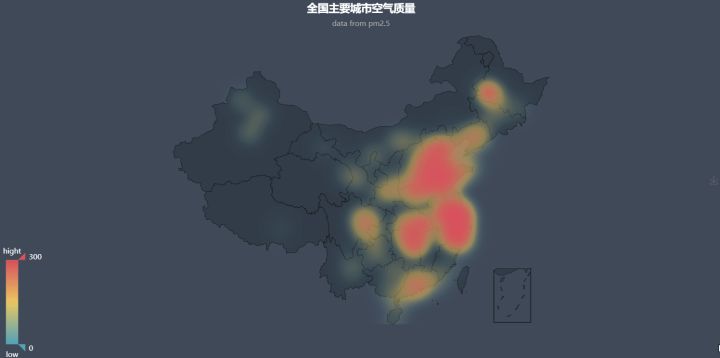
Effectscutter type
from pyecharts import Geo

data = [("Haimen", 9), ("erdos", 12), ("Zhaoyuan", 12), ("Zhoushan", 12), ("Qiqihar", 14), ("ynz ", 15)]
geo = Geo("Air quality of major cities in China", "data from pm2.5", title_color="#fff", title_pos="center",
          width=1200, height=600, background_color='#404a59')
attr, value = geo.cast(data)
geo.add("", attr, value, type="effectScatter", is_random=True, effect_scale=5)
geo.show_config()
geo.render()
Graph
from pyecharts import Graph

nodes = [{"name": "Node 1", "symbolSize": 10},
         {"name": "Node 2", "symbolSize": 20},
         {"name": "Node 3", "symbolSize": 30},
         {"name": "Node 4", "symbolSize": 40},
         {"name": "Node 5", "symbolSize": 50},
         {"name": "Node 6", "symbolSize": 40},
         {"name": "Node 7", "symbolSize": 30},
         {"name": "Node 8", "symbolSize": 20}]
links = []
for i in nodes:
    for j in nodes:
        links.append({"source": i.get('name'), "target": j.get('name')})
graph = Graph("Relation diagram-Ring layout example")
graph.add("", nodes, links, is_label_show=True, repulsion=8000, layout='circular', label_text_color=None)
graph.show_config()
graph.render()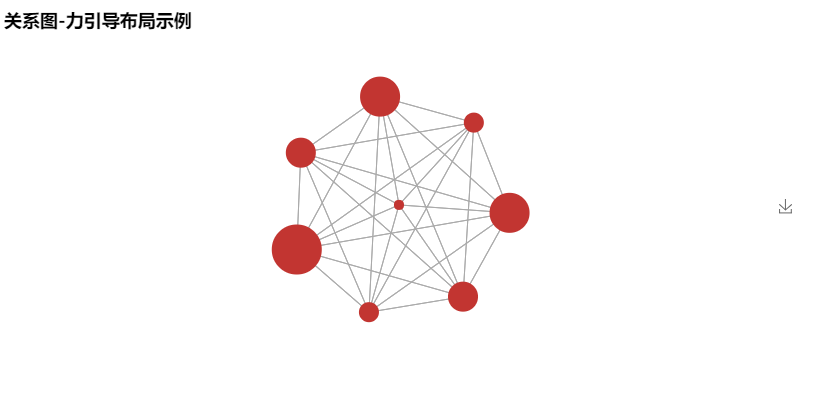
from pyecharts import Graph

import json
with open("..\json\weibo.json", "r", encoding="utf-8") as f:
    j = json.load(f)
    nodes, links, categories, cont, mid, userl = j
graph = Graph("Microblog forwarding diagram", width=1200, height=600)
graph.add("", nodes, links, categories, label_pos="right", repulsion=50, is_legend_show=False,
          line_curve=0.2, label_text_color=None)
graph.show_config()
graph.render()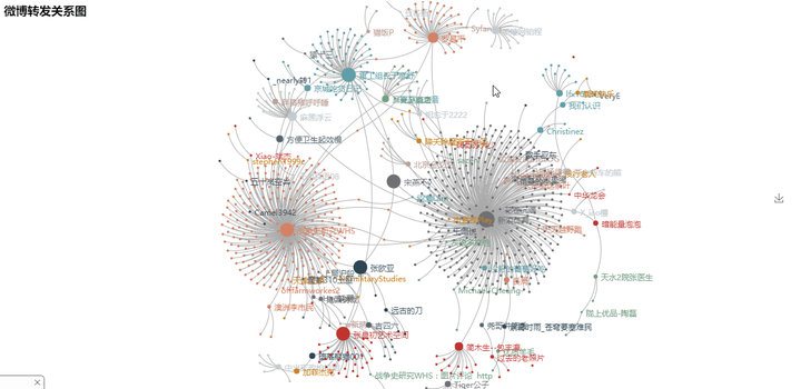
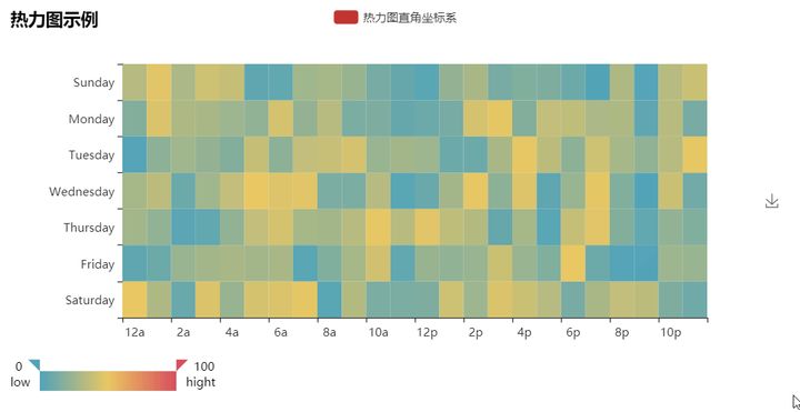
HeatMap (thermal map)
import random
from pyecharts import HeatMap

x_axis = ["12a", "1a", "2a", "3a", "4a", "5a", "6a", "7a", "8a", "9a", "10a", "11a",
"12p", "1p", "2p", "3p", "4p", "5p", "6p", "7p", "8p", "9p", "10p", "11p"]
y_aixs = ["Saturday", "Friday", "Thursday", "Wednesday", "Tuesday", "Monday", "Sunday"]
data = [[i, j, random.randint(0, 50)] for i in range(24) for j in range(7)]
heatmap = HeatMap()
heatmap.add("Rectangular coordinate system of thermodynamic diagram", x_axis, y_aixs, data, is_visualmap=True,
visual_text_color="#000", visual_orient='horizontal')
heatmap.show_config()
heatmap.render()
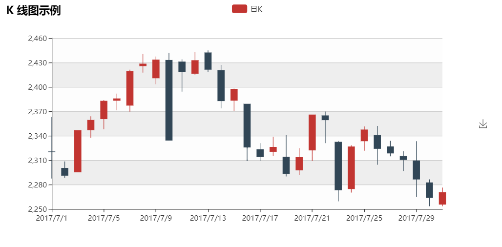
K line
from pyecharts import Kline

v1 = [[2320.26, 2320.26, 2287.3, 2362.94], [2300, 2291.3, 2288.26, 2308.38],
      [2295.35, 2346.5, 2295.35, 2345.92], [2347.22, 2358.98, 2337.35, 2363.8],
      [2360.75, 2382.48, 2347.89, 2383.76], [2383.43, 2385.42, 2371.23, 2391.82],
      [2377.41, 2419.02, 2369.57, 2421.15], [2425.92, 2428.15, 2417.58, 2440.38],
      [2411, 2433.13, 2403.3, 2437.42], [2432.68, 2334.48, 2427.7, 2441.73],
      [2430.69, 2418.53, 2394.22, 2433.89], [2416.62, 2432.4, 2414.4, 2443.03],
      [2441.91, 2421.56, 2418.43, 2444.8], [2420.26, 2382.91, 2373.53, 2427.07],
      [2383.49, 2397.18, 2370.61, 2397.94], [2378.82, 2325.95, 2309.17, 2378.82],
      [2322.94, 2314.16, 2308.76, 2330.88], [2320.62, 2325.82, 2315.01, 2338.78],
      [2313.74, 2293.34, 2289.89, 2340.71], [2297.77, 2313.22, 2292.03, 2324.63],
      [2322.32, 2365.59, 2308.92, 2366.16], [2364.54, 2359.51, 2330.86, 2369.65],
      [2332.08, 2273.4, 2259.25, 2333.54], [2274.81, 2326.31, 2270.1, 2328.14],
      [2333.61, 2347.18, 2321.6, 2351.44], [2340.44, 2324.29, 2304.27, 2352.02],
      [2326.42, 2318.61, 2314.59, 2333.67], [2314.68, 2310.59, 2296.58, 2320.96],
      [2309.16, 2286.6, 2264.83, 2333.29], [2282.17, 2263.97, 2253.25, 2286.33],
      [2255.77, 2270.28, 2253.31, 2276.22]]
kline = Kline("K Line diagram example")
kline.add("day K", ["2017/7/{}".format(i + 1) for i in range(31)], v1)
kline.show_config()
kline.render()
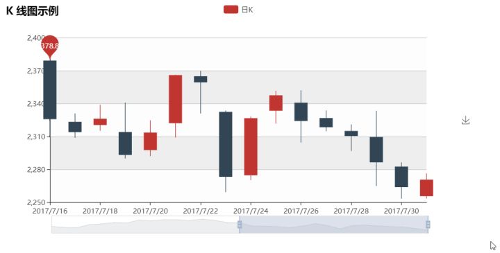
kline = Kline("K Line diagram example")
kline.add("day K", ["2017/7/{}".format(i + 1) for i in range(31)], v1, mark_point=["max"], is_datazoom_show=True)
kline.show_config()
kline.render()
Line (broken line / area diagram)
from pyecharts import Line

attr = ["shirt", "cardigan", "Chiffon shirt", "trousers", "high-heeled shoes", "Socks"]
v1 = [5, 20, 36, 10, 10, 100]
v2 = [55, 60, 16, 20, 15, 80]
line = Line("Line chart example")
line.add("business A", attr, v1, mark_point=["average"])
line.add("business B", attr, v2, is_smooth=True, mark_line=["max", "average"])
line.show_config()
line.render()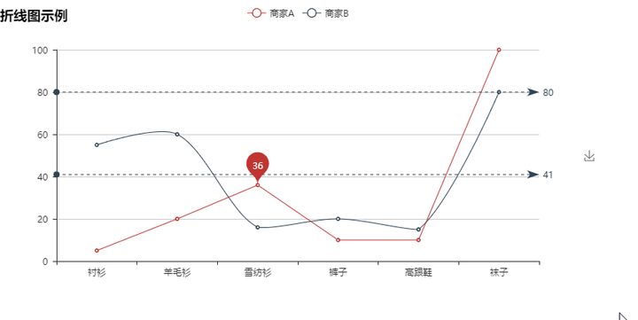
Other configurations of marking points
line = Line("Line chart example")
line.add("business A", attr, v1, mark_point=["average", "max", "min"],
mark_point_symbol='diamond', mark_point_textcolor='#40ff27')
line.add("business B", attr, v2, mark_point=["average", "max", "min"],
mark_point_symbol='arrow', mark_point_symbolsize=40)
line.show_config()
line.render()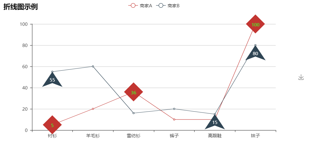
line = Line("Line chart-Ladder diagram example")
line.add("business A", attr, v1, is_step=True, is_label_show=True)
line.show_config()
line.render()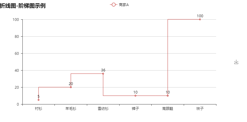
line = Line("Line chart-Area map example")
line.add("business A", attr, v1, is_fill=True, line_opacity=0.2, area_opacity=0.4, symbol=None)
line.add("business B", attr, v2, is_fill=True, area_color='#000', area_opacity=0.3, is_smooth=True)
line.show_config()
line.render()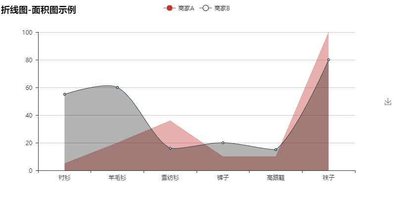
Liquid (water polo diagram)
from pyecharts import Liquid

liquid = Liquid("Water polo diagram example")
liquid.add("Liquid", [0.6])
liquid.show_config()
liquid.render()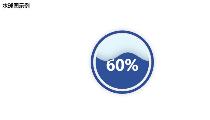
from pyecharts import Liquid

liquid = Liquid("Water polo diagram example")
liquid.add("Liquid", [0.6, 0.5, 0.4, 0.3], is_liquid_outline_show=False)
liquid.show_config()
liquid.render()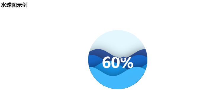
from pyecharts import Liquid

liquid = Liquid("Water polo diagram example")
liquid.add("Liquid", [0.6, 0.5, 0.4, 0.3], is_liquid_animation=False, shape='diamond')
liquid.show_config()
liquid.render()
Map
Scatter type
from pyecharts import Map

value = [155, 10, 66, 78, 33, 80, 190, 53, 49.6]
attr = ["Fujian", "Shandong", "Beijing", "Shanghai", "Gansu", "Xinjiang", "Henan", "Guangxi", "Tibet"]
map = Map("Map combination VisualMap Examples", width=1200, height=600)
map.add("", attr, value, maptype='china', is_visualmap=True, visual_text_color='#000')
map.show_config()
map.render()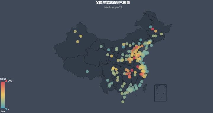
HeatMap type
geo = Geo("Air quality of major cities in China", "data from pm2.5", title_color="#fff", title_pos="center", width=1200, height=600,
background_color='#404a59')
attr, value = geo.cast(data)
geo.add("", attr, value, type="heatmap", is_visualmap=True, visual_range=[0, 300], visual_text_color='#fff')
geo.show_config()
geo.render()
Effectscutter type
from pyecharts import Map

value = [20, 190, 253, 77, 65]
attr = ['Shantou', 'Shanwei', 'Jieyang City', 'Yangjiang City', 'Zhaoqing City']
map = Map("Guangdong map example", width=1200, height=600)
map.add("", attr, value, maptype='Guangdong', is_visualmap=True, visual_text_color='#000')
map.show_config()
map.render()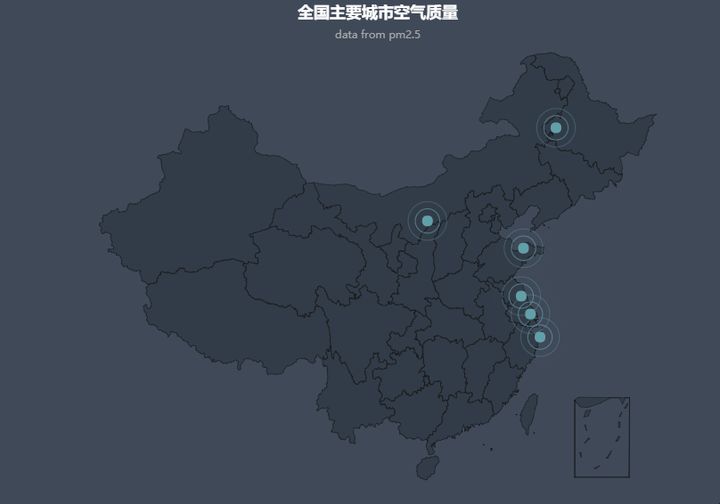
Parallel (parallel coordinate system)
from pyecharts import Parallel

c_schema = [
    {"dim": 0, "name": "data"},
    {"dim": 1, "name": "AQI"},
    {"dim": 2, "name": "PM2.5"},
    {"dim": 3, "name": "PM10"},
    {"dim": 4, "name": "CO"},
    {"dim": 5, "name": "NO2"},
    {"dim": 6, "name": "CO2"},
    {"dim": 7, "name": "Grade",
    "type": "category", "data": ['excellent', 'good', 'Light pollution', 'Moderate pollution', 'Severe pollution', 'Serious pollution']}
]
data = [
    [1, 91, 45, 125, 0.82, 34, 23, "good"],
    [2, 65, 27, 78, 0.86, 45, 29, "good"],
    [3, 83, 60, 84, 1.09, 73, 27, "good"],
    [4, 109, 81, 121, 1.28, 68, 51, "Light pollution"],
    [5, 106, 77, 114, 1.07, 55, 51, "Light pollution"],
    [6, 109, 81, 121, 1.28, 68, 51, "Light pollution"],
    [7, 106, 77, 114, 1.07, 55, 51, "Light pollution"],
    [8, 89, 65, 78, 0.86, 51, 26, "good"],
    [9, 53, 33, 47, 0.64, 50, 17, "good"],
    [10, 80, 55, 80, 1.01, 75, 24, "good"],
    [11, 117, 81, 124, 1.03, 45, 24, "Light pollution"],
    [12, 99, 71, 142, 1.1, 62, 42, "good"],
    [13, 95, 69, 130, 1.28, 74, 50, "good"],
    [14, 116, 87, 131, 1.47, 84, 40, "Light pollution"]
]
parallel = Parallel("Parallel coordinate system-User defined indicator")
parallel.config(c_schema=c_schema)
parallel.add("parallel", data)
parallel.show_config()
parallel.render()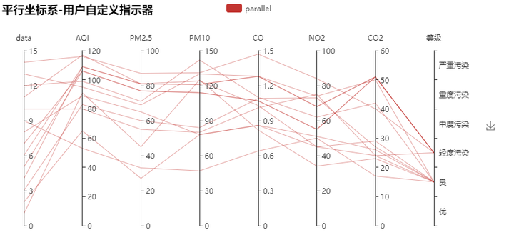
Pie (pie chart)
from pyecharts import Pie

attr = ["shirt", "cardigan", "Chiffon shirt", "trousers", "high-heeled shoes", "Socks"]
v1 = [11, 12, 13, 10, 10, 10]
pie = Pie("Pie chart example")
pie.add("", attr, v1, is_label_show=True)
pie.show_config()
pie.render()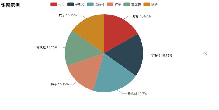
from pyecharts import Pie

attr = ["shirt", "cardigan", "Chiffon shirt", "trousers", "high-heeled shoes", "Socks"]
v1 = [11, 12, 13, 10, 10, 10]
v2 = [19, 21, 32, 20, 20, 33]
pie = Pie("Pie chart-Rose chart example", title_pos='center', width=900)
pie.add("commodity A", attr, v1, center=[25, 50], is_random=True, radius=[30, 75], rosetype='radius')
pie.add("commodity B", attr, v2, center=[75, 50], is_random=True, radius=[30, 75], rosetype='area',
        is_legend_show=False, is_label_show=True)
pie.show_config()
pie.render()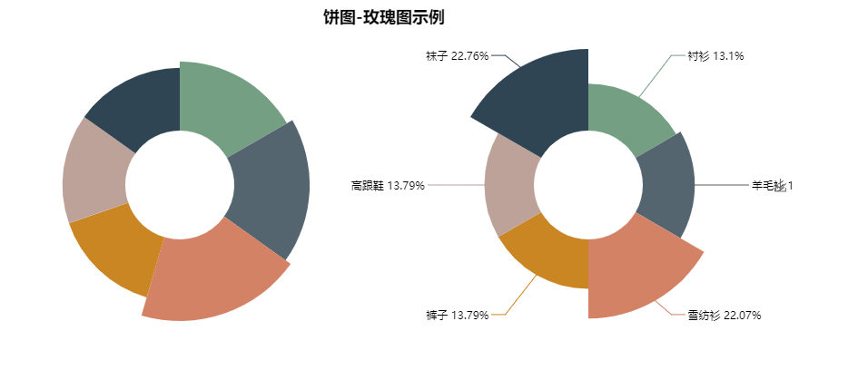
Polar (polar coordinate system)
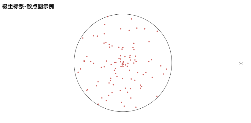
from pyecharts import Polar

import random
data = [(i, random.randint(1, 100)) for i in range(101)]
polar = Polar("Polar coordinate system-Scatter chart example")
polar.add("", data, boundary_gap=False, type='scatter', is_splitline_show=False,
area_color=None, is_axisline_show=True)
polar.show_config()
polar.render()
from pyecharts import Polar

radius = ['Monday', 'Tuesday', 'Wednesday', 'Thursday', 'Friday', 'Saturday', 'Sunday']
polar = Polar("Polar coordinate system-Stacked histogram example", width=1200, height=600)
polar.add("A", [1, 2, 3, 4, 3, 5, 1], radius_data=radius, type='barRadius', is_stack=True)
polar.add("B", [2, 4, 6, 1, 2, 3, 1], radius_data=radius, type='barRadius', is_stack=True)
polar.add("C", [1, 2, 3, 4, 1, 2, 5], radius_data=radius, type='barRadius', is_stack=True)
polar.show_config()
polar.render()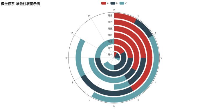
from pyecharts import Polar

radius = ['Monday', 'Tuesday', 'Wednesday', 'Thursday', 'Friday', 'Saturday', 'Sunday']
polar = Polar("Polar coordinate system-Stacked histogram example", width=1200, height=600)
polar.add("", [1, 2, 3, 4, 3, 5, 1], radius_data=radius, type='barAngle', is_stack=True)
polar.add("", [2, 4, 6, 1, 2, 3, 1], radius_data=radius, type='barAngle', is_stack=True)
polar.add("", [1, 2, 3, 4, 1, 2, 5], radius_data=radius, type='barAngle', is_stack=True)
polar.show_config()
polar.render()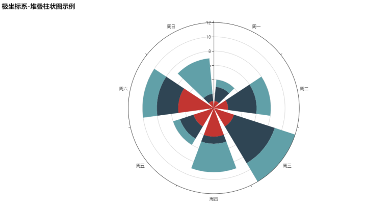
Radar
from pyecharts import Radar

schema = [
    ("sale", 6500), ("Administration", 16000), ("information technology", 30000), ("customer service", 38000), ("research and development", 52000), ("market", 25000)]
v1 = [[4300, 10000, 28000, 35000, 50000, 19000]]
v2 = [[5000, 14000, 28000, 31000, 42000, 21000]]
radar = Radar()
radar.config(schema)
radar.add("Budget allocation", v1, is_splitline=True, is_axisline_show=True)
radar.add("Actual cost", v2, label_color=["#4e79a7"], is_area_show=False)
radar.show_config()
radar.render()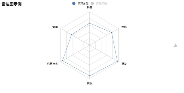
value_bj = [
    [55, 9, 56, 0.46, 18, 6, 1], [25, 11, 21, 0.65, 34, 9, 2],
    [56, 7, 63, 0.3, 14, 5, 3], [33, 7, 29, 0.33, 16, 6, 4]...]
value_sh = [
    [91, 45, 125, 0.82, 34, 23, 1], [65, 27, 78, 0.86, 45, 29, 2],
    [83, 60, 84, 1.09, 73, 27, 3], [109, 81, 121, 1.28, 68, 51, 4]...]
c_schema= [{"name": "AQI", "max": 300, "min": 5},
           {"name": "PM2.5", "max": 250, "min": 20},
           {"name": "PM10", "max": 300, "min": 5},
           {"name": "CO", "max": 5},
           {"name": "NO2", "max": 200},
           {"name": "SO2", "max": 100}]
radar = Radar()
radar.config(c_schema=c_schema, shape='circle')
radar.add("Beijing", value_bj, item_color="#f9713c", symbol=None)
radar.add("Shanghai", value_sh, item_color="#b3e4a1", symbol=None)
radar.show_config()
radar.render()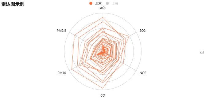
Scatter chart
from pyecharts import Scatter

v1 = [10, 20, 30, 40, 50, 60]
v2 = [10, 20, 30, 40, 50, 60]
scatter = Scatter("Scatter chart example")
scatter.add("A", v1, v2)
scatter.add("B", v1[::-1], v2)
scatter.show_config()
scatter.render()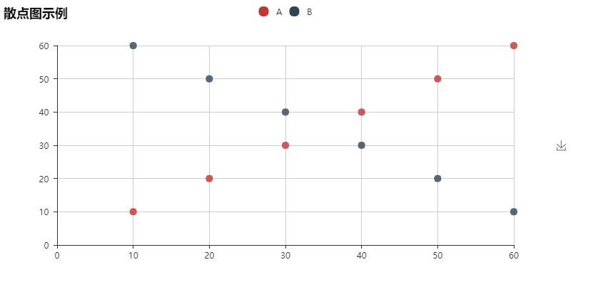
from pyecharts import Scatter

scatter = Scatter("Scatter chart example")
v1, v2 = scatter.draw("../images/pyecharts-0.png")
scatter.add("pyecharts", v1, v2, is_random=True)
scatter.show_config()
scatter.render()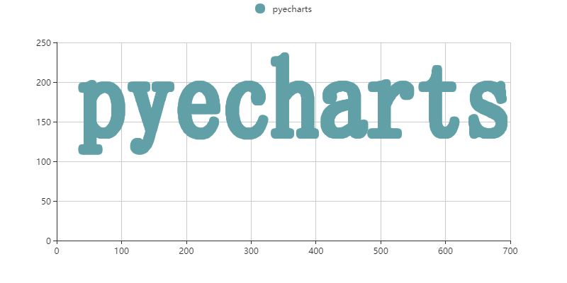
WordCloud
from pyecharts import WordCloud

name = ['Sam S Club', 'Macys', 'Amy Schumer', 'Jurassic World', 'Charter Communications',
        'Chick Fil A', 'Planet Fitness', 'Pitch Perfect', 'Express', 'Home', 'Johnny Depp',
        'Lena Dunham', 'Lewis Hamilton', 'KXAN', 'Mary Ellen Mark', 'Farrah Abraham',
        'Rita Ora', 'Serena Williams', 'NCAA baseball tournament', 'Point Break']
value = [10000, 6181, 4386, 4055, 2467, 2244, 1898, 1484, 1112, 965, 847, 582, 555,
         550, 462, 366, 360, 282, 273, 265]
wordcloud = WordCloud(width=1300, height=620)
wordcloud.add("", name, value, word_size_range=[20, 100])
wordcloud.show_config()
wordcloud.render()
wordcloud = WordCloud(width=1300, height=620)
wordcloud.add("", name, value, word_size_range=[30, 100], shape='diamond')
wordcloud.show_config()
wordcloud.render()
User defined
Users can also customize the combination of line / bar / Kline and scatter / effectscutter charts
Get is required_ Series () and custom() methods
get_series()
""" Gets the name of the chart series data """
custom(series)
''' Append custom chart type '''
- series -> dict
Append series data of chart type
Use get first_ Get the data with series() and combine the charts with custom()
from pyecharts import Bar, Line

attr = ['A', 'B', 'C', 'D', 'E', 'F']
v1 = [10, 20, 30, 40, 50, 60]
v2 = [15, 25, 35, 45, 55, 65]
v3 = [38, 28, 58, 48, 78, 68]
bar = Bar("Line - Bar Examples")
bar.add("bar", attr, v1)
line = Line()
line.add("line", v2, v3)
bar.custom(line.get_series())
bar.show_config()
bar.render()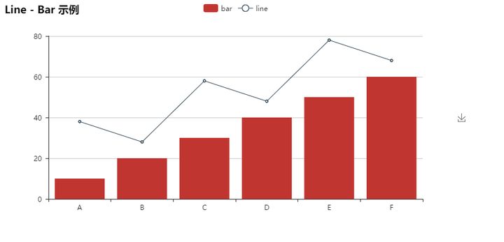
from pyecharts import Scatter, EffectScatterfrom pyecharts import Scatter, EffectScatter

v1 = [10, 20, 30, 40, 50, 60]
v2 = [30, 30, 30, 30, 30, 30]
v3 = [50, 50, 50, 50, 50, 50]
v4 = [10, 10, 10, 10, 10, 10]
es = EffectScatter("Scatter - EffectScatter Examples")
es.add("es", v1, v2)
scatter = Scatter()
scatter.add("scatter", v1, v3)
es.custom(scatter.get_series())
es_1 = EffectScatter()
es_1.add("es_1", v1, v4, symbol='pin', effect_scale=5)
es.custom(es_1.get_series())
es.show_config()
es.render()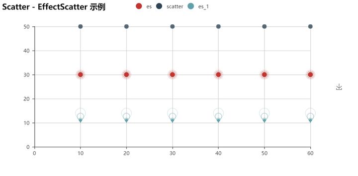
from pyecharts import Line, Kline

v1 = [[2320.26, 2320.26, 2287.3, 2362.94], [2300, 2291.3, 2288.26, 2308.38],
      [2309.16, 2286.6, 2264.83, 2333.29], [2282.17, 2263.97, 2253.25, 2286.33],
      [2255.77, 2270.28, 2253.31, 2276.22], ......]
attr = ["2017/7/{}".format(i + 1) for i in range(31)]
kline = Kline("Kline - Line Examples")
kline.add("day K", attr, v1)
line_1 = Line()
line_1.add("line-1", attr, [random.randint(2400, 2500) for _ in range(31)])
line_2 = Line()
line_2.add("line-2", attr, [random.randint(2400, 2500) for _ in range(31)])
kline.custom(line_1.get_series())
klidne.custom(line_2.get_series())
kline.show_config()
kline.render()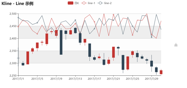
More examples
Draw a love in polar coordinates
import math
from pyecharts import Polar

data = []
for i in range(101):
    theta = i / 100 * 360
    r = 5 * (1 + math.sin(theta / 180 * math.pi))
    data.append([r, theta])
hour = [i for i in range(1, 25)]
polar = Polar("Polar coordinate system example", width=1200, height=600)
polar.add("Love", data, angle_data=hour, boundary_gap=False,start_angle=0)
polar.show_config()
polar.render()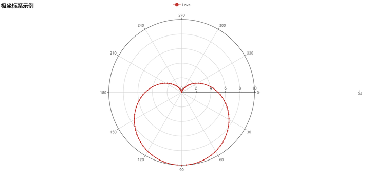
Draw a small flower in polar coordinates
import math
from pyecharts import Polar

data = []
for i in range(361):
    t = i / 180 * math.pi
    r = math.sin(2 * t) * math.cos(2 * t)
    data.append([r, i])
polar = Polar("Polar coordinate system example", width=1200, height=600)
polar.add("Flower", data, start_angle=0, symbol=None, axis_range=[0, None])
polar.show_config()
polar.render()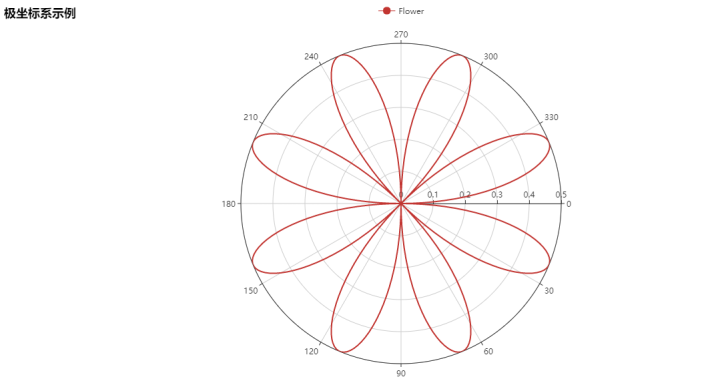
You can also color the flowers
import math
from pyecharts import Polar

data = []
for i in range(361):
    t = i / 180 * math.pi
    r = math.sin(2 * t) * math.cos(2 * t)
    data.append([r, i])
polar = Polar("Polar coordinate system example", width=1200, height=600)
polar.add("Color-Flower", data, start_angle=0, symbol=None, axis_range=[0, None],
          area_color="#f71f24", area_opacity=0.6)
polar.show_config()
polar.render()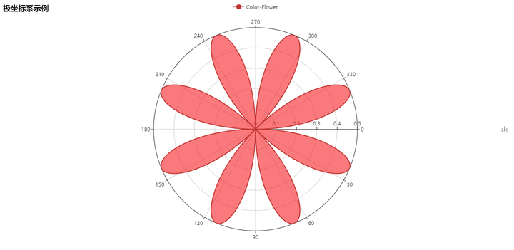
Draw a love with scattered pictures
from pyecharts import Scatter

scatter = Scatter("Scatter chart example", width=800, height=480)
v1 ,v2 = scatter.draw("../images/love.png")
scatter.add("Love", v1, v2)
scatter.render()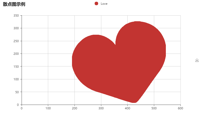

Draw a hot Bra with scattered dots
from pyecharts import Scatter

scatter = Scatter("Scatter chart example", width=1000, height=480)
v1 ,v2 = scatter.draw("../images/cup.png")
scatter.add("Cup", v1, v2)
scatter.render()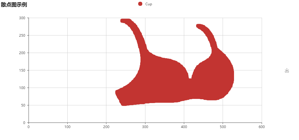
Draw a sexy Bra with a scatter picture
from pyecharts import Scatter

scatter = Scatter("Scatter chart example", width=1000, height=480)
v1 ,v2 = scatter.draw("../images/cup.png")
scatter.add("Cup", v1, v2, label_color=["#000"])
scatter.render()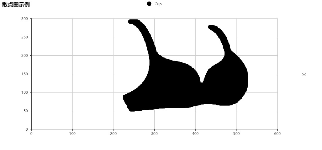
Broken line chart of the lowest and highest temperature in a place
from pyecharts import Line

attr = ['Monday', 'Tuesday', 'Wednesday', 'Thursday', 'Friday', 'Saturday', 'Sunday', ]
line = Line("Line chart example")
line.add("Maximum temperature", attr, [11, 11, 15, 13, 12, 13, 10], mark_point=["max", "min"], mark_line=["average"])
line.add("Minimum temperature", attr, [1, -2, 2, 5, 3, 2, 0], mark_point=["max", "min"],
         mark_line=["average"], yaxis_formatter="°C")
line.show_config()
line.render()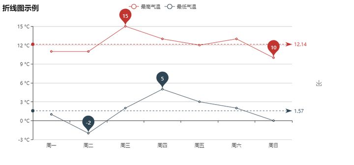
Nested pie chart
from pyecharts import Pie

pie = Pie("Pie chart example", title_pos='center', width=1000, height=600)
pie.add("", ['A', 'B', 'C', 'D', 'E', 'F'], [335, 321, 234, 135, 251, 148], radius=[40, 55],is_label_show=True)
pie.add("", ['H', 'I', 'J'], [335, 679, 204], radius=[0, 30], legend_orient='vertical', legend_pos='left')
pie.show_config()
pie.render()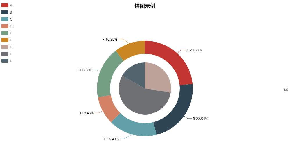
Pie chart nesting
import random
from pyecharts import Pie

attr = ['A', 'B', 'C', 'D', 'E', 'F']
pie = Pie("Pie chart example", width=1000, height=600)
pie.add("", attr, [random.randint(0, 100) for _ in range(6)], radius=[50, 55], center=[25, 50],is_random=True)
pie.add("", attr, [random.randint(20, 100) for _ in range(6)], radius=[0, 45], center=[25, 50],rosetype='area')
pie.add("", attr, [random.randint(0, 100) for _ in range(6)], radius=[50, 55], center=[65, 50],is_random=True)
pie.add("", attr, [random.randint(20, 100) for _ in range(6)], radius=[0, 45], center=[65, 50],rosetype='radius')
pie.show_config()
pie.render()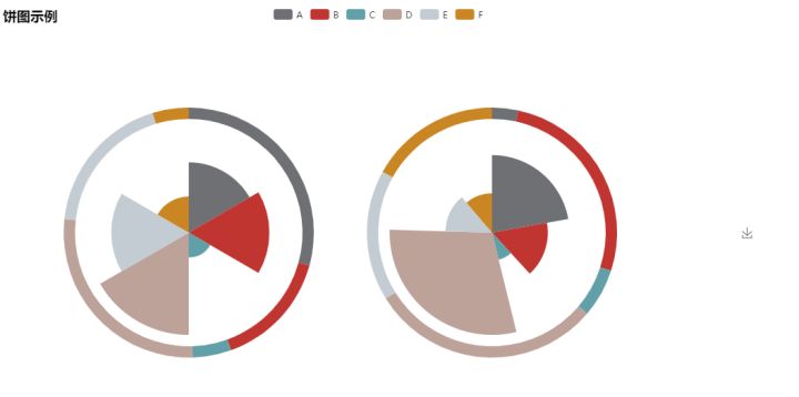
Histogram of precipitation and evaporation in a place
from pyecharts import Bar

attr = ["{}month".format(i) for i in range(1, 13)]
v1 = [2.0, 4.9, 7.0, 23.2, 25.6, 76.7, 135.6, 162.2, 32.6, 20.0, 6.4, 3.3]
v2 = [2.6, 5.9, 9.0, 26.4, 28.7, 70.7, 175.6, 182.2, 48.7, 18.8, 6.0, 2.3]
bar = Bar("Histogram example")
bar.add("Evaporation capacity", attr, v1, mark_line=["average"], mark_point=["max", "min"])
bar.add("precipitation", attr, v2, mark_line=["average"], mark_point=["max", "min"])
bar.show_config()
bar.render()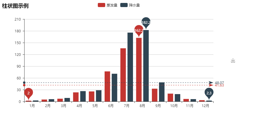
Add a dataZoom
bar = Bar("Histogram example")
bar.add("Evaporation capacity", attr, v1, mark_line=["average"], mark_point=["max", "min"])
bar.add("precipitation", attr, v2, mark_line=["average"], mark_point=["max", "min"],
is_datazoom_show=True, datazoom_range=[50, 80])
bar.show_config()
bar.render()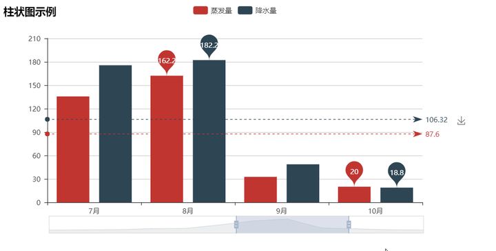
Proportion of "good films" in all kinds of films
from pyecharts import Pie

pie = Pie('In all kinds of films"Good film"Proportion of', "The data comes from Douban", title_pos='center')
pie.add("", ["plot", ""], [25, 75], center=[10, 30], radius=[18, 24],
        label_pos='center', is_label_show=True, label_text_color=None, )
pie.add("", ["Fantasy", ""], [24, 76], center=[30, 30], radius=[18, 24],
        label_pos='center', is_label_show=True, label_text_color=None, legend_pos='left')
pie.add("", ["love", ""], [14, 86], center=[50, 30], radius=[18, 24],
        label_pos='center', is_label_show=True, label_text_color=None)
pie.add("", ["Thriller", ""], [11, 89], center=[70, 30], radius=[18, 24],
        label_pos='center', is_label_show=True, label_text_color=None)
pie.add("", ["adventure", ""], [27, 73], center=[90, 30], radius=[18, 24],
        label_pos='center', is_label_show=True, label_text_color=None)
pie.add("", ["action", ""], [15, 85], center=[10, 70], radius=[18, 24],
        label_pos='center', is_label_show=True, label_text_color=None)
pie.add("", ["comedy", ""], [54, 46], center=[30, 70], radius=[18, 24],
        label_pos='center', is_label_show=True, label_text_color=None)
pie.add("", ["science fiction", ""], [26, 74], center=[50, 70], radius=[18, 24],
        label_pos='center', is_label_show=True, label_text_color=None)
pie.add("", ["Suspense", ""], [25, 75], center=[70, 70], radius=[18, 24],
        label_pos='center', is_label_show=True, label_text_color=None)
pie.add("", ["Crime", ""], [28, 72], center=[90, 70], radius=[18, 24],
        label_pos='center', is_label_show=True, label_text_color=None, is_legend_show=True, legend_top="center")
pie.show_config()
pie.render()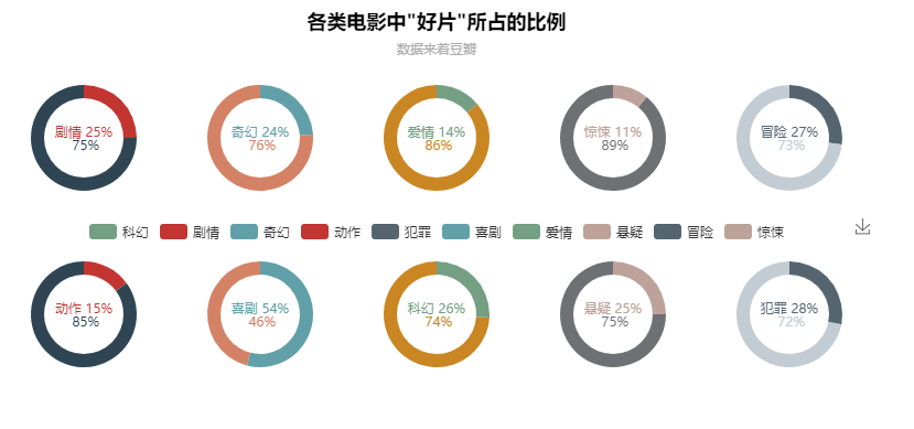
Draw a snail shell in polar coordinates
import math
from pyecharts import Polar

data = []
for i in range(5):
    for j in range(101):
        theta = j / 100 * 360
        alpha = i * 360 + theta
        r = math.pow(math.e, 0.003 * alpha)
        data.append([r, theta])
polar = Polar("Polar coordinate system example")
polar.add("", data, symbol_size=0, symbol='circle', start_angle=-25, is_radiusaxis_show=False,
          area_color="#f3c5b3", area_opacity=0.5, is_angleaxis_show=False)
polar.show_config()
polar.render()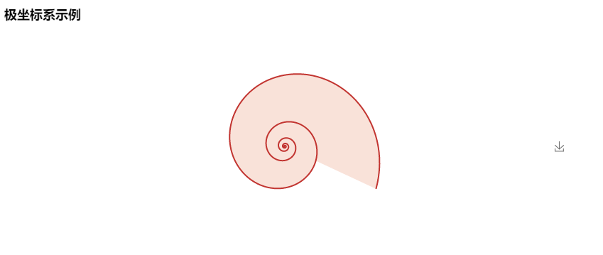
Github address: https://github.com/chenjiandongx/pyecharts
If you have any questions, you are welcome to open an issue discussion under the project and give a star or something by the way!
Project update:
Pyecarts + jupyter notebook data visualization, what PPT do you want?
3D cool stereogram has been added to pyecharts luxury lunch
Source: Python data visualization- Know