Recently, the OD data of a Hangzhou region was analyzed, and the OD expectation line needs to be drawn on the base map of Hangzhou administrative region. There are two main tasks.
1. Find the shapefile file of Hangzhou administrative region and it can be read by python
2. Draw the OD expectation line between the administrative regions in Hangzhou
1, Find shapefile file of Hangzhou Administrative Region
step1: on this website http://datav.aliyun.com/tools/atlas/index.html#&lat=28.110748760633534&lng=107.8857421875&zoom=4 Download the json file of the required City, and click Zhejiang Province - Hangzhou city on the map in turn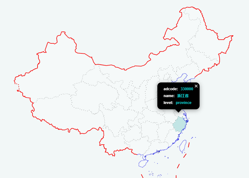
Step 2: select the data version. The administrative region of the city may change in recent years (because the data I analyze is based on the old administrative region of Hangzhou, the selected version is areas_v2)
step3: copy the json API address and open it. Copy the json content, create a new TXT document and save it. Change the txt suffix to json suffix.
step4: open this URL https://mapshaper.org/ , drag and drop the json file just created, and click import.
step5: display the administrative division of Hangzhou, click export in the upper right corner and save it in shapefile format. Files with shp suffix in the compressed package can be read by python.
2, Drawing OD expectation line in python
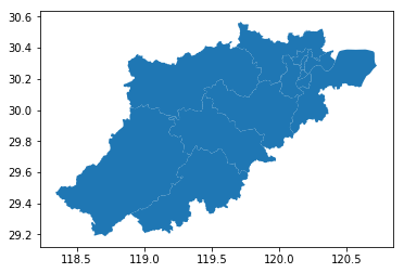
step1: read basemap
# 1, Read basemap
# 1. Import the required package
#geopandas package
import geopandas
#shapely package
from shapely.geometry import Point,Polygon,shape
shp = r'File path/XX.shp'
hz = geopandas.GeoDataFrame.from_file(shp,encoding = 'utf-8')
hz.plot()
plot view the read results of the administrative region. By default, they are displayed on a blue background and can be changed. There will be changes when drawing OD maps later.
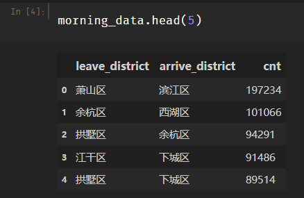
Step 2: read data (the data of OD diagram is drawn, my data is saved in excel document and read with pandas)
# 2, Read data
# 1. Import package
import pandas as pd
# 2. Read data from excel
#File path
file_path = r'route\XX.xlsx'
#Read sheet name
sheetName = 'Morning peak'
morning_data = pd.read_excel(file_path,sheet_name=sheetName)
The data format is as follows:
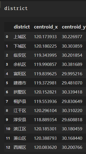
step3: read the coordinate file (when I draw the OD map, I draw it according to the center point of each administrative region as the starting and ending points, because I need to add the center point coordinates of the starting and ending administrative regions on the OD table just now)
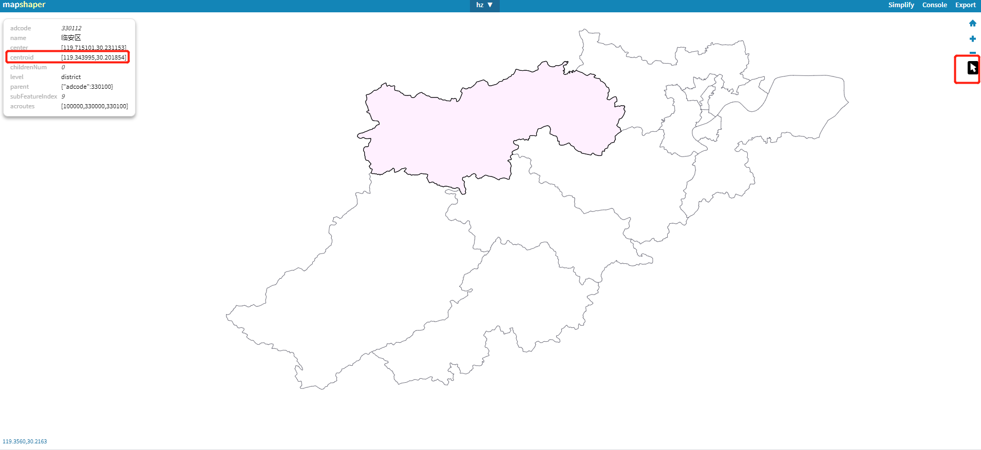
The reading of the central point of the administrative region can be viewed from the second website above. Select the arrow on the right and put it on the required administrative region to display the information of the region, including the coordinates of the central point.
# 3, Read coordinate file
#File path
file_path = r'File path/XX.xlsx'
#Read sheet name
sheetName = 'zuobiao'
district = pd.read_excel(file_path,sheet_name=sheetName)
The read data is:
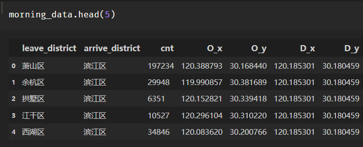
step4: connect the coordinate table with the OD table. Each od row record must have the center point coordinates of the starting and ending administrative regions
# 4, Join two tables
district.columns = ['leave_district','O_x','O_y']
morning_data = pd.merge(morning_data,district,on = ['leave_district'])
district.columns = ['arrive_district','D_x','D_y']
morning_data = pd.merge(morning_data,district,on = ['arrive_district'])
The data becomes:
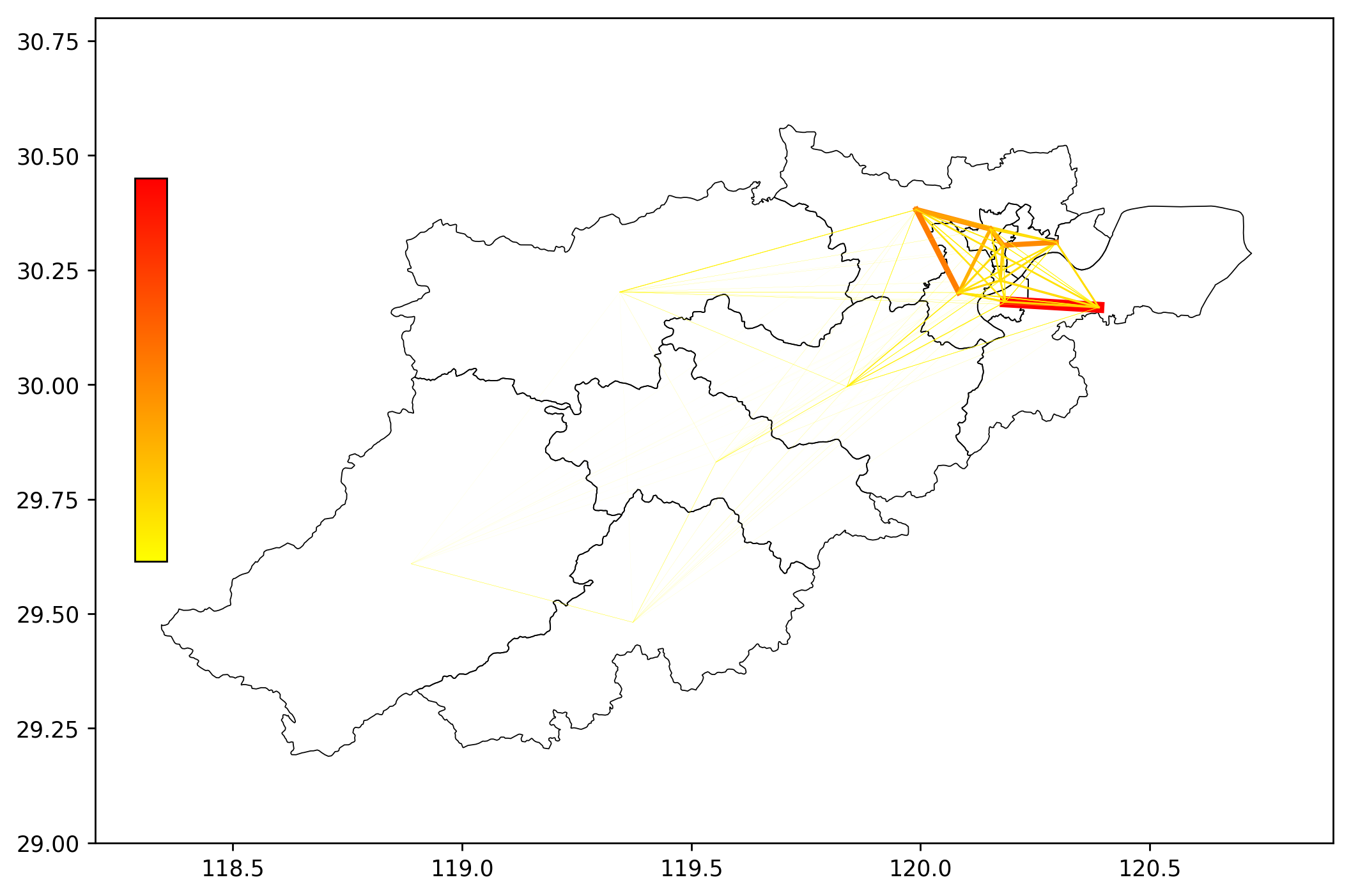
step5: draw OD expectation line
import matplotlib as mpl
import matplotlib.pyplot as plt

fig     = plt.figure(1,(10,8),dpi = 250)
ax      = plt.subplot(111)
plt.sca(ax)

#Draw the administrative division, the base map is white, the border is black, and the width is 0.5
hz.plot(ax = ax,edgecolor = (0,0,0,1),facecolor = (0,0,0,0),linewidths=0.5)

import matplotlib
#Set data for colormap
vmax = max(morning_data['cnt'])
#Set a standardized tool to set the maximum and minimum value of OD colormap. Its function is that norm(count) will standardize the count to the range of 0-1
norm = mpl.colors.Normalize(vmin=0,vmax=vmax)
#Sets the color of the colormap
cmapname = 'autumn_r'
#cmap is a tool for obtaining colors. cmap(a) returns colors, where a is a value between 0 and 1
cmap = matplotlib.cm.get_cmap(cmapname)

#Draw OD
for i in range(len(morning_data)):
    #Set the color and linewidth of the ith line
    color_i=cmap(norm(morning_data['cnt'].iloc[i]))
    linewidth_i=norm(morning_data['cnt'].iloc[i]) *5

    #draw
    plt.plot([morning_data['O_x'].iloc[i],morning_data['D_x'].iloc[i]],
             [morning_data['O_y'].iloc[i],morning_data['D_y'].iloc[i]],
             color=color_i,linewidth=linewidth_i)


# Draw a fake colorbar because the OD we draw is a line, so we can't draw a colorbar directly
# So we drew something called imshow in an invisible place. Its range is 0 to vmax
#Then we add a colorbar to imshow
plt.imshow([[0,vmax]], cmap=cmap)
#Set the size and position of the colorbar
cax = plt.axes([0.15, 0.4, 0.02, 0.3])
plt.colorbar(cax=cax)

#Then adjust the camera back to the map of Hangzhou, or the camera will be at imshow

ax.set_xlim(118.2,120.9)
ax.set_ylim(29.0,30.8)

plt.axis('off')

plt.show()
design sketch: