python visual chart analysis -- the use of pyecharts Library
preface
pyecharts Official website https://pyecharts.org/
Simple API design, smooth use, and support chain call
Includes 30 + common charts, everything
Support mainstream Notebook environment, Jupyter Notebook and jupyterab
It can be easily integrated into mainstream Web frameworks such as Flask and Django
Highly flexible configuration items can easily match with exquisite charts
Detailed documents and examples to help developers get started faster
Up to 400 + map files and native Baidu maps provide strong support for geographic data visualization
1, Histogram
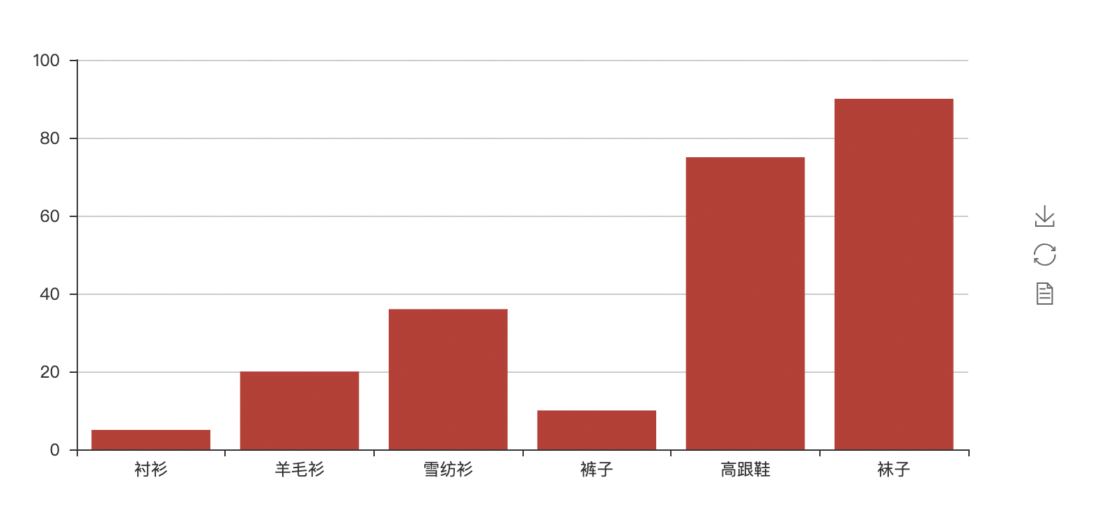
Use Bar to call add to add data to make a histogram, and render() gets render HTML file, displayed on the web page with webbrowser
webbrowser.open("file://"+ os.path.realpath("render.html"))
from pyecharts import Bar
import webbrowser
import os

x_axis = ["shirt", "cardigan", "Chiffon shirt", "trousers", "high-heeled shoes", "Socks"]
y_axis = [5, 20, 36, 10, 75, 90]

bar = Bar()
bar.add("",x_axis,y_axis)

# Render will generate local HTML files. By default, render will be generated in the current directory HTML file
# You can also pass in path parameters, such as bar render("mycharts.html")
bar.render()
webbrowser.open("file://"+ os.path.realpath("render.html"))
'''
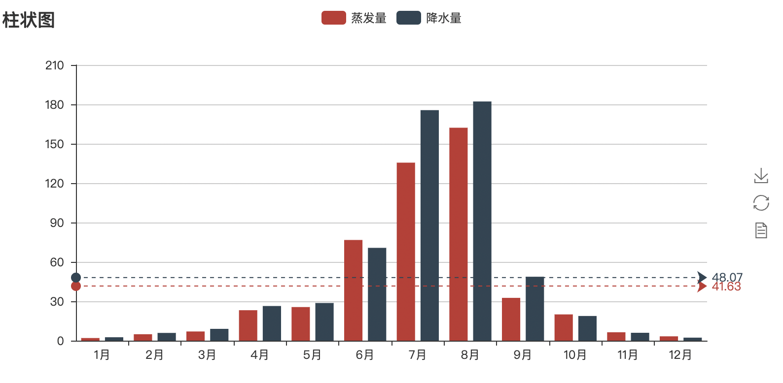
The precipitation and evaporation data of a certain area in a year are as follows
Evaporation:[2.0,4.9,7.0,23.2,25.6,76.7,135.6,162.2,32.6,20.0,6.4,3.3]
precipitation: v2=[2.6,5.9,9.0,26.4,28.7,70.7,175.6,182.2,48.7,18.8,6.0,2.3]
'''
from pyecharts import Bar
import webbrowser
import os
attr=["{}month".format(i) for i in range(1,13)]
v1=[2.0,4.9,7.0,23.2,25.6,76.7,135.6,162.2,32.6,20.0,6.4,3.3]
v2=[2.6,5.9,9.0,26.4,28.7,70.7,175.6,182.2,48.7,18.8,6.0,2.3]
bar=Bar("Histogram")
#mark_line is the marker line
bar.add("Evaporation capacity",attr,v1,mark_line=["average"],marl_point=["max","min"])
bar.add("precipitation",attr,v2,mark_line=["average"],marl_point=["max","min"])
bar.render()
webbrowser.open("file://"+os.path.realpath("render.html"))
**Common parameters: * * there are many labels, which can be selected as needed.
is_splitline_show: whether to display gridlines
is_label_show: whether to display labels
label_pos: the position of the label, including 'top' (default), 'left', 'right', 'bottom', 'inside' and 'outside'
label_text_color/size: label font color / size
is_random: whether to randomly arrange the color list
label_color: custom label color
mark_point/line: mark a point / line. By default, 'min', 'max' and 'average' are optional. You can customize the marking points and lines. The specific format is as follows: [{'coord': [x, y], 'name': 'target marking points'}]. Remember that the format is a list
mark_point/line_symbol: mark the point / line pattern. The default is' pin '. There are' circle ',' rect '(square),' roundRect '(rounded square),' triangle '(triangle),' diamond '(diamond),' pin '(point),' arrow '(arrow) options
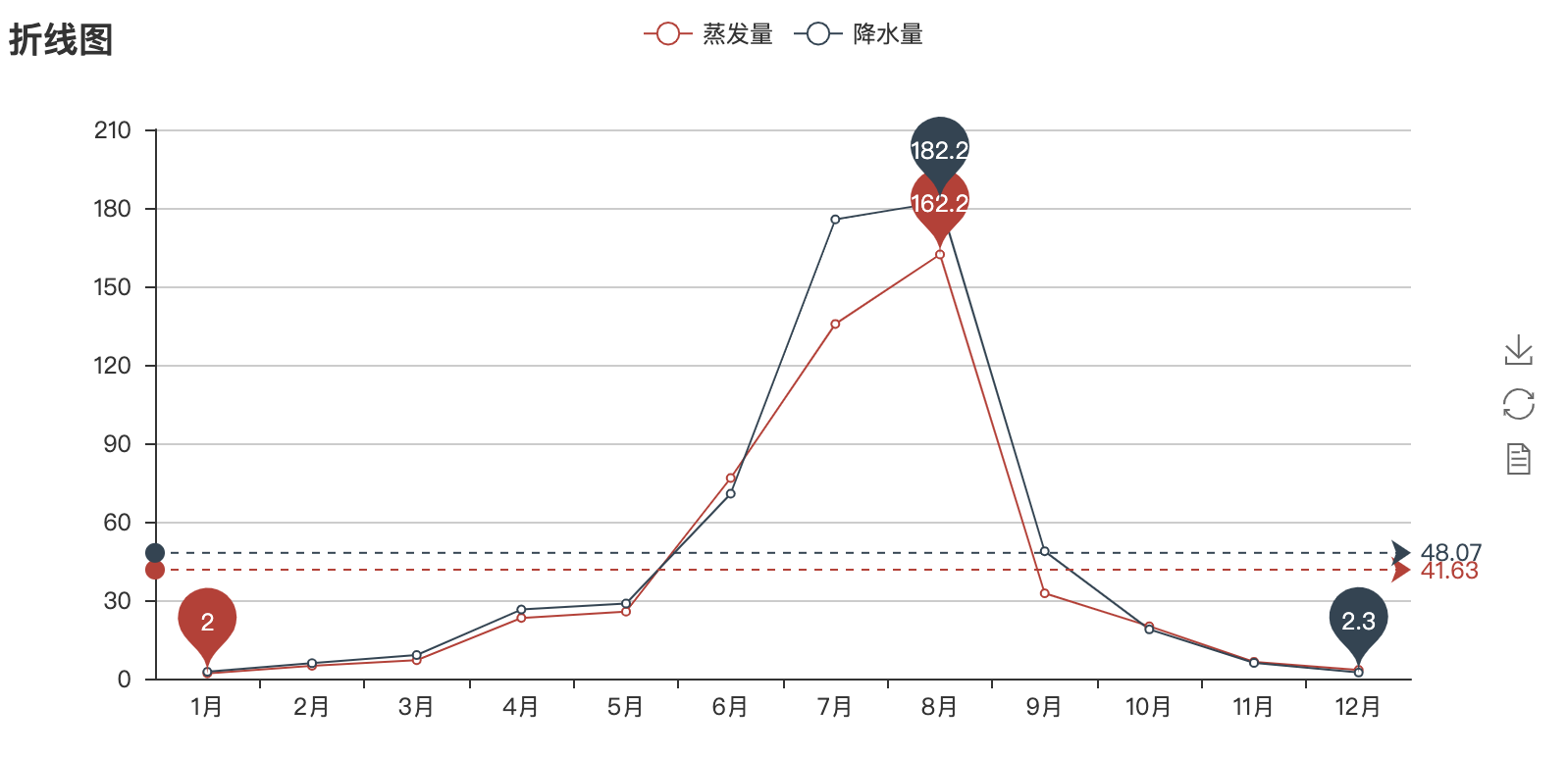
2, Line chart
Use Line() to create a new line chart. Each piece of data needs to call add() to pass in the data. Finally, render it with render() and open it with webbrowser
#Line chart
from pyecharts import Line
import webbrowser
import os

attr = ["{}month".format(i) for i in range(1,13)]
v1 = [2.0,4.9,7.0,23.2,25.6,76.7,135.6,162.2,32.6,20.0,6.4,3.3]
v2 = [2.6,5.9,9.0,26.4,28.7,70.7,175.6,182.2,48.7,18.8,6.0,2.3]
line = Line("Line chart")

#mark_point sets the marking line, and the values are "min", "max", "average"

line.add("Evaporation capacity",attr,v1,mark_line=["average"],mark_point = ["max", "min"])  #Data is passed in from the y-axis and then the x-axis
line.add("precipitation",attr,v2,mark_line=["average"],mark_point = ["max", "min"])

line.render()
webbrowser.open("file://"+os.path.realpath("render.html"))
3, Pie chart
Pie chart style customization
① Parameters in Pie():
title_pos: "left" is aligned to the left, "right" is aligned to the right, "center" is aligned to the center
② Parameters in add():
legend_pos: "left" alignment, "right" alignment, "center" alignment
legend_ Orientation: "horizontal" horizontal layout, "vertical" vertical layout
is_label_show: "True" displays the label, "False" does not display (default)
Rosetype: the center angle of the "radius" sector shows the percentage of data, and the radius shows the size of data (default)
The center angle of all sectors in "area" is the same, and the data size is displayed only by radius
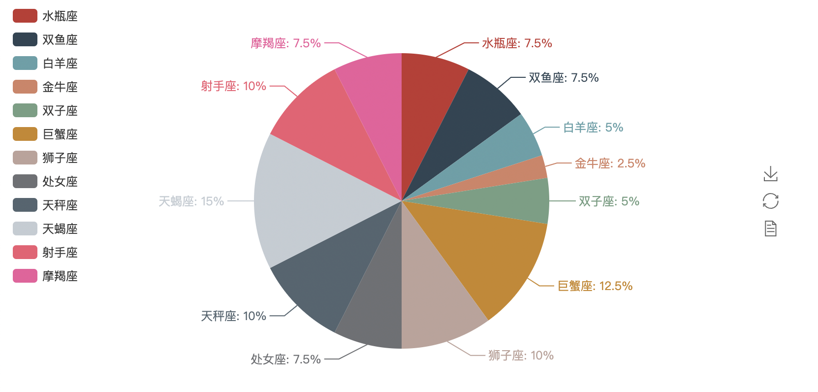
#Pie chart
from pyecharts import Pie
import webbrowser
import os
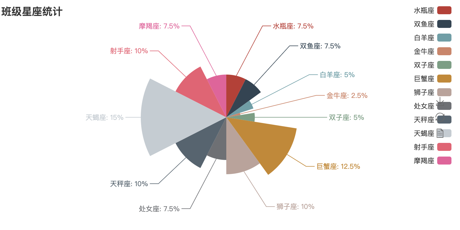
star_num = {
"aquarius":3,
"Pisces":3,
"Aries":2,
"Taurus":1,
"Gemini":2,
"Cancer":5,
"leo":4,
"Virgo":3,
"libra":4,
"scorpio":6,
"sagittarius":4,
"Capricornus":3,
}
key = list(star_num.keys())
value = list(star_num.values())
pie = Pie("Class constellation statistics")
pie.add(
"",
key,
value,
legend_pos="left",
legend_orient = "vertical",
is_label_show = True,
)
pie.render()
webbrowser.open("file://" + os.path.realpath("render.html"))
rosetype -> str
Whether it is displayed as a nightingale map. The data size is distinguished by radius. There are two modes: radius and area.
The default is' radius'
① Radius: the center angle of the sector shows the percentage of data, and the radius shows the size of data
② area: the center angle of all sectors is the same, and the data size is displayed only by radius
pie = Pie("Class constellation statistics")
pie.add(
    "",
    key,
    value,
    legend_pos="right",
    legend_orient = "vertical",
    is_label_show = True,
    rosetype = "radius"
    #rosetype = "area"
)
Word cloud picture, stuttering library word segmentation
from pyecharts import WordCloud
import webbrowser,os

with open(r'hurriedly.txt','r',encoding = 'utf-8')as f:
    text = f.read()
    print(text)

from pyecharts import WordCloud
import webbrowser,os
import jieba

with open(r'hurriedly.txt','r',encoding = 'utf-8')as f:
    text = f.read()
    words_list = jieba.lcut(text)
    words_dict = {}

    drop = ['We','You','they','namely','No,','own']
    for word in words_list:
        #De duplication judgment
        if word in words_dict:
            words_dict[word] += 1
        else:
            #Data cleaning and filtering
            if len(word) > 1 and word not in drop:
                #Create key value
                words_dict[word] = 1
    print(words_dict)
wordcloud = WordCloud(width=1440, height=900)

name = 'hurriedly'
words = list(words_dict.keys())
nums = list(words_dict.values())
wordcloud.add(name,words,nums)
wordcloud.render()
webbrowser.open("file://" + os.path.realpath('render.html'))
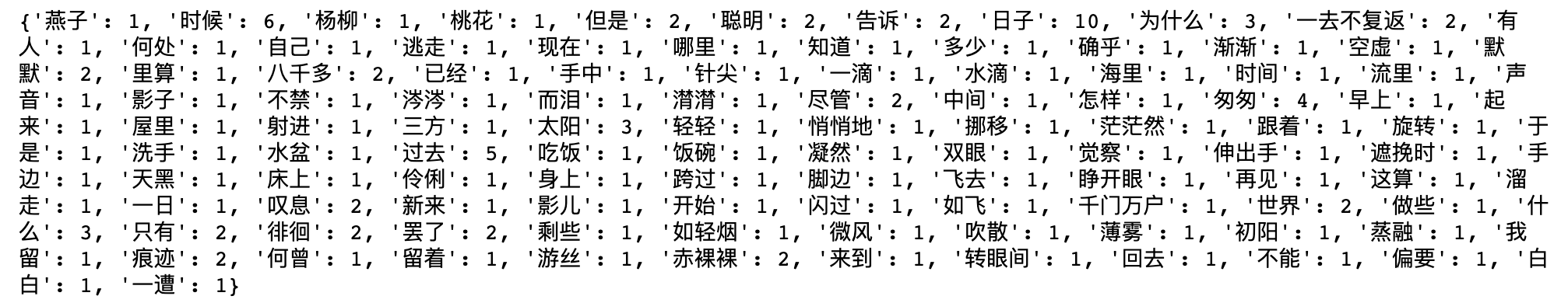

Beautify the word cloud picture, and set the shape shape and spacing word_gap and font size range word_size_range
shape–>list
The outline of the word cloud is' circle ',' cardioid ',' diamon d ',' triangle forward ',' triangle ',' pentagon ', and' star '
word_gap->int
Word spacing, default to 20
word_size_range->list
Word font size range, default to [12,60]
rotate_step->int
Rotate the word angle, which is 45 by default
wordcloud.add(name,words,nums,shape="star",word_gap=10,word_size_range=[12,100])
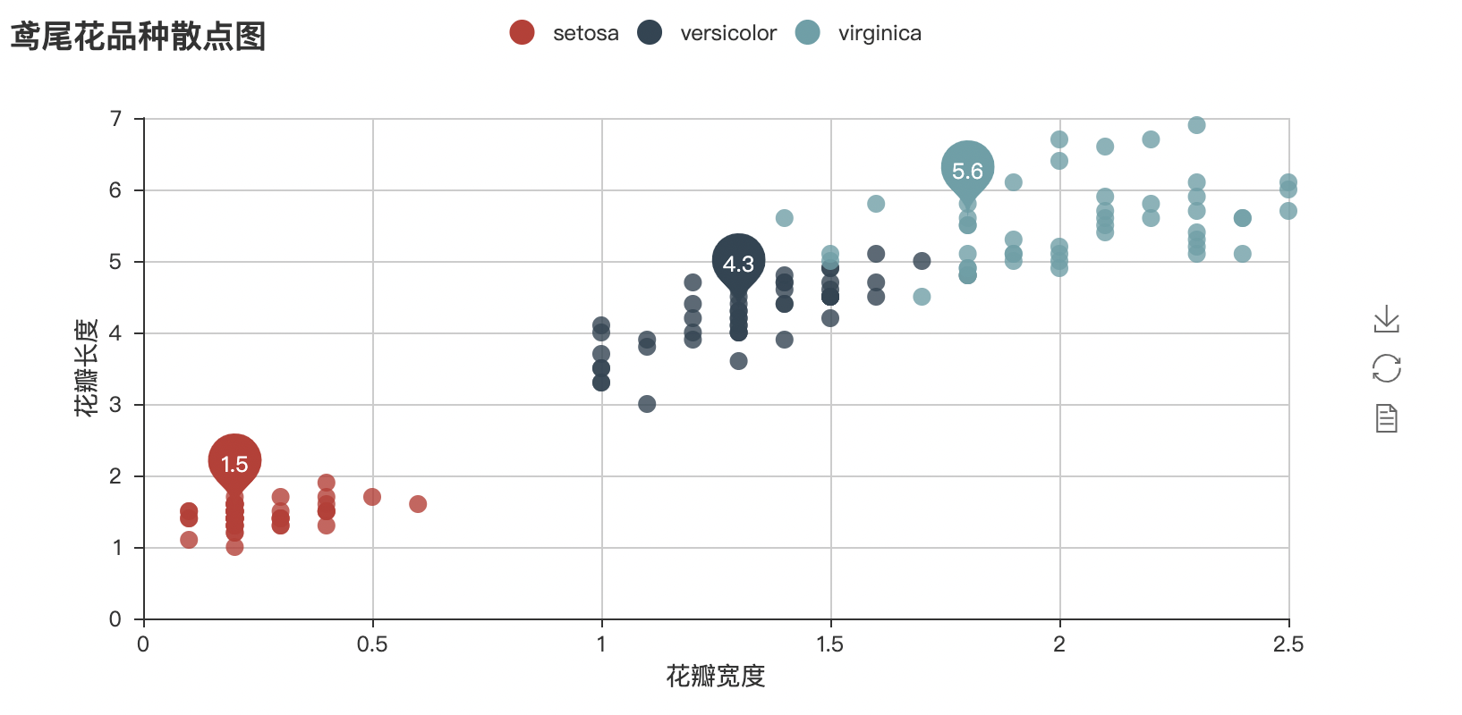
Scatter diagram
The scatter diagram shows the width x and length y values of iris petals at the same time, and the relationship between X and y values is affected by Iris species, so that the coordinate points of different species data are distributed in their respective regions to form the effect of clustering, so it is easy to divide different species in the data.
Read the corresponding iris data to make a scatter diagram
#List generation
List_1 = [i**2 for i in range(1,11)]
List_2 = [i for i in 'abcde']
print(List_1,'\n',List_2)

import json
from pyecharts import Scatter
import webbrowser,os

with open('iris.json','r')as f:
    data = json.load(f)
    # print(type(data),data)

scatter = Scatter("Scatter diagram of iris varieties")

setosa_h = [i[2] for i in data['setosa']]
setosa_w = [i[3] for i in data['setosa']]


versicolor_h = [i[2] for i in data['versicolor']]
versicolor_w = [i[3] for i in data['versicolor']]

virginica_h = [i[2] for i in data['virginica']]
virginica_w = [i[3] for i in data['virginica']]
#mark_point: mark the point. This code will mark the average
#xaxis_name, yaxis_name: add description of abscissa and ordinate
scatter.add('setosa',setosa_w,setosa_h,mark_point = ['average'])
scatter.add('versicolor',versicolor_w,versicolor_h,mark_point = ['average'])
scatter.add('virginica',virginica_w,virginica_h,mark_point = ['average'],xaxis_name = ['petal width '],yaxis_name = ['Petal length '])
scatter.render()

webbrowser.open("file://" + os.path.realpath('render.html'))
summary
Echarts is a data visualization open source by Baidu, combined with ingenious interactivity and exquisite chart design, which has been recognized by developers. Python is an expressive language, which is very suitable for data processing. When analysis meets data visualization, pyecharts is born. There are many 3D graphics rendering on the pyecharts official website, which is also very interesting. If you are interested, you can explore it.