1, Data visualization
1. What is data visualization
- Data visualization is a scientific and technological research on the visual expression of data. Among them, the visual representation of this data is defined as a kind of information extracted in a summary form, including various attributes and variables of the corresponding information unit.
- It is an evolving concept, and its boundary is expanding. It mainly refers to the more advanced technical methods in technology, which allow the visual interpretation of data through expression, modeling and the display of three-dimensional, surface, attribute and animation by using graphics, image processing, computer vision and user interface.
- Data visualization mainly aims to convey and communicate information clearly and effectively by means of graphical means, and effectively convey ideas and concepts. Aesthetic forms and functions need to go hand in hand. Through intuitive communication of key aspects and features, we can achieve in-depth insight into quite sparse and complex data sets.
- Good data visualization should clearly and effectively convey data information through the use of graphics. The best visualization allows you to easily -- visually understand the data. They break down complex information in a simple way so that the target audience can understand and make decisions based on it.
- Data visualization is a scientific and technological research on the visual expression of data. Among them, the visual representation of this data is defined as a kind of information extracted in a summary form, including various attributes and variables of the corresponding information unit.
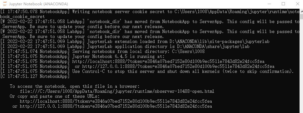
**2. Install Anacoda

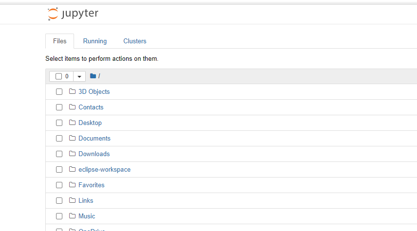
Start Jupyter
3. Use matplotlib to draw the chart
- The matploylib library only requires developers to write a few lines of 1 code to draw a chart.
- Matplotlib is Python's drawing library. It can be used with NumPy and provides an effective open source alternative to MatLab. It can also be used with graphics toolkits such as PyQt and wxPython.
- First import numpy module and pyplot module, and take the alias · as np and plt respectively
import numpy as np
import matplotlib.pyplot as plt
3.1 draw line chart
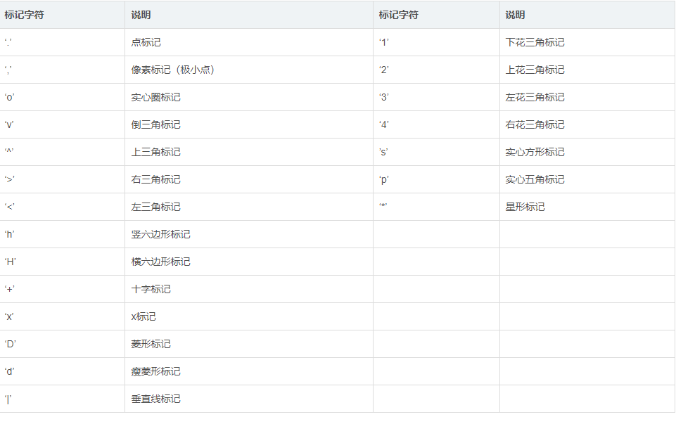
- Use the plot() function of pyplot to draw a line chart quickly
- plt.plot(x,y,format_string,**kwargs)
x:x-axis data, list or array
y:y-axis data, list or array
format_string: control the format string of the curve
**kwargs: second group or more (x,y,format_string)


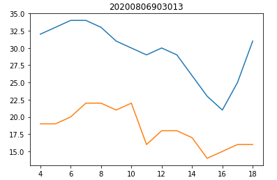
x = np.arange(4,19)
y_max = np.array([32,33,34,34,33,31,30,29,30,29,26,23,21,25,31])
y_min = np.array([19,19,20,22,22,21,22,16,18,18,17,14,15,16,16])
plt.title("20200806903013")
plt.plot(x,y_max)
plt.plot(x,y_min)
plt.show()
3.2 use bar() to draw column chart or stacked column chart
- Use pyplot's bar() function to quickly draw a column chart or stacked column chart
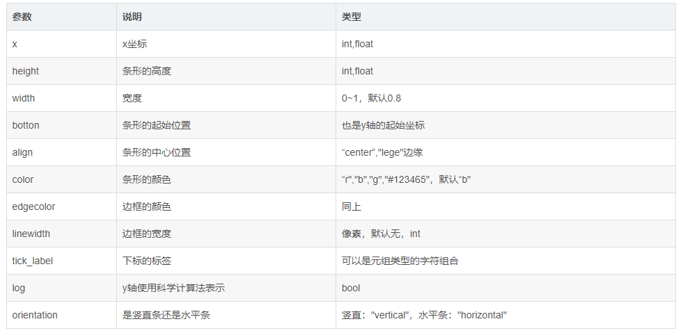
bar(x, height, width=0.8, bottom=None, ***, align='center', data=None, **kwargs)
The bar() function returns an object of the BarContainer class. The object of the BarContainer class is a container containing rectangles or error bars. It can also be regarded as an ancestor, which can traverse and obtain each rectangular bar or error bar.
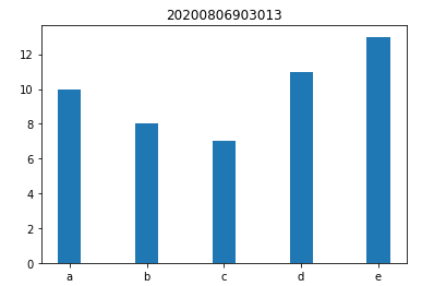
x = np.arange(5)
y1 = np.array([10,8,7,11,13])
plt.title("20200806903013")
bar_width = 0.3
plt.bar(x,y1,tick_label=['a','b','c','d','e'],width=bar_width)
plt.show()
x = np.arange(5)
y1 = np.array([9,4,6,8,10])
y2 = np.array([10,8,7,11,13])
plt.title("20200806903013")
bar_width = 0.3
plt.bar(x,y1,tick_label=['a','b','c','d','e'],width=bar_width)
plt.bar(x+bar_width,y2,width=bar_width)
plt.show()

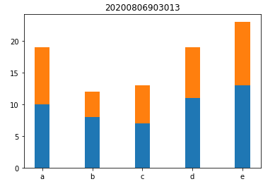
x = np.arange(5)
y1 = np.array([10,8,7,11,13])
y2 = np.array([9,4,6,8,10])
plt.title("20200806903013")
bar_width = 0.3
plt.bar(x,y1,tick_label=['a','b','c','d','e'],width=bar_width)
plt.bar(x,y2,bottom=y1,width=bar_width)
plt.show()
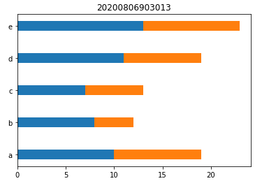
3.3 draw bar chart or stacked bar chart
Use the barh() function of pyplot to quickly draw a bar chart or stacked bar chart
You need to: orientation = "horizontal", then exchange the data between x and y, and add bottom=x.
barh(y, width, height=0.8, left=None, *, align='center', **kwargs)
The barh() function returns an object of the BarContainer class
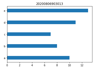
y = np.arange(5)
x1 = np.array([10,8,7,11,13])
plt.title("20200806903013")
bar_height = 0.3
plt.barh(y,x1,tick_label=['a','b','c','d','e'],height=bar_height)
plt.show()
y = np.arange(5)
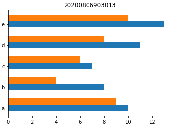
x1 = np.array([10,8,7,11,13])
x2 = np.array([9,4,6,8,10])
plt.title("20200806903013")
bar_height = 0.3
plt.barh(y,x1,tick_label=['a','b','c','d','e'],height=bar_height)
plt.barh(y+bar_height,x2,height=bar_height)
plt.show()
y = np.arange(5)
x1 = np.array([10,8,7,11,13])
x2 = np.array([9,4,6,8,10])
plt.title("20200806903013")
bar_height = 0.3
plt.barh(y,x1,tick_label=['a','b','c','d','e'],height=bar_height)
plt.barh(y,x2,left=x1,height=bar_height)
plt.show()
