3.1 histogram
Histogram is mainly used in the visualization scene of qualitative data, or in the distribution display of classification features. Then the graphics derived from the histogram are stacked histogram, and multi-data parallel histogram.
eg1: Simple histogram
Previous drawings used plt.xxx to manipulate graphics directly. Here fig is used to represent the drawing window (Figure) and ax is used to represent the coordinate system (axes) on the drawing window. The latter ax.xxx represents the xxx operation on the ax coordinate system.
fig,ax = plt.subplot()
Equivalent to
fig = plt.figure()
ax = plt.add_subplot(111)
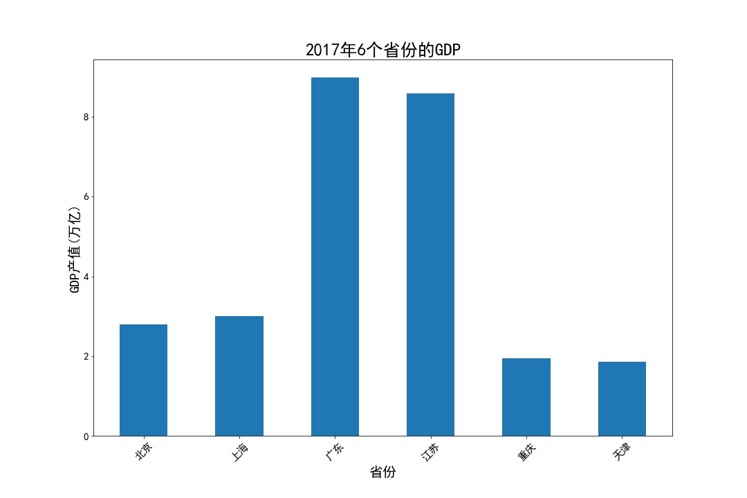
# fig, ax = plt.subplots(figsize=(15,10)) create a drawing object
GDP = pd.read_excel('Province GDP 2017.xlsx')
fig, ax = plt.subplots(figsize=(15,10)) #Create a drawing object
ax.bar(GDP.index.values,GDP.GDP,0.5) #0.5 represents column width
ax.set_xticks(GDP.index.values) #position
ax.set_xticklabels(GDP.Province,rotation = 45) #Give each location a specific label
plt.xticks(fontsize=15 )
plt.yticks(fontsize=15)
ax.set_xlabel('Province',fontsize = 20)
ax.set_ylabel('GDP output value(Trillions)',fontsize = 20)
ax.set_title('2017 Six provinces in 1996 GDP',fontsize = 25)
plt.show()
eg2: stack chart
industry_GDP = pd.read_excel('Industry_GDP.xlsx')
temp = pd.crosstab(industry_GDP['Quarter'],
                   industry_GDP['Industry_Type'],
                   values=industry_GDP['GDP'],
                   aggfunc=np.sum)#Generating Perspective
plt.bar(x= temp.index.values,
        height= temp['Primary industry'],
        color='steelblue',
        label='Primary industry',
        tick_label = temp.index.values)
plt.bar(x= temp.index.values,
        height= temp['The secondary industry'],bottom =temp['Primary industry'],
        color='green',label='The secondary industry',
        tick_label = temp.index.values)
plt.bar(x= temp.index.values,
        height = temp['The service sector; the tertiary industry'],bottom =temp['Primary industry'] +  temp['The secondary industry'],
        color='red',label='The service sector; the tertiary industry',
        tick_label = temp.index.values)
plt.ylabel('Gross domestic product(Billion)')
plt.title('2017 Quarterly gross value of tertiary industry')
plt.legend(loc=2, bbox_to_anchor=(1.02,0.8)) #The legend is displayed outside.
plt.show()
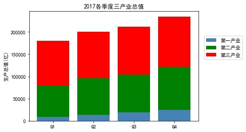
- Pay attention to controlling the stack position by height and bottom
eg3: proportion of stacked maps
temp = pd.crosstab(industry_GDP['Quarter'],industry_GDP['Industry_Type'],values=industry_GDP['GDP'],aggfunc=np.sum)
temp = temp.div(temp.sum(1).astype(float), axis=0)
plt.bar(x= temp.index.values,
        height= temp['Primary industry'],
        color='steelblue',
        label='Primary industry',
        tick_label = temp.index.values)
plt.bar(x= temp.index.values,
        height= temp['The secondary industry'],
        bottom =temp['Primary industry'], c
        olor='green',
        label='The secondary industry',
        tick_label = temp.index.values)
plt.bar(x= temp.index.values,
        height = temp['The service sector; the tertiary industry'],
        bottom =temp['Primary industry'] +  temp['The secondary industry'],
        color='red',
        label='The service sector; the tertiary industry',
        tick_label = temp.index.values)
plt.ylabel('Proportion of each industry')
plt.title('2017 The proportion of the total value of the tertiary industry in each quarter')
plt.legend(loc = 2,bbox_to_anchor=(1.01,0.8))
plt.show()
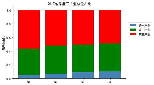
- Note that temp = temp.div(temp.sum(1).astype(float), axis=0) calculated percentage
eg4: Vertical staggered histogram
temp = pd.crosstab(industry_GDP['Quarter'],industry_GDP['Industry_Type'],values=industry_GDP['GDP'],aggfunc=np.sum)
bar_width = 0.2 #Set width
quarter = temp.index.values #Take out the quarterly name
plt.bar(x= np.arange(0,4),
        height= temp['Primary industry'],
        color='steelblue',
        label='Primary industry',
        width = bar_width)
plt.bar(x= np.arange(0,4) + bar_width,
        height= temp['The secondary industry'],
        color='green',
        label='The secondary industry',
        width=bar_width)
plt.bar(x= np.arange(0,4) + 2*bar_width,
        height= temp['The service sector; the tertiary industry'],
        color='red',
        label='The service sector; the tertiary industry',
        width=bar_width)
plt.xticks(np.arange(4)+0.2,quarter,fontsize=12)
plt.ylabel('Gross domestic product(Billion)',fontsize=15)
plt.title('2017 Quarterly gross value of tertiary industry',fontsize=20)
plt.legend(loc = 'upper left')
plt.show()
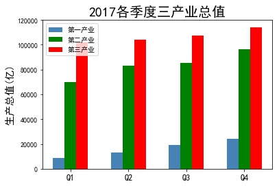
- Vertical staggered histogram should pay attention to the position of each histogram to shift its width.
3.2 Bar Chart
Bar graphs, like bar graphs, differ most from bar graphs in that they change from vertical to horizontal.
Here are two examples, without further elaboration.
- The difference between bar graph and bar graph lies in the difference between plt.bar and plt.barh. The parameters x, height, width and bottom correspond to y, width, height, left and so on.
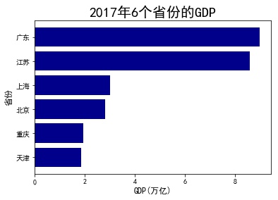
eg1: Simple bar graph
GDP = GDP.sort_values(by ='GDP')
plt.barh(y=range(GDP.shape[0]) ,
         width=GDP.GDP.values,
         color='darkblue',
         align='center',
         tick_label= GDP.Province.values)
plt.xlabel('GDP(Trillions)',fontsize=12)
plt.ylabel('Province',fontsize=12)
plt.title('2017 Six provinces in 1996 GDP',fontsize=20)
plt.show()
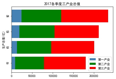
eg2: stacked bar chart
industry_GDP = pd.read_excel('Industry_GDP.xlsx')
temp = pd.crosstab(industry_GDP['Quarter'],industry_GDP['Industry_Type'],values=industry_GDP['GDP'],aggfunc=np.sum)
plt.barh(y= temp.index.values,
         width= temp['Primary industry'],
         color='steelblue',
         label='Primary industry',
         tick_label = temp.index.values)
plt.barh(y= temp.index.values,
         width= temp['The secondary industry'],
         left =temp['Primary industry'],
         color='green',
         label='The secondary industry',
         tick_label = temp.index.values)
plt.barh(y= temp.index.values,
         width = temp['The service sector; the tertiary industry'],
         left =temp['Primary industry'] +  temp['The secondary industry'],
         color='red',
         label='The service sector; the tertiary industry',
         tick_label = temp.index.values)
plt.ylabel('Gross domestic product(Billion)')
plt.title('2017 Quarterly gross value of tertiary industry')
plt.legend(loc = 'lower right')
plt.show()
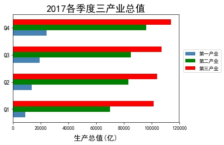
eg3: Horizontal staggered bar graph
temp = pd.crosstab(industry_GDP['Quarter'],industry_GDP['Industry_Type'],values=industry_GDP['GDP'],aggfunc=np.sum)
bar_width = 0.2 #Set width
fig1 = plt.figure('fig1')
quarter = temp.index.values #Take out the quarterly name
plt.barh(y= np.arange(0,4) ,
         width= temp['Primary industry'],
         color='steelblue',
         label='Primary industry',
         height =bar_width)
plt.barh(y= np.arange(0,4) + bar_width,
         width= temp['The secondary industry'],
         color='green',
         label='The secondary industry',
         height = bar_width )
plt.barh(y= np.arange(0,4) + 2*bar_width,
         width= temp['The service sector; the tertiary industry'],
         color='red',
         label='The service sector; the tertiary industry',
         height = bar_width )
plt.yticks(np.arange(4)+0.2,quarter,fontsize=12)
plt.xlabel('Gross domestic product(Billion)',fontsize=15,labelpad =10)
plt.title('2017 Quarterly gross value of tertiary industry',fontsize=20)
# plt.legend(loc = 'lower right')
plt.legend(loc=2, bbox_to_anchor=(1.01,0.7)) #The legend is displayed outside.
# plt.show()
fig1.show()
3.3 Histogram
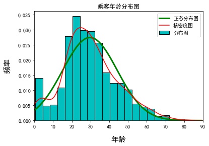
Histogram is generally used to observe the distribution of data, abscissa represents the segmentation of numerical values, ordinate represents the number and frequency of observations, and histogram is usually used in conjunction with nuclear density maps, mainly for a more specific understanding of the distribution characteristics of data. In practice, it is often necessary to determine whether the distribution of data is close to normal distribution maps through graphs.
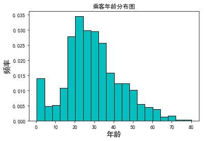
eg1: Simple Histogram
# Read Titanic data
Titanic = pd.read_csv('titanic_train.csv')
Titanic.dropna(subset=['Age'], inplace=True)
# Drawing Histogram
plt.hist(x = Titanic.Age,
         bins=20,
         color='c',
         edgecolor ='black',
         density=True)
plt.xlabel('Age',fontsize =15)
plt.ylabel('frequency',fontsize =15)
plt.title('Passenger Age Distribution map')
plt.show()
eg2: Add Nuclear density map and Normal Distribution Map
# Define the probability density formula of normal distribution
#Normal fun normal distribution function, mu: mean, sigma: standard deviation, pdf: probability density function, np.exp(): probability density function formula
def normfun(x,mu, sigma):
    pdf = np.exp(-((x - mu)**2) / (2* sigma**2)) / (sigma * np.sqrt(2*np.pi))
    return pdf
mean_x = Titanic.Age.mean()
std_x = Titanic.Age.std()
# The range of x is 60-150, in units of 1. x should be debugged according to the range.
x = np.arange(min(Titanic.Age), max(Titanic.Age)+10,1)
# Probability Density Corresponding to x Number
y = normfun(x, mean_x, std_x)
plt.hist(x=Titanic.Age,
         bins=20,color='c',
         edgecolor ='black',
         label ='Distribution Map',d
         ensity=True)
plt.plot(x,y, color='g',linewidth = 3,label ='Normal Distribution Map') #Normal Distribution Map
Titanic['Age'].plot(kind='kde',color='red',xlim=[0,90],label='Kernel Density Map')
plt.xlabel('Age',fontsize =15,labelpad=15)
plt.ylabel('frequency',fontsize =15,labelpad=15)
plt.title('Passenger Age Distribution Map')
plt.legend()
plt.show()
3.4 pie chart
The pie chart is mainly used in the visual analysis of qualitative data. By drawing the pie chart, the proportion distribution of qualitative data can be reflected intuitively.
eg1: pie chart with illustrations
elements = ['flour','Granulated sugar','cream','Strawberry jam','Nut']
weights =[40,15,20,10,15]
colors = ['#1b9e77', '#d95f02','#7570b3','#66a613','#e6ab02']
wedges,texts,autotexts = plt.pie(weights,autopct='%3.1f%%',
                                 labels = elements,
                                 textprops=dict(color='w'),
                                 colors=colors)
plt.legend(wedges,elements,fontsize=12,title='Proportioning table',
           bbox_to_anchor=(0.9,0.9)) # Upper and lower
plt.setp(autotexts,size=15,weight='bold')
plt.setp(texts,size=15, color = 'b')
plt.axis('equal')
plt.title('Proportional table of jam bread ingredients',fontsize = 20)
plt.show()
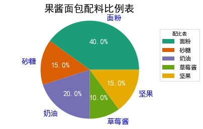
- wedges: Legend
- texts: Labels
- autotexts: percentage
eg2: Embedded ring pie chart
elements = ['flour','Granulated sugar','cream','Strawberry jam','Nut']
weights1 =[40,15,20,10,15]
weights2 =[30,25,15,20,10]
outer_colors = ['#1b9e77', '#d95f02','#7570b3','#66a613','#e6ab02']
inner_colors = ['#1b9e77', '#d95f02','#7570b3','#66a613','#e6ab02']
wedges1,texts1,autotexts1 = plt.pie(weights1,autopct='%3.1f%%',
                                    radius =1,pctdistance=0.85,
                                    colors=outer_colors,
                                    textprops=dict(color='w'),
                                    wedgeprops=dict(width=0.3,edgecolor='w'))
wedges2,texts2,autotexts2 = plt.pie(weights2,autopct='%3.1f%%',
                                    radius =0.7, pctdistance=0.75,
                                    colors=inner_colors,
                                    textprops=dict(color='w'),
                                    wedgeprops=dict(width=0.3,edgecolor='w'))
plt.legend(wedges1,elements,fontsize=12,title='Proportioning table',loc ='center left',
           bbox_to_anchor =(0.9, 0.2, 0.3, 1))
plt.setp(autotexts1,size=15,weight='bold')
plt.setp(autotexts2,size=15,weight='bold')
plt.setp(texts1,size=12)
plt.title('Proportional table of different jam bread ingredients',fontsize = 20)
plt.show()
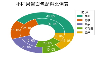
- width in parameter wedgeprops affects embedded circles
3.5 Box Map
The box-line diagram is a statistical graph consisting of a box and a pair of whiskers. The box is composed of the first quartile, the median and the third quartile. Outside the end of the whisker, the values can be understood as outliers, and the boxplot can give a general intuitive description of a set of data ranges.
plt.boxplot(x,notch,sym,vert,whis,positions,widths,patch_artist,meanline,showmeans, boxprops,labels,flierprops
- x: data
- Width: width
- patch_artist: Fill in the box color
- meanline: whether to display the mean
- showmeans: Does it show the mean?
- Meannprops; Set the mean attribute, such as the size, color, etc.
- Mediaprops: Sets the properties of the median, such as line type, size, etc.
- showfliers: Does it mean that there are outliers?
- boxprops: Set box properties, border and fill colors
- cappops: Set the attributes of the top and end lines of the box line, such as color, thickness, etc.
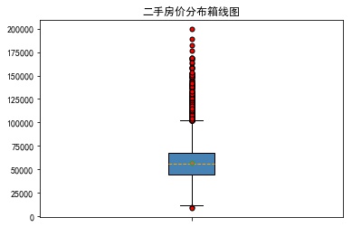
eg1: Simple boxplot
sec_building = pd.read_excel('sec_buildings.xlsx')
plt.boxplot(x=sec_building.price_unit,patch_artist=True,showmeans =True,
            boxprops={'color':'black','facecolor':'steelblue'},
            showfliers=True,
            flierprops={'marker':'o','markerfacecolor':'red','markersize':5},
            meanprops={'marker':'D','markerfacecolor':'indianred','markersize':4},
            medianprops={'linestyle':'--','color':'orange'},labels=[''])
plt.title('Box Map of Second-hand House Price Distribution')
plt.savefig('1.jpg', bbox_inches = 'tight')
plt.show()
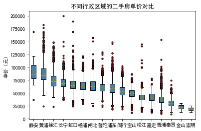
eg2: Drawing block boxes
# Average unit price of second-hand housing in each administrative region
group_region = sec_building.groupby('region')
avg_price = group_region.aggregate({'price_unit':np.mean}).sort_values('price_unit', ascending = False)
# Store second-hand houses in different administrative areas into the list through a loop
region_price = []
for region in avg_price.index:
    region_price.append(sec_building.price_unit[sec_building.region == region])
# Drawing block boxes
plt.boxplot(x = region_price,
            patch_artist=True,
            labels = avg_price.index, # Add the scale label on the x-axis
            showmeans=True,
            boxprops = {'color':'black', 'facecolor':'steelblue'},
            flierprops = {'marker':'o','markerfacecolor':'red', 'markersize':3},
            meanprops = {'marker':'D','markerfacecolor':'indianred', 'markersize':4},
            medianprops = {'linestyle':'--','color':'orange'}
           )
# Add y-axis label
plt.ylabel('Unit price (yuan)')
# Add title
plt.title('Price comparison of second-hand houses in different administrative regions')
# display graphics
plt.show()
3.6 scatter plot
If we want to study the relationship between two continuous variables, scatter plot is the best choice. If we want to study the relationship between two continuous variables in different categories, scatter plot is also the best choice.
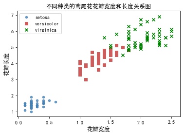
eg: Drawing different kinds of scatter plots
iris = pd.read_csv('iris.csv')
plt.scatter(x = iris.Petal_Width[iris['Species'] =='setosa'],
            y = iris.Petal_Length[iris['Species'] =='setosa'],
            s =20,
            color ='steelblue',
            marker='o',
            label = 'setosa',
            alpha=0.8)
plt.scatter(x = iris.Petal_Width[iris['Species'] =='versicolor'],
            y = iris.Petal_Length[iris['Species'] =='versicolor'],
            s =30,
            color ='indianred',
            marker='s',
            label = 'versicolor')
plt.scatter(x = iris.Petal_Width[iris['Species'] =='virginica'],
            y = iris.Petal_Length[iris['Species'] =='virginica'],
            s =40,
            color ='green',
            marker='x',
            label = 'virginica')
plt.xlabel('petal width',fontsize=12)
plt.ylabel('Petal length',fontsize=12)
plt.title('Relationships between petal width and length of iris of different species')
plt.legend(loc='upper left')
plt.show()
You can also read data in a circular manner
colors_iris = ['steelblue','indianred','green']
sepcies =[ 'setosa','versicolor','virginica']
marker_iris =['o','s','x']
for i in range(0,3):
    plt.scatter(x=iris.Petal_Width[iris['Species'] ==sepcies[i]],
                y=iris.Petal_Length[iris['Species'] == sepcies[i]],
                s=20,
                color=colors_iris[i],
                marker=marker_iris[i],
                label=sepcies[i])
plt.xlabel('petal width',fontsize = 12, labelpad =20)
plt.ylabel('Petal length',fontsize = 12, labelpad =20)
plt.title('Relationships between petal width and length of iris of different species',fontsize =12)
plt.legend(loc='upper left')
plt.show()
3.7 polyline chart
Broken line graph is a graph that connects data points in order. It can be considered that the main function is to see the trend of y changing with x. It is very suitable for time series analysis.
eg1: Drawing different types of broken lines
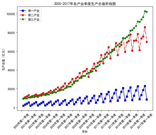
pd.set_option('display.max_columns', 8)
data = np.load('Quarterly Data of National Accounting.npz')
name = data['columns'] ## Extract the columns array as the label of the data
values = data['values']## Extract the values array, where the data exists
fig =plt.figure(figsize=(8,7)) # Create canvas
ax = fig.add_axes([0.15,0.2,0.8,0.7]) # Axes are drawing areas on canvas
plt.plot(values[:,0],values[:,3],'bs-',
       values[:,0],values[:,4],'ro-.',
       values[:,0],values[:,5],'gH--')## Draw a polygraph
plt.xlabel('Particular year')## Add horizontal label
plt.ylabel('Gross domestic product (RMB 100 million)')## Add y-axis name
plt.xticks(range(0,70,4),values[range(0,70,4),1],rotation=45)
plt.title('2000-2017 Breakdown chart of quarterly gross domestic product of each industry in the year')## Add a chart title
plt.legend(['Primary industry','The secondary industry','The service sector; the tertiary industry'])
# plt.savefig('2000-2017 quarterly break-line map of industrial gross domestic product. pdf')
plt.show()
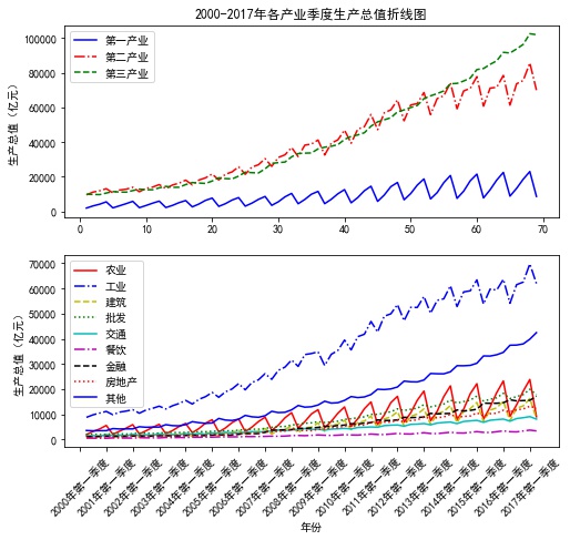
eg2: Drawing subgraphs
p1 = plt.figure(figsize=(8,7))## Set canvas
## Subgraph 1
ax3 = p1.add_subplot(2,1,1)
plt.plot(values[:,0],values[:,3],'b-',
        values[:,0],values[:,4],'r-.',
        values[:,0],values[:,5],'g--')## Draw a polygraph
plt.ylabel('Gross domestic product (RMB 100 million)')## Add Longitudinal Axis Label
plt.title('2000-2017 Breakdown chart of quarterly gross domestic product of each industry in the year')## Add a chart title
plt.legend(['Primary industry','The secondary industry','The service sector; the tertiary industry'])## Add legend
## Subgraph 2
ax4 = p1.add_subplot(2,1,2)
plt.plot(values[:,0],values[:,6], 'r-',## Draw a polygraph
        values[:,0],values[:,7], 'b-.',## Draw a polygraph
        values[:,0],values[:,8],'y--',## Draw a polygraph
        values[:,0],values[:,9], 'g:',## Draw a polygraph
        values[:,0],values[:,10], 'c-',## Draw a polygraph
        values[:,0],values[:,11], 'm-.',## Draw a polygraph
        values[:,0],values[:,12], 'k--',## Draw a polygraph
        values[:,0],values[:,13], 'r:',## Draw a polygraph
        values[:,0],values[:,14], 'b-')## Draw a polygraph
plt.legend(['Agriculture','Industry','Architecture','wholesale','traffic',
        'Restaurant','Finance','Real estate','Other'])
plt.xlabel('Particular year')## Add horizontal label
plt.ylabel('Gross domestic product (RMB 100 million)')## Add Longitudinal Axis Label
plt.xticks(range(0,70,4),values[range(0,70,4),1],rotation=45)
plt.show()