1. Item locator
Locator items are container items that manage the location of items in the declarative user interface. Locators behave like layout managers used by standard Qt widgets, except that they are also containers themselves.
Locators make it easier for many projects to work with them when they need to be arranged in a regular layout.
Qt Quick Layouts can also be used to arrange Qt Quick items in the user interface. They manage the location and size of items on the declarative user interface and are ideal for resizable user interfaces.
Note: those who are familiar with QWidget may have doubts. What is the difference between a layout and a locator? Why is there a locator and a layout in QML?
The locator in QML manages the location (x,y attributes), and the layout also manages the width and height of the project
2. Positioner
The basic set of Qt Quick graphic types provides a set of standard locators:
| Column | Place its children in the column |
| Flow | Place its children side by side and package as needed |
| Grid | Position its children in mesh formation |
| LayoutMirroring | Properties for mirroring layout behavior |
| Positioner | Provides additional properties that contain details about the location of the item in the locator |
| Row | Line up its children |
Column 2.0 items
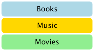
Column items are used to arrange items vertically. The following example uses column items to arrange three rectangular items in an area defined by an external item. The spacing property is set to include a small amount of space between rectangles|

import QtQuick 2.0

Item {
    width: 310; height: 170

    Column {
        anchors.horizontalCenter: parent.horizontalCenter
        anchors.verticalCenter: parent.verticalCenter

        spacing: 5

        Rectangle { color: "lightblue"; radius: 10.0
                    width: 300; height: 50
                    Text { anchors.centerIn: parent
                           font.pointSize: 24; text: "Books" } }
        Rectangle { color: "gold"; radius: 10.0
                    width: 300; height: 50
                    Text { anchors.centerIn: parent
                           font.pointSize: 24; text: "Music" } }
        Rectangle { color: "lightgreen"; radius: 10.0
                    width: 300; height: 50
                    Text { anchors.centerIn: parent
                           font.pointSize: 24; text: "Movies" } }
    }
}
Note that since the column inherits directly from the Item, any background color must be added to the parent rectangle if necessary.
2.1 line items
Line items are used to arrange items horizontally. The following example uses the Row item to arrange three rounded rectangle items in an area defined by an outer colored rectangle. The spacing property is set to include a small amount of space between rectangles.

We ensure that the parent rectangle is large enough to leave some space around the edge of the horizontally centered Row item.
import QtQuick 2.0

Rectangle {
    width: 320; height: 110
    color: "#c0c0c0"

    Row {
        anchors.horizontalCenter: parent.horizontalCenter
        anchors.verticalCenter: parent.verticalCenter

        spacing: 5

        Rectangle { width: 100; height: 100; radius: 20.0
                    color: "#024c1c" }
        Rectangle { width: 100; height: 100; radius: 20.0
                    color: "#42a51c" }
        Rectangle { width: 100; height: 100; radius: 20.0
                    color: "white" }
    }
}
2.2 grid items

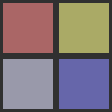
Grid items are used to place items in a grid or table arrangement. The following example uses grid items to place four rectangular items in a 2 x 2 grid. Like other locators, you can use the spacing property to specify the spacing between items.
import QtQuick 2.0

Rectangle {
    width: 112; height: 112
    color: "#303030"

    Grid {
        anchors.horizontalCenter: parent.horizontalCenter
        anchors.verticalCenter: parent.verticalCenter
        columns: 2
        spacing: 6

        Rectangle { color: "#aa6666"; width: 50; height: 50 }
        Rectangle { color: "#aaaa66"; width: 50; height: 50 }
        Rectangle { color: "#9999aa"; width: 50; height: 50 }
        Rectangle { color: "#6666aa"; width: 50; height: 50 }
    }
}
There is no difference between horizontal and vertical spacing inserted between projects, so any additional space must be added to the project itself.
Any empty cell in the grid must be created by defining a placeholder item in the appropriate location in the grid definition.
2.3 flow items

Flow items are used to place items such as words on the page, including rows or columns of non overlapping items.
Flow items arrange items in a similar way to Grid items, items are arranged along one axis (short axis) and items are arranged adjacent to each other along another axis (long axis). The flow direction and spacing between items are controlled by the flow and spacing properties.
The following example demonstrates a flow item that contains many text children. They are arranged in a manner similar to that shown in the screenshot.
import QtQuick 2.0

Rectangle {
    color: "lightblue"
    width: 300; height: 200

    Flow {
        anchors.fill: parent
        anchors.margins: 4
        spacing: 10

        Text { text: "Text"; font.pixelSize: 40 }
        Text { text: "items"; font.pixelSize: 40 }
        Text { text: "flowing"; font.pixelSize: 40 }
        Text { text: "inside"; font.pixelSize: 40 }
        Text { text: "a"; font.pixelSize: 40 }
        Text { text: "Flow"; font.pixelSize: 40 }
        Text { text: "item"; font.pixelSize: 40 }
    }
}
The main difference between mesh locators and flow locators is that when the items in the flow have insufficient space on the minor axis, they will wrap, and if the items do not have a uniform size, the items on one row may not be aligned with those on another row. Like grid items, there is no independent control over the spacing between items and between item rows.
Other ways to locate the project
There are several other ways to locate items in the user interface. In addition to the basic technique of directly specifying its coordinates, it can also be positioned relative to other items with anchors or used with QML data models, such as object models.