catalogue
Positioning, layout, input elements, and transformations
Positioning, layout, input elements, and transformations
Components
An element that can be reused. QML can customize element components. This article focuses on creating components in separate files. Define a clickableimage QML for use below.
ClickableImage.qml implementation:
import QtQuick 2.0
Image {
    id: root
    signal clicked
    MouseArea {
        anchors.fill: parent
        onClicked: root.clicked()
    }
}
Element transformations
QML elements can change the geometric state of objects through translation, rotation and scaling.
Translation: completed by X and Y coordinates
Rotation: completed by rotation attribute (0 ~ 360)
Scaling: done by scale (smaller than 1, larger than 1)
Here is a code case:
import QtQuick 2.9
import QtGraphicalEffects 1.0
Item {
width: bg.width
height: bg.height
Image {
id: bg
source: "./background.png"
}
MouseArea {
id: backgroundClicker
anchors.fill: parent
onClicked: {
rocket1.x = 20
rocket2.rotation = 0
rocket3.rotation = 0
rocket3.scale = 1.0
}
}
Image {
id: rocket1
x: 20; y: 100
source: "./pole.png"
MouseArea {
anchors.fill: parent
onClicked: {
rocket1.x += 5
}
}
}
ClickableImage {
id: rocket2
x: 140; y: 100
source: "./pole.png"
smooth: true
onClicked: {
rotation += 5
}
}
ClickableImage {
id: rocket3
x: 240; y: 100
source: "./pole.png"
smooth: true
onClicked: {
rotation += 5
scale -= 0.05
}
}
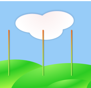
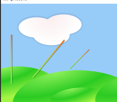
}Effect achieved:
Original drawing:
Effect after clicking:
Positioning Element
In QML, locators are used to place element objects. QtQuick module provides Row, Column, Grid and Flow as locators. Let's take a look at the effects of each locator:
Row locator
//Row
import QtQuick 2.5
Item {
    id: root
    width: 400; height: 120

    Row {
        id: row
        anchors.centerIn: parent
        spacing: 20
        Rectangle {
            width: 48
            height: 48
            color: "#ea7025"
        }
        Rectangle {
            width: 48
            height: 48
            color: "#67c111"
        }
        Rectangle {
            width: 48
            height: 48
            color: "#00bde3"
        }

    }
}
design sketch:

Column locator
//Column
import QtQuick 2.5
Item {
    id: root
    width: 120
    height: 240
    Column {
        id: row
        anchors.centerIn: parent
        spacing: 20
        Rectangle {
            width: 48
            height: 48
            color: "#ea7025"
        }
        Rectangle {
            width: 96
            height: 48
            color: "#67c111"
        }
        Rectangle {
            width: 48
            height: 48
            color: "#00bde3"
        }

    }
}
design sketch:

Grid locator
//Grid
import QtQuick 2.5
Item {
    id: root
    width: 160
    height: 160

    Grid {
        id: grid
        rows: 2
        columns: 2
        anchors.centerIn: parent
        spacing: 8
        Rectangle {
            width: 48
            height: 48
            color: "#ea7025"
        }
        Rectangle {
            width: 48
            height: 48
            color: "#67c111"
        }
        Rectangle {
            width: 48
            height: 48
            color: "#00bde3"
        }
        Rectangle {
            width: 48
            height: 48
            color: "#3c3c3c"
        }
    }
}
design sketch:

Flow locator
//Flow
import QtQuick 2.5
Item {
    id: root
    width: 160
    height: 160

    Flow {
        anchors.fill: parent
        anchors.margins: 20
        spacing: 20
        Rectangle {
            width: 48
            height: 48
            color: "#ea7025"
        }
        Rectangle {
            width: 48
            height: 48
            color: "#67c111"
        }
        Rectangle {
            width: 48
            height: 48
            color: "#00bde3"
        }
        Rectangle {
            width: 48
            height: 48
            color: "#3c3c3c"
        }
    }
}
design sketch:
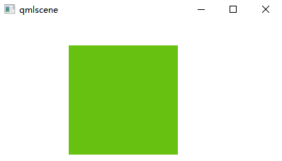
Default:

After stretching:

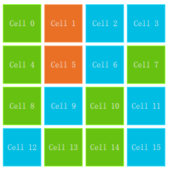
Repeater (repeating element)
Here is an example of the use of a Repeater with a locator. Repeaters are similar to for loops and iterators.
Look at a piece of code:
import QtQuick 2.5
Item {
    id: root
    width: 252
    height: 252
    //Use an array to define a set of color properties
    property variant colorArray: ["#00bde3", "#67c111", "#ea7025"]

    Grid{
        anchors.fill: parent
        anchors.margins: 8
        spacing: 4
        Repeater {
            //Create 16 rectangles from repeating elements
            model: 16
            Rectangle {
                width: 56; height: 56
                //Random color selection using mathematical functions
                property int colorIndex: Math.floor(Math.random()*3)
                color: root.colorArray[colorIndex]
                border.color: Qt.lighter(color)
                Text {
                    anchors.centerIn: parent
                    color: "#f0f0f0"
                    //Display index
                    text: "Cell " + index
                }
            }
        }
    }
}
design sketch:
Layout Element
Use anchors to lay out elements in QML. Anchors are the basic attributes of the base element object and can be used by all visual QML elements.
anchors diagram:
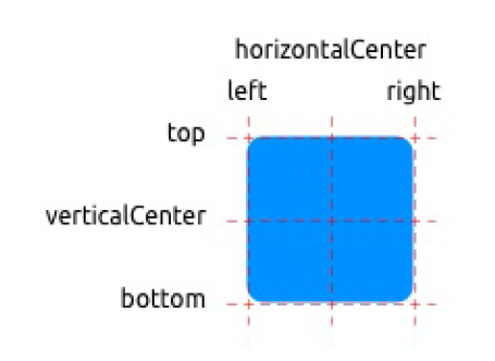
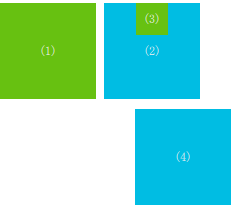
Understand the basic usage of anchors through a piece of code:
import QtQuick 2.5

Item {
    id: root
    width: 400; height: 240

    // M1>>
    Rectangle{
        id:rect1
        width: 96
        height: width
        anchors.margins: 8
        color: "#67c111"
        Text {
            anchors.centerIn: parent
            text: '(1)'
            color: "#f0f0f0"
        }
    }

    // M2>>
    Rectangle{
        id:rect2
        width: 96
        height: width
        anchors.margins: 8
        color: "#00bde3"
        anchors.left: rect1.right
        Text {
            anchors.centerIn: parent
            text: '(2)'
            color: "#f0f0f0"
        }
    }
    // <<M3
    Rectangle{
        id:rect3
        width: 32
        height: width
        anchors.margins: 8
        color: "#67c111"
        anchors.horizontalCenter: rect2.horizontalCenter
        Text {
            anchors.centerIn: parent
            text: '(3)'
            color: "#f0f0f0"
        }
    }

    // M4>>
    Rectangle{
        id:rect4
        width: 96
        height: width
        anchors.margins: 8
        color: "#00bde3"
        anchors.top: rect2.bottom
        anchors.right: parent.right
        anchors.topMargin: 10
        Text {
            anchors.centerIn: parent
            text: '(4)'
            color: "#f0f0f0"
        }
    }

}
design sketch:
Input Element
This section mainly introduces two text elements: TextInput and TextEdit
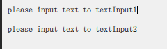
Text input
Text input: allows the user to enter a line of text. This element supports the use of regular expressions to restrict input.
Look at a code example:
import QtQuick 2.5

Rectangle {
    width: 300
    height: 80
    color: "#f0f0f0"
    TextInput {
        id: textInput1
        x: 8; y: 8
        width: 250; height: 20
        focus: true //Receive cursor
        text: "please input text to textInput1" //Default text
        KeyNavigation.tab: textInput2 //tab key to switch the cursor to textInput2
    }
    TextInput {
        id: textInput2
        x: 8; y: 36
        width: 250; height: 20
        text: "please input text to textInput2"
        KeyNavigation.tab: textInput1
    }
}
design sketch:
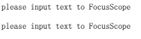
Focus scope
focus scope defines that if the area receives focus, it is the last child element to receive focus using focus:true.
Example code:
Rectangle {
    width: 300
    height: 80
    FocusScope {
        TextInput {
            id: textInput1
            x: 8; y: 8
            width: 250; height: 20
            focus: true //Receive cursor
            text: "please input text to FocusScope" //Default text
            KeyNavigation.tab: textInput2 //tab key to switch the cursor to textInput2
        }
    }
    FocusScope {
        TextInput {
            id: textInput2
            x: 8; y: 36
            width: 250; height: 20
            text: "please input text to FocusScope"
            KeyNavigation.tab: textInput1
        }
    }
}
Effect achieved:
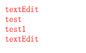
TextEdit
The TextEdit element is similar to the TextInput element. It supports multi line text editing, but does not support text input restrictions. It provides the query function of the entered text size.
Example code:
import QtQuick 2.5

Rectangle {
    width: 300
    height: 80
    FocusScope {
        TextEdit {
            id: textEdit1
            x: 8; y: 8
            color: "red"
            width: 250; height: 100
            focus: true //Receive cursor
            text: "textEdit" //Default text
            KeyNavigation.tab: textEdit2 //tab key to switch the cursor to textInput2
        }
    }
}
design sketch:
Key Element
When the program is running, you can use the Key Element to perform certain operations, such as up and down to move, tab to switch focus, etc.
Example code:
import QtQuick 2.5

Rectangle {
    width: 400; height: width
    Rectangle{
        id: square
        width: 96
        height: width
        x: 8; y: 8
        color: "#67c111"
    }
    focus:true
    Keys.onLeftPressed: square.x -= 8 //Left move left
    Keys.onRightPressed: square.x += 8 //Right move right
    Keys.onUpPressed: square.y -= 8 //Up move up
    Keys.onDownPressed: square.y += 8 //Down move down
    Keys.onPressed: {
        switch(event.key) {
        case Qt.Key_Plus: //+Magnify
            square.scale += 0.2
            break;
        case Qt.Key_Minus: //narrow
            square.scale -= 0.2
            break;
        }
    }
}
design sketch:
Default:
Move right ---- > move down ---- > zoom in: