Preface
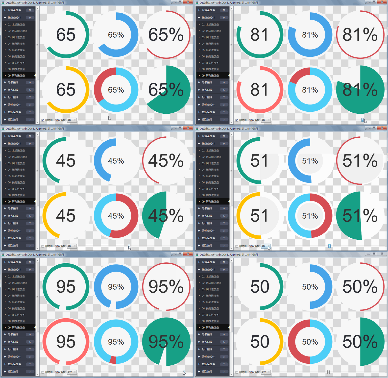
Ring progress bar, used to show the current progress, in order to meet the needs of large screen UI customization, there used to be a ring progress bar, which can not meet the needs of the project, can only be re-customized, the previous progress interval can not be self-adaptive resolution, and the current progress corresponding to the reverse progress can not be separately set color, that is, 90% of the current progress, the remaining 10% also need to be set into different colors. Another important function of color is that it can specify multiple alert values. Once the alert value exceeds or is less than that value, the current progress will automatically switch to the pre-set alert value color. It does not need the user to judge the alert value to set the alert color. The user only needs to pass in the current value. This function is very practical, and the criterion of alert judgment can also be set to exceed the value. It is less than the alarm value. Personally, I feel that this circular progress bar function has exploded all the circular progress bars on the market. As long as a little parameter setting can be turned into a variety of desired effects, what starting angle + animation effect + clockwise counterclockwise rotation, etc.
Functions realized
- 1: Range values can be set to support negative values
- 2: Can set accuracy, maximum support decimal point after 3 bits
- 3: Starting angle can be set
- 4: Three values + three colors can be set, and different colors can be drawn after the automatic detection value is enabled.
- 5: Can set whether animation effect is enabled and the step size of animation effect each time it moves
- 6: Background color / Text color / Progress color / Mid-circle color can be set
- 7:Settable value alarm comparison mode 0-no comparison 1-maximum alarm 2-minimum alarm
- 8: The value that can be set to display is percentage
- 9: The distance between the circle and the background can be set, that is, the distance between the circle and the background.
- 10:Width of ring can be set
- 11:The ring background color can be set to form two kinds of color difference.
- 12:Clockwise and counterclockwise rotation can be set
- 13: Self-adaptive form stretching, scale and text auto-zooming
Design sketch


Header file code
#ifndef PROGRESSRING_H
#define PROGRESSRING_H

/**
 * Ring progress bar control author: feiyangqingyun(QQ:517216493) 2019-5-1
 * 1:Range values can be set to support negative values
 * 2:Accuracy can be set to support the last 3 decimal places.
 * 3:Starting angle can be set
 * 4:It can set three values + three colors, and draw different colors after enabling automatic detection values.
 * 5:Can set whether animation effect is enabled and the step size of animation effect each time it moves
 * 6:Background color/text color/progress color/middle circle color can be set
 * 7:Settable alarm comparison mode 0-no comparison 1-maximum alarm 2-minimum alarm
 * 8:The value that can be set to display is percentage
 * 9:The distance between the circle and the background can be set, that is, the distance between the circle and the background.
 * 10:Width of ring can be set
 * 11:The ring background color can be set to form two kinds of color difference.
 * 12:Clockwise and counterclockwise rotation can be set
 * 13:Self-adaptive form stretching, scale and text auto-zooming
 */

#include <QWidget>

#ifdef quc
#if (QT_VERSION < QT_VERSION_CHECK(5,7,0))
#include <QtDesigner/QDesignerExportWidget>
#else
#include <QtUiPlugin/QDesignerExportWidget>
#endif

class QDESIGNER_WIDGET_EXPORT ProgressRing : public QWidget
#else
class ProgressRing : public QWidget
#endif

{
    Q_OBJECT
    Q_PROPERTY(double minValue READ getMinValue WRITE setMinValue)
    Q_PROPERTY(double maxValue READ getMaxValue WRITE setMaxValue)
    Q_PROPERTY(double value READ getValue WRITE setValue)
    Q_PROPERTY(int precision READ getPrecision WRITE setPrecision)

    Q_PROPERTY(bool showPercent READ getShowPercent WRITE setShowPercent)
    Q_PROPERTY(int alarmMode READ getAlarmMode WRITE setAlarmMode)
    Q_PROPERTY(int startAngle READ getStartAngle WRITE setStartAngle)
    Q_PROPERTY(int ringPadding READ getRingPadding WRITE setRingPadding)
    Q_PROPERTY(int ringWidth READ getRingWidth WRITE setRingWidth)

    Q_PROPERTY(bool animation READ getAnimation WRITE setAnimation)
    Q_PROPERTY(double animationStep READ getAnimationStep WRITE setAnimationStep)

    Q_PROPERTY(QColor bgColor READ getBgColor WRITE setBgColor)
    Q_PROPERTY(QColor textColor READ getTextColor WRITE setTextColor)
    Q_PROPERTY(QColor ringColor READ getRingColor WRITE setRingColor)
    Q_PROPERTY(QColor ringBgColor READ getRingBgColor WRITE setRingBgColor)
    Q_PROPERTY(QColor circleColor READ getCircleColor WRITE setCircleColor)

    Q_PROPERTY(int ringValue1 READ getRingValue1 WRITE setRingValue1)
    Q_PROPERTY(int ringValue2 READ getRingValue2 WRITE setRingValue2)
    Q_PROPERTY(int ringValue3 READ getRingValue3 WRITE setRingValue3)

    Q_PROPERTY(QColor ringColor1 READ getRingColor1 WRITE setRingColor1)
    Q_PROPERTY(QColor ringColor2 READ getRingColor2 WRITE setRingColor2)
    Q_PROPERTY(QColor ringColor3 READ getRingColor3 WRITE setRingColor3)

public:
    explicit ProgressRing(QWidget *parent = 0);
    ~ProgressRing();

protected:
    void paintEvent(QPaintEvent *);
    void drawBg(QPainter *painter);
    void drawRing(QPainter *painter);
    void drawPadding(QPainter *painter);
    void drawCircle(QPainter *painter);
    void drawValue(QPainter *painter);

private slots:
    void updateValue();

private:
    double minValue;                //minimum value
    double maxValue;                //Maximum value
    double value;                   //target value
    int precision;                  //Accuracy, after decimal points

    bool clockWise;                 //Clockwise and counterclockwise
    bool showPercent;               //Display Percentage
    int alarmMode;                  //Warning alarm mode, progress for different colors
    int startAngle;                 //Starting angle
    int ringPadding;                //Ring spacing
    int ringWidth;                  //Ring width

    bool animation;                 //Whether animation display is enabled
    double animationStep;           //Time step of animation display

    QColor bgColor;                 //background color
    QColor textColor;               //Text color
    QColor ringColor;               //Ring color
    QColor ringBgColor;             //Circle Progress Background
    QColor circleColor;             //Central circle color

    int ringValue1;                 //Ring value 1
    int ringValue2;                 //Ring value 2
    int ringValue3;                 //Ring value 3

    QColor ringColor1;              //Ring color 1
    QColor ringColor2;              //Ring color 2
    QColor ringColor3;              //Ring color 3

    bool reverse;                   //Whether to go back or not
    double currentValue;            //Current value
    QTimer *timer;                  //Timer Drawing Animation

public:
    double getMinValue()            const;
    double getMaxValue()            const;
    double getValue()               const;
    int getPrecision()              const;

    bool getClockWise()             const;
    bool getShowPercent()           const;
    int getAlarmMode()              const;
    int getStartAngle()             const;
    int getRingPadding()            const;
    int getRingWidth()              const;

    bool getAnimation()             const;
    double getAnimationStep()       const;

    QColor getBgColor()             const;
    QColor getTextColor()           const;
    QColor getRingColor()           const;
    QColor getRingBgColor()         const;
    QColor getCircleColor()         const;

    int getRingValue1()             const;
    int getRingValue2()             const;
    int getRingValue3()             const;

    QColor getRingColor1()          const;
    QColor getRingColor2()          const;
    QColor getRingColor3()          const;

    QSize sizeHint()                const;
    QSize minimumSizeHint()         const;

public Q_SLOTS:
    //Set range values
    void setRange(double minValue, double maxValue);
    void setRange(int minValue, int maxValue);

    //Set maximum and minimum
    void setMinValue(double minValue);
    void setMaxValue(double maxValue);

    //Setting target values
    void setValue(double value);
    void setValue(int value);

    //Setting Accuracy
    void setPrecision(int precision);

    //Set clockwise and counterclockwise rotation
    void setClockWise(bool clockWise);
    //Set Display Percentage
    void setShowPercent(bool showPercent);
    //Setting up Start Auto Check
    void setAlarmMode(int alarmMode);
    //Setting the starting angle
    void setStartAngle(int startAngle);
    //Setting ring spacing
    void setRingPadding(int ringPadding);
    //Set the width of the ring
    void setRingWidth(int ringWidth);

    //Set whether animation display is enabled
    void setAnimation(bool animation);
    //Set the step size for animation display
    void setAnimationStep(double animationStep);

    //Set the background color
    void setBgColor(const QColor &bgColor);
    //Setting Text Colors
    void setTextColor(const QColor &textColor);
    //Setting the ring progress color
    void setRingColor(const QColor &ringColor);
    //Set the ring background color
    void setRingBgColor(const QColor &ringBgColor);
    //Set the center circle color
    void setCircleColor(const QColor &circleColor);

    //Set three values
    void setRingValue1(int ringValue1);
    void setRingValue2(int ringValue2);
    void setRingValue3(int ringValue3);

    //Set three colors
    void setRingColor1(const QColor &ringColor1);
    void setRingColor2(const QColor &ringColor2);
    void setRingColor3(const QColor &ringColor3);

Q_SIGNALS:
    void valueChanged(int value);
};

#endif // PROGRESSRING_H
Core code
void ProgressRing::paintEvent(QPaintEvent *)
{
    int width = this->width();
    int height = this->height();
    int side = qMin(width, height);

    //Drawing preparation, enabling anti-aliasing, translating coordinate axis center, scaling in equal proportion
    QPainter painter(this);
    painter.setRenderHints(QPainter::Antialiasing | QPainter::TextAntialiasing);
    painter.translate(width / 2, height / 2);
    painter.scale(side / 200.0, side / 200.0);

    //Drawing background
    drawBg(&painter);
    //Drawing progress
    drawRing(&painter);

    //Draw the interval and redraw a circle to create the interval effect
    if (ringPadding > 0) {
        drawPadding(&painter);
    }

    //Draw the middle circle
    drawCircle(&painter);
    //Draw the current value
    drawValue(&painter);
}

void ProgressRing::drawBg(QPainter *painter)
{
    int radius = 99;
    painter->save();
    painter->setPen(Qt::NoPen);
    //Here's a trick. Set the background color of the circle if there's no spacing.
    painter->setBrush(ringPadding == 0 ? ringBgColor : bgColor);
    painter->drawEllipse(-radius, -radius, radius * 2, radius * 2);
    painter->restore();
}

void ProgressRing::drawRing(QPainter *painter)
{
    int radius = 99 - ringPadding;
    painter->save();
    painter->setPen(Qt::NoPen);
    painter->setBrush(ringColor);

    QRectF rect(-radius, -radius, radius * 2, radius * 2);

    //Calculate total range angle, current range angle, residual range angle
    double angleAll = 360.0;
    double angleCurrent = angleAll * ((currentValue - minValue) / (maxValue - minValue));
    double angleOther = angleAll - angleCurrent;

    //If counterclockwise
    if (!clockWise) {
        angleCurrent = -angleCurrent;
        angleOther = -angleOther;
    }

    //Dynamically set the current progress color
    QColor color = ringColor;
    if (alarmMode == 1) {
        if (currentValue >= ringValue3) {
            color = ringColor3;
        } else if (currentValue >= ringValue2) {
            color = ringColor2;
        } else {
            color = ringColor1;
        }
    } else if (alarmMode == 2) {
        if (currentValue <= ringValue1) {
            color = ringColor1;
        } else if (currentValue <= ringValue2) {
            color = ringColor2;
        } else {
            color = ringColor3;
        }
    }

    //Draw the current value pie circle
    painter->setBrush(color);
    painter->drawPie(rect, (startAngle - angleCurrent) * 16, angleCurrent * 16);

    //Drawing Residual Value Pie Circle
    painter->setBrush(ringBgColor);
    painter->drawPie(rect, (startAngle - angleCurrent - angleOther) * 16, angleOther * 16);

    painter->restore();
}

void ProgressRing::drawPadding(QPainter *painter)
{
    int radius = 99 - ringWidth - ringPadding;
    painter->save();
    painter->setPen(Qt::NoPen);
    painter->setBrush(bgColor);
    painter->drawEllipse(-radius, -radius, radius * 2, radius * 2);
    painter->restore();
}

void ProgressRing::drawCircle(QPainter *painter)
{
    //The width and spacing of progress should be subtracted from the text area.
    int radius = 99 - ringWidth - (ringPadding * 2);
    painter->save();
    painter->setPen(Qt::NoPen);
    painter->setBrush(circleColor);
    painter->drawEllipse(-radius, -radius, radius * 2, radius * 2);
    painter->restore();
}

void ProgressRing::drawValue(QPainter *painter)
{
    //The width and spacing of progress should be subtracted from the text area.
    int radius = 99 - ringWidth - (ringPadding * 2);
    painter->save();
    painter->setPen(textColor);

    QFont font;
    int fontSize = radius - (showPercent ? 20 : 6);
    font.setPixelSize(fontSize);
    painter->setFont(font);

    QRectF textRect(-radius, -radius, radius * 2, radius * 2);
    QString strValue;
    if (showPercent) {
        double percent = (currentValue * 100) / (maxValue - minValue);
        strValue = QString("%1%").arg(percent, 0, 'f', precision);
    } else {
        strValue = QString("%1").arg(currentValue, 0, 'f', precision);
    }

    painter->drawText(textRect, Qt::AlignCenter, strValue);

    painter->restore();
}
Control introduction
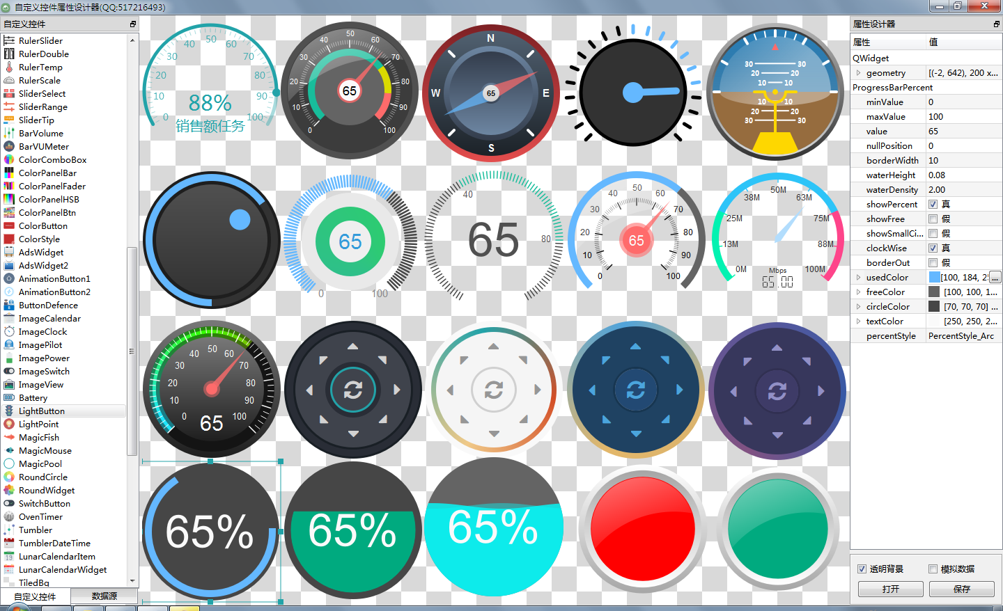
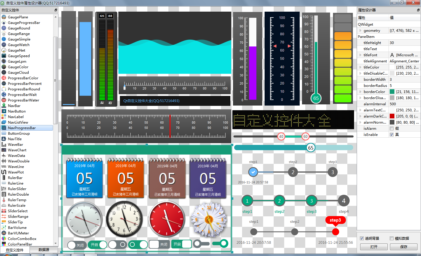
- More than 145 exquisite controls, covering a variety of dashboards, progress bars, progress balls, compasses, curves, rulers, thermometers, navigation bars, navigation bars, flatui, highlighted buttons, sliding selectors, lunar calendar, etc. Far more controls than qwt integrates.
- Each class can be separated into a separate control, zero-coupling, each control has a header file and an implementation file, independent of other files, to facilitate the integration of a single control in the form of source code into the project, less code. The control classes of qwt are interlinked and highly coupled. If you want to use one of the controls, you must include all the code.
- All pure Qt writing, QWidget+QPainter drawing, support any Qt version from Qt4.6 to Qt5.12, support mingw, msvc, gcc and other compilers, no scrambling, can be directly integrated into Qt Creator, as with its own controls, most of the effects can be set up only a few properties, very convenient.
- Each control has a corresponding separate DEMO containing the source code of the control, which is convenient for reference. It also provides an integrated DEMO for all controls.
- The source code of each control has detailed Chinese annotations, which are compiled in accordance with the unified design specifications. It is convenient to learn how to compile custom controls.
- Each control's default color matching and demo's corresponding color matching are very beautiful.
- More than 130 visible controls and 6 invisible controls.
- Some controls provide a variety of style choices, a variety of indicator style choices.
- All controls adapt to form stretching changes.
- Integrate custom control property designer, support drag design, WYSIWYG, support import and export xml format.
- With activex control demo, all controls can run directly in ie browser.
- Integrate fontawesome graphic fonts + hundreds of graphic fonts collected by Alibaba iconfont to enjoy the fun of graphic fonts.
- All controls finally generate a dll Dynamic Library file, which can be directly integrated into the qtcreator for dragging design use.
SDK Download
- SDK Download Link: https://pan.baidu.com/s/1tD9v1YPfE2fgYoK6lqUr1Q Extraction code: lyhk
- Custom Control + Property Designer Appreciation: https://pan.baidu.com/s/1l6L3rKSiLu_uYi7lnL3ibQ Extraction code: tmvl
- The download link contains various versions of dynamic library files, the header files of all controls, using demo.
- Custom Control Plug-in Open Dynamic Library dll (permanently free), without any backdoor and restrictions, please feel free to use.
- At present, 22 versions of dll have been provided, including qt5.12.3 MSVC 2017 32 + 64 MinGW 32 + 64.
- Increase control and improve control from time to time, update SDK from time to time. Welcome to make suggestions. Thank you!
- widget version (QQ: 517216493) qml version (QQ: 373955953) camel triple (QQ: 278969898).

