In a quick review, flex layout is basically used
I Basic concepts of Flex layout
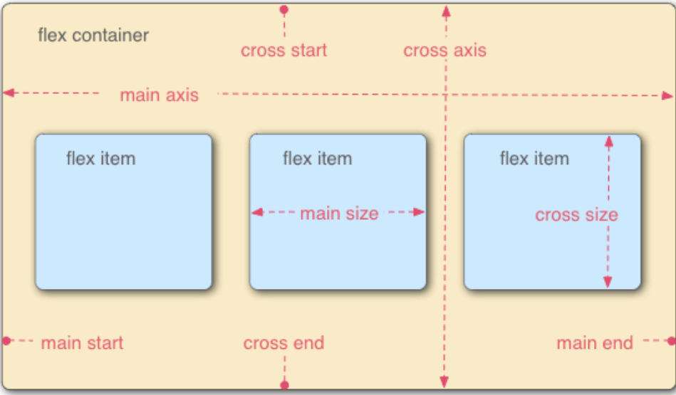
All child elements of the Flex layout automatically become members of the container, called Flex items.
The container has two axes: the main axis and the cross axis. As shown in the figure below.
II The attribute of the container (that is, the attribute of the parent element)
There are six properties set on the container
-
flex-direction
-
flex-wrap
-
flex-flow
-
justify-content
-
align-items
-
align-content
1. Flex direction attribute
The flex direction attribute determines the direction of the main axis (that is, the arrangement direction of the items)
| Row (default) | The spindle is horizontal | The starting point is at the left end |
|---|---|---|
| row-reverse | The spindle is horizontal | The starting point is at the right end |
| column | The main axis is vertical | The starting point is on the top edge |
| column-reverse | The spindle is vertical | Start at the bottom edge |
1.1 the following is an example through row and row reverse. The other two are similar
- The codes that do not use elastic layout are as follows
<!DOCTYPE html>
<html>
    <head>

    <body>
            <div class="box1">
                <div class="son1">son1</div>
                <div class="son2">son2</div>
                <div class="son3">son3</div>
            </div>
    </body>
</html>
The operation results are as follows
-
Elastic layout is used, and the code is as follows. Relative to the above, add the following two lines of code. The result is the same as above.
            display: flex;
            flex-direction:row;
.box1{ width: 400px; height: 400px; border: 1px solid red; margin: 20px auto; display: flex; flex-direction: row; }

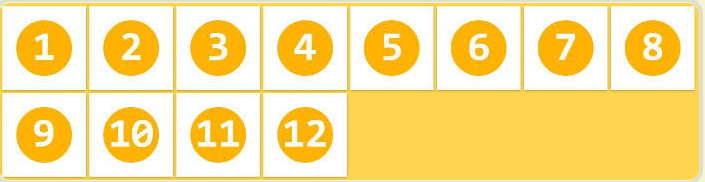
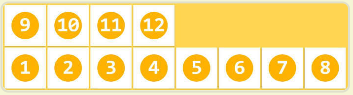
When the attribute of flex direction is row reverse, the code is shown in the following figure.
2. Flex wrap attribute
By default, items are aligned on a single line (also known as a grid line). The flex wrap attribute defines how to wrap lines if an axis cannot be arranged.
It can take three values
Nowrap warp wrap reverse
- nowrap (default, no line breaks)
- wrap
- Wrap reverse: wrap line, first line below
3. Flex flow (not commonly used at the beginning of learning)
The flex flow attribute is a short form of the flex direction attribute and the flex wrap attribute. The default value is row nowrap.
4. Justify content attribute
The justify content attribute defines the alignment of items on the spindle.
There are the following forms
.box {
  justify-content: flex-start | flex-end | center | space-between | space-around;
}
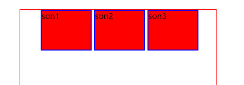
-
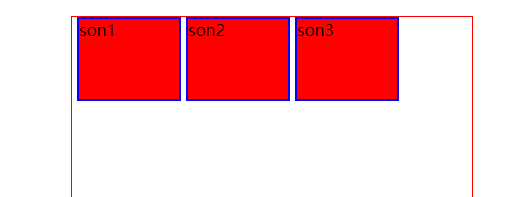
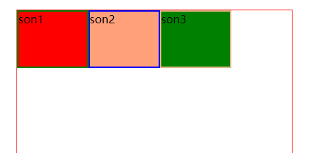
flex-start
<!DOCTYPE html>
<html>
	<head>
		<meta charset="utf-8">
		<title>flex-wrap Properties of</title>
		<style type="text/css">
			.box1{
				width: 400px;
				height: 400px;
				border: 1px solid red;
				margin: 20px auto;
				display: flex;
				justify-content: flex-start;

			}
			.son1,.son2,.son3{
				width: 100px;
				height: 80px;
				margin-left: 5px;
				background-color: red;
				border: 2px solid blue;
			}
		</style>
	</head>
	<body>
			<div class="box1">
				<div class="son1">son1</div>
				<div class="son2">son2</div>
				<div class="son3">son3</div>
			</div>
	</body>
</html>
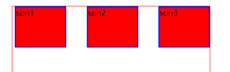
-
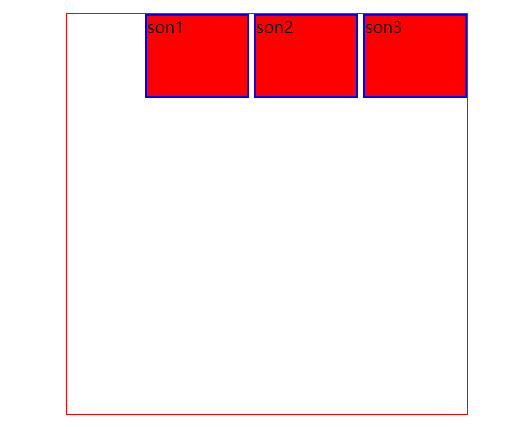
Justify end
<!DOCTYPE html>
<html>
	<head>
		<meta charset="utf-8">
		<title>flex-wrap Properties of</title>
		<style type="text/css">
			.box1{
				width: 400px;
				height: 400px;
				border: 1px solid red;
				margin: 20px auto;
				display: flex;
				justify-content: flex-end;

			}
			.son1,.son2,.son3{
				width: 100px;
				height: 80px;
				margin-left: 5px;
				background-color: red;
				border: 2px solid blue;
			}
		</style>
	</head>
	<body>
			<div class="box1">
				<div class="son1">son1</div>
				<div class="son2">son2</div>
				<div class=son3">son3</div>
			</div>
	</body>
</html>
f'g
The operation results are as follows
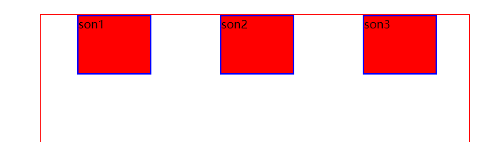
-
Center
-
Space between
-
Space around (the spacing on both sides of each item is equal. Therefore, the spacing between items is twice as large as that between items and borders.)
5 align items attribute
Property defines how items are aligned on the cross axis.
.box {
  align-items: flex-start | flex-end | center | baseline | stretch;
}
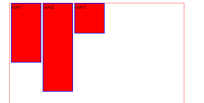
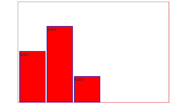
- Flex start (start from above, align above)
The height of child elements is set differently, which is more conducive to observing the phenomenon
<!DOCTYPE html>
<html>
	<head>
		<meta charset="utf-8">
		<title>flex-wrap Properties of</title>
		<style type="text/css">
			.box1{
				width: 600px;
				height: 400px;
				border: 1px solid red;
				margin: 20px auto;
				display: flex;
				align-items: flex-start;

			}
			.son1,.son2,.son3{
				margin-left: 5px;
				background-color: red;
				border: 2px solid blue;
			}
			.son1{
				width: 100px;
				height: 200px;
			}
			.son2{
				width: 100px;
				height: 300px;
			}
			.son3{
				width: 100px;
				height: 100px;
			}
		</style>
	</head>
	<body>
			<div class="box1">
				<div class="son1">son1</div>
				<div class="son2">son2</div>
				<div class="son3">son3</div>
			</div>
	</body>
</html>
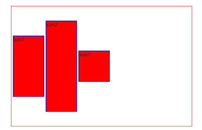
 2. flex-end
Compared with the above, the following line of code is changed
align-items: flex-end;
-
center
align-items: center;
-
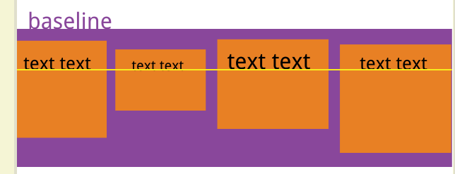
Baseline (not commonly used)
If the child element has no text, it is no different from the previous one. If there is text, it is as follows
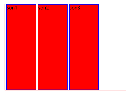
5.stretch (default): if the project is not set to height or set to auto, it will occupy the height of the whole container.
This one is not often used
<!DOCTYPE html>
<html>
	<head>
		<meta charset="utf-8">
		<title>flex-wrap Properties of</title>
		<style type="text/css">
			.box1{
				width: 600px;
				height: 300px;
				border: 1px solid red;
				margin: 20px auto;
				display: flex;
				align-items: stretch;
			}
			.son1,.son2,.son3{
				margin-left: 5px;
				background-color: red;
				border: 2px solid blue;
			}
			.son1{
				width: 100px;

			}
			.son2{
				width: 100px;

			}
			.son3{
				width: 100px;
			}
		</style>
	</head>
	<body>
			<div class="box1">
				<div class="son1">son1</div>
				<div class="son2">son2</div>
				<div class="son3">son3</div>
			</div>
	</body>
</html>
6. Align content attribute (this is not available at present, and we'll talk about it later)
III The attributes of the item (that is, the attributes of the elements placed in the container)
The following six properties are set on the project.
- order
- flex-grow
- flex-shrink
- flex-basis
- flex
- align-self
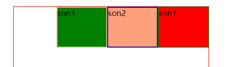
1.order
The order attribute defines the order in which items are arranged. The smaller the value, the higher the arrangement. The default value is 0.
.item {
 order: <integer>;For writing numbers
}
The example code is as follows
<!DOCTYPE html>
<html>
   <head>
   	<meta charset="utf-8">
   	<title>flex-direction Properties of</title>
   	<style type="text/css">
   		.box1{
   			width: 400px;
   			height: 400px;
   			border: 1px solid red;
   			margin: 20px auto;
   			display: flex;
   		}
   		.son1,.son2,.son3{
   			width: 100px;
   		}
   		.son1{
   			height: 100px;
   			border: 2px solid green;
   			background-color: red;
   			order: 2;
   		}
   		.son2{
               height: 200px;
   			border: 2px solid blue;
   			background-color: lightsalmon;
   			order: 1;
   		}
   		.son3{
   			height: 200px;
   			border: 2px solid burlywood;
   			background-color: #008000;
   			order: 3;
   		}
   	</style>
   </head>
   <body>
   		<div class="box1">
   			<div class="son1">son1</div>
   			<div class="son2">son2</div>
   			<div class="son3">son3</div>
   		</div>
   </body>
</html>
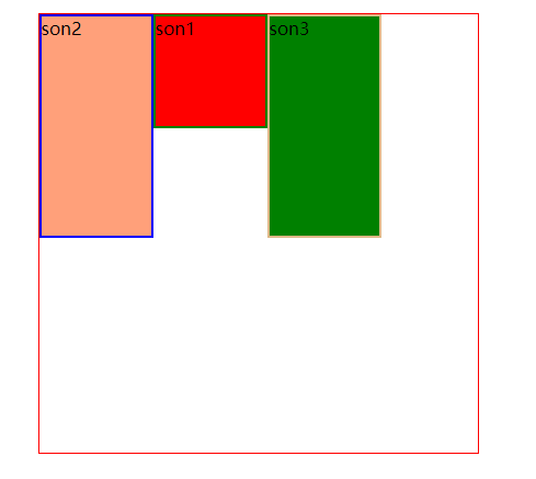
As a result, the three sub elements are written as 2, 1 and 3 respectively. Their results are then as follows.
2. Flex growth attribute (the function of this attribute has not been found yet)
The flex growth attribute defines the magnification of the item. The default is 0, that is, if there is any remaining space, it will not be enlarged.
The code I wrote doesn't seem to understand what his specific application scenario is. Let's talk about it later in the application scenario.
.item {
  flex-grow: <number>; /* default 0 */
}
The example code is as follows
<!DOCTYPE html>
<html>
	<head>
		<meta charset="utf-8">
		<title>flex-direction Properties of</title>
		<style type="text/css">
			.box1{
				width:1600px;
				height: 400px;
				border: 1px solid red;
				margin: 20px auto;
				display: flex;
			}
			.son1,.son2,.son3{
				width: 100px;
			}
			.son1{
				height: 100px;
				border: 2px solid green;
 				background-color: red;
                flex-grow: 1;
 			}
			.son2{
                height: 100px;
				border: 2px solid blue;
				background-color: lightsalmon;
				flex-grow: 0;
			}
			.son3{
				height: 100px;
				border: 2px solid burlywood;
				background-color: #008000;
				flex-grow: 2;
			}
		</style>
	</head>
	<body>
			<div class="box1">
				<div class="son1">son1</div>
				<div class="son2">son2</div>
				<div class="son3">son3</div>
			</div>
	</body>
</html>
- flex attribute (there is no need to use it at present, so we can use it later)
Flex attribute is short for flex grow, flex shrink and flex basis. The default value is 0 1 auto. The last two properties are optional. - Align self attribute (I haven't used it much at present. Let's talk about the useful scenarios at that time)
The align self attribute allows a single item to have a different alignment from other items, which can override the align items attribute. The default value is auto, which means to inherit the align items attribute of the parent element. If there is no parent element, it is equivalent to stretch.
Summary: the above is the basic knowledge of flex layout, which is relatively comprehensive. Some are not introduced in detail because there are no specific application scenarios so far. We will add them when we encounter specific application scenarios.
Know: this blog is mainly based on Ruan Yifeng's blog as a template
http://www.ruanyifeng.com/blog/2015/07/flex-grammar.html