catalogue
1, Obtain vehicle fuel efficiency data
2. Save the field information of the dataset
2, Import vehicle fuel efficiency data into R
3, Explore and describe fuel efficiency data
4, Analyze the change of vehicle fuel efficiency data with time
5, Study the brand and model of cars
1, Obtain vehicle fuel efficiency data
Study a data set containing fuel efficiency performance metrics, In this data set, fuel efficiency is expressed in terms of fuel consumption per mile (MPG). The data set contains the relevant data of most U.S. brands and models recorded since 1984. This data is from the U.S. Department of energy and the U.S. Environmental Protection Agency. In addition to the fuel efficiency data, the data set also contains other characteristics and attribute data of the listed vehicles. Such data can be classified and summarized to see which automobile Cars have historically had better fuel efficiency and how they have changed over time.
1. Download dataset

2. Save the field information of the dataset


2, Import vehicle fuel efficiency data into R
setwd("D:/mytestdata/vehicles.csv")
vehicles <- read.csv(("vehicles.csv"),stringsAsFactors = F)
head(vehicles)
tail(vehicles)
labels <- do.call(rbind, strsplit(readLines("vehicles.txt"), " - "))
head(labels)
#1: Modify work path
#2: Import dataset
#3: View the first 5 rows of the dataset
#4: When you view the last 5 rows of the dataset, you can see that there are 44593 rows of data.
#5: Label the variables of the dataset
#6: View the first 5 lines of the label
3, Explore and describe fuel efficiency data
1. View how many rows there are in the dataset

2. View how many columns the dataset has

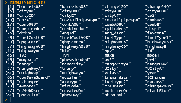
3. View each variable name
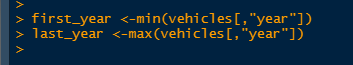
4. The view dataset contains data for several years

5. View the start and end year of the dataset
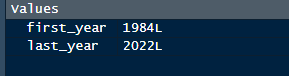
6. Find out the main types of fuel used by cars
According to the label of the variable, the variable to be viewed is FuelType1

The two main fuels should be Regular Gasoline and Premium Gasoline
That is, most cars in the data set use ordinary gasoline. The second commonly used fuel type is higher end gasoline.
7. Count the number of cars with automatic or manual gears
vehicles$trany[vehicles$trany == ""] <- NA
vehicles$trany2 <- ifelse(substr(vehicles$trany,1,4) == "Auto","Auto","Manual")
vehicles$trany <- as.factor(vehicles$trany)
table(vehicles$trany2)
#1: Fill in missing values with NA
#2: Add a new variable trany2. If the first four letters of the value in trany are "Auto", the value of trany2 is "Auto", otherwise it is "Manual". In this way, the transmission mode of the vehicle can be extracted for statistics
#3: Change new variable to factor type
#4: View the number of cars manually and automatically

According to the results, we can see that the number of automatic cars is more than twice that of manual cars.
4, Analyze the change of vehicle fuel efficiency data with time
View the trend of average MPG per year


(1) Using ddply function, integrate by year, calculate the average value of fuel efficiency of hightway, city and combined for each group, and assign this result to a new data frame.
mpgByYr <- ddply(vehicles, ~year, summarise, avgMPG = mean(comb08), avgHghy = mean(highway08), avgCity = mean(city08))
(2) In order to better understand the new data frame, the two variables avgMPG and year are drawn with a scatter diagram
ggplot(mpgByYr, aes(year, avgMPG)) + geom_point() + geom_smooth() + xlab("Year") + ylab("Average MPG") + ggtitle("All cars")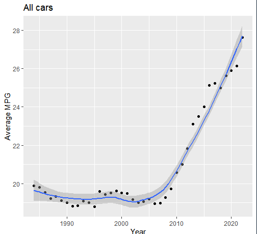
Based on this visualization result, it may be concluded that the fuel economy of selling vehicles has increased significantly in recent years. However, the sales of hybrid and non fuel vehicles will also have a certain impact on the above results.
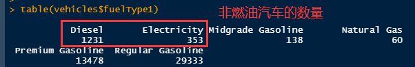
(3) Due to the small number of non fuel vehicles, the subset function is used to generate a new data frame gasCars to view the situation of fuel vehicles.
gasCars <- subset(vehicles, fuelType1 %in% c("Regular Gasoline", "Premium Gasoline", "Midgrade Gasoline") & fuelType2 == "" & atvType != "Hybrid")
mpgByYr_Gas <- ddply(gasCars, ~year, summarise, avgMPG = mean(comb08))
ggplot(mpgByYr_Gas, aes(year, avgMPG)) + geom_point() + geom_smooth() + xlab("Year") + ylab("Average MPG") + ggtitle("Gasoline cars")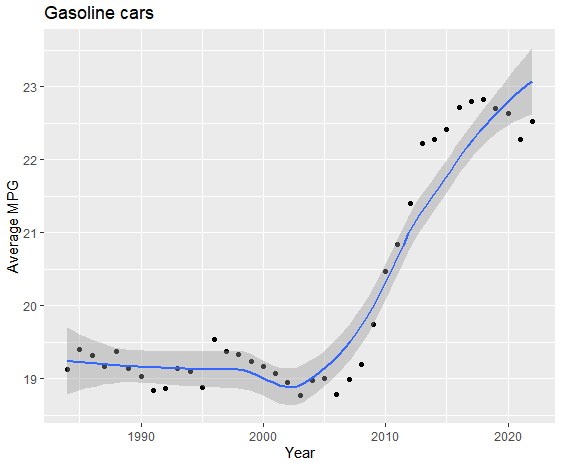
(4) Next, we can look at the reasons for the improvement of fuel efficiency. Has the output of high-power vehicles decreased in recent years? First, we should make clear whether the fuel efficiency of high-power vehicles is lower.
Note the variable displ, which represents the displacement of the engine in liters. Change it to numerical data. That is, whether the fuel efficiency of high-power vehicles is lower can be checked according to the emission of the engine.
typeof(gasCars$displ)
gasCars$displ <- as.numeric(gasCars$displ)
ggplot(gasCars, aes(displ, comb08)) + geom_point() + geom_smooth()
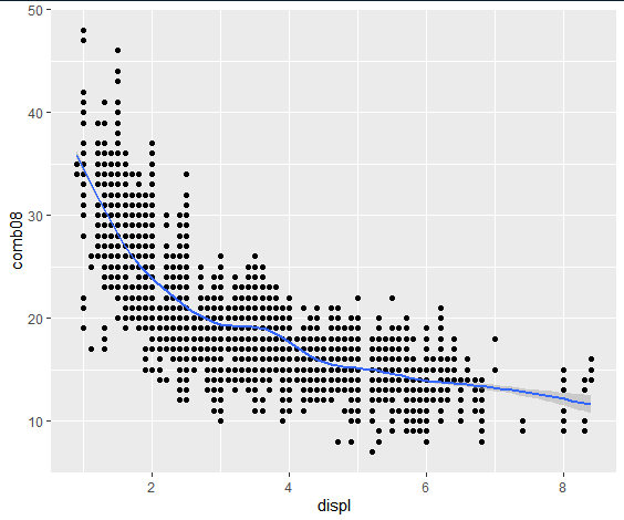
It can be seen that the fuel efficiency of high-power vehicles is really low.
(5) Next, let's see if the improvement in fuel efficiency is due to the production of more low-power cars in recent years?
avgCarSize <- ddply(gasCars, ~year, summarise, avgDispl = mean(displ))
ggplot(avgCarSize, aes(year, avgDispl)) + geom_point() + geom_smooth() + xlab("Year") + ylab("Average engine displacement (l)")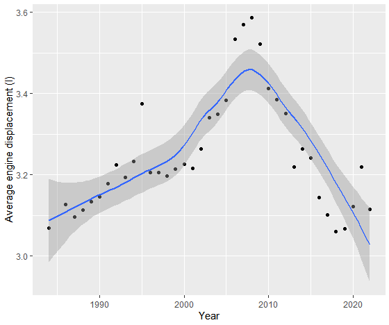
It can be seen that the average engine emission has a significant downward trend after 2008. Does that mean that the fuel efficiency is improved because there are more low-power cars?
(6) In order to better observe the data, you can directly plot the relationship between MPG and displacement in each year, that is, the relationship between fuel efficiency and large and small power vehicles. First, use the ddply function to generate a new data frame byYear, which contains the annual average fuel efficiency and average engine displacement.
byYear <- ddply(gasCars, ~year, summarise, avgMPG = mean(comb08), avgDispl = mean(displ))
head(byYear)
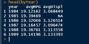
The head function shows the generated new data frame, which contains three columns: year, avgMPG and avgDispl.
(7) Use the split function in ggplot2 package to display the relationship between average fuel consumption and average displacement year by year on the same diagram but different surfaces. This data frame must be decomposed to turn a wide data frame into a long data frame.
byYear2 = melt(byYear, id = "year")
levels(byYear2$variable) <- c("Average MPG", "Avg engine displacement")
head(byYear2)
ggplot(byYear2, aes(year, value)) + geom_point() + geom_smooth() + facet_wrap(~variable, ncol = 1, scales = "free_y") + xlab("Year") + ylab("")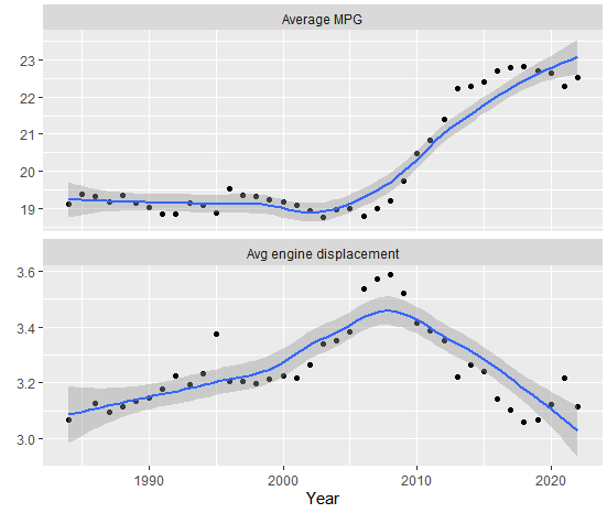
As can be seen from the above figure:
- The size of the engine was increasing before 2008, especially the engine of high-power vehicles increased significantly from 2006 to 2008
- Since 2009, the average size of vehicles began to decline, which partly explains the improvement of fuel efficiency
- Until 2005, the average size of cars has been increasing, but fuel efficiency is basically a constant. This means that the efficiency of the engine has been improving over the years
- The data from 2006 to 2008 are interesting. Although the average winter size has a sudden increase, the MPG is similar to that in previous years.
(8) Next, put this trend on small displacement engines to see whether automatic or manual transmission is more efficient than 4-cylinder engine, and how the fuel consumption changes over time.
Generate a box diagram showing the distribution of each value.
gasCars4 <- subset(gasCars, cylinders == "4")
ggplot(gasCars4, aes(factor(year), comb08)) + geom_boxplot() + facet_wrap(~trany2, ncol = 1) + theme(axis.text.x = element_text(angle = 45)) + labs(x = "Year", y = "MPG")
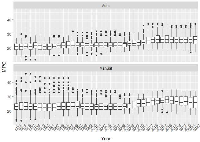
From the above figure, it seems that manual transmission mode is more effective than automatic transmission mode. Since 2008, they have shown the same growth. However, since about 2010, some of the cars with automatic transmission mode have been very efficient, while almost no cars with manual transmission mode have seen the same efficiency. In the early years, this was the opposite.
(9) Next, let's look at the changes in the proportion of manual vehicles every year.
ggplot(gasCars4, aes(factor(year), fill = factor(trany2))) + geom_bar(position = "fill") + labs(x = "Year", y = "Proportion of cars", fill = "Transmission") + theme(axis.text.x = element_text(angle = 45)) + geom_hline(yintercept = 0.5, linetype = 2)
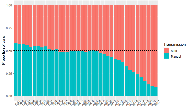
As can be seen from the above figure, the proportion of automatic vehicles is gradually increasing, especially in recent years. Therefore, the improvement of fuel efficiency may be partly due to the increase in the number of automatic vehicles.
5, Study the brand and model of cars
Study how car brands and models change over time.
1. See how brand and model changes over time affect fuel efficiency. Check the brand and model frequency of 4-cylinder engine vehicles.
carsMake <- ddply(gasCars4, ~year, summarise, numberOfMakes = length(unique(make)))
ggplot(carsMake, aes(year, numberOfMakes)) + geom_point() + labs(x = "Year", y = "Number of available makes") + ggtitle("Four cylinder cars")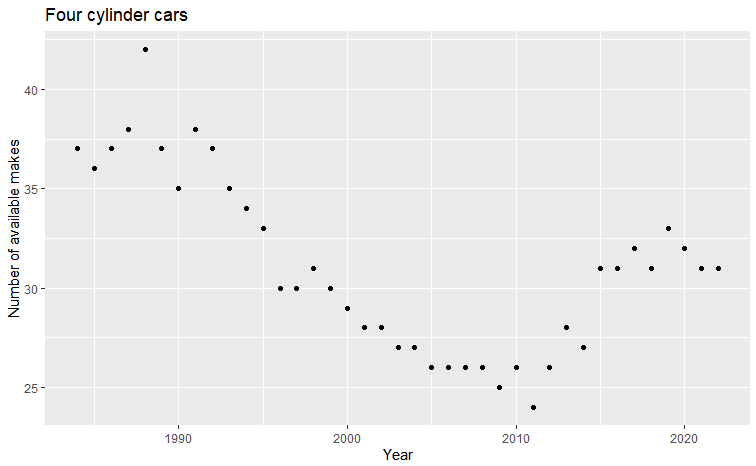
As can be seen from the above figure, the number of brands has decreased significantly, and has increased slightly in recent years.
2. Check out the car brands
uniqMakes <- dlply(gasCars4, ~year, function(x) unique(x$make))
commonMakes <- Reduce(intersect, uniqMakes)
commonMakes
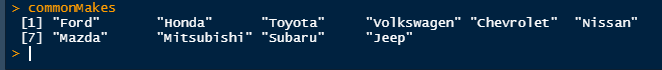
The results show that during this period, there are only 10 manufacturers manufacturing 4-cylinder engine vehicles every year.
3. Fuel efficiency from the manufacturer's perspective
carsCommonMakes4 <- subset(gasCars4, make %in% commonMakes)
avgMPG_commonMakes <- ddply(carsCommonMakes4, ~year + make, summarise, avgMPG = mean(comb08))
ggplot(avgMPG_commonMakes, aes(year, avgMPG)) + geom_line() + facet_wrap(~make, nrow = 3)

It can be seen from the results above that the fuel efficiency of most manufacturers is improving year by year, and some manufacturers have made a rapid improvement in fuel efficiency in the last five years.
Learning source: Data Science Practice Manual, 2nd Edition