Original link: http://tecdat.cn/?p=18726
Original source: Tuo end data tribal official account
_ Self organization_ Mapped neural network (SOM) is an unsupervised data visualization technology, which can be used to visualize high-dimensional data sets in low-dimensional (usually 2-dimensional) representation. In this article, we studied how to use R to create SOM for customer segmentation.
SOM was first described by Teuvo Kohonen in Finland in 1982, and Kohonen's work in this field makes him the most cited Finnish scientist in the world. Usually, the visualization of SOM is a color 2D map of hexagonal nodes.
SOM
SOM visualization consists of multiple "nodes". Each node vector has:
- Position on SOM grid
- The same weight vector as the input space dimension. (for example, if your input data represents people, you may have variables "age", "gender", "height" and "weight", and each node on the grid will also have the values of these variables)
- Enter the associated samples in the data. Each sample in the input space is "mapped" or "linked" to a node on the mesh. A node can represent multiple input samples.
The key feature of SOM is that the topological features of the original input data are retained on the graph. This means that similar input samples (where similarity is defined according to input variables (age, gender, height, weight) are placed together on the SOM grid. For example, all 55 year old women with a height of about 1.6m will be mapped to nodes in the same area of the grid. Considering all variables, short people will be mapped elsewhere. In terms of stature, tall men are closer to tall women than small fat men because they are much "similar".
SOM heat map
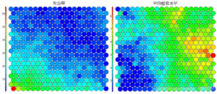
A typical SOM visualization is a "heat map". The heat map shows the distribution of variables in som. Ideally, people of similar ages should gather in the same area.
The following figure uses two heat maps to illustrate the relationship between average education level and unemployment rate.
SOM algorithm
The algorithm for generating SOM from sample data sets can be summarized as follows:
- Select the size and type of map. The shape can be hexagonal or square, depending on the shape of the desired node. In general, it is best to use a hexagonal mesh because each node has six nearest neighbors.
- Initialize all node weight vectors randomly.
- Select a random data point from the training data and present it to SOM.
- Find the best matching unit (BMU) - the most similar node on the map. The Euclidean distance formula is used to calculate the similarity.
- Identify the nodes within the BMU's "neighbors".
– the size of the neighborhood decreases with each iteration. - The selected data point adjusts the weight of the nodes in the BMU neighborhood.
– the learning rate decreases with each iteration.
– the adjustment amplitude is directly proportional to the proximity of the node to the BMU. - Repeat steps 2-5 for N iterations / convergence.
SOM in R
train
R can create SOM and visualization.
#Create a self-organizing map in R

#Create a training dataset (rows are samples and columns are variables)


#Here, I select the subset of variables available in data


data_train <- data\[, c(3,4,5,8)\]

#Change the data frame with training data to matrix

#All variables were standardized at the same time

#SOM Training process.

data\_train\_matrix <- as.matrix(scale(data_train))

#establish SOM grid

#In training SOM Train the grid first


 grid(xdim = 20, ydim=20, topo="hexagonal")

#Finally, training SOM,Iterations option,

#Learning rate

model <- som(data\_train\_matrix)
visualization
Visualization can check the quality of the generated SOM and explore the relationship between variables in the dataset.
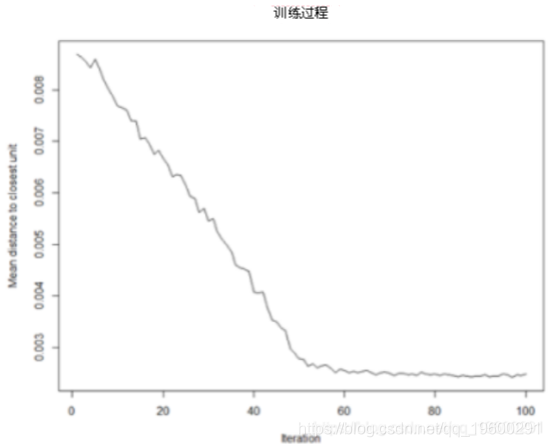
Training process:
With the SOM training iteration, the distance from the weight of each node to the sample represented by that node will decrease. Ideally, this distance should be minimal. This graph option shows the progress over time. If the curve keeps decreasing, more iterations are required.#SOM training progress plot(model, type="changes")
Node count
We can visualize the number of samples mapped to each node on the map. This measure can be used as a measure of graph quality - ideally, the sample distribution is relatively uniform. When the graph size is selected, each node must have at least 5-10 samples.#Number of nodes plot(model, type="count")

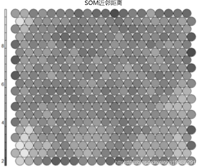
Neighbor distance
Commonly referred to as the "U matrix", this visualization represents the distance between each node and its neighbors. Gray scale view is usually used. Areas with low neighbor distance represent similar node groups. Areas with large distances indicate that the nodes are much different. The U matrix can be used to identify categories within the SOM map.#U-matrix # visualization
Code / weight vector
The node weight vector consists of the original variable value used to generate SOM. The weight vector of each node represents / is similar to the sample mapped to that node. By visualizing the weight vector on the whole map, we can see the model in the distribution of samples and variables. The default visualization of the weight vector is a "fan chart", in which each fan representation of the size of each variable in the weight vector is displayed for each node.#Weight vector view

Heat map
**heat**Graph is perhaps the most important possible visualization in self-organizing graph. Usually, SOM The process creates multiple heat maps and then compares them to identify interesting areas on the map. In this case, we will SOM Visualization of average educational level. ``` #Heat map creation ``` 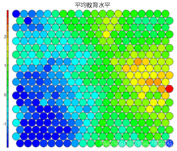
It should be noted that this default visualization draws a standardized version of the variable of interest. ``` #Non standardized heat map #Define the variables to draw aggregate(as.numeric(data\_train, by=list(som\_model$unit.classi FUN=mean) ``` 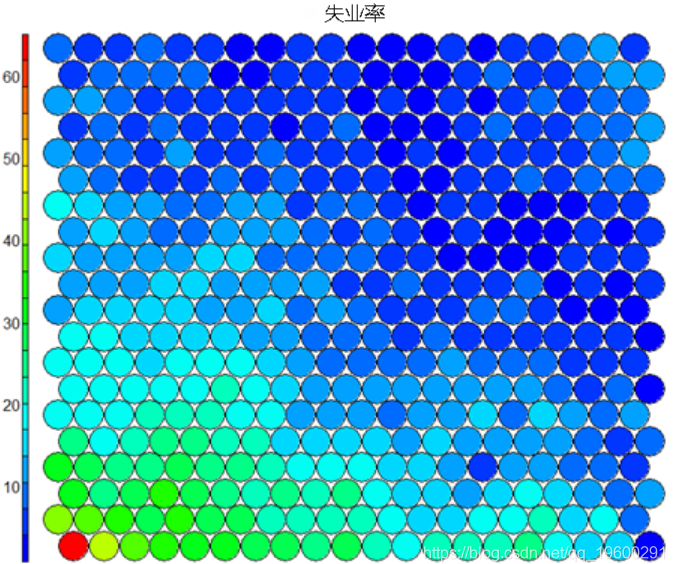 It is worth noting that the heat map above shows the inverse relationship between unemployment rate and education level. Other heat maps displayed side by side can be used to build pictures of different areas and their characteristics. 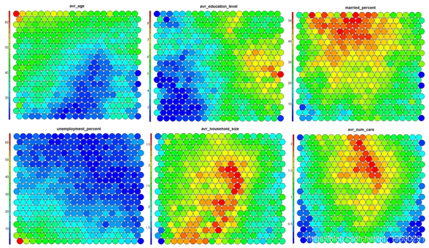 **SOM Heat map with empty nodes in Grid** In some cases, your SOM Training can lead to SOM The node in the diagram is empty. Through a few lines, we can find som_model $ unit.classif And replace it with NA value–This step will prevent empty nodes from distorting your heat map. ``` #Draw non standardized variables when there are empty nodes in SOM var\_unscaled <- aggregate(as.numeric(data\_train\_raw), by=list(som\_model$unit.classif), FUN=mean) #Add NA values for unassigned nodes missingNodes <- which(!(seq(1,nrow(som_model$codes) %in% varunscaled$Node)) #Add them to non standardized data frames var\_unscaled <- rbind(var\_unscaled, data.frame(Node=missingNodes, Value=NA)) #Result data frame var_unscaled #Now create a heat map using only the correct values. plot(som_model, type =d) ```
Clustering and segmentation of self-organizing graph
Clustering can be performed on SOM nodes to find sample groups with similar metrics. The kmeans algorithm can be used and the "elbow point" in the "sum of squares within the class" graph can be checked to determine the appropriate cluster number estimation.
#View kmeans of WCSS


for (i in 2:15) {

wss\[i\] <- sum(kmeans(mydata, centers=i)$withinss)

}


#Visual clustering results


##Hierarchical clustering is used to cluster vectors
cutree(hclust(dist(som_model$codes)), 6)

#Draw these results:


plot(som\_model, t"mappinol =ty\_pal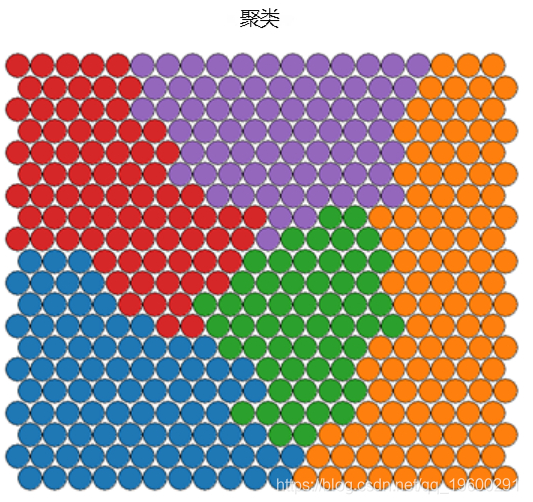
Ideally, the categories found are continuous on the surface of the graph. In order to obtain continuous clustering, a hierarchical clustering algorithm can be used, which only combines similar AND nodes on SOM grid.
Map the cluster back to the original sample
When the clustering algorithm is applied according to the above code example, the clustering is assigned to each node on the SOM map instead of the original sample in the SOM dataset.
#Obtain a vector with cluster values for each raw data sample

som\_clust\[som\_modl$unit.clasf\]

#Obtain a vector with cluster values for each raw data sample

data$cluster <- cluster_assignment
Using the statistical information and distribution of training variables in each cluster to construct meaningful pictures of cluster features - this is both art and science. The process of clustering and visualization is usually an iterative process.
conclusion
Self organizing mapping (SOM) is a powerful tool in data science. Advantages include:
- An intuitive way to find customer segmentation data.
- The relatively simple algorithm is easy to explain the results to non data scientists
- New data points can be mapped to trained models for prediction.
Disadvantages include:
- Because the training data set is iterative, there is a lack of parallelization function for very large data sets
- It is difficult to represent many variables on a two-dimensional plane
- SOM training requires cleaned up numerical data, which is difficult to obtain.

Most popular insights
1.R language k-Shape algorithm stock price time series clustering
2.Comparison of different types of clustering methods in R language
4.Hierarchical clustering of iris data set in r language
5.Python Monte Carlo K-Means clustering practice
6.Clustering web comment text mining with R
7.Python for NLP: multi label text LSTM neural network using Keras
9.Deep learning image classification of small data set based on Keras in R language