This tweet was contributed by Du Yunhan, School of economics, Southwest University of Finance and economics, and arranged by Shanshan. The following is the text:
1. Basic description
1.1 objectives of this package
Let users focus on parameter setting and adjustment, rather than the details of code use, which is similar to the process of a chip packaging. Several commonly used drawing functions are encapsulated and adjusted to the printing style for users to do topics or write papers.
1.2 functional features
After setting the parameters, only one line of code is needed to draw the printing style R image.
1.3 data description
The built-in data sets in this package are generated randomly or manually. Enter the following command to see the detailed description of the corresponding drawing function.
help(acchist)  #Stacked histogram black and white printing style drawing
help(bonbon)  #Bar chart black and white printing style drawing
help(boxeasy)  #Box line drawing in black and white printing style
help(densline)  #Black and white printing style drawing of nuclear density map
help(easyline)  #Simple line chart black and white printing style drawing
help(histeasy)  #Histogram black and white printing style drawing
help(linepoint)  #Black and white printing style drawing of dotted line drawing
help(pyramid)  #Pyramid drawing in black and white printing style
1.4 other instructions
- If the concept or variable corresponding to the actual parameter is input accurately, the data type will be automatically converted to the numerical value or character type required for the operation of the package function without manual conversion.
- Each drawing function in this package will automatically determine whether the dependent package, such as tidyverse or grid, is installed or loaded, without manual installation or loading each time. (the standard method is to attach a keyword that depends on a package when encapsulating a function. However, this package is encapsulated at the beginning of learning, so the method of adding code judgment in the package function is adopted, which readers should notice when viewing the internal code of the package)
- The user-friendly built-in training data set makes it convenient for users to compare with their own data set data structure. As long as the data structure is consistent with the training data set, the corresponding graphics can be drawn.
- A simple memory release code is added, and there is no need to clean up the temporary data generated in memory after each drawing is completed.
- In order to prevent some users from rendering errors like me due to system problems, the method of adding canvas twice is adopted to complete forced drawing and ensure the smooth drawing process.
1.5 special thanks
WeChat official account is a learning and communication platform provided by the flash R Language Handbook. Professor Zhang Jingxin of Harbin Business University from "tidy-R language" group, as well as the valuable suggestions given by Fin, Wu Anshu and other friends in the packaging process of this package.
1.6 declaration
The packaging of this package is purely public welfare. At present, it is version 0.1. It is estimated that there will not be much time to update later. You can modify it on the basis of this package. If there is a BUG that is difficult to solve, please contact Du Yunhan, School of economics, Southwest University of Finance and economics 1270950448@qq.com .
2. Use examples
2.1 installation instructions
The first use needs to be installed from Github, as follows:
rm(list = ls())
if (is.element("chip", installed.packages()[, 1]) == FALSE) {
  if (is.element("devtools", installed.packages()[, 1]) == FALSE) {
    install.packages("devtools")
    library(devtools)
  } else if (is.element("devtools", installed.packages()[, 1]) == TRUE) {
    library(devtools)
  }
  install_github("youngyaoguai/Rdraw/chip0.1/chip")
  library(chip)
} else if (is.element("chip", installed.packages()[, 1]) == TRUE) {
  library(chip)
}
For readers who cannot download due to network problems, please directly download the compressed package with Baidu online disk. The link is: https://pan.baidu.com/s/1Xhu8DH4bcjw8AedRIb3Dbw Extraction code: 8712. Then install the package locally. For specific tutorials, see: How to install R package locally.
2.2 black and white printing style drawing of stacked histogram
help(acchist)  #Function description
data("acchist_test_data",package = "chip")  #Load package built-in dataset
View(acchist_test_data)  #View built-in dataset structure
axis.x.title <- c("region")   #x-axis title
axis.y.title <- c("ratio")    #y-axis title
individual.name <- c("B","C","D","E","F")  #Area name
fill.name <- c("academic","vocational","college","high","further","primary")  #Name to populate
bar_width <- 0.3   #Column width
axis.title.size <- 30  #Axis title size
axis.text.x.size <- 30  #x-axis text display size
axis.text.y.size <- 30  #Text display size of y-axis
legend.text.size <- 30  #Text display size of legend
legend.title.size <- 30  #Legend Title Size
#Call drawing function
acchist(acchist_test_data,acchist_test_data$region,acchist_test_data$edu,acchist_test_data$ratio)
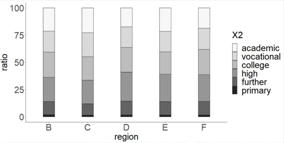
Figure 1 drawing of stacked histogram in black and white printing style
2.3 black and white printing style drawing of bar chart
help(bonbon)  #View function description
data("bonbon_test_data",package = "chip")  #load integration sample data  #Load built-in dataset
View(bonbon_test_data) #View data structure
#The individual to highlight (if there is no individual to highlight, please set it to outstanding < - C (""))
outstanding <- c("wholesaleretail","Leasing and business services","realestate")
outstanding.label <- c("24.75%","28.51%","5.16%") #The data label of the individual to be highlighted needs to be adjusted together with the outstanding
outstanding.label.size <- 7  #The data label size of the individual to highlight
outstanding.size <- 4    #The bar size of the individual to be highlighted
not.outstanding.size <- 2.3  #The rod size of an individual that does not need to be highlighted
outstanding.head.size <- 7  #The size of the rod round head of the individual to be highlighted
not.outstanding.head.size <- 5   #The size of the rod round head of an individual that does not need to be redisplayed
axis.title.x.size <- 30     #x-axis Title Size
axis.text.y.size <- 30     #Text size of y axis
value.max <- 100   #Sample maximum
value.break <- c(0,value.max%/%3,78,100)   #Sample value points to display on the x-axis
xlab.name <- c("ratio of service industry(%)")  #x-axis title
#The sorting of all individual names will be drawn from left to right, and the drawing result is from bottom to top
individual.name <- c("Leasing and business services","wholesaleretail","scientificresearch","Accommodation and Catering","Informationtransmission","culture","socialwork","publicfacilities","residentsservice","financial","education","transportation","publicmanagement","realestate")
bonbon(bonbon_test_data,bonbon_test_data$industry,bonbon_test_data$index)
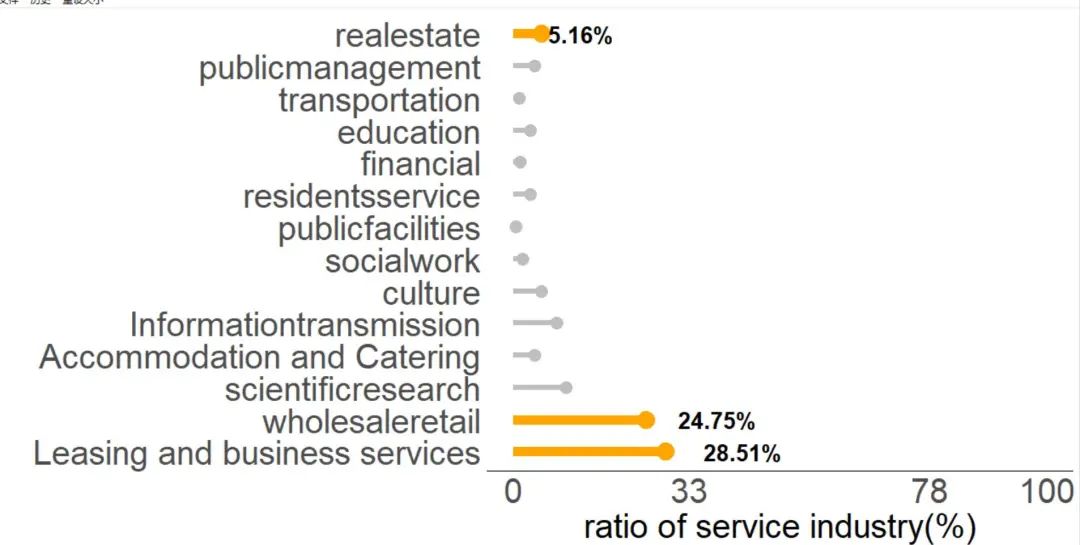
Figure 2 black and white printing style drawing of bar chart
2.4 black and white printing style drawing of box line drawing
help(boxeasy)  #View drawing function description
data("box_test_data",package = "chip")  #Load built-in dataset
View((box_test_data) #View data structure
     ylab.name <- c("index")       #y-axis title
     xlab.name <- c("year")  #x-axis title
     axis.title.x.size <- 15  #x-axis Title Size
     axis.title.y.size <- 15  #y-axis Title Size
     axis.text.x.size <- 15  #x-axis text size
     axis.text.y.size <- 15  #y-axis text size
     #Call function
     boxeasy(box_test_data,box_test_data$year,box_test_data$index)
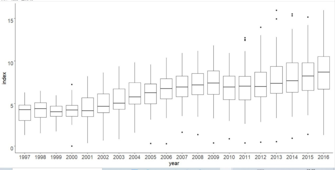
Figure 3 black and white printing style drawing of box line diagram
2.5 drawing of simple line chart in black and white printing style
help(easyline)  #View function description
data("easyline_test_data",package = "chip")  #Load built-in dataset
View(easyline_test_data) #View data structure
ylab.name <- "population" #y-axis title
xlab.name <- "age" #x-axis title
axis.title.x.size <- 25 #x-axis Title Size
axis.title.y.size <- 25#y-axis Title Size
axis.line.x.thickness <- 0.5 #x-axis thickness
axis.line.y.thickness <- 0.5 #y-axis thickness
axis.text.x.size <- 20  #x-axis text size
axis.text.y.size <- 20 #y-axis text size
x.start <- 0  #x-axis start value
x.end <- 100 #x-axis end value
x.interval <- 10 #x-axis value interval
y.start <- 0 #y-axis start value
y.end <- 21571 #y-axis end value
y.interval <- 5000 #y-axis value interval
#Call function
easyline(easyline_test_data,easyline_test_data$population,easyline_test_data$age)
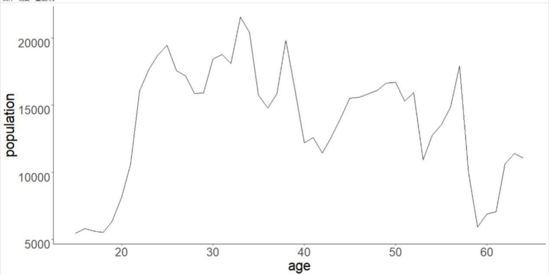
Fig. 4 simple line chart black and white printing style drawing
2.6 black and white printing style drawing of nuclear density map
help(densline)  #View description
data("densline_test_data",package = "chip")  #Load built-in dataset
View(densline_test_data)  #View data structure
yscope <- c()  #You can't know the specific scope for the first time. Fill in the blank
xscope <- c() #You can't know the specific scope for the first time. Fill in the blank
#Fill in from left to right according to the data set
legend.name <- c("line1","line2","line3","line4","line5")
#Call function
densline(test_data)
#Roughly know the range of values according to the diagram and make fine adjustment
yscope <- c(0.0004,0.00155)
xscope <- c(0,1000)
legend.name <- c("line1","line2","line3","line4","line5")
densline(densline_test_data)
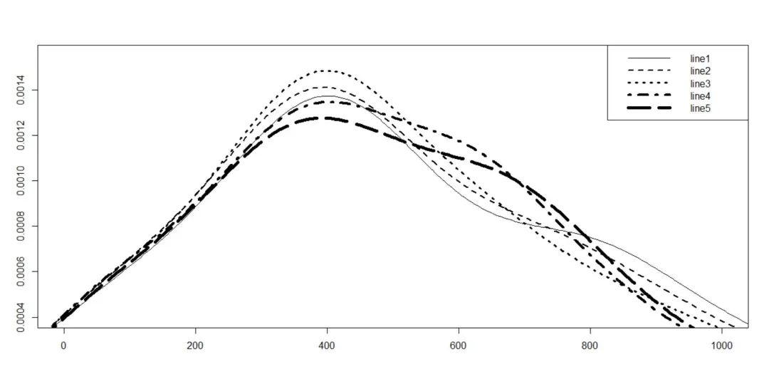
Figure 5 black and white printing style drawing of nuclear density diagram
2.7 black and white printing style drawing of histogram
help(histeasy)  # view help
data("hist_test_data ",package = "chip")  #Load built-in dataset
View(hist_test_data)   #View data structure
x.size <- 2  #x-axis text size
y.size <- 2  #y-axis text size
lab.size <- 2  #Axis title size
legend.x <- 30   #Legend horizontal position
legend.y <- 0.3   #Legend vertical position
legend.x.distance <- 0.1  #Distance between picture and text in legend
axisname.x <- c("region")  #x-axis title
axisname.y <- c("ratio")  #y-axis title
type.name = c("0-14","15-64","65+","immortality")  #Different categories
individual.name=c("A","B","C","D","E")   #Different individuals
histeasy(hist_test_data,hist_test_data$region,hist_test_data$age,hist_test_data$ratio)
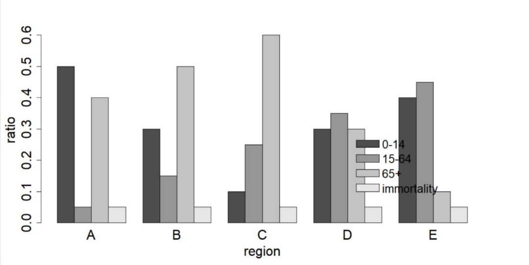
Figure 6 drawing of black and white printing style of histogram
2.8 black and white printing style drawing of dotted line drawing
help(linepoint)
data("line_test_data",package = "chip")
View(line_test_data)  #View built-in dataset data structure
start <- 2009  #x-axis start value
end <- 2019  #x-axis end value
interval <- 2  #x-axis value interval
axis.text.x.size <- 30  #x-axis text size
axis.text.y.size <- 30  #y-axis text size
legend.title.size <- 30  #Legend Title Size
legend.text.size <- 30   #Legend text size
axis.title.x.size <- 30  #x-axis Title Size
axis.title.y.size <- 30  #y-axis Title Size
axis.line.x.size <- 0.5  #x-axis thickness
axis.line.y.size <- 0.5  #y-axis thickness
geom.point.size <- 7  #Polyline point size
ylab.name <- c("index")  #y-axis title
xlab.name <- c("year")  #x-axis title
individual.name <- c("A","B","C","D","E")  #Individual name
legend.name <- c("region")  #Legend Title
linepoint(line_test_data,line_test_data$region,line_test_data$index,line_test_data$year)
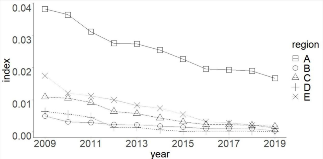
Figure 7 drawing of black-and-white printing style with dotted line
2.9 pyramid drawing in black and white printing style
help(pyramid)
View(pyramid_test_data)  #View built-in dataset data structure
data("pyramid_test_data",package = "chip")  #load integration sample data
v_max <- 4400  #Maximum value in sample
middle.size <- 6.6  #Middle text size
left.axis.title.x.size <- 30  #Left x-axis Title Size
left.axis.text.x.size <- 30  #Left x-axis text size
right.axis.title.x.size <- 30  #Right x-axis Title Size
right.axis.text.x.size <- 30  #Right x-axis text size
right.title <- c("female")  #Right x-axis title
left.title <- c("male")  #Left x-axis title
pyramid(pyramid_test_data,pyramid_test_data$male,pyramid_test_data$female,pyramid_test_data$group,pyramid_test_data$group_name)
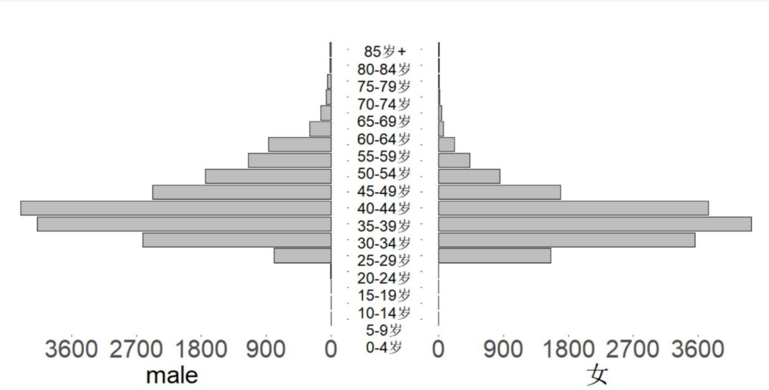
Figure 8 pyramid drawing in black and white printing style
3. Solutions to drawing failure
- Decompress the drawing function in the package, use the source function to load the drawing function in the package, draw locally, or check whether there is a BUG in the drawing function itself.
- Use AI to revise the drawing. See the following tweets for details: Drawing details will not be changed? Then use AI!.