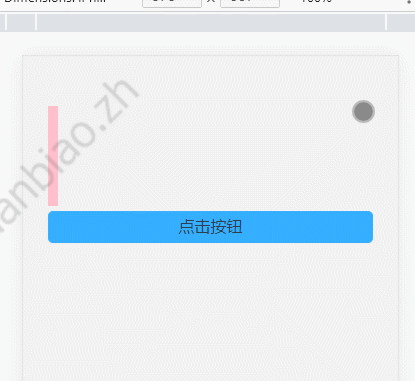
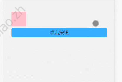
1. Realization of Transition Animation
1, no transition, direct change
<template>
  <div class="testBox">
    <div class="testCon" :style="{ width: width + 'px' }"></div>
    <div class="testBtn" @click="clickBtn">Click the button</div>
  </div>
</template>

<script setup>
import { ref } from 'vue';
const width = ref(10);
const clickBtn = () => (width.value += 100);
</script>

<style lang="scss" scoped>
.testBox {
  overflow: hidden;
  height: 100vh;
  padding: 100px 50px;
  box-sizing: border-box;
  .testCon {
    height: 200px;
    background: pink;
  }
  .testBtn {
    margin-top: 10px;
    height: 60px;
    line-height: 60px;
    border: 1px solid #35aeff;
    background: #35aeff;
    border-radius: 10px;
  }
}
</style>
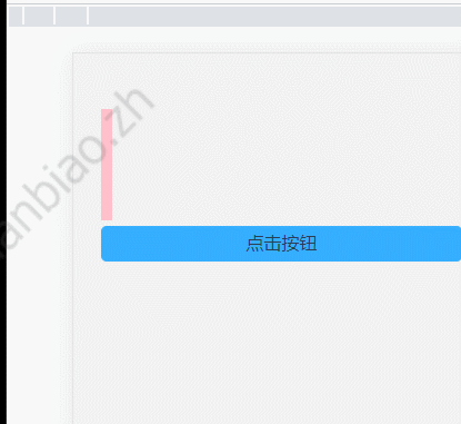
For the sake of telling, just look at one click. That is, width:10px at the beginning and width:110px at the end. When no transition is set, the changes are abrupt and rigid. As follows:
2, Set transition, Set time and rate
Realization of transition. You can think of it as recording the starting state, then adding a time and speed from start to end.
The main purpose is to use the transition of css3 to set it up. Whoever needs to listen for property changes is written in whose style:
  .testCon {
    height: 200px;
    background: pink;
    transition: width 2s linear;//Listen for changes in the width property of this element,
  }
The width property is then listened for, and the change from start to end is stretched to 2s to change linearly.
When you want to listen for changes to all elements of the element, simply change the attribute to all:
<template>
  <div class="testBox">
    <div :class="['testCon', btnClick ? 'btnClick' : '']"></div>
    <div class="testBtn" @click="clickBtn">Click the button</div>
  </div>
</template>

<script setup>
import { ref } from 'vue';
const btnClick = ref(false);
const clickBtn = () => {
  btnClick.value = true;
};
</script>

<style lang="scss" scoped>
.testBox {
  overflow: hidden;
  height: 100vh;
  padding: 100px 50px;
  box-sizing: border-box;
  .testCon {
    width: 100px;
    height: 100px;
    background: pink;
  }
  .btnClick {
    height: 200px;
    width: 200px;
    background: red;
    transition: all 2s linear;
  }
  .testBtn {
    margin-top: 10px;
    height: 60px;
    line-height: 60px;
    border: 1px solid #35aeff;
    background: #35aeff;
    border-radius: 10px;
  }
}
</style>
Mainly from this style:
.testCon {
    width: 100px;
    height: 100px;
    background: pink;
}
Become:
  .btnClick {
    height: 200px;
    width: 200px;
    background: red;
    transition: all 2s linear;
  }
This adds the effect of transitional changes to all changing attributes of the element:
That is, transitions are primarily the result of transitions, a css style.
transition : transition-property(Properties to perform the transformation) || transition-duration(Time to perform the transformation) || transition-timing-function(Rate of transformation execution) || transition-delay(Delay transformation time);
transition-property
| transition-property | Preferable value |
|---|---|
| none | Transition without attributes |
| all | All properties will have a transition effect and will be their default value |
| property | Comma-separated list of CSS attribute names |
transition-duration
The duration of the transition, measured in s (seconds) or MS (milliseconds), has a default value of 0, which means that the transformation is immediate.
transition-timing-function (rate of transformation execution)
| value | describe |
|---|---|
| linear | Start to end at the same speed |
| ease | Slow start, then fast, then slow end |
| ease-in | Slow start |
| ease-out | Slow end |
| ease-in-out | Slow start and end |
| cubic-bezier(n,n,n,n) | Define your own values in the cubic-bezier function. Possible values are values between 0 and 1. |
transition-delay
The default is 0, which means immediate execution, or deferred execution transition if a value is set.
It is important to note that not all CSS properties support transition and can The effect can be seen here.
Two, animation and keyframe combined to achieve animation
Transition animation, can only define the first two states. Animation can customize the transition effect between states of multiple frames. To achieve real animation.
1, value of animation
| value | describe |
|---|---|
| animation-name | Specifies the keyframe name to bind to the selector |
| animation-duration | Specify how long it takes to complete the animation, in seconds or milliseconds |
| animation-timing-function | Specify the speed curve of the animation |
| animation-delay | Defines the delay before the animation starts, with a default value of 0 |
| animation-iteration-count | Specifies the number of times an animation should be played, defaulting to 1 |
| animation-direction | Specifies whether the animation should be played back in turn and the default is forward |
2,keyframe
@keyframes are animations that allow programmers to set a sequence of frames and then provide them to animation.
Usage method:
When using percentage usage:
@keyframes Animation Name{
  0% { top: 0; left: 0px}
  50% { top: 30px; left: 20px; }
  100% { top: 0; left: 30px;}
}
The following methods are used:
<template>
  <div class="testBox">
    <div class="testCon"></div>
  </div>
</template>

<script setup></script>

<style lang="scss" scoped>
.testBox {
  overflow: hidden;
  height: 100vh;
  padding: 100px 50px;
  box-sizing: border-box;
  .testCon {
    animation: testAni 3s ease-in-out infinite;
  }
}
@keyframes testAni {
  0% {
    width: 50px;
    height: 50px;
    background: #cd4a48;
    border-radius: 50px;
  }
  50% {
    width: 100px;
    height: 100px;
    background: #e72365;
    border-radius: 0;
  }
  100% {
    width: 50px;
    height: 50px;
    background: #04aef1;
    border-radius: 50px;
  }
}
</style>
Effect achieved:
When using the from-to usage:
@keyframes preloader {
  from {
    transform: rotate(0deg);//Actually, what I'm writing here is the properties that support transitional animation.
  }
  to {
    transform: rotate(360deg);
  }
}
Unlike transition, animation is used to trigger automatically without event triggering.
3. transform transformation
Attribute changes are often used when making animations. transform is the distortion, which mainly includes rotate, skew, scale, translate and matrix distortion.
transform: none || transform-functions
none: means no transformation; transform-function represents one or more transformation functions, separated by spaces.
There are several transform-function transformation functions:
1, Rotate rotate
Specify a 2D rotation (2D rotation) for the original element by specifying an angle parameter, preceded by a definition of the transform-origin attribute (the center of the default dom element). Transform-origin defines the base point of rotation, where angle refers to the angle of rotation. If a positive value is set to rotate clockwise, and if a negative value is set to rotate counterclockwise. For example: transform:rotate(30deg):
<template>
  <div class="testBox">
    <div class="testCon"></div>
  </div>
</template>

<script setup></script>

<style lang="scss" scoped>
.testBox {
  overflow: hidden;
  height: 100vh;
  padding: 100px 50px;
  box-sizing: border-box;
  .testCon {
    width: 100px;
    height: 100px;
    animation: testAni 3s ease-in-out infinite;
  }
}
@keyframes testAni {
  0% {
    background: #04aef1;
    border-radius: 50px;
  }
  50% {
    background: #e72365;
    border-radius: 0;
    transform: rotate(180deg);
  }
  100% {
    background: #04aef1;
    border-radius: 50px;
  }
}
</style>
2, Mobile translate
There are three cases of moving translate: translat (x, y) moves both horizontally and vertically (that is, both X and Y axes move simultaneously); translateX(x) moves only horizontally (X axis); Translation Y (Y) only moves vertically (Y-axis movement), and if negative, it moves in the opposite direction. Of course, you can also use transform-origin to control the datum.
@keyframes testAni {
  0% {
    background: #04aef1;
    border-radius: 50px;
  }
  50% {
    background: #e72365;
    border-radius: 0;
    transform: rotate(180deg);
    transform: translate(50px, 50px);
  }
  100% {
    background: #04aef1;
    border-radius: 50px;
  }
}
This is the result:
3, scale scaling
scale(x,y) scales elements both horizontally and vertically (that is, both X and Y axes). The scaleX(x) element scales only horizontally (X-axis scaling); scaleY(y) elements are scaled vertically only (Y-axis scaling), but they have the same scaling center point and cardinality, where the center point is the center position of the element and the scaling cardinality is 1. If the value is greater than 1, the scaling cardinality is enlarged, otherwise the value is less than 1 and the element is reduced. Similarly, it can use transform-origin to control the baseline.
  50% {
    background: #e72365;
    border-radius: 0;
    transform: scale(1.5, 2);
  }
4, twist skew
Twisting skew has the same three cases as translat and scale: skew(x,y) distorts elements both horizontally and vertically (X and y are distorted at the same time by a certain angle value); skewX(x) distorts elements only horizontally (X-axis distortions); skewY(y) distorts elements only vertically (Y-axis distortions).
 50% {
    background: #e72365;
    border-radius: 0;
    transform: skewX(30deg);
  }

Individual animations may seem a bit rigid, but when multiple animations are combined, they work:
<div id="preloader">
      <span></span>
      <span></span>
      <span></span>
      <span></span>
</div>

#preloader {
  position: relative;
  width: 42px;
  height: 42px;
  animation: preloader 5s infinite linear;
}
#preloader span {
  width: 20px;
  height: 20px;
  position: absolute;
  background: red;
  // display: block;
  animation: preloader_6_span 1s infinite linear;
}
#preloader span:nth-child(1) {
  background: #2ecc71;
}
#preloader span:nth-child(2) {
  left: 22px;
  background: #9b59b6;
  animation-delay: 0.2s; //Start animation after 0.2s delay
}
#preloader span:nth-child(3) {
  top: 22px;
  background: #3498db;
  animation-delay: 0.4s; //Start animation after 0.4s delay
}
#preloader span:nth-child(4) {
  top: 22px;
  left: 22px;
  background: #f1c40f;
  animation-delay: 0.6s; //Start animation after 0.6s delay
}
@keyframes preloader {
  from {
    transform: rotate(0deg);
  }
  to {
    transform: rotate(360deg);
  }
}
@keyframes preloader_6_span {
  0% {
    transform: scale(1);
  }
  50% {
    transform: scale(0.5);
  }
  100% {
    transform: scale(1);
  }
}
4. Animation effects in vue
1. Normal transition animation
Vue 3 provides some animation encapsulation, using built-in transition components to control the animation of components.
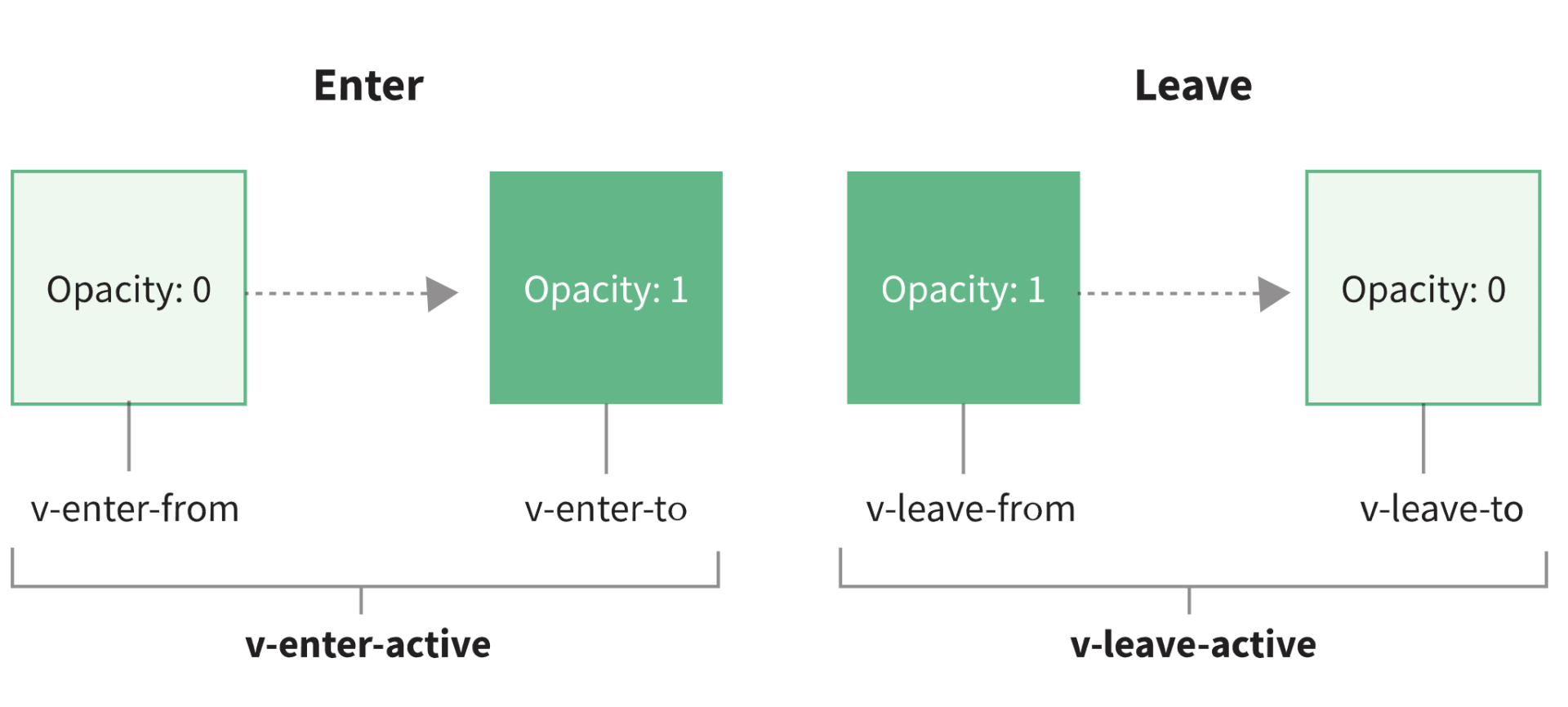
According to the official website, components wrapped in transition switch between these six class es:
1,v-enter-from: Defines the starting state for transition. Effective before the element is inserted and removed at the next frame after the element is inserted.
2,v-enter-active: Defines the state when transition takes effect. Applied throughout the transition phase, effective before the element is inserted, in the transition/Remove after the animation is complete. This class can be used to define the transition time, delay, and curve functions.
3,v-enter-to: Defines the end state of the transition. The next frame takes effect after the element is inserted (Meanwhile v-enter-from Removed),In Transition/Remove after the animation is complete.
4,v-leave-from: Defines the starting state of the departure transition. Effective immediately when the departure transition is triggered, the next frame is removed.
5,v-leave-active: Defines the status when the departure transition takes effect. Applied throughout the departure transition phase, effective immediately when the departure transition is triggered, during the transition/Remove after the animation is complete. This class can be used to define the process time, delay, and curve functions for leaving the transition.
6,v-leave-to: Leave the end state of the transition. The next frame takes effect after the departure transition is triggered (Meanwhile v-leave-from Removed),In Transition/Remove after the animation is complete.
The name of the specific class is well explained by a graph on Vue's official website, where V in v-enter-front is the name attribute we set.
In fact, this process is the representation of transitional animation. When the element enters the frame, a class of v-enter-from is added, setting the initial state. The v-enter-to is where the element begins to enter the class that will be added when it completes, setting the end state of the element transition. v-enter-active is a class that will exist throughout the transition time.
That is, the picture above is actually like this:
Thus, v-enter-active and v-leave-active can be used to define the transition time, delay and curve functions. Because these two classes persist for the transition time, they are not deleted until the transition is complete.
V-enter-front and v-leave-to can be used to set the start and end of the animation.
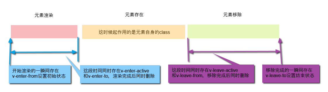
The other two can be replaced by the class of the element itself instead of using it:
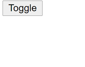
<template>
  <div id="demo">
    <button @click="data.noActivated = !data.noActivated">Toggle</button>
    <transition name="fade">
      <p v-if="data.noActivated" class="test">hello</p>
    </transition>
  </div>
</template>

<script setup>
import { reactive } from "vue";
const data = reactive({
  noActivated: false
});
</script>

<style lang="scss" scoped>
.test {
  color: green;
  opacity: 1;
}
.fade-enter-active,
.fade-leave-active {
  transition: all 5s ease;
}
.fade-enter-from,
.fade-leave-to {
  color: black;
  opacity: 0;
}
</style>
Effect achieved:
That is, in the animation rendered by the element:
1,fade-enter-from Initial state set
2,fade-enter-active Set transition animation and time
3,The element itself class:test Acts as the final state set.
This enables the transition animation effect to start rendering.
In the animation where the element was removed:
1,The element itself class:test Acts as setting the initial state.
2,fade-leave-active Set transition animation and time
3,fade-leave-to The final state is set.
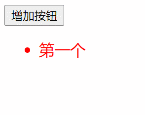
2, list entry/exit transition animation
Transition elements act as transitional effects for individual elements/components. Transition will only apply transitional effects to the contents of its package, without rendering the DOM elements extra or appearing at the component level that can be inspected. The six classes are placed on this subelement. So instead of this, list rendering uses transition-grou to wrap, and the six classes are added to the item. As mentioned above, I am used to replacing v-enter-to and v-leave-from with the class of the element itself. So these two are not set.
<template>
  <div id="demo">
    <button @click="clickBtn">Add Button</button>
    <transition-group name="fade" tag="ul">
      <li v-for="(item, index) in data.testList" :key="index" class="test">
        {{ item.content }}
      </li>
    </transition-group>
  </div>
</template>

<script setup>
import { reactive } from "vue";
const data = reactive({
  testList: [
    {
      content: "First"
    }
  ]
});
function clickBtn() {
  data.testList.push({
    content: "Next"
  });
}
</script>

<style lang="scss" scoped>
.test {
  color: red;
  font-size: 18px;
}
.fade-enter-active,
.fade-leave-active {
  transition: all 2s ease;
}
.fade-enter-from,
.fade-leave-to {
  color: black;
  opacity: 0;
  transform: translateX(30px);
}
</style>
3, js animation with transition
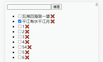
<template>
  <div class="title">
    <input type="text" @keypress.enter="add" v-model="title" />
    <button @click="clear">Clear</button>
  </div>
  <div class="content">
    <transition-group name="flip-list" tag="ul">
      <li v-for="(item, index) in todoList" :key="item.content">
        <input type="checkbox" v-model="item.done" />
        <span :class="[item.done ? 'inactive' : 'active']">
          {{ item.content }}
        </span>
        <span class="remove-btn" @click="removeTodo($event, index)">❌</span>
      </li>
    </transition-group>
  </div>

  <span class="dustbin">🗑</span>
  <div class="animate-wrap">
    <transition
      @before-enter="beforeEnter"
      @enter="enter"
      @after-enter="afterEnter"
    >
      <div class="animate" v-show="animate.show">📋</div>
    </transition>
  </div>
</template>

<script setup>
import { ref, reactive } from "vue";
//Decouple this useTodo
function useTodos() {
  let title = ref("");
  let todoList = ref([
    {
      content: "All over the world",
      done: false
    },
    {
      content: "Qianjiang River Has Water and Qianjiang Moon",
      done: true
    }
  ]);
  function add() {
    const obj = {
      content: title.value,
      done: false
    };
    todoList.value.push(obj);
    title.value = "";
  }
  function clear() {
    todoList.value = todoList.value.filter((v) => !v.done);
  }
  return { title, todoList, add, clear };
}

//In fact, you can pull out a separate file from the component file to maintain any piece of code inside the component.
//Then use it in this component so that they don't depend on this context, and deconstruct the assignment here
let { title, todoList, add, clear } = useTodos();

const { animate, beforeEnter, enter, afterEnter, removeTodo } = useAnimation();

function useAnimation() {
  let animate = reactive({
    show: false,
    el: null
  });
  const dustbin = {
    el: null,
    pos: [],
    init(queryStr) {
      this.el = document.querySelector(queryStr);
      this.getPos();
    },
    getPos() {
      const { left, top } = this.el.getBoundingClientRect();
      this.pos[0] = left;
      this.pos[1] = top;
    }
  };
  function beforeEnter(el) {
    let dom = animate.el;
    let rect = dom.getBoundingClientRect();
    const aniEl = document.querySelector(".animate");
    //Animation elements are positioned to dustbin, or css can write precise positions directly
    aniEl.style.left = `${dustbin.pos[0]}px`;
    aniEl.style.top = `${dustbin.pos[1]}px`;
    //Calculate and assign an offset
    let dx = dustbin.pos[0] - rect.left;
    let dy = dustbin.pos[1] - rect.top;
    el.style.transform = `translate(-${dx}px, ${dy * -1}px)`;
  }
  function enter(el, done) {
    document.body.offsetHeight;
    el.style.transform = `translate(0,0)`;
    el.addEventListener("transitionend", done);
  }
  function afterEnter(el) {
    animate.show = false;
    el.style.display = "none";
  }
  function removeTodo(e, i) {
    animate.el = e.target;
    animate.show = true;
    todoList.value.splice(i, 1);
    dustbin.init(".dustbin");
  }
  return { animate, beforeEnter, enter, afterEnter, removeTodo };
}
</script>

<style lang="scss" scoped>
.active {
  color: v-bind(color);
}
.flip-list-move {
  transition: transform 0.8s ease;
}
.flip-list-enter-active,
.flip-list-leave-active {
  transition: all 1s ease;
}
.flip-list-enter-from,
.flip-list-leave-to {
  opacity: 0;
  transform: translateX(30px);
}
.dustbin {
  position: absolute;
  top: 0;
  right: 0;
}
.animate-wrap .animate {
  position: fixed;
  right: 10px;
  top: 10px;
  z-index: 100;
  transition: all 0.5s linear;
}
</style>
Effect achieved: