This article is the third part of the kaggle case sharing. The title of the competition is: Mushroom Classification, safe to eat or dead poison?
Data from UCI: https://archive.ics.uci.edu/ml/datasets/mushroom
kaggle source address: https://www.kaggle.com/nirajvermafcb/comparing-various-ml-models-roc-curve-comparison

<!--MORE-->
ranking
The following is the ranking of this topic on kaggle. The first place focuses on feature selection. Without using the data of this question, I personally feel that I deviated; The second place focuses on the classification based on Bayesian theory, which has limited ability. We can talk about it after learning Bayesian theory.
Therefore, I chose the third notebook source code to learn. The author compares the modeling and model evaluation of six supervised learning methods on this data set.

data set
This dataset was donated by UCI to kaggle. The total number of samples is 8124, including 6513 samples for training and 1611 samples for testing; In addition, 4208 samples were edible, accounting for 51.8%; The toxic samples were 3916, accounting for 48.2%. Each sample describes 22 attributes of mushrooms, such as shape, smell, etc.
Poisoning incidents of eating wild mushrooms by mistake occur from time to time, and the shapes of mushrooms vary greatly. For non professionals, it is impossible to distinguish toxic mushrooms from edible mushrooms in terms of appearance, shape and color. There is no simple standard to distinguish toxic mushrooms from edible mushrooms. To understand whether mushrooms are edible, it is necessary to collect mushrooms with different characteristic attributes and analyze whether they are toxic.
By analyzing the 22 characteristic attributes of mushrooms, we can get the mushroom usability model to better predict whether mushrooms are edible or not.
The following is the specific data information displayed by UCI:
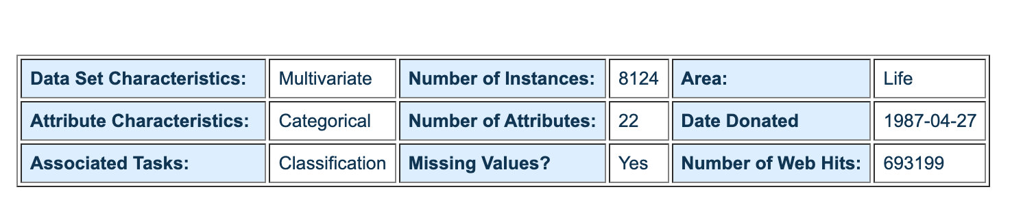
Interpretation of attribute characteristics:

Data EDA
Import data
import pandas as pd
import numpy as np

import plotly_express as px
from matplotlib import pyplot as plt
import seaborn as sns

# Ignore warning
import warnings
warnings.filterwarnings('ignore')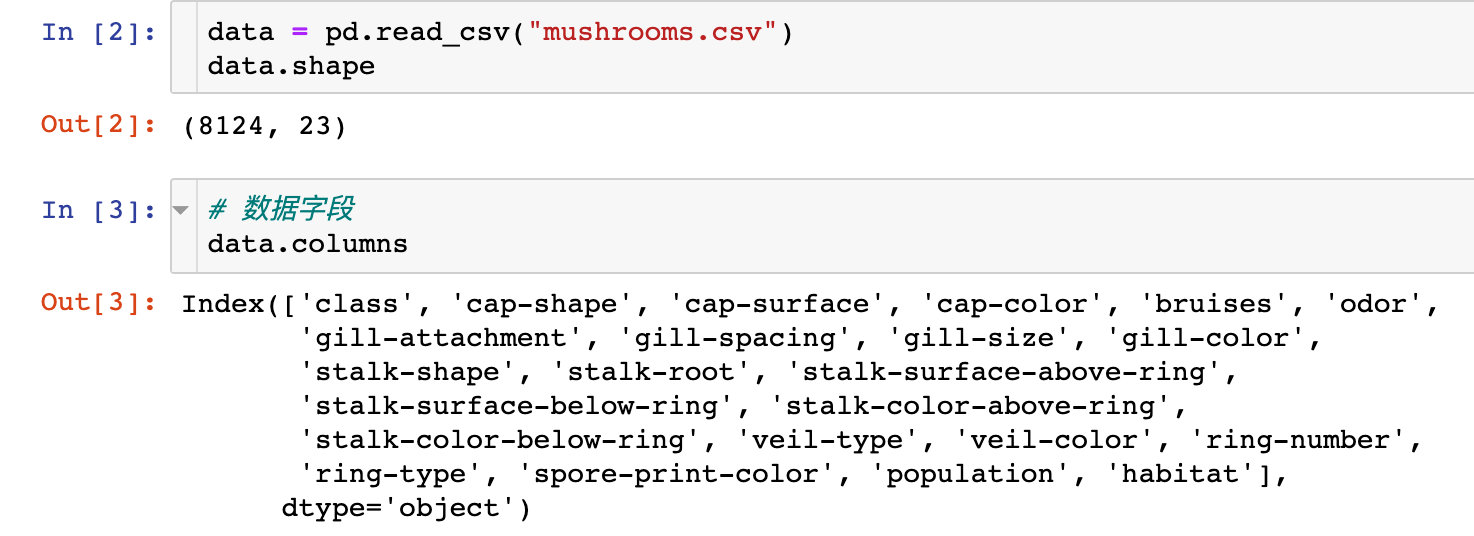
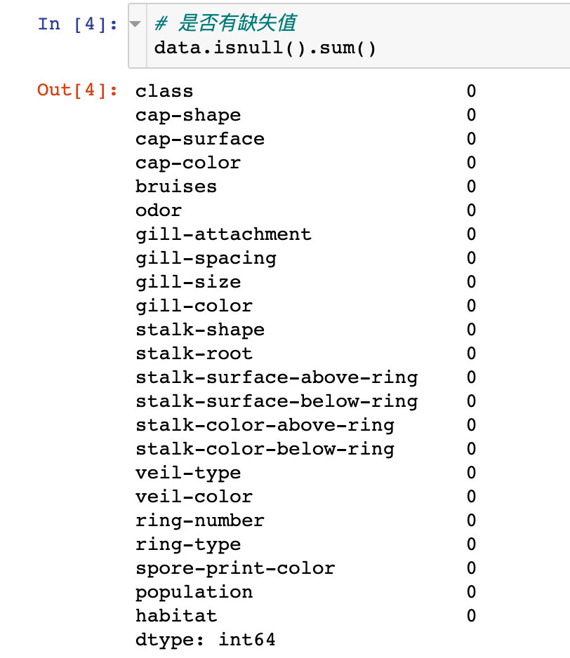
The original data has 8124 records and 23 attributes; And there are no missing values
Non toxic comparison
Statistical comparison of toxic and non-toxic quantities:

Visual analysis
Cap color
First, let's discuss the color of the cap: the number of times of each cap color
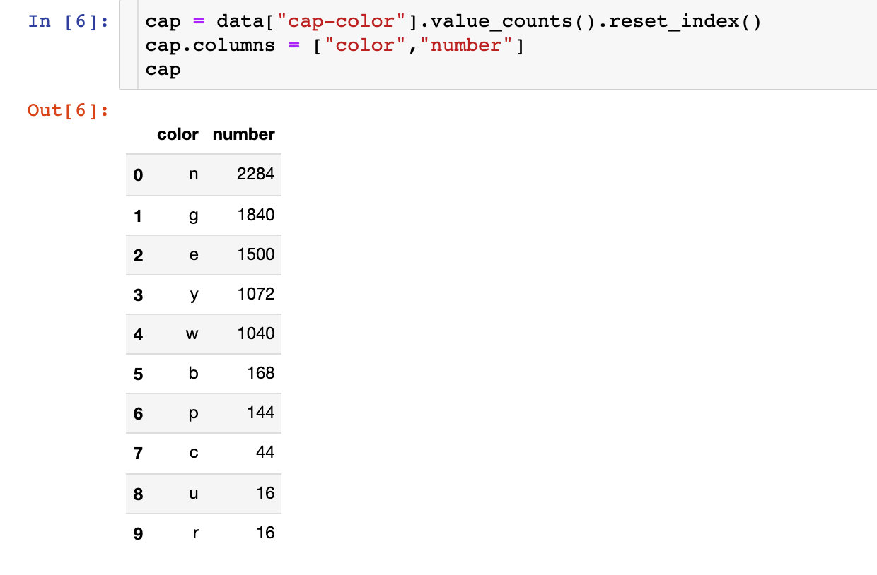
fig = px.bar(cap,x="color",
             y="number",
             color="number",
             text="number",
             color_continuous_scale="rainbow")

# fig.update_layout(text_position="outside")
fig.show()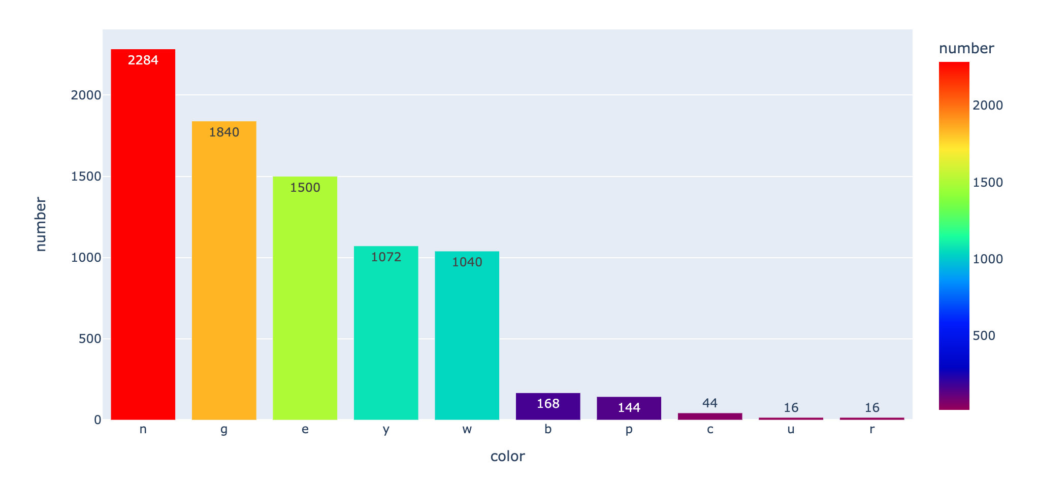
Which kinds of poisonous mushrooms have more colors? Statistical color distribution under toxic and non-toxic conditions:
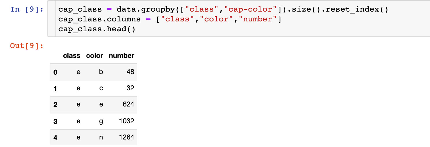
 fig = px.bar(cap_class,x="color",
              y="number",
              color="class",
              text="number",
              barmode="group",
             )

fig.show()
Summary: there are many colors n, g and e in toxic p conditions.
Smell of bacteria
Count the number of each odor:
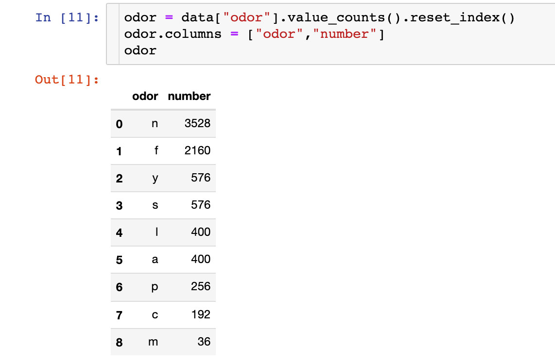
fig = px.bar(odor,
             x="odor",
             y="number",
             color="number",
             text="number",
             color_continuous_scale="rainbow")

fig.show()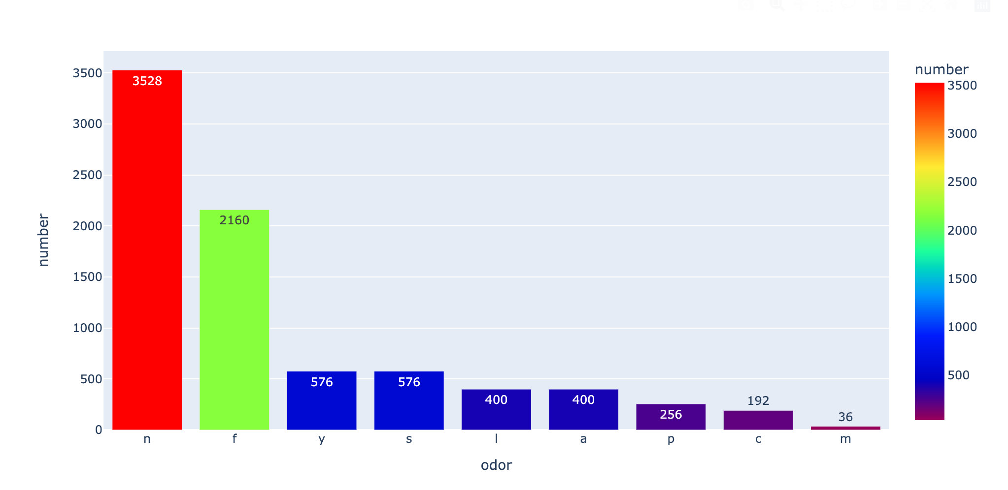
The above is for the overall data. The following discussion is divided into toxic and non-toxic:
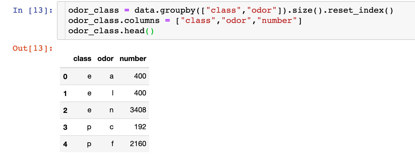
 fig = px.bar(odor_class,
              x="odor",
              y="number",
              color="class",
              text="number",
              barmode="group",
             )

fig.show()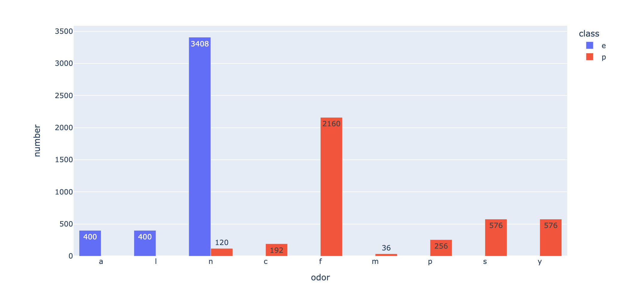
Summary: from the above two pictures, we can see: f this smell is the most likely to cause toxicity
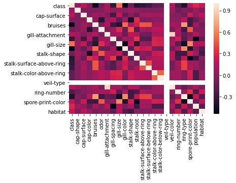
Characteristic correlation
Draw the correlation coefficient between features into a thermal diagram to check the distribution:
corr = data.corr()
sns.heatmap(corr)

plt.show()
Characteristic Engineering
Feature transformation
The features in the original data are all text types. We convert them into numerical types for subsequent analysis:
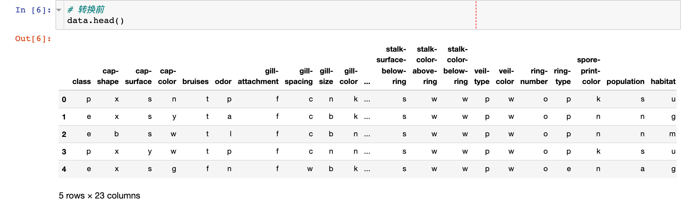
1. Before conversion
2. Implement conversion
from sklearn.preprocessing import LabelEncoder  # Type code
labelencoder = LabelEncoder()

for col in data.columns:
    data[col] = labelencoder.fit_transform(data[col])

# After conversion
data.head()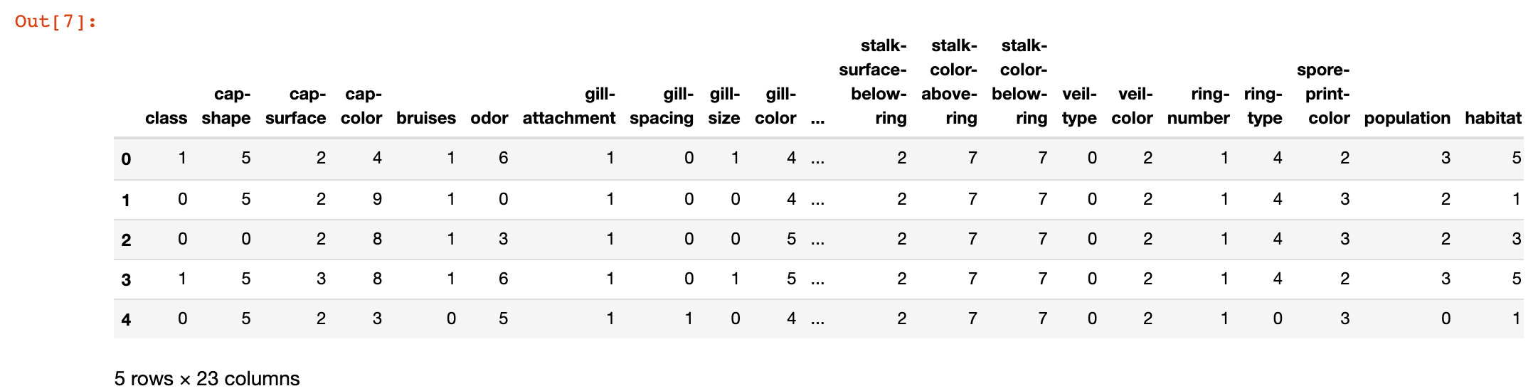
3. View the conversion results of some attributes
data distribution
View the data distribution after data conversion coding:
ax = sns.boxplot(x='class',
                 y='stalk-color-above-ring',
                 data=data)

ax = sns.stripplot(x="class",
                   y='stalk-color-above-ring',
                   data=data,
                   jitter=True,
                   edgecolor="gray")

plt.title("Class w.r.t stalkcolor above ring",fontsize=12)

plt.show()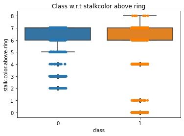
Separating features and labels
X = data.iloc[:,1:23]  # features
y = data.iloc[:, 0]  # label
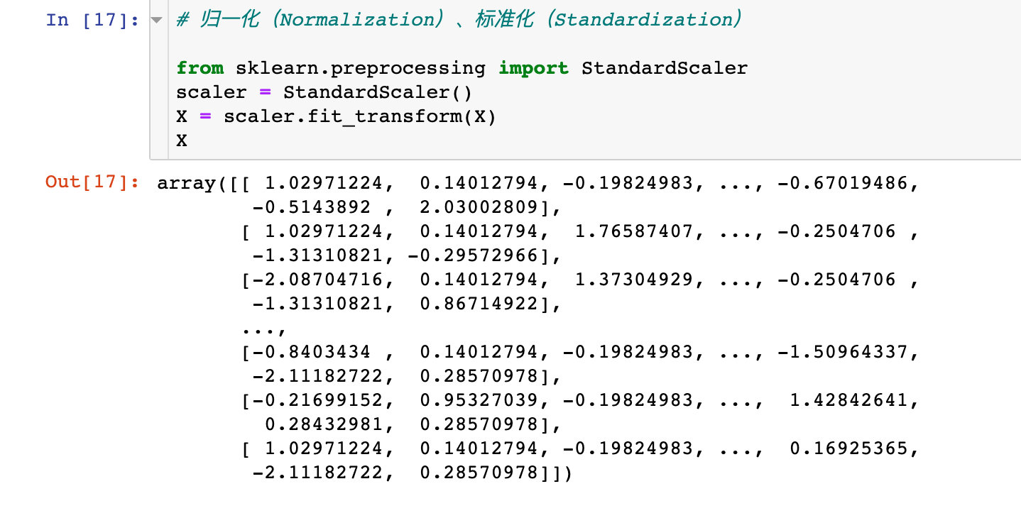
Data standardization
# Normalization, Standardization

from sklearn.preprocessing import StandardScaler
scaler = StandardScaler()
X = scaler.fit_transform(X)
X
Principal component analysis PCA
PCA process
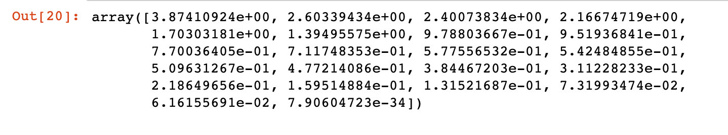
The 22 attributes in the original data may not be all valid data, or some attributes themselves have certain relationships, resulting in the overlap of feature attributes. We use principal component analysis to find out the key features first:
# 1. Implement pca
from sklearn.decomposition import PCA
pca = PCA()
pca.fit_transform(X)

# 2. The correlation coefficient is obtained
covariance = pca.get_covariance()

# 3. Get the corresponding variance value of each variable
explained_variance=pca.explained_variance_
explained_variance
The score relationship of each principal component is displayed by drawing:
with plt.style.context("dark_background"):  # background
    plt.figure(figsize=(6,4))  # size

    plt.bar(range(22),  # Number of principal components
           explained_variance,  # Variance value
            alpha=0.5,  # transparency
            align="center",
            label="individual explained variance"  # label
           )
    plt.ylabel('Explained variance ratio')  # Shaft name and legend
    plt.xlabel('Principal components')
    plt.legend(loc="best")
    plt.tight_layout()  # Automatically adjust subgraph parameters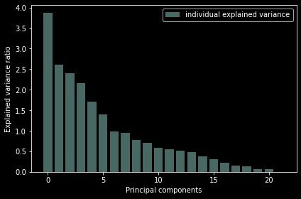
Conclusion: it can be seen from the above figure that the sum of the variances of the last four principal components is very small; The first 17 occupy more than 90% of the variance and can be used as principal components.
We can see that the last 4 components has less amount of variance of the data.The 1st 17 components retains more than 90% of the data.
Data distribution under two principal components
Then we use the data based on two attributes to implement K-means clustering:
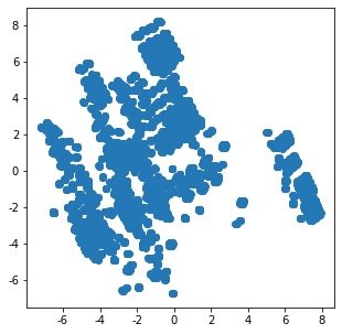
1. Raw data distribution under two principal components
N = data.values
pca = PCA(n_components=2)
x = pca.fit_transform(N)

plt.figure(figsize=(5,5))
plt.scatter(x[:,0],x[:,1])
plt.show()
2. Distribution after cluster modeling:
from sklearn.cluster import KMeans
km = KMeans(n_clusters=2,random_state=5)

N = data.values  # numpy array form
X_clustered = km.fit_predict(N)  # Modeling results 0-1

label_color_map = {0:"g",  # The classification results are only 0 and 1 for marking
                  1:"y"}
label_color = [label_color_map[l] for l in X_clustered]

plt.figure(figsize=(5,5))
# x = pca.fit_transform(N)
plt.scatter(x[:,0],x[:,1], c=label_color)
plt.show()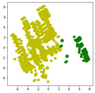
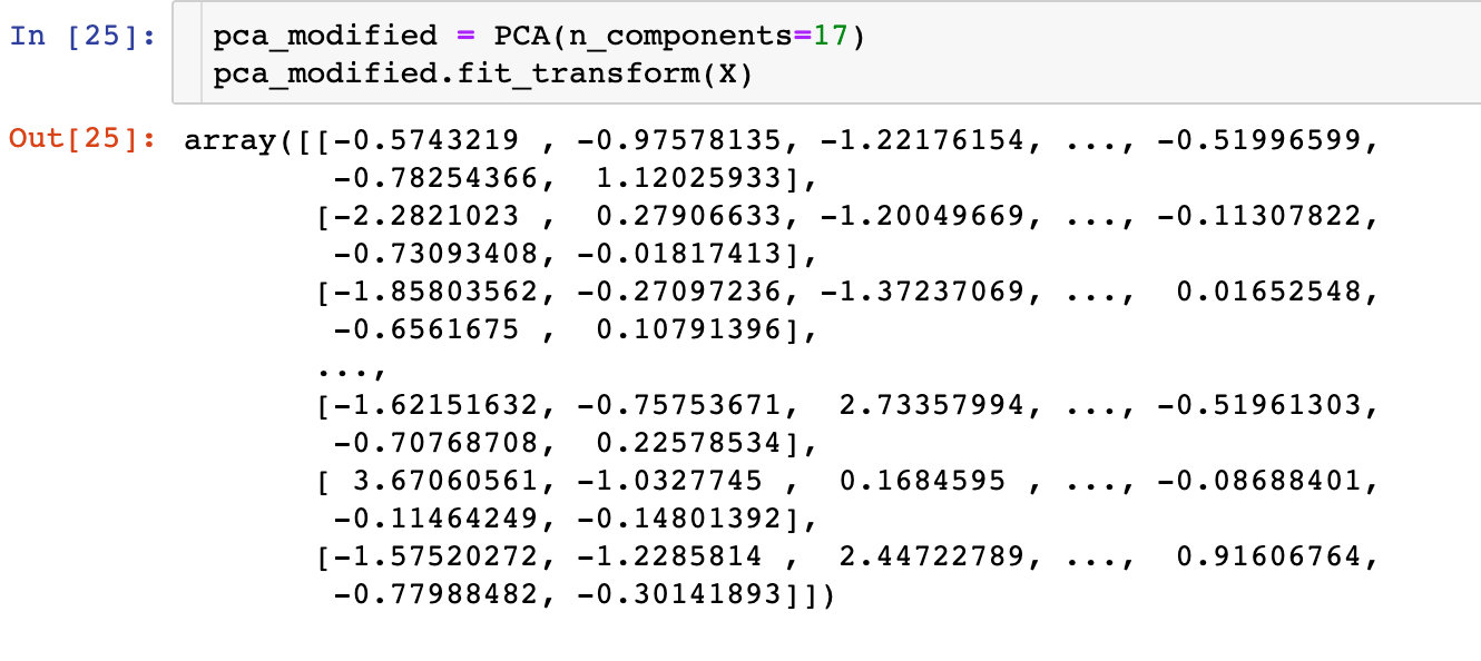
Modeling based on 17 principal components
I don't understand this place: there are 22 attributes in total, and 4 features are selected above. Why is this based on the analysis of 17 principal components??
Firstly, the transformation based on 17 principal components is made:
Division of data set: the proportion of training set and test set is 8-2
from sklearn.model_selection import train_test_split
X_train, X_test, y_train, y_test = train_test_split(X, y, test_size=0.2, random_state=4)
Here are the specific processes of the six supervised learning methods:
Model 1: logistic regression
from sklearn.linear_model import LogisticRegression  # Logistic regression (classification)
from sklearn.model_selection import cross_val_score  # Cross validation score
from sklearn import metrics  # Model evaluation

# Model building
model_LR = LogisticRegression()
model_LR.fit(X_train, y_train)
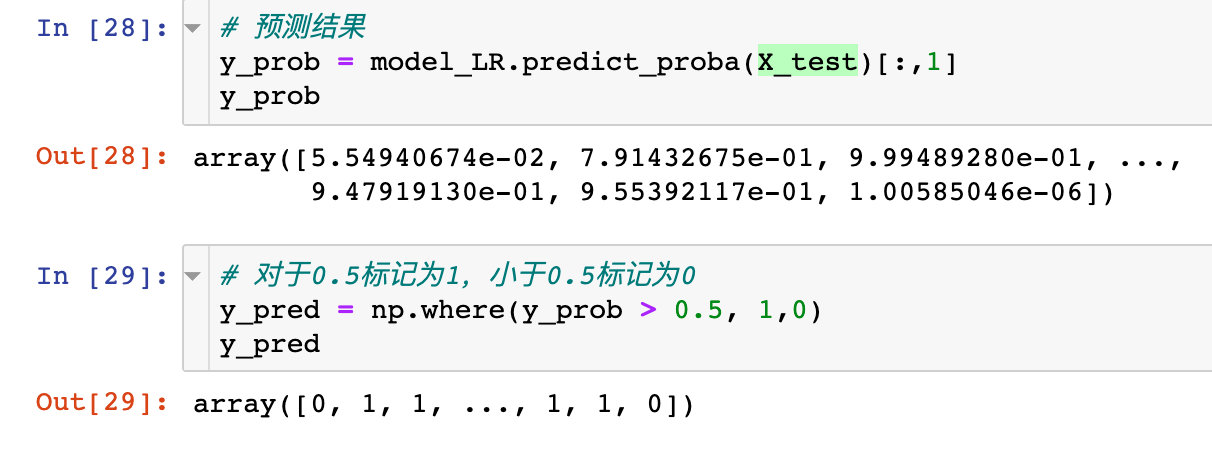
See the specific prediction effect:
model_LR.score(X_test,y_pred)

# result
1.0  # The effect is very good
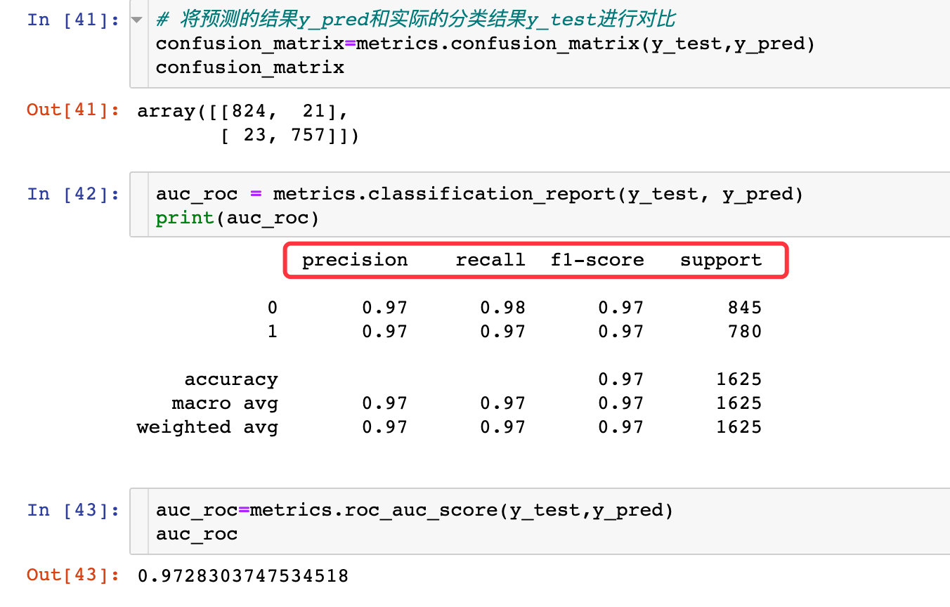
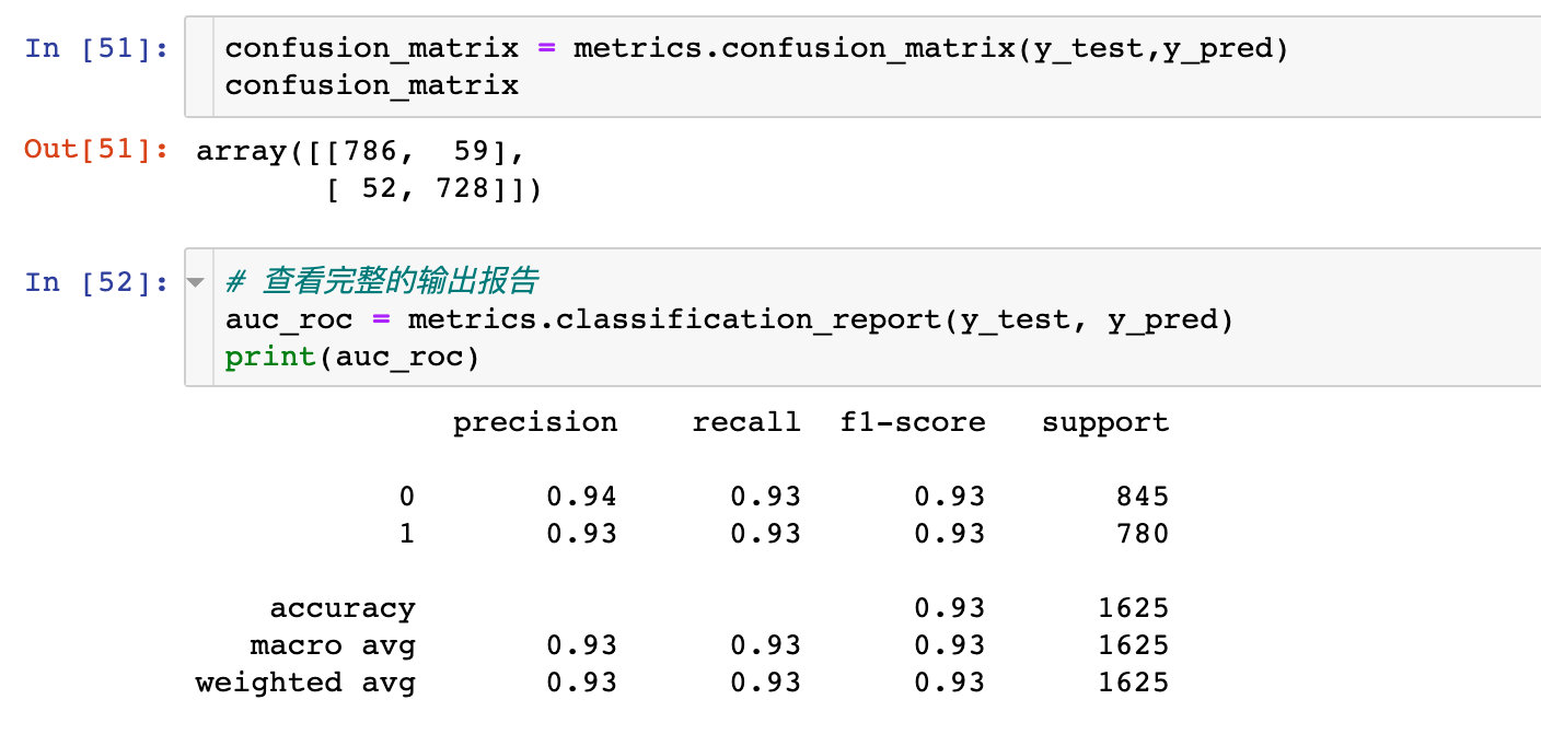
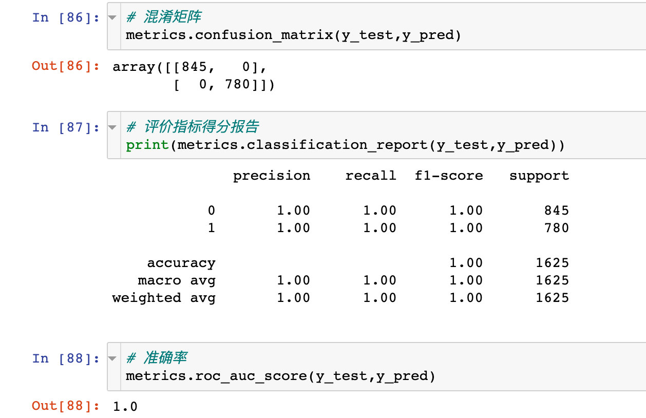
Confusion matrix under logistic regression:
confusion_matrix = metrics.confusion_matrix(y_test, y_pred)
confusion_matrix

# result
array([[815,  30],
       [ 36, 744]])
Specific auc value:
auc_roc = metrics.roc_auc_score(y_test, y_pred)  # Test paper and predicted value
auc_roc

# result
0.9591715976331362
True false positive
from sklearn.metrics import roc_curve, auc
false_positive_rate, true_positive_rate,thresholds = roc_curve(y_test, y_prob)

roc_auc = auc(false_positive_rate,true_positive_rate)
roc_auc

# result
0.9903474434835382
ROC curve
import matplotlib.pyplot as plt
plt.figure(figsize=(10,10))
plt.title("ROC")  # Receiver Operating Characteristic
plt.plot(false_positive_rate,
         true_positive_rate,
         color="red",
         label="AUC = %0.2f"%roc_auc
        )

plt.legend(loc="lower right")
plt.plot([0,1],[0,1],linestyle="--")
plt.axis("tight")
# True positive: positive with prediction category of 1; Predicted correctly true
plt.ylabel("True Positive Rate")
# False positive: positive with prediction category of 1; Prediction error false
plt.xlabel("False Positive Rate") 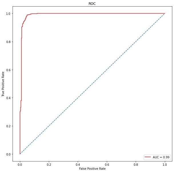
The following is the correction of the logistic regression model. The correction here mainly adopts the grid search method to select the best parameters, and then carry out the next modeling. Grid search process:
from sklearn.linear_model import LogisticRegression
from sklearn.model_selection import cross_val_score
from sklearn import metrics

# Unoptimized model
LR_model= LogisticRegression()
# Parameters to be determined
tuned_parameters = {"C":[0.001,0.01,0.1,1,10,100,1000],
                    "penalty":['l1','l2']  # Choose different regularization methods to prevent over fitting
                   }
# Grid search module
from sklearn.model_selection import GridSearchCV
# Add grid search function
LR = GridSearchCV(LR_model, tuned_parameters,cv=10)
# Modeling after searching
LR.fit(X_train, y_train)

# Determine parameters
print(LR.best_params_)

{'C': 100, 'penalty': 'l2'}
View the optimized forecast:

Confusion matrix and AUC:
ROC curve:
from sklearn.metrics import roc_curve, auc
false_positive_rate, true_positive_rate, thresholds = roc_curve(y_test, y_prob)

#roc_auc = auc(false_positive_rate, true_positive_rate)

import matplotlib.pyplot as plt
plt.figure(figsize=(10,10))
plt.title("ROC")  # Receiver Operating Characteristic
plt.plot(false_positive_rate,
         true_positive_rate,
         color="red",
         label="AUC = %0.2f"%roc_auc
        )

plt.legend(loc="lower right")
plt.plot([0,1],[0,1],linestyle="--")
plt.axis("tight")
# True positive: positive with prediction category of 1; Predicted correctly true
plt.ylabel("True Positive Rate")
# False positive: positive with prediction category of 1; Prediction error false
plt.xlabel("False Positive Rate") 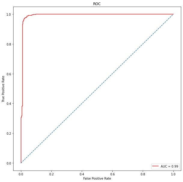
Model 2: Gaussian naive Bayes
modeling
from sklearn.naive_bayes import GaussianNB
model_naive = GaussianNB()

# modeling
model_naive.fit(X_train, y_train)

# Prediction probability
y_prob = model_naive.predict_proba(X_test)[:,1]
y_pred = np.where(y_prob > 0.5,1,0)
model_naive.score(X_test,y_pred)

# result
1
Number of differences between predicted value and real value: 111

Cross validation
scores = cross_val_score(model_naive,
                        X,
                        y,
                        cv=10,
                        scoring="accuracy"
                       )
scores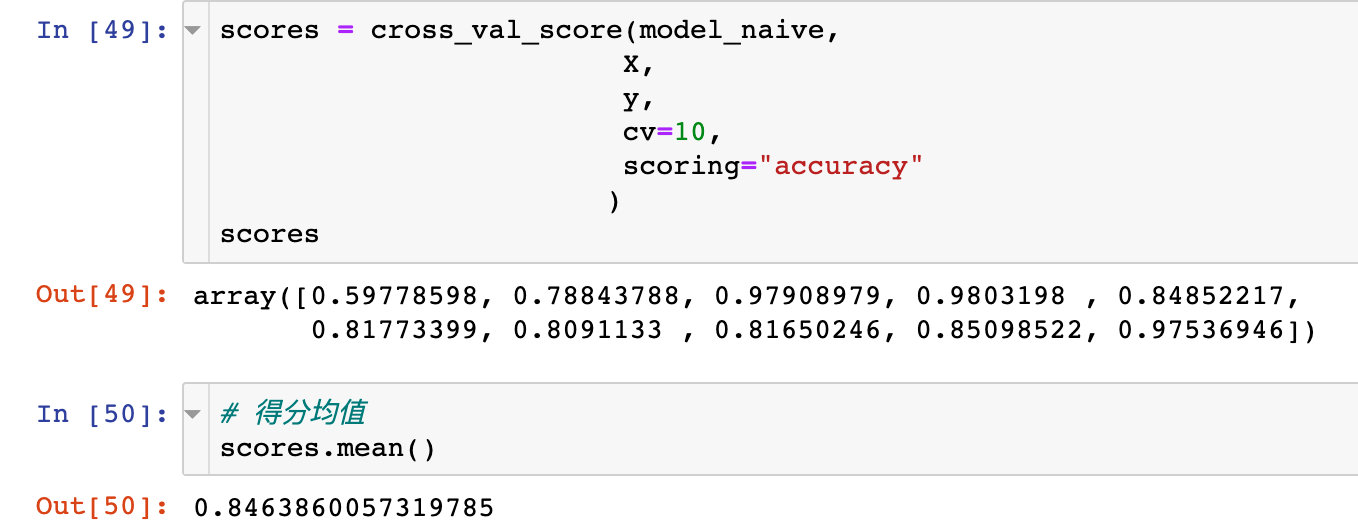
Confusion matrix and AUC
True false positive
# Import evaluation module
from sklearn.metrics import roc_curve, auc

# evaluating indicator
false_positive_rate, true_positive_rate, thresholds = roc_curve(y_test, y_prob)

# roc curve area
roc_auc = auc(false_positive_rate, true_positive_rate)
roc_auc

# result
0.9592201486876043
ROC curve
The value of AUC is only 0.96
# mapping
import matplotlib.pyplot as plt
plt.figure(figsize=(10,10))

plt.title("ROC")
plt.plot(false_positive_rate,true_positive_rate,color="red",label="AUC=%0.2f"%roc_auc)

plt.legend(loc="lower right")
plt.plot([0,1],[0,1],linestyle='--')

plt.axis("tight")
plt.xlabel('False Positive Rate')
plt.ylabel('True Positive Rate')
plt.show()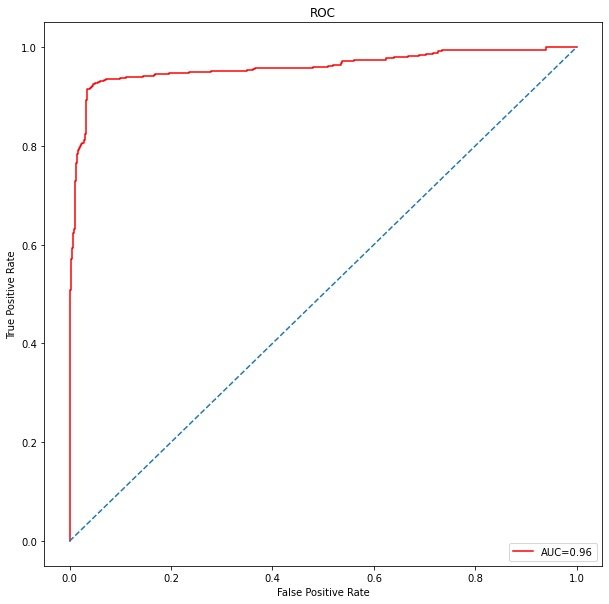
Model 3: support vector machine SVM
Support vector machine process with default parameters
Modeling process
from sklearn.svm import SVC
svm_model = SVC()

tuned_parameters = {
    'C': [1, 10, 100,500, 1000],
    'kernel': ['linear','rbf'],
    'C': [1, 10, 100,500, 1000],
    'gamma': [1,0.1,0.01,0.001, 0.0001],
    'kernel': ['rbf']
}
Random mesh search RandomizedSearchCV
from sklearn.model_selection import RandomizedSearchCV

# Establish random search model
model_svm = RandomizedSearchCV(
    svm_model,  # Model to be searched
    tuned_parameters,  # parameter
    cv=10,  # 10 fold cross validation
    scoring="accuracy",  # Scoring criteria
    n_iter=20  # Number of iterations
    )

# Training model
model_svm.fit(X_train,y_train)
RandomizedSearchCV(cv=10,
estimator=SVC(),
n_iter=20,
param_distributions={'C': [1, 10, 100, 500, 1000],
'gamma': [1, 0.1, 0.01, 0.001, 0.0001],
'kernel': ['rbf']},
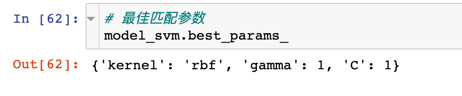
scoring='accuracy')# Best score effect print(model_svm.best_score_) 1.0
Score best match parameters:
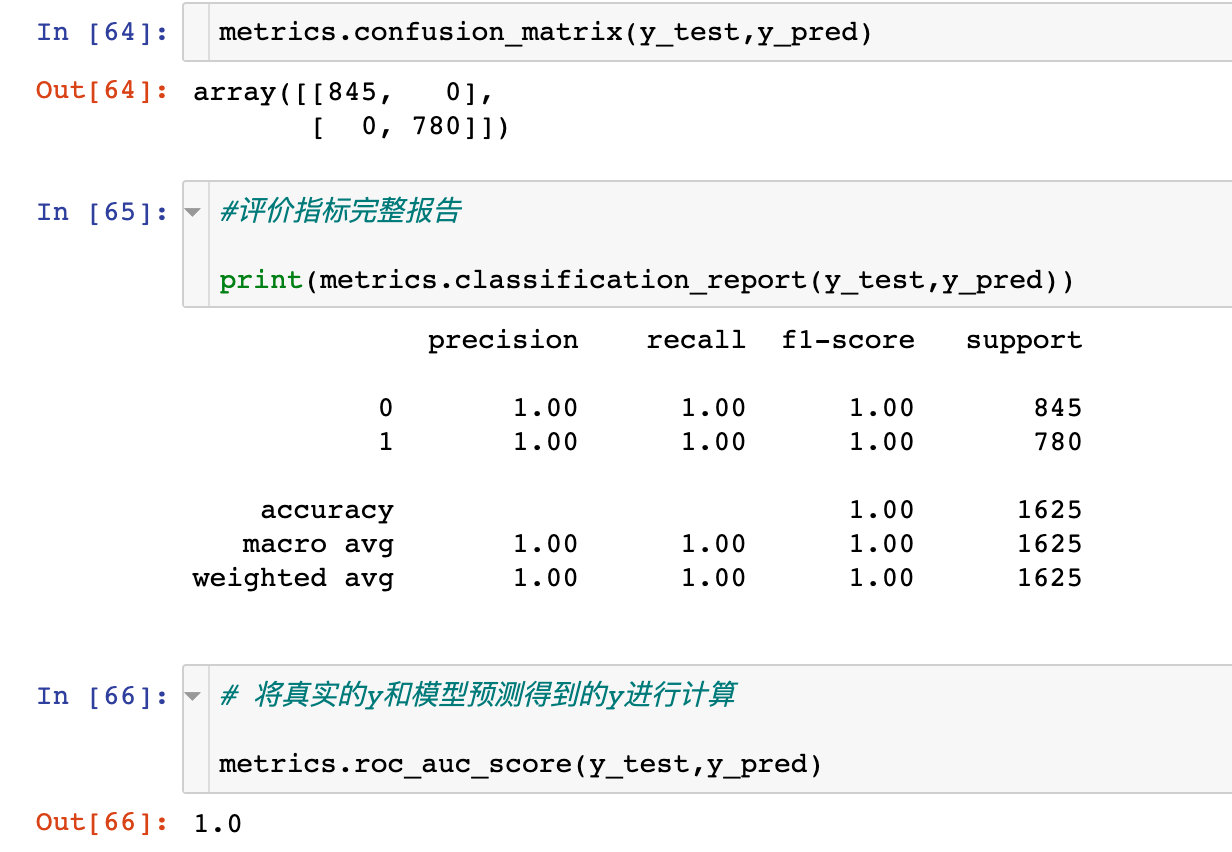
# forecast
y_pred = model_svm.predict(X_test)

# Calculation of predicted value and original tag value: classification accuracy
metrics.accuracy_score(y_pred, y_test)
# result
1
Confusion matrix
Check the specific confusion matrix and prediction:
ROC curve
from sklearn.metrics import roc_curve, auc
false_positive_rate, true_positive_rate, thresholds = roc_curve(y_test, y_pred)
roc_auc = auc(false_positive_rate, true_positive_rate)

import matplotlib.pyplot as plt

plt.figure(figsize=(10,10))
plt.title('ROC')

plt.plot(false_positive_rate,true_positive_rate, color='red',label = 'AUC = %0.2f' % roc_auc)

plt.legend(loc = 'lower right')
plt.plot([0, 1], [0, 1],linestyle='--')

plt.axis('tight')
plt.ylabel('True Positive Rate')
plt.xlabel('False Positive Rate')
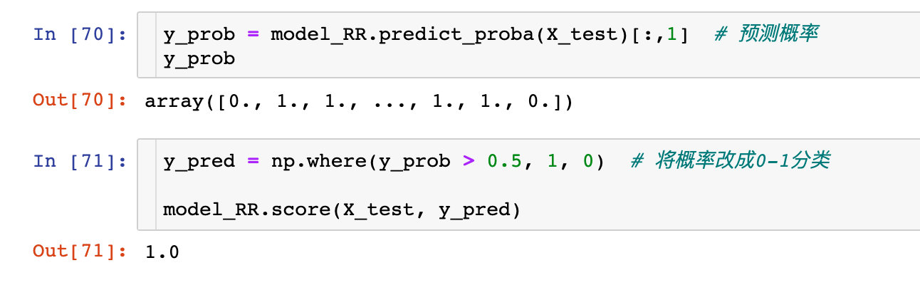
Model 5: random forest
Modeling fitting
from sklearn.ensemble import RandomForestClassifier

# modeling
model_RR = RandomForestClassifier()
# fitting
model_RR.fit(X_train, y_train)
Prediction score
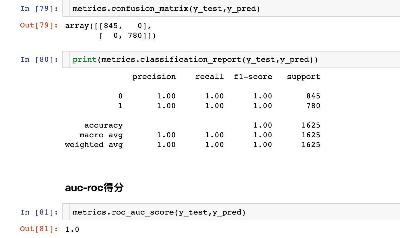
Confusion matrix
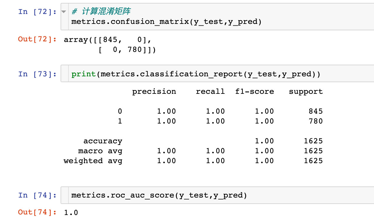
ROC curve
from sklearn.metrics import roc_curve, auc

false_positive_rate, true_positive_rate, thresholds = roc_curve(y_test, y_prob)

roc_auc = auc(false_positive_rate, true_positive_rate)
roc_auc  # 1

import matplotlib.pyplot as plt
plt.figure(figsize=(10,10))
plt.title('ROC')

plt.plot(false_positive_rate,true_positive_rate, color='red',label = 'AUC = %0.2f' % roc_auc)

plt.legend(loc = 'lower right')
plt.plot([0, 1], [0, 1],linestyle='--')

plt.axis('tight')
plt.ylabel('True Positive Rate')
plt.xlabel('False Positive Rate')
plt.show()
Model 6: decision tree (CART)
modeling
from sklearn.tree import DecisionTreeClassifier

# modeling
model_tree = DecisionTreeClassifier()
model_tree.fit(X_train, y_train)

# forecast
y_prob = model_tree.predict_proba(X_test)[:,1]

# The predicted probability is converted to 0-1 classification
y_pred = np.where(y_prob > 0.5, 1, 0)
model_tree.score(X_test, y_pred)
# result
1
Confusion matrix
Reflection of various evaluation indicators:
ROC curve
from sklearn.metrics import roc_curve, auc
false_positive_rate, true_positive_rate, thresholds = roc_curve(y_test, y_prob)
roc_auc = auc(false_positive_rate, true_positive_rate)
roc_auc  # 1

import matplotlib.pyplot as plt
plt.figure(figsize=(10,10))  # canvas
plt.title('ROC')  # title

plt.plot(false_positive_rate,  # mapping
         true_positive_rate,
         color='red',
         label = 'AUC = %0.2f' % roc_auc)

plt.legend(loc = 'lower right') #  Legend location
plt.plot([0, 1], [0, 1],linestyle='--')  # Positive proportional line

plt.axis('tight')
plt.xlabel('False Positive Rate')
plt.ylabel('True Positive Rate')
plt.show()
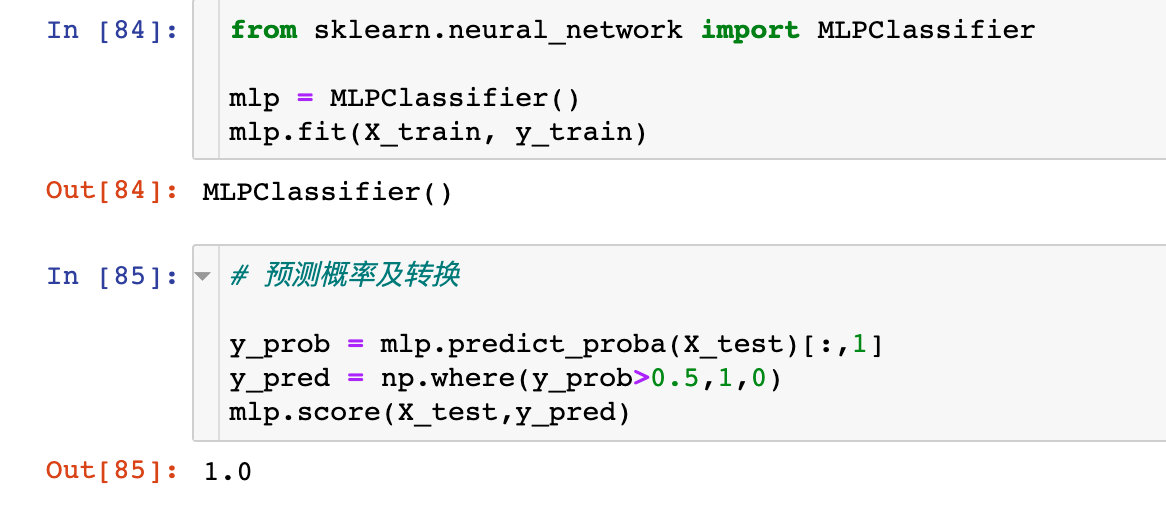
Model 6: neural network ANN
modeling
Confusion matrix
ROC curve
 # True false positive
from sklearn.metrics import roc_curve, auc
false_positive_rate, true_positive_rate, thresholds = roc_curve(y_test, y_prob)
roc_auc = auc(false_positive_rate, true_positive_rate)
roc_auc  # 1

# Draw ROC curve

import matplotlib.pyplot as plt
plt.figure(figsize=(10,10))
plt.title('ROC')
plt.plot(false_positive_rate,true_positive_rate, color='red',label = 'AUC = %0.2f' % roc_auc)

plt.legend(loc = 'lower right')
plt.plot([0, 1], [0, 1],linestyle='--')

plt.axis('tight')
plt.ylabel('True Positive Rate')
plt.xlabel('False Positive Rate')
plt.show()
The parameters of the neural network are optimized as follows:
- hidden_layer_sizes: number of hidden layers
- activation: activate function
- alpha: learning rate
- max_iter: maximum number of iterations
Grid search
from sklearn.neural_network import MLPClassifier

# instantiation
mlp_model = MLPClassifier()
# Parameters to be adjusted
tuned_parameters={'hidden_layer_sizes': range(1,200,10),
                  'activation': ['tanh','logistic','relu'],
                  'alpha':[0.0001,0.001,0.01,0.1,1,10],
                  'max_iter': range(50,200,50)
}

model_mlp= RandomizedSearchCV(mlp_model,
                              tuned_parameters,
                              cv=10,
                              scoring='accuracy',
                              n_iter=5,
                              n_jobs= -1,
                              random_state=5)
model_mlp.fit(X_train,y_train)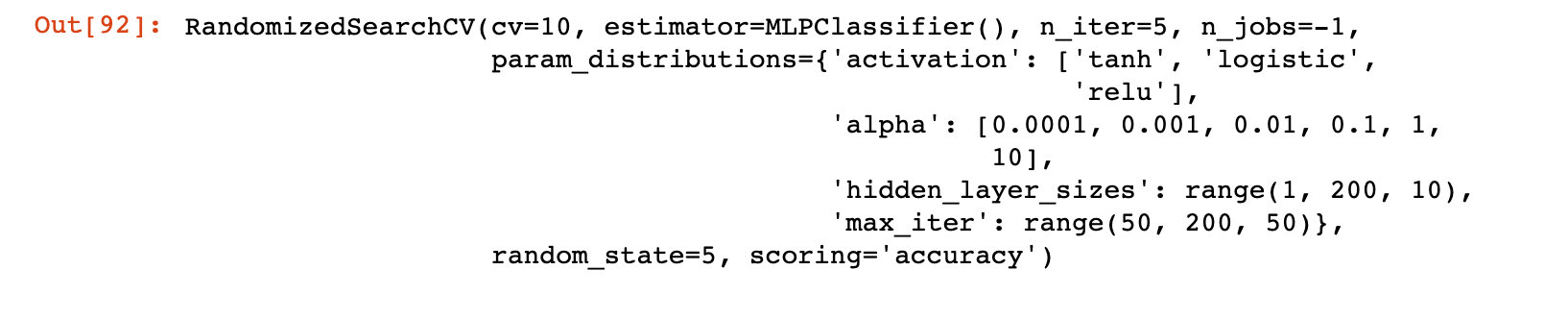
Model properties
The model properties and appropriate parameters after tuning:
ROC curve
from sklearn.metrics import roc_curve, auc
false_positive_rate, true_positive_rate, thresholds = roc_curve(y_test, y_prob)
roc_auc = auc(false_positive_rate, true_positive_rate)
roc_auc  # 1

import matplotlib.pyplot as plt
plt.figure(figsize=(10,10))
plt.title('ROC')

plt.plot(false_positive_rate,true_positive_rate, color='red',label = 'AUC = %0.2f' % roc_auc)

plt.legend(loc = 'lower right')
plt.plot([0, 1], [0, 1],linestyle='--')

plt.axis('tight')
plt.xlabel('False Positive Rate')
plt.ylabel('True Positive Rate')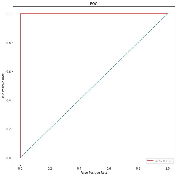
Confusion matrix and ROC
This is a good article to explain confusion matrix and ROC: https://www.cnblogs.com/wuliytTaotao/p/9285227.html
1. What is confusion matrix?
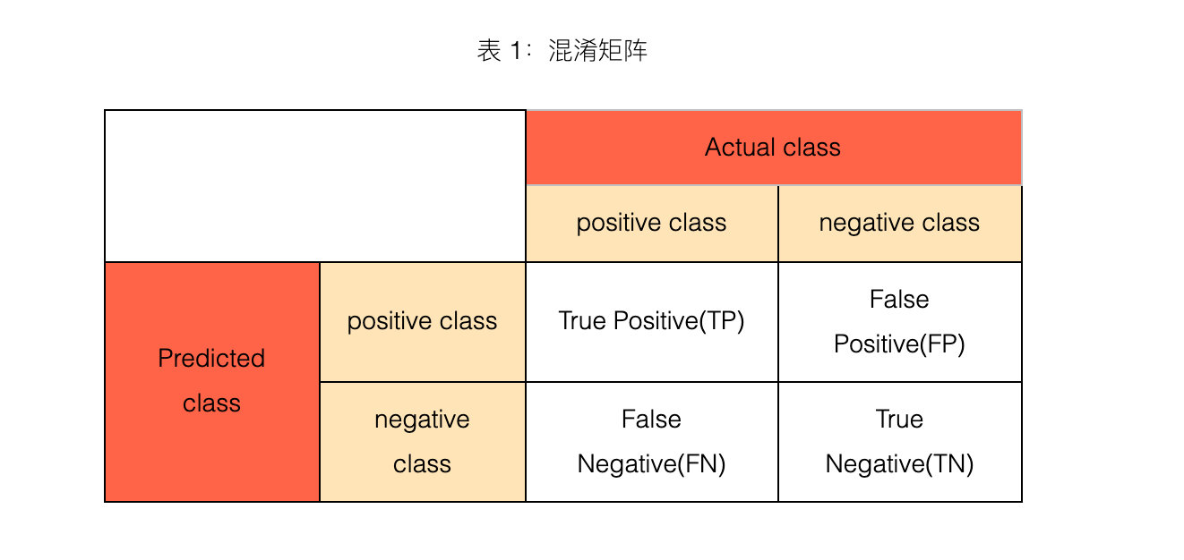
2. 4 major indicators
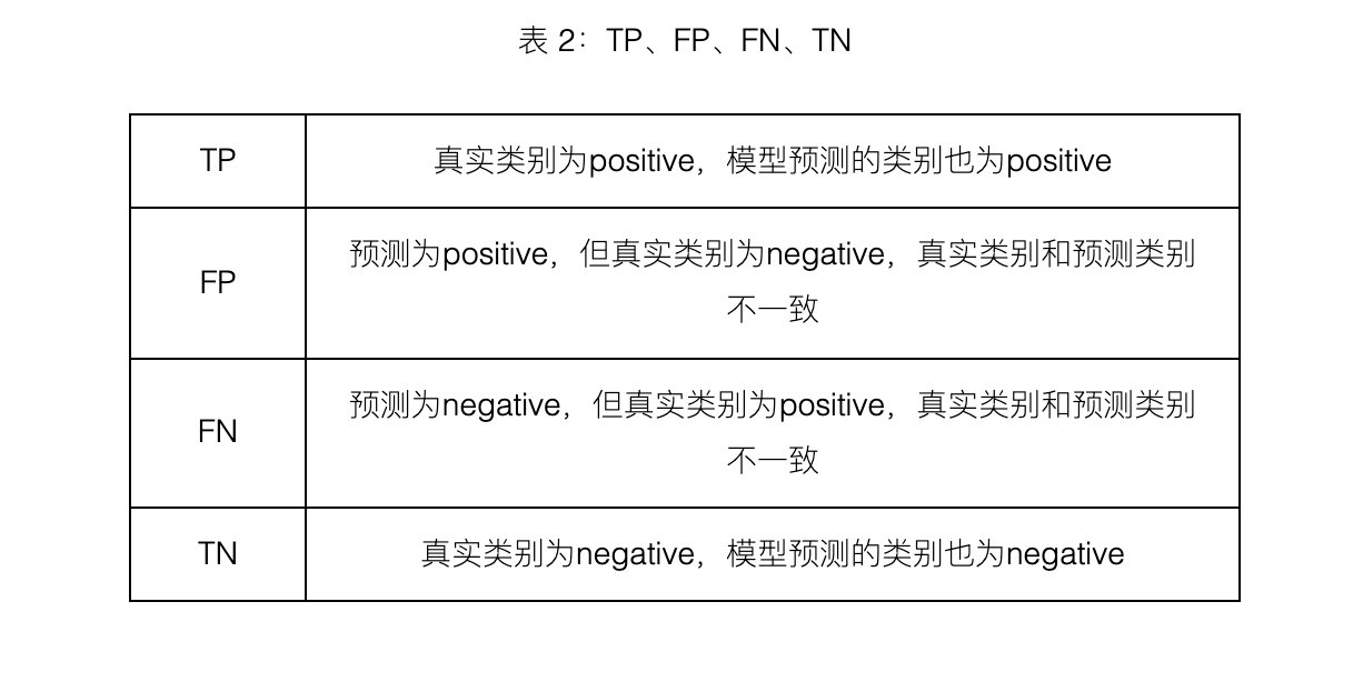
TP, FP, TN, FN, the second letter indicates the predicted category of the sample, and the first letter indicates whether the predicted category of the sample is consistent with the real category.
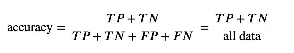
3. Accuracy
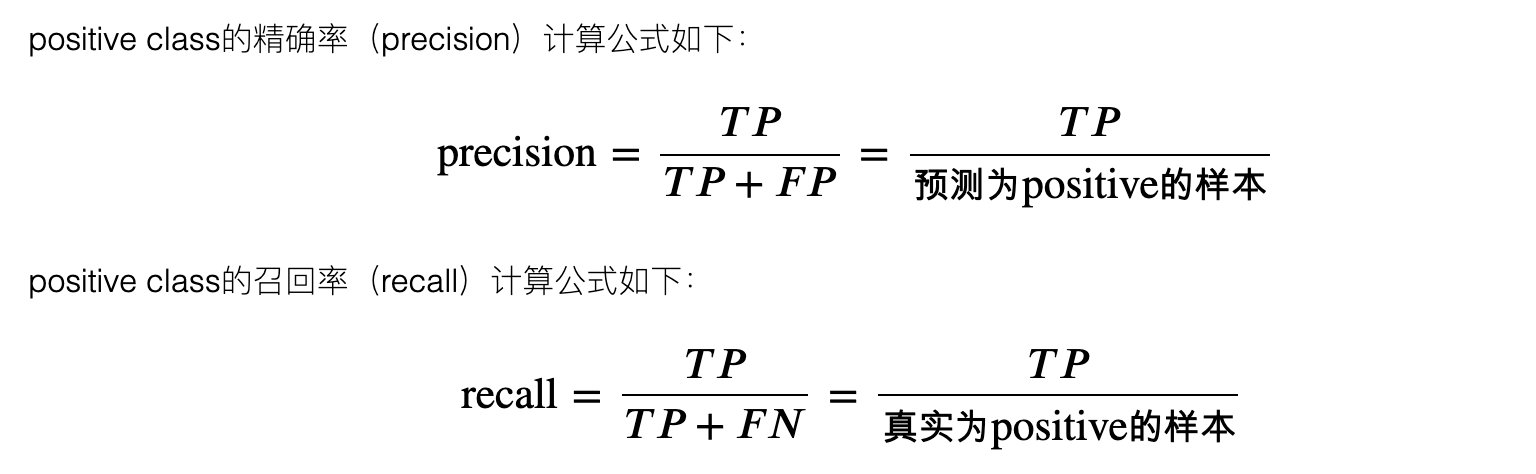
4. Accuracy and recall
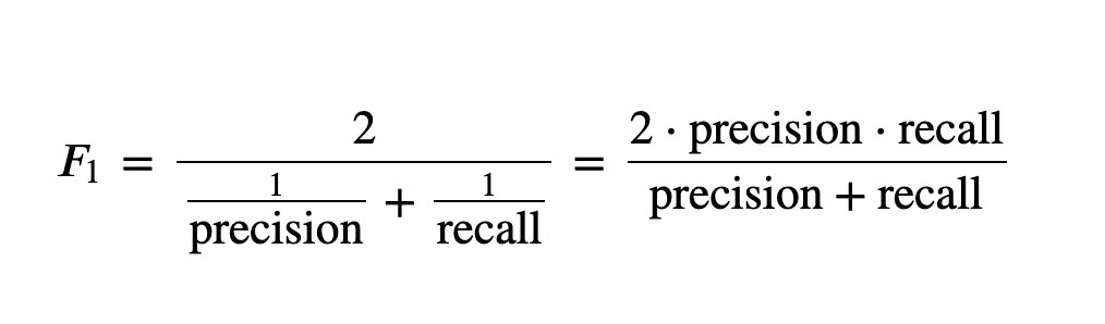
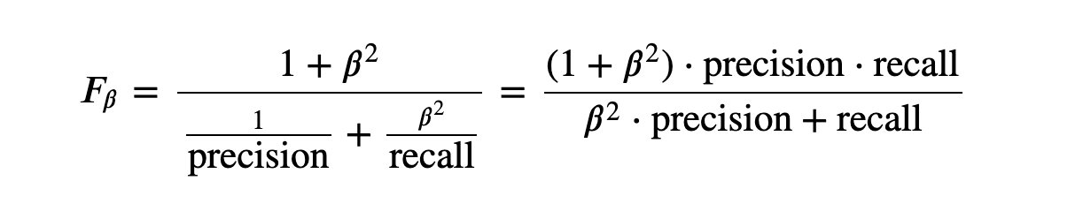
5,F_1 and F_B
6. ROC curve
The full name of AUC is Area Under Curve, which represents the area under a curve. The AUC value of ROC curve can be used to evaluate the model. ROC curve is shown in Figure 1:
summary
After reading this notebook source code, you need to master the following knowledge points:
- Overall idea of machine learning modeling: model selection, modeling, grid search and parameter adjustment, model evaluation, ROC curve (classification)
- Technology of Feature Engineering: code conversion, data standardization and data set division
- Evaluation indicators: confusion matrix and ROC curve are the key points, which are specially explained in subsequent articles
Notice: later, Peter will write a special article to model and analyze this data. It's a pure original idea. Look forward to it~