Multi-column Layout of css3 Attributes and Realization of Waterfall Flow by JS
Background: I planned to summarize the knowledge points of flex layout by myself before, and found myself unable to start. What's the reason? I reflected on it. The reason is very simple: less use, more time use percentage, floating and positioning solution. This also shows the difference between blog and note-taking, I usually take notes, more records, rather than summary, in fact, I am not skilled in mastering.
Sometimes such notes even appear:
I'm going to stick to blogging, no matter how bad my summary is, I'm going to stick to it, even if I see my notes a few years later and I laugh secretly. Think about the original freshman technology is still so immature ah.
Css3 multicolumn
1) Compatibility issues mentioned above: IE10 and opera support multiple columns, chrome needs webkit-prefix, Firefox needs moz-prefix, and Ie9 does not support multiple columns in earlier versions. You can use this tool to easily view your browser's kernel and version information. http://ie.icoa.cn/
2) css3 multi-column attributes: css3 multi-column attributes are mainly five attributes
-
-
- column-count < Number of columns that specify that elements are separated >
- column-gap < specifies the interval between columns >
- Colum-rule < specifies the width, style, color between columns >
- column-width < column width >
- Colum-span <Number of columns an element should span>
-
Note: When setting column-width, set the width of the box at the same time. Otherwise, the width of the box is 100% by default, and the width of each column is averaged by the number of columns. The width of each column of the box must be greater than or equal to the value set by column-width, otherwise the number of columns will be reduced to increase the width of each column.
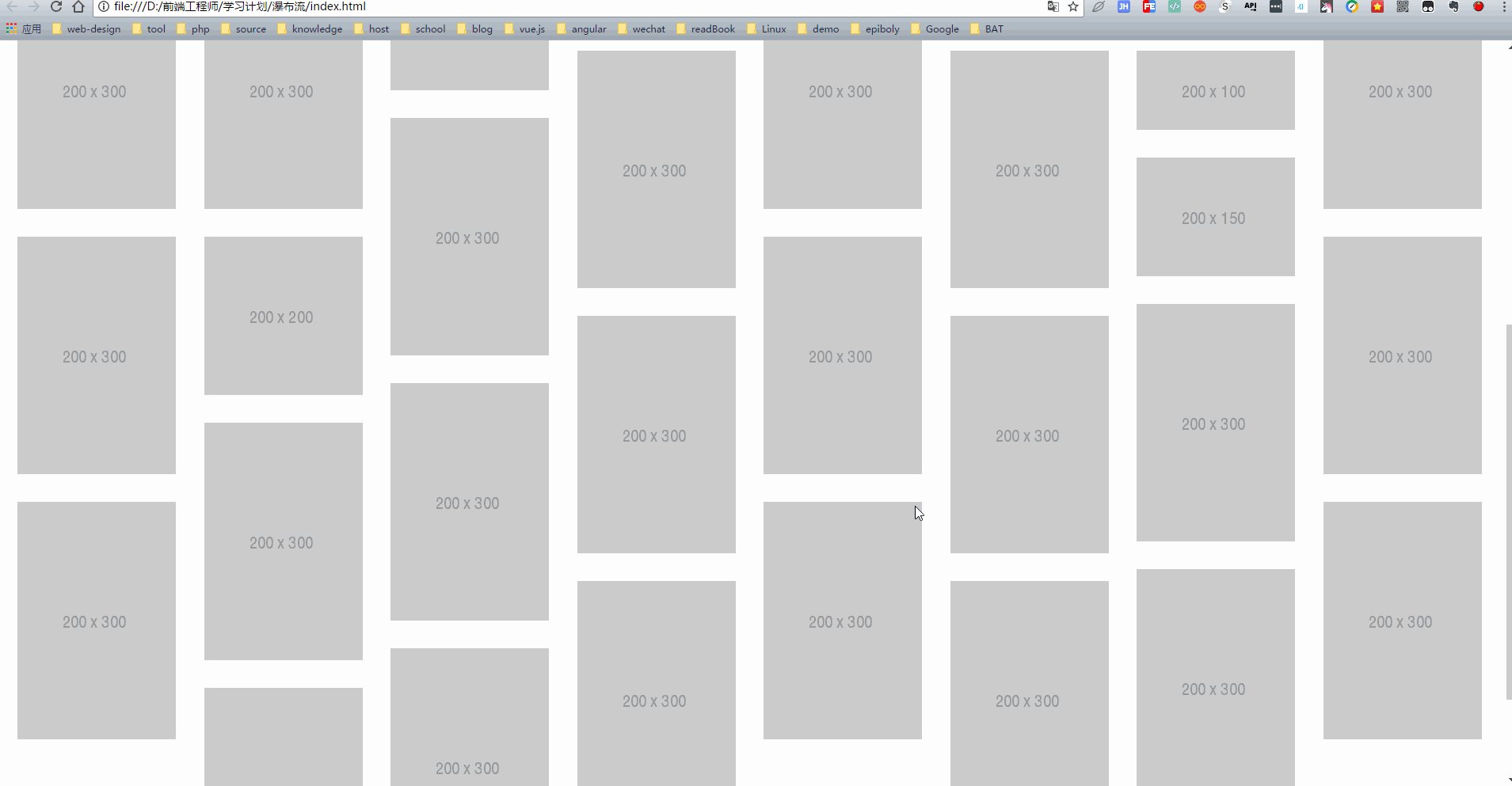
css3 Multilevel and S Realize Waterfall Flow
Give yourself a wave of Amway, see the effect of many waterfalls on the Internet, wow, is it wonderful? So I can't wait to open the vpn and open it. pinterest Official website.

I also sort out the logic: <Before writing js code, we must first understand the logic, and then start writing the code by hand >
We are not unfamiliar with the waterfall flow is the same width, but the height is different, the main job of js is to layout according to the height.
1) When a row is full and ready for the second row, place the first picture at the lowest height in the previous row, and so on.
Another point is automatic loading. Here I make a condition to decide whether to load or not.
2) When the last element is half the height of the offsetTop + scrollTop + the height of the visible area of the page:
Let's load the images (I didn't use ajax requests here, I used a json array to simulate json data)
To clarify the specific meanings of offsetTop, scrollTop and clientHeight, you can refer to them. Blogs of predecessors.
After sorting out the logic, let's write the code by hand.
html is relatively simple. I used the picture here. placehold Picture placeholders, if you don't have good material, may be a good choice
<body>
<div class="main clearfix" id="main">
    <div class="box">
        <div class="pic"><img src="http://placehold.it/200x300"/></div>
    </div>
    <div class="box">
        <div class="pic"><img src="http://placehold.it/200x300"/></div>
    </div>
    <div class="box">
        <div class="pic"><img src="http://placehold.it/200x300"/></div>
    </div>
    <div class="box">
        <div class="pic"><img src="http://placehold.it/200x200"/></div>
    </div>
    <div class="box">
        <div class="pic"><img src="http://placehold.it/200x200"/></div>
    </div>
    <div class="box">
        <div class="pic"><img src="http://placehold.it/200x300"/></div>
    </div>
    <div class="box">
        <div class="pic"><img src="http://placehold.it/200x300"/></div>
    </div>
    <div class="box">
        <div class="pic"><img src="http://placehold.it/200x300"/></div>
    </div>
    <div class="box">
        <div class="pic"><img src="http://placehold.it/200x300"/></div>
    </div>
    <div class="box">
        <div class="pic"><img src="http://placehold.it/200x150"/></div>
    </div>
    <div class="box">
        <div class="pic"><img src="http://placehold.it/200x200"/></div>
    </div>
    <div class="box">
        <div class="pic"><img src="http://placehold.it/200x300"/></div>
    </div>
    <div class="box">
        <div class="pic"><img src="http://placehold.it/200x200"/></div>
    </div>
    <div class="box">
        <div class="pic"><img src="http://placehold.it/200x300"/></div>
    </div>
    <div class="box">
        <div class="pic"><img src="http://placehold.it/200x300"/></div>
    </div>
    <div class="box">
        <div class="pic"><img src="http://placehold.it/200x300"/></div>
    </div>
    <div class="box">
        <div class="pic"><img src="http://placehold.it/200x300"/></div>
    </div>
    <div class="box">
        <div class="pic"><img src="http://placehold.it/200x300"/></div>
    </div>
    <div class="box">
        <div class="pic"><img src="http://placehold.it/200x300"/></div>
    </div>
    <div class="box">
        <div class="pic"><img src="http://placehold.it/200x300"/></div>
    </div>
    <div class="box">
        <div class="pic"><img src="http://placehold.it/200x100"/></div>
    </div>
    <div class="box">
        <div class="pic"><img src="http://placehold.it/200x300"/></div>
    </div>
    <div class="box">
        <div class="pic"><img src="http://placehold.it/200x150"/></div>
    </div>
    <div class="box">
        <div class="pic"><img src="http://placehold.it/200x300"/></div>
    </div>
    <div class="box">
        <div class="pic"><img src="http://placehold.it/200x200"/></div>
    </div>
    <div class="box">
        <div class="pic"><img src="http://placehold.it/200x300"/></div>
    </div>
</div>
css uses multi-column column-width and column-gap attributes
* {
            margin: 0;
            padding: 0;
        }

        .clearfix:after,
        .clearfix:before {
            content: "";
            display: table;
        }

        .clearfix:after {
            clear: both;
        }

        .main {
            position: relative;
            -webkit-column-width: 210px;
            -webkit-column-gap: 5px;
            -moz-column-gap: 5px;
        }

        .box {
            float: left;
            padding: 15px 0 0 15px;
        }

        .box .pic {
            width: 200px;
            height: auto;
            padding: 10px;
            border-radius: 10px;
            box-shadow: 0px 0 5px #ccc;
        }

        .box .pic img {
            display: block;
            width: 100%;
        }
After sorting out the logic, it's time to start writing js
 window.onload = function () {

            waterfall('main', 'box');

            //simulation json data
            var ImgJson = {
                'data': [
                    {'src': 'http://placehold.it/200x300'}

                ]
            };

            //Monitor scroll Event
            window.onscroll = function () {
                var isPosting = false;
                if (checkScrollSlide('main', 'box') && !isPosting) {
                    var oParent = document.getElementById('main');
                    for (var i in ImgJson.data) {
                        var oBox = document.createElement('div');
                        oBox.className = 'box';
                        oBox.innerHTML = '<div class="pic"><img src="' + ImgJson.data[i].src + '"></div>';
                        oParent.appendChild(oBox);
                    }
                    isPosting = false;
                    waterfall('main', 'box');
                }
            }
        };

        function waterfall(parent, clsName) {
            //Get elements
            var oParent = document.getElementById(parent);
            //Get all box
            var aBoxArr = oParent.getElementsByClassName(clsName);
            //single box Width
            var iBoxw = aBoxArr[0].offsetWidth;
            //Column number
            var cols = Math.floor(document.documentElement.clientWidth / iBoxw);
            oParent.style.cssText = 'width:' + iBoxw * (cols + 1) + 'px;margin:0 auto;';

            //Store all heights
            var hArr = [];
            for (var i = 0; i < aBoxArr.length; i++) {
                if (i < cols) {
                    hArr[i] = aBoxArr[i].offsetHeight;
                } else {
                    //Obtain hArr Minimum value
                    var minH = Math.min.apply(null, hArr);
                    //hArr Minimum Index index
                    var minHIndex = getMinHIndex(hArr, minH);
                    aBoxArr[i].style.cssText = 'position:absolute;top:' + minH + 'px;left:' + aBoxArr[minHIndex].offsetLeft + 'px';

                    //Update after adding elements hArr
                    hArr[minHIndex] += aBoxArr[i].offsetHeight;
                }
            }
        }

        //Get the minimum index value
        function getMinHIndex(arr, val) {
            for (var i in arr) {
                if (arr[i] == val) {
                    return i;
                }
            }
        }

        //Check whether the conditions for loading data are met
        function checkScrollSlide(parent, clsName) {
            var oParent = document.getElementById(parent);
            var aBoxArr = oParent.getElementsByClassName(clsName);
            //The last one box Elemental offsetTop+Half the height
            var lastBoxH = aBoxArr[aBoxArr.length - 1].offsetTop + aBoxArr[aBoxArr.length - 1].offsetHeight / 2;

            var scrollTop = document.documentElement.scrollTop || document.body.scrollTop;
            var height = document.documentElement.clientHeight || document.body.clientHeight;
            return lastBoxH < scrollTop + height;
        }
Finally, take a wave of effects.