The horizontal layout and the vertical layout of cistrant Android are very familiar. Does it seem that the horizontal layout and the vertical layout of cistrant Android are well aligned?

In fact, it is an upgraded version of the relative layout,

layout_contrainTop_toBottomof: in fact, the upper edge of the current component is aligned with the lower edge of the component with the ID added later;
This is not like a relative layout_below? It's just a small upgrade, and it can reduce our layout nesting, which is much more convenient
 <androidx.constraintlayout.widget.ConstraintLayout
        android:layout_width="match_parent"
        android:layout_height="wrap_content"

        tools:ignore="MissingConstraints"

        app:layout_constraintTop_toBottomOf="@id/tv_class"
        android:layout_marginTop="20dp"

        app:layout_constraintLeft_toLeftOf="parent"
        app:layout_constraintRight_toRightOf="parent"
        >
        <LinearLayout
            android:layout_width="match_parent"
            android:layout_height="wrap_content"
            android:id="@+id/lyFrist"
            app:layout_constraintTop_toTopOf="parent"
            android:orientation="horizontal">
            <TextView
                android:id="@+id/tvName"
                android:layout_width="0dp"
                android:layout_height="wrap_content"
                app:layout_constraintLeft_toLeftOf="parent"
                android:layout_weight="2"
                android:gravity="right"
                android:text="full name:"
                android:textSize="40dp"
                />
            <EditText
                android:layout_width="0dp"
                android:layout_height="50dp"
                android:layout_weight="3"
                app:layout_constraintLeft_toRightOf="@id/tvName"
                />
        </LinearLayout>
        <LinearLayout
            android:layout_width="match_parent"
            android:layout_height="wrap_content"
            android:id="@+id/lySeccond"
            app:layout_constraintTop_toBottomOf="@id/lyFrist"
            android:layout_marginTop="30dp"
            android:orientation="horizontal">
            <TextView
                android:id="@+id/tvPasswprd"
                android:gravity="right"
                android:layout_width="0dp"
                android:layout_height="wrap_content"
                android:layout_weight="2"
                android:text="Class:"
                android:textSize="40dp"
                />
            <EditText
                android:layout_width="0dp"
                android:layout_height="50dp"
                android:layout_weight="3"
                />
        </LinearLayout>

        <RelativeLayout
            android:layout_width="match_parent"
            android:layout_height="wrap_content"
            app:layout_constraintTop_toBottomOf="@id/lySeccond"
            android:layout_marginTop="30dp"
            tools:ignore="NotSibling">

            <Button
                android:id="@+id/btLogin"
                android:layout_width="wrap_content"
                android:layout_height="wrap_content"
               android:layout_toLeftOf="@id/tvMiddle"
                android:text="land"
                android:textSize="40dp"/>

            <TextView
                android:layout_width="30dp"
                android:layout_height="50dp"
                android:id="@+id/tvMiddle"
                android:layout_centerInParent="true"/>

            <Button
                android:id="@+id/btCreate"
                android:layout_width="wrap_content"
                android:layout_height="wrap_content"
                android:layout_toRightOf="@id/tvMiddle"
                android:text="register"
                android:textSize="40dp"/>
        </RelativeLayout>


    </androidx.constraintlayout.widget.ConstraintLayout>
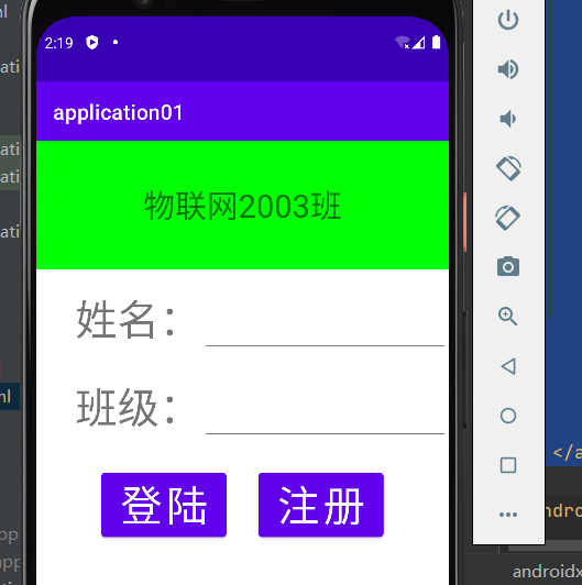
Let's analyze this code. Here, the small editor is also used to nest several layouts. The purpose is to let you review the previous knowledge. Ha, the paragraph below the green part is the above code. The large layout uses constraint layout, and the class and name nest linear layout. Here is a point gravity. This attribute means the direction of the content, And there is a layout_gravity means the location of the control to the layout.
In the linear layout, I also used a weight technique. Originally, I thought that when the mobile phone horizontal screen would not be disordered. As a result, I carefully designed it and found that the mobile phone horizontal screen did not rotate. It may be that Xiaobian ignored some settings. Ha ha, it can be said that I didn't see the results of my own design, but it's still very similar in general. It's enough for you to understand the compact layout.

There is another attribute of horizontal and vertical tendency, but it is not used here, because the Xiaobian tried it, and the result seems not very satisfactory. If you are interested, you can try it, that is, layout constraint horizon SL_ Bias # and layout constraintvertical_ Bias , followed by a number of 0 ~ 1, which is used to represent the number of this row (column).
Why is constrained layout so popular? In fact, there are many functions. You can go back and have a try. You will find many interesting layout methods. That's it. Bye...
