introduce
The code and data are all free and put in my gitee warehouse https://gitee.com/yuanzhoulvpi/time_series. If you want to use it, you can download it directly from my warehouse. The jupyter notebook link corresponding to this article is: click [read the original text] at the end of the article
This paper is the following python and time series (opening) The second part introduces two important correlation coefficients of time series: acf and pacf in detail. This paper will focus on how to calculate and draw acf and pacf.
This is also the first article you have seen, which introduces in detail how to reproduce acf and pacf ~ in python
There are many contents in this article [rough statistics: all texts are close to 8000 words; the code is more than 300 lines].
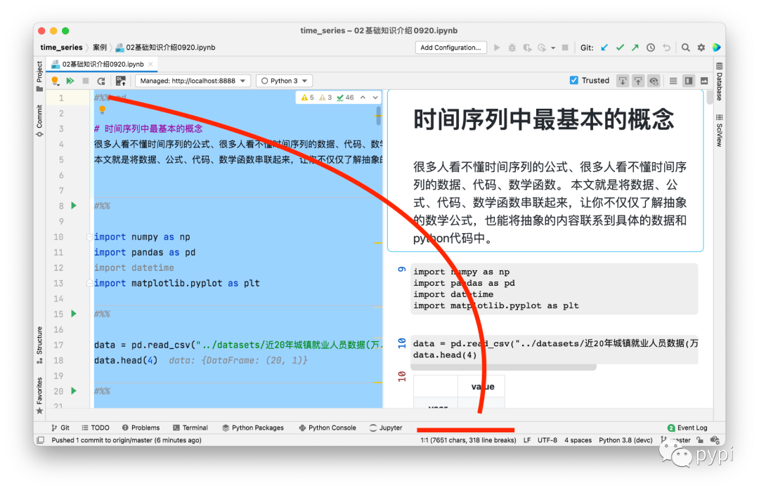
The specific Jupiter notebook structure is as follows:
-
The most basic concept in time series;
-
What is lag;
-
Time series formula;
-
Basic knowledge of statistics;
-
Autocorrelation coefficient (formula, reproduction, packet switching, visualization);
-
Partial autocorrelation coefficient (formula, reproduction, packaging, visualization);
1. The most basic concepts in time series
Many people can't understand the formula of time series, and many people can't understand the data, codes and mathematical functions of time series. This article is to connect data, formula, code and mathematical functions, so that you can not only understand the abstract mathematical formula, but also connect the abstract content to the specific data and Python code, and not just simply call the python package, but your own handwriting algorithm.
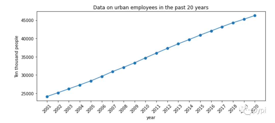
The following code is the data of urban employment in recent 20 years (10000 people), which is from the China Bureau of statistics.
import numpy as np
import pandas as pd
import datetime
import matplotlib.pyplot as plt

data = pd.read_csv("../datasets/Data of urban employment in recent 20 years(ten thousand people).csv", index_col=['year'])
data.head(4)

#  visualization
fig, ax = plt.subplots(figsize=(10, 4))
ax.plot(data.index, data['value'], 'o-')
ax.set_title(u"Data on urban employees in the past 20 years")
ax.set_ylabel("Ten thousand people")
ax.set_xlabel("year")
ax.set_xticks(data.index)
ax.set_xticklabels(data.index, rotation=45)
2. What is lag
Lag is often seen in time series. In colloquialism, lag is called lag; For example:
-
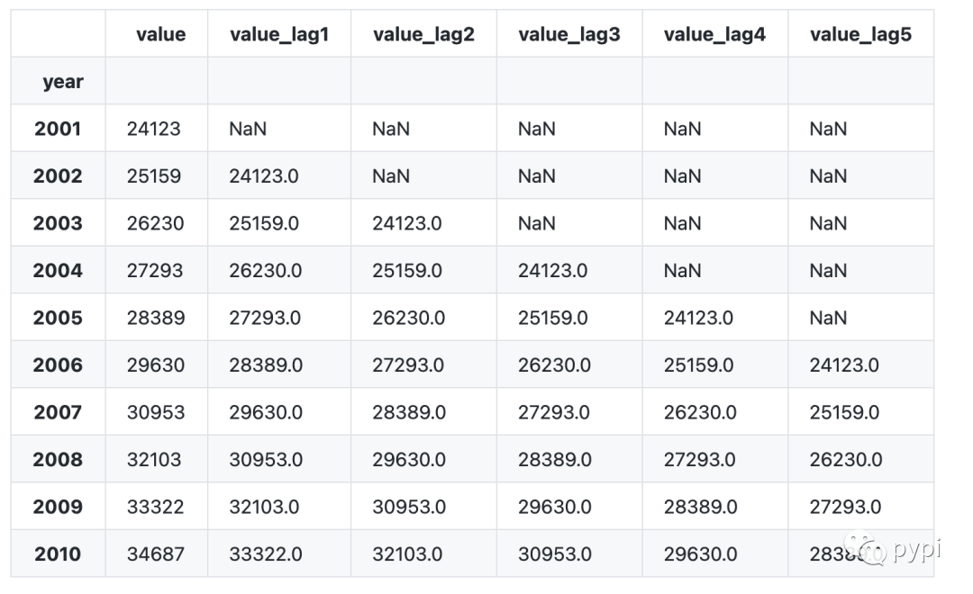
lag1 stands for one item of lag data, that is, the data in 2002 lags one year, and the data in 2001 is obtained; The data of 2003 is one year behind that of 2002;
-
lag2 represents two items of lagging data, that is, the data of 2003 lags behind two years to obtain the data of 2001; The data of 2004 lags behind 2 years, that is, the data of 2002;
-
By analogy, the lag data is calculated in this way.
Let's use python to lag the above data of [urban employment data in recent 20 years (10000 people)].
#  The shift of pandas can be used for lag
data1 = data.copy()
# data1['value_lag1'] = data1['value'].shift(1)
# data1['value_lag2'] =  data1['value'].shift(2)
for i in [1, 2, 3, 4, 5]:
    data1[f"value_lag{i}"] = data1['value'].shift(i)
data1.head(10)
Data interpretation:
-
Because there is no data before 2001, the data obtained by the lagging item in 2001 is null data;
-
Because there is no data before 2002, there is no data for the two items lagging behind in 2002.
-
And so on.
3. Time series formula
We often see that the formulas of time series are written in a mess. This is a pile of formulas, and that is a pile of formulas, which makes people dizzy. Now, to illustrate the need, we define several simple formulas:
Suppose our time series is value = [4,3,2,10,3]. We define this time series as ; Then the symbols corresponding to each element in the time series are,,, etc.
If lag1 is done, the time series obtained is value lag1=[nan, 4,3,2,10], and the new time series is recorded as.
If you do lag2, the time series obtained is value lag2=[nan,nan, 4,3,2], and record the new time series as.
By analogy, it is a simple time series formula.
4. Basic knowledge of Statistics
-
Mean value:
-
Variance:
-
Covariance:
-
Correlation coefficient:
5. Autocorrelation coefficient
5.1 autocorrelation basis calculation
After understanding the above [basic statistical knowledge], it is not difficult to understand autocorrelation. Autocorrelation is the correlation between variables and themselves under different time lags. For time series of delay order. The autocovariance is and the autocorrelation coefficient is
5.2 call package to calculate acf value
#  acf function using statsmodels package
from statsmodels.tsa.stattools import acf
5.3 write your own function according to the formula
def cal_acf(x, nlags):
    """
    Write your own according to the formula acf function
    It is only used to help understand. It is not recommended to use it in other environments
    """
    x = np.array(x)
    mean_x = np.mean(x)
    length_x = x.shape[0]
    c_0 = np.mean((x-mean_x) **2)
    c_k = np.sum((x[:(length_x-nlags)] - mean_x) * (x[nlags:] - mean_x)) / length_x
    r_k = c_k / c_0
    return r_k
5.4 comparison of two results
#  Results summary
pd.DataFrame({'index':np.arange(11),
             'value_by_myself':[cal_acf(x=data['value'], nlags=i) for i in range(11)],
             'value_by_statsmodels':acf(data.value,nlags=10)})
The results are as follows:

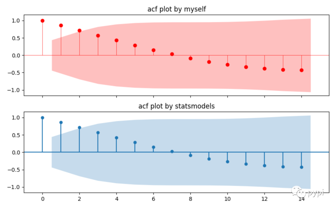
5.5 drawing of autocorrelation coefficient
There are two methods of drawing:
-
Use the plot of statsmodels directly_ acf;
-
Use acf function to calculate the value, and then visualize the value. This is generally convenient for customization and more detailed adjustment.
#  Draw one yourself
#  Calculate yourself
acf_value, acf_interval, _, _ = acf(data.value,nlags=14,qstat=True,alpha=0.05, fft=False)

xlabel = np.arange(start=0, stop=acf_value.shape[0], dtype='float')

fig, ax = plt.subplots(nrows=2, figsize=(10,6), sharex=True, dpi=100)
ax[0].hlines(y=0, xmin=np.min(xlabel)-2, xmax=np.max(xlabel)+2, colors='red', linewidth=0.5)
ax[0].scatter(x=xlabel, y=acf_value, c='red')
ax[0].vlines(x = xlabel, ymin=0, ymax=acf_value, colors='red', linewidth=0.5)
xlabel[1] -= 0.5
xlabel[-1] += 0.5
ax[0].fill_between(x=xlabel[1:], y1=acf_interval[1:,0] - acf_value[1:], y2=acf_interval[1:, 1]-acf_value[1:], alpha=0.25, linewidth=0, color='red')
ax[0].set_title("acf plot by myself")


#  Use functions written by others

from statsmodels.graphics.tsaplots import plot_acf
plot_acf(data['value'], ax=ax[1])
ax[1].set_title("acf plot by statsmodels")
ax[1].set_xlim(-1, np.max(xlabel)+1)
6. Partial autocorrelation coefficient
Partial autocorrelation coefficient can be regarded as a conditional correlation. The correlation between two variables is based on a series of other conditional variables. Imagine a question like this:
We have a Y variable, which is related to, and a variable. Then I want to know whether it is related to the. How should I calculate it?
Certainly, we should eliminate the influence of, on and on. Then the correlation between calculation and is:
So for a time series, Partial autocorrelation coefficient between and: Based on ,,,…… yes And the impact of calculation Correlation coefficient between and.
6.1 calculation formula of partial autocorrelation:
-
When h=1, what we consider is The partial autocorrelation coefficient between and. At this time, there is no other conditional sequence in the middle, so the partial autocorrelation coefficient is equal to the autocorrelation coefficient.
-
When h=2, what we consider is The partial autocorrelation coefficient between and. At this time, the intermediate condition sequence is, so the partial autocorrelation coefficient is:
.
-
When h=3, what we consider is The partial autocorrelation coefficient between and. At this time, the intermediate condition sequence is,, so the partial autocorrelation coefficient is:
.
-
And so on.
6.2 partial autocorrelation calculation:
-
Use the pacf function of statsmodels, which can select different calculation methods, including ols method and Yule Walker method.
-
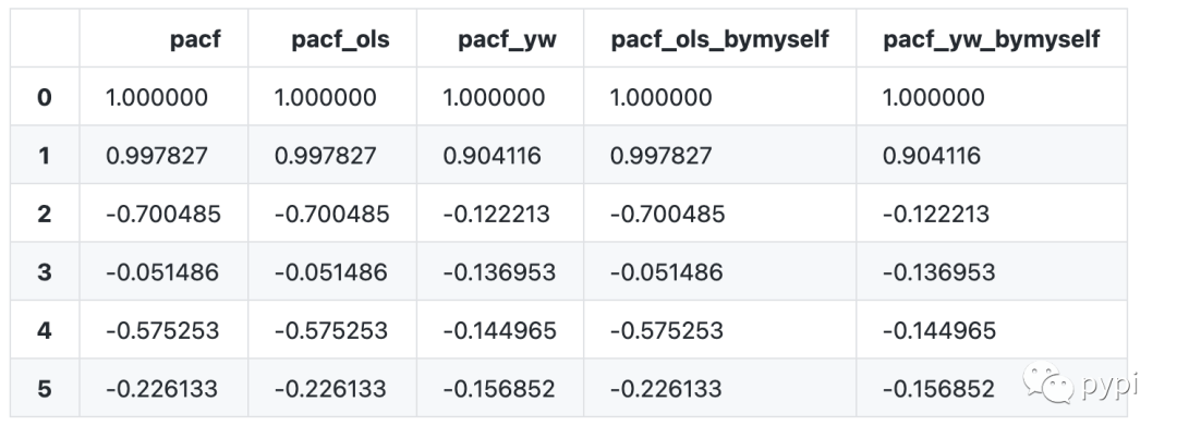
In addition to the package called by method 1, we can also use formula method, ols method and Yule Walker method to calculate the coefficient of pacf. The results calculated as like as two peas are identical to those calculated by pacf's function of statsmodels.
In the following code block, we use PACF and PACF in the stats models package_ ols,pacf_yw function calculates the partial autocorrelation coefficient. In addition, we calculate the partial autocorrelation coefficient by OLS theory and Yule Walker theory.
#  Use the pacf function of the statsmodels package
from statsmodels.tsa.stattools import pacf,pacf_ols,pacf_yw


#  The function of solving pacf with ols is implemented by myself
from numpy.dual import lstsq
from statsmodels.tools import add_constant
from statsmodels.tsa.tsatools import lagmat

def cal_my_pacf_ols(x, nlags=5):
    """
    Self realization pacf,The principle uses ols(least square method)
    :param x:
    :param nlags:
    :return:
    """
    pacf = np.empty(nlags+1) * 0
    pacf[0] = 1.0

    xlags, x0 = lagmat(x, nlags, original="sep")
    xlags = add_constant(xlags)

    for k in range(1, nlags+1):
        params = lstsq(xlags[k:, :(k+1)], x0[k:], rcond=None)[0]
        pacf[k] = params[-1]

    return pacf


def cal_my_yule_walker(x, nlags=5):
    """
    Self realization yule_walker theory
    :param x:
    :param nlags:
    :return:
    """
    x = np.array(x, dtype=np.float64)
    x -= x.mean()
    n = x.shape[0]

    r = np.zeros(shape=nlags+1, dtype=np.float64)
    r[0] = (x ** 2).sum()/n

    for k in range(1, nlags+1):
        r[k] = (x[0:-k] * x[k:]).sum() / (n-k*1)

    from scipy.linalg import toeplitz
    R = toeplitz(c=r[:-1])
    result = np.linalg.solve(R, r[1:])
    return result

def cal_my_pacf_yw(x, nlags=5):
    """
    Pass by yourself yule_walker Method pacf Value of
    :param x:
    :param nlags:
    :return:
    """
    pacf = np.empty(nlags+1) * 0
    pacf[0] = 1.0
    for k in range(1, nlags+1):
        pacf[k] = cal_my_yule_walker(x,nlags=k)[-1]

    return pacf

cal_my_pacf_yw(x=data.values)

#  Comparison of results

pd.DataFrame({'pacf':pacf(data.value,nlags=5, method='ols'),
              'pacf_ols':pacf_ols(data.value,nlags=5),
              'pacf_yw':pacf_yw(data.value,nlags=5),
              'pacf_ols_bymyself':cal_my_pacf_ols(x=data.values),
              'pacf_yw_bymyself':cal_my_pacf_yw(x=data.values)})
Effect comparison:
6.3 drawing of partial autocorrelation coefficient
There are two methods of drawing:
-
Use the plot of statsmodels directly_ pacf;
-
The pacf function is used to calculate the data and then visualize the data. This is generally convenient for customization and more detailed adjustment.
#%%
sunspotarea = pd.read_csv("../datasets/sunspotarea.csv",parse_dates=['date'])


#  Draw one yourself
#  Calculate yourself
pacf_value, pacf_interval = pacf(sunspotarea.value,nlags=15,alpha=0.05)

xlabel = np.arange(start=0, stop=pacf_value.shape[0], dtype='float')

fig, ax = plt.subplots(nrows=2, figsize=(10,6), sharex=True, dpi=100)
ax[0].hlines(y=0, xmin=np.min(xlabel)-2, xmax=np.max(xlabel)+2, colors='red', linewidth=0.5)
ax[0].scatter(x=xlabel, y=pacf_value, c='red')
ax[0].vlines(x = xlabel, ymin=0, ymax=pacf_value, colors='red', linewidth=0.5)
xlabel[1] -= 0.5
xlabel[-1] += 0.5
ax[0].fill_between(x=xlabel[1:], y1=pacf_interval[1:,0] - pacf_value[1:], y2=pacf_interval[1:, 1]-pacf_value[1:], alpha=0.25, linewidth=0, color='red')
ax[0].set_title("pacf plot by myself")


#  Use functions written by others


from statsmodels.graphics.tsaplots import plot_pacf
plot_pacf(sunspotarea.value, ax=ax[1], lags=15)
ax[1].set_title("pacf plot by statsmodels")
ax[1].set_xlim(-1, np.max(xlabel)+1)

Write later
-
This paper mainly emphasizes how to reproduce acf and pacf calculation and visualization of handwritten code. I suggest you take a look at the code of Yule Walker method to calculate pacf.
-
A tutorial will follow to introduce the meaning, recurrence and code of Yule Walker equation.
-
The reason why this period is so many days apart is that it is stuck when calculating pacf. After reading a lot of materials, I finally understood the principle and reproduced the code.
-
I wish you a happy National Day ~
Read more
python and time series (opening)
python and time series - basic case tutorial 1 (14700 words, 19 figures, 37 minutes for reading)