[responsive layout of mobile Web development] front end notes (20)
This study note is a personal summary of teacher Pink's course. Please indicate the source for reprint!
1, Responsive development
1.1 principles of responsive development
Media query is used to set the layout and style of devices with different widths, so as to adapt to different devices.
| Equipment division | Dimension interval |
|---|---|
| Ultra small screen (mobile phone) | < 768px |
| Small screen device (flat panel) | >= 768px ~ < 992px |
| Medium screen (desktop display) | >= 992px ~ < 1200px |
| Widescreen settings (large desktop display) | >= 1200px |
1.2 responsive layout container
The response requires a parent as the layout container to match the child elements to achieve the change effect.
The principle is to change the size of the layout container through media query on different screens, and then change the arrangement and size of sub elements inside, so as to see different page layout and style changes on different screens.
[our usual responsive size division]
- Ultra small screen (mobile phone, less than 768px): set the width to 100%
- Small screen (flat panel, 768px or more): set the width to 750px
- Medium screen (desktop display, greater than or equal to 992px): the width is set to 970px
- Large screen (large desktop display, greater than or equal to 1200px): the width is set to 1170px
However, we can also define the division according to the actual situation.
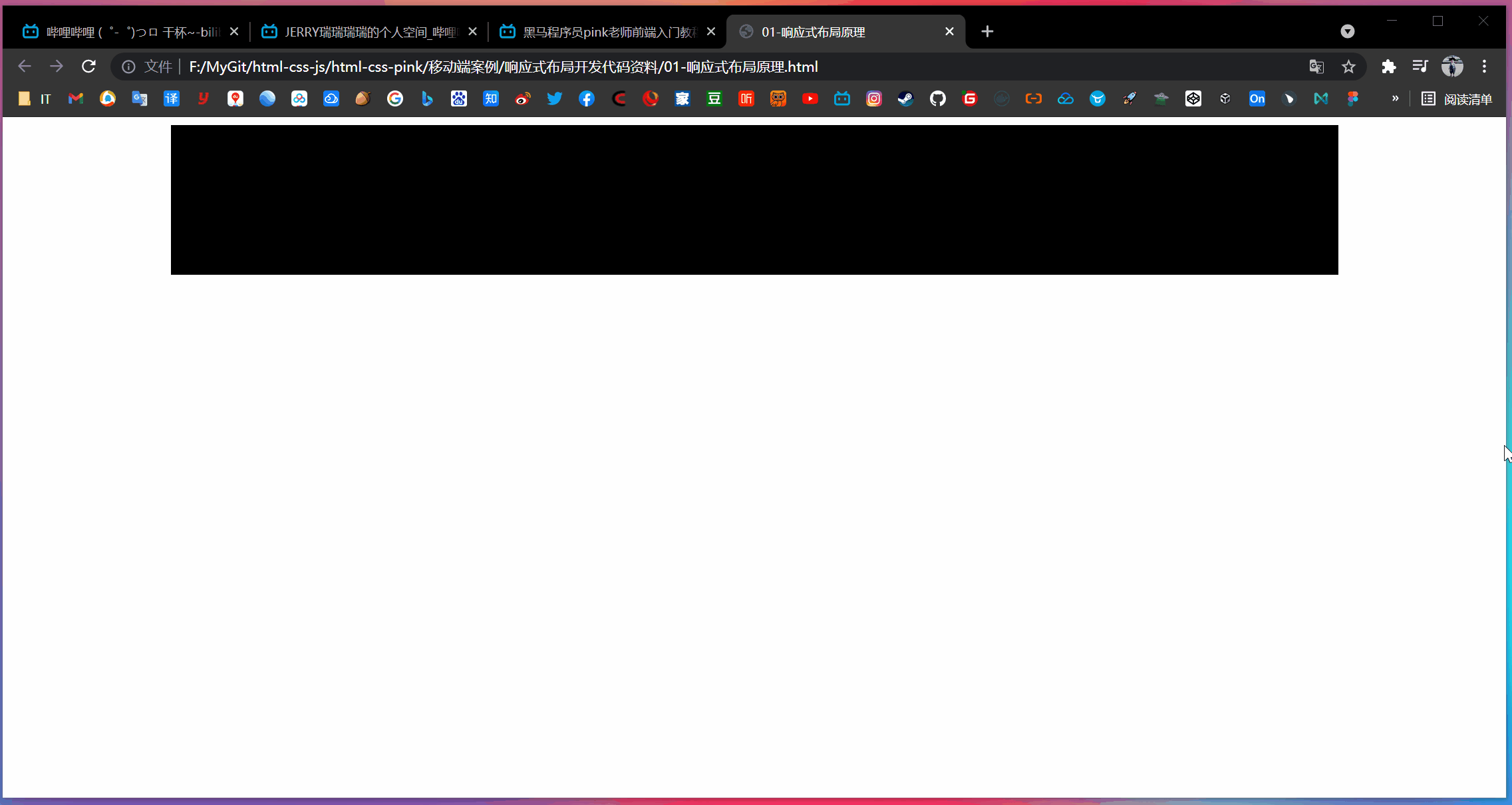
[case]
<!DOCTYPE html>
<html lang="en">

<head>
    <meta charset="UTF-8">
    <meta name="viewport" content="width=device-width, initial-scale=1.0">
    <meta http-equiv="X-UA-Compatible" content="ie=edge">
    <title>01-Responsive layout principle</title>
    <style>
        .container {
            height: 150px;
            background-color: black;
            margin: 0 auto;
        }

        /* 1. The width of containers with a layout smaller than 768 under the ultra small screen is 100% */

        @media screen and (max-width: 767px) {
            .container {
                width: 100%;
            }
        }

        /* 2. Under the small screen, the layout container greater than or equal to 768px is changed to 750px */

        @media screen and (min-width: 768px) {
            .container {
                width: 750px;
            }
        }

        /* 3. In the medium screen, the layout container greater than or equal to 992px is modified to 970px */

        @media screen and (min-width: 992px) {
            .container {
                width: 970px;
            }
        }

        /* 4. The layout container greater than or equal to 1200px on the large screen is modified to 1170 */

        @media screen and (min-width: 1200px) {
            .container {
                width: 1170px;
            }
        }
    </style>
</head>

<body>
    <!-- In reactive development, you first need a layout container -->
    <div class="container"></div>
</body>

</html>
- design sketch
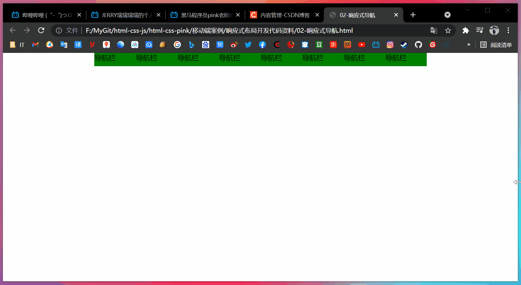
[case: responsive navigation]
- requirement analysis
- When the screen is larger than or equal to 800 pixels, we give the nav a width of 800px. Because the inner sub box needs to float, the nav needs to clear the float
- The nav contains 8 small li boxes. The width of each box is 100px and the height is 30px. It is displayed in a floating line
- When we zoom the screen and the width is less than 800 pixels, the nav box width is changed to 100% width
- The width of 8 small li's in nav is changed to 33.33%, so that only 3 small li's can be displayed in one line, and the rest are displayed in the lower line
<!DOCTYPE html>
<html lang="en">

<head>
    <meta charset="UTF-8">
    <meta name="viewport" content="width=device-width, initial-scale=1.0">
    <meta http-equiv="X-UA-Compatible" content="ie=edge">
    <title>02-Responsive navigation</title>
    <style>
        * {
            margin: 0;
            padding: 0;
        }

        ul {
            list-style: none;
        }

        .container {
            width: 750px;
            margin: 0 auto;
        }

        .container ul li {
            float: left;
            width: 93.75px;
            height: 30px;
            background-color: green;
        }

        @media screen and (max-width: 767px) {
            .container {
                width: 100%;
            }

            .container ul li {
                width: 33.33%;
            }
        }
    </style>
</head>

<body>
    <div class="container">
        <ul>
            <li>navigation bar</li>
            <li>navigation bar</li>
            <li>navigation bar</li>
            <li>navigation bar</li>
            <li>navigation bar</li>
            <li>navigation bar</li>
            <li>navigation bar</li>
            <li>navigation bar</li>
        </ul>
    </div>
</body>

</html>
2, Bootstrap front end development framework
2.1 Bootstrap introduction
Bootstrap comes from Twitter and is currently the most popular front-end framework.
Bootstrap is based on HTML, CSS and JavaScript. It is concise and flexible, making Web development faster.
- Chinese official website: http://www.bootcss.com/
- Official website: https://getbootstrap.com/
Framework: as the name suggests, it is a set of architecture. It has a relatively complete web page function solution, and the control is in the framework itself, including prefabricated style libraries, components and plug-ins. Users should develop according to some rules specified in the framework.
(1) Advantages
- Standardized html + css coding specification
- It provides a set of simple, intuitive and powerful components
- It has its own ecosystem and is constantly updated and iterated
- It makes the development easier and improves the efficiency of development
(2) Version
- 2.x.x: the maintenance is stopped, the compatibility is good, the code is not concise enough, and the function is not perfect enough
- 3.x.x: it is currently used most and stable, but IE6-IE7 is abandoned. It supports IE8, but the interface effect is not good. It is used to develop Web projects with responsive layout and mobile device priority
- 4.x.x: the latest version, which is not very popular at present
The following is based on 3 x.x
2.2 Bootstrap usage
At this stage, we haven't touched on JavaScript related courses, so we only consider using its CSS style library.
The control is in the framework itself, and users should develop according to some specifications specified in the framework.
Bootstrap uses four steps:
- Create folder structure
- Create html skeleton structure
- Import related style files
- Writing content
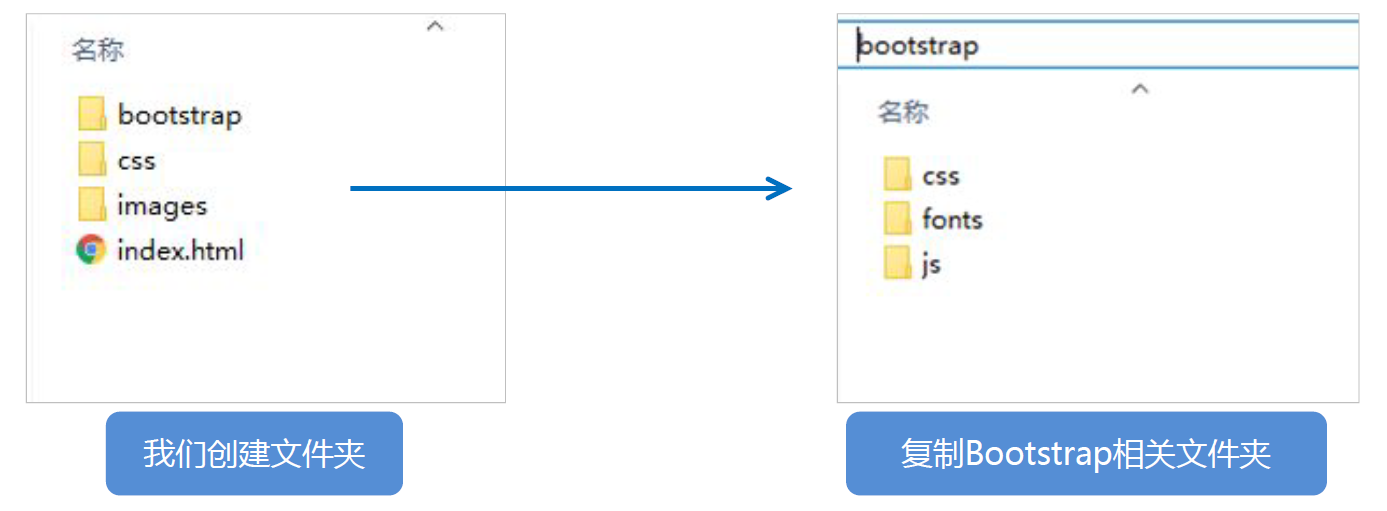
(1) Create folder structure
(2) Create html skeleton structure
<!-- Require the current page to use IE The browser uses the highest version of the kernel to render -->
<meta http-equiv="X-UA-Compatible" content="IE=edge">
<!-- Viewport settings: the width of the viewport is consistent with the equipment, and the default zoom scale is and PC The end is consistent, and the user cannot scale by himself -->
<meta name="viewport" content="width=device-width, initial-scale=1, user-scalable=0">
<!--[if lt IE 9]>
<!-- solve ie9 The following browser pairs html5 The new label is not recognized and causes CSS Problems that don't work -->
<script src="https://oss.maxcdn.com/html5shiv/3.7.2/html5shiv.min.js"></script>
<!-- solve ie9 The following browser pairs css3 Media Query Unrecognized -->
<script src="https://oss.maxcdn.com/respond/1.4.2/respond.min.js"></script>
<![endif]-->
Note: <-- [if LT ie 9] > and <! [ENDIF] -- >: comment and judge for HTML conditions, and execute when the conditions are met.
(3) Import related style files
<!-- Bootstrap Core style-->
<link rel="stylesheet" href="bootstrap/css/bootstrap.min.css">
(4) Writing content
- Copy the predefined style of Bootstrap to use
- Modify the original Bootstrap style and pay attention to the weight
- The key to learning Bootstrap well is to know what styles it defines and what effects these styles can achieve
[case]
- Project structure
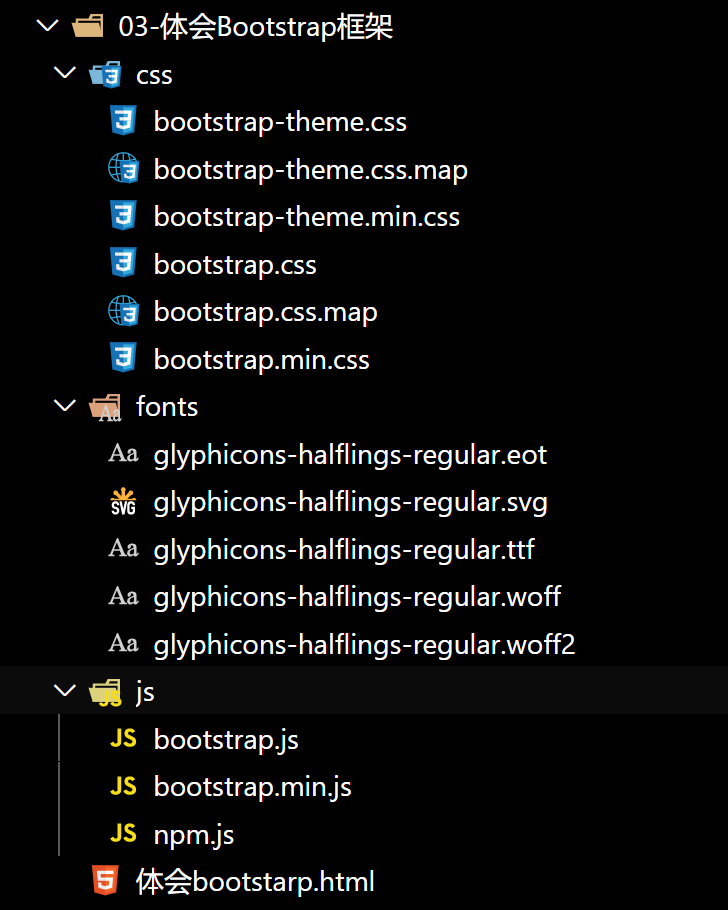
Note: normalize is used by default in Bootstrap CSS initializes the stylesheet, so we don't need to introduce it again.
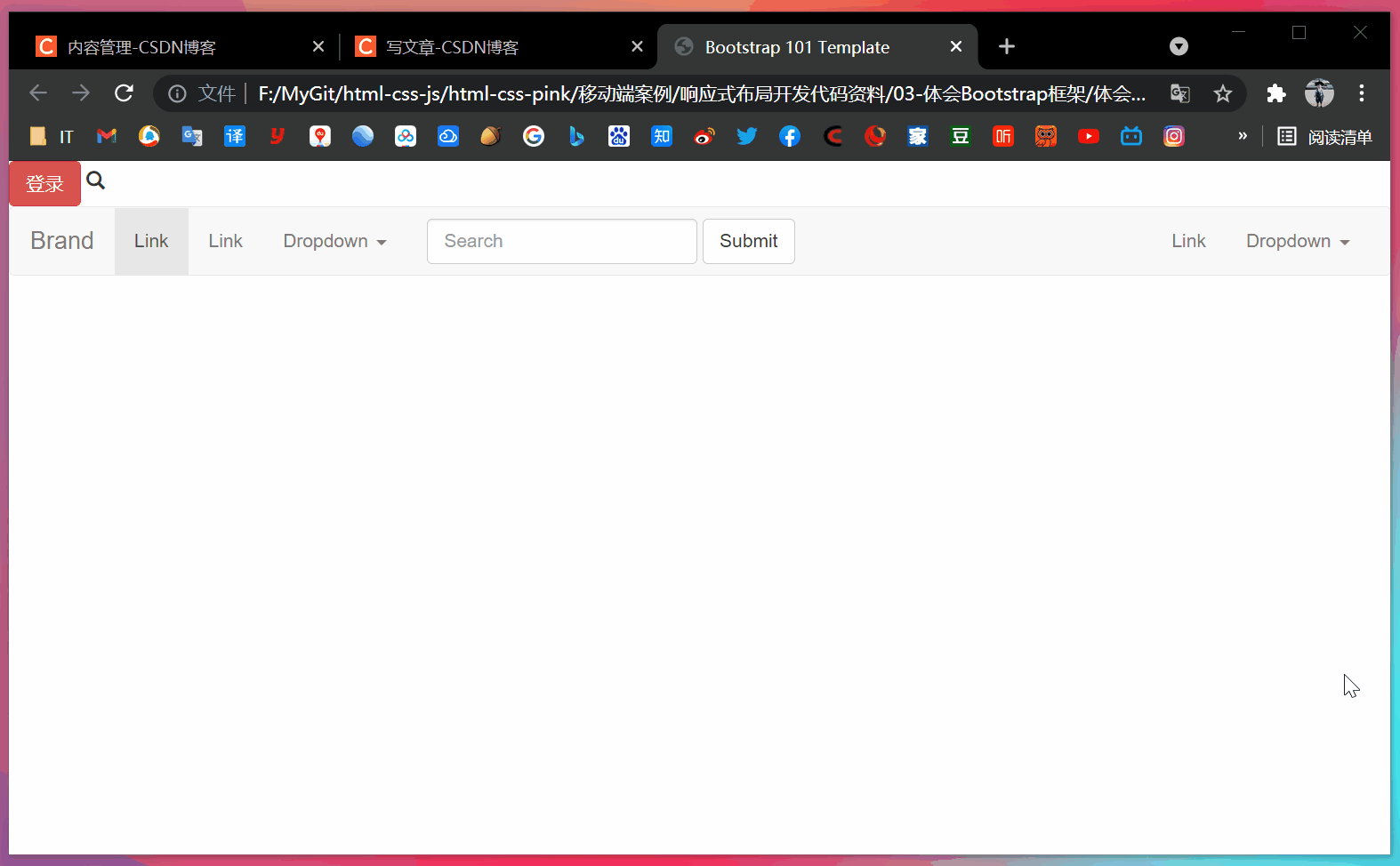
- Experience bootstrap html
<!DOCTYPE html>
<html lang="en">

<head>
    <meta charset="utf-8">
    <meta http-equiv="X-UA-Compatible" content="IE=edge">
    <meta name="viewport" content="width=device-width, initial-scale=1">
    <title>Bootstrap 101 Template</title>
    <link rel="stylesheet" href="css/bootstrap.min.css">

</head>

<body>
    <button type="button" class="btn btn-danger">Sign in</button>
    <span class="glyphicon glyphicon-search"></span>
    <nav class="navbar navbar-default">
        <div class="container-fluid">
            <!-- Brand and toggle get grouped for better mobile display -->
            <div class="navbar-header">
                <button type="button" class="navbar-toggle collapsed" data-toggle="collapse"
                    data-target="#bs-example-navbar-collapse-1">
                    <span class="sr-only">Toggle navigation</span>
                    <span class="icon-bar"></span>
                    <span class="icon-bar"></span>
                    <span class="icon-bar"></span>
                </button>
                <a class="navbar-brand" href="#">Brand</a>
            </div>

            <!-- Collect the nav links, forms, and other content for toggling -->
            <div class="collapse navbar-collapse" id="bs-example-navbar-collapse-1">
                <ul class="nav navbar-nav">
                    <li class="active"><a href="#">Link <span class="sr-only">(current)</span></a></li>
                    <li><a href="#">Link</a></li>
                    <li class="dropdown">
                        <a href="#" class="dropdown-toggle" data-toggle="dropdown" role="button"
                            aria-expanded="false">Dropdown <span class="caret"></span></a>
                        <ul class="dropdown-menu" role="menu">
                            <li><a href="#">Action</a></li>
                            <li><a href="#">Another action</a></li>
                            <li><a href="#">Something else here</a></li>
                            <li class="divider"></li>
                            <li><a href="#">Separated link</a></li>
                            <li class="divider"></li>
                            <li><a href="#">One more separated link</a></li>
                        </ul>
                    </li>
                </ul>
                <form class="navbar-form navbar-left" role="search">
                    <div class="form-group">
                        <input type="text" class="form-control" placeholder="Search">
                    </div>
                    <button type="submit" class="btn btn-default">Submit</button>
                </form>
                <ul class="nav navbar-nav navbar-right">
                    <li><a href="#">Link</a></li>
                    <li class="dropdown">
                        <a href="#" class="dropdown-toggle" data-toggle="dropdown" role="button"
                            aria-expanded="false">Dropdown <span class="caret"></span></a>
                        <ul class="dropdown-menu" role="menu">
                            <li><a href="#">Action</a></li>
                            <li><a href="#">Another action</a></li>
                            <li><a href="#">Something else here</a></li>
                            <li class="divider"></li>
                            <li><a href="#">Separated link</a></li>
                        </ul>
                    </li>
                </ul>
            </div>
            <!-- /.navbar-collapse -->
        </div>
        <!-- /.container-fluid -->
    </nav>
</body>

</html>
- design sketch
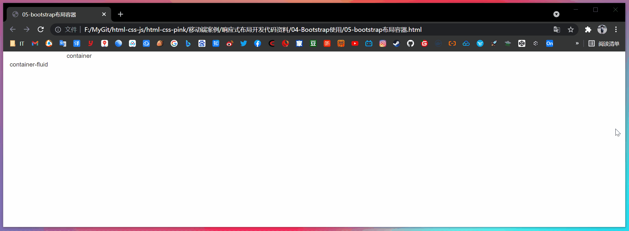
2.3 container layout
Bootstrap needs to wrap a for page content and grid system container, which provides two classes for this purpose.
- container class
- Responsive layout container fixed width
- The width of large screen (> = 1200px) is 1170px
- The width of the middle screen (> = 992px) is set to 970px
- The width of small screen (> = 768px) is set to 750px
- Ultra small screen (100%)
- Container fluid class
- Flow layout container, 100% width
- A container that occupies all viewport s
[case]
<!DOCTYPE html>
<html lang="en">

<head>
  <meta charset="UTF-8">
  <meta name="viewport" content="width=device-width, initial-scale=1.0">
  <meta http-equiv="X-UA-Compatible" content="ie=edge">
  <!--[if lt IE 9]>
      <script src="https://oss.maxcdn.com/html5shiv/3.7.2/html5shiv.min.js"></script>
      <script src="https://oss.maxcdn.com/respond/1.4.2/respond.min.js"></script>
  <![endif]-->
  <!-- Do not forget to introduce bootstrap Style file for -->
  <link rel="stylesheet" href="bootstrap/css/bootstrap.min.css">
  <title>05-bootstrap Layout container</title>
</head>

<body>
  <div class="container">container</div>
  <div class="container-fluid">container-fluid</div>
</body>

</html>
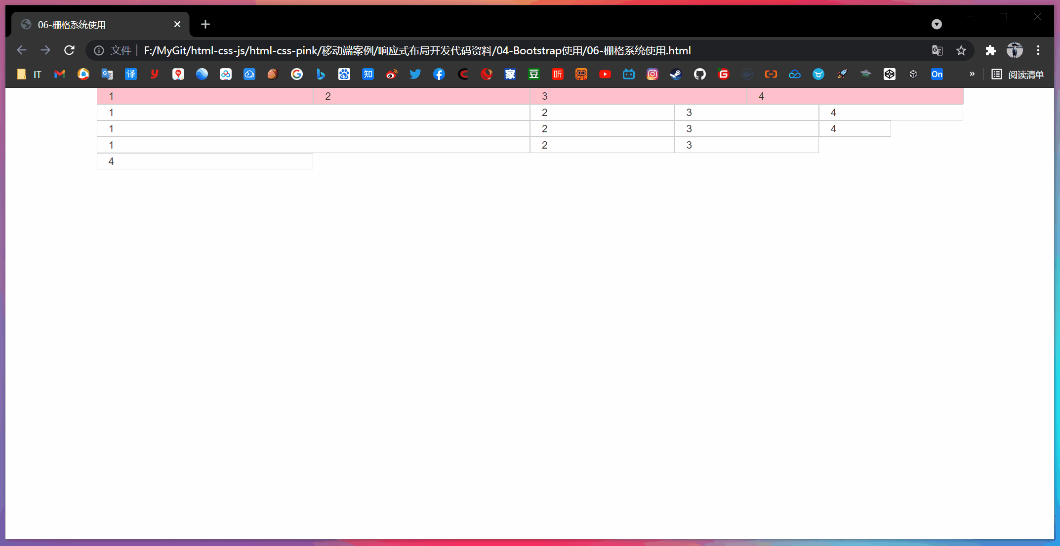
3, Bootstrap grid system
3.1 introduction to grid system
Grid systems, also translated as "grid systems", refers to dividing the page layout into equal width columns, and then modularizing the page layout through the definition of the number of columns.
Bootstrap provides a responsive, mobile device first streaming grid system. With the increase of screen or viewport size, the system will be automatically divided into up to 12 columns.
3.2 grid option parameters
The grid system is used to create a page layout by combining a series of row s and column s, and your content can be put into these created layouts.
| Ultra small screen (mobile phone) < 768px | Small screen device (tablet) > = 768px | Medium screen (desktop display) > = 992px | Widescreen device (large desktop display) > = 1200px | |
|---|---|---|---|---|
| . container maximum width | Automatic (100%) | 750px | 970px | 1170px |
| Class prefix | .col-xs- | .col-sm- | .col-md- | .col-lg- |
| Number of column s | 12 | 12 | 12 | 12 |
- It is divided into 1 ~ 12 equal parts according to different screens
- row removes the default 15px inner margin of the parent container
- XS extra small: ultra small; Small: small; MD medium: medium; LG large: large;
- If the column is greater than 12, the elements of the redundant "column" will be arranged in another row as a whole
- Each column has left and right 15 pixel padding by default
- You can specify the class names of multiple devices for a column at the same time to divide different copies under different window sizes, for example: class="col-md-4 col-sm-6"
- When only one class prefix is specified, the width greater than the class prefix conforms to the number of copies specified by the class prefix by default, and the width less than the class prefix accounts for 12 copies per element by default
[case: use of grid system]
<!DOCTYPE html>
<html lang="en">

<head>
    <meta charset="UTF-8">
    <meta name="viewport" content="width=device-width, initial-scale=1.0">
    <meta http-equiv="X-UA-Compatible" content="ie=edge">
    <!--[if lt IE 9]>
      <script src="https://oss.maxcdn.com/html5shiv/3.7.2/html5shiv.min.js"></script>
      <script src="https://oss.maxcdn.com/respond/1.4.2/respond.min.js"></script>
    <![endif]-->
    <!-- Do not forget to introduce bootstrap Style file for -->
    <link rel="stylesheet" href="bootstrap/css/bootstrap.min.css">
    <title>06-Grid system usage</title>
    <!-- modify Bootstrap The original style, due to the weight problem, is placed in link after -->
    <style>
        [class^="col"] {
            border: 1px solid #ccc;
        }

        .row:nth-child(1) {
            background-color: pink;
        }
    </style>
</head>

<body>
    <div class="container">
        <div class="row">
            <div class="col-lg-3 col-md-4 col-sm-6 col-xs-12">1</div>
            <div class="col-lg-3 col-md-4 col-sm-6 col-xs-12">2</div>
            <div class="col-lg-3 col-md-4 col-sm-6 col-xs-12">3</div>
            <div class="col-lg-3 col-md-4 col-sm-6 col-xs-12">4</div>
        </div>

        <!-- If the child's shares add up to 12, the child can occupy the whole container Width of -->
        <div class="row">
            <!-- When only one class prefix is specified, the width greater than the class prefix conforms to the number of copies specified by the class prefix by default, and the width less than the class prefix accounts for 12 copies per element by default -->
            <div class="col-lg-6">1</div>
            <div class="col-lg-2">2</div>
            <div class="col-lg-2">3</div>
            <div class="col-lg-2">4</div>
        </div>

        <!-- What happens if the child's shares add up to less than 12? It accounts for the whole container The width of the will be blank -->
        <div class="row">
            <div class="col-lg-6">1</div>
            <div class="col-lg-2">2</div>
            <div class="col-lg-2">3</div>
            <div class="col-lg-1">4</div>
        </div>

        <!-- What happens if the child's shares add up to more than 12? More than one column will be displayed in another row -->
        <div class="row">
            <div class="col-lg-6">1</div>
            <div class="col-lg-2">2</div>
            <div class="col-lg-2">3</div>
            <div class="col-lg-3">4</div>
        </div>
    </div>
</body>

</html>
3.3 column nesting
The built-in grid system of the grid system nests the content again. A simple understanding is that a column is divided into several small columns. We can add a new one The row element and a series Col SM - * element to an existing Col SM - * element.

<!-- Column nesting -->
<div class="col-sm-4">
	<div class="row">
		<div class="col-sm-6">Small column</div>
		<div class="col-sm-6">Small column</div>
	</div>
</div>
[case: column nesting]
<!DOCTYPE html>
<html lang="en">

<head>
    <meta charset="UTF-8">
    <meta name="viewport" content="width=device-width, initial-scale=1.0">
    <meta http-equiv="X-UA-Compatible" content="ie=edge">
    <!--[if lt IE 9]>
      <script src="https://oss.maxcdn.com/html5shiv/3.7.2/html5shiv.min.js"></script>
      <script src="https://oss.maxcdn.com/respond/1.4.2/respond.min.js"></script>
    <![endif]-->
    <!-- Do not forget to introduce bootstrap Style file for -->
    <link rel="stylesheet" href="bootstrap/css/bootstrap.min.css">
    <title>07-Grid system column nesting</title>
    <style>
        .row>div {
            height: 50px;
            background-color: pink;
        }
    </style>
</head>

<body>
    <div class="container">
        <div class="row">
            <div class="col-md-4">
                <!-- We'd better add a row to the nested column row This cancels the parent element padding Value, and the height is automatically as high as the parent -->
                <div class="row">
                    <div class="col-md-4">a</div>
                    <div class="col-md-8">b</div>
                </div>
            </div>
            <div class="col-md-4">2</div>
            <div class="col-md-4">3</div>
        </div>
    </div>
</body>

</html>
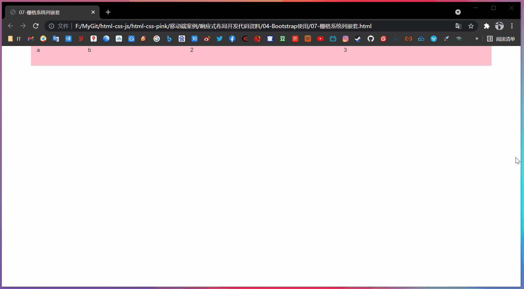
Note: b is covered by 2.
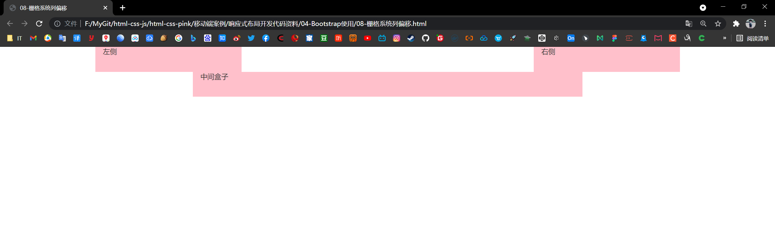
3.4 column offset
use. Col MD offset - * class can offset the column to the right.
These classes actually increase the left margin for the current element by using the * selector.

<!-- Column offset -->
<div class="row">
	<div class="col-lg-4">1</div>
	<div class="col-lg-4 col-lg-offset-4">2</div>
</div>
[case: column offset]
<!DOCTYPE html>
<html lang="en">

<head>
    <meta charset="UTF-8">
    <meta name="viewport" content="width=device-width, initial-scale=1.0">
    <meta http-equiv="X-UA-Compatible" content="ie=edge">
    <!--[if lt IE 9]>
      <script src="https://oss.maxcdn.com/html5shiv/3.7.2/html5shiv.min.js"></script>
      <script src="https://oss.maxcdn.com/respond/1.4.2/respond.min.js"></script>
    <![endif]-->
    <!-- Do not forget to introduce bootstrap Style file for -->
    <link rel="stylesheet" href="bootstrap/css/bootstrap.min.css">
    <title>08-Grid system column offset</title>
    <style>
        .row div {
            height: 50px;
            background-color: pink;
        }
    </style>
</head>

<body>
    <div class="container">
        <div class="row">
            <div class="col-md-3">left</div>
            <!-- The number of copies offset is 12 - Number of copies in two boxes = 6 -->
            <div class="col-md-3 col-md-offset-6">right</div>
        </div>
        <div class="row">
            <!-- If there is only one box, then offset = (12 - 8) / 2 -->
            <div class="col-md-8 col-md-offset-2">Middle box</div>
        </div>

    </div>
</body>

</html>
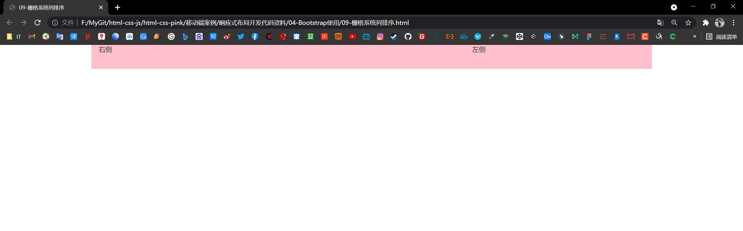
3.5 column sorting
By using Col MD push - * and The column MD pull - * class can easily change the order of columns.
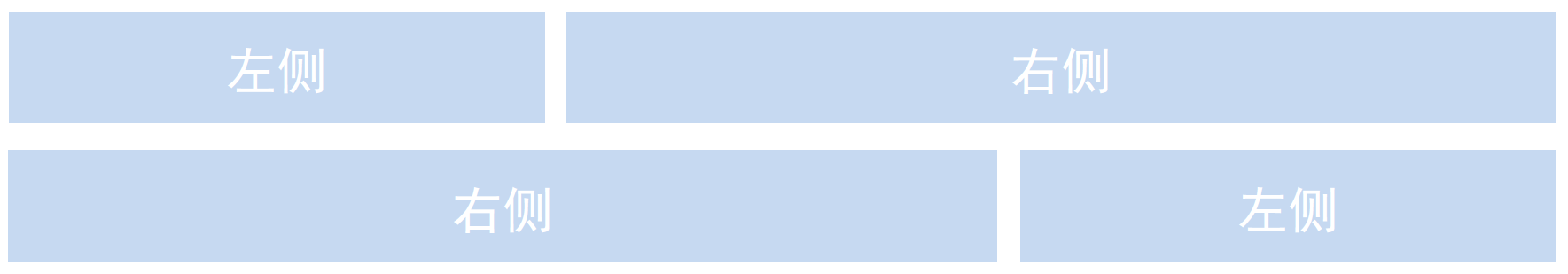
<!-- Column sorting -->
<div class="row">
	<div class="col-lg-4 col-lg-push-8">left</div>
	<div class="col-lg-8 col-lg-pull-4">right</div>
</div>
[case: column sorting]
<!DOCTYPE html>
<html lang="en">

<head>
    <meta charset="UTF-8">
    <meta name="viewport" content="width=device-width, initial-scale=1.0">
    <meta http-equiv="X-UA-Compatible" content="ie=edge">
    <!--[if lt IE 9]>
      <script src="https://oss.maxcdn.com/html5shiv/3.7.2/html5shiv.min.js"></script>
      <script src="https://oss.maxcdn.com/respond/1.4.2/respond.min.js"></script>
    <![endif]-->
    <!-- Do not forget to introduce bootstrap Style file for -->
    <link rel="stylesheet" href="bootstrap/css/bootstrap.min.css">
    <title>09-Grid system column sorting</title>
    <style>
        .row div {
            height: 50px;
            background-color: pink;
        }
    </style>
</head>

<body>
    <div class="container">
        <div class="row">
            <div class="col-md-4 col-md-push-8">left</div>
            <div class="col-md-8 col-md-pull-4">right</div>
        </div>
    </div>
</body>

</html>
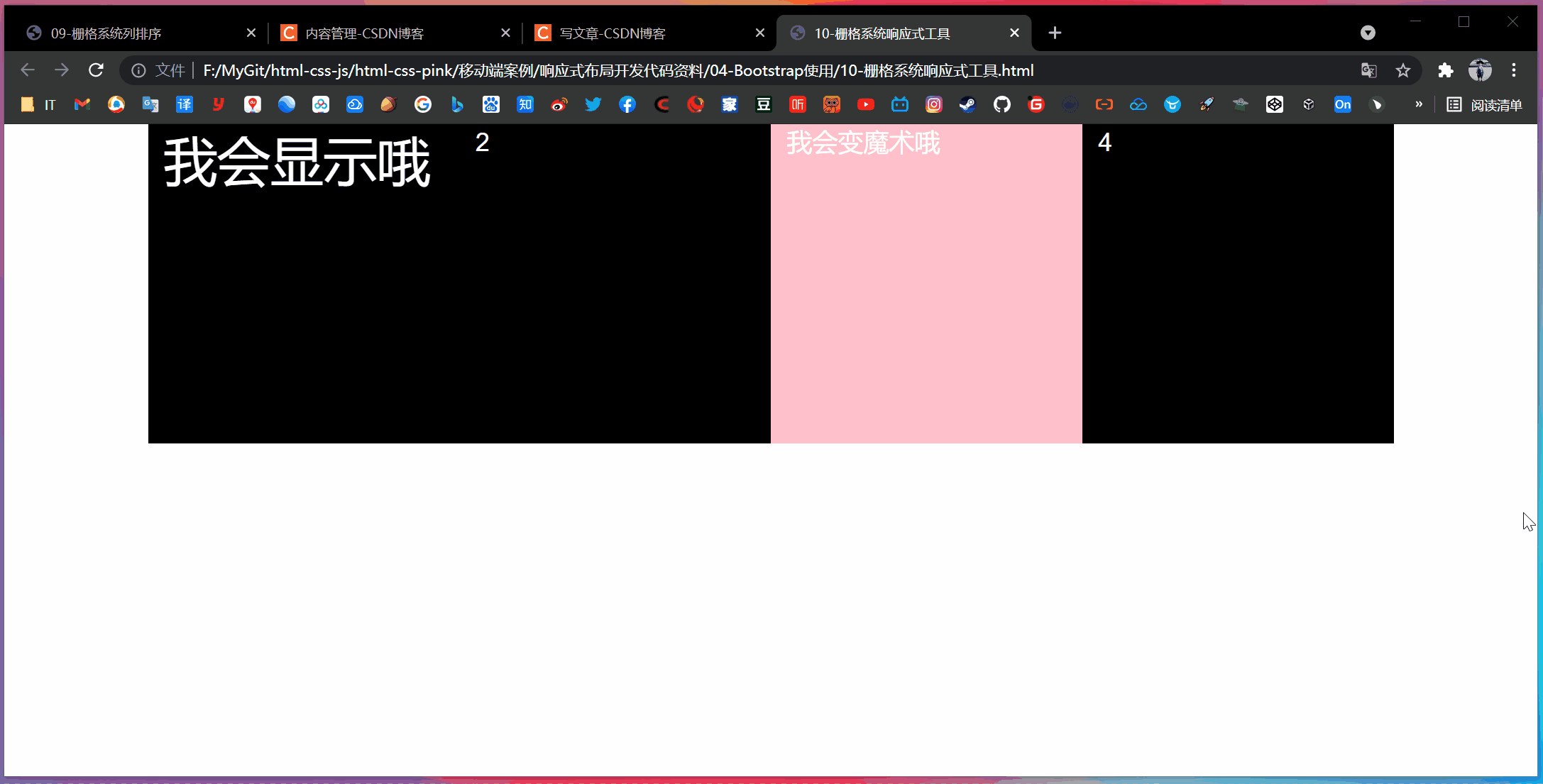
3.6 responsive tools
In order to speed up the development of mobile device friendly pages, we can easily display or hide page content for different devices by using media query function and these tools.
| Class name | Ultra small screen | Small screen | Middle screen | Large screen |
|---|---|---|---|---|
| .hidden-xs | hide | so | so | so |
| .hidden-sm | so | hide | so | so |
| .hidden-md | so | so | hide | so |
| .hidden-lg | so | so | so | hide |
For other Bootstrap (buttons, forms, tables), please refer to the Bootstrap documentation.
[case: responsive tools]
<!DOCTYPE html>
<html lang="en">

<head>
    <meta charset="UTF-8">
    <meta name="viewport" content="width=device-width, initial-scale=1.0">
    <meta http-equiv="X-UA-Compatible" content="ie=edge">
    <!--[if lt IE 9]>
      <script src="https://oss.maxcdn.com/html5shiv/3.7.2/html5shiv.min.js"></script>
      <script src="https://oss.maxcdn.com/respond/1.4.2/respond.min.js"></script>
    <![endif]-->
    <!-- Do not forget to introduce bootstrap Style file for -->
    <link rel="stylesheet" href="bootstrap/css/bootstrap.min.css">
    <title>10-Grid system responsive tools</title>
    <style>
        .row div {
            height: 300px;
            background-color: purple;

        }

        .row div:nth-child(3) {
            background-color: pink;
        }

        span {
            font-size: 50px;
            color: #fff;
        }
    </style>
</head>

<body>
    <div class="container">
        <div class="row">
            <div class="col-xs-3">
                <span class="visible-lg">I'll show you</span>
            </div>
            <div class="col-xs-3">2</div>
            <div class="col-xs-3 hidden-md hidden-xs">I can do magic</div>
            <div class="col-xs-3">4</div>
        </div>
    </div>
</body>

</html>
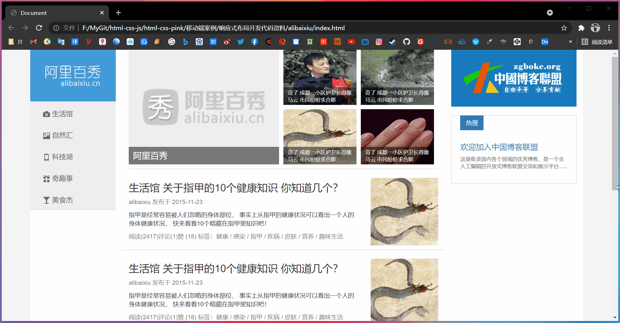
4, Alibaba Baixiu homepage case
[technology selection]
Scheme: adopt the responsive page development scheme
Technology: Bootstrap framework
Design drawing: This design drawing adopts 1280px design size
[page layout analysis]
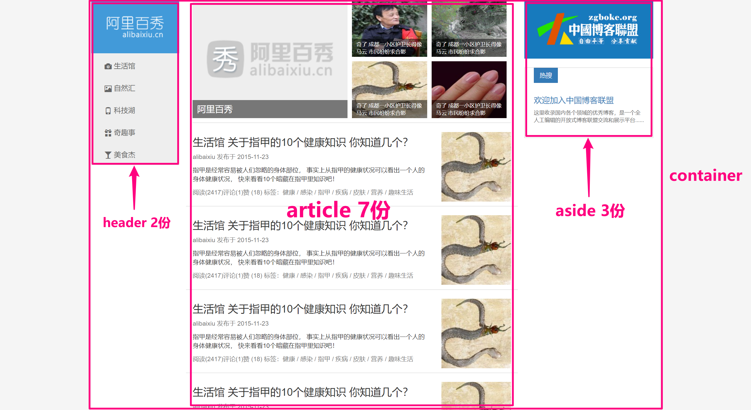
[screen division analysis]
- In screen zooming, the layout of the screen and the large screen are consistent. Therefore, we can define the column as col md -, and md is greater than or equal to 970
- The screen zooms and the layout of the small screen changes, so we need to change the layout for the small screen according to our needs
- The screen zooms and the ultra small screen layout changes again, so we need to change the layout according to the needs for the ultra small screen
- Strategy: we first layout the PC side layout above md, and finally modify the special style layout of small screen and ultra small screen according to the actual needs
[create folder structure]
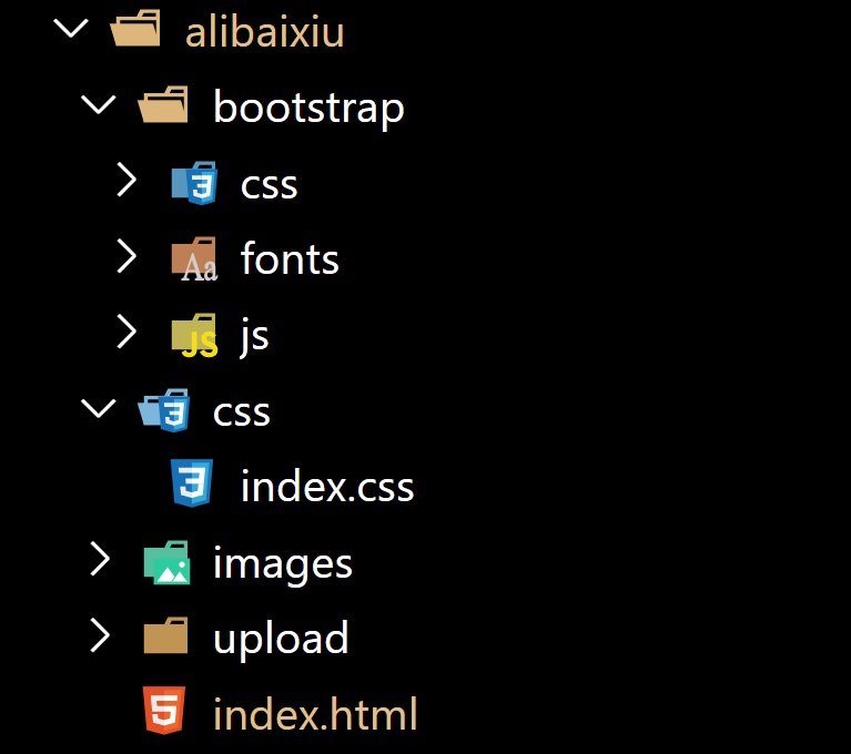
[modify container width]
Because the width of this rendering is 1280px, and the maximum width of the container in the Bootstrap is 1170px, we need to manually change the width of the container.
/* Use media query to modify the width of the container to fit the width of the renderings */
@media screen and (min-width: 1280px) {
    .container {
        width: 1280px;
    }
}
[case code]
- index.css
ul {
    list-style-type: none;
    margin: 0;
    padding: 0;
}

a {
    color: #666;
    text-decoration: none;
}

a:hover {
    text-decoration: none;
}

body {
    background-color: #f5f5f5;
}

.container {
    background-color: #fff;
}


/* Modify the maximum width of the container to 1280. Follow the design draft */

@media screen and (min-width: 1280px) {
    .container {
        width: 1280px;
    }
}


/* header */

header {
    padding-left: 0 !important;
}

.logo {
    background-color: #429ad9;
}

.logo img {
    display: block;
    /* width: 100%; */
    /* logo The picture does not need to be scaled */
    max-width: 100%;
    margin: 0 auto;
}


/* 1.If we enter the super small screen, the pictures in the logo will be hidden */


/* 2. We have prepared a box in the logo in advance. It is usually hidden and can only be displayed under the super small screen */

.logo span {
    display: block;
    height: 50px;
    line-height: 50px;
    color: #fff;
    font-size: 18px;
    text-align: center;
}

.nav {
    background-color: #eee;
    border-bottom: 1px solid #ccc;
}

.nav a {
    display: block;
    height: 50px;
    line-height: 50px;
    padding-left: 30px;
    font-size: 16px;
}

.nav a:hover {
    background-color: #fff;
    color: #333;
}

.nav a::before {
    vertical-align: middle;
    padding-right: 5px;
}


/* When we enter the small screen and super small screen, the li in our nav floats and the width is 20%  */

@media screen and (max-width: 991px) {
    .nav li {
        float: left;
        width: 20%;
    }

    article {
        margin-top: 10px;
    }
}


/* When we enter the ultra small screen, our nav text will become 14px  */

@media screen and (max-width: 767px) {
    .nav li a {
        font-size: 14px;
        padding-left: 3px;
    }

    /* When we are on the super small screen news, the width of the first li is 100%, and the remaining small li is 50% respectively */
    .news li:nth-child(1) {
        width: 100% !important;
    }

    .news li {
        width: 50% !important;
    }

    .publish h3 {
        font-size: 14px;
    }
}

.news li a {
    position: relative;
    display: block;
    width: 100%;
    height: 100%;
}

.news li {
    float: left;
    width: 25%;
    height: 128px;
    padding-right: 10px;
    margin-bottom: 10px;
}

.news li:nth-child(1) {
    width: 50%;
    height: 266px;
}

.news li:nth-child(1) p {
    line-height: 41px;
    font-size: 20px;
    padding: 0 10px;
}

.news li a img {
    width: 100%;
    height: 100%;
}

.news li a p {
    position: absolute;
    bottom: 0;
    left: 0;
    width: 100%;
    height: 41px;
    padding: 5px 10px;
    margin-bottom: 0;
    background: rgba(0, 0, 0, .5);
    font-size: 12px;
    color: #fff;
}

.publish {
    border-top: 1px solid #ccc;
}

.publish .row {
    border-bottom: 1px solid #ccc;
    padding: 10px 0;
}

.pic {
    margin-top: 10px;
}

.pic img {
    width: 100%;
}

.banner img {
    width: 100%;
}

.hot {
    display: block;
    margin-top: 20px;
    padding: 0 20px 20px;
    border: 1px solid #ccc;
}

.hot span {
    border-radius: 0;
    margin-bottom: 20px;
}

.hot p {
    font-size: 12px;
}
- index.html
<!DOCTYPE html>
<html lang="en">

<head>
    <meta charset="UTF-8">
    <meta name="viewport" content="width=device-width, initial-scale=1.0">
    <meta http-equiv="X-UA-Compatible" content="ie=edge">
    <!--[if lt IE 9]>
      <script src="https://oss.maxcdn.com/html5shiv/3.7.2/html5shiv.min.js"></script>
      <script src="https://oss.maxcdn.com/respond/1.4.2/respond.min.js"></script>
    <![endif]-->
    <!-- introduce bootstrap Style file -->
    <link rel="stylesheet" href="bootstrap/css/bootstrap.min.css">
    <!-- Introduce our own home page style file -->
    <link rel="stylesheet" href="css/index.css">
    <title>Document</title>
</head>

<body>
    <div class="container">
        <div class="row">
            <header class="col-md-2">
                <div class="logo">
                    <a href="#">
                        <img src="images/logo.png" alt="" class="hidden-xs">
                        <span class="visible-xs">Ali Baixiu</span>
                    </a>
                </div>
                <div class="nav">
                    <ul>
                        <li><a href="#"Class =" glyphicon camera "> life hall</a></li>
                        <li><a href="#"Class =" glyphicon glyphicon picture "> Natural sink</a></li>
                        <li><a href="#"Class =" glyphicon glyphicon phone "> technology Lake</a></li>
                        <li><a href="#"Class =" glyphicon glyphicon gift "> funny stories</a></li>
                        <li><a href="#"Class =" glyphicon glass "> gourmet hero</a></li>
                    </ul>
                </div>
            </header>
            <article class="col-md-7">
                <!-- Journalism -->
                <div class="news clearfix">
                    <ul>
                        <li>
                            <a href="#">
                                <img src="upload/lg.png" alt="">
                                <p>Ali Baixiu</p>
                            </a>
                        </li>
                        <li>
                            <a href="#">
                                <img src="upload/1.jpg" alt="">
                                <p>It's strange that the guard of a community in Chengdu looks like Ma Yun, and the citizens have asked for a group photo</p>
                            </a>
                        </li>

                        <li>
                            <a href="#">
                                <img src="upload/2.jpg" alt="">
                                <p>It's strange that the guard of a community in Chengdu looks like Ma Yun. The citizens are asking for a group photo</p>
                            </a>
                        </li>

                        <li>
                            <a href="#">
                                <img src="upload/3.jpg" alt="">
                                <p>It's strange that the guard of a community in Chengdu looks like Ma Yun. The citizens are asking for a group photo</p>
                            </a>
                        </li>

                        <li>
                            <a href="#">
                                <img src="upload/4.jpg" alt="">
                                <p>It's strange that the guard of a community in Chengdu looks like Ma Yun. The citizens are asking for a group photo</p>
                            </a>
                        </li>

                    </ul>
                </div>
                <!-- publish -->
                <div class="publish">
                    <div class="row">
                        <div class="col-sm-9">
                            <h3>How many of the 10 health knowledge about nails do you know?</h3>
                            <p class="text-muted hidden-xs">alibaixiu Published in 2015-11-23</p>
                            <p class="hidden-xs">Nails are often overlooked body parts. In fact, a person's health can be seen from the health status of nails. Let's take a look at 10 hidden knowledge in nails!</p>
                            <p class="text-muted">read(2417)comment(1)fabulous (18) <span class="hidden-xs">Label: Health / Infected / nail / disease / skin
                                    / Nutrition / Interesting life</span>

                            </p>
                        </div>
                        <div class="col-sm-3 pic hidden-xs">
                            <img src="upload/3.jpg" alt="">
                        </div>
                    </div>
                    <div class="row">
                        <div class="col-sm-9">
                            <h3>How many do you know about the 10 health knowledge of nails in life hall?</h3>
                            <p class="text-muted hidden-xs">alibaixiu Published in 2015-11-23</p>
                            <p class="hidden-xs">Nails are often overlooked body parts. In fact, a person's health can be seen from the health status of nails. Let's take a look at 10 hidden knowledge in nails!</p>
                            <p class="text-muted">read(2417)comment(1)fabulous (18) <span class="hidden-xs">Label: Health / Infected / nail / disease / skin
                                    / Nutrition / Interesting life</span>

                            </p>
                        </div>
                        <div class="col-sm-3 pic hidden-xs">
                            <img src="upload/3.jpg" alt="">
                        </div>
                    </div>
                    <div class="row">
                        <div class="col-sm-9">
                            <h3>How many of the 10 health knowledge about nails do you know?</h3>
                            <p class="text-muted hidden-xs">alibaixiu Published in 2015-11-23</p>
                            <p class="hidden-xs">Nails are often overlooked body parts. In fact, a person's health can be seen from the health status of nails. Let's take a look at 10 hidden knowledge in nails!</p>
                            <p class="text-muted">read(2417)comment(1)fabulous (18) <span class="hidden-xs">Label: Health / Infected / nail / disease / skin
                                    / Nutrition / Interesting life</span>

                            </p>
                        </div>
                        <div class="col-sm-3 pic hidden-xs">
                            <img src="upload/3.jpg" alt="">
                        </div>
                    </div>
                    <div class="row">
                        <div class="col-sm-9">
                            <h3>How many of the 10 health knowledge about nails do you know?</h3>
                            <p class="text-muted hidden-xs">alibaixiu Published in 2015-11-23</p>
                            <p class="hidden-xs">Nails are often overlooked body parts. In fact, a person's health can be seen from the health status of nails. Let's take a look at 10 hidden knowledge in nails!</p>
                            <p class="text-muted">read(2417)comment(1)fabulous (18) <span class="hidden-xs">Label: Health / Infected / nail / disease / skin
                                    / Nutrition / Interesting life</span>

                            </p>
                        </div>
                        <div class="col-sm-3 pic hidden-xs">
                            <img src="upload/3.jpg" alt="">
                        </div>
                    </div>
                </div>

            </article>
            <aside class="col-md-3">
                <a href="#" class="banner">
                    <img src="upload/zgboke.jpg" alt="">
                </a>
                <a href="#" class="hot">
                    <span class="btn btn-primary">Hot search</span>
                    <h4 class="text-primary">Welcome to China Blog alliance</h4>
                    <p>The excellent blogs in various fields in China are included here. It is an open blog alliance exchange and display platform edited by all people......</p>
                </a>
            </aside>
        </div>
    </div>
</body>

</html>
5, Mobile terminal technology selection
- Streaming layout (percentage layout)
- flex flexible layout (recommended)
- rem adaptive layout (recommended)
- Responsive layout
Suggestion: we select a main technology selection and other technologies as auxiliary to develop this hybrid technology.