1. What is a responsive website
Responsive is a technical method of web design, which can make the website have suitable presentation corresponding to different resolutions when browsing on different devices (from desktop computer display to mobile phone or other mobile product devices).
2. Core logic of responsive website
Elegant downgrade, content first.
Responsive: a website is compatible with multiple terminals, rather than making a specific version for each terminal.
advantage:
In the face of different resolutions, the equipment has high flexibility;
Quickly solve the adaptation problems of many devices
Suitable for small and medium-sized websites
Disadvantages:
Because it needs to be compatible with various devices, the workload is large and the efficiency is not high
Code redundancy, there will be many hidden and useless elements, and the loading time is long
Principle: customize the web page layout of a certain width range through the new media query in css3.
Specifically:
1. Scalable content blocks: the of content blocks can be adjusted automatically to some extent to ensure that the whole page is filled
2. Freely arranged content blocks: when the page size changes greatly, the number of columns arranged can be reduced / increased
3. Margin to fit page size: when the page size changes more, the margin of the block should also change
4. Pictures that can adapt to scale changes: for common width adjustments, the pictures still remain beautiful and available when the two sides are hidden
5. Content that can be automatically hidden / partially displayed: for example, a large description text displayed on the computer can only be displayed in a small amount or completely hidden on the mobile phone
6. Navigation and menus that can be folded automatically: expand or collapse should be judged according to the page size
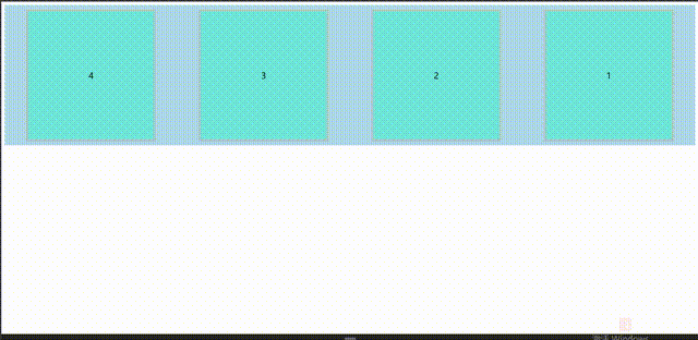
1 Code:
<!DOCTYPE html>
<html lang="en">
<head>
    <meta charset="UTF-8">
    <meta name="viewport" content="width=device-width,user-scalable=no, initial-scale=1.0,maxiumn-scale=1.0,miniumn-			scale=1.0">
    <title>Mode 1</title>
   	<style>
		.container {
    		width: 100%;
   			/* height: 500px; */
				display: flex;
   			background-color: lightblue;
    		margin: 0 auto;
				overflow-y: auto;
					}
		.box0{
			  width: 300px;
   			height: 300px;
				background-color: #6fe7db;
				border: #b0c5c3 5px solid;
				margin: 10px auto;
				font-size: 20px;
				line-height: 300px;
				text-align: center;
		}
		@media screen and (max-width:768px) {
    			/* Pink when the screen width is less than or equal to 768px */
					.container {
            flex-direction:  column;
						justify-content:  center ;
					}

				}
		@media screen and (min-width:768px) and (max-width:992px) {
    			.container {
            /* 768px<=lightblue when screen width < = 992px */
       					/* background-color: lightblue; */
								 flex-direction: column-reverse;
								 justify-content:  center ;
  							  }
																}
		@media screen and (min-width:992px) and (max-width:1200px) {
    			.container {
            /* 992px<=When the screen width is < = 1200px, yellow */
       				 	/* background-color: yellow; */
									flex-direction: row ;
									justify-content:  space-between ;
   							 }
																	}
		@media screen and (min-width:1200px){
    			.container {
            /* When screen width > = 1200px, red */
        				/* background-color: red; */
								flex-direction:row-reverse ;
								justify-content:  space-around;
    						}
}
</style>
</head>
<body>
    <div class="container">
        <div class="box0">1</div>
        <div class="box0">2</div>
        <div class="box0">3</div>
        <div class="box0">4</div>
    </div>
</body>
</html>
3. Media query
It can detect the width of the device screen and display different styles through different width values
Ultra small screen (mobile device): below 768px;
Small screen (tablet): 768px-992px;
Medium screen (standard screen equipment): 992px-1200px;
Large screen equipment (wide screen equipment): above 1200px
🎈 viewport
Adaptation problem: the screen size is different
Solution: percentage layout = = = streaming layout, non fixed pixels, content filled to both sides
By setting the viewport, set the viewport function with the content value inside
Set viewport width = current device width = device width
Allow users to scale automatically: user scalable = no (no / yes0 / 1)
Set default scale: initial scale = 1.0
Set maximum scale: maximum scale = 1.0
Set minimum scale: minimum scale = 1.0
head>
    <meta charset="UTF-8">
    <!-- Viewport -->
    <meta name="viewport" content="width=device-width, initial-scale=1.0,user-scalable=no,maximum-scale=1.0,minimum-scale=1.0">
    <title>Document</title>
</head>
media type
All all media
Screen color screen device
Print is used for printer and print preview
speech is used in screen readers and other sound producing devices
braille for braille touch (obsolete)
embossed blind printing equipment for printing (abandoned)
Projection for projection equipment (obsolete)
tty device not suitable for pixels (obsolete)
tv (obsolete)
Logical key of media query
And: and (and)
not: used to exclude a specified media type (non)
only: (limit a device) a specific media type
Remember to type a space after the symbol
Parameter condition of media query (media feature)
(width:600px)
(max width: 600px) maximum width < = 600
(min width: 480px) minimum width > = 480
(orientation:portrait) vertical screen
(orientation:landscape) horizontal screen
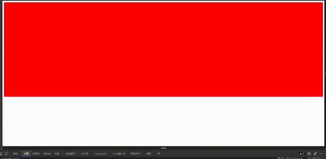
🎈 mode 2@media
Syntax: @ media media type keyword media attribute {}
Code format: @ media mediatype [and/not/only] (media feature) [and/not/only] (media feature)... {code block};
Code format: @ media which device judgment condition 1 parameter condition 1 judgment condition 2 parameter condition 2... {code block}
<!DOCTYPE html>
<html lang="en">
<head>
    <meta charset="UTF-8">
    <meta name="viewport" content="width=device-width,user-scalable=no, initial-scale=1.0,maxiumn-scale=1.0,miniumn-scale=1.0">
    <title>Mode 2</title>
   	<style>
		.container {
    		width: 100%;
   			height: 500px;
   			background-color: pink;
    		margin: 0 auto;
					}
		@media screen and (max-width:768px) {
    			/* Pink when the screen width is less than or equal to 768px */
				}
		@media screen and (min-width:768px) and (max-width:992px) {
    			.container {
            /* 768px<=lightblue when screen width < = 992px */
       					background-color: lightblue;
  							  }
																}
		@media screen and (min-width:992px) and (max-width:1200px) {
    			.container {
            /* 992px<=When the screen width is < = 1200px, yellow */
       				 	background-color: yellow;
   							 }
																	}
		@media screen and (min-width:1200px){
    			.container {
            /* When screen width > = 1200px, red */
        				background-color: red;
    						}
}
</style>
</head>
<body>
    <div class="container">
        <div class="box01"></div>
        <div class="box02"></div>
        <div class="box03"></div>
        <div class="box04"></div>
    </div>
</body>
</html>
🎈 Mode 2 @ inport
Code format: @ inport url(css file address) mediatype [and/not/only] (media feature) [and/not/only] (media feature);
<style>
        @import url(css/media01.css) screen and (max-width:768px);
        @import url(css/media02.css) screen and (min-width:768px) and (max-width:992px);
   /*css:
    	.container {
    		background-color: lightgreen;
					}
    	.container>div {
            width: 90%;
            height: 200px;
            margin: 10px auto;
            background-color: grey;
}
     */

.container>div {
    width: 90%;
    height: 200px;
    margin: 10px auto;
    background-color: grey;
}*/
</style>
<body>
    <div class="container">
        <div class="box01"></div>
        <div class="box02"></div>
        <div class="box03"></div>
        <div class="box04"></div>
    </div>
</body>
🎈 Mode 3 link
Code format: < link rel = "file type" href = "file address" media = "mediatype [and/not/only] (media feature)..." >
Code format: < link rel = "file type" href = "file address" media = "which device judgment condition 1 parameter condition 1..." >
<!DOCTYPE html>
<html lang="en">
<head>
    <meta charset="UTF-8">
    <title></title>
    <link rel="stylesheet" href="css/media01.css" media="screen and (max-width:768px)">
    <link rel="stylesheet" href="css/media02.css" media="screen and (min-width:768px) and (max-width:992px)">
</head>
<body>
    <div class="container">
        <div class="box01"></div>
        <div class="box02"></div>
        <div class="box03"></div>
        <div class="box04"></div>
    </div>
</body>
</html>
🎈 Breakpoint design
The traditional scheme for determining breakpoints is to use some fixed widths for division, such as 320px(iPhone), 768px(iPad), 960px or 1024px (traditional PC browser). The advantage of this scheme is that it takes good care of the current mainstream devices, but the technology development and implementation is too fast, and devices with different resolutions emerge one after another. For example, some mobile phones are close to tablets, Some tablets are larger than computers and so on. It is difficult to ensure that they can support all kinds of devices in the future.
Another way to determine breakpoints is to set breakpoints according to the content and how many breakpoints to set. With the emergence of devices of various sizes, it is more appropriate to name breakpoints in a more general way rather than using devices.
🎈 Root element rem
The default font size of the root element is 16px