In CSS specification Scroll-linked Animations In, an epoch-making CSS function is introduced. That is -- The @scroll-timeline At rule, literally translated as rolling timeline.
This article will take you to find out, from getting started to learning to use CSS @ scroll timeline.
What is @ scroll timeline?
What is @ scroll timeline?
@Scroll timeline can set the beginning and end of an animation, which is determined by the scrolling progress in the scrolling container, not by time.
This means that we can define an animation effect, and the beginning and end of the animation can be controlled by scrolling the container.
Schematic DEMO
Before studying grammar systematically, let's briefly understand its usage through a DEMO:
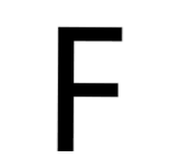
We first implement a simple font F rotation Animation:
<div id="g-box">F</div>
#g-box {
    animation-name: rotate;
    animation-duration: 3s;
    animation-direction: alternate;
    animation-easing-function: linear;
}
@keyframes rotate {
    0% {
        transform: rotate(0);
    }
    100% {
        transform: rotate(360deg);
    }
}
Normally, it is such a simple animation:
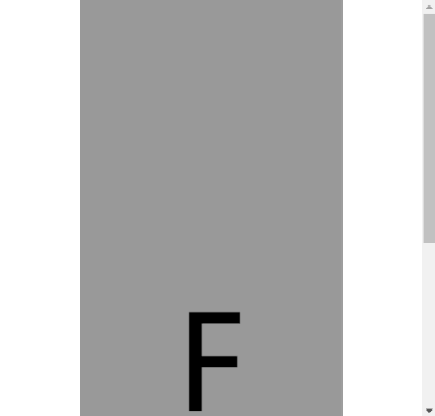
Next, we combine this animation with @ scroll timeline and place it in a scrollable container:
<div id="g-content">
    <div id="g-box">F</div>
</div>
#g-content {
width: 300px;
height: 170vh;
background: #999;
}
#g-box {
font-size: 150px;
margin: 70vh auto 0;
animation-name: rotate;
animation-duration: 3s;
animation-direction: alternate;
animation-easing-function: linear;
animation-timeline: box-rotate;
}
@keyframes rotate {
0% {
transform: rotate(0);
}
100% {
transform: rotate(360deg);
}
}
@scroll-timeline box-rotate {
source: selector("#g-content");
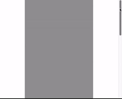
}Here, we implement a scrollable container #g-content, which is 170vh high, that is, 1.7 times the height of the visual interface, and place the #g-box container at a height of 70vh from the top:
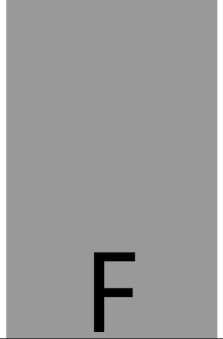
Interestingly, the rotation animation we set will not start automatically. The animation will start only when we scroll down. The actual effect Gif:
CodePen Demo -- @scroll-timeline Demo
Seeing this, you should be able to understand the role and meaning of @ scroll timeline. It gives CSS the ability to control the progress of animation based on the scrolling of the scroll bar! Amazing!!
@Introduction to scroll timeline syntax
Next, let's take a quick look at the syntax of @ scroll timeline.
When using @ scroll timeline, the most important thing is to define a @ scroll timeline rule:
@scroll-timeline moveTimeline {
  source: selector("#g-content");
  orientation: vertical;
  scroll-offsets: 0px, 500px;
}
Of which:
- source: bind the scroll container that triggers the scroll animation
- source: auto: bind to Document, that is, the global Windows object
- Source: selector ("ID selector"), through selector(), a #id selector is built in to select a scrollable container
- source: none: scroll container that does not refer to
- orientation: sets the direction of scrolling the timeline
- orientation: auto: the default is vertical, that is, vertical scrolling
- orientation: vertical: vertical scrolling
- orientation: horizontal: horizontal scrolling
- orientation: block: not commonly used. It uses the rolling position along the block axis, which conforms to the writing mode and directivity
- orientation: inline: it is not commonly used. It uses the rolling position along the inline axis, which conforms to the writing mode and directionality
- Scroll offsets: the core of scrolling timeline, which sets the stage of scrolling and triggers animation. It can be set in one of three ways:
- Scroll offsets: none this means that no scroll offset is specified.
- Comma separated length-percentage The value list is determined. Each value is mapped to animation-duration . For example, if the animation duration is set to 2s and the scroll offset is 0px, 30px, 100px, the scroll offset will be 30px at 1s.
- The third way to determine the roll offset is to use the element offset. This means that you can specify the elements within the page, whose position determines the scrolling timeline and which edge of these elements to use. The specified element is completed using the selector() function, which receives the id of the element. The edge is determined by the keyword start or end. An optional threshold of 0 – 1 can be used to represent the percentage of elements expected to be visible in scrolling.
It will be difficult to understand scroll offsets, which we will elaborate later.
After setting a @ scroll timeline, we just need to bind it to the animation. Through the animation timeline:
@scroll-timeline moveTimeline {
  source: selector("#g-content");
  orientation: vertical;
  scroll-offsets: 0px, 500px;
}
div {
    animation-name: move;
    animation-duration: 3s;
    animation-timeline: moveTimeline;
}
@keyframes move{
    0% {
        transform: translate(0, 0);
    }
    100% {
        transform: translate(100%, 0);
    }
}
Use @ scroll timeline to implement the scroll progress indicator
Before Incredible pure CSS scrolling progress bar effect In this article, we introduced a pure CSS scrolling progress indicator effect using gradient:
This method has some minor flaws. One is that when the scrolling distance is too short, there will be an obvious bevel effect on the right side of the progress bar.
With @ scroll timeline, we can finally bind the two elements of scroll and animation, and then realize the scroll progress indicator, which is very easy:
<div id="g-container">
    <p>...Text content...</p>
</div>
#g-container {
width: 100vw;
}
#g-container::before {
content: "";
position: fixed;
height: 5px;
left: 0;
top: 0;
right: 0;
background: #ffc107;
animation-name: scale;
animation-duration: 1s;
animation-fill-mode: forwards;
animation-timeline: box-rotate;
transform-origin: 0 50%;
}
@keyframes scale {
0% {
transform: scaleX(0);
}
100% {
transform: scaleX(1);
}
}
@scroll-timeline box-rotate {
source: auto;
orientation: vertical;
}- At the top of the page, we use a pseudo element to realize a 5px high progress bar that accounts for 100% of the full screen. Normally:
- By setting an animation from transform: scaleX(0) to transform: scaleX(1) and binding it with the rolling of the body, you can get the rolling indicator. The effect is as follows:
Complete code, you can stamp here: CodePen Demo - use @ scroll timeline to scroll the progress bar
Use scroll offsets to precisely control the animation trigger timing
You can take another look at the Gif diagram above. There is a problem, that is, the start time of animation starts from the beginning of scrolling and ends at the end of scrolling. So what if I want the animation to trigger at a specific stage of scrolling?
Here, we need to use scroll offsets to more accurately control our animation.
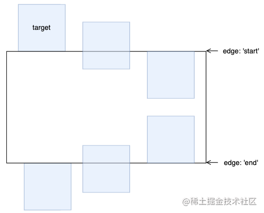
During scrolling, we can divide an element into three areas:
- In the process of rolling, enter the field of view from the blind area of the field of view above
- In view during scrolling
- In the process of scrolling, from the field of view, enter the blind area of the lower field of view
Here, we can get two boundaries, the upper boundary and the lower boundary:
For the upper and lower boundaries, there will be two states. Taking the above boundary as an example, there will be:
- The element has just begun to enter the visual area
- The element enters the visual area completely
For these two states, we use start 0 and start 1. Similarly, the lower boundary can also be represented by end 0 and end 1:
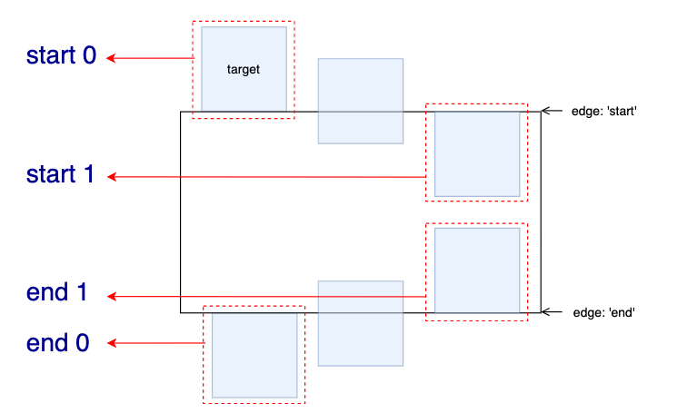
Here, 0 and 1 actually represent the percentage of elements expected to be visible in scrolling.
With these state values, combined with scroll offsets, we can accurately control the trigger time of scroll animation.
Let's set an animation from left to right with transparency changes. Let's take a look at the following situations:
- The scrolling animation starts when the element appears from below and ends when it appears completely.
Animation operation range: end 0 -- > end 1:
@keyframes move {
    0% {
        transform: translate(-100%, 0);
        opacity: 0;
    }
    100% {
        transform: translate(0, 0);
        opacity: 1;
    }
}
@scroll-timeline box-move {
    source: auto;
    orientation: "vertical";
    scroll-offsets:
        selector(#g-box) end 0,
        selector(#g-box) end 1;

    /* Legacy Descriptors Below: */
    start: selector(#g-box) end 0;
    end: selector(#g-box) end 1;
    time-range: 1s;
}
#g-box {
    animation-name: move;
    animation-duration: 3s;
    animation-fill-mode: both;
    animation-timeline: box-move;
}
The effect is as follows:
- The scrolling animation starts when the element appears completely from below and ends after scrolling to the top and leaving the screen:
Animation operation range: end 1 -- > start 1:
// ...
@scroll-timeline box-move {
    source: auto;
    orientation: "vertical";
    scroll-offsets:
        selector(#g-box) end 1,
        selector(#g-box) start 1;

    /* Legacy Descriptors Below: */
    start: selector(#g-box) end 1;
    end: selector(#g-box) start 1;
    time-range: 1s;
}
// ...
The effect is as follows:
- Scrolling animation starts when the element scrolls to the top and is about to leave the screen, and ends when it completely leaves the screen:
Animation running range: start 1 -- > start 0:
// ...
@scroll-timeline box-move {
    source: auto;
    orientation: "vertical";
    scroll-offsets:
        selector(#g-box) start 1,
        selector(#g-box) start 0;

    /* Legacy Descriptors Below: */
    start: selector(#g-box) start 1;
    end: selector(#g-box) start 0;
    time-range: 1s;
}
// ...
The effect is as follows:
Mastering the usage of scroll offsets is the key to flexibly using the scrolling timeline. Of course, you will also see the writing methods of start: selector(#g-box) start 1 and end: selector(#g-box) start 0 above. This is a problem left over from the history of the specification. The latest specification has used scroll offsets to replace the writing methods of start: and end:.
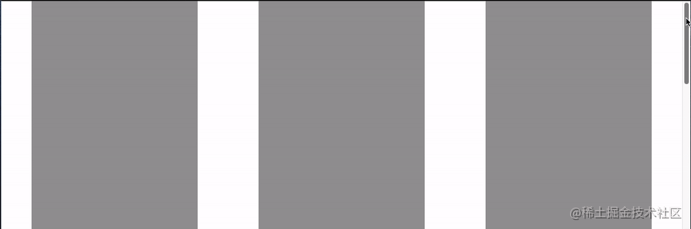
Put the above three situations together and compare them:
Complete code, you can stamp here: CodePen Demo - @scroll-timeline Demo | element-based offset
Use @ scroll timeline to achieve various effects
After mastering the syntax of @ scroll timeline, we can start using it to create various animation effects.
For example, the following scrolling contents are continuously entered:
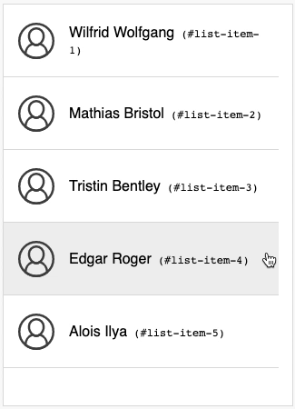
The code is long and can be stamped here. It comes from bramus Codepen CodePen Demo -- Fly-in Contact List (CSS @scroll-timeline version)
Some full screen animations can be made by combining the full screen scrolltype and even scrolling effects:
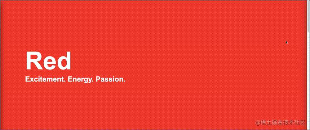
You know, in the past, it was completely impossible to realize this by using pure CSS. You can stamp the complete code here: CodePen Demo -- CSS Scroll-Timeline Split Screen Carousel
In short, any animation effect can now be combined with scrolling, even with SVG elements. Here I also briefly modified the previous SVG line Animation:
You can stamp the complete code here: CodePen Demo -- SVG Text Line Effect | Scroll Timeline
@Laboratory characteristics and characteristic detection of scroll timeline
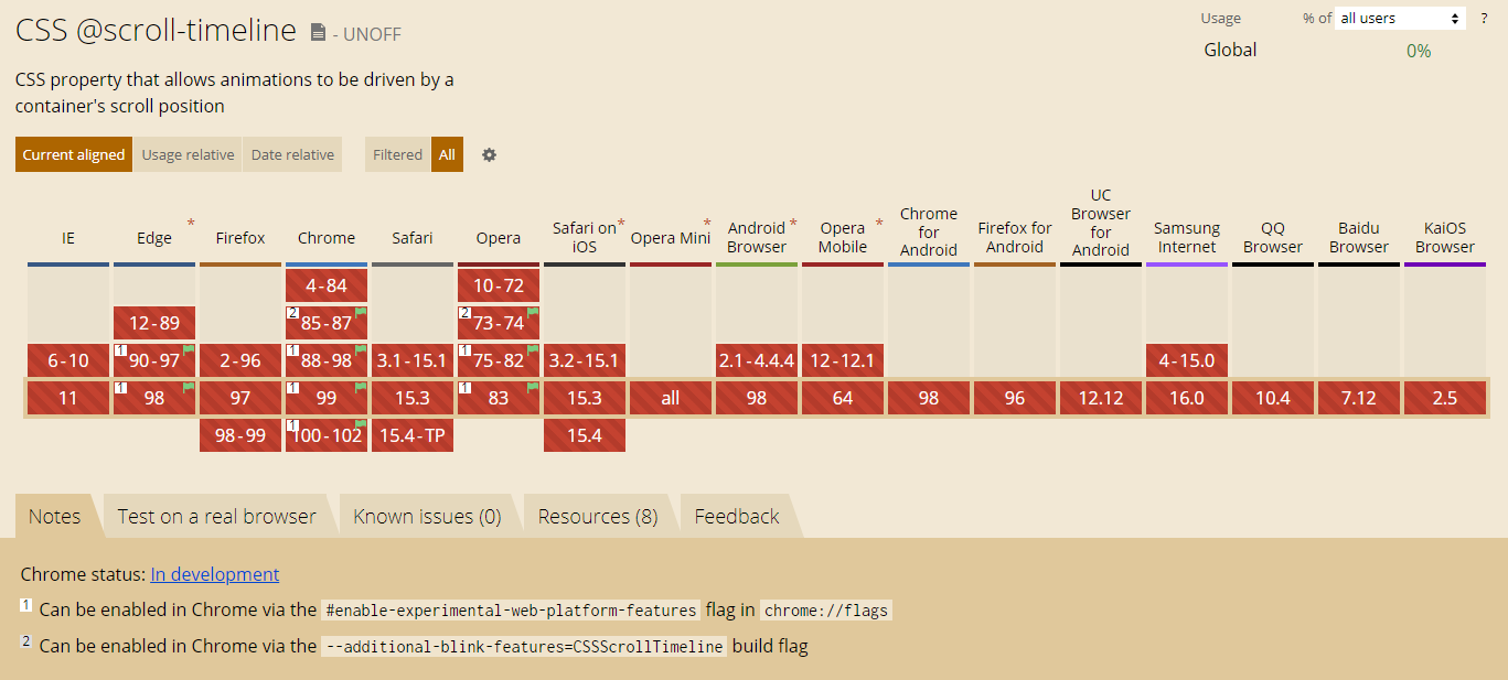
@Although the scroll timeline is good, it is still in the laboratory feature time. Chrome has been supported since version 85, but it is turned off by default.
Compatibility is as follows (2022-03-07):
In the latest Chrome, Edge and Opera, you can enable this feature through browser configuration. To enable this feature in Chrome, you need to:
- Browser URL box input chrome://flags
- Open #enable empirical web platform features
Although the wine is good, it still needs to wait for a while before it can be fully used. Give me some time!
Characteristic detection
Based on the current compatibility problem, we can gradually enhance the use of this function by detecting @ supports syntax through the characteristics of the browser.
The syntax of feature detection is also very simple:
@supports (animation-timeline: works) {
    @scroll-timeline list-item-1 {
	source: selector(#list-view);
	start: selector(#list-item-1) end 0;
	end: selector(#list-item-1) end 1;
        scroll-offsets:
            selector(#list-item-1) end 0,
            selector(#list-item-1) end 1
        ;
	time-range: 1s;
    }
    // ...
}
You can judge whether the browser supports @ scroll timeline through @ supports (animation timeline: Works) {}.
last
At present, there is very little introduction about @ scroll timeline, but it is a very big innovation that can change CSS animation. With the gradual popularity of compatibility, it is bound to occupy a place in CSS in the future.
This article ends here. I hope it will be helpful to you 😃
More wonderful CSS technical articles are summarized in my Github -- iCSS , continuously updated, welcome to a star collection.
If you have any questions or suggestions, you can communicate more. The original articles are limited in writing and lack of talent and learning. If there is anything wrong in the article, please let me know.