1. Concepts
ComboBox is a combination of buttons and pop-up lists. It provides a way to display a list of options to the user, which takes up the least screen space.
ComboBox is populated with data models. Data models are usually JavaScript arrays, ListModel s, or integers, but they also support other types of data models.
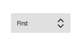
ComboBox {
		x:200
		y:200
      model: ["First", "Second", "Third"]
  }
Appearance:
2. Editable Combo Box
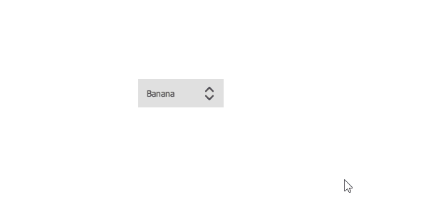
ComboBox is editable. An editable combo box automatically completes text based on what is available in the model.
The following example demonstrates appending content to an editable combo box by responding to an accepted signal.
ComboBox {
      editable: true
      model: ListModel {
          id: model
          ListElement { text: "Banana" }
          ListElement { text: "Apple" }
          ListElement { text: "Coconut" }
      }
      onAccepted: {
          if (find(editText) === -1)
              model.append({text: editText})
      }
} 
3. Combo Box Model Role
ComboBox can visualize standard data models that provide modelData roles:
- Model with only one role
- Model without named role (JavaScript array, integer)
When using models with multiple named roles, you must configure ComboBox to use specific text roles for its display text and delegate instances.
  ComboBox {
      textRole: "key"
      model: ListModel {
          ListElement { key: "First"; value: 123 }
          ListElement { key: "Second"; value: 456 }
          ListElement { key: "Third"; value: 789 }
      }
  }
Note: If ComboBox is assigned a data model with multiple named roles, but textRole is not defined, ComboBox will not be able to visualize it and throw a ReferenceError: modelData is not defined.
4. Attributes
4.1 [read-only] acceptableInput : bool
This property is used to save whether the combo box contains acceptable text in an editable text field.
If a validator is set, the value is true only if the validator accepts the current text as the final string rather than the intermediate string.
4.2 [read-only] count : int
This property holds the number of items in the combo box.
4.3 currentIndex : int
This property holds the index of the current item in the combo box.
4.4 [read-only] currentText : string
This property holds the text of the current item in the combo box.
4.5 delegate : Component
This property holds a delegate that displays items in the combo box pop-up box.
It is recommended that you use ItemDelegate (or any other AbstractButton derivative) as a delegate. This ensures that the interaction works as expected and that the pop-up window will automatically close when appropriate. When using other types of delegation, you must close the pop-up window manually. For example, if you use MouseArea:
delegate: Rectangle {
      // ...
      MouseArea {
          // ...
          onClicked: comboBox.popup.close()
      }
  }
4.6 displayText : string
This property holds the text displayed on the combo box button.
By default, display text displays the current selection. That is, it follows the text of the current project. However, you can override the default display text with a custom value.
  ComboBox {
      currentIndex: 1
      displayText: "Size: " + currentText
      model: ["S", "M", "L"]
  }
4.7 down : bool
This property keeps the combo box button visually down.
Unless explicitly set, this property is true when pressed or ejected. To return the default value, set this property to undefined.
4.8 editText : string
This property holds the text in the text field of an editable combo box.
4.9 editable : bool
This property is used to save whether the combo box is editable.
The default value is false.
4.10 flat : bool
This property keeps the combo box button flat.
A flat combo box button does not draw a background unless it interacts with it. The flat combo box provides a look that makes it less prominent in other UI s than a normal combo box. For example, when placing a combo box on a toolbar, you may need to set the combo box flat to better match the flat look of the tool button.
The default value is false.
4.11 [read-only] highlightedIndex : int
This property holds the index of the highlighted item in the combo box pop-up list.
When the highlighted item is activated, the pop-up window closes, the current Index is set to highlightedIndex, and the value of this property is reset to -1 because there are no more highlighted items.
4.12 indicator : Item
This property holds the drag-and-drop indicator.
See Custom Combo Box.
4.13 [read-only] inputMethodComposing : bool
This property is used to save whether an editable combo box has some text input from the input method.
When combining, an input method may rely on mouse or key events in the combo box to edit or submit part of the text. This property can be used to determine when to disable event handlers that may interfere with the correct operation of the input method.
4.14 inputMethodHints : flags
Provides input methods with tips on what the combo box expects and how it should behave.
The default value is Qt.ImhNoPredictiveText.
If no prompt is set, the value is a bitwise combination of flags|Qt.ImhNone.
Flags used to modify behavior are:
Qt.ImhHiddenText - Characters should be hidden, which is usually used when entering a password
Qt.ImhSensitiveData - Active Input Method should not store typed text in any persistent storage, such as a predictive user dictionary
Qt.ImhNoAutoUppercase - Input method should not automatically switch to uppercase at the end of a sentence
Qt.ImhPreferNumbers - Numbers are preferred (but not required)
Qt.ImhPreferUppercase - Preferred uppercase (but not required)
Qt.ImhPreferLowercase - Lowercase is preferred (but not required)
Qt.ImhNoPredictiveText - Do not use associative text (such as dictionary lookup) when typing
Qt.ImhDate - The purpose of the text editor is to act as a date field
Qt.ImhTime - The text editor functions like a time field
The flags that limit input (exclusive flags) are:
Qt.ImhDigitsOnly - Only numbers allowed
Qt.ImhFormattedNumbersOnly - Only numbers are allowed. This includes decimal points and negative signs.
Qt.ImhUppercaseOnly - Allow only uppercase letters
Qt.ImhLowercaseOnly - Allow lowercase input only
Qt.ImhDialableCharactersOnly - Only characters suitable for making phone calls are allowed
Qt.ImhEmailCharactersOnly - Only characters suitable for e-mail addresses are allowed
Qt.ImhUrlCharactersOnly - Only characters suitable for URLs are allowed
Masks:
Qt.ImhExclusiveInputMask - This mask will produce a non-zero value if any exclusive flag is used.
This property holds the model that provides the data for the combo box.
  ComboBox {
      textRole: "key"
      model: ListModel {
          ListElement { key: "First"; value: 123 }
          ListElement { key: "Second"; value: 456 }
          ListElement { key: "Third"; value: 789 }
      }
  }
4.15 popup : Popup
This property saves the pop-up window.
If you want, you can open or close the pop-up window manually:
onSpecialEvent: comboBox.popup.close()
4.16 pressed : bool
This property keeps the combo box button physically pressed. Buttons can be pressed by touch or by press event.
4.17 textRole : string
This property contains the model roles used to populate the combo box.
When the model has multiple roles, you can set the textRole to determine which role should be displayed.
4.18 validator : Validator
This property holds the input text validator for the editable combo box.
When a validator is set, text fields will only accept input that leaves the text property in the middle state. Acceptable signals will only be sent if the text is in the acceptable state when the Return or Enter key is pressed.
Currently supported validators are IntValidator, DoubleValidator, and RegExpValidator. Here is an example of using a validator that allows you to enter integers between 0 and 10 in a text field:
    ComboBox {
      model: 10
      editable: true
      validator: IntValidator {
          top: 9
          bottom: 0
      }
  }
5. Signal
5.1 void accepted()
This signal is emitted when the Return or Enter key is pressed on the editable combo box. If the confirmed string is not currently in the model, currentIndex will be set to -1 and currentText will be updated accordingly.
Note: If a validator is set on the combo box, the signal will only be emitted if the input is acceptable.
5.2 void activated(int index)
This signal is emitted when the user activates the index item.
When a pop-up window opens, an item is selected, causing the pop-up window to close (currentIndex changes), or when the pop-up window closes and the combo box navigates through the keyboard, causing the currentIndex to change, the item is activated. The currentIndex property is set to index.
5.3 void highlighted(int index)
This signal is emitted when the user highlights the index item in the pop-up list.
Highlighted signals are only emitted when a pop-up window opens and an item is highlighted, but may not be activated.
6. Member Functions
6.1 void decrementCurrentIndex()
The current index of the decreasing combo box, or the decreasing highlighted index if the pop-up list is visible.
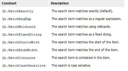
6.2 int find(string text, flags = Qt.MatchExactly)
Returns the index of the specified text, or -1 if no match is found.
The way the search is performed is defined by the specified match flag. By default, the combo box performs a case-sensitive exact match (Qt.MatchExactly). All other match types are case-insensitive unless the Qt.MatchCaseSensitive flag is also specified.
6.3 void incrementCurrentIndex()
Increase the current index of the combo box and the highlighted index if the pop-up list is visible.
See also currentIndex and highlightedIndex.
6.4 void selectAll()
Select all text in the editable text field of the combo box.
6.5 string textAt(int index)
Returns the text of the specified index, or an empty string if the index is out of bounds.
7. Custom Styles
//A combo box consists of a background, content items, pop-up boxes, indicators, and delegates.
ComboBox {
	  x:200
	  y:200
      id: control
      model: ["First", "Second", "Third"]

	  //Entrust
      delegate: ItemDelegate {
          width: control.width
          contentItem: Text {
              text: modelData
              color: "#21be2b"
              font: control.font
              elide: Text.ElideRight
              verticalAlignment: Text.AlignVCenter
          }
          highlighted: control.highlightedIndex === index
      }

	  //indicator
      indicator: Canvas {//canvas
          id: canvas
          x: control.width - width - control.rightPadding
          y: control.topPadding + (control.availableHeight - height) / 2
          width: 12
          height: 8
          contextType: "2d"

          Connections {
              target: control
              onPressedChanged: canvas.requestPaint()
          }

          onPaint: {
              context.reset();
              context.moveTo(0, 0);
              context.lineTo(width, 0);
              context.lineTo(width / 2, height);
              context.closePath();
              context.fillStyle = control.pressed ? "#17a81a" : "#21be2b";
              context.fill();
          }
      }

	  //Content Items
      contentItem: Text {
          leftPadding: 0
          rightPadding: control.indicator.width + control.spacing

          text: control.displayText
          font: control.font
          color: control.pressed ? "#17a81a" : "#21be2b"
          verticalAlignment: Text.AlignVCenter
          elide: Text.ElideRight
      }

	  //background
      background: Rectangle {
          implicitWidth: 120
          implicitHeight: 40
          border.color: control.pressed ? "#17a81a" : "#21be2b"
          border.width: control.visualFocus ? 2 : 1
          radius: 2
      }

	  //Popup
      popup: Popup {
          y: control.height - 1
          width: control.width
          implicitHeight: contentItem.implicitHeight
          padding: 1

          contentItem: ListView {
              clip: true
              implicitHeight: contentHeight
              model: control.popup.visible ? control.delegateModel : null
              currentIndex: control.highlightedIndex

              ScrollIndicator.vertical: ScrollIndicator { }
          }

          background: Rectangle {
              border.color: "#21be2b"
              radius: 2
          }
      }
  }