In vscode, you first need to install live sass compiler to compile sass into css in real time.

Click watch sass at the bottom to compile the sass file into a css file with the same name in real time.
nesting
I think the most important function of sass is that it can be nested layer by layer in html, instead of selecting an element in css and writing multiple parent tags.
<header>
    <h1>hello my dear</h1>
    <button>Hello</button>
</header>
<div class="contact">
    <button>submit</button>
    <div class="info">Our contact info</div>
    <p>This is our info</p>
</div>
// scss
header{
    button{
        color:blue;
    }
}
/*css*/

header blue{
    color:blue;
}
When there are multiple levels of html, the nesting function of scss is much easier to use than css. Of course, in scss, it fully supports the writing of ordinary css!
In addition, if you want to write the hover effect of the mouse over button, you can do so with scss.
header{
    button{
        color:blue;
        &:hover{
            color:pink;
        }
    }
}
Can you write a lot less labels?
Similarly, if you want to add pseudo elements to a button, you can also directly use & in the style of the button to connect before or after.
header {
    button {
        color: blue;
        &:hover {
            color: blue;
        }
        &::after{ // You can also write only one: for example &: after
            content:'hi';
            color:red;
        }
    }
}
Define variables
When a value needs to be used more than once, you can decorate it with the $symbol and specify a value for it.
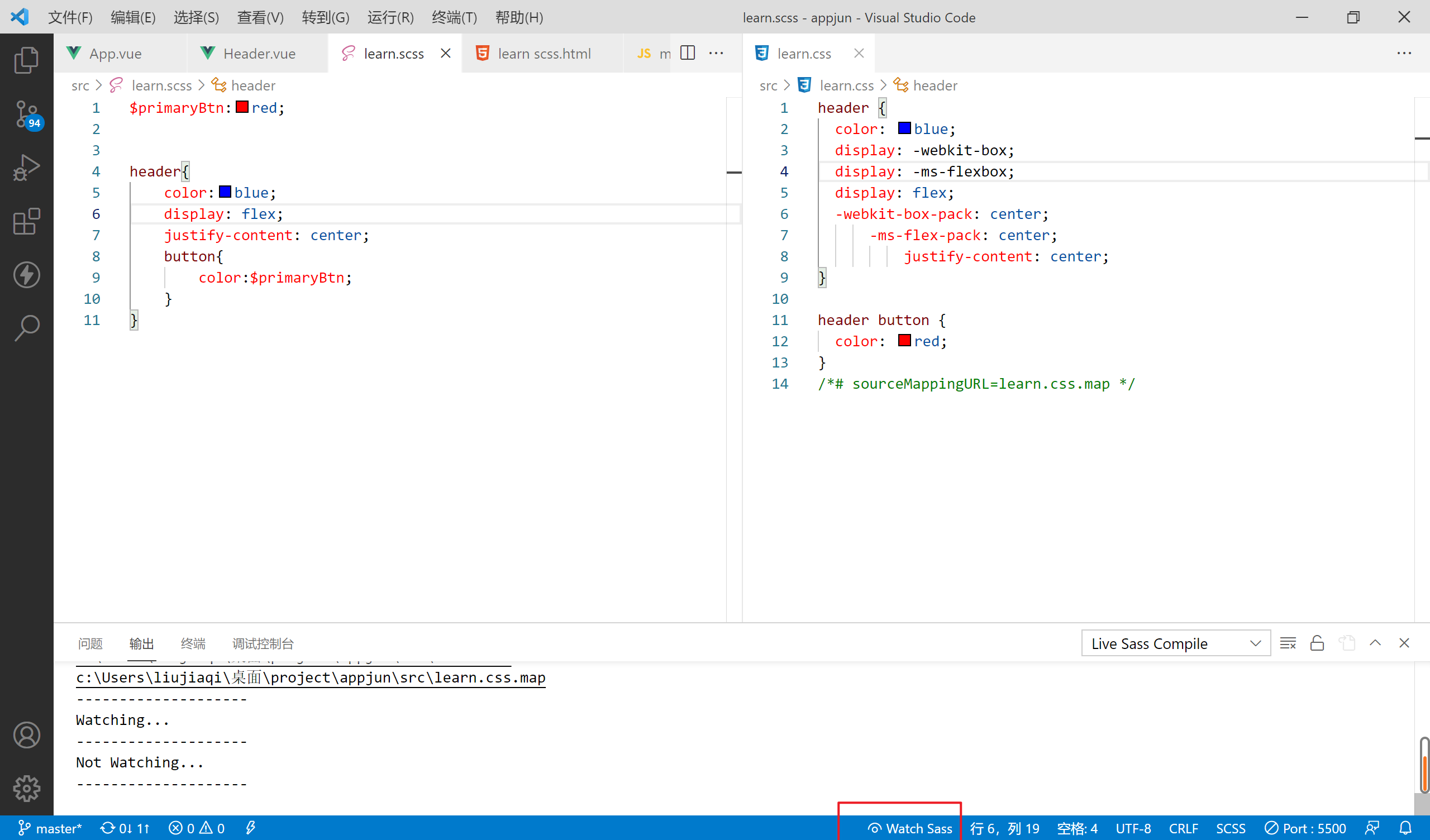
$primaryBtn: red;

// This variable can then be called

header{
    button{
        color: $primaryBtn;
    }
}
Of course, css can also achieve this function:
*{
    --primaryBtn:red;
}

header button{
    color:var(--primaryBtn);
}
Split scss file
For example, my current scss file is as follows:
$primaryBtn:red;
$text:rgb(31, 31, 190);


header {
    color: $text;
    display: flex;
    justify-content: center;

    button {
        color: $primaryBtn;
        &:hover {
            color: blue;
        }
        &::after{
            content:'hi';
            color:red;
        }
    }
}

.contact button{
    background-color: $primaryBtn;
    color:$text;
}
At this point, I want to write the header style separately. But in css, there is no new modular syntax like ES6 in JavaScript. However, sass supports this modular syntax.
First, create a new file named_ header.scss, which is underlined to indicate that it is a module (it can not be added).
Next, you need to import this module into the core sass.
$primaryBtn:red;
$text:rgb(31, 31, 190);

@import './header'; //You don't have to write suffixes or underscores

.contact button{
    background-color: $primaryBtn;
    color:$text;
}
Custom code block
For example, if I want the content in the header to be centered, the common writing method is to use flex.
header{
    display: flex;
    justify-content: center;
    align-items: center
}
At the same time, I want the content to be centered elsewhere, so I keep repeating the above three lines of css code.
Therefore, if you can customize functions in css like js, you can reuse code.
Unfortunately, css does not support this at present, but scss can do it.
// Define code blocks
@mixin flexCenter {
    display: flex;
    justify-content: center;
    align-items: center;
}

// Call code block
header {
    height: 100vh;
    @include flexCenter();
}
In addition, you can pass parameters to the defined code block. For example, I want to change the value of justify content to flex start:
@mixin flexCenter($justify) { // Note that the definition variable starts with $
    display: flex;
    justify-content: $justify;
    align-items: center;
}


header {
    height: 100vh;
    @include flexCenter(flex-start); // Pass parameters when calling a code block
}
Of course, you can also define multiple parameters:
@mixin flexCenter($justify,$direction) {
    display: flex;
    justify-content: $justify;
    align-items: center;
    flex-direction: $direction;
}


header {
    color: $text;
    height: 100vh;
    @include flexCenter(flex-start,column);
}
inherit
Now that I have written the style of header, I will write the style of footer, which is roughly the same as that of header. So I can copy the header style and paste it into the footer.
But scss gives us a simpler way to use the keyword extend. If some styles in the footer are different, we can directly overwrite the original style.
header{
    color: pink;
    background-color: black;
    font-size: 14px;
}

footer{
    @extend header;
    background-color: red; // Override the background color of the header
}
At this point, the live sass compiler compiles scss as follows:
header, footer {
  color: pink;
  background-color: black;
  font-size: 14px;
}

footer {
  background-color: red;
}