1, Picture path.
How to write path:
For example:
Video folder - video files
Source code - source code file
(video folder and source code are brothers)
When in source code:
Video folder / video file
When in source files:
.. / return to the previous level (often used)
.. / video folder / video file
Placing text in < body > < / body > is no different from that in the label. The purpose is to modify the style through the label.
2, css: cascading style sheets.
css defines how HTML elements are displayed
Writing style:
style = "1. style in line"
To style the p tag, write the style directly on the line of the p tag
Inside page style and outside chain style are through selector: name the label and add style to the label according to the name
2. In page style: < style > < / style >
Write the style in the index page
The style in the page is placed in < head > < / head >
3. Outer chain style
Create a new css file and write styles in css.
<link href=" " rel="stylesheet" type="text/css" />
In line styles should be written in double quotation marks, and styles should be separated by semicolons
color
3, Selector.
Label selectors: p{write style}
Class selector: class = "" class
ID selector:
#id{}
class selector} allows duplicate naming
id selector} duplicate naming is not allowed
Use the class selector for writing styles
Background:
background-color:blue
Text style:
Color: font color
text-align:
text alignment
Value:
1.center
2.right
3.left
line-height:50px;
Row height
It is often used together with text alignment to achieve the effect of centering up and down, left and right, and centering up and down. The attribute value of row height is generally the height of the outer wrapping box.
notes:
html <!-- Notes -- >
css / * comment * /
4, Text decoration.
text-decoration:;
Value:
none default
underline lower horizontal line
overline
Line through
Blink blink text
wavy wave line
Dotted dotted line
Text conversion:
text-transform:
Value:
Uppercase uppercase
lowercase
capitalize captions
Text indent:
text-indent
typeface:
<font></font>
font size
font-size: 50px;
1em=16px
Font family text font
Font weight:
font-weight
normal-400 # default
bold-700 bold
bolder thicker
lighter thinning
100--900
400 default
5, Background:
Background color:
background-color
Value:
1. English: red blue
2. Hex: #e61818
0-9
A B C D E F
#000000 white
#FFFFFF black
3.rgb(111,111,111)
Value:
0-255
Background picture:
background-image
url()
Duplicate background:
background-repeat
Value:
No repeat
repeat-x repeats along the X axis
repeat-y repeats along the Y axis
Background positioning:
background-position
Value: x # y
1. top left
2. 0% 0%
Abbreviation:
background:url(img/0.jpg) no-repeat right bottom
Background picture size
background-size
Value:
x y
100% 100%
px px
6, Border.
border
Border style:
border-style:
dashed: dotted line
solid line
Dotted dotted line
Border color
border-color
Border thickness
border-width
Style a single border:
Color of the left border
border-left-color: ;
Type of top border
border-top-style:
The thickness of the bottom border
border-bottom-width:
Direction words can be changed: top # left # bottom # right
7, Practice code.
index2.html
<!DOCTYPE html>
<html>
	<head>
		<meta charset="utf-8">
		<title></title>
		<!-- <style>
			p{
				font-size: 6.25rem;
				/* font-family: "New song style "; */
				font-weight: bolder;
				width:1000px;
				height: 1000px;
				/* background-color: #7FFFD4; */
				background-color: rgb(111,111,110);
				/* p Add a background picture in the label, which is different from adding a background picture in the body */
				background-image: url(img/02.jpg);
				/* The background picture is not repeated */
				background-repeat: no-repeat;
			}
		</style> -->
		<style>
			body{
			/*Write the top picture and the bottom picture in turn	 */
			background-image: url(img/02.jpg),url(img/02.jpg),url(img/01.png);
			height: 50rem;
			background-repeat: no-repeat,no-repeat,repeat;
			background-position: center,left top;
			/* background-size: 100% 100%; */
			/* The background picture is not repeated */
			/* background-repeat: repeat-x; */
			/* Spread along the x-axis */
			/* background-repeat: no-repeat; */
			/* 0% 0%Corresponding to top left, give it a height after setting the position, otherwise the picture will only show part */
			/* background-position: 50% 50%; */
			/* Abbreviation */
			/* background:url(img/01.png) no-repeat center; */
			}
		</style>

	</head>
	<body>
		<p>
			The distant shadow of the lonely mountain and the quiet blue sky
		</p>

	</body>
</html>
<!DOCTYPE html>
<html>
<head>
<meta charset="utf-8">
<title></title>
<style>
/* Clear the internal and external margins of all browsers (to be written on the top side of the style) */
*{margin:0;padding: 0;}
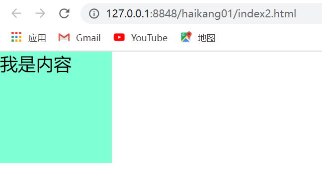
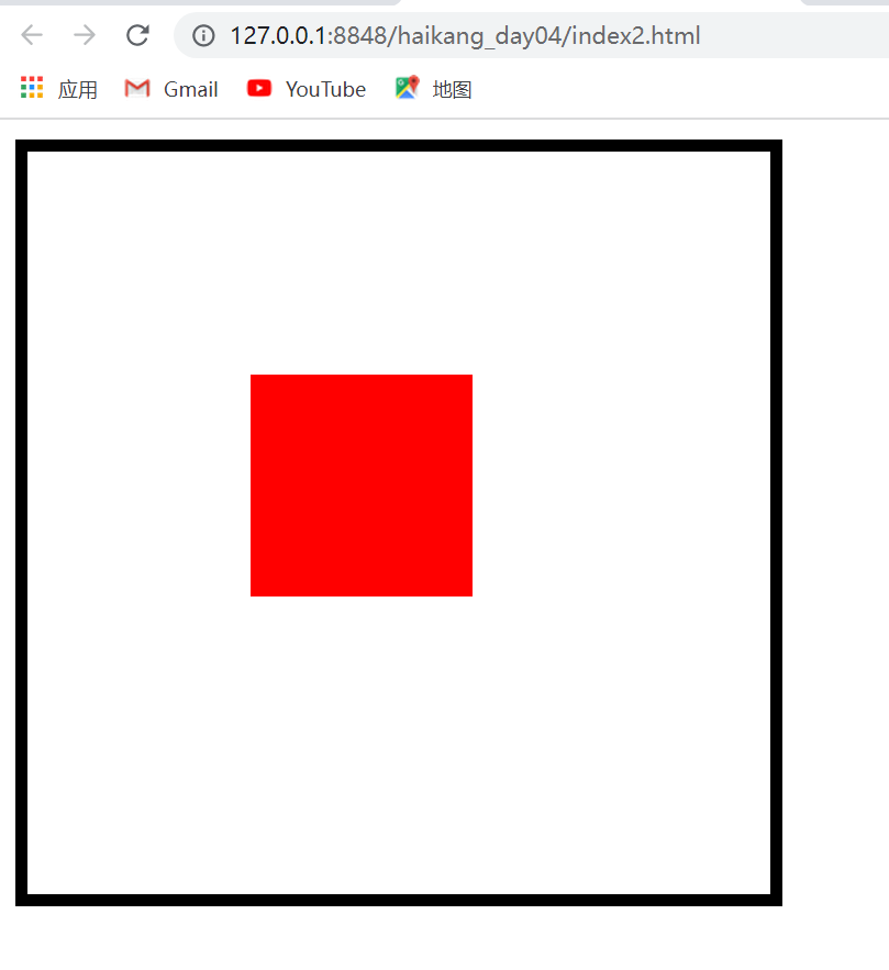
div{
width:6.25rem;
height: 6.25rem;
background-color: aquamarine;
/* margin-bottom:1.5625rem; */
/* margin: 0.625rem 1.25rem 1.875rem 2.5rem;
padding-left: 6.25rem;
padding-top: 6.25rem; */
/* Left and right auto is in the middle, and there is no auto up and down */
/* margin: 0rem auto; */
/* border: #0000FF 0.3125rem;
border-style: dashed dotted double groove; */
/* background-color: #0000FF; */
/* Three elements of border: thickness, color and type */
/* border-style:dotted;
border-color: #7FFFD4;
border-width: 3.125rem;
border-top-color: #FF0000; */
/* In border abbreviation, there is no difference in the order of these three elements */
/* border:3.75rem solid #0000ff; */
/* border-left-style: dotted; */
/* Shorthand setting specifies the border line */
/* border-top: 0.1875rem #7FFFD4 solid; */
/* Change the radian of the four corners of the box and the px value of 100% or larger. The square will become a circle and the rectangle will become an ellipse*/
/* border-radius: 100%; */
/* border-bottom-right-radius: 3.125rem; */
/* Box shadow, four parameters, x-axis offset, y-axis offset, the greater the value of shadow blur radius, the more blurred the shadow, and the shadow color */
/* box-shadow: 1.875rem 3.125rem 0.3125rem gray; */
/* Text shadow */
/* text-shadow: 0.3125rem 0.3125rem 0.1875rem gray; */
}
</style>
</head>
<body>
<div>I am the content</div>
<!-- <div></div> -->
</body>
</html>