Matplotlib
Getting Started
Basic use
import matplotlib as mpl
import matplotlib.pyplot as plt
import numpy as np
A simple example
Matplotlib displays your data on Figure. Each picture can contain one or more coordinate fields (Axes: an area that can represent specific points with x-y coordinates, polar coordinates and three-dimensional coordinates), and pyplot Subplots can create a Figure with coordinates, which can use Axes Plot draws some data in the coordinate field, such as
fig, ax = plt.subplots()  # Create a figure containing a single axes.
ax.plot([1, 2, 3, 4], [1, 4, 2, 3]);  # Plot some data on the axes.
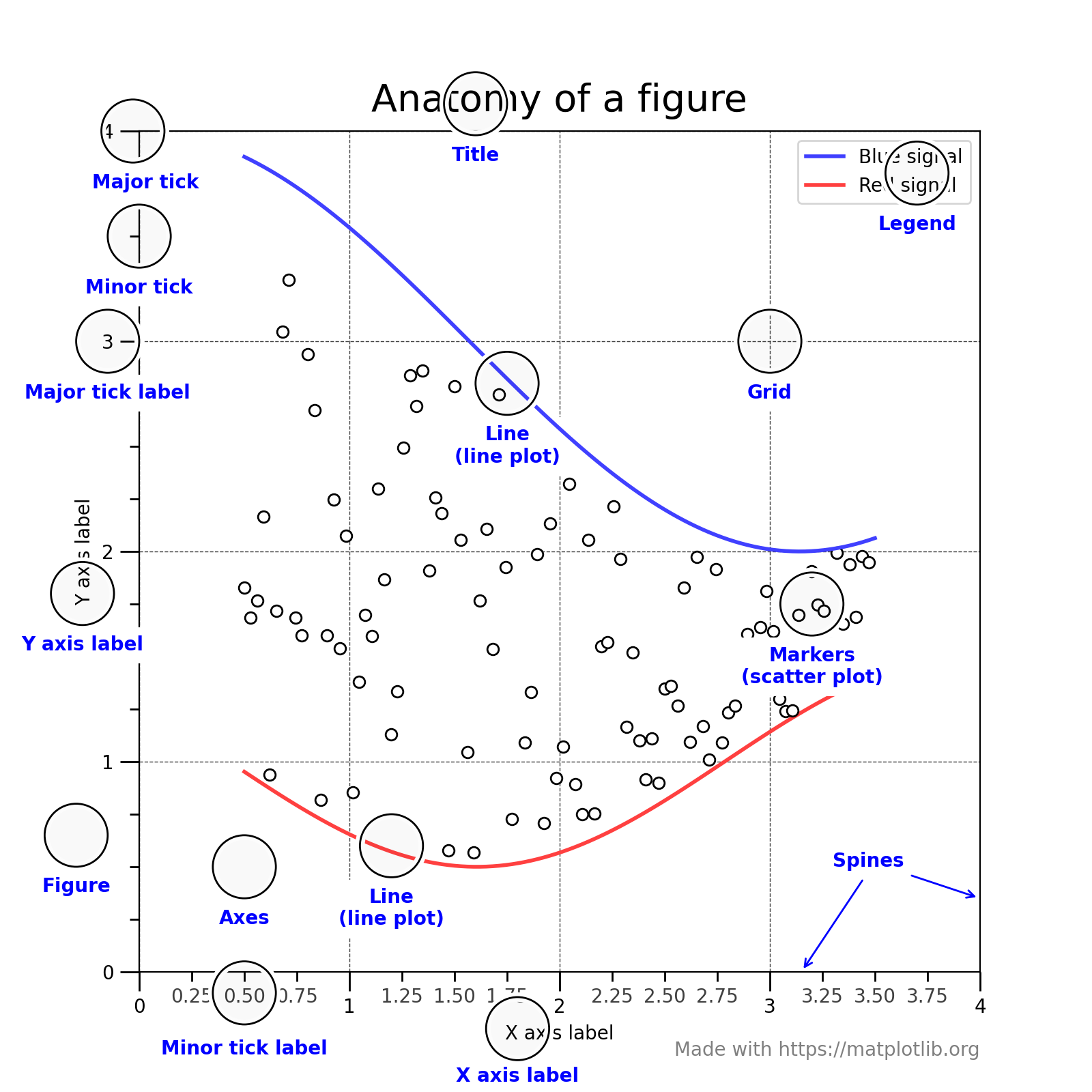
Figure composition
Figure can contain parts in the figure
The simplest way to create a new Figure is to use pyplot. The following are examples of creating several different styles of figures
fig = plt.figure()  # an empty figure with no Axes
fig, ax = plt.subplots()  # a figure with a single Axes
fig, axs = plt.subplots(2, 2)  # a figure with a 2x2 grid of Axes
Artist
Any element visible in Figure is called an Artist, and most artists are bound to an axis
Axes
Axes is the drawing area in Figure, which usually contains 2 or 3 coordinate axes and corresponding coordinate interval scales
Input variable type of drawing function
The type of input expected by the drawing function is numpy Array or numpy ma. masked_ array,
Or it can be converted to. Numpy Data of asarray. Some data classes of array like, such as pandas and numpy Matrices may not work the way you want them to, and they are usually converted to numopy Type asarray for drawing, for example
b = np.matrix([[1, 2], [3, 4]])
b_asarray = np.asarray(b)
Most methods also resolve data types of addressing types, such as dict and numpy rearray,pandas. dataFrames. Matplotlib allows you provide the data keyword argument and generate plots passing the strings corresponding to the x and y variables.
np.random.seed(19680801)  # seed the random number generator.
data = {'a': np.arange(50),
        'c': np.random.randint(0, 50, 50),
        'd': np.random.randn(50)}
data['b'] = data['a'] + 10 * np.random.randn(50)
data['d'] = np.abs(data['d']) * 100

fig, ax = plt.subplots(figsize=(5, 2.7), layout='constrained')
ax.scatter('a', 'b', c='c', s='d', data=data)
ax.set_xlabel('entry a')
ax.set_ylabel('entry b');
Coding style
Package common drawing methods into a function
def my_plotter(ax, data1, data2, param_dict):
    """
    A helper function to make a graph.
    """
    out = ax.plot(data1, data2, **param_dict)
    return out
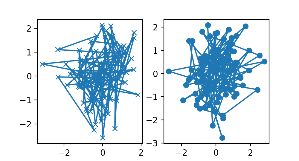
data1, data2, data3, data4 = np.random.randn(4, 100)  # make 4 random data sets
fig, (ax1, ax2) = plt.subplots(1, 2, figsize=(5, 2.7))
my_plotter(ax1, data1, data2, {'marker': 'x'})
my_plotter(ax2, data3, data4, {'marker': 'o'})
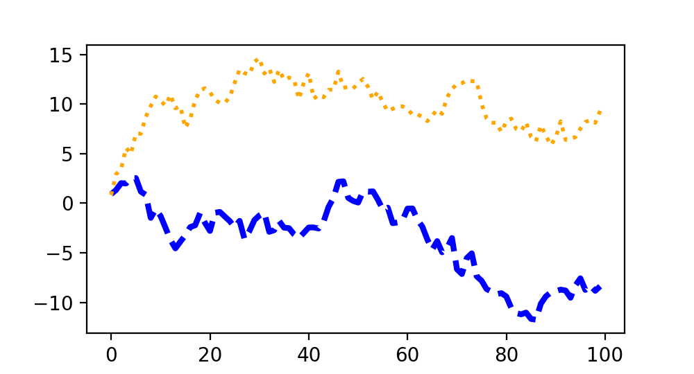
Artists Styles
Most drawing methods have Styles options. You can manually set colors, lineweights, linetypes, etc. through plot
fig, ax = plt.subplots(figsize=(5, 2.7))
x = np.arange(len(data1))
ax.plot(x, np.cumsum(data1), color='blue', linewidth=3, linestyle='--')
l, = ax.plot(x, np.cumsum(data2), color='orange', linewidth=2)
l.set_linestyle(':')
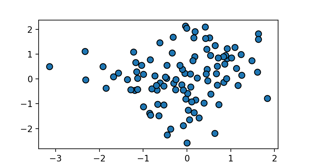
colour
fig, ax = plt.subplots(figsize=(5, 2.7))
ax.scatter(data1, data2, s=50, facecolor='C0', edgecolor='k')
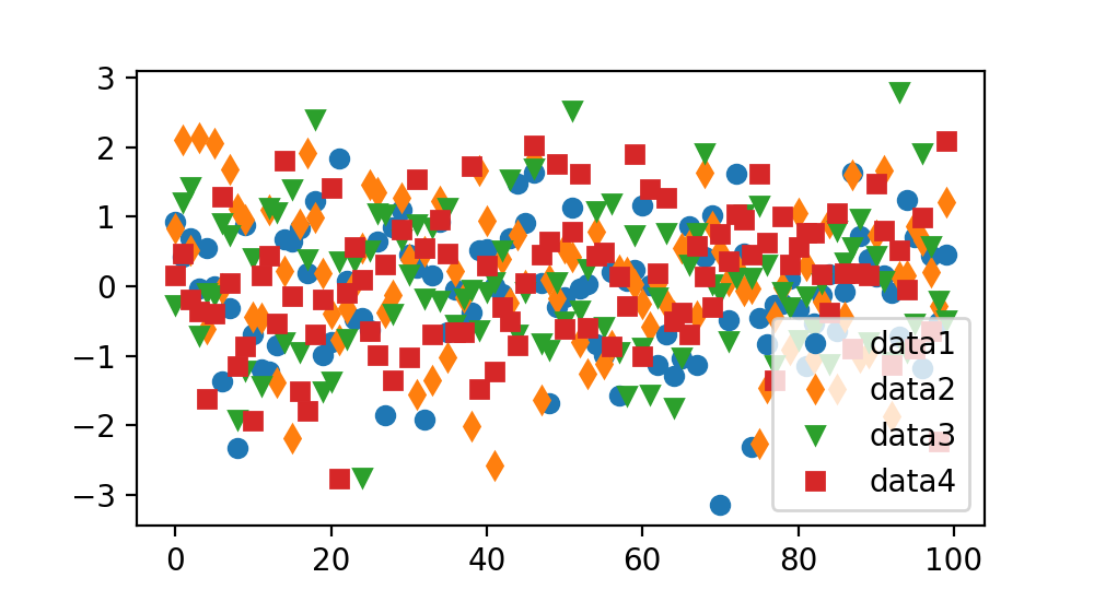
Lineweight, linetype, identifier
fig, ax = plt.subplots(figsize=(5, 2.7))
ax.plot(data1, 'o', label='data1')
ax.plot(data2, 'd', label='data2')
ax.plot(data3, 'v', label='data3')
ax.plot(data4, 's', label='data4')
ax.legend()
Add label
Coordinate domain labels and text
set_xlabel, set_ylabel, set_title, text
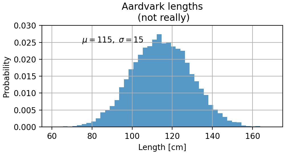
mu, sigma = 115, 15
x = mu + sigma * np.random.randn(10000)
fig, ax = plt.subplots(figsize=(5, 2.7), layout='constrained')
# the histogram of the data
n, bins, patches = ax.hist(x, 50, density=1, facecolor='C0', alpha=0.75)

ax.set_xlabel('Length [cm]')
ax.set_ylabel('Probability')
ax.set_title('Aardvark lengths\n (not really)')
ax.text(75, .025, r'$\mu=115,\ \sigma=15$')
ax.axis([55, 175, 0, 0.03])
ax.grid(True)
mathematical expression
Matplotlib accepts Tex's equation expression, for example σ i = 15 \sigma_i = 15 σi=15
ax.set_title(r'$\sigma_i=15$')
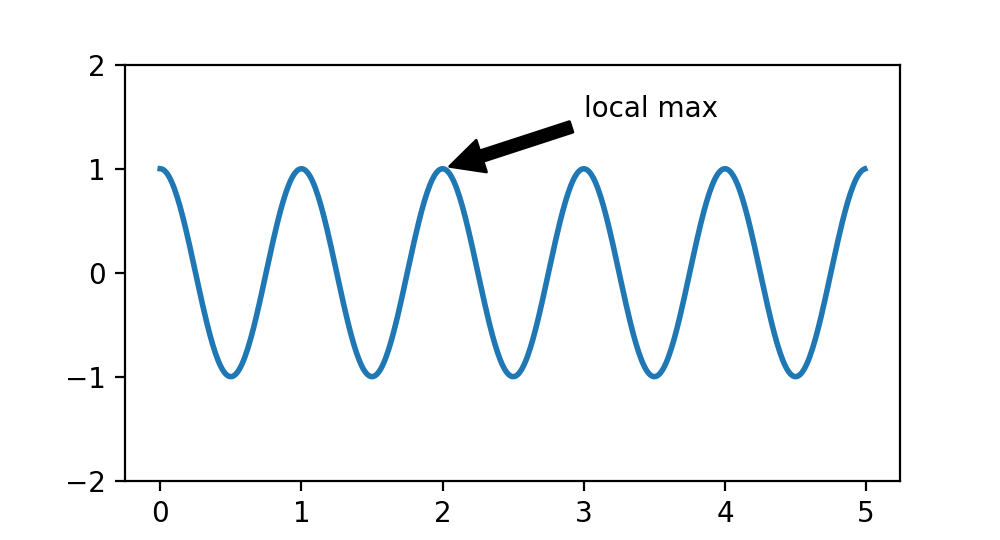
Annotations
fig, ax = plt.subplots(figsize=(5, 2.7))

t = np.arange(0.0, 5.0, 0.01)
s = np.cos(2 * np.pi * t)
line, = ax.plot(t, s, lw=2)

ax.annotate('local max', xy=(2, 1), xytext=(3, 1.5),
            arrowprops=dict(facecolor='black', shrink=0.05))

ax.set_ylim(-2, 2)
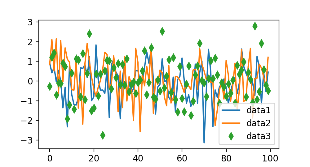
Legends
fig, ax = plt.subplots(figsize=(5, 2.7))
ax.plot(np.arange(len(data1)), data1, label='data1')
ax.plot(np.arange(len(data2)), data2, label='data2')
ax.plot(np.arange(len(data3)), data3, 'd', label='data3')
ax.legend()
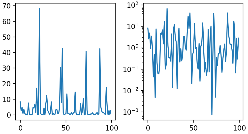
Axis scale and scale
scale
loglog, semilogx, semilogy
fig, axs = plt.subplots(1, 2, figsize=(5, 2.7), layout='constrained')
xdata = np.arange(len(data1))  # make an ordinal for this
data = 10**data1
axs[0].plot(xdata, data)

axs[1].set_yscale('log')
axs[1].plot(xdata, data)
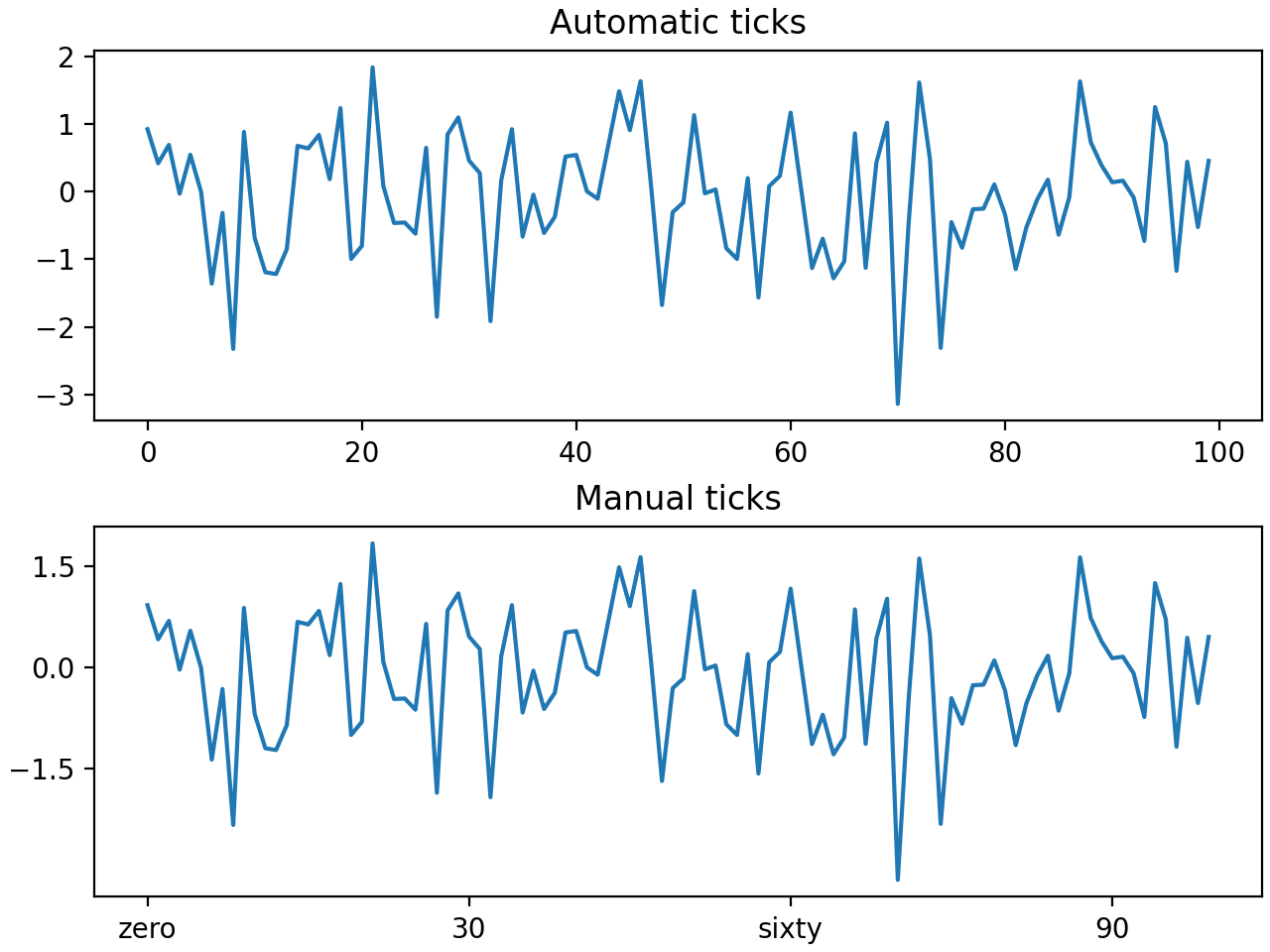
Scale position and format
set_xticks
fig, axs = plt.subplots(2, 1, layout='constrained')
axs[0].plot(xdata, data1)
axs[0].set_title('Automatic ticks')

axs[1].plot(xdata, data1)
axs[1].set_xticks(np.arange(0, 100, 30), ['zero', '30', 'sixty', '90'])
axs[1].set_yticks([-1.5, 0, 1.5])  # note that we don't need to specify labels
axs[1].set_title('Manual ticks')
Draw date and string
Unfinished to be continued