preface
I learned about canvas briefly before, and now I will learn about svg briefly, so as to enter a door for future work
svg learning tutorial: Rookie tutorial
For basic learning, you can see the rookie tutorial. If it is more complex, you can find some svg libraries
Recommended articles: Ruan Yifeng SVG image tutorial
svg
SVG means Scalable Vector Graphics.
SVG uses XML format to define images.
The SVG size is 300 * 150 by default. If it is greater than this value, it should be set
<svg
   xmlns="http://www.w3.org/2000/svg"
   version="1.1"
   width="600"
   height="300"
 >
   <rect width="550" height="200" style="fill: red; stroke: black" />
 </svg>
Use in html
The following uses are introduced in the tutorial
Use the < embedded > tag
Advantage: all major browsers support and allow the use of scripts
Disadvantages: not recommended in HTML4 and XHTML (but allowed in HTML5)
<embed src="circle1.svg" type="image/svg+xml" />
Use < Object > tag
Advantages: all major browsers support and support HTML4, XHTML and HTML5 standards
Disadvantages: scripts are not allowed
<object data="circle1.svg" type="image/svg+xml"></object>
Use < iframe > tags
Advantage: all major browsers support and allow the use of scripts
Disadvantages: not recommended in HTML4 and XHTML (but allowed in HTML5)
<iframe src="circle1.svg"></iframe>
Embed SVG code directly in HTML
In mainstream browsers
<svg xmlns="http://www.w3.org/2000/svg" version="1.1">
   <circle cx="100" cy="50" r="40" stroke="black" stroke-width="2" fill="red" />
</svg>
Basics
rectangle
rect tags can be used to create rectangles and variants of rectangles
Common attributes:
- Width, height: set width and height
- x. y the distance from the pricing rectangle to the left of the browser
- The rx and ry attributes round the rectangle
- The style attribute is used to define CSS attributes:
- The fill property defines the fill color of the rectangle (rgb value, color name, or hexadecimal value)
- The stroke width property defines the width of the rectangular border
- The stroke property defines the color of the rectangular border
- The fill opacity property defines the fill color transparency (legal range: 0 - 1)
- The stroke opacity property defines the transparency of the contour color (legal range: 0 - 1)
example
<svg xmlns="http://www.w3.org/2000/svg" version="1.1">
  <rect width="150" height="150"
		style="fill:red;stroke:black;stroke-width:5;opacity:0.5" />
</svg>
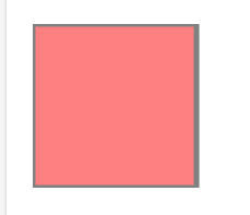
After a simple test, the effects of rx and ry are the same, and the effects of writing one and writing two are the same.
circular
circle can be used to create circles
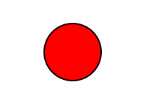
<svg xmlns="http://www.w3.org/2000/svg" version="1.1">
    <circle cx="100" cy="50" r="40" stroke="black" stroke-width="2" fill="red" />
</svg>
- The cx and cy attributes define the x and y coordinates of the dot. If cx and cy are omitted, the center of the circle is set to (0, 0)
- The r attribute defines the radius of the circle
- Related properties in the rectangle can also be used
ellipse
The ellipse element is used to create an ellipse
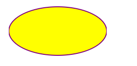
<svg xmlns="http://www.w3.org/2000/svg" version="1.1">
  <ellipse cx="300" cy="80" rx="100" ry="50"
  style="fill:yellow;stroke:purple;stroke-width:2"/>
</svg>
- cx cy defines the center of the circle
- rx horizontal radius, ry vertical radius
straight line
The < line > element is used to create a line:
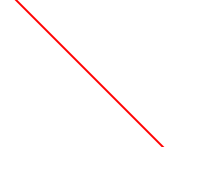
<svg xmlns="http://www.w3.org/2000/svg" version="1.1">
  <line x1="0" y1="0" x2="200" y2="200"
  style="stroke:rgb(255,0,0);stroke-width:2"/>
</svg>
- x1, starting point of y1 line
- End of x2, y2 line
polygon
The < polygon > label is used to create a graph with no less than three edges.
A polygon is composed of straight lines whose shape is "closed" (all lines are connected).
<svg  height="210" width="500">
  <polygon points="200,10 250,190 160,210"
  style="fill:lime;stroke:purple;stroke-width:1"/>
</svg>
Lines are actually multiple points connected to form a closed figure. Write the coordinates of points according to the clockwise attribute. The points are separated by spaces, and the x and y of points are separated by commas
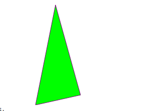
There is a fill rule attribute here. There are many contents. You can see the document
pline
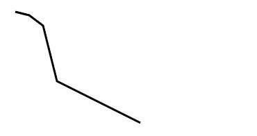
The < polyline > element is used to create any shape with only lines:
<svg xmlns="http://www.w3.org/2000/svg" version="1.1">
  <polyline points="20,20 40,25 60,40 80,120 120,140 200,180"
  style="fill:none;stroke:black;stroke-width:3" />
</svg>
It is basically consistent with the polygon, and multiple points are connected into a line
route
The < Path > element defines a path.
The following commands are available for path data:
- M = moveto
- L = lineto
- H = horizontal lineto
- V = vertical lineto
- C = curveto
- S = smooth curveto
- Q = quadratic Bézier curve
- T = smooth quadratic Bézier curveto
- A = elliptical Arc
- Z = closepath
Note: all the above commands allow lowercase letters. Upper case indicates absolute positioning and lower case indicates relative positioning.
This document is complex. It is recommended to use SVG editor. Here is an online editor
<svg xmlns="http://www.w3.org/2000/svg" version="1.1">
    <path d="M150 0 L75 200 L225 200 Z" />
</svg>
text
The < text > element is used to define text.
- Basic text
<svg xmlns="http://www.w3.org/2000/svg" version="1.1">
  <text x="0" y="15" fill="red">I love SVG</text>
</svg>
- Rotate text
<svg xmlns="http://www.w3.org/2000/svg" version="1.1">
  <text x="0" y="15" fill="red" transform="rotate(30 20,40)">I love SVG</text>
</svg>
rotate parameter: angle rotation center. The angle and rotation center are separated by a space, and a comma is added between the coordinates
- grouping
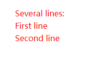
Elements can be arranged in any sub group with Number of elements. each Elements can contain different formats and locations. Several lines of text (and Element:
<svg xmlns="http://www.w3.org/2000/svg" version="1.1">
  <text x="10" y="20" style="fill:red;">Several lines:
    <tspan x="10" y="45">First line</tspan>
    <tspan x="10" y="70">Second line</tspan>
  </text>
</svg>
- Text link
<svg xmlns="http://www.w3.org/2000/svg" version="1.1"
xmlns:xlink="http://www.w3.org/1999/xlink">
  <a xlink:href="https://www.runoob.com/svg/svg-text.html" target="_blank">
    <text x="0" y="15" fill="red">I love SVG</text>
  </a>
</svg>
Blur effect
< defs > and < Filter >
All Internet SVG filters are defined in the < defs > element< Defs > the element definition is short and contains the definition of special elements (such as filters).
The < Filter > tag is used to define the SVG filter< The filter > tag uses the required id attribute to define which filter is applied to the graph?
<svg xmlns="http://www.w3.org/2000/svg" version="1.1">
  <defs>
    <filter id="f1" x="0" y="0">
      <feGaussianBlur in="SourceGraphic" stdDeviation="15" />
    </filter>
  </defs>
  <rect width="90" height="90" stroke="green" stroke-width="3"
  fill="yellow" filter="url(#f1)" />
</svg>
- The < Filter > element id attribute defines the unique name of a filter
- The < fegaussian Blur > element defines the blur effect
- in="SourceGraphic" this section defines the effect created by the entire image
- The stdDeviation attribute defines the amount of ambiguity
- The filter attribute of the < rect > element is used to link the element to the "f1" filter
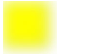
Other filter effects: Filter Effects
Linear gradient
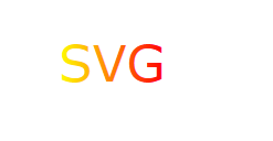
The < LinearGradient > element defines a linear gradient.
The < LinearGradient > tag must be nested inside < defs >< The defs > tag is an acronym for definitions, which defines special elements such as gradients.
Linear gradients can be defined as horizontal, vertical, or angular gradients:
- When y1 and y2 are equal, but x1 and x2 are different, a horizontal gradient can be created
- When x1 and x2 are equal and y1 and y2 are different, a vertical gradient can be created
- When x1 and x2 are different and y1 and y2 are different, you can create an angular gradient
<svg xmlns="http://www.w3.org/2000/svg" version="1.1">
  <defs>
    <linearGradient id="grad1" x1="0%" y1="0%" x2="100%" y2="0%">
      <stop offset="0%" style="stop-color:rgb(255,255,0);stop-opacity:1" />
      <stop offset="100%" style="stop-color:rgb(255,0,0);stop-opacity:1" />
    </linearGradient>
  </defs>
  <text fill="url(#grad1)" font-size="45" font-family="Verdana" x="150" y="86">SVG</text>
</svg>
radial gradient
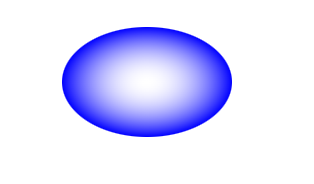
The < RadialGradient > element defines a radioactive gradient.
The < RadialGradient > tag must be nested inside < defs >< The defs > tag is an acronym for definitions, which defines special elements such as gradients.
<svg xmlns="http://www.w3.org/2000/svg" version="1.1">
  <defs>
    <radialGradient id="grad1" cx="50%" cy="50%" r="50%" fx="50%" fy="50%">
      <stop offset="0%" style="stop-color:rgb(255,255,255);stop-opacity:0" />
      <stop offset="100%" style="stop-color:rgb(0,0,255);stop-opacity:1" />
    </radialGradient>
  </defs>
  <ellipse cx="200" cy="70" rx="85" ry="55" fill="url(#grad1)" />
</svg>
svg animation
<animate>
Simple animation effects can be achieved through the < animate > tag. The more important attributes are as follows
- attributeName requires the attribute name of the animation
- Initial value of the from property
- The end value of the to property
- Values: when there are only two values, it is consistent with the writing of from and to; When there are multiple values, you can achieve a circular effect
- repeatCount: animation repetition times; Number specifies a fixed number of times, and infinite repeats indefinite ly
- dur: duration of animation
example
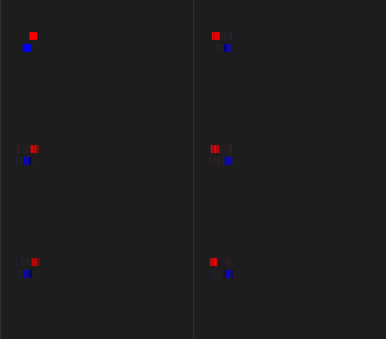
<svg xmlns="http://www.w3.org/2000/svg" version="1.1" width="600" height="300">
    <rect width="20" height="20" x="20" y="10" style="fill:red">
        <animate attributeName="x" values="10;50;10" dur="2s" repeatCount="indefinite" />
    </rect>
    <rect width="20" height="20" x="20" y="40" style="fill:blue">
        <animate attributeName="x" from="10" to="50" dur="2s" repeatCount="indefinite" />
    </rect>
</svg>
The rendering seems to have a little problem. You can try it yourself.
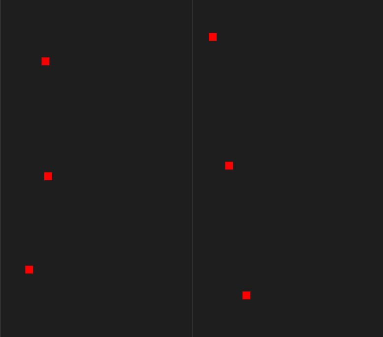
If you want to animate more attributes of the element, just add more < animate > elements to the element
<svg xmlns="http://www.w3.org/2000/svg" version="1.1" width="600" height="300">
    <rect width="20" height="20" x="20" y="10" style="fill:red">
        <animate attributeName="x" values="10;100;10" dur="3s" repeatCount="indefinite" />
        <animate attributeName="y" values="10;100;10" dur="3s" repeatCount="indefinite" />
    </rect>
</svg>
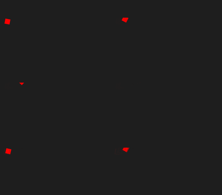
<animateTransform>
The < animatetransform > element can animate transform attributes. The more important attributes are as follows:
- attributeName = "transform" this is fixed
- begin and dur start and duration
- Type type: rotate, scale, translate, skewX, skewY
- from = "0 50 100": the first parameter represents the start angle, the second parameter represents the start coordinate of X axis, and the third parameter represents the start coordinate of Y axis;
- to = "90 150 100": the first parameter represents the end angle, the second parameter represents the X-axis end coordinate, and the third parameter represents the Y-axis end coordinate;
- Number of repeatCount executions
To give a simple example, what feels really difficult is the idea
<svg xmlns="http://www.w3.org/2000/svg" version="1.1" width="600" height="300">
    <rect width="20" height="20" x="20" y="10" style="fill:red">
        <animateTransform attributeName="transform" begin="0s" dur="5s" type="rotate" from="0 50 100" to="90 150 100"
            repeatCount="indefinite" />
    </rect>
</svg>
<animateMotion>
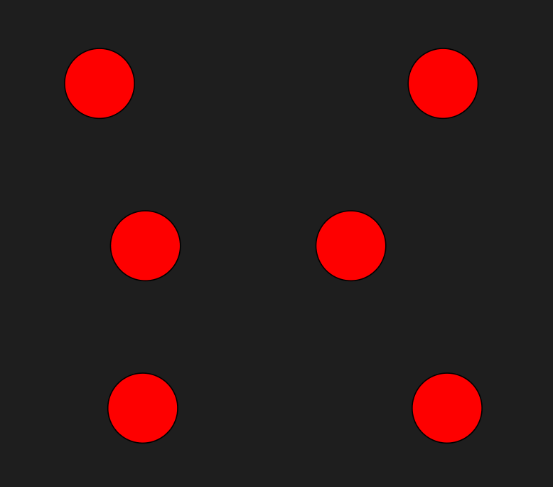
animateMotion can control the more linear operation of the control.
The more important attributes are as follows:
- Path this path, you can think of Label, you can use the curve to make the control animate according to the position of the specified curve;
- dur duration;
- repeatCount is the number of repetitions, which is one by default. Use the indefinite parameter to do the perpetual motion;
< animatemotion > label usage, or put it in the label that needs animation.
<svg xmlns="http://www.w3.org/2000/svg" version="1.1" width="400" height="400">
    <circle r="30" cx="150" cy="100" style="fill: red; stroke: black">
        <animateMotion path="M-50 0H50 0Z" dur="3s" repeatCount="indefinite" />
    </circle>
</svg>
svg and css and js
If the SVG code is written directly in an HTML web page, it becomes a part of the DOM of the web page and can be operated directly with the DOM.
<svg
  id="mysvg"
  xmlns="http://www.w3.org/2000/svg"
  viewBox="0 0 800 600"
  preserveAspectRatio="xMidYMid meet"
>
  <circle id="mycircle" cx="400" cy="300" r="50" />
<svg>
css
circle {
  stroke-width: 5;
  stroke: #f00;
  fill: #ff0;
}

circle:hover {
  stroke: #090;
  fill: #fff;
}
js
var mycircle = document.getElementById('mycircle');

mycircle.addEventListener('click', function(e) {
  console.log('circle clicked - enlarging');
  mycircle.setAttribute('r', 60);
}, false);