CSS floating and positioning
It mainly describes the concepts and examples of floating, positioning, pseudo class, etc
Block level elements and inline elements
Block level elements:
div,h,ul,li,p
- Exclusive row (exclusive row is not the row of the body, but the row of the parent container), and cannot be juxtaposed with any other element.
- Can set width and height.
- If you do not set the width, the width becomes 100% of the father by default.
Inline elements:
span,a,input,u,i,img
- Can be side-by-side with other inline elements. Width and height cannot be set.
- The default width and height are the width and height of the text.
Conversion between block level elements and inline elements
Block level elements can be set as inline elements
Inline elements can be set to block level elements
Convert with display
<!DOCTYPE html>
<html>
	<head>
		<meta charset="utf-8">
		<title></title>
		<style type="text/css">
			div {
				display: inline;
				background-color: #55ff7f;
			}
			span {
				display: block;
				background-color: #4169E1;
				width: 500px;
				height: 500px;
			}
		</style>
	</head>
	<body>
		<div>div1</div>
		<div>div2</div>
		<div>div3</div>
		<span>span</span>
	</body>
</html>
Here we can see that three div blocks are written to the body in the code. In the case of no conversion, the three blocks should occupy one line respectively, showing the color and square blocks according to the settings. However, after conversion, the three div blocks only occupy one line.
Therefore, once the "inline" label is set for a block level element, it will immediately become an inline element. At this time, it is the same as a span: at this time, the div cannot set the width and height;
Similarly: "block" makes the tag a block level element. At this time, the label is the same as a div: at this time, the span can set the width and height; The elements in the line occupy the whole line, and others cannot stand side by side with him; If the width is not set, it will be full

float
definition
A floating box can move left or right until its outer edge touches the border containing the box or another floating box. When the floating box is separated from the DOM flow, the parent element will behave like a floating box that does not exist.
It can be imagined that the element without floating is under the water, and the "floating" element floats away from the parent element.
Floating elements float to the next line when one line is full.

<!DOCTYPE html>
<html>
    <head>
       <meta charset="utf-8">
       <title></title>
       <style type="text/css">
           .fl {
               float: left;
           }
           .fr {
               float: right;
           }
           .clear {
               clear: both;
           }
           /* container Write only those related to this, not others */
           .container {
               width: 1000px;
               margin: 0 auto;
           }
           .company .item {
               width: 244px;
               height: 200px;
               margin: 3px;
               background-color: greenyellow;
           }
           .bg-pink {
               background-color: pink;
           }
           .service .item {
               width: 162px;
               height: 250px;
               margin: 2px;
               background-color: skyblue;
           }
           .company .title {
               height: 50px;
               background-color: darkblue;
           }
           .service .title {
               height: 50px;
               margin-top: 20px;
               margin-bottom: 20px;
               background-color: red;
           }
           .bg-orange {
               background-color: orange;
           }
           /* .service {
               padding-top: 20px;
           } */
       </style>
    </head>
    <body>
       <div class="bg-pink company">
           <div class="container">
               <div class="title">title</div>
               <div class="list">
                  <div class="item fl">1</div>
                  <div class="item fl">2</div>
                  <div class="item fl">3</div>
                  <div class="item fl">4</div>
                  <div class="item fl">5</div>
                  <div class="item fl">6</div>
                  <div class="item fl">7</div>
                  <div class="item fl">8</div>
                  <div class="clear"></div>
               </div>
           </div>
       </div>
       <div class="bg-orange service">
           <div class="container">
               <div class="title">title</div>
               <div class="list">
                  <div class="item fr">1</div>
                  <div class="item fr">2</div>
                  <div class="item fr">3</div>
                  <div class="item fr">4</div>
                  <div class="item fr">5</div>
                  <div class="item fr">6</div>
                  <div class="clear"></div>
               </div>
           </div>
       </div>
    </body>
</html>
Left float and right float can appear at the same time to meet the demand.
Clear float
1. The clear attribute specifies which side of the element does not allow other floating elements.
clear: eliminate the impact of floating on yourself, and the current element will move below the floating element.
2. Float and clear float appear in pairs
3. Clear floating is usually placed at the end of the closest floating element. Clear floating is only effective for the same level elements
Float and clear float should appear together
practice
Using floating web page template

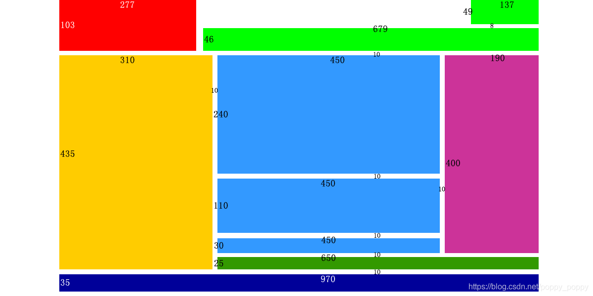
<!DOCTYPE html>
<html>
	<head>
		<meta charset="utf-8">
		<title></title>
		<style type="text/css">
			.fl {
				float: left;
			}
			.fr {
				float: right;
			}
			.clean {
				clear: both;
			}
			.bg-pink {
				width: 970px;
				background-color: pink;
				margin-bottom: 10px;
			}
			.container {
				width: 970px;
				margin: 0 auto;
			}
			.logo {
				width: 277px;
				height: 103px;
				background-color: red;
			}
			.select {
				width: 679px;
				height: 46px;
				margin-top: 8px;
				margin-left: 14px;
				background-color: #ADFF2F;
			}
			.language {
				width: 137px;
				height: 49px;
				margin-left: 556px;
				background-color: #ADFF2F;
			}
			.picture {
				width: 310px;
				height: 435px;
				background-color: orange;
			}
			.middle {
				width: 450px;
				height: 400px;
				margin-bottom: 10px;
				margin-left: 10px;
			}
			.bottom {
				width: 650px;
				height: 25px;
				background-color: #008000;
			}
			.hot {
				width: 190px;
				height: 400px;
				margin-bottom: 10px;
				margin-left: 10px;
				background-color: purple;
			}
			.middle .news {
				width: 450px;
				height: 240px;
				margin-bottom: 10px;
				background-color: #0000FF;
			}
			.middle .notices {
				width: 450px;
				height: 110px;
				margin-bottom: 10px;
				background-color: #0000FF;
			}
			.middle .messages {
				width: 450px;
				height: 30px;
				background-color: #0000FF;
			}
			.address {
				width: 970px;
				height: 35px;
				background-color: #00008B;
			}
		</style>
	</head>
	<body>
		<div class="bg-pink">
			<div class="container">
				<div class="logo fl">title</div>
				<div class="fr">
					<div class="language">language</div>
					<div class="select">select1</div>
				</div>
				<div class="clean"></div>
			</div>
		</div>
		<div class="bg-pink">
			<div class="container">
				<div class="hot fr">hot</div>

				<div class="middle fr">
					<div class="news">news</div>
					<div class="notices">notices</div>
					<div class="messages">massages</div>
				</div>

				<div class="bottom fr">select2</div>
				<div class="picture">picture</div>
			</div>
		</div>
		<div class="bg-pink">
			<div class="container">
				<div class="address">address</div>
			</div>
		</div>
	</body>
</html>
location
Classification of positioning (5 categories):
Default positioning
-
The default block elements are arranged vertically (div, p, h, ul, uo), and the elements in the row are arranged left and right (img, a, span, input)
This default arrangement is called flow positioning.There are many restrictions in the standard flow. When making the interface layout, the following requirements are often required: let the block level elements not only set the width and height, but also arrange left and right
Special positioning (4 kinds)
- Floating positioning (floating): block elements can be arranged left and right (without losing the advantage that block level elements can be set wide and high).
- Relative positioning: it can make the element target itself to produce a small offset (mouse over, image offset, etc.).
- Absolute positioning: it can make the element have a large offset with the parent class as the target.
- Fixed positioning: it can make the element have a large offset with the window as the target.
The last three kinds of positioning are offset by taking an element as the target.
Their differences
1. What they have in common:
- The offset should be set in the same way;
- The syntax for setting the offset is the same;
- Based on any edge, offset to the center as an integer.
2. Their differences
Relative positioning: relative positioning
- Reference: self
- It exists in the DOM stream and occupies the original space
- It must be combined with the four directions of top/bottom/left/right to take effect
- Choose one up and down, one left and one right
- Fine tuning the position of an element is often used as a reference for absolute positioning of elements;
- position:relative
When hovering over li, make li offset 2px to the upper right
Absolute positioning: absolute positioning
- Reference: the closest fixed/relative/absolute ancestor element. If there is no positioned ancestor element, its position is relative to or positioned;
- It breaks away from the DOM stream and does not occupy space.
- It must be combined with the four directions of top/bottom/left/right to take effect
- Choose one up and down, one left and one right
- Commonly used as animation structure, position:absolute
Fixed positioning: fixed positioning
- References: browser window
- Break away from the DOM stream and occupy no space
- It must be combined with the four directions of top/bottom/left/right to take effect
- Choose one up and down, one left and one right
- Except for special purposes, do not use margin when positioning
- position:fixed
practice
<!DOCTYPE html>
<html>
<head>
<meta charset="utf-8">
<title></title>
<style>
*{
margin: 0px;
padding: 0px;
}
body{
background-color: aliceblue;
}
.fl {
float: left;
}
.fr {
float: right;
}
.clean {
clear: both;
}
.container {
width: 730px;
margin: 0px auto;
}
.pic-box ul {
border: 2px dashed skyblue;
/* Remove the dots */
list-style-type: none;
}
.pic-box img {
width: 200px;
height: 200px;
}
.pic-box p{
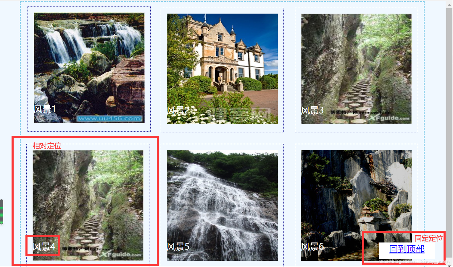
position: absolute;
bottom: 30px;
color: white;
/* Text centered */
text-align: center;
}
.pic-box ul li {
/* Relative positioning */
position: relative;
border: 1px dotted darkblue;
padding: 10px;
margin: 10px;
}
/* move */
.pic-box ul li:hover {
position: relative;
left: 2px;
top: -2px;
}
.jump-top {
width: 100px;
height: 30px;
/* Fixed positioning, so that the return vertex is always fixed and does not move with the movement of the scroll bar */
position: fixed;
/* Sets the distance from the right and lower parent classes */
right: 20px;
bottom: 20px;
background-color: white;
/* Text centered */
text-align: center;
}
.jump-top a:link {
color: blue;
}
.jump-top a:hover {
color: aqua;
}
.jump-top a:visited {
color: blue;
}</style>
</head>
<body>
<div class="pic-box">
<div class="container">
<ul>
<li class="fl">
<img src="../img/01.jpg"/>
<p>Landscape 1</p>
</li>
<li class="fl">
<img src="../img/02.jpg"/>
<p>Landscape 2</p>
</li>
<li class="fl">
<img src="../img/03.jpg"/>
<p>Landscape 3</p>
</li>
<li class="fl">
<img src="../img/04.jpg"/>
<p>Landscape 4</p>
</li>
<li class="fl">
<img src="../img/05.jpg"/>
<p>Landscape 5</p>
</li>
<li class="fl">
<img src="../img/06.jpg"/>
<p>Landscape 6</p>
</li>
<div class="clean"></div>
</ul>
</div>
<div class="jump-top">
<a href="#"> back to top</a>
</div>
</div>
</body>
</html>