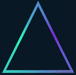
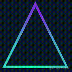
Recently, a little friend asked me, where A website See a colorful triangle border animation realized by SVG, and ask whether it can be realized by CSS:
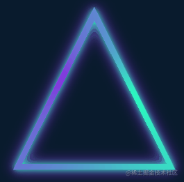
A very interesting animation effect immediately reminds me of where I am CSS fantasy border animation The border animation introduced in the article is very similar:
Its core is to use the conic gradient, and then cover the central area of the pattern with a small figure.
However, there are two difficulties in this triangle Animation:
- The whole figure is a triangle
In CSS, we can easily realize rectangle and circle, but triangle will undoubtedly be a lot tricky here.
- The entire border is also shaded, and the shadows are still on both sides of the border
If the above-mentioned method is not used to cover the complex pattern on one side, how to generate a small shadow on the other side? Even if you use drop shadow, it will be obscured by the covered inner figure.
Of course, CSS can still realize this graphic. This article will explain how to use CSS to realize the above colorful triangle border animation.
Body animation through angular gradient
First of all, we still need to realize the main body of the whole animation with the help of angular gradient conic gradient.
<div></div>
@property --angle {
  syntax: '<angle>';
  inherits: false;
  initial-value: 0deg;
}

div {
    width: 260px;
    height: 260px;
    background: conic-gradient(from var(--angle), hsl(162, 100%, 58%), hsl(270, 73%, 53%), hsl(162, 100%, 58%));
    animation: rotate 3s infinite linear;
}

@keyframes rotate {
    to {
        --angle: 360deg;
    }
}
The core is just an angular gradient pattern, combined with CSS @Property to rotate the whole effect:
Of course, if you feel that CSS @Property is not easy to understand or worry about compatibility, you can replace it with using pseudo elements to realize the same graphics, and then perform transform: rotate() rotation. The effect is the same.
Get triangles based on rectangular graphics
OK, next, we need to get the triangle shape based on the rectangle shape. For the triangle of the outer ring, we can cut it through clip path, which is also very simple:
div {
    width: 260px;
    height: 260px;
    background: conic-gradient(from var(--angle), hsl(162, 100%, 58%), hsl(270, 73%, 53%), hsl(162, 100%, 58%));
    animation: rotate 3s infinite linear;
  + clip-path: polygon(0 100%, 100% 100%, 50% 0);
}
The following results can be obtained:
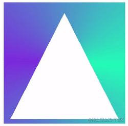
In this way, we get a solid triangle. Next, we need to find a way to empty the interior.
The simplest idea is to superimpose a smaller figure in the middle, and the color is consistent with the background color:
Complete code, you can stamp here-- CodePen Demo -- Pure CSS Linear Triangle
However, there are two fatal problems in doing so:
- If the background color is not a solid color but a gradient, this method fails
- The inside of the triangle border implemented by this method cannot add shadow effect
These two defects are unacceptable, so we must find a way to really hollow out the middle. After the hollowing is completed, its center must be transparent.
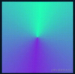
Therefore, we have to use mask here.
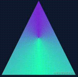
However, it is troublesome to use mask to realize a smaller triangle based on such a figure. We are equivalent to realizing such a hollowed out triangle figure. The schematic diagram is as follows:
Such a figure, combined with clip path, can get a triangular border figure. What does it mean? I have made a dynamic diagram here:
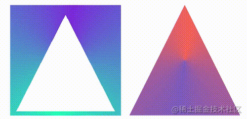
On the left is the figure after mask, and on the right is the figure after clip path cutting. When their effects are superimposed together, a border triangle can be realized.
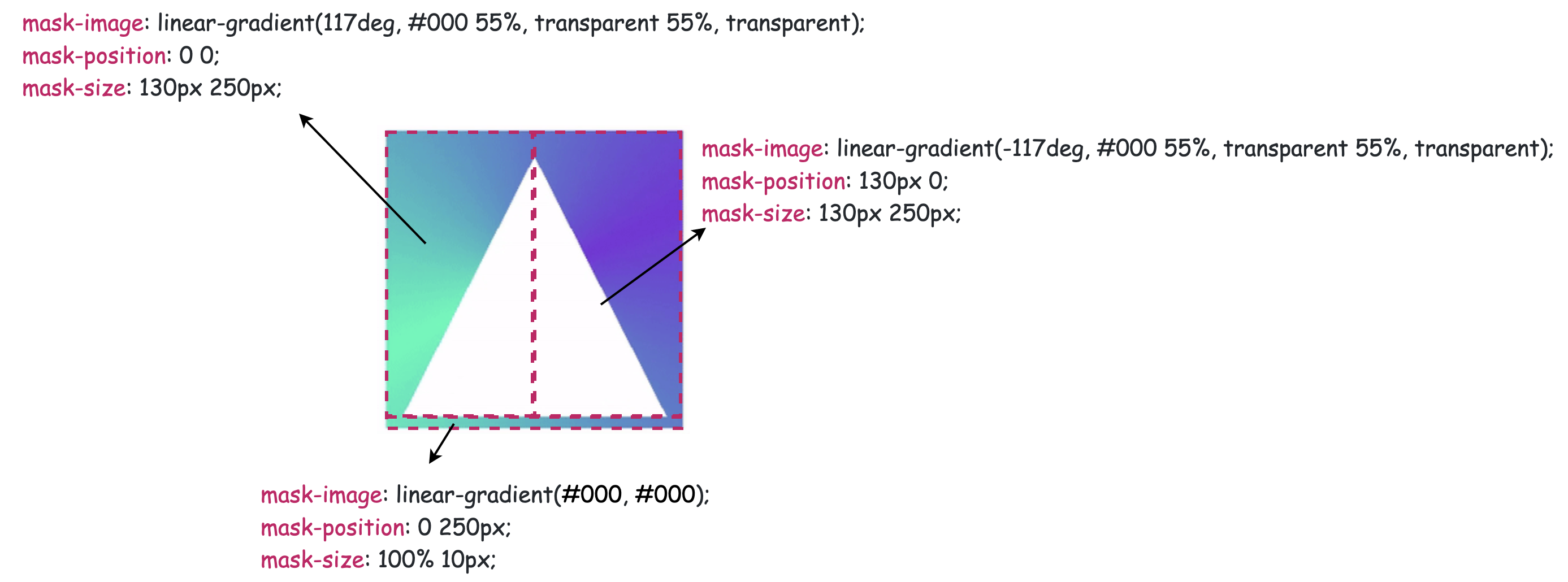
Of course, we need to master the mask deeply here. We need to use the mask to cut an internally hollowed out triangle. The schematic diagram is as follows:
OK, the complete code is as follows:
@property --angle {
  syntax: '<angle>';
  inherits: false;
  initial-value: 0deg;
}

div {
    width: 260px;
    height: 260px;
    background: conic-gradient(from var(--angle), hsl(162, 100%, 58%), hsl(270, 73%, 53%), hsl(162, 100%, 58%));
    clip-path: polygon(0 100%, 100% 100%, 50% 0);
    mask:
        linear-gradient(117deg, #000 55%, transparent 55%, transparent),
        linear-gradient(-117deg, #000 55%, transparent 55%, transparent),
        linear-gradient(#000, #000);
    mask-position: 0 0, 130px 0, 0 250px;
    mask-size: 130px 250px, 130px 250px, 100% 10px;
    mask-repeat: no-repeat;
    animation: rotate 3s infinite linear;
}

@keyframes rotate {
    to {
        --angle: 360deg;
    }
}
We get a triangular frame with hollow inside:
Using drop shadow to add light and shadow
The last step is relatively simple. Since the above triangle is already a hollowed out figure, here you can directly use drop shadow to add a layer of light and shadow effect to the element. However, due to the use of clip path, the drop shadow directly added to the original element cannot be displayed. This is a good solution. We only need to set more than one layer structure and add drop shadow to the parent element:
<div class="g-container">
    <div class="g-triangle"></div>
</div>
@property --angle {
syntax: '<angle>';
inherits: false;
initial-value: 0deg;
}
.g-container {
width: 260px;
height: 260px;
filter: drop-shadow(0 0 5px hsl(162, 100%, 58%)) drop-shadow(0 0 10px hsl(270, 73%, 53%));
}
.g-triangle {
width: 260px;
height: 260px;
background: conic-gradient(from var(--angle), hsl(162, 100%, 58%), hsl(270, 73%, 53%), hsl(162, 100%, 58%));
clip-path: polygon(0 100%, 100% 100%, 50% 0);
mask:
linear-gradient(117deg, #000 55%, transparent 55%, transparent),
linear-gradient(-117deg, #000 55%, transparent 55%, transparent),
linear-gradient(#000, #000);
mask-position: 0 0, 130px 0, 0 250px;
mask-size: 130px 250px, 130px 250px, 100% 10px;
mask-repeat: no-repeat;
animation: rotate 3s infinite linear;
}
@keyframes rotate {
to {
--angle: 360deg;
}
}Here is another trick. Drop shadow can be added repeatedly. The two shadow colors added here are the colors set in conic gradient(). Finally, we get the effect shown in the caption:
Complete code, you can stamp here-- CodePen Demo -- Pure CSS Glowing Triangle
Use clip path to cut circular triangles
The above uses clip path to cut out the outer triangle and mask out the inner triangle. It is reminded that clip path can cut out a ring triangle alone.
The above code can also be simplified to:
<div class="g-container">
    <div class="g-triangle"></div>
</div>
@property --angle {
syntax: '<angle>';
inherits: false;
initial-value: 0deg;
}
.g-container {
width: 260px;
height: 260px;
filter: drop-shadow(0 0 5px hsl(162, 100%, 58%)) drop-shadow(0 0 10px hsl(270, 73%, 53%));
}
.g-triangle {
width: 200px;
height: 200px;
clip-path:
polygon(
50% 0%,
0% 100%,
8% 100%,
50% 15%,
88% 93%,
7% 93%,
7% 100%,
100% 100%
);
background: conic-gradient(from var(--angle), hsl(162, 100%, 58%), hsl(270, 73%, 53%), hsl(162, 100%, 58%));
animation: rotate 3s infinite linear;
}
@keyframes rotate {
to {
--angle: 360deg;
}
}The effect is the same:

Complete code, you can stamp here-- CodePen Demo -- Pure CSS Glowing Triangle
It is necessary to explain here that it is possible to cut a circular pattern using clip path. Suppose we need a square ring with the following order of points:
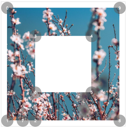
{
clip-path: polygon(0% 0%,0% 100%,25% 100%,25% 25%,75% 25%,75% 75%,25% 75%,14% 100%,100% 100%,100% 0%);
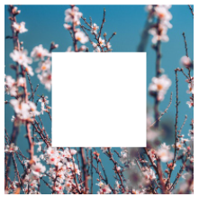
}You can get:
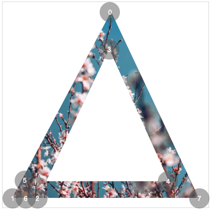
Similarly, you need to get a triangular ring, which only needs 7 points:
{
    clip-path: polygon(50% 0%,0% 100%,13% 100%,50% 20%,85% 90%,8% 90%,8% 100%,100% 100%);
}
The effect is as follows:
Here is a very useful tool to assist in making clip path graphics. If you are interested, you can try the following: CSS clip-path Editor
last
To understand the above complete code, you may need to supplement some basic CSS knowledge. You can click on it as needed:
- clip-path: Wonderful CSS shapes
- CSS @property custom properties: CSS @property, making the impossible possible
- Use drop shadow to generate the light source and frame of irregular graphics: Using drop shadow to realize the light and shadow effect of lines
Well, that's the end of this article. I hope this article will help you 😃
More wonderful CSS technical articles are summarized in my Github -- iCSS , continuously updated, welcome to a star collection.
If you have any questions or suggestions, you can communicate more. The original articles are limited in writing and lack of talent and learning. If there is anything wrong in the article, please let me know.