CSS selector and its priority
| Selector name | format | Priority weight |
|---|---|---|
| id selector | #id | 100 |
| Class selector | .className | 10 |
| attribute selectors | a[ref="eee"] | 10 |
| Pseudo class selector | li:last-child | 10 |
| tag chooser | div | 1 |
| Pseudo element selector | li:after | 1 |
| Adjacent Sibling Selectors | h1+p | 0 |
| Child selectors | ul>li | 0 |
| Descendant Selectors | li a | 0 |
| Wildcard selector | * | 0 |
For selector priority:
- Inline style: 1000
- id selector: 100
- Class selector, pseudo class selector, property selector: 10
- Label selector, pseudo element selector: 1
matters needing attention:
- By! Declaration of the highest priority;
- If the priority is the same, the last defined style shall prevail;
- Inherited styles have the lowest priority
- General selector (*), sub selector (>) and adjacent sibling selector (+) are not in these four levels, so their weights are all 0;
- When the sources of style sheets are different, the priority order is: inline style > internal style > external style > browser user defined style > browser default style
What are the inheritable and non inheritable properties in CSS
1, Non inheritable properties:
1. display: Specifies the type of box that the element should generate
2. Text attributes: vertical align, text decoration, text shadow, white space, Unicode bidi
3. Attributes of box model: width, height, margin, border, padding
4. Background attributes: background, background color, background image, background repeat, background position, background attachment
5. Positioning attributes: float, clear, position, top, right, bottom, left, min width, min height, max width, Max height
6. Generate content attributes: content, counter reset, counter increment
7. Outline style attributes: outline style, outline before, outline color, outline
8. Page style attributes: size, page break before, page break after
9. Sound style attributes: pause before, pause after, pause, cue before, cue after, cue, play during
2, Properties that can be inherited:
1. Font attribute: font family, font weight, font size, font style
2. Text attributes: text indent, text align, line height, word spacing, letter spacing, text transform, color
3. Element visibility: visibility
4. List layout properties: list style
5. Cursor attribute: cursor
Attribute value of display and its function
| Attribute value | effect |
|---|---|
| none | The element is not displayed and is removed from the document flow |
| block | Block element type. The default width is the width of the parent element. The width and height can be set and displayed in a single line |
| inline | Inline element type. The default width is the content width. You can't set the width and height. The same line is displayed |
| inline-block | Inline block element type. The default width is the content width. You can set the width and height to display in the same row |
| list-item | The element is displayed as a list |
| table | The element is displayed as a block level table with line breaks before and after the table |
| inline-table | The element will be displayed as an in row table, and there is no line break before and after the table |
| inherit | Specifies that the element will inherit the value of the display attribute from the parent element |
The difference between display block, inline and inline bllock
(1) Block: the element can be set as a block level element, which will occupy a single line. The width, height, margin and padding attributes can be set
(2) Inline: you can set an element as an inline element, which will not monopolize a row. Setting the width and height attributes will be invalid, but you can set the margin and padding attributes in the horizontal direction, not in the vertical direction.
(3) Inline block: you can set an element as an inline block element. This element will not monopolize a row, but you can set the width, height, margin and padding attributes like a block level element.
What are the ways to hide elements
-
display:none: the rendering tree will not have this element, so this element will not occupy a position on the page and will not respond to the bound listening event
-
visibility:hidden: the element will still occupy a position in the page, but will not respond to the bound listening event
-
opacity:0: set the transparency of the element to 0 to hide the element. However, the element will still occupy a position in the page and will also respond to the bound listening event
-
position:absolute: use absolute positioning to move elements out of the visual area to achieve the effect of hiding elements
-
z-index: negative value: set the level of the element to the lowest, and cover the element with other elements
-
Clip / clip path: using the method of element clipping, the element will still occupy a position on the page, but will not respond to the bound listening event
-
transform:scale(0,0): scale the element to 0. The element will still occupy a position on the page, but will not respond to the bound listening event
The difference between display:none and visibility:hidden
These two attributes can hide elements. The differences between them are as follows:
(1) In the render tree
- display:none will make the elements completely disappear from the rendering tree and will not occupy any space during rendering;
- visibility:hidden will not make elements disappear from the rendering tree, and the rendered elements will occupy space, but the content is invisible;
(2) Is it an inherited property
- display:none is a non inherited attribute, and the descendant node will disappear from the rendering tree along with the parent node. It cannot be displayed even by modifying the attributes of the descendant node;
- visibility:hidden is an inherited attribute. Descendant nodes disappear because they inherit the parent node's visibility:hidden attribute. You can set visibility:visible to make descendant nodes display;
(3) Rearrange or redraw
- Modifying the display attribute of elements in a regular document will result in document rearrangement
- Modifying the visibility attribute will only lead to the redrawing of the element;
(4) If you use a screen reader
- Setting display:none will not be read,
- The content set to visibility: hide will be read
The difference between pseudo elements and pseudo classes
- Pseudo elements: insert additional elements or styles before and after content elements, but these elements are not actually generated in the document. They are visible only in the external display, but they are not found in the source code of the document, so they are called "pseudo" elements.
p::before {content:"Chapter I:";}
p::after {content:"Hot!";}
p::first-line {background:red}
p::first-letter {font-size:30px}
- Pseudo class: add special effects to specific elements. It is added on the basis of existing elements and will not produce new elements.
a:hover {color:#FF00FF}
p:first-child {color:red}
Summary: pseudo elements change elements through the operation of elements, and pseudo classes add pseudo classes to the original elements to change the state of elements
Understanding of box model
In CSS3, the box model is divided into standard box model and IE box model
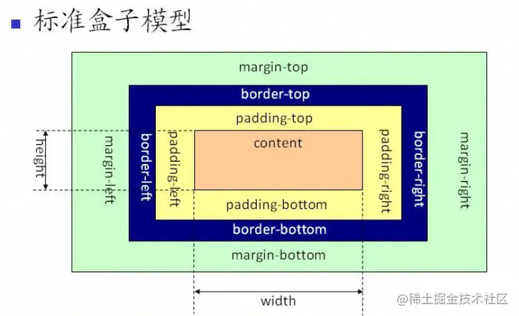
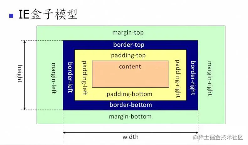
The box model is composed of four parts: content, padding, border and margin
The main difference between standard box model and IE box model is that their width and height correspond to different ranges:
- The scope of the width and height attributes of the standard box model only includes the content part
- The range of width and height attributes of IE box model includes content, padding and border
You can change the box model of an element by modifying the box sizing attribute of the element:
- Box sizing: content box indicates the standard box model (default value)
- Box sizing: border box represents IE box model (weird box model)
What are the new features in CSS3
- Add various CSS selectors (: not(.input): all nodes whose class is not "input")
- Fillet (border radius: 8px)
- Multi column layout
- Shadows and Reflections
- Text shadow
- Text rendering
- Linear gradient
- Rotate
- Zoom, tilt, animation, etc
Single line and multi line text overflow hiding
<div class="divOne">
    They are all CSS Preprocessor, yes CSS An abstraction layer on. They are a special kind of grammar/Language compiled into CSS.  for example Less Is a dynamic style language that will CSS It gives dynamic language features, such as variables, inheritance, operations, functions, LESS
    It can run on the client (support
    IE 6+, Webkit, Firefox),It can also run on the server (With the help of Node.js).
</div>
<div class="divTwo">
    They are all CSS Preprocessor, yes CSS An abstraction layer on. They are a special kind of grammar/Language compiled into CSS.  for example Less Is a dynamic style language that will CSS It gives dynamic language features, such as variables, inheritance, operations, functions, LESS
    It can run on the client (support
    IE 6+, Webkit, Firefox),It can also run on the server (With the help of Node.js).
</div>
.divOne {
    width: 200px;
    height: 100px;
    /* Force text to appear on one line*/
    white-space: nowrap;
    /* Excess hidden */
    overflow: hidden;
    /* Use an ellipsis to replace the excess */
    text-overflow: ellipsis;

}

.divTwo {
    width: 200px;
    height: 100px;
    /* Excess hidden */
    overflow: hidden;
    /* Use an ellipsis to replace the excess */
    text-overflow: ellipsis;
    /* Elastic box model display */
    display: -webkit-box;
    /* Limit the number of lines of text displayed */
    -webkit-line-clamp: 2;
    /* Sets or retrieves the arrangement of the child elements of the expansion box object */
    -webkit-box-orient: vertical;
}
Implementation of two column layout
The general two column layout means that the width of the left column is fixed and the width of the right column is adaptive. The specific implementation of the two columns is as follows
<div class="father">
    <div class="left">This is on the left</div>
    <div class="right">This is on the right</div>
</div>
- Using floating, set the width of the element on the left to 200px and set floating to the left. Set the margin left of the element on the right to 200px and the width to auto (the default is auto, which covers the entire parent element)
.father {
    height: 200px;
}

.left {
    float: left;
    width: 200px;
    background: red;
}

.right {
    margin-left: 200px;
    width: auto;
    background: blue;
}
- Using floating, the left element is set to a fixed size and floating on the left, and the right element is set to overflow:hidden; In this way, the BFC is triggered on the right. The area of the BFC will not overlap with the floating element, so the two sides will not overlap
.father {
    height: 200px;`Insert code slice here`
}

.left {
    float: left;
    width: 100px;
    background: red;
}

.right {
    overflow: hidden;
    background: blue;
}
- Using the flex layout, set the elements on the left to a fixed width of 200px and the elements on the right to flex:1
.father {
    display: flex;
    height: 200px;
}

.left {
    width: 200px;
    background: red;
}

.right {
    flex: 1;
    background: blue;
}
- Using absolute positioning, set the parent element to relative positioning. The left element is set to absolute positioning, and the width is set to 200px. Set the margin left value of the right element to 200px
.father {
    position: relative;
    height: 200px;
    ;
}

.left {
    position: absolute;
    width: 200px;
    background: red;
}

.right {
    margin-left: 200px;
    background: skyblue;
}
- Using absolute positioning, set the parent element to relative positioning. The left element width is set to 200px, the right element is set to absolute positioning, the left positioning is 200px, and the other directions are 0
.father {
    position: relative;
    height: 200px;

}

.left {
    width: 200px;
    height: 200px;
    background: red;
}

.right {
    position: absolute;
    top: 0;
    bottom: 0;
    left: 200px;
    right: 0;
    background: skyblue;
}
Implementation of three column layout
The three column layout generally refers to the layout with three columns in the page, the left and right columns with fixed width and adaptive middle. The specific implementation of the three column layout is as follows:
<div class="father">
    <div class="left">This is on the left</div>
    <div class="center">This is the middle</div>
    <div class="right">This is on the right</div>
</div>
- Using absolute positioning, set the parent element to relative positioning, set the left and right columns to absolute positioning, and set the margin value of its corresponding direction in the middle
.father {
    position: relative;
    height: 100px;
}

.left {
    position: absolute;
    width: 100px;
    height: 100px;
    background: tomato;
}

.right {
    position: absolute;
    top: 0;
    right: 0;
    width: 100px;
    height: 100px;
    background: yellow;
}

.center {
    margin-left: 100px;
    margin-right: 100px;
    height: 100px;
    background: skyblue;
}
- Using the flex layout, the left and right columns are set to a fixed size, and the middle column is set to flex:1
.father {
    display: flex;
    height: 100px;
}

.left {
    width: 100px;
    background: red;
}

.right {
    width: 100px;
    background: blue;
}

.center {
    flex: 1;
    width: 100px;
    background: green;
}
- Using floating, the left and right columns are set with fixed size, and the floating in the corresponding direction is set. The middle column sets the margin values in the left and right directions (the middle part here should be placed last)
.father {
    height: 100px;
}

.left {
    float: left;
    width: 200px;
    height: 100px;
    background: red;
}

.right {
    float: right;
    width: 100px;
    height: 100px;
    background: blue;
}

.center {
    height: 100px;
    margin-left: 200px;
    margin-right: 100px;
    background-color: chartreuse;
}
- Grail layout, using floating and negative margins to achieve. The left and right padding is set for the parent element, and the three columns are set to float to the left. The middle column is placed in the front, and the width is set to the width of the parent element. Therefore, the next two columns will be squeezed to the next row. Move them to the previous row by setting the negative value of margin, and then use relative positioning to locate them on both sides.
.father {
    height: 100px;
    padding-left: 100px;
    padding-right: 200px;
}

.left {
    position: relative;
    left: -100px;

    float: left;
    margin-left: -100%;

    width: 100px;
    height: 100px;
    background: tomato;

}

.right {
    position: relative;

    float: right;
    margin-right: -200px;

    width: 200px;
    height: 100px;
    background: blue;

}

.center {
    float: left;

    width: 100%;
    height: 100px;
    background: green;
}
- Double wing layout. Compared with the Holy Grail layout, the left and right positions of the double wing layout are reserved through the margin value in the middle column. In essence, it is also achieved by floating and negative outer margin.
.father {
    height: 100px;

}

.left {
    float: left;
    /* margin-left: -100px; */
    position: relative;
    top: -100px;
    width: 100px;
    height: 100px;
    background-color: chartreuse;
}

.right {
    float: right;
    margin-left: -200px;

    position: relative;
    top: -100px;

    width: 200px;
    height: 100px;
    background-color: blue;
}

.center {
    margin-left: 100px;
    margin-right: 200px;
    height: 100px;
    background-color: aqua;
}
Realization of horizontal and vertical centering
- You can use auto margin: to achieve horizontal centering
.center {
    background-color: aqua;
    margin: auto;
    width: 100px;
    height: 100px;
}
- Using absolute positioning, first locate the upper left corner of the element to the center of the page through top:50% and left:50%, and then adjust the center point of the element to the center of the page through translate.
.center {
    position: absolute;
    height: 100px;
    width: 100px;
    left: 50%;
    top: 50%;
    transform: translate(-50%, -50%);
    background-color: aqua;
}
- Using absolute positioning, set the value of all four directions to 0, and set margin to auto. Due to the fixed width, the corresponding directions can be divided equally, which can realize the center in the horizontal and vertical directions. This method is applicable to the case that the box has width and height.
.center {
    position: absolute;
    top: 0;
    left: 0;
    right: 0;
    bottom: 0;
    margin: auto;
    width: 100px;
    height: 100px;
    background-color: aqua;
}
- Using absolute positioning, first locate the upper left corner of the element to the center of the page through top:50% and left:50%, and then adjust the center point of the element to the center of the page through the negative value of margin. This method is applicable to the case where the width and height of the box are known
.center {
    position: absolute;
    top: 50%;
    left: 50%;
    /* Half its height */
    margin-top: -50px;
    /* Half its width */
    margin-left: -50px;
    width: 100px;
    height: 100px;
    background-color: aqua;
}
- Using the flex layout, set the parent element to flex, and set the vertical and horizontal alignment of the container through align items: Center and justify content: Center. Then its child elements can also be vertically and horizontally centered.
.parent {
    display: flex;
    justify-content: center;
    align-items: center;
}

.center {
    background-color: aqua;
    margin: auto;
    width: 100px;
    height: 100px;
}
Understanding of Flex layout and its usage scenarios
Flex is the abbreviation of Flexible Box, which means "flexible layout", and is used to provide maximum flexibility for box model.
Any container can be specified as a Flex layout, and inline elements can also use a Flex layout. However, it should be noted that after setting the Flex layout, the float, clear and vertical alian attributes of child elements will become invalid.
Elements that adopt Flex layout are called Flex layout, or "container" for short. Its child elements will automatically become container members, which is called Flex project, or "project".
By default, the container has two axes: the horizontal main axis and the vertical cross axis. Items are arranged along the main axis by default.
Properties of the container:
- Flex direction: determines the direction of the spindle (i.e. the arrangement direction of items)
- Flex Wrap: how to wrap a line if an axis cannot fit
- Flex fllow: short for the above two attributes. The default value is row nowrap
- Justify content: defines the alignment of items on the main axis
- Align items: defines how items are aligned on the cross axis
- Align content: defines the alignment of multiple axes. If there is only one axis in the project, this attribute will not work
Properties of the project:
- Order: defines the order of items. The smaller the value, the higher the value. The default value is 0
- Flex growth: defines the method scale of the project. The default value is 0. That is, if there is any remaining space, it will not be enlarged
- Flex shrink: defines the reduction scale of the project. The default value is 1, that is, if there is insufficient space, the project will be reduced
- Flex basis: defines the spindle space occupied by the project before allocating excess space. Based on this attribute, the browser will calculate whether the spindle has excess space. Its default value is auto, which is the original size of the project.
- Flex: short for flex grow, flex shrink, and flex basis. The default is 0 1 auto
- Align self: allows a single item to have a different alignment from other items. You can override the align items attribute. The default value is auto, which means that it inherits the align items attribute of the parent element. If there is no parent element, it is equivalent to stretch
Why do I need to clear the float? Clear floating styles
The position of the floating element that will be moved out of the control flow refers to the position of the floating element that will be set in the floating process.
Problems caused by floating elements?
- The height of the parent element cannot be extended, which will affect the elements at the same level as the parent element
- Non floating elements of the same level as floating elements follow
- If the floating element is not the first element, the elements before the element also need to be floating, otherwise it will affect the display structure of the page
How to clear floating:
- Sets the height of the parent element
- After the last floating element, add an empty div tag and add the clear:both attribute
- Add an overflow:hidden or overflow:auto attribute to the parent tag containing the floating element
- Use: after pseudo element. However, since IE6-7 does not support: after, you need to use zoom:1
.clearfix:after{
  content: "\200B";
  display: table;
  height: 0;
  clear: both;
}
.clearfix{
  *zoom: 1;
}
Understanding of BFC and how to create BFC
What are the attributes of position and what are the differences
| Attribute value | summary |
|---|---|
| absolute | Generate an absolutely positioned element, which is positioned relative to a parent element other than static positioning. The position of the element is specified by the left, top, right and bottom attributes |
| relative | Generate a relatively positioned element and position it relative to its original position. The position of the element is specified by the left, top, right and bottom attributes |
| fixed | Generate an absolutely positioned element, and specify the position of the element relative to the screen viewport to specify the position of the element. The position of elements will not change when the screen scrolls. For example, the button back to the top is usually positioned in this way |
| static | The default value is no positioning. The elements appear in the normal document flow, ignoring the top, bottom, left, right or z-index attributes. Block level elements are arranged vertically from top to bottom, and row level elements are arranged from left to right |
| inherit | Specifies that the value of the position attribute is inherited from the parent element |
The positioning methods of the first three are as follows:
- relate: the positioning of an element is always relative to the position of the element itself. It has nothing to do with other elements and will not affect other elements.
- fixed: the positioning of the element is relative to the window boundary and has nothing to do with other elements. However, it is destructive and will lead to changes in the position of other elements.
- Absolute: the location of an element will find all its parent elements. If an element with position:relative/absolute/fixed is found, it will be located based on the element. If it is not found, it will be located based on the browser boundary.
Implement a triangle
The main use of CSS to draw triangles is the border attribute, that is, the border. The border attribute is composed of triangles.
.center {
    /* Set its height and width to 0 */
    width: 0;
    height: 0;
    /* Set the thickness, color and style of the border */
    border: 100px solid;
    border-color: red green blue yellow;
}
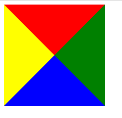
Therefore, triangles can be drawn according to this property:
.center {
    /* Set its height and width to 0 */
    width: 0;
    height: 0;
    /* Set the thickness, color and style of the border */
    border: 100px solid;
    border-color: red green blue yellow;
    /* Upper triangle */
    /* border-color: aqua transparent transparent transparent; */
    /* Right triangle */
    /* border-color: transparent aqua transparent transparent; */
    /* Lower triangle */
    /* border-color: transparent transparent aqua transparent; */
    /* Left triangle */
    /* border-color: transparent transparent transparent aqua; */
    /* Large triangle with upper and right sides integrated */
    /* border-color: aqua aqua transparent transparent; */
    /* Large triangle with right and lower edges integrated */
    /* border-color: transparent aqua aqua transparent; */
    /* Large triangle with lower and left integration */
    /* border-color: transparent transparent aqua aqua; */
    /* Large triangle with upper and left sides integrated */
    /* border-color: aqua transparent transparent aqua; */
}
Realize a sector
The principle of realizing a sector in CSS is basically the same as that of realizing a triangle, that is, there is an additional rounded corner style
.center {
    /* Set its height and width to 0 */
    width: 0;
    height: 0;
    /* Set the thickness, color and style of the border */
    border: 100px solid;
    border-color: red transparent transparent transparent;
    /* Set fillet style to achieve fan shape */
    border-radius: 100px;
}
How to solve 1px problems
The problem of 1px is that on some Retina screen models, the 1px on the mobile page will become very thick, showing the effect of more than 1px. The reason is simple - 1 training in CSS cannot be equated with 1px on mobile devices. The proportional relationship between them has a special attribute to describe:
window.devicePixelRatio = Physical pixels of the device / CSS Pixels.
Open the Chrome browser, start the mobile debugging mode, and output the value of the devicePixelRatio on the console. Select iPhone6/7/8 models here, and the output is 2:
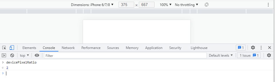
This means that the set 1px CSS pixels will actually be rendered with two physical pixel units on this device, so what you actually see will be thicker than 1px.
Three ways to solve 1px problems:
- Idea 1: write 0.5px directly
If the previous 1px style says this:
border:1px solid #333
You can get the window in JS first The value of devicepixelratio, and then give this value to the data of CSS through JSX or template syntax to achieve this effect (JSX syntax is used as an example here):
<div id="container" data-device={{window.devicePixelRatio}}></div>
Then you can use the attribute selector in CSS to hit the case where devicePixelRatio is a certain value. For example, try to hit the case where devicePixelRatio is 2:
#container[data-device="2"] {
  border:0.5px solid #333
}
Directly change 1px to the value after 1/devicePixelRatio, which is the simplest method so far. The drawback of this method is that it is not compatible. IOS system requires 8 or more versions, while Android system is directly incompatible.
- Idea 2: pseudo elements enlarge and then shrink
This method will be more feasible and more compatible. The only drawback is that there will be more code.
The idea is to zoom in first and then zoom out: add a:: after pseudo element after the target element. After the element is laid out as absolute, the whole element is spread on the target element, and then set its width and height to twice that of the target element, and the border value is set to 1px. Reduce the ability of the whole animation element to 50% with the help of the original CSS. At this time, the width and height of the pseudo element are good, which can be aligned with the original target element, and the border is reduced to half of 1px, indirectly realizing the effect of 0.5px.
The code is as follows:
#container[data-device="2"] {
    position: relative;
}
#container[data-device="2"]::after{
      position:absolute;
      top: 0;
      left: 0;
      width: 200%;
      height: 200%;
      content:"";
      transform: scale(0.5);
      transform-origin: left top;
      box-sizing: border-box;
      border: 1px solid #333;
    }
}
- Idea 3: solve the problem by zooming the viewport
This idea is to start with several key attributes in the meta tag:
<meta name="viewport" content="initial-scale=0.5, maximum-scale=0.5, minimum-scale=0.5, user-scalable=no">
Here, for the page with pixel ratio of 2, the whole page is scaled to the original 1 / 2 size. In this way, the 1px style that used to occupy two physical pixels now occupies a standard physical pixel. According to different pixel ratios, this scaling ratio can be calculated as different values, which can be realized by js code as follows:
const scale = 1 / window.devicePixelRatio;
// Here, metaEl refers to the Dom corresponding to the meta tag
metaEl.setAttribute('content', `width=device-width,user-scalable=no,initial-scale=${scale},maximum-scale=${scale},minimum-scale=${scale}`);
This is solved, but the side effects are also great, and the whole page is scaled. At this time, 1px has been processed into physical pixel size, which is very suitable for displaying the border on the mobile phone. However, some contents that do not need to be reduced, such as text and pictures, have also been reduced indiscriminately.