1 Introduction
Hi, everyone, this is senior student Dan Cheng. Today I'd like to introduce you to a big data project
Big data analysis: Stock Forecasting Analysis Based on time series
You can use it for graduation design
Technical solutions, problem opening guidance and design completion help
 Design help:<Q>746876041
2 origin of time series
When it comes to time series analysis technology, we have to talk about the AR/MA/ARMA/ARIMA analysis model. The common feature of these four analysis methods is to jump out of the analysis angle of changing components, and strive to obtain the quantitative relationship between the early data and the later data from the time series itself, so as to establish a model in which the early data is the independent variable and the later data is the dependent variable, so as to achieve the purpose of prediction. Let's use a popular metaphor. You the day before yesterday, you the day before yesterday and you yesterday have created you today.
2.1 names of four models:
- AR model: Auto Regressive model;
- MA model: Moving Average model;
- ARMA: Auto Regressive and Moving Average model;
- ARIMA model: differential autoregressive moving average model.
- AR model:
If any value of a time series can be expressed as the following regression equation, the time series follows an autoregressive process of order p, which can be expressed as AR §:
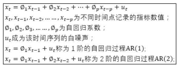
The AR model uses the correlation between previous and later values (autocorrelation) to establish a regression equation including previous and later values to achieve the purpose of prediction, so it becomes an autoregressive process. Here, it is necessary to explain the white noise. The white noise can be understood as the random fluctuation of time series values, and the sum of these random fluctuations will be equal to 0. For example, an automatic biscuit production line requires 500 grams per package of biscuits, but it is produced Due to the influence of random factors, biscuit products cannot be accurately equal to 500g, but will fluctuate up and down at 500g. The sum of these fluctuations will offset each other, equal to 0.
3 Data Preview
import pandas as pd
import matplotlib.pyplot as plt
%matplotlib inline

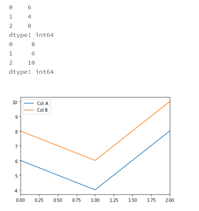
#Prepare two arrays
list1 = [6,4,8]
list2 = [8,6,10]

#Convert list1 and list2 to Series array respectively
list1_series = pd.Series(list1)
print(list1_series)
list2_series = pd.Series(list2)
print(list2_series)

#Convert the two Series to DataFrame, and the corresponding column names are A and B respectively
frame = { 'Col A': list1_series, 'Col B': list2_series }
result = pd.DataFrame(frame)

result.plot()
plt.show()
4 theoretical formula
4.1 covariance
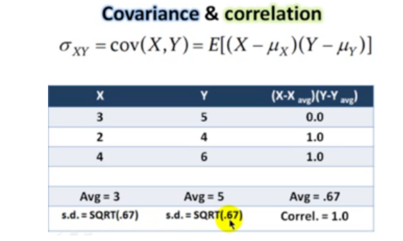
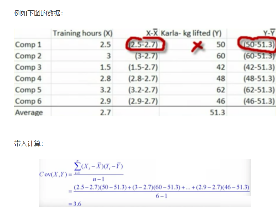
Let's first look at the covariance formula:
4.2 correlation coefficient
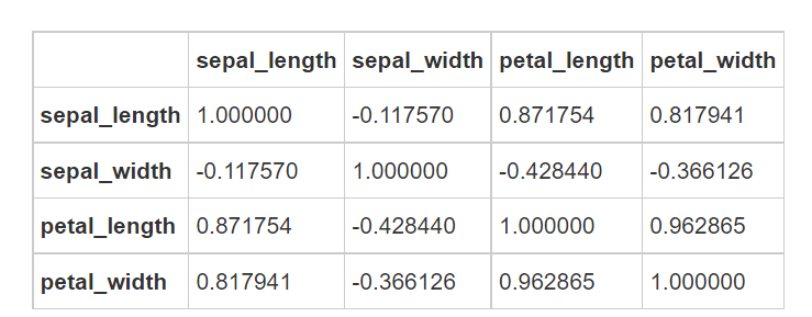
After Cov is calculated, the correlation coefficient can be calculated. The value is between - 1 and 1. The closer it is to 1, the greater the positive correlation is; The closer to - 1, the greater the negative correlation, and 0 is no correlation
The formula is as follows:

4.3 scikit learn calculation correlation
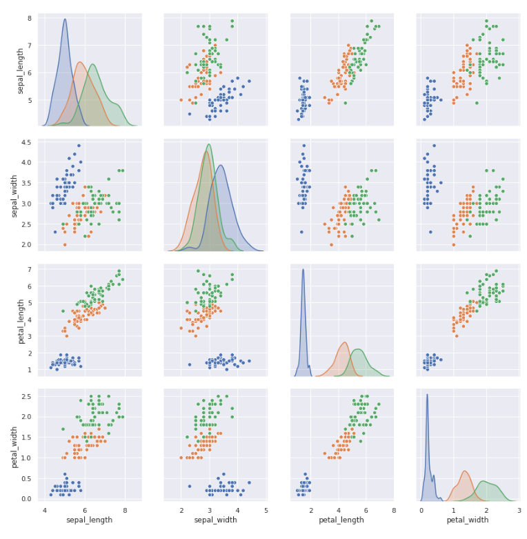
#Matrix diagram of the relationship between features
sns.pairplot(iris, hue='species', size=3, aspect=1)
Andrews Curves is a way to visualize multidimensional data by mapping each observation to a function.
Andrew curves is used to convert each multivariable observation value into a curve and represent the coefficients of Fourier series, which is very useful for detecting outliers in time series data.
plt.subplots(figsize = (10,8))
pd.plotting.andrews_curves(iris, 'species', colormap='cool')
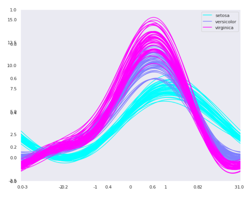
Take the classic iris data set as an example
setosa, versicolor and virginica represent three varieties of iris. It can be seen that there are intersections between various features and certain separate laws.
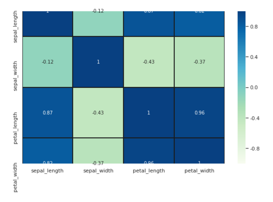
#Finally, find out the correlation between different features in the data set through the heat map. High positive or negative values indicate that the features are highly correlated:

fig=plt.gcf()
fig.set_size_inches(10,6)
fig=sns.heatmap(iris.corr(), annot=True, cmap='GnBu', linewidths=1, linecolor='k', \
square=True, mask=False, vmin=-1, vmax=1, \
cbar_kws={"orientation": "vertical"}, cbar=True)
5 time series analysis of financial data
This paper mainly introduces: time series change calculation, time series resampling and window function
5.1 data overview
import pandas as pd

tm = pd.read_csv('/home/kesci/input/gupiao_us9955/Close.csv')
tm.head()

Meaning of each indicator in the data:
- AAPL.O | Apple Stock
- MSFT.O | Microsoft Stock
- INTC.O | Intel Stock
- AMZN.O | Amazon Stock
- GS.N | Goldman Sachs Stock
- SPY | SPDR S&P 500 ETF Trust
- .SPX | S&P 500 Index
- .VIX | VIX Volatility Index
- EUR= | EUR/USD Exchange Rate
- XAU= | Gold Price
- GDX | VanEck Vectors Gold Miners ETF
- GLD | SPDR Gold Trust
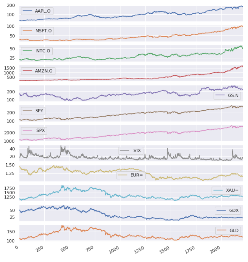
List of price (or index) trend in 8 years
5.2 calculation of sequence change
- Calculate the difference value of each indicator of each day (the result of the previous day minus the latter day)
- Calculate pct_change: growth rate, i.e. (last value - previous value) / previous value)
- Calculate average pct_change index
- Plot to see which indicator has the highest average growth rate
- Calculate the growth rate of continuous time (where the difference between today's price and yesterday's price needs to be calculated)
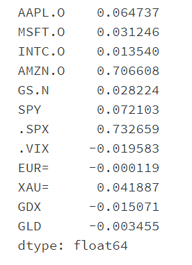
Calculate the difference value of each indicator of each day (the result of the previous day minus the latter day)
Calculate pct_change: growth rate, i.e. (last value - previous value) / previous value)
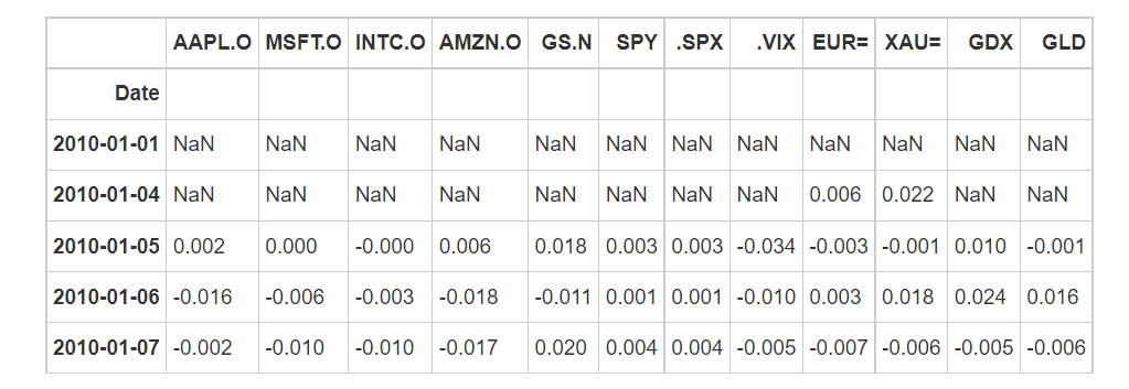
Calculate average pct_change index
Plot to see which indicator has the highest average growth rate
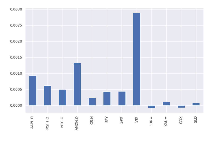
In addition to the highest growth rate of volatility index (. VIX Index), Amazon's stock price! Bezos is the strongest bald head in the universe
Calculate the growth rate of continuous time (where the difference between today's price and yesterday's price needs to be calculated)
#Day 2 data
tm.shift(1).head()

#Calculate growth rate
rets = np.log(tm/tm.shift(1))
print(rets.tail().round(3))

#cumsum chestnuts:
print('Results of small chestnuts:',np.cumsum([1,2,3,4]))

#For cumsum of growth rate, you need to restore the log with e^x
rets.cumsum().apply(np.exp).plot(figsize=(10,6))
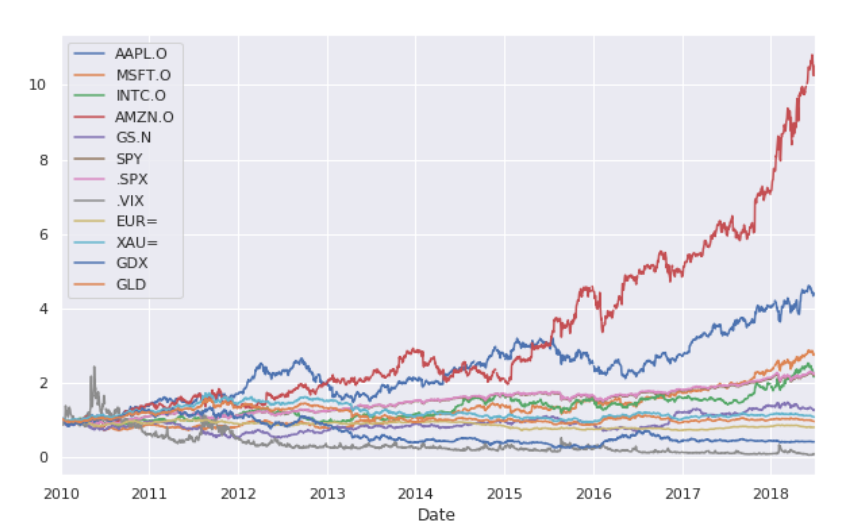
The above is the growth rate in a continuous period, that is, one yuan in 2010 has become more than 10 yuan by 2018 (take Amazon as an example)
(to be continued, this project is a demo prediction part. Some students need to contact the senior to complete it)
last
Technical solutions
 Design help:<Q>746876041
Follow the senior students' public-private-account to get more information on the completion of the project:
