Style and color show youth [¶]
The fifth chapter introduces the use of styles and colors in matplotlib in detail. Drawing styles and colors are important means to enrich visual charts. Therefore, mastering this chapter can make visual charts more beautiful, highlight key points and highlight artistry.
There are three common methods for drawing styles: modifying predefined styles, customizing styles, and rcparams.
About the use of color, this chapter introduces five common basic methods to represent monochrome color and the method of multicolor display of colormap.
1, Drawing style of matplotlib [¶]
In matplotlib, the easiest way to set the drawing style is to set the style separately when drawing elements. However, sometimes when users are making special reports, they often want to maintain the unity of the overall style without modifying each figure one by one. Therefore, matplotlib library also provides four ways to modify the global style in batch
1.matplotlib predefined style [¶]
matplotlib provides many built-in styles for users to use. The use method is very simple. Just enter the name of the style you want to use at the beginning of the python script. Try to call different built-in styles and compare the differences
import matplotlib as mpl
import matplotlib.pyplot as plt
import numpy as np
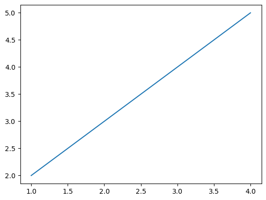
plt.style.use('default')
plt.plot([1,2,3,4],[2,3,4,5]);
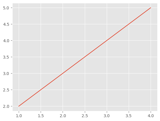
plt.style.use('ggplot')
plt.plot([1,2,3,4],[2,3,4,5]);
So what styles are built into matplotlib for use? A total of 26 rich styles are available.
print(plt.style.available)
['Solarize_Light2', '_classic_test_patch', 'bmh', 'classic', 'dark_background', 'fast', 'fivethirtyeight', 'ggplot', 'grayscale', 'seaborn', 'seaborn-bright', 'seaborn-colorblind', 'seaborn-dark', 'seaborn-dark-palette', 'seaborn-darkgrid', 'seaborn-deep', 'seaborn-muted', 'seaborn-notebook', 'seaborn-paper', 'seaborn-pastel', 'seaborn-poster', 'seaborn-talk', 'seaborn-ticks', 'seaborn-white', 'seaborn-whitegrid', 'tableau-colorblind10']
2. User defined stylesheet [¶]
Create a style list with the suffix mplstyle under any path, edit the file and add the following style contents
axes.titlesize : 24
axes.labelsize : 20
lines.linewidth : 3
lines.markersize : 10
xtick.labelsize : 16
ytick.labelsize : 16
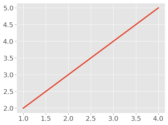
Observe the chart changes after referencing the custom stylesheet.
plt.style.use('file/presentation.mplstyle')
plt.plot([1,2,3,4],[2,3,4,5]);
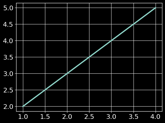
It is worth noting that matplotlib supports mixed style references. You only need to enter a style list when referencing. If several styles involve the same parameter, the style sheet on the right will overwrite the value on the left.
plt.style.use(['dark_background', 'file/presentation.mplstyle'])
plt.plot([1,2,3,4],[2,3,4,5]);
3. Set rcparams [¶]
We can also change the style by modifying the default rc settings. All rc settings are saved in a file called Matplotlib In the variable of rcparams.
After modification, you can see that the drawing style has changed.
plt.style.use('default') # Restore to default style
plt.plot([1,2,3,4],[2,3,4,5]);

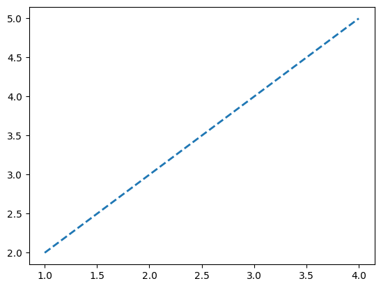
mpl.rcParams['lines.linewidth'] = 2
mpl.rcParams['lines.linestyle'] = '--'
plt.plot([1,2,3,4],[2,3,4,5]);
In addition, matplotlib also provides a more convenient way to modify styles, which can modify multiple styles at one time.
mpl.rc('lines', linewidth=4, linestyle='-.')
plt.plot([1,2,3,4],[2,3,4,5]);

2, color setting of matplotlib [¶]
In visualization, how to choose the appropriate color and collocation combination also needs to be carefully considered. The color selection should reflect the theme of the visual image.
By analyzing the color from the perspective of visual coding, the color can be divided into three visual channels: hue, brightness and saturation. Generally speaking:
Hue: there is no obvious order. Generally, it is not used to express the amount of data, but to express the category of data column.
Lightness and saturation: it is visually easy to distinguish the priority, which is used as the expression order or the visual channel to express the amount of data.
The specific knowledge about color theory does not belong to the focus of this tutorial. Please refer to the relevant expansion materials.
ECharts data visualization Laboratory
Learn these six basic visual color matching skills to restore the meaning of the data itself
In matplotlib, there are several ways to set colors:
1.RGB or RGBA [¶]
plt.style.use('default')
# The color is represented by floating-point numbers between [0,1], and the four components are (red, green, blue, alpha) in order, where alpha transparency can be omitted
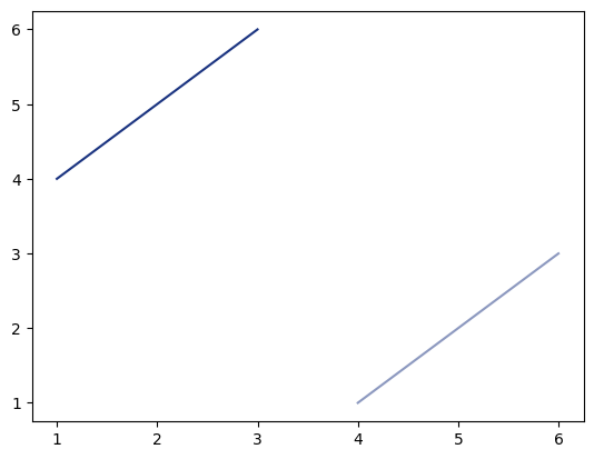
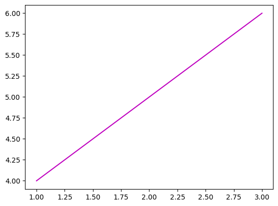
plt.plot([1,2,3],[4,5,6],color=(0.1, 0.2, 0.5))
plt.plot([4,5,6],[1,2,3],color=(0.1, 0.2, 0.5, 0.5));
2.HEX RGB or RGBA [¶]
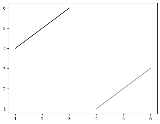
# It is represented by hexadecimal color code. Similarly, the last two digits represent transparency and can be omitted
plt.plot([1,2,3],[4,5,6],color='#0f0f0f')
plt.plot([4,5,6],[1,2,3],color='#0f0f0f80');
RGB color and HEX color can correspond one to one. The following website provides conversion tools for two color representation methods.
https://www.colorhexa.com/
3. Gray scale [¶]
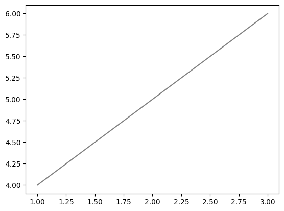
# When there is only one value at [0,1], it indicates the gray scale
plt.plot([1,2,3],[4,5,6],color='0.5');
4. Single character basic color [¶]
# matplotlib has eight basic colors, which can be represented by a single string, namely 'B', 'g', 'R', 'C','m ',' y ',' k ',' W ', corresponding to the English abbreviations of blue, green, red, cyan, magenta, yellow, black, and white
plt.plot([1,2,3],[4,5,6],color='m');
5. Color name [¶]
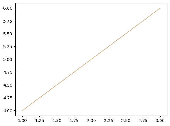
# matplotlib provides a color comparison table for querying the names corresponding to colors
plt.plot([1,2,3],[4,5,6],color='tan');
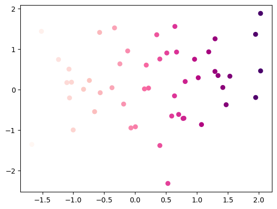
6. Use colormap to set a set of colors [¶]
Some charts support the use of colormap to configure a set of colors, so as to express more information through color changes in visualization.
In matplotlib, there are five types of colormap:
- Sequential. Usually, a single tone is used to gradually change the brightness and color, which is used to represent sequential information
- Divergence. Change the brightness and saturation of two different colors, which meet with unsaturated colors in the middle; This value should be used when the plotted information has a key intermediate value (e.g. terrain) or the data deviates from zero.
- Cycle. Change the brightness of two different colors and meet with unsaturated colors in the middle and at the beginning / end. The value used to wrap around at the endpoint, such as phase angle, wind direction, or time of day.
- Qualitative. Often variegated, used to represent information that has no sort or relationship.
- Miscellaneous. Some variegated combinations used in specific scenes, such as rainbow, ocean, terrain, etc.
x = np.random.randn(50)
y = np.random.randn(50)
plt.scatter(x,y,c=x,cmap='RdPu');
On the following official website page, you can query the corresponding relationship between the string representation of the above five colormap s and the color map
x = np.random.randn(50)
y = np.random.randn(50)
plt.scatter(x,y,c=x,cmap='RdPu');
[external chain picture transferring... (img-P5eVVwxp-1642762840809)]
On the following official website page, you can query the corresponding relationship between the string representation of the above five colormap s and the color map
https://matplotlib.org/stable/tutorials/colors/colormaps.html