This paper summarizes several common methods of three column layout, the effect is as follows:
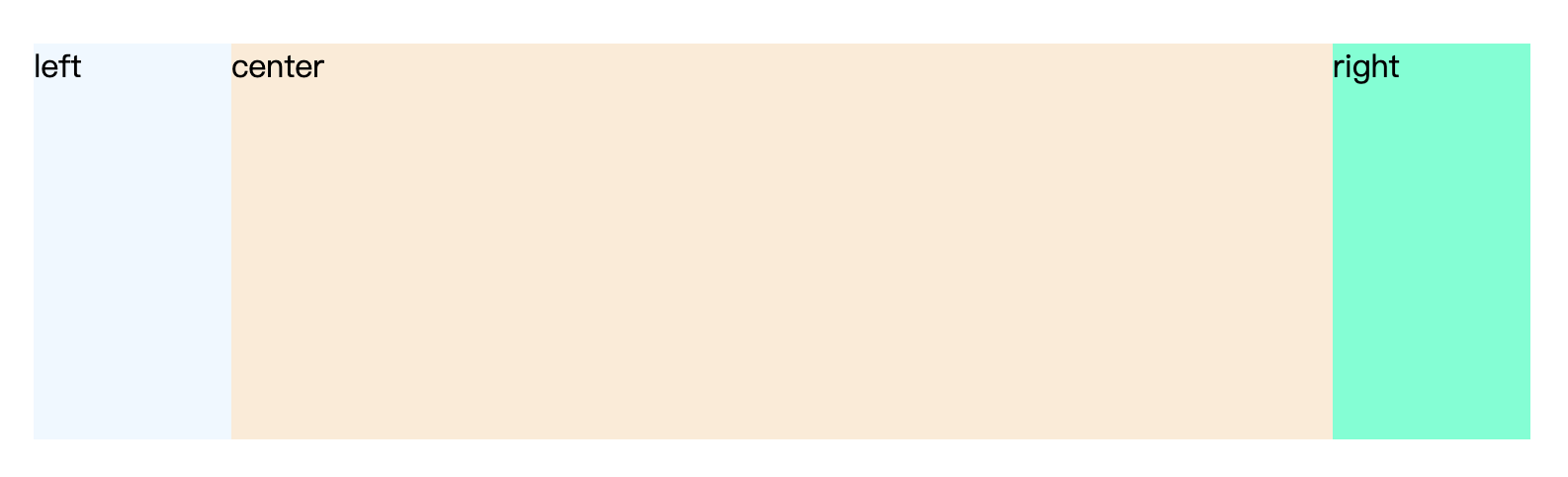
Among them, the left and right are respectively 100px, and the middle is adaptive.
1. floating
html code:
        <div class="left">left</div>
        <div class="right">right</div>
        <div class="center">center</div>
css code:
      .container-float > div {
        height: 200px;
      }
      .container-float > .left {
        width: 100px;
        background: aliceblue;
        float: left;
      }
      .container-float > .center {
        background: antiquewhite;
        margin: 0 100px 0 100px;
      }
      .container-float > .right {
        width: 100px;
        background: aquamarine;
        float: right;
      }
Disadvantages:
- The middle column must be placed at the end;
- When the window shrinks, the middle bar may be overwritten, and the right bar may be pushed to the next row.
2. Absolute positioning
html code:
        <div class="container-absolute">
          <div class="left">left</div>
          <div class="center">center</div>
          <div class="right">right</div>
        </div>
css code:
      .container-absolute {
        height: 200px;
        position: relative;
      }
      .container-absolute > div {
        height: 200px;
        position: absolute;
        top: 0;
      }
      .container-absolute .left {
        width: 100px;
        background: aliceblue;
        left: 0;
      }
      .container-absolute .center {
        background: antiquewhite;
        left: 100px;
        right: 100px;
      }
      .container-absolute .right {
        width: 100px;
        background: aquamarine;
        right: 0;
      }
Disadvantages:
- When the window is reduced, the middle and left columns may be overwritten;
- With absolute positioning, consider relationships with other elements of the page.
3. flex
html code:
        <div class="container-flex">
          <div class="left">left</div>
          <div class="center">center</div>
          <div class="right">right</div>
        </div>
css code:
      .container-flex {
        height: 200px;
        display: flex;
      }
      .container-flex > div {
        height: 200px;
      }
      .container-flex .left {
        width: 100px;
        background: aliceblue;
      }
      .container-flex .center {
        background: antiquewhite;
        flex: 1;
      }
      .container-flex .right {
        width: 100px;
        background: aquamarine;
      }
Disadvantages:
- When the window is shrunk, the width of the left and right columns may change.
4. table
html code:
        <div class="container-table">
          <div class="left">left</div>
          <div class="center">center</div>
          <div class="right">right</div>
        </div>
css code:
      .container-table {
        height: 200px;
        width: 100%;
        display: table;
      }
      .container-table > div {
        height: 200px;
        display: table-cell;
      }
      .container-table .left {
        width: 100px;
        background: aliceblue;
      }
      .container-table .center {
        background: antiquewhite;
      }
      .container-table .right {
        width: 100px;
        background: aquamarine;
      }
Disadvantages:
- When the window is shrunk, the width of the left and right columns may change.
5. grid
html code:
        <div class="container-grid">
          <div class="left">left</div>
          <div class="center">center</div>
          <div class="right">right</div>
        </div>
css code:
      .container-grid {
        height: 200px;
        width: 100%;
        display: grid;
        grid-template-rows: 200px;
        grid-template-columns: 100px auto 100px;
      }
      .container-grid .left {
        background: aliceblue;
      }
      .container-grid .center {
        background: antiquewhite;
      }
      .container-grid .right {
        background: aquamarine;
      }
6. Layout of Holy Grail
html code:
        <div class="container-shengbei">
          <div class="left">left</div>
          <div class="center">center</div>
          <div class="right">right</div>

        </div>
css code:
      .container-shengbei {
        height: 200px;
        padding: 0 100px 0 100px;
      }
      .container-shengbei > div {
        float: left;
        position: relative;
        height: 200px;
      }
      .container-shengbei .left {
        width: 100px;
        background: aliceblue;
        margin-left: -100px;
      }
      .container-shengbei .center {
        width: 100%;
        background: antiquewhite;
      }
      .container-shengbei .right {
        width: 100px;
        background: aquamarine;
        right: -100px;
        margin-left: -100px;
      }
Disadvantages:
- When the window shrinks, the middle bar may be overwritten, and the right bar may be pushed to the next row.
7. Dual wing layout
html code:
        <div class="container-shuangfei">
          <div class="center">
              <div class="inner">center</div>
          </div>
          <div class="left">left</div>
          <div class="right">right</div>
        </div>
css code:
      .container-shuangfei {
        height: 200px;
      }
      .container-shuangfei > div {
        float: left;
        position: relative;
        height: 200px;
      }
      .container-shuangfei .left {
        width: 100px;
        background: aliceblue;
        margin-left: -100%;
      }
      .container-shuangfei .center {
        width: 100%;
      }
      .container-shuangfei .center .inner{
          margin: 0 100px 0 100px;
          height: 200px;
          background: antiquewhite;
      }
      .container-shuangfei .right {
        width: 100px;
        background: aquamarine;
        margin-left: -100px;
      }
Disadvantages:
- When the window is shrunk, the middle and left columns may be covered, and the whole layout may be disordered.