Opening remarks

Survival analysis accounts for a large proportion in medical research, and when conducting survival analysis, R language, SPSS and other tools are often used for survival analysis, while Python is rarely used for survival analysis. Because we found a python version of survival analysis tool - lifelines, this library has provided relatively complete tools related to survival analysis. I recently studied survival analysis, and then began to write this project in combination with lifelines. While writing the code, we also show some conceptual nouns in survival analysis according to our own understanding. Because you write while learning, please correct any mistakes.
#Install the python library for survival analysis ----- lifelines
#Lifelines related document address https://lifelines.readthedocs.io/en/latest/
!pip install lifelines
!pip install  numpy==1.19.2
!pip install pyzmq==18.1.1
import pandas as pd
import numpy as np
import seaborn as sns
import matplotlib.pyplot as plt
1. What is survival analysis
In medicine, survival analysis is one of the very common and important analysis methods. It is a statistical method that combines the results of events and the time experienced by such results.
Case 1:
To study what factors affect the survival time of patients with rectal cancer. Will collect patient information. For example, there are age, gender, marital status, TMN stage, T stage, tumor diameter, tumor differentiation, treatment methods, etc. In addition, it will collect the time of death events in a certain period of time, that is, the survival time. Kaplan Meier curve was used for univariate analysis, which factor was the survival time of patients with rectal cancer, or Cox proportional hazards regression was used for multivariate analysis. The survival time of new patients with rectal cancer was predicted.
Case 2: in order to make a clinical trial of an anticancer drug, cancer patients were randomly divided into two groups. One group took the anticancer drug and the other group took the control drug. The survival time from the beginning of medication to death was recorded. And analyze whether there are differences in the relationship between the occurrence and time of death events in the two groups to judge whether the drugs are effective.
It can be seen from the two cases that survival analysis is to study the relationship between the occurrence of events and time under different conditions, not only considering whether events occur, but also considering the length of time of events.
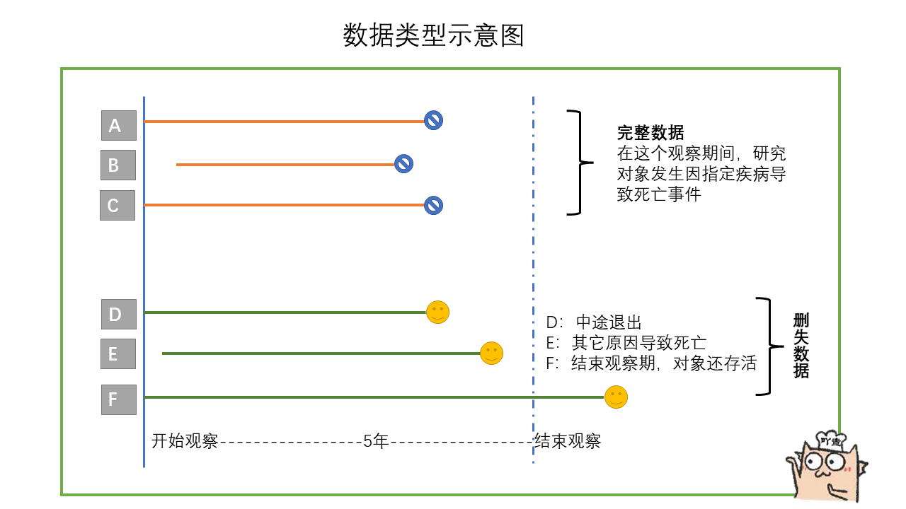
1.1 what is the data of survival analysis
The data of survival analysis is somewhat similar to the classified data. However, the survival analysis adds a column of time data. This column of time data is from the occurrence of specific events, recording how long the study object had failure events (such as death events) during the whole observation period. Survival analysis is to study the relationship between survival time and outcome and many influencing factors.
For example, the following table records the survival time and influencing factors of interest of 6 cancer patients during the 2-year observation period. The failure event here is a death event, which we are concerned about. The lifetime corresponds to the lifetime of the table. The influencing factors were age, gender, smoking and tumor size.
In the table, there is a patient whose survival time is only 21 months, but the outcome is survival. It may be that the patient withdrew from observation or changed his phone number, so he can't contact the patient and continue the research. This kind of data belongs to deleted data. It can be seen that in real life, the survival analysis data usually contains deleted data. For another example, in the table, there is a patient whose survival time is 19 months and the outcome is death. This kind of data belongs to complete data. However, these deleted data will also be analyzed together during survival analysis.
| Age | Gender | Do you smoke | Tumor size (mm) | Survival time (months) | event |
|---|---|---|---|---|---|
| 55 | male | yes | 17 | 23 | survival |
| 65 | female | yes | 20 | 24 | survival |
| 36 | female | no | 16 | 19 | death |
| 38 | male | yes | 25 | 21 | survival |
| 69 | male | no | 16 | 23 | survival |
| 70 | male | no | 28 | 20 | death |

1.2 common technical terms in survival analysis
Survival analysis has some common technical terms. For example, what is the survival rate, what is the survival curve, etc.
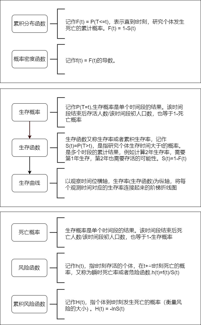
1.3 main purpose of survival analysis
- Estimate the survival rate of the subjects
- The survival rates of 2 different groups (influencing factors) were compared
- Analyze the factors and contribution that affect the survival time of the subjects
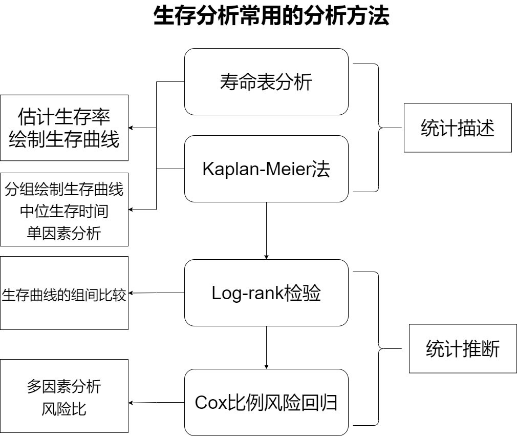
1.4 main methods of survival analysis
- Life table method and Kaplan Meier method (belonging to statistical description)
- Log rank test (belonging to statistical inference)
- Cox proportional hazards regression model (belonging to statistical inference)
[1] Life table and KM method belong to nonparametric methods, which are used to statistically describe survival data, such as estimating survival function in each time period and drawing survival curve. Life span method is mostly used for data with large samples and large follow-up time span. For example, the study object is followed up only once every 1 year. The product limit method is used to calculate the survival function by KM method and life span method. However, in practice, life table analysis is not very commonly used, and KM method is often used for analysis. Km method can calculate the median survival time, group the data, draw the survival curve respectively and conduct single factor analysis (single factor analysis can only analyze classified variables. If continuous variables are analyzed, continuous variables need to be grouped to become classification).
[2] Log rank test is a nonparametric test, which is used to compare the survival curves or survival time of two or more groups. It can compare the survival curves drawn after grouping in KM method.
[3] Cox proportional hazard regression model belongs to the semi parametric method, which can estimate the survival function, compare two or more groups of survival functions, single factor analysis or multi factor analysis. Single factor analysis includes classified variables and continuous variables. It can establish the relationship model between survival time and influencing factors and calculate the risk ratio of influencing factors. Note that Cox regression requires to meet the proportional risk assumption, that is, the influencing factors do not change with time.
1.5 evaluation indicators of survival analysis
On the one hand, the goodness of fit of the model, such as R-square, AIC, etc. On the one hand, there are model prediction accuracy, such as mean square error, AUC, etc. More attention is paid to the model prediction accuracy in clinic. The commonly used evaluation indicators of model prediction accuracy in survival analysis modeling are (here only talk about C-index index index...):
C-index (consistency index)
c-index reflects the consistency between the predicted results of the model and the actual situation.
The calculation method is to randomly form a pair of all research objects. The object with longer survival time predicted by the model has longer actual survival time, or the survival time with high predicted survival probability has longer actual survival time.
2. Data processing and analysis
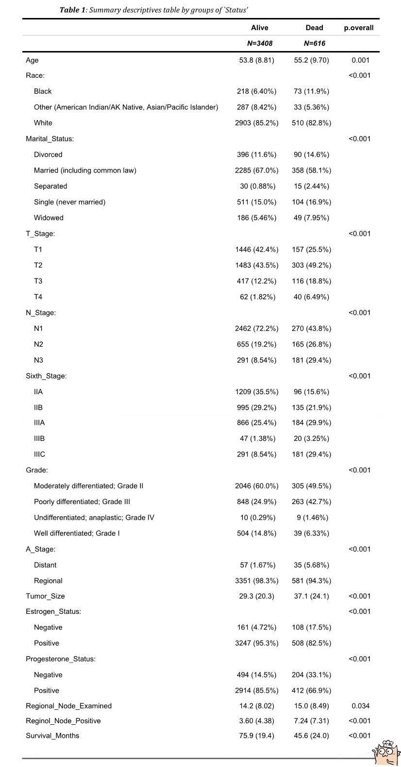
2.1 view the baseline data for breast cancer data in this project.
The invalidation of this breast cancer dataset is "Dead" in "Status", and the survival time is Survival_Months.
The characteristics of this breast cancer dataset are as follows:
- Age
- Race
- Marital_ Status (marital status)
- T_ Stage (primary tumor size)
- N_ Stage (lymph nodes with cancer cell spread)
- Sixth_Stage
- Grade
- A_Stage
- Tumor_ Size (tumor size)
- Estrogen_ Status (estrogen receptor positive)
- Progesterone_ Status (progesterone receptor positive)
- Regional_Node_Examined
- Reginol_Node_Positive
- Survival_Months (survival time in months)
By dividing the baseline data table into two groups according to "Alive" and "Dead", we can see the population distribution and proportion of each feature.
2.2 reading and processing data
Read csv files through pandas to obtain data. Through head(), you can see that some columns are composed of strings. For example, each value in the "Race" column is composed of "Black" and "White" equivalents, so you need to encode them into numbers 0, 1, 2, etc. during survival analysis.
"""
Read data and process classified variable data, otherwise use cox The model will report an error
 When encoding the string of column values, a symbol is compiled into a digital code
 Because some features do not have size, such as Race,That's 0, that's 1, no problem, you can pass pd.factorize Simple processing.
for example T_Stage Obviously progressive, can be handled as T1 Is 0, T2 It's 1.
for example['T2', 'T1', 'T3', 'T4'] ->[1,0,2,3]
The failure event we are concerned about here is Dead,censored data  Alive,So“ Status"Need to be processed into Alive Is 0, Dead Is 1
"""
df = pd.read_csv('SEER Breast Cancer Dataset .csv')

for name in df.columns.values:
    if df[name].dtype == object:
        print(f'Column name:{name}')
        print(f"Value:{df[name].unique().tolist()}\n")

df['Race'] = pd.factorize(df['Race'])[0].astype(np.uint16)
df['Marital_Status'] = pd.factorize(df['Marital_Status'])[0].astype(np.uint16)

df['A_Stage'] = pd.factorize(df['A_Stage'])[0].astype(np.uint16)
df['T_Stage'] = df['T_Stage'].map({'T1':1, 'T2':2,'T3':3,'T4':4})
df['N_Stage'] = df['N_Stage'].map({'N1':0, 'N2':1,'N3':2})
df['Sixth_Stage'] = df['Sixth_Stage'].map({'IIA':0, 'IIB':1,'IIIA':2,'IIIB':3,'IIIC':4})
df['Grade'] = df['Grade'].map({'Well differentiated; Grade I':0,
                                'Moderately differentiated; Grade II':1,
                                'Poorly differentiated; Grade III':2,
                                'Undifferentiated; anaplastic; Grade IV':3})
df['Estrogen_Status'] = df['Estrogen_Status'].map({'Positive':0, 'Negative':1})
df['Progesterone_Status'] = df['Progesterone_Status'].map({'Positive':0, 'Negative':1})


df['Status'] = df['Status'].map({'Alive':0, 'Dead':1})
df.head()
Column name:Race
Value:['Other (American Indian/AK Native, Asian/Pacific Islander)', 'White', 'Black']

Column name:Marital_Status
Value:['Married (including common law)', 'Divorced', 'Single (never married)', 'Widowed', 'Separated']

Column name:T_Stage
Value:['T2', 'T1', 'T3', 'T4']

Column name:N_Stage
Value:['N3', 'N2', 'N1']

Column name:Sixth_Stage
Value:['IIIC', 'IIIA', 'IIB', 'IIA', 'IIIB']

Column name:Grade
Value:['Moderately differentiated; Grade II', 'Poorly differentiated; Grade III', 'Well differentiated; Grade I', 'Undifferentiated; anaplastic; Grade IV']

Column name:A_Stage
Value:['Regional', 'Distant']

Column name:Estrogen_Status
Value:['Positive', 'Negative']

Column name:Progesterone_Status
Value:['Positive', 'Negative']

Column name:Status
Value:['Alive', 'Dead']
| Age | Race | Marital_Status | T_Stage | N_Stage | Sixth_Stage | Grade | A_Stage | Tumor_Size | Estrogen_Status | Progesterone_Status | Regional_Node_Examined | Reginol_Node_Positive | Survival_Months | Status | |
|---|---|---|---|---|---|---|---|---|---|---|---|---|---|---|---|
| 0 | 43 | 0 | 0 | 2 | 2 | 4 | 1 | 0 | 40 | 0 | 0 | 19 | 11 | 1 | 0 |
| 1 | 47 | 0 | 0 | 2 | 1 | 2 | 1 | 0 | 45 | 0 | 0 | 25 | 9 | 2 | 0 |
| 2 | 67 | 1 | 0 | 2 | 0 | 1 | 2 | 0 | 25 | 0 | 0 | 4 | 1 | 2 | 1 |
| 3 | 46 | 1 | 1 | 1 | 0 | 0 | 1 | 0 | 19 | 0 | 0 | 26 | 1 | 2 | 1 |
| 4 | 63 | 1 | 0 | 2 | 1 | 2 | 1 | 0 | 35 | 0 | 0 | 21 | 5 | 3 | 1 |
2.3 simple data analysis
Draw histogram and box diagram for data to show the relationship between some data and final events
"""
There were 4024 subjects, 3408 cases of deletion and 616 cases of death
"""
print(len(df))
print(df['Status'].value_counts(),'\n')
4024
0    3408
1     616
Name: Status, dtype: int64
#Columnar distribution of different T (tumor size) stages, deletions and deaths
sns.countplot(x="T_Stage",hue="Status",data=df,)
<AxesSubplot:xlabel='T_Stage', ylabel='count'>
[the external chain picture transfer fails. The source station may have an anti-theft chain mechanism. It is recommended to save the picture and upload it directly (img-mJ86lnlJ-1645703648858)(output_15_1.png)]
#Columnar distribution of different lymph node metastasis, deletion and death
sns.countplot(x="N_Stage",hue="Status",data=df,)
<AxesSubplot:xlabel='N_Stage', ylabel='count'>
[the external chain picture transfer fails. The source station may have an anti-theft chain mechanism. It is recommended to save the picture and upload it directly (img-MVpYq555-1645703648859)(output_16_1.png)]
"""
Draw the age box diagram of deletion group and death group
 The median age of the death group was a little higher than that of the deletion group
"""
ax = df.boxplot(column='Age',by="Status",figsize=(6,6))
ax.set_xticklabels(["censor","death"])
[Text(1, 0, 'censor'), Text(2, 0, 'death')]
[the external chain picture transfer fails. The source station may have anti-theft chain mechanism. It is recommended to save the picture and upload it directly (img-52x0zxw0-1645703648860)(output_17_1.png)]
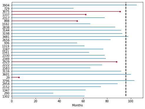
2.4 drawing life cycle diagram
30 patients were randomly selected in the data set and the life cycle diagram was drawn. Suppose the observation time is 96 months. In 96 months, 5 patients had failure events (death), and most of the remaining patients lost contact / could not be followed up before 96 months (this data belongs to deleted data). For example, patient 1347 in the figure lost contact with the patient at the 62nd month of follow-up and did not know the real survival time of the patient.
Through the life cycle diagram, we can see that many data are deleted data. Whether the average survival time of patients with failure events is calculated separately without combining the deleted data, or the average survival time of patients is calculated together with the deleted data, this calculation underestimates the real survival time, It can be recognized that the right censored data has a great impact on the estimation of survival time, so survival analysis is to solve this kind of problem.
from lifelines.plotting import plot_lifetimes
df_sample = df.sample(n=30,random_state=10)
df_sample['Status'] = np.where(df_sample['Status']== 1,True,False)
plt.figure(figsize=[8,6])
ax = plot_lifetimes(df_sample['Survival_Months'], event_observed=df_sample['Status'],sort_by_duration=False)
ax.vlines(96, 0, 30, lw=2, linestyles='--',colors='black')
plt.xlabel("Months")
3. Start survival analysis
3.1 life table analysis method
The life table divides the events into time periods (months and years), and counts the occurrence of events according to the time period, so as to calculate the survival rate. It is generally used for follow-up data with large sample and large time span (such as 1 year and 2 years). For some reasons, the research object is not contacted every day, but the data of the object is obtained in a certain time interval, such as a year later. Therefore, it is not accurate to record the occurrence time of the outcome, but only know that there is an end event in a certain interval. In this case, the life table can be drawn and the survival rate can be calculated for analysis.
It is assumed that there is a life table (similar frequency table) as follows:
| Years of diagnosis | death toll | Number of deleted | Initial number |
|---|---|---|---|
| 0~1 | 1 | 0 | 100 |
| 1~2 | 1 | 0 | 99 |
| 2~3 | 3 | 1 | 98 |
| 3~4 | 1 | 1 | 94 |
| 4~5 | 2 | 0 | 92 |
| 5~ | 3 | 87 | 90 |
The death probability and survival probability and survival rate can be calculated through the life table
Probability of death = number of deaths / (initial number - number of deleted / 2)
Survival probability = 1-death probability
Survival rate = survival probability 1 X survival probability 2 X survival probability 3..
For example, the death probability of interval 2-3 = 3 / (98-1 / 2) = 0.0307.
Survival probability = 1-0.0307 = 0.969
Survival rate = 0.99 * 0.9899 * 0.969 = 0.949
The survival curve can be drawn by the calculated survival rate
| Years of diagnosis | death toll | Number of deleted | Initial number | Probability of death | Survival probability | survival rate |
|---|---|---|---|---|---|---|
| 0~1 | 1 | 0 | 100 | 0.01 | 0.99 | 0.99 |
| 1~2 | 1 | 0 | 99 | 0.0101 | 0.9899 | 0.9799 |
| 2~3 | 3 | 1 | 98 | 0.0307 | 0.969 | 0.949 |
| 3~4 | 1 | 1 | 94 | 0.017 | 0.989 | 0.938 |
| 4~5 | 2 | 0 | 92 | 0.022 | 0.978 | 0.918 |
| 5~ | 3 | 87 | 90 | 0.0645 | 0.9355 | 0.859 |
In the single factor analysis, we can group according to the influencing factors, make the life table respectively, calculate each index and draw the survival curve for comparison.
3.2 breast cancer dataset generating life table
Calculate the survival rate and draw the survival curve
from lifelines.utils import survival_table_from_events

#The original data is that the survival time is in months, but now it is calculated in years, and then the life table is made
def months_to_year(x):
    if x % 12 ==0:
        return x /12
    else:
        return int(x/12)+1
df['year'] = df['Survival_Months'].map(months_to_year)
T = df['year']
E = df['Status']
survival_table_from_events(T, E,columns=['removed', 'observed', 'censored', 'entrance', 'at_risk'])
| removed | observed | censored | entrance | at_risk | |
|---|---|---|---|---|---|
| event_at | |||||
| 0.0 | 0 | 0 | 0 | 4024 | 4024 |
| 1.0 | 71 | 47 | 24 | 0 | 4024 |
| 2.0 | 114 | 88 | 26 | 0 | 3953 |
| 3.0 | 117 | 100 | 17 | 0 | 3839 |
| 4.0 | 225 | 118 | 107 | 0 | 3722 |
| 5.0 | 739 | 105 | 634 | 0 | 3497 |
| 6.0 | 725 | 60 | 665 | 0 | 2758 |
| 7.0 | 731 | 54 | 677 | 0 | 2033 |
| 8.0 | 674 | 33 | 641 | 0 | 1302 |
| 9.0 | 628 | 11 | 617 | 0 | 628 |
| event_at | removed | observed | censored | entrance | at_risk |
|---|---|---|---|---|---|
| 0.0 | 0 | 0 | 0 | 4024 | 4024 |
| 1.0 | 71 | 47 | 24 | 0 | 4024 |
| 2.0 | 114 | 88 | 26 | 0 | 3953 |
| 3.0 | 117 | 100 | 17 | 0 | 3839 |
| 4.0 | 225 | 118 | 107 | 0 | 3722 |
| 5.0 | 739 | 105 | 634 | 0 | 3497 |
| 6.0 | 725 | 60 | 665 | 0 | 2758 |
| 7.0 | 731 | 54 | 677 | 0 | 2033 |
| 8.0 | 674 | 33 | 641 | 0 | 1302 |
| 9.0 | 628 | 11 | 617 | 0 | 628 |
The death probability and survival probability and survival rate are calculated through the above life table
| event_at | removed | observed | censored | entrance | at_risk | probability of death | probability of surviving | survival rate |
|---|---|---|---|---|---|---|---|---|
| 0.0 | 0 | 0 | 0 | 4024 | 4024 | 0 | 1 | 1 |
| 1.0 | 71 | 47 | 24 | 0 | 4024 | 0.0117 | 0.9883 | 0.9883 |
| 2.0 | 114 | 88 | 26 | 0 | 3953 | 0.0223 | 0.9777 | 0.9663 |
| 3.0 | 117 | 100 | 17 | 0 | 3839 | 0.0261 | 0.9739 | 0.941 |
| 4.0 | 225 | 118 | 107 | 0 | 3722 | 0.03217 | 0.9678 | 0.911 |
| 5.0 | 739 | 105 | 634 | 0 | 3497 | 0.033 | 0.967 | 0.881 |
| 6.0 | 725 | 60 | 665 | 0 | 2758 | 0.0247 | 0.975 | 0.858 |
| 7.0 | 731 | 54 | 677 | 0 | 2033 | 0.0319 | 0.9681 | 0.8313 |
| 8.0 | 674 | 33 | 641 | 0 | 1302 | 0.0336 | 0.9664 | 0.803 |
| 9.0 | 628 | 11 | 617 | 0 | 628 | 0.0344 | 0.9656 | 0.776 |
#Then draw the survival curve through the calculated survival rate
x = [0,1,2,3,4,5,6,7,8,9]
y = [1, 0.9883, 0.9663, 0.941,0.911,0.881,0.858,0.8313,0.803,0.776]
plt.figure(figsize=(8,8))
plt.title("survival curve")
plt.step(x,y,color="#8dd3c7", where="pre",lw=2)
plt.xlim(0,9)
plt.ylim(0.7,1)
plt.xlabel("year")
plt.ylabel('S(t)')
plt.show()
[the external chain picture transfer fails. The source station may have anti-theft chain mechanism. It is recommended to save the picture and upload it directly (img-m5vjpVYP-1645703648861)(output_25_0.png)]
3.3 Kaplan Meier method
The above attempts to calculate the survival rate and draw the survival curve through the life table. When estimating the survival rate, the product limit method is actually used, that is, Kaplan Meier method, referred to as K-M method, and K-M method is a nonparametric method
Survival rate S(t), when t=3, means the survival rate of the research object when it has lived for more than 3 years, which is calculated on the premise that the object has lived for more than 2 years, while knowing the survival rate of more than 2 years is calculated on the premise that the research object has lived for more than 1 year.
So s (t = 3) = P1 * P2 * P3, P is the survival probability of each year.
The survival time of the original breast cancer data set is in the monthly unit, and the sample size is more than 4000. Now using the Kaplan meierfitter tool in the lifelines library, you can draw the survival curve using the K-M method.
Draw the survival curve by grouping to show the survival curve of the research object under different factors, so as to conduct single factor analysis.
The KM method can also calculate the median survival time. The median survival time is the time t corresponding to the ordinate = 0.5 (i.e. the cumulative survival rate = 0.5). When drawing multiple groups of survival curves, the differences between groups can be simply compared through the median survival time.
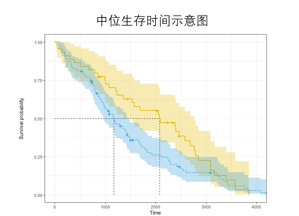
For example, in this figure, the survival time of the blue curve is about 1200, and that of the Yellow curve is 2100. The survival time of the Yellow curve is longer than that of the blue curve.
#KM analysis was used, and the survival curve was drawn and the median survival time was calculated
from lifelines import KaplanMeierFitter
from lifelines.utils import median_survival_times
kmf = KaplanMeierFitter()
kmf.fit(durations=df['Survival_Months'],
       event_observed=df['Status'])

print("Generation probability:")
print(kmf.survival_function_)
print("Intermediate survival probability=0.5 When, 95%section")
median_confidence_interval = median_survival_times(kmf.confidence_interval_)
print(median_confidence_interval)  #Because the survival probability was not lower than 0.5 during the study period, there was no time corresponding to the intermediate survival probability
plt.figure(figsize=[10,10])
kmf.plot_survival_function(at_risk_counts=True)#show_ Licensors = true, whether to display deletion, at_risk_counts=True show risk count
Generation probability:
          KM_estimate
timeline
0.0          1.000000
1.0          1.000000
2.0          0.999503
3.0          0.999006
4.0          0.996767
...               ...
103.0        0.785709
104.0        0.785709
105.0        0.785709
106.0        0.785709
107.0        0.785709

[108 rows x 1 columns]
Intermediate survival probability=0.5 When, 95%section
     KM_estimate_lower_0.95  KM_estimate_upper_0.95
0.5                     inf                     inf


<AxesSubplot:xlabel='timeline'>
[the external link image transfer fails. The source station may have an anti-theft chain mechanism. It is recommended to save the image and upload it directly (img-qkNumVLL-1645703648863)(output_27_2.png)]
#Print the short statistical content of the survival curve (life table). Including observations, number of events, number of deletions, survival rate and its confidence interval.
pd.concat([kmf.event_table,kmf.survival_function_,kmf.confidence_interval_],axis=1)
| removed | observed | censored | entrance | at_risk | KM_estimate | KM_estimate_lower_0.95 | KM_estimate_upper_0.95 | |
|---|---|---|---|---|---|---|---|---|
| 0.0 | 0 | 0 | 0 | 4024 | 4024 | 1.000000 | 1.000000 | 1.000000 |
| 1.0 | 1 | 0 | 1 | 0 | 4024 | 1.000000 | 1.000000 | 1.000000 |
| 2.0 | 3 | 2 | 1 | 0 | 4023 | 0.999503 | 0.998014 | 0.999876 |
| 3.0 | 4 | 2 | 2 | 0 | 4020 | 0.999006 | 0.997353 | 0.999627 |
| 4.0 | 10 | 9 | 1 | 0 | 4016 | 0.996767 | 0.994438 | 0.998121 |
| ... | ... | ... | ... | ... | ... | ... | ... | ... |
| 103.0 | 50 | 0 | 50 | 0 | 251 | 0.785709 | 0.765872 | 0.804086 |
| 104.0 | 48 | 0 | 48 | 0 | 201 | 0.785709 | 0.765872 | 0.804086 |
| 105.0 | 45 | 0 | 45 | 0 | 153 | 0.785709 | 0.765872 | 0.804086 |
| 106.0 | 47 | 0 | 47 | 0 | 108 | 0.785709 | 0.765872 | 0.804086 |
| 107.0 | 61 | 0 | 61 | 0 | 61 | 0.785709 | 0.765872 | 0.804086 |
108 rows × 8 columns
3.4 the data were grouped and the single factor survival analysis was carried out by KM method
KM method can be used to analyze the survival rate of the research object of the whole data. Sometimes, in order to study whether the drug brings therapeutic effect to the disease, the experimental group and the control group will be set. When using KM analysis method, the survival curves of the two groups can be drawn to show the difference between the two groups, or the median survival time can be calculated. Assuming that the median survival time of the experimental group is greater than that of the control group, it shows that the drug can delay the life of patients.
However, KM method can only group classified variables. Corresponding to continuous values, continuous values need to be partitioned and then grouped
Comparing the survival differences between the two groups can be compared by median survival time. You can also specify a time point to calculate whether there is a significant difference between the two groups of curves. The area under the survival curve in T time can also be calculated. The differences between different survival curves can be compared by the area under the curve (restricted mean survival time / RMST). Survival differences between the two groups can also be compared by calculating the p-th percentile survival time
"""
yes T-Stage Tumor size was grouped and survival curves were drawn
 It is obvious from the survival curve T4 Patients with large tumors)The survival rate of decreased rapidly
"""
from lifelines import KaplanMeierFitter
plt.figure(figsize=(8,8))
kmf = KaplanMeierFitter()
for name, grouped_df in df.groupby('T_Stage'):
    kmf.fit(grouped_df["Survival_Months"], grouped_df["Status"], label=name)
    kmf.plot_survival_function()
[the external chain picture transfer fails. The source station may have an anti-theft chain mechanism. It is recommended to save the picture and upload it directly (img-8mLgXVID-1645703648864)(output_30_0.png)]
"""
Because age is a continuous value, km The method is only applicable to categorical variables, because the ages of continuous values need to be grouped in intervals
 Age was grouped and survival curves were drawn
"""
from lifelines import KaplanMeierFitter
df['age_'] = pd.cut(df['Age'],[0,40,50,60])
plt.figure(figsize=(8,8))
kmf = KaplanMeierFitter()
for name, grouped_df in df.groupby('age_'):
    kmf.fit(grouped_df["Survival_Months"], grouped_df["Status"], label=name)
    kmf.plot_survival_function()
[the external chain picture transfer fails. The source station may have anti-theft chain mechanism. It is recommended to save the picture and upload it directly (img-NVKc0lxQ-1645703648865)(output_31_0.png)]
"""
The difference in survival between the two groups can be compared by median survival time
(Because of this data, the survival rate of some groups is greater than 0 in the end.5,Unable to calculate the health storage time in, so it is displayed inf)
"""

from lifelines.utils import median_survival_times
kmf = KaplanMeierFitter()
for name, grouped_df in df.groupby('T_Stage'):
    kmf_temp = KaplanMeierFitter().fit(grouped_df["Survival_Months"], grouped_df["Status"])
    median = median_survival_times(kmf_temp)
    print(f"{name}Median survival time of group:{median}")
T1 Median survival time of group:inf
T2 Median survival time of group:inf
T3 Median survival time of group:inf
T4 Median survival time of group:inf
"""
Some data showed that the survival rate was greater than 0 at the end of follow-up.5,That is, the median survival time cannot be calculated.
However, you can specify a third party qth Quantile survival time to obtain the corresponding survival time
"""

from lifelines.utils import qth_survival_time
qth = 0.9
kmf = KaplanMeierFitter()
for name, grouped_df in df.groupby('T_Stage'):
    kmf_temp = KaplanMeierFitter().fit(grouped_df["Survival_Months"], grouped_df["Status"])
    time = qth_survival_time(qth,kmf_temp)
    print(f"{name}Group No{qth*100}Quantile survival time:{time}")
T1 Group 90.0 Quantile survival time:81.0
T2 Group 90.0 Quantile survival time:49.0
T3 Group 90.0 Quantile survival time:40.0
T4 Group 90.0 Quantile survival time:25.0


/opt/conda/envs/python35-paddle120-env/lib/python3.7/site-packages/lifelines/fitters/__init__.py:273: ApproximationWarning: Approximating using `survival_function_`. To increase accuracy, try using or increasing the resolution of the timeline kwarg in `.fit(..., timeline=timeline)`.

  exceptions.ApproximationWarning,
"""
The survival difference corresponding to this time can be compared by specifying the time (for example, the survival difference in the 60th month I am concerned about))
"""
from lifelines.statistics import survival_difference_at_fixed_point_in_time_test
from lifelines.datasets import load_waltons

T = df['Survival_Months']
E = df['Status']
ix = df['A_Stage']== 0
kmf_1 = KaplanMeierFitter().fit(T[ix],  E[ix])
kmf_2 = KaplanMeierFitter().fit(T[~ix],  E[~ix])

point_in_time = 60. #Specify when to compare
results = survival_difference_at_fixed_point_in_time_test(point_in_time, kmf_1, kmf_2)
results.print_summary()
| null_distribution | chi squared |
|---|---|
| degrees_of_freedom | 1 |
| point_in_time | 60 |
| fitterA | <lifelines.KaplanMeierFitter:"KM_estimate", fi... |
| fitterB | <lifelines.KaplanMeierFitter:"KM_estimate", fi... |
| test_name | survival_difference_at_fixed_point_in_time_test |
| test_statistic | p | -log2(p) | |
|---|---|---|---|
| 0 | 40.84 | <0.005 | 32.49 |
"""
Restricted mean survival time/RMST
 The survival difference was compared by calculating the area under different survival curves
"""
from lifelines.utils import restricted_mean_survival_time
from lifelines.plotting import rmst_plot

T = df['Survival_Months']
E = df['Status']
ix = df['A_Stage']== 0 #0 is' Regional '

time_limit = 60#Within the specified time

kmf_1 = KaplanMeierFitter().fit(T[ix], E[ix])
rmst_1 = restricted_mean_survival_time(kmf_1, t=time_limit)
print(f"Area under curve:{rmst_1}")

kmf_2 = KaplanMeierFitter().fit(T[~ix], E[~ix])
rmst_2 = restricted_mean_survival_time(kmf_2, t=time_limit)
print(f"Area under curve:{rmst_2}")

#Plot the area of the curve
plt.figure(figsize=(10,12))
ax = plt.subplot(311)
rmst_plot(kmf_1, t=time_limit, ax=ax)
ax = plt.subplot(312)
rmst_plot(kmf_2, t=time_limit, ax=ax)
ax = plt.subplot(313)
rmst_plot(kmf_1, model2=kmf_2, t=time_limit, ax=ax)
Area under curve:57.22662022019032
 Area under curve:49.82516339891577


<AxesSubplot:xlabel='timeline'>
[the external chain picture transfer fails. The source station may have anti-theft chain mechanism. It is recommended to save the picture and upload it directly (img-lqgOVtUY-1645703648866)(output_35_2.png)]
3.5 log rank test
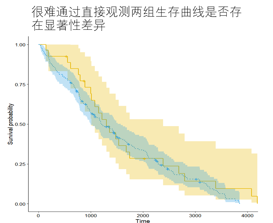
After using KM method to draw multiple survival curves according to groups, it is not sufficient to determine whether there are significant differences between multiple curves only through direct observation. Log rank test makes up for this.
There was no significant difference in the distribution of survival time between the zero hypothesis group and the group of log rank test. When the calculated P value is less than 0.05, the null hypothesis is overturned and it is considered that there is a significant difference in the distribution of survival time between the two groups.
"""
The survival curves of the two groups were compared
 result A_Stage Group P Value less than 0.005,There are significant differences(Direct observation of the graph also shows significant differences)
"""
from lifelines.statistics import logrank_test
from lifelines import KaplanMeierFitter
plt.figure(figsize=(8,8))
kmf = KaplanMeierFitter()
for name, grouped_df in df.groupby('A_Stage'):
    kmf.fit(grouped_df["Survival_Months"], grouped_df["Status"], label=name)
    kmf.plot_survival_function()

T = df['Survival_Months']
E = df['Status']
ix = df['A_Stage']== 'Distant'
result = logrank_test(T[ix],T[~ix], E[ix],E[~ix])
result.print_summary()
| t_0 | -1 |
|---|---|
| null_distribution | chi squared |
| degrees_of_freedom | 0 |
| test_name | logrank_test |
| test_statistic | p | -log2(p) | |
|---|---|---|---|
| 0 | 0.00 | nan | nan |
[the external chain picture transfer fails. The source station may have an anti-theft chain mechanism. It is recommended to save the picture and upload it directly (img-R66tN956-1645703648868)(output_37_1.png)]
"""
Compare whether there is significant difference in the survival curve between the two groups
 result T_Stage Group P Value less than 0.005,There are significant differences(Direct observation of the graph also shows significant differences)
"""

from lifelines.statistics import multivariate_logrank_test
kmf = KaplanMeierFitter()
for name, grouped_df in df.groupby('N_Stage'):
    kmf.fit(grouped_df["Survival_Months"], grouped_df["Status"], label=name)
    kmf.plot_survival_function()
results = multivariate_logrank_test(df['Survival_Months'], df['N_Stage'], df['Status'])
results.print_summary()
print(results.p_value)
| t_0 | -1 |
|---|---|
| null_distribution | chi squared |
| degrees_of_freedom | 2 |
| test_name | multivariate_logrank_test |
| test_statistic | p | -log2(p) | |
|---|---|---|---|
| 0 | 298.86 | <0.005 | 215.58 |
1.2701885843852175e-65
[the external chain picture transfer fails, and the source station may have an anti-theft chain mechanism. It is recommended to save the picture and upload it directly (IMG rnjouauur-1645703648869) (output_38_2. PNG)]
3.6 parameter estimation
If the distribution of survival time is known in advance, the parameter method can be used: the parameters in the assumed distribution model can be estimated according to the sample observations to obtain the probability distribution model of survival time.
The distributions of survival time are exponential distribution, Weibull distribution, lognormal distribution, loglogistic distribution and Gamma distribution. The analysis process is similar to KM method. Because the distribution of survival time of real data is often unknown, all parameter estimation is not a common survival analysis method.
"""
Simple display if used linelifes To use the parameter method for survival analysis and draw the survival curve.
"""
from lifelines.datasets import load_waltons
from lifelines.utils import median_survival_times
import matplotlib.pyplot as plt
import numpy as np
from lifelines import *
# Data loading
T = df['Survival_Months']
E = df['Status']

fig, axes = plt.subplots(3, 3, figsize=(13.5, 7.5))

# Multi parameter model
kmf = KaplanMeierFitter().fit(T, E, label='KaplanMeierFitter')
wbf = WeibullFitter().fit(T, E, label='WeibullFitter')
exf = ExponentialFitter().fit(T, E, label='ExponentialFitter')
lnf = LogNormalFitter().fit(T, E, label='LogNormalFitter')
llf = LogLogisticFitter().fit(T, E, label='LogLogisticFitter')
pwf = PiecewiseExponentialFitter([40, 60]).fit(T, E, label='PiecewiseExponentialFitter')
ggf = GeneralizedGammaFitter().fit(T, E, label='GeneralizedGammaFitter')
sf = SplineFitter(np.percentile(T.loc[E.astype(bool)], [0, 50, 100])).fit(T, E, label='SplineFitter')

wbf.plot_survival_function(ax=axes[0][0])
exf.plot_survival_function(ax=axes[0][1])
lnf.plot_survival_function(ax=axes[0][2])
kmf.plot_survival_function(ax=axes[1][0])
llf.plot_survival_function(ax=axes[1][1])
pwf.plot_survival_function(ax=axes[1][2])
ggf.plot_survival_function(ax=axes[2][0])
sf.plot_survival_function(ax=axes[2][1])
<AxesSubplot:>
[the external chain picture transfer fails. The source station may have an anti-theft chain mechanism. It is recommended to save the picture and upload it directly (img-RJkcN4V3-1645703648869)(output_40_1.png)]
3.7 proportional hazards regression model – Cox model
Cox proportional hazards regression model was proposed by the British statistician D.R.Cox (unfortunately, D.R.Cox died in January 2022) in 1972 for the basic prognostic analysis of tumors.
The formula of Cox proportional regression is as follows:
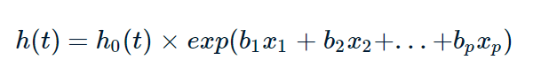
Where, T represents the survival time, x is the covariate, b is the regression coefficient of the covariate, h0 is the benchmark risk, and represents the risk rate of death at time t when all covariates are 0. h(t) is the risk function of the research object, which can be understood as time t death risk. exp(bi) is the risk ratio of xi of the covariate, the covariate with the value of risk ratio greater than 1 is the risk factor, and the covariate with the value greater than 1 is the protective factor.
Cox proportional hazards regression model belongs to the semi parametric method, which can estimate the survival function, compare two or more groups of survival distribution functions, and can be single factor analysis or multi factor analysis. Univariate analysis includes classified variables and continuous variables (KM method can only analyze classified variables). The relationship model between survival time and influencing factors can be established to calculate the risk ratio of influencing factors. Note that Cox regression requires to meet the proportional risk assumption, that is, the influencing factors do not change with time. If the variables are not satisfied, the variables should be stratified and then Cox regression.
3.8 divide the data into training set and verification set
Firstly, delete the missing rows in the data, and then 8:2 divide the data into training set and verification set
#Load data
df = pd.read_csv('SEER Breast Cancer Dataset .csv')

df['Race'] = pd.factorize(df['Race'])[0].astype(np.uint16)
df['Marital_Status'] = pd.factorize(df['Marital_Status'])[0].astype(np.uint16)

df['A_Stage'] = pd.factorize(df['A_Stage'])[0].astype(np.uint16)
df['T_Stage'] = df['T_Stage'].map({'T1':1, 'T2':2,'T3':3,'T4':4})
df['N_Stage'] = df['N_Stage'].map({'N1':0, 'N2':1,'N3':2})
df['Sixth_Stage'] = df['Sixth_Stage'].map({'IIA':0, 'IIB':1,'IIIA':2,'IIIB':3,'IIIC':4})
df['Grade'] = df['Grade'].map({'Well differentiated; Grade I':0,
                                'Moderately differentiated; Grade II':1,
                                'Poorly differentiated; Grade III':2,
                                'Undifferentiated; anaplastic; Grade IV':3})
df['Estrogen_Status'] = df['Estrogen_Status'].map({'Positive':0, 'Negative':1})
df['Progesterone_Status'] = df['Progesterone_Status'].map({'Positive':0, 'Negative':1})
df['Status'] = df['Status'].map({'Alive':0, 'Dead':1})
#Delete rows with missing values
df = df.dropna(axis=0)

#Split training set and verification set
df_train = df.sample(frac=0.8,random_state=2022)
df_val = df.drop(index = df_train.index)
print(f"Training set size:{len(df_train)}")
print(f"Validation set size:{len(df_val)}")
print("*"*20)
#Count the number of failure events and deleted data
print(df_train['Status'].value_counts())
print(df_val['Status'].value_counts())
Training set size: 3219
 Verification set size: 805
********************
0    2740
1     479
Name: Status, dtype: int64
0    668
1    137
Name: Status, dtype: int64
3.9 build Cox model and start training
Through print_ The summary () model outputs three tables
Table 1: duration col is the time column name, event col is the event column name, breslow is the model parameter estimation method, 3219 is the total data volume, and 479 is the number of failure events
| model | lifelines.CoxPHFitter |
|---|---|
| duration col | 'Survival_Months' |
| event col | 'Status' |
| baseline estimation | breslow |
| number of observations | 3219 |
| number of events observed | 479 |
| partial log-likelihood | -3516.57 |
| time fit was run | 2022-02-06 03:27:20 UTC |
Table 2: coef is the regression coefficient of the covariate, exp(coef) is the risk ratio, se(coef) is the standard error of the coefficient, 95% confidence zone of the standard error, 95% confidence zone of the hazard ratio, Wald statistical value (z), whether the P value of Wald statistical value is significant.
How to interpret the risk ratio? When the risk ratio is greater than 1, it is a risk factor, the increase of value will increase the death risk of patients, and less than 1 is a protective factor to reduce the death risk of patients.
For example, the p value of Age is less than 0.005, the risk ratio HR = 1.02, and the 95% confidence interval is 1.01-1.03, indicating a relationship between Age value and increased risk of death. Keeping other covariates unchanged, Age increased by one unit and the patient's risk increased by 2%.
| coef | exp(coef) | se(coef) | coef lower 95% | coef upper 95% | exp(coef) lower 95% | exp(coef) upper 95% | z | p | -log2§ | |
|---|---|---|---|---|---|---|---|---|---|---|
| Age | 0.02 | 1.02 | 0.01 | 0.01 | 0.03 | 1.01 | 1.03 | 3.09 | <0.005 | 8.95 |
| Race | 0.36 | 1.43 | 0.12 | 0.13 | 0.59 | 1.14 | 1.80 | 3.09 | <0.005 | 8.96 |
| Marital_Status | 0.07 | 1.08 | 0.04 | -0.01 | 0.16 | 0.99 | 1.17 | 1.76 | 0.08 | 3.69 |
Table 3: Concordance is the consistency index. All covariates are used to train the cox model, and the consistency index is 0.75
| Concordance | 0.75 |
|---|---|
| Partial AIC | 7059.14 |
| log-likelihood ratio test | 398.31 on 13 df |
| -log2§ of ll-ratio test | 253.44 |
"""
Univariate analysis
"""
from lifelines import CoxPHFitter
varList = df_train.columns.to_list()
varList.pop()#Remove time column
varList.pop()#Remove the status column

#Create Cox regression model
cph = CoxPHFitter()
for var in varList:
    cph.fit(df=df_train,duration_col='Survival_Months',event_col='Status',formula=var)
    print(f"{var} of P Value:{cph.summary.p[var]},<0.05 {cph.summary.p[var]<0.05}")
Age of P Value: 0.0248649940872201,<0.05 True
Race of P Value: 1.3550638342845673e-06,<0.05 True
Marital_Status of P Value: 8.68912013912815e-05,<0.05 True
T_Stage of P Value: 2.2304661752517098e-20,<0.05 True
N_Stage of P Value: 1.6617003098137667e-45,<0.05 True
Sixth_Stage of P Value: 1.0290156463874445e-47,<0.05 True
Grade of P Value: 6.022575977628071e-23,<0.05 True
A_Stage of P Value: 1.0633163182382273e-08,<0.05 True
Tumor_Size of P Value: 5.79647504244188e-16,<0.05 True
Estrogen_Status of P Value: 1.0415072293170037e-27,<0.05 True
Progesterone_Status of P Value: 5.007000090288116e-25,<0.05 True
Regional_Node_Examined of P Value: 0.1065243965415506,<0.05 False
Reginol_Node_Positive of P Value: 1.5269471157224244e-46,<0.05 True
"""
Multivariate analysis
"""
from lifelines import CoxPHFitter
#Create Cox regression model
cph = CoxPHFitter()
#df incoming DataFrame format data, duration_col column name of incoming time, event_col the column name of the incoming event. By default, all covariates are used
#Some covariates can be passed in through the parameter formula='Age+Race '
cph.fit(df=df_train,duration_col='Survival_Months',event_col='Status',show_progress=True)
#Print model
cph.print_summary()
Iteration 1: norm_delta = 1.07058, step_size = 0.9000, log_lik = -3715.72192, newton_decrement = 255.86131, seconds_since_start = 0.2
Iteration 2: norm_delta = 0.47681, step_size = 0.9000, log_lik = -3575.51461, newton_decrement = 52.18325, seconds_since_start = 0.4
Iteration 3: norm_delta = 0.12309, step_size = 0.9000, log_lik = -3520.88106, newton_decrement = 3.96398, seconds_since_start = 0.6
Iteration 4: norm_delta = 0.01909, step_size = 1.0000, log_lik = -3516.63264, newton_decrement = 0.06359, seconds_since_start = 0.9
Iteration 5: norm_delta = 0.00045, step_size = 1.0000, log_lik = -3516.56817, newton_decrement = 0.00003, seconds_since_start = 1.1
Iteration 6: norm_delta = 0.00000, step_size = 1.0000, log_lik = -3516.56814, newton_decrement = 0.00000, seconds_since_start = 1.3
Convergence success after 6 iterations.
| model | lifelines.CoxPHFitter |
|---|---|
| duration col | 'Survival_Months' |
| event col | 'Status' |
| baseline estimation | breslow |
| number of observations | 3219 |
| number of events observed | 479 |
| partial log-likelihood | -3516.57 |
| time fit was run | 2022-02-23 17:30:27 UTC |
| coef | exp(coef) | se(coef) | coef lower 95% | coef upper 95% | exp(coef) lower 95% | exp(coef) upper 95% | z | p | -log2(p) | |
|---|---|---|---|---|---|---|---|---|---|---|
| Age | 0.02 | 1.02 | 0.01 | 0.01 | 0.03 | 1.01 | 1.03 | 3.09 | <0.005 | 8.95 |
| Race | 0.36 | 1.43 | 0.12 | 0.13 | 0.59 | 1.14 | 1.80 | 3.09 | <0.005 | 8.96 |
| Marital_Status | 0.07 | 1.08 | 0.04 | -0.01 | 0.16 | 0.99 | 1.17 | 1.76 | 0.08 | 3.69 |
| T_Stage | 0.37 | 1.45 | 0.11 | 0.16 | 0.58 | 1.17 | 1.79 | 3.42 | <0.005 | 10.63 |
| N_Stage | 0.36 | 1.43 | 0.18 | 0.02 | 0.70 | 1.02 | 2.02 | 2.05 | 0.04 | 4.63 |
| Sixth_Stage | -0.00 | 1.00 | 0.11 | -0.23 | 0.22 | 0.80 | 1.25 | -0.01 | 0.99 | 0.01 |
| Grade | 0.47 | 1.60 | 0.08 | 0.32 | 0.63 | 1.37 | 1.87 | 6.02 | <0.005 | 29.06 |
| A_Stage | 0.00 | 1.00 | 0.21 | -0.41 | 0.41 | 0.66 | 1.51 | 0.01 | 0.99 | 0.01 |
| Tumor_Size | -0.00 | 1.00 | 0.00 | -0.01 | 0.00 | 0.99 | 1.00 | -0.64 | 0.52 | 0.93 |
| Estrogen_Status | 0.54 | 1.72 | 0.15 | 0.24 | 0.84 | 1.28 | 2.31 | 3.58 | <0.005 | 11.50 |
| Progesterone_Status | 0.55 | 1.73 | 0.12 | 0.31 | 0.78 | 1.37 | 2.18 | 4.58 | <0.005 | 17.71 |
| Regional_Node_Examined | -0.03 | 0.97 | 0.01 | -0.05 | -0.02 | 0.95 | 0.98 | -4.69 | <0.005 | 18.49 |
| Reginol_Node_Positive | 0.05 | 1.05 | 0.01 | 0.03 | 0.08 | 1.03 | 1.08 | 4.10 | <0.005 | 14.58 |
| Concordance | 0.75 |
|---|---|
| Partial AIC | 7059.14 |
| log-likelihood ratio test | 398.31 on 13 df |
| -log2(p) of ll-ratio test | 253.44 |
#Draw the HR value and 95% confidence interval of each covariate (forest diagram)
plt.figure(figsize=(8,8))
cph.plot(hazard_ratios=True)

"""
Combine the above print_summary()The table shows that 95% of covariates%The confidence interval crosses the covariate of 1 on the abscissa axis p Values are greater than 0.05
"""
'\n Combine the above print_summary()The table shows that 95% of covariates%The confidence interval crosses the covariate of 1 on the abscissa axis p Values are greater than 0.05\n'
[the external chain picture transfer fails. The source station may have an anti-theft chain mechanism. It is recommended to save the picture and upload it directly (img-hxYOl86A-1645703648871)(output_47_1.png)]
#Remove the insignificant variables and re fit the cox model
FORMULA = 'Age + Race  + T_Stage + N_Stage+Grade+Estrogen_Status+Progesterone_Status+Regional_Node_Examined+Reginol_Node_Positive'
cph.fit(df=df_train,duration_col='Survival_Months',event_col='Status',formula=FORMULA)
#Print model
cph.print_summary()
| model | lifelines.CoxPHFitter |
|---|---|
| duration col | 'Survival_Months' |
| event col | 'Status' |
| baseline estimation | breslow |
| number of observations | 3219 |
| number of events observed | 479 |
| partial log-likelihood | -3518.31 |
| time fit was run | 2022-02-23 17:30:49 UTC |
| coef | exp(coef) | se(coef) | coef lower 95% | coef upper 95% | exp(coef) lower 95% | exp(coef) upper 95% | z | p | -log2(p) | |
|---|---|---|---|---|---|---|---|---|---|---|
| Age | 0.02 | 1.02 | 0.01 | 0.01 | 0.03 | 1.01 | 1.03 | 3.32 | <0.005 | 10.13 |
| Estrogen_Status | 0.55 | 1.73 | 0.15 | 0.25 | 0.84 | 1.29 | 2.33 | 3.65 | <0.005 | 11.87 |
| Grade | 0.47 | 1.61 | 0.08 | 0.32 | 0.63 | 1.38 | 1.87 | 6.06 | <0.005 | 29.43 |
| N_Stage | 0.35 | 1.42 | 0.09 | 0.16 | 0.53 | 1.18 | 1.71 | 3.68 | <0.005 | 12.05 |
| Progesterone_Status | 0.55 | 1.73 | 0.12 | 0.31 | 0.78 | 1.37 | 2.18 | 4.57 | <0.005 | 17.68 |
| Race | 0.40 | 1.49 | 0.12 | 0.17 | 0.62 | 1.19 | 1.87 | 3.45 | <0.005 | 10.78 |
| Reginol_Node_Positive | 0.05 | 1.05 | 0.01 | 0.03 | 0.08 | 1.03 | 1.08 | 4.31 | <0.005 | 15.89 |
| Regional_Node_Examined | -0.03 | 0.97 | 0.01 | -0.05 | -0.02 | 0.95 | 0.98 | -4.68 | <0.005 | 18.42 |
| T_Stage | 0.33 | 1.39 | 0.06 | 0.22 | 0.44 | 1.24 | 1.56 | 5.80 | <0.005 | 27.13 |
| Concordance | 0.75 |
|---|---|
| Partial AIC | 7054.62 |
| log-likelihood ratio test | 394.83 on 9 df |
| -log2(p) of ll-ratio test | 261.63 |
#Draw survival curve S(t)
cph.baseline_survival_.plot()
<AxesSubplot:>
[the external chain picture transfer fails. The source station may have an anti-theft chain mechanism. It is recommended to save the picture and upload it directly (img-AXbYqi6u-1645703648872)(output_49_1.png)]
#Cumulative risk curve H(t)
cph.baseline_cumulative_hazard_.plot()
<AxesSubplot:>
[the external chain picture transfer fails. The source station may have an anti-theft chain mechanism. It is recommended to save the picture and upload it directly (img-Ai7eyoCy-1645703648873)(output_50_1.png)]
#Because the cumulative risk function H(t) = -lnS(t)
#Now calculate H(t) and draw the curve. The result is consistent with the figure above.
(-np.log(cph.baseline_survival_)).plot()
<AxesSubplot:>
[the external chain picture transfer fails, and the source station may have an anti-theft chain mechanism. It is recommended to save the picture and upload it directly (img-glexcvsvj-1645703648874) (output_51_1. PNG)]
#Draw the risk function h(t) corresponding to each time point
cph.baseline_hazard_.plot()
<AxesSubplot:>
[the external chain picture transfer fails. The source station may have an anti-theft chain mechanism. It is recommended to save the picture and upload it directly (img-u17GVfeN-1645703648874)(output_52_1.png)]
print(cph.predict_partial_hazard(pd.DataFrame(df_val.iloc[0]).T))#Predicting individual risk
print(cph.predict_percentile(pd.DataFrame(df_val.iloc[10]).T,p=0.9))#Predict the survival time of the 90th quantile
print(cph.predict_median(pd.DataFrame(df_val.iloc[10]).T))#Predict the median survival time of individuals
print(cph.predict_cumulative_hazard(df_val.iloc[0]))#Predicting individual cumulative risk function
print(cph.predict_survival_function(df_val.iloc[0]))#Predicting individual survival function
1    0.573792
dtype: float64
96.0
inf
              1
1.0    0.000000
2.0    0.000118
3.0    0.000353
4.0    0.001059
5.0    0.001414
...         ...
103.0  0.103245
104.0  0.103245
105.0  0.103245
106.0  0.103245
107.0  0.103245

[107 rows x 1 columns]
              1
1.0    1.000000
2.0    0.999882
3.0    0.999647
4.0    0.998941
5.0    0.998587
...         ...
103.0  0.901906
104.0  0.901906
105.0  0.901906
106.0  0.901906
107.0  0.901906

[107 rows x 1 columns]
from lifelines.utils import concordance_index
#Calculate c-index
#Method 1
print(f"Training set c-index:{cph.score(df_train, scoring_method='concordance_index')}")
print(f"Validation set c-index:{cph.score(df_val, scoring_method='concordance_index')}")
#Method 2
print(concordance_index(df_train['Survival_Months'], -cph.predict_partial_hazard(df_train), df_train['Status']))
#Predict the survival rate of a study object in the validation set
cph.predict_survival_function(df_val.iloc[0])
Training set c-index:0.7460170801920486
 Validation set c-index:0.7108462839198003
0.7460166658656356
| 1 | |
|---|---|
| 1.0 | 1.000000 |
| 2.0 | 0.999882 |
| 3.0 | 0.999647 |
| 4.0 | 0.998941 |
| 5.0 | 0.998587 |
| ... | ... |
| 103.0 | 0.901906 |
| 104.0 | 0.901906 |
| 105.0 | 0.901906 |
| 106.0 | 0.901906 |
| 107.0 | 0.901906 |
107 rows × 1 columns
"""
Can pass k Fold cross validation, try the combination of all covariates to find the best combination
 There are more than 8190 combinations here, and the running time will be very long. There is no need to run them and the whole project will not be affected
"""
from lifelines.utils import k_fold_cross_validation
from itertools import combinations

def combine(temp_list, n):
    '''according to n Get all possible combinations in the list( n (elements as a group)'''
    temp_list2 = []
    for c in combinations(temp_list, n):
        temp_list2.append(c)
    return temp_list2
varList = df_train.columns.to_list()
varList.pop()#Remove "Status"
varList.pop()#Remove "Survival_Months"

end_list = []
for i in range(len(varList)):
    if combine(varList, i)!=[()]:
        end_list.extend(combine(varList, i))
#Print combination quantity
print(len(end_list))
mean_score = []#Save the c-index score of k-fold crossover of each combination
for i in set(end_list):
    columns = list(i)+['Survival_Months','Status']
    df_temp = df_train.loc[:,columns]
    scores = k_fold_cross_validation(CoxPHFitter(), df_temp, 'Survival_Months', event_col='Status', k=10,scoring_method="concordance_index")
    mean_score.append(np.mean(scores))
#Print highest score
print(np.max(mean_score))
#Print the covariate combination with the highest score
print(end_list[mean_score.index(np.max(mean_score))])
3.10 how does the covariate value affect the survival curve
"""
The baseline survival curve of the model was compared with what happened when the values of covariates in a group changed.
When we change covariates(s)When other conditions are the same, this helps to compare the survival of subjects.
"""

cph.plot_partial_effects_on_outcome('T_Stage',values=[1,2,3,4])
<AxesSubplot:>
[the external link image transfer fails. The source station may have an anti-theft chain mechanism. It is recommended to save the image and upload it directly (img-Q7TFBpGb-1645703648875)(output_57_1.png)]
"""
Observe how the values of multiple covariates affect the survival curve
"""

cph.plot_partial_effects_on_outcome(['T_Stage', 'N_Stage'], values=[[0, 0], [1, 0], [1,1], [1,2]], cmap='coolwarm')
<AxesSubplot:>
[the external chain picture transfer fails. The source station may have an anti-theft chain mechanism. It is recommended to save the picture and upload it directly (img-oRVpOhzx-1645703648876)(output_58_1.png)]
#Draw a smooth calibration curve
from lifelines.calibration import survival_probability_calibration
fig, axes = plt.subplots(1, 2, figsize=(12, 5))
#Calibration curve of the training set, t0 (float) – time to evaluate the probability of occurrence of the event
survival_probability_calibration(cph,df_train,t0=36,ax=axes[0])
#Calibration curve of validation set
survival_probability_calibration(cph,df_val,t0=36,ax=axes[1])
"""
ICI – Predicted and observed mean absolute difference
E50 – Median absolute difference between predicted and observed
"""
ICI =  0.0033427008106428234
E50 =  0.0022028810234795415
ICI =  0.008988198843408044
E50 =  0.008933834566536292


'\nICI – Predicted and observed mean absolute difference\nE50 – Median absolute difference between predicted and observed\n'
[the external chain picture transfer fails. The source station may have an anti-theft chain mechanism. It is recommended to save the picture and upload it directly (img-qDMleuTf-1645703648877)(output_59_2.png)]
3.11 testing proportional hazards (PH) assumptions
As mentioned before, the Cox regression model needs to meet the proportional risk assumption, that is, the covariate does not change with time, for example, whether a covariate is treated with a certain drug, but this treatment does not occur only once, but the amount of treatment will increase with time. Unlike marital status, race, gender and other covariates do not change over time.
[how to test PH hypothesis]
If PH assumption is satisfied or not, the cox regression model established needs special treatment, which can be checked here_ The assumptions () tool is used to test whether all covariates meet the PH hypothesis. This tool will give the P value of statistical test through the statistical test method, and judge through the P value. Generally, the covariate with P less than 0.05 does not meet the proportional risk sharing assumption.
check_ The output of the assets () tool has three parts
Part I:
| test_statistic | p | -log2§ | ||
|---|---|---|---|---|
| A_Stage | km | 4.91 | 0.03 | 5.23 |
| rank | 4.43 | 0.04 | 4.83 | |
| Estrogen_Status | km | 4.99 | 0.03 | 5.29 |
| rank | 6.11 | 0.01 | 6.22 |
The null hypothesis variable satisfies the PH hypothesis. When the P value is less than 0.05, reject the null hypothesis, that is, this variable does not satisfy the PH hypothesis, such as estrogen in the table_ Status variable.
Part II:
2. Variable 'Estrogen_Status' failed the non-proportional test: p-value is 0.0134.

   Advice: with so few unique values (only 2), you can include `strata=['Estrogen_Status', ...]` in
the call in `.fit`. See documentation in link [E] below.

   Bootstrapping lowess lines. May take a moment...
It is pointed out that those covariates do not meet the PH assumption, and the solution is given.
Part III:
Estrogen_ Schoenfeld residuals diagram of status variable
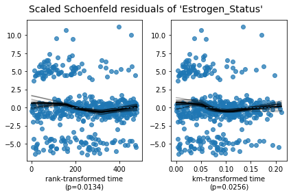
If the variable satisfies the PH assumption, the black solid line (variation of variable influence coefficient with time) in the figure should be parallel to the blue horizontal dotted line. On the contrary, as shown in the figure, the black solid line also changes with time.
[how to solve the problem if PH assumption is not met]
-
Method 1: [layering] layering the variable that does not meet the PH assumption, and cox modeling the remaining covariates
-
Method 2: [time dependent variable covariate]
If the PH assumption is not satisfied, Cox regression with time-dependent covariates should be used to fit the model.
cph.check_assumptions(df_train, p_value_threshold=0.05, show_plots=True)
The ``p_value_threshold`` is set at 0.05. Even under the null hypothesis of no violations, some
covariates will be below the threshold by chance. This is compounded when there are many covariates.
Similarly, when there are lots of observations, even minor deviances from the proportional hazard
assumption will be flagged.

With that in mind, it's best to use a combination of statistical tests and visual tests to determine
the most serious violations. Produce visual plots using ``check_assumptions(..., show_plots=True)``
and looking for non-constant lines. See link [A] below for a full example.
| null_distribution | chi squared |
|---|---|
| degrees_of_freedom | 1 |
| model | <lifelines.CoxPHFitter: fitted with 3219 total... |
| test_name | proportional_hazard_test |
| test_statistic | p | -log2(p) | ||
|---|---|---|---|---|
| Age | km | 3.22 | 0.07 | 3.78 |
| rank | 4.69 | 0.03 | 5.04 | |
| Estrogen_Status | km | 4.99 | 0.03 | 5.29 |
| rank | 6.11 | 0.01 | 6.22 | |
| Grade | km | 0.03 | 0.86 | 0.22 |
| rank | 0.01 | 0.91 | 0.13 | |
| N_Stage | km | 1.31 | 0.25 | 1.99 |
| rank | 1.26 | 0.26 | 1.93 | |
| Progesterone_Status | km | 10.13 | <0.005 | 9.42 |
| rank | 9.77 | <0.005 | 9.14 | |
| Race | km | 0.22 | 0.64 | 0.65 |
| rank | 0.07 | 0.79 | 0.34 | |
| Reginol_Node_Positive | km | 0.85 | 0.36 | 1.49 |
| rank | 0.84 | 0.36 | 1.48 | |
| Regional_Node_Examined | km | 0.00 | 0.95 | 0.07 |
| rank | 0.04 | 0.84 | 0.25 | |
| T_Stage | km | 0.00 | 0.95 | 0.07 |
| rank | 0.03 | 0.86 | 0.21 |
1. Variable 'Age' failed the non-proportional test: p-value is 0.0304.

   Advice 1: the functional form of the variable 'Age' might be incorrect. That is, there may be
non-linear terms missing. The proportional hazard test used is very sensitive to incorrect
functional forms. See documentation in link [D] below on how to specify a functional form.

   Advice 2: try binning the variable 'Age' using pd.cut, and then specify it in `strata=['Age',
...]` in the call in `.fit`. See documentation in link [B] below.

   Advice 3: try adding an interaction term with your time variable. See documentation in link [C]
below.


   Bootstrapping lowess lines. May take a moment...


2. Variable 'Estrogen_Status' failed the non-proportional test: p-value is 0.0134.

   Advice: with so few unique values (only 2), you can include `strata=['Estrogen_Status', ...]` in
the call in `.fit`. See documentation in link [E] below.

   Bootstrapping lowess lines. May take a moment...


3. Variable 'Progesterone_Status' failed the non-proportional test: p-value is 0.0015.

   Advice: with so few unique values (only 2), you can include `strata=['Progesterone_Status', ...]`
in the call in `.fit`. See documentation in link [E] below.

   Bootstrapping lowess lines. May take a moment...


---
[A]  https://lifelines.readthedocs.io/en/latest/jupyter_notebooks/Proportional%20hazard%20assumption.html
[B]  https://lifelines.readthedocs.io/en/latest/jupyter_notebooks/Proportional%20hazard%20assumption.html#Bin-variable-and-stratify-on-it
[C]  https://lifelines.readthedocs.io/en/latest/jupyter_notebooks/Proportional%20hazard%20assumption.html#Introduce-time-varying-covariates
[D]  https://lifelines.readthedocs.io/en/latest/jupyter_notebooks/Proportional%20hazard%20assumption.html#Modify-the-functional-form
[E]  https://lifelines.readthedocs.io/en/latest/jupyter_notebooks/Proportional%20hazard%20assumption.html#Stratification


[[<AxesSubplot:xlabel='rank-transformed time\n(p=0.0304)'>,
  <AxesSubplot:xlabel='km-transformed time\n(p=0.0729)'>],
 [<AxesSubplot:xlabel='rank-transformed time\n(p=0.0134)'>,
  <AxesSubplot:xlabel='km-transformed time\n(p=0.0256)'>],
 [<AxesSubplot:xlabel='rank-transformed time\n(p=0.0018)'>,
  <AxesSubplot:xlabel='km-transformed time\n(p=0.0015)'>]]
[the external chain picture transfer fails. The source station may have an anti-theft chain mechanism. It is recommended to save the picture and upload it directly (img-GxkuF4CL-1645703648878)(output_61_4.png)]
[the external chain picture transfer fails. The source station may have an anti-theft chain mechanism. It is recommended to save the picture and upload it directly (img-guK9Oao6-1645703648879)(output_61_5.png)]
[the external chain picture transfer fails. The source station may have anti-theft chain mechanism. It is recommended to save the picture and upload it directly (img-mXXEf9qq-1645703648880)(output_61_6.png)]
Pass check_ Through the PH test with the tools of assessments (), it is found that there are three covariates that do not meet the PH assumption, namely Age (continuous variable) and Estrogen_Status (classification variable), progesterone_ Status (classification variable). These variables can be handled by "layering". For example, for the total sample, according to estrogen_ The status classification variable divides the data into sub samples, and then cox models all sub samples. The continuous variable Age can also be processed by layering. First, the continuous variable is divided into multiple levels through the interval (continuous variable - > classified variable), and then cox modeling is carried out for all sub samples.
"""
Process classification variables first Estrogen_Status and Progesterone_Status
"""
FORMULA = 'Age + Race  + T_Stage + N_Stage+Grade+Regional_Node_Examined+Reginol_Node_Positive'
cph_wexp = CoxPHFitter()
cph_wexp.fit(df_train, 'Survival_Months','Status',formula =FORMULA,strata=['Estrogen_Status','Progesterone_Status'])
#Now the remaining Age does not meet the PH assumption
cph_wexp.check_assumptions(df_train, show_plots=True)
The ``p_value_threshold`` is set at 0.01. Even under the null hypothesis of no violations, some
covariates will be below the threshold by chance. This is compounded when there are many covariates.
Similarly, when there are lots of observations, even minor deviances from the proportional hazard
assumption will be flagged.

With that in mind, it's best to use a combination of statistical tests and visual tests to determine
the most serious violations. Produce visual plots using ``check_assumptions(..., show_plots=True)``
and looking for non-constant lines. See link [A] below for a full example.
| null_distribution | chi squared |
|---|---|
| degrees_of_freedom | 1 |
| model | <lifelines.CoxPHFitter: fitted with 3219 total... |
| test_name | proportional_hazard_test |
| test_statistic | p | -log2(p) | ||
|---|---|---|---|---|
| Age | km | 3.27 | 0.07 | 3.82 |
| rank | 6.04 | 0.01 | 6.16 | |
| Grade | km | 0.02 | 0.89 | 0.18 |
| rank | 0.89 | 0.35 | 1.54 | |
| N_Stage | km | 1.41 | 0.24 | 2.09 |
| rank | 0.05 | 0.82 | 0.28 | |
| Race | km | 0.39 | 0.53 | 0.91 |
| rank | 0.72 | 0.40 | 1.34 | |
| Reginol_Node_Positive | km | 1.08 | 0.30 | 1.74 |
| rank | 1.06 | 0.30 | 1.72 | |
| Regional_Node_Examined | km | 0.00 | 0.97 | 0.04 |
| rank | 0.34 | 0.56 | 0.84 | |
| T_Stage | km | 0.01 | 0.91 | 0.14 |
| rank | 0.01 | 0.94 | 0.09 |
1. Variable 'Age' failed the non-proportional test: p-value is 0.0140.

   Advice 1: the functional form of the variable 'Age' might be incorrect. That is, there may be
non-linear terms missing. The proportional hazard test used is very sensitive to incorrect
functional forms. See documentation in link [D] below on how to specify a functional form.

   Advice 2: try binning the variable 'Age' using pd.cut, and then specify it in `strata=['Age',
...]` in the call in `.fit`. See documentation in link [B] below.

   Advice 3: try adding an interaction term with your time variable. See documentation in link [C]
below.


   Bootstrapping lowess lines. May take a moment...


---
[A]  https://lifelines.readthedocs.io/en/latest/jupyter_notebooks/Proportional%20hazard%20assumption.html
[B]  https://lifelines.readthedocs.io/en/latest/jupyter_notebooks/Proportional%20hazard%20assumption.html#Bin-variable-and-stratify-on-it
[C]  https://lifelines.readthedocs.io/en/latest/jupyter_notebooks/Proportional%20hazard%20assumption.html#Introduce-time-varying-covariates
[D]  https://lifelines.readthedocs.io/en/latest/jupyter_notebooks/Proportional%20hazard%20assumption.html#Modify-the-functional-form
[E]  https://lifelines.readthedocs.io/en/latest/jupyter_notebooks/Proportional%20hazard%20assumption.html#Stratification


[[<AxesSubplot:xlabel='rank-transformed time\n(p=0.0140)'>,
  <AxesSubplot:xlabel='km-transformed time\n(p=0.0707)'>]]
[the external chain picture transfer fails. The source station may have an anti-theft chain mechanism. It is recommended to save the picture and upload it directly (img-HoIfvY9C-1645703648880)(output_63_4.png)]
"""
Now deal with continuous variables age,Using interval pair age Divide and make into classification variables.
Display with box diagram age The minimum age distribution is 30 years old and the most is about 68 years old, which is concentrated between 47 and 62 years old
"""
df_train.boxplot(column='Age')
df_train2  = df_train.copy()
df_train2['age_strata'] = pd.cut(df_train2['Age'], np.array([30, 45, 60,75]))
df_train2['age_strata'] = pd.factorize(df_train2['age_strata'])[0].astype(np.uint16)
[the external chain picture transfer fails. The source station may have an anti-theft chain mechanism. It is recommended to save the picture and upload it directly (img-FQq8tKTO-1645703648881)(output_64_0.png)]
FORMULA = 'Race  + T_Stage + N_Stage+Grade+Regional_Node_Examined+Reginol_Node_Positive'
cph_strata = CoxPHFitter()
cph_strata.fit(df_train2, 'Survival_Months','Status',formula =FORMULA,strata=['age_strata','Estrogen_Status','Progesterone_Status'])
cph_strata.check_assumptions(df_train2, show_plots=True)
#All variables that do not conform to PH assumptions have been processed. Prompt: proportional hazard assessment looks okay
Proportional hazard assumption looks okay.


[]
#Finally, print the cox model after dealing with covariates that do not meet the PH assumption
#The c-index is found to be lower.
cph_strata.print_summary()
()
cph_strata.plot()
| model | lifelines.CoxPHFitter |
|---|---|
| duration col | 'Survival_Months' |
| event col | 'Status' |
| strata | [age_strata, Estrogen_Status, Progesterone_Sta... |
| baseline estimation | breslow |
| number of observations | 3219 |
| number of events observed | 479 |
| partial log-likelihood | -2590.82 |
| time fit was run | 2022-02-23 17:46:56 UTC |
| coef | exp(coef) | se(coef) | coef lower 95% | coef upper 95% | exp(coef) lower 95% | exp(coef) upper 95% | z | p | -log2(p) | |
|---|---|---|---|---|---|---|---|---|---|---|
| Grade | 0.45 | 1.57 | 0.08 | 0.29 | 0.60 | 1.34 | 1.83 | 5.73 | <0.005 | 26.54 |
| N_Stage | 0.36 | 1.44 | 0.10 | 0.18 | 0.55 | 1.19 | 1.73 | 3.83 | <0.005 | 12.95 |
| Race | 0.42 | 1.53 | 0.12 | 0.20 | 0.65 | 1.22 | 1.92 | 3.64 | <0.005 | 11.84 |
| Reginol_Node_Positive | 0.05 | 1.05 | 0.01 | 0.03 | 0.08 | 1.03 | 1.08 | 4.14 | <0.005 | 14.79 |
| Regional_Node_Examined | -0.04 | 0.97 | 0.01 | -0.05 | -0.02 | 0.95 | 0.98 | -4.70 | <0.005 | 18.59 |
| T_Stage | 0.32 | 1.38 | 0.06 | 0.21 | 0.43 | 1.23 | 1.54 | 5.59 | <0.005 | 25.38 |
| Concordance | 0.70 |
|---|---|
| Partial AIC | 5193.64 |
| log-likelihood ratio test | 257.89 on 6 df |
| -log2(p) of ll-ratio test | 172.99 |
<AxesSubplot:xlabel='log(HR) (95% CI)'>
[the external chain picture transfer fails. The source station may have an anti-theft chain mechanism. It is recommended to save the picture and upload it directly (img-Kb7FI84k-1645703648882)(output_66_2.png)]
3.12 do you really need to care about the proportional risk assumption
The author believes that:
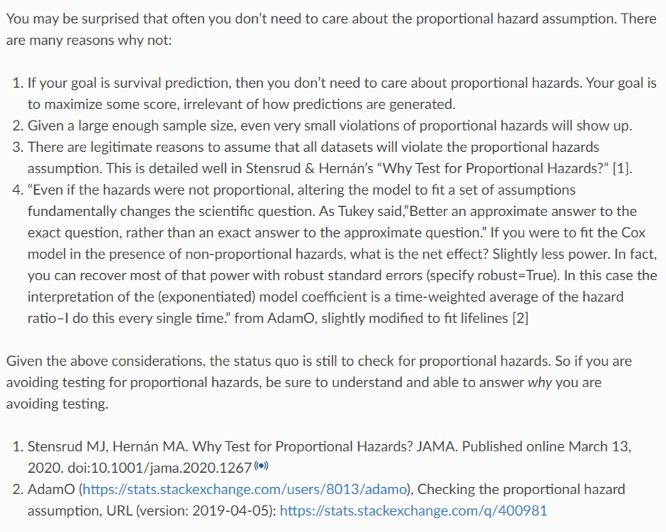
Specific details can be viewed Original link Ha
epilogue
Lifelines is a very convenient survival analysis tool for people familiar with python. But for those familiar with survival analysis, lifelines has many shortcomings. Because this library lacks tools to generate various evaluation indicators, for example, it does not provide tools to draw ROC curve, nomogram, decision curve and so on. The R language provides many packages to draw these diagrams.
In addition, I feel that lifelines does not deal with multi classification variables very well. In R language, multi classification variables are generally processed into factor type, and each sub variable will be compared with a "basic" variable to generate risk ratio. Lifelines feels that it will process multi classified variables into continuous value variables.
After all, most of survival analysis is to study medicine, and the figure is a ready-made tool to solve the problems in scientific research. Lifelines does not provide tools, and people who use them generally do not deliberately build wheels. However, I still hope that more survival analysis tools can be provided in future updates of lifelines.
reference material
1.A concise tutorial on survival analysis
2.Survival Analysis, Cox proportional hazards model and C-index
3.Survival analysis was more than median survival time
4.AUC and C-index are commonly used in clinical research
6.How to understand the risk function in survival analysis
7.COX regression of survival analysis
8.Teach you three tricks Cox regression proportional hazards (PH) hypothesis test
8. Tan Ling, Liu Zilin, Tang Linghan, Xiao Jiangwei Construction and validation of long-term survival prediction model for rectal cancer
- Nomogram prediction model [J] Chinese Journal of basic and clinical medicine, 2021,28 (08): 1031-1038