4.BasicShapes
Once the coordinate system is established in the < SVG > tag, you can start drawing. This chapter will introduce some basic shapes: lines, rectangles,
Polygons, circles, and ellipses. You can use these basic shapes to create the main elements of most paintings.
Lines
SVG allows you to draw a line through the < line > element. You only need to specify the x-axis and y-axis coordinates of the line endpoint. You can specify no units for coordinates. In this case, user coordinates are used by default.
Or consider using centimeters (cm), or feet (in) as units, etc. (as described in The Viewport in Chapter 3)
<line x1="start-x" y1="start-y" x2="end-x" y2="end-y" />
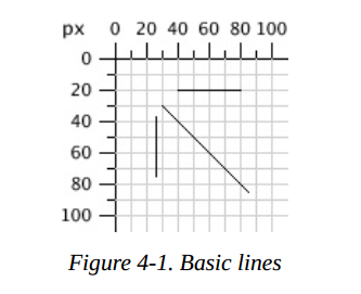
The SVG image in example 4-1 draws several lines; The reference grid you see in Figure 4-1 is not part of SVG.
<svg width="200px" height="200px" viewBox="0 0 200 200"
xmlns="http://www.w3.org/2000/svg">
    <!-- horizontal line -->
    <line x1="40" y1="20" x2="80" y2="20" style="stroke: black;"/>
    <!-- vertical line -->
    <line x1="0.7cm" y1="1cm" x2="0.7cm" y2="2.0cm" style="stroke: black;"/>
    <!-- diagonal line -->
    <line x1="30" y1="30" x2="85" y2="85" style="stroke: black;"/>
</svg>
Stroke Characteristics
Lines are considered pen strokes drawn on the canvas. The size, color, and style of the stroke are part of the line representation. Therefore, these features will be placed in the style attribute.
stroke-width
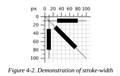
As mentioned in Chapter 3, the grid lines of the canvas are infinitely thin. So where do the lines or strokes fall relative to the grid? The answer is that the grid line falls in the center of the stroke. Example 4-2 drawing
Some lines have been, in which the stroke width has been set to 10 user coordinates to show obvious effect. As a result, as shown in Figure 4-2, grid lines have been drawn so that you can see the effect clearly.
Example 4-2. Demonstration of stroke-width
<svg width="200px" height="200px" viewBox="0 0 200 200"
xmlns="http://www.w3.org/2000/svg">
  <!-- horizontal line -->
  <line x1="30" y1="10" x2="80" y2="10" style="stroke-width: 10; stroke: black;"/>
  <!-- vertical line -->
  <line x1="10" y1="30" x2="10" y2="80" style="stroke-width: 10; stroke: black;"/>
  <!-- diagonal line -->
  <line x1="25" y1="25" x2="75" y2="75" style="stroke-width: 10; stroke: black;"/>
</svg>
Note: the SVG coordinate grid may be infinitely thin, but your computer screen consists of pixels of a fixed size. When the computer converts it to the nearest pixel block, the diagonal may look jagged.
This is called aliasing. Alternatively, the computer can use anti aliasing to soften the edges and blur the pixels of all overlapping parts that the lines pass through.
Most SVG viewers use anti aliasing by default, which sometimes makes a 1-pixel black line look like a 2-pixel gray line, because its center is the space between the two pixels.
You can control the use of anti aliasing through shape rendering in CSS style properties. Set the value of this attribute to crispededges (for an element or SVG)
As a whole, anti aliasing will be turned off, resulting in clear (sometimes jagged) lines. If the value is set to geometricPrecision, smooth (possibly sometimes blurred) edges are emphasized.
Stroke Color
You can specify the color of strokes in a variety of ways:
-
A basic color keyword name: aqua,black,blue,fuchsia,gray,green,lime,maroon,olive,purple,red,silver,teal,white, and yellow. You too
The color keywords defined in Section 4.2 of the SVG specification can be used. -
A 6-bit hexadecimal indicator in the form #rrggbb. rr is the red component, GG is the green component, and BB is the blue component. The value range of each component is 00 FF.
-
Three digit hexadecimal indicator in the format of #rgb, r is the red component, G is the green component, and B is the blue component. The value range of each component is 0-f.
This is a short form of the previously specified color method. In order to be equivalent to 6-bit hexadecimal, each abbreviated number must be repeated; Therefore, #d6e and #dd66ee are the same. -
RGB specifiers (red value, green value, blue value) in RGB form. If their value is an integer, the value range is 0-255. If it is a percentage, the value range is 0% to 100%.
-
currentColor keyword, which uses the calculated CSS color attribute for the bit element. The color attribute has no direct effect in SVG. It is used to set the text color in HTML and inherited by the child element.
Using currentcolor (refer to Inline SVG in XHTML or HTML5) in the inline SVG icon can make the icon present the same color as the surrounding text.
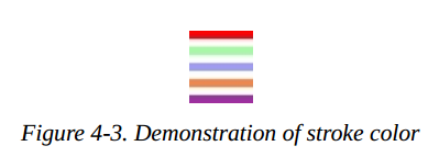
Style 4-3 uses all of these methods (except currentColor), as shown in Figure 4-3.
Example 4-3. Demonstration of stroke color
<svg width="200px" height="200px" viewBox="0 0 200 200"
xmlns="http://www.w3.org/2000/svg">
   <!-- red -->
   <line x1="10" y1="10" x2="50" y2="10" style="stroke: red; stroke-width: 5;"/>
   <!-- light green -->
   <line x1="10" y1="20" x2="50" y2="20" style="stroke: #9f9; stroke-width: 5;"/>
   <!-- light blue -->
   <line x1="10" y1="30" x2="50" y2="30" style="stroke: #9999ff; stroke-width: 5;"/>
   <!-- medium orange -->
   <line x1="10" y1="40" x2="50" y2="40" style="stroke: rgb(255, 128, 64); stroke-width: 5;"/>
   <!-- deep purple -->
   <line x1="10" y1="50" x2="50" y2="50" style="stroke: rgb(60%, 20%, 60%); stroke-width: 5;"/>
</svg>
There are more ways to specify colors. They are used in CSS3 Color specification. Although widely supported in web browsers, they are not part of the SVG 1.1 specification and may not be supported by other SVG implementations; At the time of writing, for example, Apache Batik and Inkscape do not support them. It consists of three new color functions and a new keyword:
-
The form of rgba() indicator is RGB (red value, green value, blue value, alpha value). Here, the color value is in the same format as the color value of rgb() function. Alpha value is a decimal number with a value range of 0 to 1.
-
The form of hsl() indicator is hsl(hue, saturation, lightness), where hue is an integer type angle, the value range is from 0 to 360, and the values of saturation and lightness are from 0 to 255 If it is an integer type. If it is percentage, the value range is from 0% to 100%.
-
hsla() indicator, where the values of hue, satuation, and lightness are the same as hsl, and the value of alpha is the same as that in rgba.
-
Transparent (completely transparent); The effect is the same as that of rgba(0, 0, 0, 0).
Note: if you do not specify the stroke color, you will not see any lines; The default value of the stroke property is none.
stroke-opacity
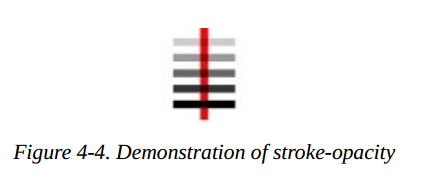
So far, all the lines in the example are solid, blocking anything below them. By giving stroke opacity a value from 0.0 to 1.0, you can control the shape of the line
opacity: the opposite of transparency. Where 0 represents completely transparent and 1 represents completely opaque.
A value less than 0 will be changed to 0; A value greater than 1 will be changed to 1. Example 4-4 changes the opacity value from 0.2 to 1, with 0.2 as the interval value. The results are shown in Figure 4-4.
The red line in the picture can make you see the transparent effect more clearly.
Example 4-4. Demonstration of stroke-opacity
<svg width="200px" height="200px" viewBox="0 0 200 200"
xmlns="http://www.w3.org/2000/svg">
    <line x1="30" y1="0" x2="30" y2="60" style="stroke:red; stroke-width: 5;"/>
    <line x1="10" y1="10" x2="50" y2="10" style="stroke-opacity: 0.2; stroke: black; stroke-width: 5;"/>
    <line x1="10" y1="20" x2="50" y2="20" style="stroke-opacity: 0.4; stroke: black; stroke-width: 5;"/>
    <line x1="10" y1="30" x2="50" y2="30" style="stroke-opacity: 0.6; stroke: black; stroke-width: 5;"/>
    <line x1="10" y1="40" x2="50" y2="40" style="stroke-opacity: 0.8; stroke: black; stroke-width: 5;"/>
    <line x1="10" y1="50" x2="50" y2="50" style="stroke-opacity: 1.0; stroke: black; stroke-width: 5;"/>
</svg>
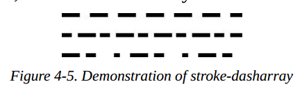
stroke-dasharray Attribute
If you need dotted lines or dashed lines, use the stroke dasharray attribute. Its value consists of a set of numbers separated by commas or spaces. Specify the length of dash length and gaps. The list should have an even number of entries, but if you give an odd number of entries, SVG will repeat the list, so the total number of entries is even. (see the final example of example 4-5.)
Example 4-5. Demonstration of stroke-dasharray
<svg width="200px" height="200px" viewBox="0 0 200 200"
xmlns="http://www.w3.org/2000/svg">
    <!-- 9-pixel dash, 5-pixel gap -->
    <line x1="10" y1="10" x2="100" y2="10" style="stroke-dasharray: 9, 5; stroke: black; stroke-width: 2;"/>
    <!-- 5-pixel dash, 3-pixel gap, 9-pixel dash, 2-pixel gap -->
    <line x1="10" y1="20" x2="100" y2="20" style="stroke-dasharray: 5, 3, 9, 2; stroke: black; stroke-width: 2;"/>
    <!-- Odd number of entries is duplicated; this is equivalent to:
         9-pixel dash, 3-pixel gap, 5-pixel dash,
         9-pixel gap, 3-pixel dash, 5-pixel gap -->
    <line x1="10" y1="30" x2="100" y2="30" style="stroke-dasharray: 9 3 5; stroke: black; stroke-width: 2;"/>
</svg>
Figure 4-5 shows the results, enlarged for clarity.
Rectangles
Rectangle is the simplest of the basic shapes. You specify the upper left corner of the rectangle, its width, and its height through the x and y coordinate values. Inside of rectangle
Fill with the fill color you specify. If you do not specify a fill color, the inside of the shape will be filled with black. The fill color can be specified using any of the methods described in Stroke Color, or it
The value none is used so that the shape has no fill inside and is therefore transparent. You may also specify a fill opacity attribute, which is in the same format as your stroke opacity formula. Fill and fill opacity
They are all display attributes, and they all belong to style attributes.
After internal filling (if necessary), stroke the outer frame of the rectangle. These properties can be specified as you specify line properties. If you do not specify a stroke, assume the value is none,
There is no border drawn. Example 4-6 plots several variants of the < rect > element. Figure 4-6 shows the results, with a grid to provide a comparison.
Example 4-6. Demonstration of the rectangle element
<svg width="200px" height="200px" viewBox="0 0 200 200"
xmlns="http://www.w3.org/2000/svg">
    <!-- black interior, no outline -->
    <rect x="10" y="10" width="30" height="50"/>
    <!-- no interior, black outline -->
    <rect x="50" y="10" width="20" height="40" style="fill: none; stroke: black;"/>
    <!-- blue interior, thick semi-transparent red outline -->
    <rect x="10" y="70" width="25" height="30" style="fill: #0000ff; stroke: red; stroke-width: 7; stroke-opacity: 0.5;"/>
    <!-- semi-transparent yellow interior, dashed green outline -->
    <rect x="50" y="70" width="35" height="20" style="fill: yellow; fill-opacity: 0.5; stroke: green; stroke-width: 2; stroke-dasharray: 5 2"/>
</svg>
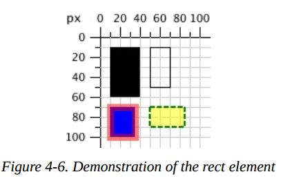
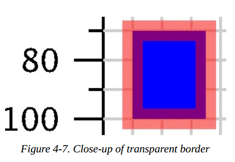
Note: contoured strokes "span" abstract gridlines. So the stroke will be half inside the shape, usually outside the shape. Figure 4-7 is a close-up of the translucent red outline drawn in example 4-6, which clearly shows this.
If you do not specify a starting x or y value, assume that their value is 0. If you only specify a value of 0 in width or height, the rectangle will not be displayed. Provide for width or height
A negative value is wrong.
Rounded Rectangles
If you want the rectangle to have rounded corners, you can specify the curvature of the rounded corners through rx and ry. The maximum value of rx (x-radius) is half the width of the rectangle and the maximum value of ry (y-radius)
Is half the height of the rectangle. If you specify only one of rx or ry, assume that they are equal. Examples 4-7 show various combinations of rx and ry.
Example 4-7. Demonstration of rounded rectangle
<svg width="200px" height="200px" viewBox="0 0 200 200"
xmlns="http://www.w3.org/2000/svg">
    <!-- rx and ry equal, increasing -->
    <rect x="10" y="10" width="20" height="40" rx="2" ry="2" style="stroke: black; fill: none;"/>
    <rect x="40" y="10" width="20" height="40" rx="5" style="stroke: black; fill: none;"/>
    <rect x="70" y="10" width="20" height="40" ry="10" style="stroke: black; fill: none;"/>
    <!-- rx and ry unequal -->
    <rect x="10" y="60" width="20" height="40" rx="10" ry="5" style="stroke: black; fill: none;"/>
    <rect x="40" y="60" width="20" height="40" rx="5" ry="10" style="stroke: black; fill: none;"/>
</svg>
Figure 4-8 shows the results. The grid lines in the background are for comparison.
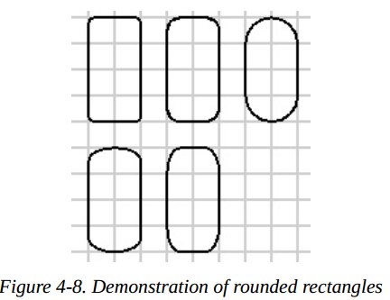
Note: if you are familiar with CSS border radius property, you may know that the trick to convert a rectangle into a circle or an ellipse is to set the corner radius of height and width to 50%. Although you can specify the corner radius of the SVG rectangle using percentage values, they will be resolved to the width(rx) or height(ry) of the view window. Just as you use percentage to set the width or height of the rectangle, not as a percentage of the rectangle itself. Fortunately, SVG has a simpler way to create circles and ellipses.
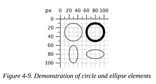
Circles and Ellipses
To draw a circle, use the < circle > element to specify the x-axis, y-axis, and radius of the center point through the cx, cy, and r attributes. Like a rectangle, the default fill color of a circle is black,
And the outline will not be drawn unless you specify other combinations of fill and stroke.
In addition to the X coordinate and Y coordinate of the center point, an ellipse needs both x-radius and y-radius. The attributes of these radii are named rx and ry.
In circles and ellipses, if cx or cy is omitted, its value is assumed to be 0. If the radius is 0, no graphics will be displayed; It is a mistake to set the radius to a negative value.
Examples 4-8 draw circles and ellipses. The results are shown in Figure 4-9.
Example 4-8. Demonstration of circles and ellipses
<svg width="200px" height="200px" viewBox="0 0 200 200"
xmlns="http://www.w3.org/2000/svg">
   <circle cx="30" cy="30" r="20" style="stroke: black; fill: none;"/>
   <circle cx="80" cy="30" r="20" style="stroke-width: 5; stroke: black; fill: none;"/>
   <ellipse cx="30" cy="80" rx="10" ry="20" style="stroke: black; fill: none;"/>
   <ellipse cx="80" cy="80" rx="20" ry="10" style="stroke: black; fill: none;"/>
</svg>
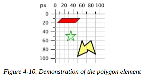
The <polygon> Element
In addition to rectangles, circles, and ellipses, you may want to draw hexagons, octagons, stars, or arbitrary closed shapes< The polygon > element lets you specify a series of points that describe the collection area to be filled and outlined, as described earlier. The points property consists of a series of x and y coordinates separated by commas or spaces. The series of numbers you give must be even pairs. You do not have to return to the starting point; The drawing closes automatically. Example 4-9 uses the < polygon > element to draw a parallelogram, a star, and an irregular shape.
Example 4-9. Demonstration of the polygon element
<svg width="200px" height="200px" viewBox="0 0 200 200"
xmlns="http://www.w3.org/2000/svg">
    <!-- parallelogram -->
    <polygon points="15,10 55, 10 45, 20 5, 20" style="fill: red; stroke: black;"/>
    <!-- star -->
    <polygon points="35,37.5 37.9,46.1 46.9,46.1 39.7,51.5 42.3,60.1 35,55 27.7,60.1 30.3,51.5 23.1,46.1 32.1,46.1"
        style="fill: #ccffcc; stroke: green;"/>
    <!-- weird shape -->
    <polygon points="60 60, 65 72, 80 60, 90 90, 72 80, 72 85, 50 95" style="fill: yellow; fill-opacity: 0.5; stroke: black;
        stroke-width: 2;"/>
</svg>
The results are shown in Figure 4-10, and the grid lines in the background are used as a reference.
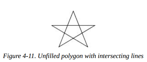
Filling Polygons That Have Intersecting Lines
For the polygons currently displayed, it is easy to fill the shape. None of the lines forming the polygon intersect each other, so the inside of the shape is easy to distinguish from the outside of the shape. However, when the lines cross each other, the recognition
The content of polygons is not easy. The SVG in example 4-10 draws a polygon. In Figure 4-11, is the middle part of the pentagram considered internal or external?
Example 4-10. Unfilled polygon with intersecting lines
<svg width="200px" height="200px" viewBox="0 0 200 200" xmlns="http://www.w3.org/2000/svg">
    <polygon points="48,16 16,96 96,48 0,48 80,96" style="stroke: black; fill: none;"/>
</svg>
SVG has two sets of rules to determine whether a point is inside or outside the polygon. Fill rule (fill rule, which is part of the presentation) has two values: nonzero (default) and eventd. Depending on the rule you choose, you will get a different effect. Example 4-11 fills two different stars with different rules. The results are shown in Figure 4-12.
Example 4-11. Effect of different fill-rules
<svg width="200px" height="200px" viewBox="0 0 200 200" xmlns="http://www.w3.org/2000/svg">
    <polygon style="fill-rule: nonzero; fill: yellow; stroke: black;" points="48,16 16,96 96,48 0,48 80,96" />
    <polygon style="fill-rule: evenodd; fill: #00ff00; stroke: black;" points="148,16 116,96 196,48 100,48 180,96" />
</svg>
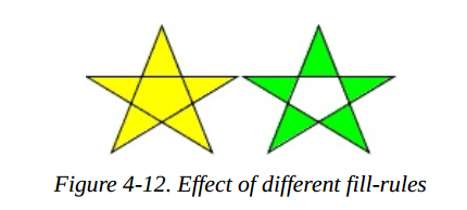
Interpretation of filling rules
For the sake of completeness, the following are how fill rules work, but rest assured that you can use them without knowing more. A nonzero rule draws a line from the point in question to infinity
Line to determine whether a point is inside or outside the polygon. It calculates the number of times the line intersects the polygon line. If the polygon line is from right to left, it will increase by one, and if the polygon line is from left to right, it will decrease by one. If the total is zero,
The shop is just outside the polygon. If the total is not zero (hence the name), the point is inside the polygon.
The parity rule also draws a line from the point in question to infinity, but it only calculates the number of times the line passes through the polygon. If the total number of intersections is odd, the point is inside the polygon. If
If the intersection point is even, the point is outside the polygon.
The <polyline> Element
Finally, to conclude our discussion of basic shapes, we will return to straight lines. Sometimes you need a series of lines that do not form a closed shape. You can use multiple < line > elements,
However, if there are many lines, it may be easier to use the < polyline > element. It has the same points attribute as < polygon >, except that the shape is not closed.
Example 4-12 draws symbols for resistors. The results are shown in Figure 4-13.
Example 4-12. The polyline element
<svg width="100px" height="50px" viewBox="0 0 100 50"
xmlns="http://www.w3.org/2000/svg">
    <polyline points="5 20, 20 20, 25 10, 35 30, 45 10, 55 30, 65 10, 75 30, 80 20, 95 20"
    style="stroke: black; stroke-width: 3; fill: none;"/>
</svg>
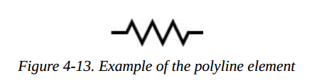
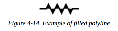
Warning: when using the < polyline > element, it is best to set the value of the fill attribute to none, and SVG can fill this shape when viewing it, which sometimes leads to surprising results as shown in Figure 4-14.
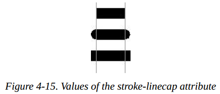
Line Caps and Joins
When drawing a < line > or < polyline >, you can specify the shape of the line end point by setting the stroke linecap style attribute to a value (but, round, or square). Example 4-13 uses these three values, and then draws the actual endpoint of the line with a gray line. In Figure 4-15, you can see that the circle and square exceed the end coordinates.
Example 4-13. Values of the stroke-linecap property
<line x1="10" y1="15" x2="50" y2="15"
style="stroke: black; stroke-linecap: butt; stroke-width: 15;"/>
<line x1="10" y1="45" x2="50" y2="45"
style="stroke: black; stroke-linecap: round; stroke-width: 15;"/>
<line x1="10" y1="75" x2="50" y2="75"
style="stroke: black; stroke-linecap: square; stroke-width: 15;"/>
<!-- guide lines -->
<line x1="10" y1="0" x2="10" y2="100" style="stroke: #999;"/>
<line x1="50" y1="0" x2="50" y2="100" style="stroke: #999;"/>
Through the stroke line join style attribute, you can specify the link mode of lines at the corner of a graph. The optional values are miter(pointed), round, or bevel(flat). Example 4-14 produces the results shown in Figure 4-16.
Example 4-14. Values of the stroke-linejoin attribute
<polyline
style="stroke-linejoin: miter; stroke: black; stroke-width: 12;
fill: none;"
points="30 30, 45 15, 60 30"/>
<polyline
style="stroke-linejoin: round; stroke: black; stroke-width: 12;
fill: none;"
points="90 30, 105 15, 120 30"/>
<polyline
style="stroke-linejoin: bevel; stroke-width: 12; stroke: black;
fill: none;"
points="150 30, 165 15, 180 30"/>
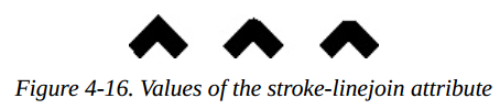
Note: if your line has a mitered connection at a sharp angle, it is possible that the sharp part extends far beyond the thickness of the line. You can use the stroke mitterlimit s style property to set the thickness ratio of miter and linked lines. The default value is 4
Basic Shapes Reference Summary
The table below summarizes the basic graphics in SVG and their appearance styles.
Shape Elements
Table 4-1 summarizes the basic graphics available in SVG.
Table4-1. Shape elements
| shape | describe |
|---|---|
| <line x1="start-x" y1="start-y" x2="end-x" y2="end-y"/> | Draw a line from the coordinate point (start-x,start-y) to the coordinate point (end-x,end-y). |
| <rect x="left-x" y="top-y" width="width", height="height"/> | Draw a rectangle with the coordinates of the upper left corner at the point (left-x,top-y), using the given width and height |
| <circle cx="center-x" cy="center-y" r="radius"/> | Draw a circle with the given radius, and the center point of the circle is (center-x,center-y) |
| <ellipse cx="center-x" cy="center-y" rx="x-radius" ry="y-radius"/> | Draw an ellipse with the given x-radius and y-radius. The center point of the ellipse is (center-x, center-y). |
| `<polygon points= | |
| points-list/>` | Draw an arbitrarily closed polygon. The border of the polygon is described by a set of point coordinates points list. The points are specified by a pair of x-axis coordinates and y-axis coordinates. These point coordinates are only user coordinate systems; You can not add the specified length unit. |
| <polyline points="points-list"/> | Draw a set of arbitrary link lines according to the points described in the points list. These points are specified by x and y coordinates. They are just user coordinate systems. You can not add the specified length units. |
When you specify a number for an attribute, it defaults to the user coordinate system. In addition to the last two elements in table 4-1, you can also add a length unit identifier, such as mm, pt, etc. For example:
<line x1="1cm" y1="30" x2="50" y2="10pt">
Specifying Colors
You can specify the fill color or outline color of a shape in one of the following ways:
- none, which means no outline is drawn or the shape is not filled.
- A basic color name can be one of aqua, black, blue, fuchisa, gray, green, lime, maroon, navy, purple, red, silver, teal, white, or yellow.
- One of the extended color names in the SVG specification.
- It is represented by six hexadecimal characters in the form of #rrggbb, and each pair represents the values of red, green, and blue.
- It is represented by three hexadecimal characters in the form of #rgb and describes the values of red, green and blue. This is a reduced version of the previous method; Hexadecimal numbers are repeated, so #rgh is equivalent to #rrggbb
- rgb(r,g,b), the value range of each value is 0-255, or 0% to 100%.
- currentColor, the calculated (usually inherited) color attribute value of the element.
- One of the specifications from CSS3 Color module (it may not be supported by all SVG implementations).
Stroke and Fill Characteristics
In order to see the outline of a line or figure, you must use the following properties to specify the characteristics of stroke. The outline of a shape is drawn after its interior is filled. All these features, summarized as shown in Table 4-2, are represented as attributes and then as part of style.
Table 4-2. Stroke characteristics
| attribute | value |
|---|---|
| stroke | stroke color, as described in the specifying colors section. The default is none |
| stroke-width | The width of the stroke may be given as a measure of the user coordinate system, or specified by a length identifier. The width of stroke is centered along the abstract grid line, and the default value is 1 |
| stroke-opacity | Values range from 0.0 to 1.0; 0.0 means fully transparent and 1.0 means fully opaque (default) |
| stroke-dasharray | A group of numbers used to indicate the dash used in scribing and the length of the gap. These numbers can only use the user coordinate system. The default value is none |
| stroke-linecap | The shape of the end of a line; The value is one of but (the default), round, or square. |
| stroke-linejoin | The shape at the corner of a polygon or broken line; The value is one of miter (point, default), round, or bevel(flat) |
| stroke-miterlimit | Maximum ratio of miter point length to width: the default value is 4 |
You can use one of the fill attributes shown in table 4-3 to control how the interior of a shape is filled. A shape is a shape that is filled before the outline is drawn.
Table 4-3. Filling characteristics
| attribute | value |
|---|---|
| fill | Fill color, as described in the specified color, the default color is black |
| fill-opacity | A number ranging from 0.0 to 1.0; 0.0 is completely transparent; 1.0 (the default) is completely opaque |
| fill-rule | The value of this attribute can be nonzero (default) or eventd, which applies different rules to determine whether a point is inside or outside a shape. These rules have different effects only when there are intersecting lines or "holes" in the shape. Details are in Filling Polygons That Have Intersecting Lines earlier in this chapter. |
This is just a few examples of style attributes that can be applied to SVG elements.
In Appendix B, form B-1, there is a complete list.
[6] Technically, the x value is the smaller of the x-coordinate values, and the y is the smaller of the y-coordinate values of
the rectangle's sides in the current user coordinate system. Because you are not yet using transformations, which are
covered in Chapter 6, this is the moral equivalent of the upper-left corner.