Boring start:
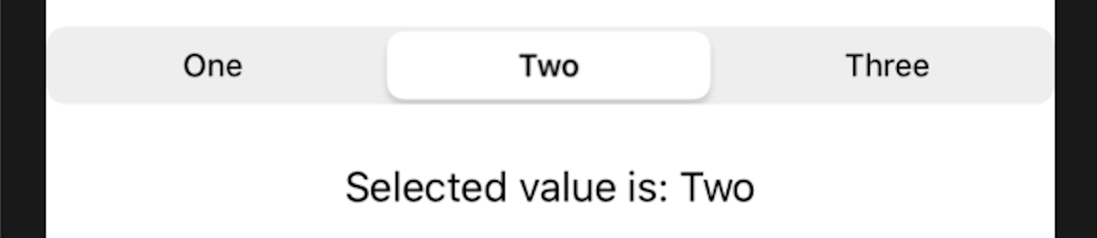
You need to create a segmented control. The effect is as follows:

Does it look familiar? Yes, it looks like Android, right?! The black underline will move under the selected title, and can automatically expand and shrink according to the length of the text.
Why is it so Android like? Because I spent an afternoon getting it out and found that the Figma design page I opened was Android...
So well, if you pee on your hands, no, if you need a similar design, I hope this article can help you.
Lace text:
Don't ask me why the text is lace, don't you like it?!
First, SwiftUI's own Picker # can create the following Segmented control
Well, it's estimated that no designer will agree to use this, so custom layout is inevitable. But the segmented pickerstyle can change too few things. So let's build it ourselves.
Step 1: create a demo project and select SwiftUI App. For the convenience of demonstration, if you are used to AppDelegate, it is the same.
After the creation, you get a display of "Hello, world!" Empty item, experience value + 1...
Step 2: create a new SwiftUI class called Xiaojuan or SegmentedControl. Replace with the following code
import SwiftUI

struct SegmentedControl: View {

    @Binding private var selection: Int
    @State private var segmentSize: CGSize = .zero

    private let items: [String]

    private let xSpace: CGFloat = 4

    public init(items: [String],
                selection: Binding<Int>) {
        self._selection = selection
        self.items = items
    }

    var body: some View {
        // 1
        VStack(alignment: .center, spacing: 0) {
            // 2
            VStack(alignment: .leading, spacing: 0) {
                // 3
                HStack(spacing: xSpace) {
                    ForEach(0 ..< items.count, id: \.self) { index in
                        segmentItemView(for: index)
                    }
                }
                .padding(.bottom, 12)
            }
            .padding(.horizontal, xSpace)

            // full width divider
            Divider()
        }
    }

    // 4
}

struct SegmentedControl_Previews: PreviewProvider {
    static var previews: some View {
        SegmentedControl(items: ["S", "Hanmeimei", "Lilie"], selection: .constant(0))
    }
}
In the comments of the above code:
/ / 1, / / 2, / / 3 three stacks build the basic structure. The / / 3 - hsstack contains all the items in the Segmented control The index here will be below 👇 need.
Step 3: prepare for takeoff
The above code is missing the segmentItemView(:) function. Here:
private func segmentItemView(for index: Int) -> some View {
    guard index < self.items.count else {
        // 5
        return EmptyView().eraseToAnyView()
    }

    let isSelected = self.selection == index

    return
        Text(items[index])
        .font(.caption)
        .foregroundColor(isSelected ? .blue : .gray)
        // 6
        .background(BackgroundGeometryReader())
        // 7
        .onPreferenceChange(SizePreferenceKey.self) {
            // 8
            itemTitleSizes[index] = $0
        }
        .onTapGesture { onItemTap(index: index) }
        .eraseToAnyView()
}

private func onItemTap(index: Int) {
    guard index < self.items.count else { return }
    self.selection = index
}
Copy to the location of code / / 4 above
Here is a brief explanation of the code:
//5, / / 6, / / 7 use three auxiliary functions. Create a new swift class, helper Swift, copy the following code:
import SwiftUI

/ Helpers /

extension View {
    func eraseToAnyView() -> AnyView {
        AnyView(self)
    }
}

/// PreferenceKey for a subview to notify superview of its size
struct SizePreferenceKey: PreferenceKey {
    public typealias Value = CGSize
    public static var defaultValue: Value = .zero

    public static func reduce(value: inout Value, nextValue: () -> Value) {
        value = nextValue()
    }
}

struct BackgroundGeometryReader: View {
    public init() {}

    public var body: some View {
        GeometryReader { geometry in
            return Color
                    .clear
                    .preference(key: SizePreferenceKey.self, value: geometry.size)
        }
    }
}

/ End of Helpers /
The , SizePreferenceKey and , BackgroundGeometryReader here are used to pass the size of the subview to the parent view.
Returning to the previous code segment, / / 8 uses a new array variable, / / itemTitleSizes, to store the text length of each segment. This variable is an array of @ State s, which can be assigned according to items in the init() function.
struct SegmentedControl: View {

    @Binding private var selection: Int
    @State private var segmentSize: CGSize = .zero
    // 9
    @State private var itemTitleSizes: [CGSize] = []

    private let items: [String]

    private let xSpace: CGFloat = 4

    public init(items: [String],
                selection: Binding<Int>) {
        self._selection = selection
        self.items = items
        // 10
        self._itemTitleSizes = State(initialValue: [CGSize](repeating: .zero, count: items.count))
    }
Add two lines corresponding to / / 9 / / 10.
So far, segmentedcontrol The swift class should have no errors. Now we need to modify the contentview Swift code to test the UI.
The code to replace ContentView is as follows:
import SwiftUI

struct ContentView: View {

    @State private var selectedIndex: Int = 0

    private let demo = ["A", "Long name", "sn"]

    var body: some View {
        SegmentedControl(items: demo, selection: $selectedIndex)
    }
}

struct ContentView_Previews: PreviewProvider {
    static var previews: some View {
        ContentView()
    }
}
Compile and run, and the effect is as follows:
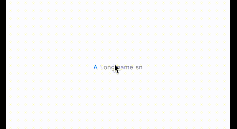
Well, nothing! Let's continue... TO BE CONTINUED. . .
Step 4: the BOSS is coming
Back to segmentedcontrol Swift, modify the code in the body as follows
var body: some View {
    // 1
    VStack(alignment: .center, spacing: 0) {
        // 2
        VStack(alignment: .leading, spacing: 0) {
            // 3
            HStack(spacing: xSpace) {
                ForEach(0 ..< items.count, id: \.self) { index in
                    segmentItemView(for: index)
                }
            }
            .padding(.bottom, 12)

            // 11
            Rectangle()
                .foregroundColor(.black)
                // 12
                .frame(width: selectedItemWidth, height: 3)
                // 13
                .offset(x: selectedItemHorizontalOffset(), y: 0)
                .animation(Animation.linear(duration: 0.3))
        }
        .padding(.horizontal, xSpace)

        // full width divider
        Divider()
    }
}
//11. Rectangle() is the little BOSS of this article! Guess who the big BOSS is?
//The selectedItemWidth of 12 is actually the value corresponding to the selected index in itemTitleSizes, so
private var selectedItemWidth: CGFloat {
    return itemTitleSizes.count > selection ? itemTitleSizes[selection].width : .zero
}
//At 13, you need to calculate the offset, which refers to the distance from the leftmost side of the SegmentedControl to the selected item. You need to calculate slightly:
private func selectedItemHorizontalOffset() -> CGFloat {
    guard selectedItemWidth != .zero, selection != 0 else { return 0 }

    let result = itemTitleSizes
        .enumerated()
        // 14
        .filter { $0.offset < selection }
        // 15
        .map { $0.element.width }
        // 16
        .reduce(0, +)

    return result + xSpace * CGFloat(selection)
}
Thanks to Swift, this code should be well understood:
//14 - filter finds all items whose index is less than the selection (the offset here is the offset after enumerated, which is the index of the array)
//15 - map "lists" the width values of all the items found
//16 - reduce(, +) to add all the width
return needs to add n {xSpace (the space between two item s).
Now there is another value we haven't assigned to him, which is segmentSize, We need to know the length of the whole segmented control (used for calculation). How to get the size of a View in SwiftUI? What we can think of right away is to use , GeometryReader, but I don't suggest you directly add GeometryReader to our VStack, because , GeometryReader starts from the upper left corner of the whole screen, which will have some unexpected consequences (although it will not have an impact in our demo).
Let's still use a color Clear to calculate the length of the view. Modify the body code as follows
var body: some View {
    ZStack {
        GeometryReader { geometry in
            Color
                .clear
                .onAppear {
                    segmentSize = geometry.size
                }
        }
        .frame(maxWidth: .infinity, maxHeight: 1)

        VStack(alignment: .center, spacing: 0) {
            VStack(alignment: .leading, spacing: 0) {
                HStack(spacing: xSpace) {
                    ForEach(0 ..< items.count, id: \.self) { index in
                        segmentItemView(for: index)
                    }
                }
                .padding(.bottom, 12)

                Rectangle()
                    .foregroundColor(.black)
                    .frame(width: selectedItemWidth, height: 3)
                    .offset(x: selectedItemHorizontalOffset(), y: 0)
                    .animation(Animation.linear(duration: 0.3))
            }
            .padding(.horizontal, xSpace)

            // full width divider
            Divider()
        }
    }
}
Add a ZStack and a clear Color for calculating size
Okay, if you run the program now, everything is ideal. And you will find that if you think the spacing between item s is not large enough, you can modify the value of xSpace to change it... Is it? How big will it be? Huh?
Final BOSS - xSpace
Go directly to the code and modify xSpace to
private var xSpace: CGFloat {
    guard !itemTitleSizes.isEmpty, !items.isEmpty, segmentSize.width != 0 else { return 0 }
    let itemWidthSum: CGFloat = itemTitleSizes.map { $0.width }.reduce(0, +).rounded()
    let space = (segmentSize.width - itemWidthSum) / CGFloat(items.count + 1)
    return max(space, 0)
}
Just one thing - average spacing! (I guess you're going to curse your mother) but it took me more than 30 minutes to figure it out. If you have a better way, remember to leave a message!
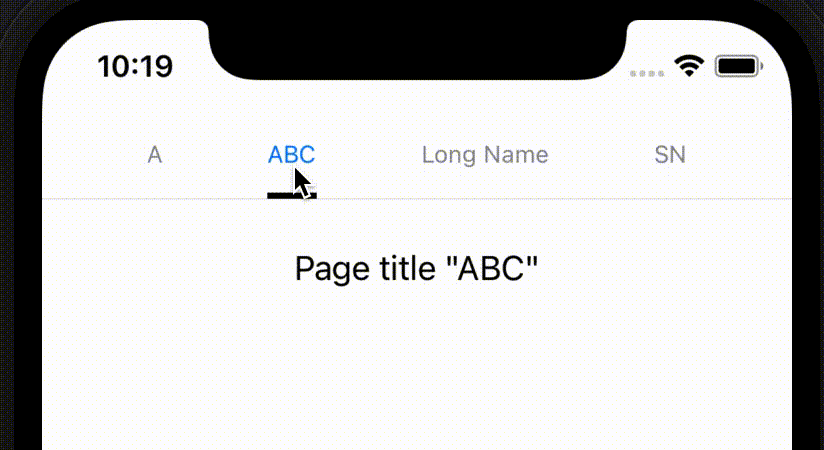
All right, it's done! Now run, the effect is the one at the beginning of the article gif
Last last:
Demo repo: https://github.com/ylem/swiftui-segmented-control-demo