This article is for beginners who have never used Taliwind CSS. We will explain the basic settings and customization methods by building the Tailwind CSS environment, so as to understand the increasingly popular CSS framework of Tailwind CSS.
The current usage of Taliwind CSS is that the number of users is increasing and new functions are being added one after another. The latest version is v3 0 Some of the contents described in this document are in v3 0 can also be set in a simpler way. However, the basic knowledge of Utilize Class has not changed, so it provides information for learning basic knowledge.
catalogue
- 1 what is Tailwind CSS?
--1.1 what is Utilize Class?
--1.2 why Tailwind CSS? - 2. Create environment
--2.1 method of using cdn
--2.2 installing Tailwind css using npm - 3 how to use Tailwind CSS
--3.1 show Hello Tailwind CSS
--3.2 character size setting
--3.3 character thickness setting
--3.4 character color setting
--3.5 create button
--3.6 Tailwind CSS customization
--3.7 pseudo class settings
--3.8 key points of pseudo class setting
--3.9 transition settings
--3.10 transformation settings
--3.11 group setting
--3.12 animation settings - 4 tailwind.confing.js configuration file
--4.1 creating a profile
--4.2 adding color
--4.3 increase maximum width and spacing
--4.4 add font size
--4.5 how to customize other values - 5 Tailwind CSS plug-in settings
1. What is Tailwind CSS?
Tailwind CSS is a CSS framework that uses utility classes (hereinafter referred to as utility classes). Many people will think of CSS frameworks, such as bootstrap, Bulma and Material UI. Bootstrap, Bulma and other frameworks use pre prepared components (such as buttons, menus, and breadcrumbs). In tailwind CSS, you do not prepare any components, but use Utilize Class to create and design your own components.
Tailwind CSS also provides a Headless UI( https://headlessui.dev ), if you want to create complex components (such as drop-down menus and dialog boxes), you can use it.
Originally, Bootstrap and other frameworks can efficiently design websites by preparing component collections in advance, but there is a disadvantage that they are not original because they use the same design. In contrast, Tailwind CSS has no component collection, so even if you create a component named the same button, everyone will create it with a different Utilize Class, which can create a highly original website.
Both have advantages and disadvantages, so which one to use depends on the individual, but the number of people using Tailwind CSS is steadily increasing.
1.1. What is Utilize Class?
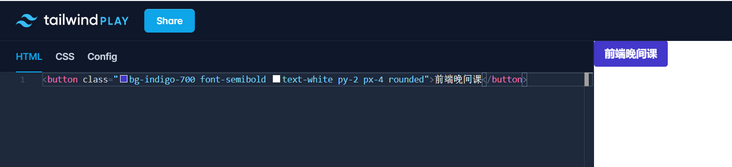
For example, if you want to create a button using Bootstrap, set class to btn. However, in Tailwind, there is no class such as btn for creating buttons. You can create buttons by writing the Utilize Class shown below. You may think there are too many classes to set, but the learning cost is very low, because you get used to it as soon as you use it. If you don't know the class name, you can easily find it by searching the Tailwind CSS document.
<button class="bg-indigo-700 font-semibold text-white py-2 px-4 rounded">Front end evening class</button>
bg-indigo-700 sets the color, font SemiBold sets the font thickness, text white sets the text color, py-2 sets the left and right filling, px sets the up and down filling, and rounded sets the fillet.
Create a button
The utility class set here has no specific meaning in the class itself (unlike the class btn of Bootstrap, which represents buttons). It can be used in various places (sometimes for buttons), sometimes for navigation links, etc., so it is named utility class. That is, the utility class is a pre configured class in Tailwind CSS.
When explaining Tailwind's Utilize Class, the community uses the term low-level, such as low-level styles, low-level utility classes, and low-level frameworks.
There are nine different font sizes and a considerable number of colors of the Utilize Class, so you can design by updating only html files without writing your own css styles.
If you want to use colors that are not registered in the Utilize Class of Tailwind CSS, you may want to know what to do. In this case, you can use it in the same way as other Tailwind CSS utilize classes by registering it in the Tailwind CSS configuration file.
In the current version, fixed values such as text-[#121212] and w-[100px] can be set with parentheses even if they are not registered in the Utilize Class, without describing them in the configuration file. For those frequently used, it is more efficient to continue setting in the configuration file.
1.2 why Tailwind CSS?
After reading this, you may wonder whether you should write using the style attribute without using Tailwind CSS? Using Tailwind CSS has some advantages over the style attribute.
With Tailwind CSS, you can easily set up responsive design using Utilize Class, so you don't need to set up media queries. Once you get used to Tailwind CSS, you will forget to use media query. In addition, settings such as hover and focus as pseudo classes cannot be set through the style attribute, but in Tailwind CSS, pseudo classes can be set by using classes. You can also use Utilize Class to set animation and gradient colors through CSS.
Build environment
Method of using cdn
When using cdn, please paste the following link labels into html.
<link href="https://unpkg.com/tailwindcss@^2/dist/tailwind.min.css" rel="stylesheet">
Please note that if you use cdn, you will not be able to customize Tailwind CSS, which will be described later in this document, such as adding colors.
Installing Tailwind css using npm/yarn
You cannot customize Tailwind CSS using cdn. If you want to customize, you need to use npm and yarn to install Tailwind CSS.
 $ npm init -y

 $ npm install tailwindcss@latest
Next, create a css directory and create a style css file. Add the following three tailwind directives to style css file. This style css cannot be read directly from html. So we'll build it later and convert it into a css file that familiar html can read. By building, the Utilize Class used by Tailwindcss will be extracted from the foundation, components and utilities.
@tailwind base;
@tailwind components;
@tailwind utilities;
Create a public/css directory to store the css files created after the build.
Let's actually build and create a css file from the style. XML file with the Tailwind directive added Read html from css file.
$  % npx tailwind build ./css/style.css -o ./public/css/style.css

   tailwindcss 2.1.2

   🚀 Building: css/style.css

   ✅ Finished in 2.61 s
   📦 Size: 3.81MB
   💾 Saved to public/css/style.css
You can see that the CSS file created contains ordinary CSS. Since all utilize classes created by Twailwind in advance are described, the file is large with 50000 or more lines.
/*! tailwindcss v2.1.2 | MIT License | https://tailwindcss.com */

/*! modern-normalize v1.1.0 | MIT License | https://github.com/sindresorhus/modern-normalize */

/*
Document
========
*/

/**
Use a better box model (opinionated).
*/

*,
::before,
::after {
  box-sizing: border-box;
}
You can also see the style created in Modern normalization is applied at the top of the CSS file.
Using the npx command, you can add the build command to the package JSON file
"scripts": {
  "build": "tailwind build css/style.css -o public/css/style.css"
},
In this way, the environment can be built using Tailwind CSS.
How to use Tailwind CSS
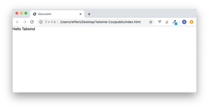
Hello Tailwind CSS
Now that you have built an environment using Tailwind, please create the following index in the public directory HTML file. Use the link tag to specify the built style css.
<!DOCTYPE html>
<html lang="ja">
<head>
    <meta charset="UTF-8">
    <meta name="viewport" content="width=device-width, initial-scale=1.0">
    <meta http-equiv="X-UA-Compatible" content="ie=edge">
    <link rel="stylesheet" href="css/style.css">
    <title>Document</title>
</head>
<body>
    <h1>Hello Tailwind CSS</h1>
</body>
</html>
Open the browser as follows:
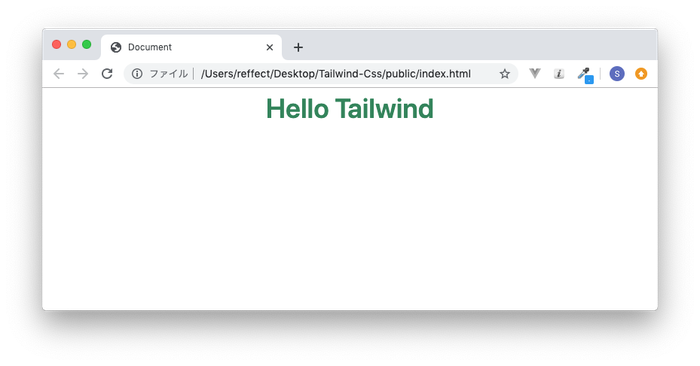
Use Utilize Class to decorate text. Set up four utility classes: font size, color, position, and thickness.
<h1 class="text-4xl text-green-700 text-center font-semibold">Hello Tailwind</h1>
From here, let's introduce the frequently used Utilize Class.
Character size setting
To set the font size, use text- {size}. The size can take 13 values. The corresponding CSS style is in parentheses.
.text-xs(Font size:.75rem;)
.text-sm(Font size:.875rem;)
.text-base(Font size: 1 rem;)
.text-lg(Font size: 1.125rem;)
.text-xl(Font size: 1.25rem;)
.text-2xl(Font size: 1.5rem;)
.text-3xl(Font size: 1.875rem;)
.text-4xl(Font size: 2.25rem;)
.text-5xl(Font size: 3 rem;)
.text-6xl(Font size: 4 rem;)
.text-7xl(Font size: 4.5rem;)
.text-8xl(Font size: 6 rem;)
.text-9xl(Font size: 8 rem;)
When applied to html, it will look like this:
<div class="text-center mt-10">
    <p class="text-xs">Front end evening class</p>
    <p class="text-sm">Front end evening class</p>
    <p class="text-base">Front end evening class</p>
    <p class="text-lg">Front end evening class</p>
    <p class="text-xl">Front end evening class</p>
    <p class="text-2xl">Front end evening class</p>
    <p class="text-3xl">Front end evening class</p>
    <p class="text-4xl">Front end evening class</p>
    <p class="text-5xl">Front end evening class</p>
    <p class="text-6xl">Front end evening class</p>
</div>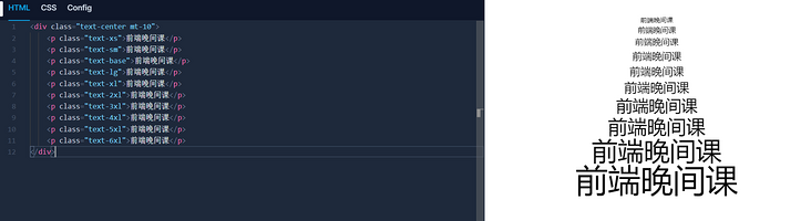
Character thickness setting
To set the character thickness, use font- {thickness}. The thickness can take 9 values. The corresponding CSS style is in parentheses.
.font-thin (font-weight: 100;)
.font-extralight (font-weight: 200;)
.font-light (font-weight: 300;)
.font-normal (font-weight: 400;)
.font-medium (font-weight: 500;)
.font-semibold (font-weight: 600;)
.font-bold(font-weight: 700;)
.font-extrabold(font-weight: 800;)
.font-black(font-weight: 900;)
<div class="text-center mt-10">
    <p class="font-thin">Front end evening class</p>
    <p class="font-extralight">Front end evening class</p>
    <p class="font-light">Front end evening class</p>
    <p class="font-normal">Front end evening class</p>
    <p class="font-medium">Front end evening class</p>
    <p class="font-semibold">Front end evening class</p>
    <p class="font-bold">Front end evening class</p>
    <p class="font-extrabold">Front end evening class</p>
    <p class="font-black">Front end evening class</p>
</div>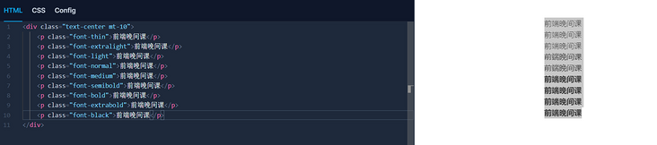
Text color settings
To set the text color, use text- {color}-{color depth}. The color can be set to white, black, red, blue, indigo, etc. Color intensity can take 9 values. For example, in the case of green, as shown below.
text-green-100(Color:# f0fff4;)
text-green-200(Color:#c6f6d5;)
text-green-300(Color:#9ae6b4;)
text-green-400(Color:#68d391;)
text-green-500(Color:#48bb78;)
text-green-600(Color:#38a169;)
text-green-700(Color:#2f855a;)
text-green-800(Color:#276749;)
text-green-900(Color:#22543d;)
If you want to change the text color to red instead of green, you can change it like text-red-500. If you want to change the background color, you can use bg-red-500 to set it.
<div class="text-center mt-10">
    <p class="text-green-100">Front end evening class</p>
    <p class="text-green-200">Front end evening class</p>
    <p class="text-green-300">Front end evening class</p>
    <p class="text-green-400">Front end evening class</p>
    <p class="text-green-500">Front end evening class</p>
    <p class="text-green-600">Front end evening class</p>
    <p class="text-green-700">Front end evening class</p>
    <p class="text-green-800">Front end evening class</p>
    <p class="text-green-900">Front end evening class</p>
</div>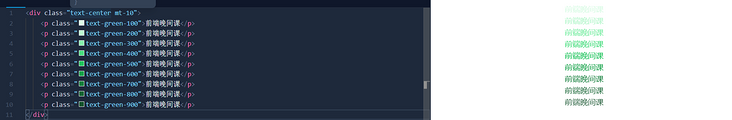
You can also use utility classes such as margins, padding, and flexbox. You can view each Utilize Class in [official documentation] ().
Create button
Now that you know what utility class looks like, let's use utility class to create a button.
<button class="bg-indigo-700 font-semibold text-white py-2 px-4 rounded">Front end evening class</button>

In py-2,. 5rem padding is set up and down, and in px-4, 1rem padding is set left and right. In a circle, the boundary radius. 25rem is applied and the angle is rounded.
Tailwind CSS customization
Because the button is a component that is likely to be reused, and you want to design it uniformly in the application, you can register the Utilize Class set to create the button as another class.
Open the pre built CSS / style CSS file and add the following between the @ components and @ utility directives.
@tailwind base;

@tailwind components;

.btn{
    @apply font-semibold text-white py-2 px-4 rounded;
}

@tailwind utilities;
Then rebuild, npm run build,
The built public / CSS / style. Will be overwritten CSS, so open style CSS file, search btn
You can see that the content just added with @ apply has been added as css to style In the css file,
.btn{
  font-weight: 600;
  color: #fff;
  padding-top: 0.5rem;
  padding-bottom: 0.5rem;
  padding-left: 1rem;
  padding-right: 1rem;
  border-radius: 0.25rem;
}
Created using the btn class and the added button, only change the background color to red.
<div class="text-center mt-10">
    <button class="bg-indigo-700 font-semibold text-white py-2 px-4 rounded">Front end evening class</button>
    <button class="bg-red-700 btn">Front end evening class</button>
</div>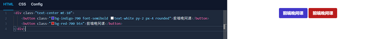
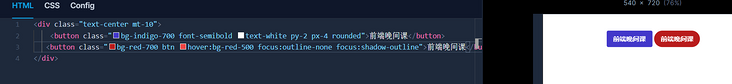
Pseudo class settings hover
Learn how to execute a pseudo class by hovering in Tailwind to change the color of a button when the cursor hovers over it. If you want to change the color, set the color after hovering, and the setting will be reflected.
<button class="bg-red-700 btn hover:bg-red-500">Front end evening class</button>

Pseudo class set focus
You also set the focus when you click the button. For clarity, change from rounded to round to emphasize the roundness of the button. Modify @ apply
@tailwind base;

@tailwind components;
.btn{
    @apply font-semibold text-white py-2 px-4 rounded-full;
}
@tailwind utilities;
When you select a button (using a tab), a box is displayed. When you click, a box appears, so we erase the box by setting the focus.

When I set the focus to no outline, the outline disappears, but I don't know whether the button is selected.
<button class="bg-red-700 btn hover:bg-red-500 focus:outline-none">Front end evening class</button>
Set the shadow outline so that you can see that the button is selected. If you set it, a shadow will be created along the button, so the user will not feel any discomfort.
<button class="bg-red-700 btn hover:bg-red-500 focus:outline-none focus:shadow-outline">Front end evening class</button>
Transition settings
I confirmed that by setting the hover of the pseudo class, the color of the button can be changed when the cursor moves over the button. When the cursor hovers over the button, you can see the color. You can slowly change the color of the button by using the transition. Next, by setting duration-1000, the color will change slowly within 1 second. Multiple values of duration are registered from duration-75 to duration-1000.
<button class="bg-indigo-700 font-semibold text-white py-2 px-4 rounded hover:bg-red-700 duration-1000">Front end evening class</button>
Transform settings
If you want to make the button itself larger and change the color of the button by hovering, you can use transform and scaling's Utilize Class.
<button class="bg-indigo-700 font-semibold text-white py-2 px-4 rounded transform hover:scale-110 hover:bg-red-700 duration-1000">Front end evening class</button>
Group settings
So far, in the hover setting, when the cursor passes through the target element, the change of hover will occur on the element. However, in the group setting, when the cursor passes through the parent element, the hover effect can be presented in the child element of the set hover.
In the following example, when the cursor passes over the parent element with group set, due to the hover setting set for the child element, the text color of one p label element changes to red and the other changes to blue.
<div class="group m-10 p-10 border hover:bg-gray-100">
  <p class="font-black group-hover:text-red-900">Front end evening class</p>
  <p class="font-black group-hover:text-blue-900">Front end evening class</p>
</div>

Animation settings
Simply set animate bounce and animate pulse to class and you can easily animate without setting up complex CSS.
tailwind.confing.js configuration file
create profile
Using Tailwind CSS, you can customize by adding colors, margins, widths, etc. not included in Tailwind CSS Utilize Class. Customization requires a configuration file, but it is not created by default, so it is created using the command.
% npx tailwind init

   tailwindcss 2.1.2

   ✅ Created Tailwind config file: tailwind.config.js
The above command will create a tailwind config. JS file.
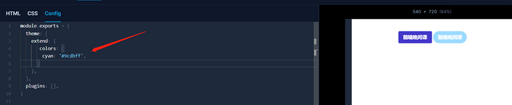
Add color
module.exports = {
  theme: {
    extend: {
      colors: {
        cyan: '#9cdbff',
      }
    }
  },
  variants: {},
  plugins: []
}
Even if you do not use a configuration file, you can set colors that are not commonly used in your application, such as bg-[#9cdbff].
After adding, npm run build
Change the button color from red to cyan. Since the color depth is not set when adding cyan, it is set to BG cyan (changed from bg-red-700 to BG cyan).
<button class="bg-cyan btn hover:bg-red-500 focus:outline-none focus:shadow-outline">Front end evening class</button>
Add maximum width and spacing
You can use max width to set the maximum width of elements in the browser, but you may want to set it to a width different from the width registered by default in Tailwind CSS. In this case, please in tailwind config. JS and other settings in color.
theme: {
    extend: {
        colors:{
            'cyan':'#9cdbff',
        },
        maxWidth:{
            custom:'60rem',
        },
    },
    variants: {},
    plugins: []
},
When used in the class attribute, set max-w-custom.
You can use spacing to set the width.
theme: {
    extend: {
        colors:{
            'cyan':'#9cdbff',
        },
        maxWidth:{
            custom:'60rem',
        },
        spacing:{
            76: '19rem',
        },
    },
    variants: {},
    plugins: []
},
When used in the class attribute, set to w-76.
Even if you don't use a configuration file, you can set a description such as p-[19rem] for those styles you don't use often.
Add font size
The smallest font size class is text XS, but if you want to add a smaller font size class, you can do so.
theme: {
    extend: {
        colors:{
            'cyan':'#9cdbff',
        },
        maxWidth:{
            custom:'60rem',
        },
        spacing:{
            76: '19rem',
        },
        fontSize:{
            xxs:['0.625em',{lineHeight:'1rem'}],
        },
    },
    variants: {},
    plugins: []
},
If you want to use it, set text XXS in the class attribute.
How to customize other values
I explained how to add color, maximum width, width and font size, but where should I check the setting method when I want to add box shadow, for example?
First, go to the official Tailwind CSS document and search.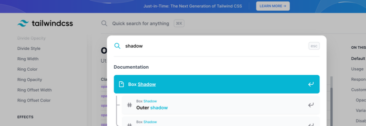
Search in documents
When searching, the Box Shadow page is displayed.

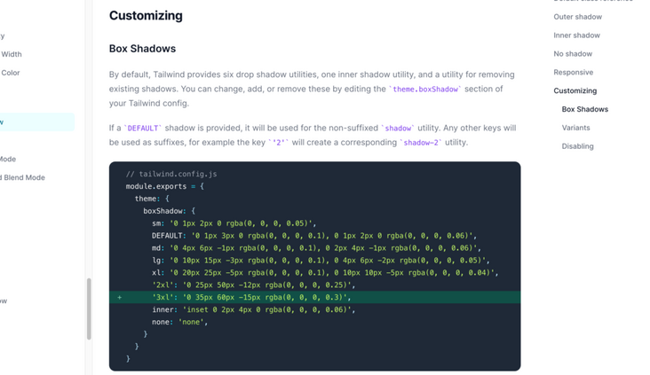
Box shadow page
When you scroll, you will find the custom. The default registered value in Tailwind CSS will be displayed there, so if you want to set it with a value that is not included, please add it to tailwind according to the displayed setting method config. JS file.
Tailwind CSS plugin settings
Tailwind CSS provides some official plug-ins. Let's check how to set up tailwindcss / line clamp, which is one of the plug-ins.
When a long sentence like the following is displayed in the browser, it will also display multiple lines in the browser.
<div class="m-20">
  <div>
    Lorem ipsum dolor sit amet, consectetur adipisicing elit. Suscipit a in ad voluptatem necessitatibus et laborum, minus amet aliquid pariatur fugit recusandae neque illum voluptatibus repellendus est natus harum modi maxime eos aliquam eum ratione tempore? Sapiente nam corrupti odio quibusdam dolore harum consequatur sint mollitia at? Voluptas quae eligendi quia omnis porro totam laudantium dolorum. Ipsum quasi cupiditate expedita! Dolor ut voluptatibus quos ipsa beatae, accusamus, a incidunt provident, delectus tempore id ex placeat quo laboriosam iusto velit animi molestiae dignissimos sint perspiciatis quis accusantium maxime corrupti. Repellat hic error in totam consequuntur non magni maiores quibusdam quidem cum.
  </div>
</div>
If you only want to see the first few lines instead of all lines, you can use the plug-in tailwindcss / line clamp.
% npm install @tailwindcss/line-clamp
After the installation is completed, it needs to be installed in tailwind config. JS.
    plugins: [
        require('@tailwindcss/line-clamp'),
    ],
After setting up, you will need to build. Run npm run build. After the build is completed, the settings for using the plug-in are complete.
Line clamp sets the number of lines to display after line clamp, as shown below.
<div class="m-20">
  <div class="line-clamp-3">
    Lorem ipsum dolor sit amet, consectetur adipisicing elit. Suscipit a in ad voluptatem
//slightly
  </div>
</div>
Only 3 lines with line-clamp-3 set can be displayed.

So far, we have learned what tailwind CSS is? How to build tailwind CSS environment and use tailwind CSS? Tailwind CSS customization and the use of plug-ins. I believe you have a comprehensive understanding of tailwind CSS. The next step is to write it.