
On December 10, 2021, Adam Wathan, founder of TailwindCSS, announced TailwindCSS v3 0 was officially released, which brought a series of performance improvements, improvement of development workflow and a large number of new features.
So this brilliant new star in the field of CSS engineering is in v3 What interesting new features did 0 bring us? Let's introduce them one by one.
Just in time mode anytime, anywhere
Tailwind 2.x introduces a new mode, just in time mode, which can keep the development and production build consistent and build on demand. Compared with the previous tailwind needs to build all basic contents, it greatly improves the performance. For any construction tool, such as Webpack, it only takes 800ms to build, but before, it may take 30-45s.
And thanks to the JIT mode, Tailwind supports a series of new features such as "arbitrary value auxiliary class".
When using JIT before, you need to specify the mode in the configuration file:
// tailwind.config.js

module.exports = {
 // ...
  mode: 'jit',
  // ...
}
Then you can enjoy extremely fast construction speed, and you can use auxiliary classes with arbitrary values, such as:
<div class="top-[-113px]"></div>
This is not allowed in the previous Tailwind version. If you need to override this arbitrary value, you still have to define a class name and write the corresponding CSS:
<div class="arbitrary-values"></div>

<style>
.arbitrary-values {
  top: -113px;
}
</style>
This form seems to be separated from Tailwind. Therefore, in JIT mode, because it supports on-demand construction, this form of arbitrary value can also be written using Tailwind's unified syntax.
And in v3 0, Tailwind has built-in JIT. There is no need to declare the JIT mode in the configuration file. By default, it is built on demand, any auxiliary classes can be used, and the development and production construction methods are unified with the products, avoiding inconsistency and achieving great performance optimization.
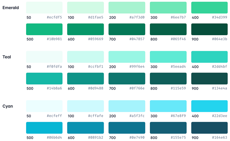
All colors are available out of the box
In v3 Before 0, in order to focus on the size of CSS volume in development mode, Tailwind must carefully limit the available colors, but in v3.0 After 0, we can introduce many new palette colors, such as cyan (sky blue), rose (rose), fuchsia (Fuchsia), lime (acid orange) and 15 medium gray shadows, without worrying about the increasing volume of CSS files.
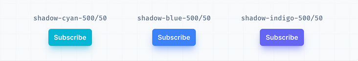
Support colored shadows
Previously, Tailwind wanted to support colored shadows in a combined way. Although users have been asking for this function for a long time, it has not been realized. After five failed attempts, it was finally installed in Tailwind v3 0. Now you can use these colored shadows in Tailwind:
For example, the following codes:
<button class="bg-cyan-500 shadow-lg shadow-cyan-500/50 ...">Subscribe</button>
<button class="bg-blue-500 shadow-lg shadow-blue-500/50 ...">Subscribe</button>
<button class="bg-indigo-500 shadow-lg shadow-indigo-500/50 ...">Subscribe</button>
The following effects can be obtained:
Scroll capture API
We have added a complete set of auxiliary classes for realizing CSS scrolling capture module, so that you can directly realize very rich scrolling capture effects in HTML:
What is roll capture? That is, when you slide to the next Item, you can choose to slide to a certain position of this Item, such as the following positioning in the middle of the picture.
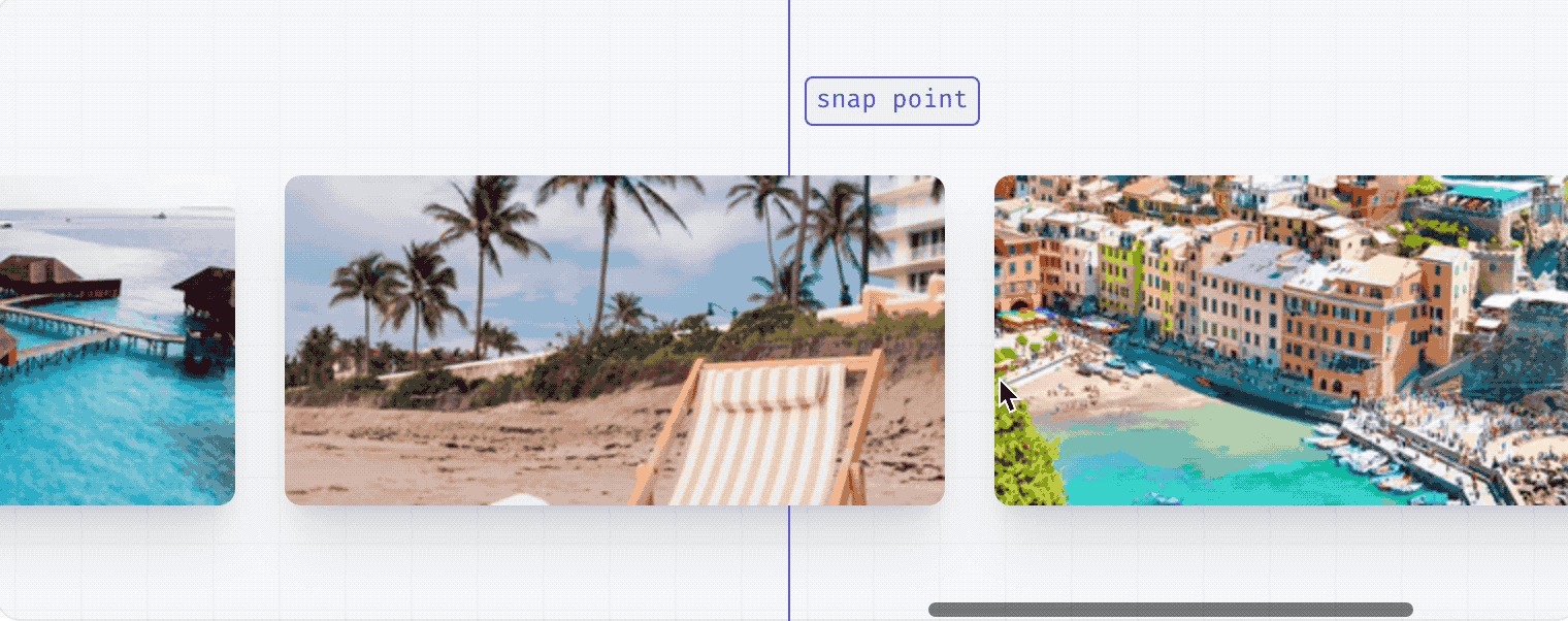
The above effect only needs the following relatively simple Tailwind auxiliary class:
<div class="snap-x ...">
<div class="snap-center ...">
<img src="https://images.unsplash.com/photo-1604999565976-8913ad2ddb7c?ixlib=rb-1.2.1&ixid=MnwxMjA3fDB8MHxwaG90by1wYWdlfHx8fGVufDB8fHx8&auto=format&fit=crop&w=320&h=160&q=80" />
</div>
<div class="snap-center ...">
<img src="https://images.unsplash.com/photo-1540206351-d6465b3ac5c1?ixlib=rb-1.2.1&ixid=MnwxMjA3fDB8MHxwaG90by1wYWdlfHx8fGVufDB8fHx8&auto=format&fit=crop&w=320&h=160&q=80" />
</div>
<div class="snap-center ...">
<img src="https://images.unsplash.com/photo-1622890806166-111d7f6c7c97?ixlib=rb-1.2.1&ixid=MnwxMjA3fDB8MHxwaG90by1wYWdlfHx8fGVufDB8fHx8&auto=format&fit=crop&w=320&h=160&q=80" />
</div>
<div class="snap-center ...">
<img src="https://images.unsplash.com/photo-1590523277543-a94d2e4eb00b?ixlib=rb-1.2.1&ixid=MnwxMjA3fDB8MHxwaG90by1wYWdlfHx8fGVufDB8fHx8&auto=format&fit=crop&w=320&h=160&q=80" />
</div>
<div class="snap-center ...">
<img src="https://images.unsplash.com/photo-1575424909138-46b05e5919ec?ixlib=rb-1.2.1&ixid=MnwxMjA3fDB8MHxwaG90by1wYWdlfHx8fGVufDB8fHx8&auto=format&fit=crop&w=320&h=160&q=80" />
</div>
<div class="snap-center ...">
<img src="https://images.unsplash.com/photo-1559333086-b0a56225a93c?ixlib=rb-1.2.1&ixid=MnwxMjA3fDB8MHxwaG90by1wYWdlfHx8fGVufDB8fHx8&auto=format&fit=crop&w=320&h=160&q=80" />
</div>
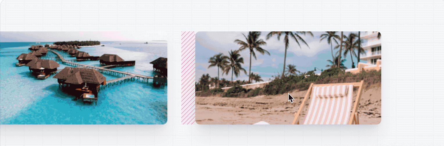
</div>In a snap container, snap center, snap start, etc. are settings for rolling positioning, while Scroll Margin is used to set the offset relative to positioning. It is set in a format such as scroll-m{side}-{size}. For example, scroll-ml-6 is a length offset of 6 units relative to the left:
<div class="snap-x ...">
  <div class="scroll-ml-6 snap-start ...">
    <img src="https://images.unsplash.com/photo-1604999565976-8913ad2ddb7c?ixlib=rb-1.2.1&ixid=MnwxMjA3fDB8MHxwaG90by1wYWdlfHx8fGVufDB8fHx8&auto=format&fit=crop&w=320&h=160&q=80" />
  </div>
  <div class="scroll-ml-6 snap-start ...">
    <img src="https://images.unsplash.com/photo-1540206351-d6465b3ac5c1?ixlib=rb-1.2.1&ixid=MnwxMjA3fDB8MHxwaG90by1wYWdlfHx8fGVufDB8fHx8&auto=format&fit=crop&w=320&h=160&q=80" />
  </div>
  <div class="scroll-ml-6 snap-start ...">
    <img src="https://images.unsplash.com/photo-1622890806166-111d7f6c7c97?ixlib=rb-1.2.1&ixid=MnwxMjA3fDB8MHxwaG90by1wYWdlfHx8fGVufDB8fHx8&auto=format&fit=crop&w=320&h=160&q=80" />
  </div>
  <div class="scroll-ml-6 snap-start ...">
    <img src="https://images.unsplash.com/photo-1590523277543-a94d2e4eb00b?ixlib=rb-1.2.1&ixid=MnwxMjA3fDB8MHxwaG90by1wYWdlfHx8fGVufDB8fHx8&auto=format&fit=crop&w=320&h=160&q=80" />
  </div>
  <div class="scroll-ml-6 snap-start ...">
    <img src="https://images.unsplash.com/photo-1575424909138-46b05e5919ec?ixlib=rb-1.2.1&ixid=MnwxMjA3fDB8MHxwaG90by1wYWdlfHx8fGVufDB8fHx8&auto=format&fit=crop&w=320&h=160&q=80" />
  </div>
</div>
According to the above code, the snap center will be positioned at the beginning of the picture when scrolling. After adding scroll-ml-6, it will be offset by 6 units relative to the left, resulting in the following effect:
Multi column layout
We joined columns Column layout support, also known as the "news layout" type, is very useful. At the same time, it is also very useful in the layout design of the navigation bar at the bottom.
For example, the multi column navigation bar design at the bottom of most of our websites, take Tailwind official website as an example:
When you use the corresponding auxiliary class as follows:
<div class="columns-1 sm:columns-3 ...">
  <p>...</p>
  <!-- ... -->
</div>
You can achieve the following effects:
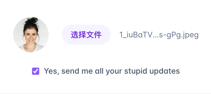
Native form control style
We have added support for CSS accent color attribute, such as adding styles to the file input box buttons in the form, which enables you to add styles to the native form control buttons in a fine-grained manner, as shown in the following code:
<form>
  <div class="flex items-center space-x-6">
    <div class="shrink-0">
      <img class="h-16 w-16 object-cover rounded-full" src="https://images.unsplash.com/photo-1580489944761-15a19d654956?ixlib=rb-1.2.1&ixid=MnwxMjA3fDB8MHxwaG90by1wYWdlfHx8fGVufDB8fHx8&auto=format&fit=crop&w=1361&q=80" alt="Current profile photo" />
    </div>
    <label class="block">
      <span class="sr-only">Choose profile photo</span>
      <input type="file" class="block w-full text-sm text-gray-500
        file:mr-4 file:py-2 file:px-4
        file:rounded-full file:border-0
        file:text-sm file:font-semibold
        file:bg-violet-50 file:text-violet-700
        hover:file:bg-violet-100
      "/>
    </label>
  </div>
  <label class="mt-6 flex items-center justify-center space-x-2 text-sm font-medium text-gray-600">
    <input type="checkbox" class="accent-violet-500" checked/>
    <span>Yes, send me all your stupid updates</span>
  </label>
</form>
The following effects can be obtained:
Before selecting a file for:

After selecting a file:
Print modifier
We have added the print modifier to show how users print your website:
<div>
  <article class="print:hidden">
    <h1>My Secret Pizza Recipe</h1>
    <p>This recipe is a secret, and must not be shared with anyone</p>
    <!-- ... -->
  </article>
  <div class="hidden print:block">
    Are you seriously trying to print this? It's secret!
  </div>
</div>
For example, the above code logic is that in print mode, the first article block is not displayed, while the div block is displayed.
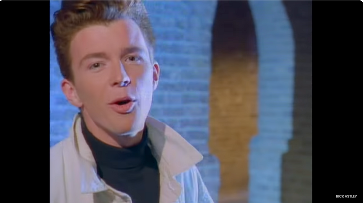
Modern aspect ratio API
We added support for the native aspect ratio * * attribute, because now the browser support is very high, that is, we can obtain a perfect aspect ratio.
For example, the following code can set the best aspect ratio of the video:
<iframe class="w-full aspect-video ..." src="https://www.youtube.com/..."></iframe>
The above code gives the following results:
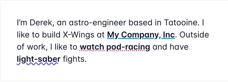
Nice underline style
We now support modifying the color, thickness and other properties of the underline~
As shown in the following code:
<p>
  I'm Derek, an astro-engineer based in Tatooine. I like to build X-Wings at
  <a href="#" class="underline decoration-sky-500 decoration-2">My Company, Inc</a>. Outside of work, I
  like to <a href="#" class="underline decoration-pink-500 decoration-dotted decoration-2">watch pod-racing</a>
  and have <a href="#" class="underline decoration-indigo-500 decoration-wavy decoration-2">light-saber</a>
  fights.
</p>
The following effects can be obtained:
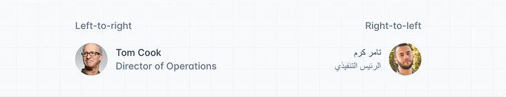
RTL and LTR modifiers
We have also added experimental support for multi-directional layouts such as RTL (from right to left) and LTR (from right to right), as shown in the following code:
<div class="group flex items-center">
  <img class="shrink-0 h-12 w-12 rounded-full" src="..." alt="" />
  <div class="ltr:ml-3 rtl:mr-3">
    <p class="text-sm font-medium text-gray-700 group-hover:text-gray-900">...</p>
    <p class="text-sm font-medium text-gray-500 group-hover:text-gray-700">...</p>
  </div>
</div>
The following effects can be obtained:
Portrait and Landscape modifiers
We have also added modifier support in different screen directions, such as portrait and landscape, so that you can control the style in the corresponding screen direction through different modifiers:
<div>
  <div class="portrait:hidden">
    <!-- ... -->
  </div>
  <div class="landscape:hidden">
    <p>
      This experience is designed to be viewed in landscape. Please rotate your
      device to view the site.
    </p>
  </div>
</div>
Arbitrary value helper class support
Although it seems unreasonable, we still add Tailwind auxiliary classes with arbitrary CSS values, and enable you to use them in combination with hover, lg and other modifiers:
<div class="[mask-type:luminance] hover:[mask-type:alpha]">
  <!-- ... -->
</div>
Or any value like 56px or 44px, used with lg modifier:
<div class="[--scroll-offset:56px] lg:[--scroll-offset:44px]">
  <!-- ... -->
</div>
Using CDN to use Tailwind
At present, there is no good CSS based CDN method to use tailwind CSS v3 0, so we built a JavaScript library to help you use it:
<!DOCTYPE html>
<html lang="en">
  <head>
    <meta charset="utf-8">
    <meta name="viewport" content="width=device-width, initial-scale=1.0" />
    <title>Example</title>
    <script src="https://cdn.tailwindcss.com/"></script>
  </head>
  <body>
    <!-- -->
  </body>
</html>
This method is limited to the development environment, or you can use it when you want to build a demo or try an interesting idea. Just add a script tag to reference any HTML document that wants to use the Tailwind feature https://cdn.tailwindcss.com/ Just.
The above is tailwindcss v3 0 updated all the features, see here, you think tailwindcss v3 How about 0? You're ready to use it for production or add it to the toolbox when building your next application 🐴?
❤️/ Thank you for your support/
The above is all the content of this sharing. I hope it will help you^_^
If you like, don't forget to share, like and collect~
Welcome to official account occupation bus, the three brothers from bytes, shrimp skins and silver merchants, sharing programming experience, technical dry cargo and career planning, helping you to walk in the big factory without any detours.