Taobao user behavior analysis project
Note: the project passes the Jupiter notebook. Third party libraries such as pandas, numpy, matplotlib and seaborn are used to analyze the data in different dimensions.
1, Project background
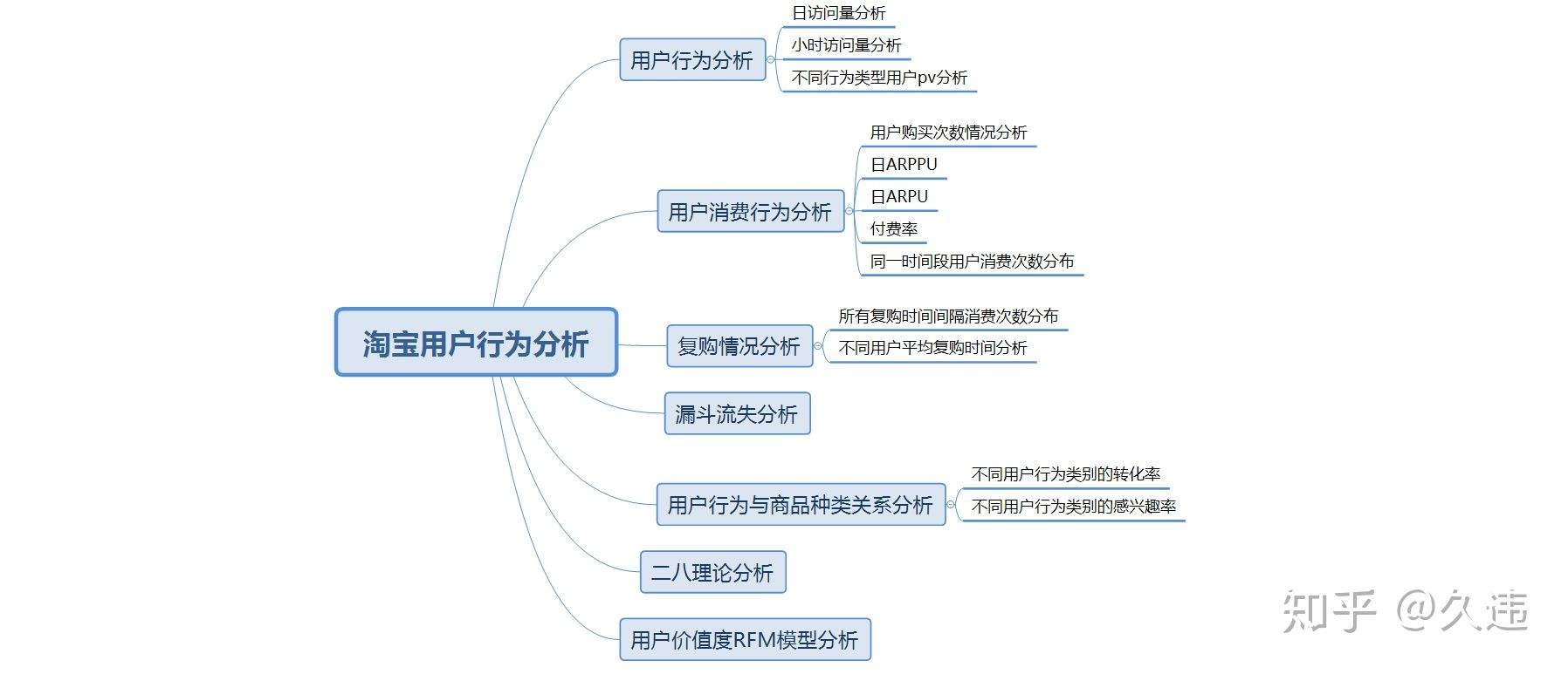
Taking Taobao app platform as the data set, this data report analyzes the behavior of Taobao users through industry indicators, so as to explore the behavior mode of Taobao users. Specific indicators include daily PV and daily UV analysis, payment rate analysis, repurchase behavior analysis, funnel loss analysis and user value RFM analysis.
2, Data source
Link: https://pan.baidu.com/s/1468_ZeV0N_J1_FSyUgEMeQ
Extraction code: 3c5c
3, Problems to be solved
1. How many days pv are there
2. How much is the daily uv
3. Payment rate
4. What is the repurchase rate
5. How about the loss of funnel
6. User value
4, Data description
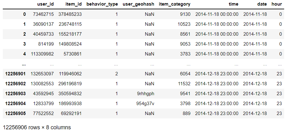
There are about 1.04 million pieces of data in this data set. The data is the user behavior data of Taobao app2 from November 18, 2014 to December 18, 2014, with a total of 6 columns. The columns are:
user_id: user identity, desensitization
item_id: Commodity ID, desensitization
behavior_type: user behavior type (including clicking, collecting, adding shopping cart and paying, represented by numbers 1, 2, 3 and 4 respectively)
user_geohash: geographic location
item_category: category ID (category to which the commodity belongs)
Time: the time when the user behavior occurs
5, Data cleaning
# Import necessary Libraries
import pandas as pd
import numpy as py
%matplotlib inline
import matplotlib.pyplot as plt
import seaborn as sns
import re
# Import data (Note: you need to enter the absolute path of the data)
data_user=pd.read_csv('E:/PythonData/tianchi_mobile_recommend_train_user.csv')
# View missing values
missingTotal = data_user.isnull().sum()
missingTotal

# View the first 5 rows of data
data_user.head()

# Extract the date and time respectively through regular expressions
import re
# Extraction date
data_user['date'] = data_user['time'].map(lambda s:re.compile(' ').split(s)[0])
# Extracting hours through regular expressions
data_user['hour'] = data_user['time'].map(lambda s:re.compile(' ').split(s)[1])
# View data
data_user.head()

# View data type
data_user.dtypes

# Convert the date and time to the corresponding format
data_user['date']=pd.to_datetime(data_user['date'])
data_user['time']=pd.to_datetime(data_user['time'])

#Convert hour to integer
data_user['hour']=data_user['hour'].astype('int64')
data_user.dtypes

# Sort the data in ascending order through the time field
data_user = data_user.sort_values(by='time',ascending=True)

# After sorting, reset the index to get a new data set
data_user = data_user.reset_index(drop=True)
data_user
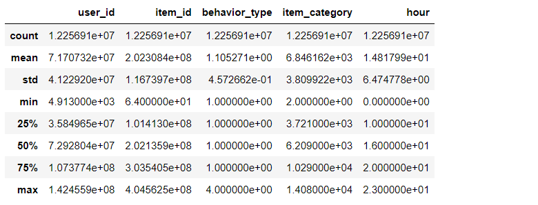
# View statistics of data
data_user.describe()
6, User behavior analysis
1. pv and uv analysis
PV (traffic): that is, Page View, specifically refers to the page views or clicks of the website, which is calculated once the page is refreshed.
UV (independent visitor): that is, Unique Visitor. A computer client accessing your website is a visitor.
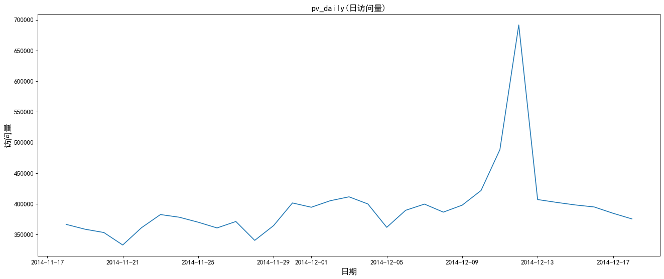
1. Daily traffic analysis
# pv_daily records the number of user operations per day, uv_daily records the number of different online users every day

# Daily visits (group dates and count and aggregate user IDs. Reset the index and rename the field user_id to pv)
pv_daily=data_user.groupby('date')['user_id'].count().reset_index().rename(columns={'user_id':'pv'})

# Daily visitor volume (the operation is the same as above, but the difference is to de count different user_id s)
uv_daily=data_user.groupby('date')['user_id'].apply(lambda x:x.drop_duplicates().count()).reset_index().rename(columns={'user_id':'uv'})

#Add Chinese
plt.rcParams['font.sans-serif'] = ['SimHei']

# Create drawing
plt.figure(figsize=(20,8),dpi=80)
plt.plot(pv_daily.date,pv_daily.pv)

# Adjust scale
plt.xticks(size=12)
plt.yticks(size=12)

# Add dimension
plt.xlabel('date',size=15)
plt.ylabel('Visits',size=15)

#Add title
plt.title('pv_daily(Daily visits)',size=15)
# Create drawing
plt.figure(figsize=(20,8),dpi=80)
plt.plot(uv_daily.date,uv_daily.uv)

# Adjust scale
plt.xticks(size=12)
plt.yticks(size=12)

# Add dimension
plt.xlabel('date',size=15)
plt.ylabel('Number of visitors',size=15)

#Add title
plt.title('uv_daily',size=15)
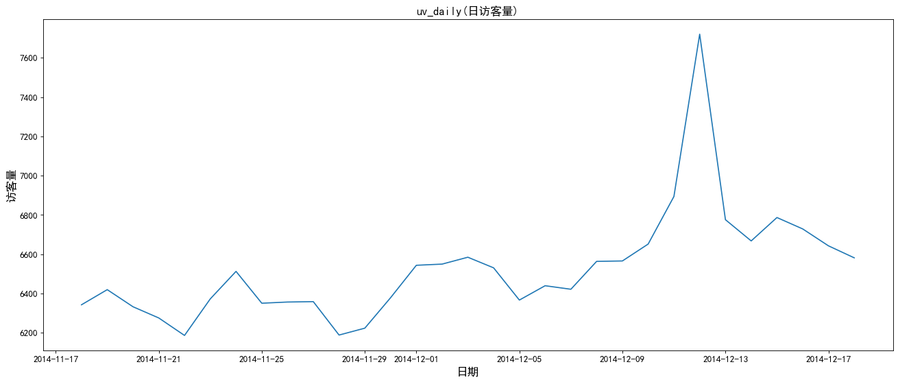
From the above figure: the peak number of visits and visitors during the double twelfth Festival.
2. Hourly traffic analysis
#pv_hour records the number of user operations per hour, uv_hour records the number of online users per hour
# Visits per hour (group the hours, count and aggregate the user id, reset the index, and rename the user id to pv)
pv_hour=data_user.groupby('hour')['user_id'].count().reset_index().rename(columns={'user_id':'pv'})

# Number of visitors per hour (the operation is the same as above, except that the user id is de counted)
uv_hour=data_user.groupby('hour')['user_id'].apply(lambda x:x.drop_duplicates().count()).reset_index().rename(columns={'user_id':'uv'})

# Create drawing
plt.figure(figsize=(20,8),dpi=80)
plt.plot(pv_hour.hour,pv_hour.pv)

# Adjust scale
plt.xticks(size=12)
plt.yticks(size=12)

# Add dimension
plt.xlabel('hour',size=15)
plt.ylabel('Visits per hour',size=15)

#Add title
plt.title('pv_hour((visits per hour)',size=15)
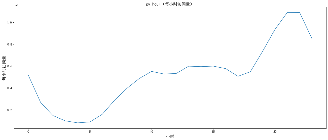
As can be seen from the above figure, the number of visitors and visits is the largest during 8.00 p.m.
3. pv analysis of users with different behavior types
# Group different types of user behavior and hours
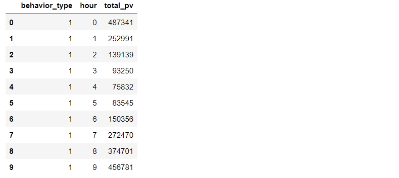
pv_detail=data_user.groupby(['behavior_type','hour'])['user_id'].count().reset_index().rename(columns={'user_id':'total_pv'})

# View the first 10 rows of data
pv_detail.head(10)
# Create drawing
plt.figure(figsize=(20,8),dpi=80)

# Draw a broken line chart of hourly pv situation of users with different behavior types
plt.plot(pv_detail[pv_detail.behavior_type==1].hour,pv_detail[pv_detail.behavior_type==1].total_pv,label='click',color='r')
plt.plot(pv_detail[pv_detail.behavior_type==2].hour,pv_detail[pv_detail.behavior_type==2].total_pv,label='Collection',color='b')
plt.plot(pv_detail[pv_detail.behavior_type==3].hour,pv_detail[pv_detail.behavior_type==3].total_pv,label='Add shopping cart',color='y')
plt.plot(pv_detail[pv_detail.behavior_type==4].hour,pv_detail[pv_detail.behavior_type==4].total_pv,label='payment',color='g')

# Adjust scale
plt.xticks(size=12)
plt.yticks(size=12)

# Add dimension
plt.xlabel('time/hour',fontsize=12)
plt.ylabel('quantity',fontsize=12)

# Add legend
plt.legend(loc='best',fontsize=15)

# Add title
plt.title('Different user behaviors pv analysis',fontsize=15)
3.1 only compare the pv situation where the user's behavior is collection, shopping cart addition and payment
# Create drawing
plt.figure(figsize=(20,8),dpi=80)

# Draw the pv line chart of collection, shopping cart and payment
plt.plot(pv_detail[pv_detail.behavior_type==2].hour,pv_detail[pv_detail.behavior_type==2].total_pv,label='Collection',color='b')
plt.plot(pv_detail[pv_detail.behavior_type==3].hour,pv_detail[pv_detail.behavior_type==3].total_pv,label='Add shopping cart',color='y')
plt.plot(pv_detail[pv_detail.behavior_type==4].hour,pv_detail[pv_detail.behavior_type==4].total_pv,label='payment',color='g')

# Adjust scale
plt.xticks(size=12)
plt.yticks(size=12)

# Add dimension
plt.xlabel('time/hour',fontsize=15)
plt.ylabel('quantity',fontsize=15)

# Add legend
plt.legend(loc='best',fontsize=20)

# Add title
plt.title('Different types of user behavior pv Analysis 2',size=15)
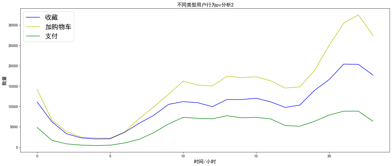
As shown in the chart above:
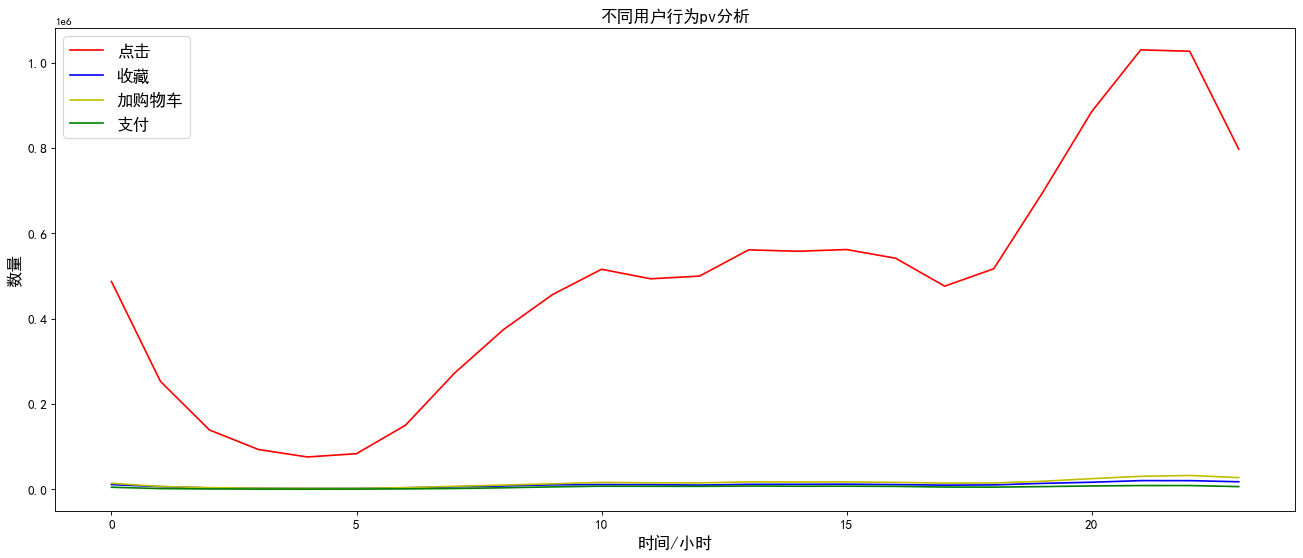
Compared with the other three types of user behaviors, the click user behavior has higher pv visits, and the fluctuations of the four user behaviors are basically the same. Therefore, no matter which user behavior is in the evening, the pv visits are the highest.
As can be seen from Figure 2, the total amount of pv of user behavior of adding shopping cart is higher than the total amount of collection. Therefore, in the subsequent funnel loss analysis, user type 3 should be analyzed before 2.
7, Consumer behavior analysis
1. Analysis of user purchase times
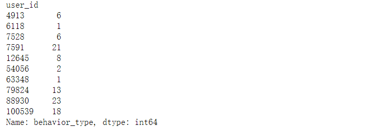
# Filter the data, and type 4 is payment. Group user IDs and aggregate the number of payment types
data_user_buy=data_user[data_user.behavior_type==4].groupby('user_id')['behavior_type'].count()

# Data obtained_ user_ Buy is the sequence, the index user id, and the value represents the number of payments made by the user
data_user_buy.head(10)
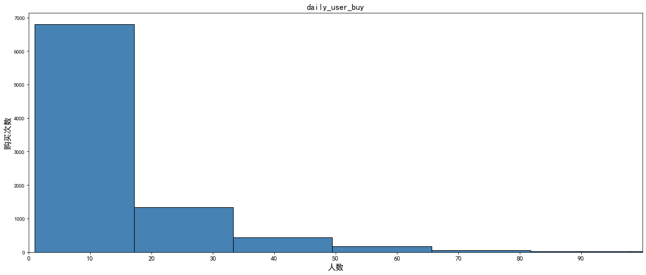
# Draw frequency histogram to check the distribution of purchase times and corresponding number of people
# Create drawing
plt.figure(figsize=(20,8),dpi=80)

# Draw frequency histogram
plt.hist(data_user_buy,bins=50,color = 'steelblue',edgecolor = 'k')

# Adjust scale
plt.xticks(range(100)[::10],size=12)

plt.xlim(0,100)

# Add dimension
plt.xlabel('Number of people',size=15)
plt.ylabel('Number of purchases',size=15)

# Add title
plt.title('daily_user_buy',size=15)
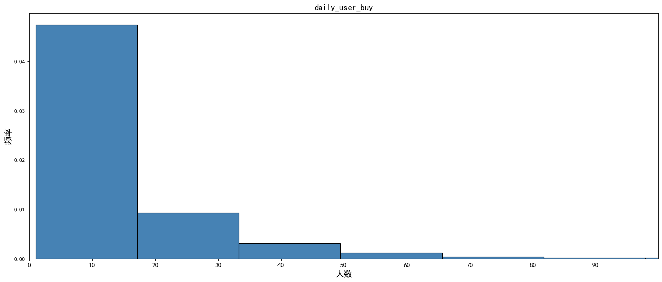
# Draw frequency histogram
plt.figure(figsize=(20,8),dpi=80)

# Create frequency histogram
plt.hist(data_user_buy,bins=50,color = 'steelblue',edgecolor = 'k',density = True)

# Adjust scale
plt.xticks(range(100)[::10],size=12)

# Add dimension
plt.xlabel('Number of people',size=15)
plt.ylabel('frequency',size=15)

# Add title
plt.title('daily_user_buy',size=15)

plt.xlim(0,100)
plt.show()
2. Day ARPPU
ARPPU (average revenue per paying user) refers to the income obtained from each paying user, which reflects the average payment amount of each paying user.
ARPPU = total revenue / amount paid by active users
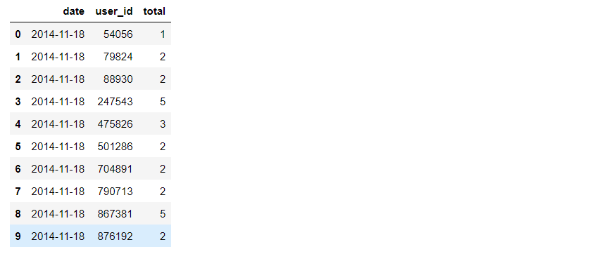
Since there is no consumption amount in this data set, the consumption times are used to replace the consumption amount in the calculation process
Per capita consumption times = total consumption times / number of consumers
# Create a new DataFrame, reset the index 0,1,2,3
data_use_buy1=data_user[data_user.behavior_type==4].groupby(['date','user_id'])['behavior_type'].count().reset_index().rename(columns={'behavior_type':'total'})

# View the first 10 rows of data
data_use_buy1.head(10)
data_use_buy1 = data_use_buy1.groupby('date').apply(lambda x:x.total.sum()/x.total.count())

# View data
data_use_buy1.head()

plt.figure(figsize=(20,8),dpi=80)
plt.plot(data_use_buy1)

#Adjust scale
plt.xticks(size=13)
plt.yticks(size=13)

# Add dimension
plt.xlabel('date',size=20)
plt.ylabel('Per capita consumption times',size=20)

# Add title
plt.title('Per capita consumption times',size=20)
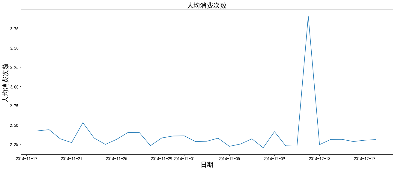
The chart shows that the average daily consumption fluctuates between 1-2 times, and the consumption times reach the highest value during the double twelve.
3. Day ARPU
ARPU(Average Revenue Per User): average revenue per user, which can be calculated by total revenue / AU. It can measure the profitability and development vitality of products.
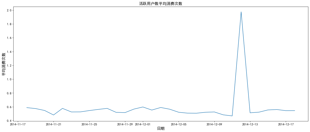
Average consumption times of active users = total consumption times / number of active users (those with operation behavior every day are active)
data_user['operation']=1
data_use_buy2=data_user.groupby(['date','user_id','behavior_type'])['operation'].count().reset_index().rename(columns={'operation':'total'})

data_use_buy2 = data_use_buy2.groupby('date').apply(lambda x:x[x.behavior_type==4].total.sum()/len(x.user_id.unique()))

# View the first 5 rows of data
data_use_buy2.head()

# Create drawing
plt.figure(figsize=(20,8),dpi=80)
# Draw a line chart
plt.plot(data_use_buy2)

# Adjust scale
plt.xticks(size=12)
plt.yticks(size=12)

# Add flag
plt.xlabel('date',size=15)
plt.ylabel('Average consumption times',size=15)

# Add title
plt.title('Average consumption times of active users',size=15)

# display graphics
plt.show()
4. Daily payment rate
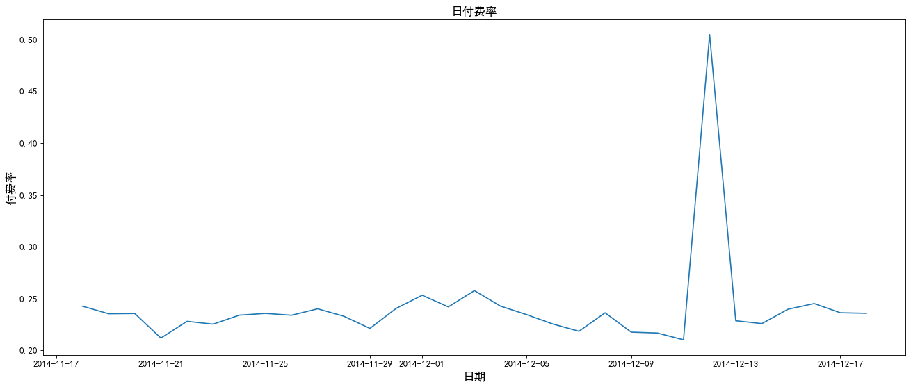
Payment rate = number of consumers / number of active users
data_use_buy2=data_user.groupby(['date','user_id','behavior_type'])['operation'].count().reset_index().rename(columns={'operation':'total'})
daily_afford_rate = data_use_buy2.groupby('date').apply(lambda x:x[x.behavior_type==4].total.count()/len(x.user_id.unique()))

# View the first 5 rows of data
daily_afford_rate.head()

# Create drawing
plt.figure(figsize=(20,8),dpi=80)
# Draw a line chart
plt.plot(daily_afford_rate)

# Adjust scale
plt.xticks(size=12)
plt.yticks(size=12)

# Add notes
plt.xlabel('date',size=15)
plt.ylabel('Rate ',size=15)

# Add title
plt.title('Daily payment rate',size=15)

# display graphics
plt.show()
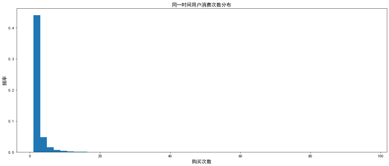
5. Distribution of user consumption times in the same time period
data_user_buy3=data_user[data_user.behavior_type==4].groupby(['user_id','date','hour'])['operation'].sum().rename('buy_count')

plt.figure(figsize=(20,8),dpi=80)
plt.hist(data_user_buy3,bins=50,density = True)

# Adjust scale
plt.xticks(size=12)
plt.yticks(size=12)

# Add dimension
plt.xlabel('Number of purchases',size=15)
plt.ylabel('frequency',size=15)

# Add title
plt.title('Distribution of user consumption times at the same time')

print('Most users consume:{}second'.format(data_user_buy3.mode()[0]))
Consumption of most users: once
8, Analysis of repurchase
1. Repurchase rate
Re purchase, that is, if there is a purchase behavior for more than two days, multiple purchases a day are counted as one
Repurchase rate = number of users with repurchase behavior / total number of users with purchase behavior
date_rebuy=data_user[data_user.behavior_type==4].groupby('user_id')['date'].apply(lambda x:len(x.unique())).rename('rebuy_count')

# Re purchase behavior screening: Date_ Buy > = 2, 4 significant digits reserved
print('Repurchase rate:',round(date_rebuy[date_rebuy>=2].count()/date_rebuy.count(),4))
Repurchase rate: 0.8717
2. Distribution of consumption times in all repurchase intervals
data_day_buy=data_user[data_user.behavior_type==4].groupby(['user_id','date']).operation.count().reset_index()
data_user_buy4=data_day_buy.groupby('user_id').date.apply(lambda x:x.sort_values().diff(1).dropna())
data_user_buy4=data_user_buy4.map(lambda x:x.days)

# Create drawing
plt.figure(figsize=(20,8),dpi=80)

# Draw bar chart
data_user_buy4.value_counts().plot(kind='bar')

# Adjust scale
plt.xticks(size=12)
plt.yticks(size=12)

# Add dimension
plt.xlabel('gap_day',size=15)
plt.ylabel('gap_count',size=15)

# Add title
plt.title('time_gap',size=15)
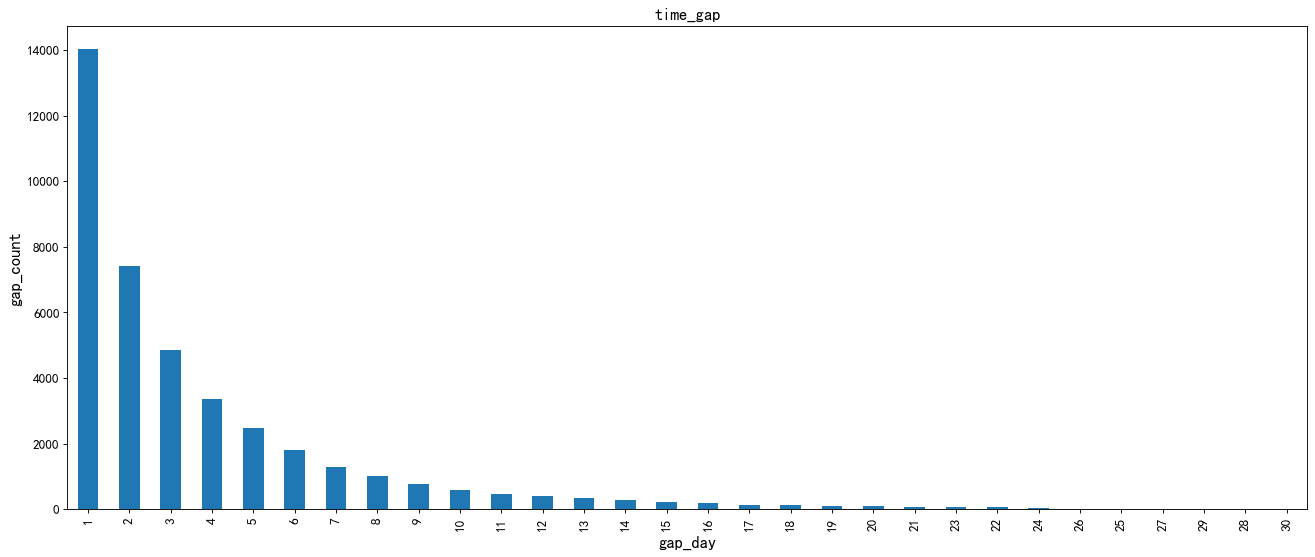
The repurchase rate of most users is 0.8717, and the consumption times continue to decline with the increase of consumption time interval. There are more repurchase times within 1-10 days, and Taobao users rarely repurchase after 10 days. Therefore, it is necessary to pay attention to the repurchase behavior of Taobao users within 10 days and increase users' repurchase. The average repurchase time of different users is normally distributed, but overall, it shows a gradual downward trend. The average repurchase time of most Taobao users is concentrated in the interval of 1-5 days.
3. Analysis of average repurchase time of different users
# Create drawing
plt.figure(figsize=(20,8),dpi=80)

# Draw the average repurchase time distribution histogram
sns.distplot(data_user_buy4.reset_index().groupby('user_id').date.mean())

# Adjust scale
plt.xticks(size=12)
plt.yticks(size=12)

# Add dimension
plt.xlabel('gap_day',size=15)
plt.ylabel('gap_count',size=15)

# Add title
plt.title('time_gap',size=15)
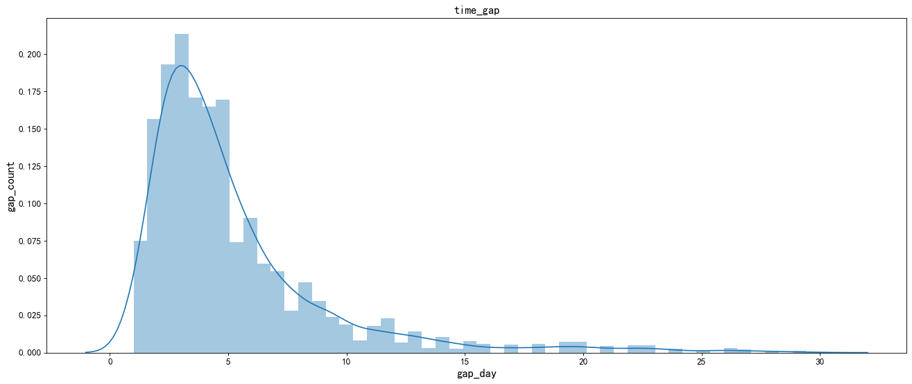
From the above figure: the average repurchase time of different users is normally distributed. Overall, it shows a gradual downward trend. The average repurchase time of most Taobao users is concentrated in the interval of 1-5 days.
9, Funnel loss analysis
Funnel analysis is a set of process data analysis, which can scientifically reflect the user behavior state and the user conversion rate from the starting point to the end point.
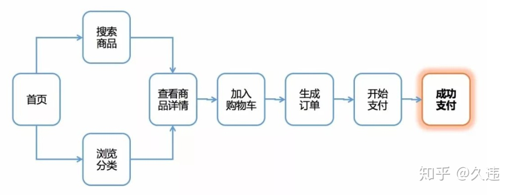
1. Calculate the loss rate of each stage
Note: in the pv analysis of users with different behavior types above, the total amount of pv added to the shopping cart is higher than the total amount of collection. Therefore, in the funnel loss analysis, user type 3 should be analyzed before 2.
# Group user types and count them
# Count all IDS (1: click 2: collect 3: add shopping cart 4: pay)
pv_all=data_user['user_id'].count()
pv_1 = data_user[data_user.behavior_type==1]['user_id'].count()
pv_2 = data_user[data_user.behavior_type==2]['user_id'].count()
pv_3 = data_user[data_user.behavior_type==3]['user_id'].count()
pv_4 = data_user[data_user.behavior_type==4]['user_id'].count()

print(pv_all,pv_1,pv_2,pv_3,pv_4)
12256906 11550581 242556 343564 120205
# Calculation of loss rate in each stage
Wastage_rate1 = round(1-pv_1/pv_all,4)
Wastage_rate2 = round(1-pv_3/pv_1,4)
Wastage_rate3 = round(1-pv_2/pv_3,4)
Wastage_rate4 = round(1-pv_4/pv_2,4)

# Format and output each loss rate
print('Total views - the loss rate of hits is%s%%'%(Wastage_rate1*100))
print('Hits-The loss rate of shopping cart volume is%s%%'%(Wastage_rate2*100))
print('Number of shopping carts added-The loss rate of collection is%s%%'%(Wastage_rate3*100))
print('Collection volume-The loss rate of purchase volume is%s%%'%(Wastage_rate4*100))

10, Analysis on the relationship between user behavior and commodity types
1. Conversion rate of different user behavior categories
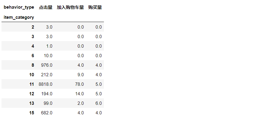
data_category=data_user[data_user.behavior_type!=2].groupby(['item_category','behavior_type']).operation.count().unstack(1).rename(columns={1:'Hits',3:'Number of shopping carts added',4:'Purchase volume'}).fillna(0)

# View the first 10 rows of data
data_category.head(10)
#Conversion calculation
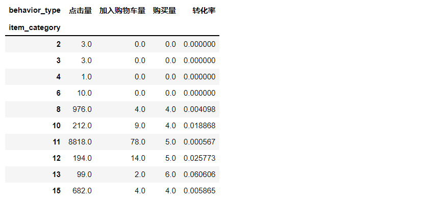
data_category['Conversion rate']=data_category['Purchase volume']/data_category['Hits']
data_category.head(10)
#Outlier handling
data_category=data_category.fillna(0)
data_category=data_category[data_category['Conversion rate']<=1]

# Create drawing
plt.figure(figsize=(20,8),dpi=80)

#Conversion mapping
sns.distplot(data_category['Conversion rate'])

# Adjust scale
plt.xticks(size=12)
plt.yticks(size=12)

# Add dimension
plt.xlabel('Conversion rate',fontsize=15)
plt.ylabel('density',fontsize=15)

# Add title
plt.title('Conversion distribution',size=15)
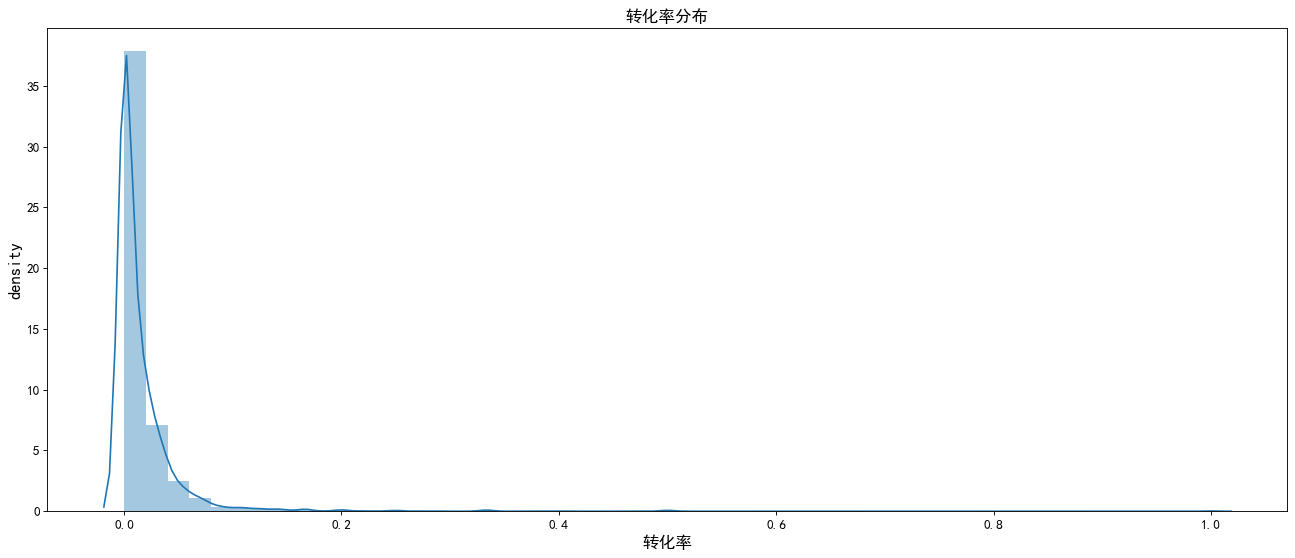
The chart shows: basically, the conversion rate of various user behavior types is within 0.1, and most users do not buy. We need to focus on the causes of this phenomenon and analyze and improve it.
2. Interest ratio
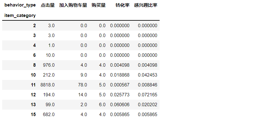
data_category['Interest ratio']=data_category['Number of shopping carts added']/data_category['Hits']
data_category.head(10)
#Outlier processing, ratio of interest drawing
data_category=data_category[data_category['Interest ratio']<=1]

# Create drawing
plt.figure(figsize=(20,8),dpi=80)
sns.distplot(data_category['Interest ratio'])

# Adjust scale
plt.xticks(size=12)
plt.yticks(size=12)

# Add dimension
plt.xlabel('Interest ratio',fontsize=15)
plt.ylabel('density',fontsize=15)

Add title
plt.title('Distribution of interest ratio',size=15)
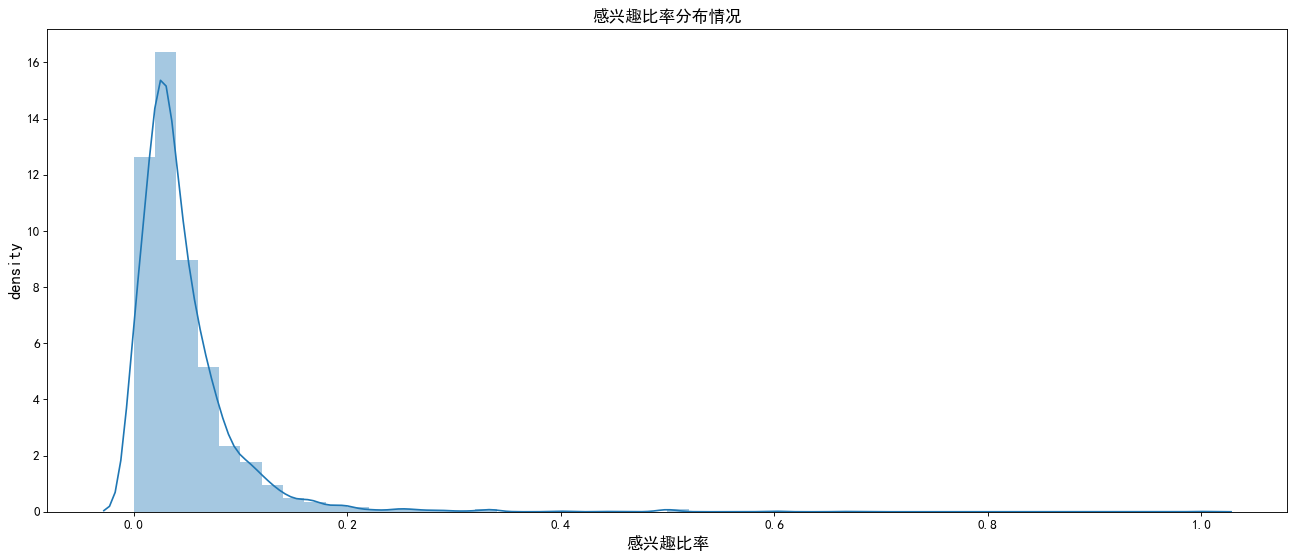
The chart shows that the interest rate is similar to the conversion rate, which is basically within 0.1, indicating that the vast majority of products clicked by users are not interested, so we need to pay attention to the adjustment of the recommendation system.
11, 28 theoretical analysis
28 law: in any group of things, the most important only accounts for a small part, about 20%, and the remaining 80% is secondary, although it is the majority. Therefore, it is also called 28 law.
#28 theory and long tail theory
data_category=data_category[data_category['Purchase volume']>0]
value_8=data_category['Purchase volume'].sum()*0.8
value_10=data_category['Purchase volume'].sum()
data_category=data_category.sort_values(by='Purchase volume',ascending=False)
data_category['Cumulative purchase']=data_category['Purchase volume'].cumsum()
data_category['classification']=data_category['Cumulative purchase'].map(lambda x:'Top 80%' if x<=value_8 else 'Last 20%')
data_category.head()

data_category.groupby('classification')['classification'].count()/data_category['classification'].count()

The chart shows that about 15% of the top 80% of sales are contracted by commodity categories, which is close to the principle of February 8th. But we also see that nearly 20% of sales are provided by 85% of commodity categories.
For the traditional retail industry, because of the high cost, it can only provide profits for the first 20% of the goods;
For e-commerce, the space cost is reduced to zero, so that the last 80% of the goods can also be sold. Therefore, optimizing and recommending the goods in the long tail can bring greater benefits to the enterprise.
12, Analysis of user value RFM model
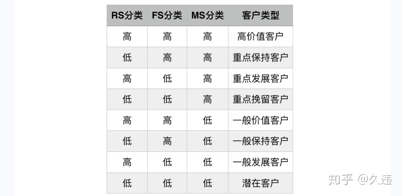
Meaning of RFM:
R (Recency): the interval between the last transaction of the customer. The greater the R value, the longer the date of customer transaction; otherwise, the closer the date of customer transaction.
F (Frequency): the number of transactions of the customer in the latest period of time. The larger the F value, the more frequent the customer transactions; otherwise, the less active the customer transactions.
M (Monetary): the amount of the customer's transaction in the latest period of time. The larger the m value, the higher the customer value; otherwise, the lower the customer value.
RFM analysis is a method to segment customer value according to the contribution of customer activity and transaction amount.
from datetime import datetime
datenow=datetime(2014,12,20)

#Latest purchase time per user
recent_buy_time=data_user[data_user.behavior_type==4].groupby('user_id').date.apply(lambda x:datetime(2014,12,20)-x.sort_values().iloc[-1]).reset_index().rename(columns={'date':'recent'})
recent_buy_time.recent=recent_buy_time.recent.map(lambda x:x.days)

#Consumption frequency per user
buy_freq=data_user[data_user.behavior_type==4].groupby('user_id').date.count().reset_index().rename(columns={'date':'freq'})
rfm=pd.merge(recent_buy_time,buy_freq,left_on='user_id',right_on='user_id',how='outer')

#Divide each dimension into two levels. The higher the score, the better
rfm['recent_value']=pd.qcut(rfm.recent,2,labels=['2','1'])
rfm['freq_value']=pd.qcut(rfm.freq,2,labels=['1','2'])
rfm['rfm']=rfm['recent_value'].str.cat(rfm['freq_value'])
rfm.head(10)
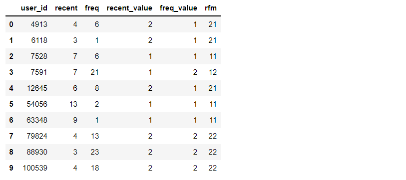
The table shows: because this data set does not provide consumption amount, only R and F can conduct user value analysis. Through RF user value analysis, 22 users are key users that need attention; For those with high loyalty and insufficient purchasing power such as 21, you can appropriately give some discounts or bundle sales to increase the purchase frequency of users. For 12 those with low loyalty and strong purchasing power, we need to pay attention to their shopping habits and do precision marketing.