Recently, there is a big data experiment to be done. I found that the virtual machine in the virtualbox used for big data only knocks the code. It's really tired. I can knock the double tags, but I can't copy them. After knocking for a day, people are numb, and I have to take CET-4 in a few days. I hope I can pass this time.
OK, or focus on what I learned today. Today's content is not very much. Learning iconfont, server font and media queries, most of the time still layouts the layout of mobile terminals. Today, Alipay page is written, and it feels the flexibility of layout.
1, iconfont
Website of Alibaba vector icon library: https://www.iconfont.cn/
GitHub:
- This is the world's largest programmer exchange platform
- Some good ideas or software codes developed by programmers can be shared and used by developers all over the world
- iconfont can log in using GitHub account
- Because the server of GitHub website is abroad, the access time is relatively slow
Code cloud:
- Also known as a code warehouse
- The domestic programmer exchange platform can be understood as the Chinese version of GitHub
- All are in Chinese, and the user base is still relatively large
iconfont font icon file:
- Replace the previous picture form with the form of code
- The efficiency of code execution is higher than that of pictures, and the form of code can be treated as text
- The downloaded icon can be directly used as text to set some properties
svg format:
- Vector icon, when the picture is scaled, it will not be distorted
- You can create your own icons in the form of coding
- Syntax: xml form, xml data format, and also a markup language. The markup can be customized
iconfont font icon used in actual development:
- If the UI does not provide svg format, you can only download it yourself
- As long as there are icons in SVG format, directly upload all the needed icons to the iconfont Font Icon project, and then download them
Specific steps:
<!--Step 1:-->
<!--Import font icon style file-->
<link rel="stylesheet" type="text/css" href="fonts/iconfont.css"/>

<!--Step 2:-->
<!--Can use i Mark or span Tag to specify iconfont-->
<span class="iconfont icon-chongzhizhongxin"></span>
<i class="iconfont icon-richscan_icon"></i>

<!--Step 3:-->
<style type="text/css">
	span{
		/*Set weight to maximum*/
		font-size: 66px !important;
		color: yellow;
	}
	i{
		color: orange;
		font-size: 66px !important;
	}
</style>
2, Server font
- The fonts supported by the browser are limited, and generally do not support artistic fonts, etc
- css provides font face, which can introduce external font resources
example:
<style type="text/css">
@font-face {
/*Font name, which can be customized*/
font-family:"Nimble";
src: url("font2/Smart finger book mobile phone font.ttf");
}
h1{
font-family: "Nimble";
}
</style>
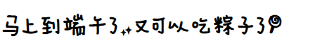
<h1>It's almost the Dragon Boat Festival. You can eat Zongzi again!</h1>
effect:
Note: the font should pay attention to the copyright. Don't use the copyrighted font indiscriminately, and use it in business
3, Media query
- Requirements: it is impossible to display different web page styles according to different computer resolutions
- However, these operations can be achieved through media query
Syntax:
@media all and (){}

all Indicates all media types: notebook, mobile device, printing device, projection, TV device, etc

only Means to qualify a device

not Indicates that a device is excluded

and Means and, and

()Indicates that the conditions placed in the parentheses of the expression have a judgment function
+ If the condition is true, execute true
+ If the condition is false, it will not be implemented false

/*If the width of the browser is greater than 1000px, the following code will be executed if the condition is true */
@media all and (min-width:1000px) {

}

/*Indicates that the following code is executed when the width of the browser is less than 800px*/
@media all and (max-width:800px) {

}

/*
	Exclusion conditions are understood as conditions that used to be true and now are false. There is an operator called negation in mathematics
	This is equivalent to executing the following code when the browser width is less than 1000
*/
@media not all and (min-width:1000px) {

}

/*The following code is executed when the width of the browser is 600-1000px*/
@media all and (min-width:600px) and (max-width:1000px) {

}

/*Multiple intervals can be specified*/
@media all and (max-width:1000px) and (min-width:800px) {
	div{
		background-color: yellow;
	}
}
@media all and (max-width:799px) and (min-width:600px){
	div{
		background-color: #ccc;
	}
}
@media all and (max-width:599px) and (min-width:300px) {
	div{
		background-color: green;
	}
}

/* Vertical screen */
@media screen and (orientation:portrait) {

}

/* Horizontal screen */
@media screen and (orientation:landscape){

}