preface
Recently, I'm preparing to find a job, but as a background, I also need to know some front-end frameworks. At present, there is a big fire VUE, but VUE still has a certain learning cost, so it is decided to start with the background friendly LayUI, do some small projects to practice, and then consider using VUE+ElementUI to build a larger SAAS system. After consulting the materials, the following articles are obtained as learning records.
Drop down menu component document
dropdown is a multifunctional general drop-down menu component derived from the "basic menu" structure of layui. It triggers the originally statically rendered menu in the form of various events, and then pops up in the form of a separate panel. It can be used not only as a common "drop-down menu", but also as a "right-click menu" to realize more interaction possibilities.
Module loading Name: dropdown
Quick use
<button class="layui-btn" id="demo1">
  drop-down menu
  <i class="layui-icon layui-icon-down layui-font-12"></i>
</button>

<script>
layui.use('dropdown', function(){
  var dropdown = layui.dropdown
  dropdown.render({
    elem: '#demo1 '/ / can be bound to any element. Here, take the above button as an example
    ,data: [{
      title: 'menu item 1'
      ,id: 100
      ,href: '#'
    },{
      title: 'menu item 2'
      ,id: 101
      ,href: 'https://www.layui.com / '/ / open hyperlink
      ,target: '_blank' //Open in new window mode
    },{type: '-'},{
      title: 'menu item 3'
      ,id: 102
      ,type: 'group'  //Menu type, support: normal/group/parent/-
      ,child: [{
        title: 'menu item 3-1'
        ,id: 103
      },{
        title: 'menu item 3-2'
        ,id: 104
        ,child: [{
          title: 'menu item 3-2-1'
          ,id: 105
        },{
          title: 'menu item 3-2-2'
          ,id: 106
        }]
      },{
        title: 'menu item 3-3'
        ,id: 107
      }]
    },{type: '-'},{
      title: 'menu item 4'
      ,id: 108
    },{
      title: 'menu item 5'
      ,id: 109
      ,child: [{
        title: 'menu item 5-1'
        ,id: 11111
        ,child: [{
          title: 'menu item 5-1-1'
          ,id: 2111
        },{
          title: 'menu item 5-1-2'
          ,id: 3111
        }]
      },{
        title: 'menu item 5-2'
        ,id: 52
      }]
    },{type:'-'},{
      title: 'menu item 6'
      ,id: 6
      ,type: 'group'
      ,isSpreadItem: false
      ,child: [{
        title: 'menu item 6-1'
        ,id: 61
      },{
        title: 'menu item 6-2'
        ,id: 62
      }]
    }]
    ,id: 'demo1'
    //Menu clicked event
    ,click: function(obj){
      console.log(obj);
      layer.msg('The parameters returned by the callback have been displayed on the console');
    }
  });
});
</script>
The core data of the menu list comes from the data parameter. For details, please refer to the menu column parameters in the directory on the right
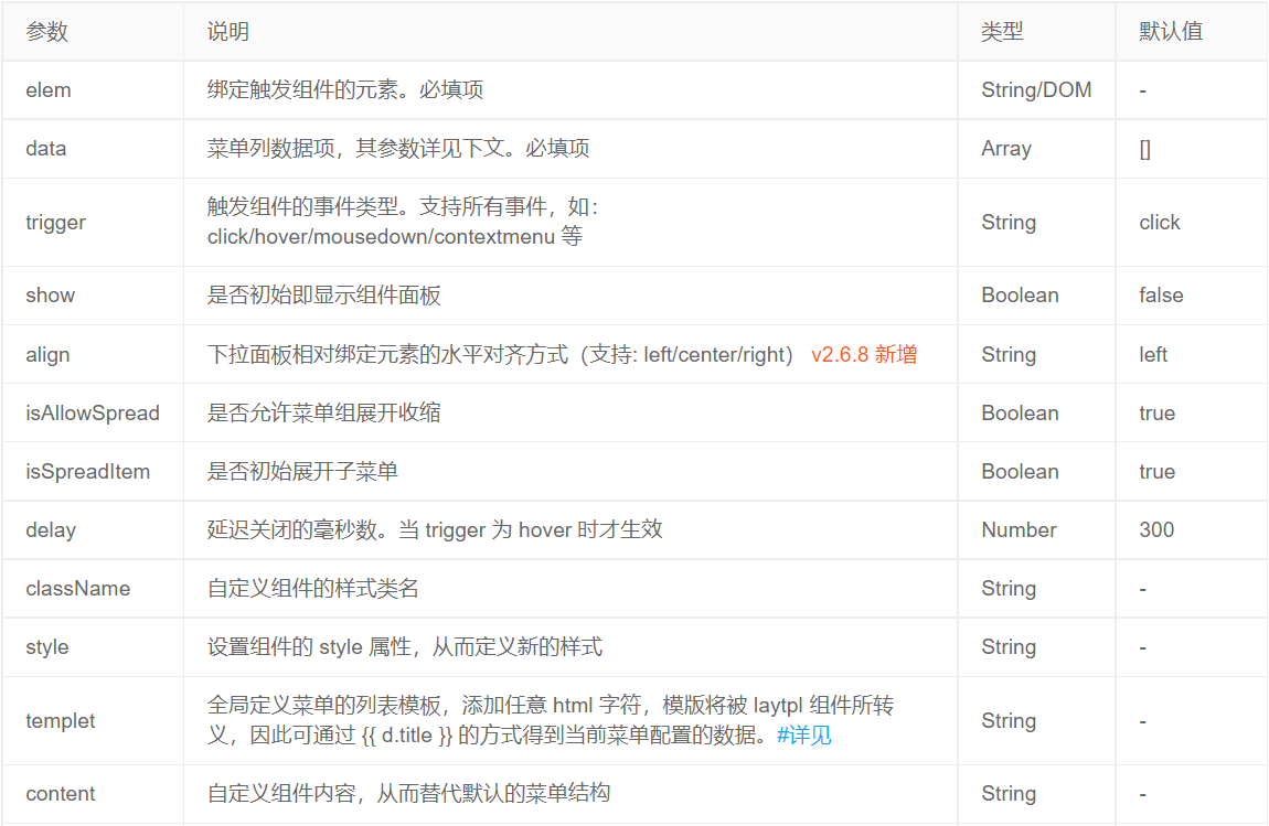
Basic parameters
The core method is dropdown Parameters corresponding to options in render (options):
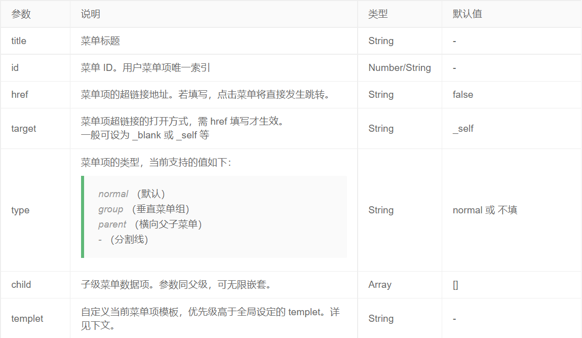
Menu item parameters
That is, the parameter corresponding to the above basic parameter data. The format is: data: [{title: 'menu item 1', id: 1}, {}, {}]
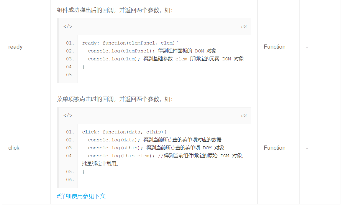
Callback when menu item is clicked
<table class="layui-table">
  <tbody>
    <tr>
      <td>List 1</td>
      <td><button class="layui-btn layui-btn-sm demolist" data-id="111">More operations</button></td>
    </tr>
    <tr>
      <td>List 2</td>
      <td><button class="layui-btn layui-btn-sm demolist" data-id="222">More operations</button></td>
    </tr>
    <tr>
      <td>Listing 3</td>
      <td><button class="layui-btn layui-btn-sm demolist" data-id="333">More operations</button></td>
    </tr>
  </tbody>
</table>
<script>
layui.use('dropdown', function(){
  var dropdown = layui.dropdown
  ,$ = layui.jquery;

  dropdown.render({
    elem: '.demolist'
    ,data: [{
      title: 'item 1'
      ,id: 'aaa'
    }, {
      title: 'item 2'
      ,id: 'bbb'
    }]
    ,click: function(data, othis){
      var elem = $(this.elem)
      ,listId = elem.data('id'); //Embedded data of table list
      layer.msg('Get a list of tables id: '+ listId +',drop-down menu  id: '+ data.id);
    }
  });
});
</script>
Customize menu item templates
The menu item template can be customized through the templet parameter, and its characters will be escaped by the laytpl component. Therefore, the data of the current menu configuration can be obtained through undefined.
var dropdown = layui.dropdown;

//Execution menu
dropdown.render({
  elem: '#id'
  ,data: [{
    title: 'Refresh'
    //When the template is set, the menu item will give priority to the template structure; Otherwise, the title is displayed by default
    ,templet: '<i class="layui-icon layui-icon-refresh"></i> {{d.title}}'
    ,id: 100
  },{
    title: 'menu item 2'
    //The template consists of "picture + title + badge"
    ,templet: '<img src="1.jpg" style="width: 16px;"> {{d.title}} <span class="layui-badge-dot"></span>'
    ,id: 101
    ,href: 'https://www.layui.com/'
    ,target: '_blank'
  },{
    title: 'menu item 3' //When the template is not opened, the title is displayed directly by default
    ,id: 103
  }]
})
Right click menu
When the parameter is set to trigger: 'contextmenu', the default right-click menu will be masked in the bound element, so as to present the menu configured by the dropdown component.
var dropdown = layui.dropdown;

//Execution menu
dropdown.render({
  elem: '#Demo '/ / an event is triggered in the element with id="demo". You can also set it directly to document to reset the entire right-click menu
  ,trigger: 'contextmenu' //Right click event
  ,data: [{
    title: 'menu item 1'
    ,id: 1
  },{
    title: 'menu item 2'
    ,id: 'reload'
  },{type:'-'},{
    title: 'menu item 3'
    ,id: 3
    ,child: [{
      title: 'menu item 3-1'
      ,id: 31
    },{
      title: 'menu item 3-2'
      ,id: 32
    },{
      title: 'menu item 3-3'
      ,id: 33
    }]
  },{type:'-'},{
    title: 'menu item 4'
    ,id: 111
  },{
    title: 'menu item 5'
    ,id: 555
  },{
    title: 'menu item 6'
    ,id: 666
  }]
});
The component is very flexible, and the pop-up panel makes scientific judgment on the coordinates (based on the internal lay.js module), which can always be adsorbed and displayed in the best position.
Official website link