preface
Most pages have a title block, which usually encapsulates the initialization code of the general title block in the base class, and then only needs to include a title block layout in the layout code, so it is very convenient to set the title block in the Activity.
This may be the current more common way of packaging. There are also some disadvantages. It is tedious to write include code in the layout every time. If it is a special title bar, it can only be implemented by itself.
Today, I'll introduce a new way to add a title block to the ship. Let's have a look at the final effect
class MainActivity : AppCompatActivity() {

  override fun onCreate(savedInstanceState: Bundle?) {
    super.onCreate(savedInstanceState)
    setContentView(R.layout.activity_main)
    // Add title block with back key and right button
    setToolbar("title", NavIconType.BACK, "complete"){
      Toast.makeText(this, "Click the finish button", Toast.LENGTH_SHORT).show()
    }
  }
}
It's so simple. You don't need to include the title bar in the layout, or inherit the base class. You can call one line of code directly. Of course, not only that, but also a title bar with linkage effect can be added, which is difficult to be achieved by the encapsulation of include.
Of course, this method needs to be written by yourself, because the title bar is various, such as multiple icons on the right, two-level height, search box, linkage effect, etc. The requirements are ever-changing. Only we know what we want, but we just need to write a little code. It's very convenient to reuse later, just like the example above.
So how to achieve it? Please listen to me.
Solution
preparation
First of all, let's play our leading role—— LoadingHelper . Yes, you are right. This is a personal packaging loading library, which can manage the title bar. Not to mention that the annotation has only one more than 200 lines of Kotlin code. Although the code is not many, it is very powerful. You can see it from the following.
First of all, why does a loading library manage the title bar? Because the title block will affect the loading area in most cases. In most cases, we need to load the page, and the existence of the title bar makes us display the layout such as loading or error in the area below the title bar. There are other considerations. I suggest reading this article first Manage Loading interface and title block gracefully It introduces the whole idea and usage in detail.
This paper briefly introduces the basic usage of the loading function.
loadingHelper = LoadingHelper(this)
loadingHelper.register(ViewType.LOADING, LoadingAdapter())
loadingHelper.showView(ViewType.LOADING)
The usage is so simple that it will be displayed after registration. There are five default View types, which can also be transferred to any type of data for registration. Registered adapter is inherited LoadingHelper.Adapter , and RecyclerView.Adapter Similarly, they are used to create and cache views.
For ease of use, it provides a way to register the global adapter and show the default type view.
LoadingHelper.setDefaultAdapterPool {
  register(ViewType.LOADING, LoadingAdapter())
  register(ViewType.ERROR, ErrorAdapter())
  register(ViewType.EMPTY, EmptyAdapter())
}
loadingHelper.showLoadingView() // Corresponding view type ViewType.LOADING
loadingHelper.showContentView() // Corresponding view type ViewType.CONTENT , show the original content
loadingHelper.showErrorView() // Corresponding view type ViewType.ERROR
loadingHelper.showEmptyView() // Corresponding view type ViewType.EMPTY
Compared with other loading libraries, the learning cost has been kept as low as possible. In addition to the adapters we are familiar with, they are the register and show methods.
Add title block
Enter the main topic immediately, how to add the title bar, which is another very practical function of this library - to wrap the content with a decorative container. Adding a title block is just one of the most common usage. There are other usage scenarios, such as the bottom text input box, the head search box, the layout with the edit all function in the head, and so on. Multiple pages need to be reused, or if you want to add without changing the original layout code, you can use this library to add management.
Now let's add a title bar with linkage effect. It's not a problem to add anything else.
First, prepare a layout DecorView for decorating content. This is not the DecorView class in the Android source code, but it's a tribute to the implementation principle of adding ActionBar to DecorView, and it's a View for decoration. It's also suitable to be called DecorView.
The DecorView mentioned here is just a common View, but it needs to have the following structure:
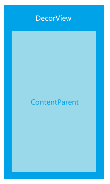
The structure is very simple. The ContentParent is used to add content layout, switch loading, error, empty and other pages.
OK, let's first realize a layout with linkage effect:
<?xml version="1.0" encoding="utf-8"?>
<androidx.coordinatorlayout.widget.CoordinatorLayout xmlns:android="http://schemas.android.com/apk/res/android"
  xmlns:app="http://schemas.android.com/apk/res-auto"
  android:layout_width="match_parent"
  android:layout_height="match_parent"
  android:fitsSystemWindows="true">

  <com.google.android.material.appbar.AppBarLayout
    android:id="@+id/app_bar"
    android:layout_width="match_parent"
    android:layout_height="@dimen/app_bar_height"
    android:fitsSystemWindows="true"
    android:theme="@style/AppTheme.AppBarOverlay">

    <com.google.android.material.appbar.CollapsingToolbarLayout
      android:id="@+id/toolbar_layout"
      android:layout_width="match_parent"
      android:layout_height="match_parent"
      android:fitsSystemWindows="true"
      app:contentScrim="?attr/colorPrimary"
      app:layout_scrollFlags="scroll|exitUntilCollapsed"
      app:toolbarId="@+id/toolbar">

      <androidx.appcompat.widget.Toolbar
        android:id="@+id/toolbar"
        android:layout_width="match_parent"
        android:layout_height="?attr/actionBarSize"
        app:layout_collapseMode="pin"
        app:popupTheme="@style/AppTheme.PopupOverlay" />

    </com.google.android.material.appbar.CollapsingToolbarLayout>
  </com.google.android.material.appbar.AppBarLayout>

  <FrameLayout
    android:id="@+id/content_parent"
    android:layout_width="match_parent"
    android:layout_height="match_parent"
    app:layout_behavior="@string/appbar_scrolling_view_behavior" />

</androidx.coordinatorlayout.widget.CoordinatorLayout>
Then we need to inherit an adapter for creating a DecorView LoadingHelper.DecorAdapter , the abstract methods to be implemented should be well understood in combination with the previous figure.
class ScrollDecorAdapter : DecorAdapter() {
  override fun onCreateDecorView(inflater: LayoutInflater): View {
    return inflater.inflate(R.layout.layout_scrolling_toolbar, null)
  }

  override fun getContentParent(decorView: View): ViewGroup {
    return decorView.findViewById(R.id.loading_container)
  }
}
Finally, set up the decoration adapter.
loadingHelper.setDecorAdapter(ScrollDecorAdapter())
But most of the time, we just want to add a common title bar at the top, which needs a parent container to wrap the Toolbar. It's a bit cumbersome to write.
Of course, this situation is also considered, which requires another method, setting the head of decoration, which is simply to add one or more views to the top.
You need to implement the previous loading function LoadingHelper.Adapter , which is the adapter used to create and cache the View. And LoadingHelper.DecorAdapter Is the adapter used to create the decorator container DecorView. Don't confuse the two.
At this time, we can make use of the previous layout of the title block used for include. Is the following adapter code familiar?
class ToolbarAdapter(
  private val title: String?,
  private val type: NavIconType = NavIconType.NONE
) : LoadingHelper.Adapter<LoadingHelper.ViewHolder>() {

  override fun onCreateViewHolder(inflater: LayoutInflater, parent: ViewGroup): LoadingHelper.ViewHolder {
    return LoadingHelper.ViewHolder(inflater.inflate(R.layout.layout_toolbar, parent, false))
  }

  override fun onBindViewHolder(holder: LoadingHelper.ViewHolder) {
    holder.rootView.apply {
      if (title.isNullOrBlank()) {
        toolbar.title = title
      }
      if (type == NavIconType.BACK) {
        toolbar.setNavigationIcon(R.drawable.ic_baseline_arrow_back_24)
        toolbar.setNavigationOnClickListener {
          (holder.rootView.context as Activity).finish()
        }
      } else {
        toolbar.navigationIcon = null
      }
    }
  }
}

enum class NavIconType {
  BACK, NONE
}
Finally, the method of setting the decorated head can be invoked, and multiple heads can be added. Of course, registration adapters are also required before setting up.
loadingHelper.register(ViewType.TITLE, ToolbarAdapter("title", NavIconType.BACK))
loadingHelper.register(VIEW_TYPE_SEARCH, SearchHeaderAdapter())
loadingHelper.setDecorHeader(ViewType.TITLE, VIEW_TYPE_SEARCH)
It's OK to call the method of setting decoration multiple times. The later one will replace the former one. If there is such a use scenario, you can try it.
You can also add sub decoration containers or sub decoration headers. For example, I want to add a search box under a title bar with linkage effect:
loadingHelper.setDecorAdapter(ScrollDecorAdapter())
loadingHelper.addChildDecorHeader(VIEW_TYPE_SEARCH)
Whether adding decoration containers or decoration headers, they will eventually be added to our layout. That is to say, although there is no code for the relevant control in the layout, we can still find the control through findViewById after setting.
val toolbar: Toolbar = findViewById(R.id.toolbar)
setSupportActionBar(toolbar)
So far, how to use this library to add decorative containers or decorative heads has been finished.
So how to add a title block with one line of code at the beginning?
Recommended usage
Because only one Activity or View object and adapter are needed to add a title bar, the Kotlin extension function can be used to simplify the code. The following encapsulates the adapter implemented previously.
fun Activity.setToolbar(title: String, type: NavIconType = NavIconType.NONE) =
  LoadingHelper(this).apply {
    register(ViewType.TITLE, ToolbarAdapter(title, type))
    setDecorHeader(ViewType.TITLE)
  }
It can be understood that the method of adding setToolbar to Activity enables us to add the title bar without inheriting the base class:
class MainActivity : AppCompatActivity() {

  private lateinit var loadingHelper:LoadingHelper

  override fun onCreate(savedInstanceState: Bundle?) {
    super.onCreate(savedInstanceState)
    setContentView(R.layout.activity_main)
    loadingHelper = setToolbar("title", NavIconType.BACK)
  }
}
I spent some time talking about the usage of loading, because here we can use the returned objects to display the loading, content, error and other pages as needed. This use not only has low coupling, but also retains the loading function.
Some people may ask, this is the use of Kotlin. What about Java? Using java requires writing a tool class.
public class ToolbarUtils {

  public static LoadingHelper setToolbar(Activity activity, String title, NavIconType type) {
    LoadingHelper loadingHelper = new LoadingHelper(activity);
    loadingHelper.register(ViewType.TITLE, new ToolbarAdapter(title, type));
    loadingHelper.setDecorHeader(ViewType.TITLE);
    return loadingHelper;
  }
}
ToolbarUtils.setToolbar(this, "title", NavIconType.BACK);
In addition, you can choose to encapsulate it in the base class, which can also decouple well. When loading, you can avoid touching the LoadingHelper object, which is more concise and convenient to use. However, the coupling degree of tool class or extended function is lower, which can be added without changing the original code. You can choose according to your own needs.
Demo
Click or scan QR code to download. In addition to simple content, other content in Demo is basically added dynamically with this library.

summary
This paper mainly talks about the disadvantages of the traditional way of using include to encapsulate the title block, and introduces how to use it LoadingHelper The title block is decoupled in depth, which recommends an innovative way of using the title block without writing the code in the layout, without inheriting the base class, and taking into account the loading function at the same time. Coupling degree is very low, which can be easily applied to their own projects. I recommend you to try it. In addition, it is a good choice to encapsulate the library in the base class.
If you think this library is good, I hope you can give it star Support me~